Kitchen design is not only a deliberate purchase of furniture, but also a choice of colors. The tones used in the design of the room affect a person’s mood, appetite and well-being. Therefore, it is important to create a pleasant atmosphere in the kitchen, not forgetting about the harmony of shades.
White kitchen with black elements and wooden countertop Source pakiplay.com
The meaning of colors in design
The impression created by the interior largely depends on the color scheme used. It affects the visual perception of the entire environment. By applying design techniques in practice, you can create the impression of spaciousness, distract attention from the asymmetry of the room, and highlight the necessary accents.
The impression created by the interior depends on the color scheme used
If the color palette is chosen incorrectly, the overall perception of the layout and interior may be disrupted. The tone of the furniture should be in harmony with the shade of the walls, kitchen apron, floor, and ceiling.
The choice of the general range should be based on your preferences in design. There are several main options:
- Cheerful, cheerful interior.
- Balanced and balanced environment.
- Calm and cozy space.
Balanced and balanced environment
How to choose a headset color
The color of the kitchen set is determined depending on the overall design of the room. Types of design:
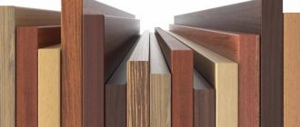
- Under wood or stone. This design is often used in loft and eco style kitchens. The set will complement any kitchen, regardless of color scheme. This option is considered traditional, so if one of the parts is damaged, it can be easily replaced.
- With graphic design. Squares, circles or diamonds, arranged in a precise or chaotic order, take away the originality of the room. This option can be used if the color scheme of the cabinets and walls matches. But it is better to refuse such a design if the kitchen already has other details with prints that are not similar to the geographical pattern of the set.
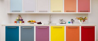
Four colors in one kitchen Source pinterest.co.uk
- Plain matte. Such cabinets are chosen to complement a Provence kitchen or when stylized to resemble the design of the 60-70s of the last century. The set is also installed in kitchens where the walls, floor or ceiling are already decorated with drawings. Plain furniture will help to unobtrusively dilute the pattern.
Muted raspberry with light beige Source dmrealty.ru
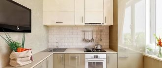
- Plain glossy. This option is often installed in small kitchens, as thanks to reflections and reflections, the illusion of expanding the space appears. The options for combining the color of the set with other elements of the kitchen are unlimited, it all depends on the owner’s imagination.
Milky glossy furniture in the kitchen Source ukuhnya.com
Where to start the project?
The choice of color combinations in the kitchen interior should be based on the following important factors:
- room size;
- ceiling height;
- shape of the room;
- is the kitchen combined with other rooms;
- availability of natural light;
- age and temperament of family members;
- number and location of windows;
- Which side of the world are the windows facing;
- how much time family members will spend here;
- how family members want the kitchen to look;
- style of the kitchen, as well as the entire apartment.
Cheerful cheerful interior
Additionally, the necessary financial investments in remodeling an existing kitchen or decorating an existing one must be taken into account and calculated.
Cold and warm tones
The entire range of tones is divided into warm and cold. The choice of one or another is made based on the planned effect.
Light and cool shades have a calming effect. These include:
- grey;
- blue;
- pale green.
White color is not very practical
For rooms with insufficient lighting, warm colors are the best choice. Such tones will create a cozy atmosphere conducive to friendly communication.
Warm ones include:
- light pink;
- red;
- yellow;
- brick.
Beige
Photos in various interior styles
Each style direction has its own specific color character.
Classical
For the general background in the classics, discreet pastels, neutral, calm or noble shades are used. For example, it could be pale pink, beige, sand, pale blue, cream, pale yellow or other tones, diluted with large portions of white. Such discreet and muted wall decoration will become an integral part of this style.
Provence
Calm, seemingly slightly faded undertones, such as soft blue, lilac, olive, pink, beige with the addition of bright and rich accents in the form of cornflower blue, turquoise or amber yellow, will create an atmosphere as close as possible to French Provence.
The photo shows beige wall decoration in a kitchen made in Provence style.
Modern
For this style, a color scheme is appropriate that includes no more than two or three shades, which should be perfectly combined with each other. Quite often, white, natural beige, gray or milky are used for modern design. They are an excellent backdrop for creating any design ideas.
Small kitchen: there will be no easy ways in design
Arranging a small room is always a difficult task. We need to combine practicality and home comfort at the same time.
Dark set: pros and cons
The choice of a dark furniture set in this case is rarely justified. Dark is noble and effective, but will act overwhelming, depriving the space of comfort and visually making it smaller.
Stylish kitchen design
Kitchen combined with living room
If the living room and kitchen are combined, then the style and design of these rooms, which differ in functionality, should be common. At the same time, visual separation is allowed by the use of different materials, types of finishes, and shades.
Overcoming limitations
The smaller your kitchen, the fewer options you have for implementing design techniques.
The best choice for a modest-sized room would be a pastel palette with a predominance of cold tones.
Classic version
Lacquered surfaces will help to visually add free space:
- furniture facades;
- glossy stretch ceiling;
- Kitchen backsplash tiles with a glossy sheen.
Advice In cases where the design requires the introduction of dark colors into the interior, you can use a combination of several tones. White and black combinations, graphite with a milky tone can show themselves well. This will give originality to the interior and add sophistication to it.
White room color with bright elements
Glossy or matte
The matte set absorbs sunlight, creating an atmosphere of comfort in the room. Also, splashes, scratches, and dust are less noticeable on such a surface. However, the rough texture is more difficult to maintain.
Glossy furniture also has its advantages: it visually increases the space, is easy to maintain (sometimes it is enough to wipe the surface with a dry cloth), and has an impressive appearance. But there is a drawback - any dirt is visible on the glossy surface, so it will need to be constantly wiped.
Kitchen apron: wide choice
An opportunity to enliven a small kitchen is provided by an apron of unusual colors, located near the sink and along the work surfaces. It can be the same tone as the vertical or horizontal surfaces of the kitchen furniture. Or it may be different, bringing originality to the design of the room.
The choice of palette for the apron is quite large, each tone has its own advantages:
- black adds style and is often combined with a white set;
- brown - goes well with almost the entire palette, adds coziness;
- gray – universal, noble, can be presented as an imitation of marble or granite chips;
- white is a classic, ideal for any decor.
White is often combined with a black set
Countertop: quality or style?
There are no strict rules for choosing in this case. Most often, a neutral palette is selected: gray, beige, white, black.
The imitation stone looks interesting. This option will suit any style.
Main requirements:
- good quality material;
- high performance properties;
- compatibility with apron, facades.
Brown - goes well with almost the entire palette
Curtains for windows
Window decoration is essential in any interior. Thick, good-quality curtains will be inappropriate.
It is best to choose light, thin fabrics that match the rest of the interior. They do not burden the perception of space.
Gray color is universal
Curtains can be plain or contain prints that match the style of the room. Bright colors are rarely chosen; usually preference is given to a calm color scheme, white.
Color for the kitchen: flour of choice
When choosing the main palette for the kitchen, there are many factors to consider. Including compliance with the style and overall design of the house. It is important that the selected shade does not irritate.
Orange: dynamic
Dynamic and juicy, orange can give a boost of energy. It stimulates creativity, lifts mood, improves appetite, brings cheerfulness, and promotes sincere conversations. Most suitable for cheerful, creative individuals.
White is a classic, ideal for any decor
A lot of orange becomes boring if you see it every day. It is not often chosen by balanced people who value the tranquility of their home.
One of the best combinations of orange is with white.
Bright and always invigorating
Green: freshness, calm
Bright green, absorbing all the richness of spring meadows. It brings a touch of freshness and revitalization.
Bright green, absorbing all the richness of spring meadows
Green is considered to be:
- stimulates brain function;
- gives peace of mind;
- calms;
- relaxes;
- promotes relaxation.
Green, reminiscent of shades of grass and leaves, gives the impression of a clean, environmentally friendly interior. Especially when combined with white, yellow and other companion colors.
Green stimulates brain function
Blue: romanticism
It is a rich color with many tones. Soft blue – associated with the sky and sea. Deep - helps to concentrate, gives impetus to the development of creativity.
Tip Blue goes well with white, natural unpainted wood, and beige.
Red: activity
Active, dynamic people, who are always full of ideas and a thirst for activity, often prefer red. In addition, in design it has a strong association with romantic relationships and love. It also improves your mood, looks unusual, bright.
Red – for active and dynamic people
Despite all the advantages, shades of red should be used with caution so that the interior does not turn out to be irritating. An excess of exciting red can provoke nervousness and aggression. And total red will be too intrusive.
Advice The best combinations are given by red with white and black.
A color scheme
Almost all interiors are based on an organic combination of several shades. The selected colors should fit well with each other and be pleasant for those living in the house.
In the style of minimalism
Monochrome interior
Maintaining the entire interior in one color means using several different degrees of saturation. It can be almost any color. Greens, blues or other shades will look interesting.
Close tones
Close colors are those that are adjacent on the color wheel. These include, for example, red, orange, yellow. Using only one or two bright colors, and the rest are blurry, pastels, you can make the interior warm and cozy.
Classic style in green
Contrasting combinations
Spectacular contrasts have already become classics. This is for example:
- white with black;
- brown with green;
- red and white and others.
What colors should I use for the kitchen?
Today, muted, dusty tones are in fashion, replacing the clean, “glossy” range. Everyone is bored with the whiteness of walls and furniture: now designers mix cool white with warm milky, pink and gray-blue shades.
Cool or warm shades
Cool colors are no less suitable for the kitchen than cozy warm ones. The blue, blue and lilac palette will harmoniously fit into high-tech, Provence, classic and Mediterranean style. But if sunlight rarely enters the room, choosing a cold color scheme is contraindicated. Also, if there are few windows, it is better to decorate the room in warm shades: orange, yellow, beige and wood. They are suitable for modern, country and loft styles.
The photo shows a spacious but cozy kitchen-living room with dark pink walls and a brown floor that echoes the dining group. An additional color is graphite.
Achromatic colors
Black and white kitchen interior, as well as gray color in kitchen furnishings, is a timeless trend. It’s hard to go wrong with these combinations; besides, you can safely add any bright accent to the achromatic range. For Scandinavian style and minimalism, this is the most popular solution.
The photo shows a laconic corner in monochrome design. The severity is diluted by wooden elements - chairs and lamps.
Style dictates the rules
There are many restrictions and selection criteria. First of all, it is compliance with a certain style. Each of the directions has its own main features.
| Style | Predominant tones | Note |
| High tech | Metal surfaces are complemented by gray and white | |
| Minimalism | White solo or a combination of black with white and gray | |
| Scandinavian | White | |
| Pop Art | Bright | Neon colors are acceptable |
| Kitsch | Bright | Neon colors are acceptable |
| Shabby chic | Pastel | |
| Provence | Pastel | Complemented with lavender |
| Country | Pastel | |
| Classical | Natural and pastel |
Simple tips will help you avoid mistakes when decorating and create a beautiful interior.
Retro style
Recommendations:
- Do not use several bright shades at the same time;
- It’s best to limit yourself to three primary colors;
- if bright wallpaper is chosen, then it is advisable to make furniture facades in calm colors;
- It is better to use trendy bright colors for wallpaper, rather than for facades, since it will be much easier to replace wallpaper later;
- if family members spend a lot of time in the kitchen, then it is best to choose neutral colors for decoration;
- for older families, light colors are preferable, as bright colors can be tiring;
- pink and gray, combined together, reduce appetite;
- horizontal contrasting stripes on the walls allow you to “expand” the space;
- the most universal are calm natural tones;
- it is easier to add dynamism to a calm interior using bright accessories than to try to dim the brightness of the main tone colors;
- vertical stripes – “raise” the ceiling;
- It is better to choose a neutral color as the main color for the headset - gray or white.
VIDEO: Beautiful interiors in different colors
What color to choose for the kitchen?
Creating a good mood in the kitchen
How to choose the color of the floor, ceiling and walls
There are 3 most common design options for floors, walls and ceilings:
- Unity of all three elements. In this case, it is recommended to use dark, rich tones. This will increase the life of the room. In this case, the color of the headset can be any: matching dark, bright and multi-colored, plain light. Another option is a light design of the floor, walls and ceiling. You will soon need cosmetic repairs or contact a cleaning company, as stains may remain during cooking and eating. To avoid unnecessary expenses, it is recommended to use materials that are easy to clean even from stubborn stains.
Large glossy kitchen Source akcent-mebel.com
- The same type of walls and ceiling. With this design, a colored stretch ceiling is used and wall tiles to match it. When choosing the color of the cabinets, it is better to pay attention to different shades of the main color or opt for a black and white set. Otherwise, you will end up with an overly bright and uncomfortable kitchen.
- Different designs for all three elements. In this case, designers advise using dim, monochromatic elements of the same color scheme. A consistent shade or design will help keep the space cohesive. Colored furniture and bright decorative elements will help diversify the kitchen.
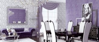
Modern kitchen in lilac tones Source gornostay.spb.ru