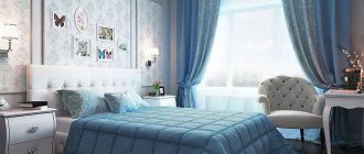
Designing and coloring a kitchen becomes a difficult task for many. After all, it is extremely important that this particular room is bright, pleasant and not overloaded with various details. At a time when minimalism is at the peak of popularity, we recommend paying attention to the kitchen in blue. This is a fresh solution that will remain relevant for many years to come. But to get such an effect, it is important to use suitable shades, as well as combinations and proportions in the interior.
Peculiarities of perception and use of color
When creating a harmonious interior, it is important to take into account the psychology of color. What emotions does this shade evoke? Psychologists say that it has a beneficial effect on the nervous system, calms, helps to concentrate, which is why it is ideal for easily excitable and emotional people. And this is not surprising, because this color was created by nature itself.
However, there is also a downside: in large quantities it can depress, cause associations with a hospital ward, and drive depression and apathy. To avoid a negative effect and find a middle ground, it is important to dilute it with other shades that will balance its severity.
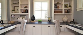
Straight corner set with blue facades in combination with wood-effect facades Corner kitchen set with sky-colored facades
Let's tell you a few facts that will help you better understand how suitable this shade is for decorating your kitchen.
- Blue reduces appetite. On a psychological level, color is associated with peace and serenity and encourages slow and mindful eating.
- Blue is ideal for designing well-lit kitchens with south-facing windows. The bright daytime sun can be tiring, but turquoise or cornflower blue curtains, for example, will just refresh the interior and bring visual coolness.
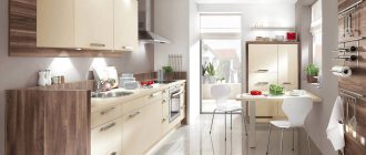
Kitchen island and bar counter "2 in 1". Bar stools with soft upholstery are like a bright accent.
- Blue is a cool shade. In large quantities it can be depressing and depressing. Therefore, it is important to add warmth to it with the help of other warm tones - cream, milk, butter, etc., as well as with the help of certain materials and textures - surfaces like natural wood or stone, textured plaster finishes, textiles made from natural fabrics with coarse weaving (for example, cotton, linen, matting, burlap), wicker furniture.
An island set with an accent module-island. A tabletop in a dark wood look while preserving the natural texture will soften strict, cold facades.
- Blue has many similar shades - turquoise, mint, azure, blue-gray, cornflower blue, aqua, hyacinth, aquamarine, etc.
All of them also belong to cool shades, but they produce a different impression. For example, turquoise and aqua are more active and rich compared to the calmer gray-green or mint.
Kitchen with peninsula and turquoise walls
Corner mint set
L-shaped mint-colored set in a small kitchen
Advantages of decorating kitchens in this color
Blue color is ideal for people watching their weight and wanting to lose weight. It is believed that under its influence the appetite becomes worse and we eat less. But even those who do not adhere to diets often choose it to decorate their kitchen, which is due to a number of reasons:
- A kitchen decorated in blue shades visually looks taller and wider. If you combine it with white, you can make it lighter. In combination, these colors make the room spacious, add lightness and air. While blue can weigh down objects and add bulk, its lighter counterpart has the opposite effect. Therefore, he is able to make even the smallest kitchen larger and more comfortable.
- Blue color has a beneficial effect on the human psyche. It promotes relaxation, gives a feeling of peace and tranquility. It is enough to remember the emotions that the blue sky or the surface of the sea evokes in us. A kitchen decorated in this color can evoke approximately the same sensations.
- Azure tones go well with other shades from neutral and light to bright and rich.
As for the disadvantages of this color scheme, you need to take into account that an excess of blue can provoke a feeling of fatigue and even depression. Therefore, it is recommended to dilute it with others.
IMPORTANT! This color scheme should not be used for a kitchen that is not located on the sunny side - it may turn out to be too cold. On the contrary, blue color is ideal if the windows face south or southeast - it will add pleasant coolness.
A color scheme
Depending on the brightness, this tone can act as a background, a bright accent, or a complementary shade in a contrasting color scheme. All three examples are shown in the photo below.
Pale blue serves as a neutral, calm background against which bright accents will stand out. Bright tones do not overload the interior, as they are diluted with achromatic white
As a bright accent against the background of an overall neutral color scheme
The combination with gray and blue creates a monochrome interior. To prevent it from seeming boring, play with the degree of brightness and saturation of shades.
There are several general secrets, knowledge of which will help you easily select successful combinations.
- Pale blue can also be combined with pastel, light shades of other colors.
- Bright blue will go better with equally bright tones. In order not to overdo it in brightness, the interior can be diluted with a neutral white, beige, creamy, creamy or milky shade.
- Blue is the color of the sky and water surface, which means it gets along well with other colors that naturally occur in nature - yellow, blue, brown, beige, sand, green, white, etc.
- If you are not sure which companion shade to choose, choose white. Pale and medium blue paired with white form a calm background, and you can experiment with colored accents and add warm shades using oversized furnishings - kitchen chairs, textiles, decor, etc.
With white
The most win-win combination is with achromatic white. It will help balance the excess of blue in the interior and dilute the bright turquoise or azure shade. White will always save you when you are in doubt about choosing the right compatible tone.
Selection of furniture
The basic principle of harmony is this: the colors on the walls and furniture cannot match. They must belong to different scales. For example, if the walls are blue, then the set, table and chairs are selected in a different color, for example, golden, honey, light green. This will avoid pressure and excess of one shade. If the furniture is made in a blue finish, then the walls should be painted in a different color, such as beige, yellow or light gray.
A kitchen apron is always a slightly different story. Its color is selected to match the set so that it does not blend in with the furniture. However, muted tones are used: grayish or dirty. The wall should not steal all the attention. A bright or very light apron is impractical: all drops, splashes, and dirt will be visible on it.
The finish looks interesting if different colors are combined on it. However, you need to remember their compatibility. And select additional tones so that they match the main one.
The table is the heart of the kitchen. It attracts attention as soon as a person enters the room. A table with a white top will look ideal in a blue kitchen. This solution will refresh the interior and make it lighter. Another win-win option is a wooden countertop.
What style is suitable for a blue kitchen?
This tone is universal and suitable for any design direction. However, in some styles it looks most harmonious.
Modern classic
Blue is an ally of elegance, and therefore neoclassicism. You can dilute it with gray, white, milky, black.
Mediterranean
The name of the style itself already conveys its basic color scheme - shades of blue, blue, sea wave, turquoise, azure. The background is white, light gray, and the accents are yellow, orange and red.
Provence and country
This color will fit especially organically into a rustic-style interior. The natural shade of the sky will harmonize perfectly with the worn and aged surfaces of the Provençal kitchen, with textiles made from coarse fabrics, with solid wood furniture and natural materials with a pronounced texture and texture.
Minimalism
Blue can dilute an ascetic minimalist interior, since this color best suits the mood of the style. It will not be difficult to fit it organically into the overall color scheme, since it goes well with the colors characteristic of minimalism - white, gray, black.
Kitchen set
A blue set will definitely attract all the attention in the kitchen, so it is better not to duplicate this tone in the room or choose very small decorative items to match the tone, for example, a vase or dishes. Antique metal handles look best on such furniture, for example, from:
- bronze;
- become;
- copper
Chrome or nickel plated surfaces are also suitable. Not everyone will decide to buy a completely blue set, so there are also analogues on the market - for example, a white or beige top and a blue bottom.
It is important to think about the apron - it should be combined with the blue kitchen. The following tones are perfect for this:
- grey;
- white;
- cream;
- brown;
- yellowish.
It is worth paying attention to the material from which the set is made. The options are completely different.
Tabletop and apron
Another design option in blue is the work area. This can be a separate apron or tabletop, or both items at once.
In any case, the work area should be in harmony with the rest of the room’s decoration - walls, ceiling, floor, and kitchen unit. Since the work area does not take up as much space as the set, its blue tone can be duplicated in curtains or a dining area.
Often the countertop and apron are made of the same material. This creates a very harmonious atmosphere, especially with a corner layout.
The classic combination of a white kitchen and a blue countertop. Pay attention to the fittings and small inserts in the apron
Materials for the blue work area
The blue color greatly limits the number of materials suitable for finishing the work area. For example, first of all you will have to abandon natural and artificial stone, as well as untreated solids. But there are still many options to choose from.
| MDF and chipboard | These panels are wood chips, just processed differently. In this regard, these options cannot be called durable. In addition, due to contact with water, they can swell, so such surfaces should be treated very carefully. |
| Ceramics | Ceramics have long since taken root on an apron, and on a countertop it will look very original. This is an excellent material - resistant to moisture and temperature. The only negative is the seams. They will become clogged with grease, dust and dirt, and over time, fungus may even appear. |
| Steel | A very practical material - durable, easy to care for and resistant to high temperatures, water and chemicals. It’s not for nothing that restaurant kitchens use steel for everything. But the kitchen in the apartment is not a service space, and the style of steel is very difficult to fit into the interior. Most often, comfort disappears instantly. |
| Strained glass | Another practical option - it does not absorb dirt and grease, and is not afraid of water and temperature. It is more suitable for an apron (more details in this article), since it is afraid of strong impacts and falls. But there are also glass countertops. |
Notice how beautiful it looks, not the typical white boar, but the blue one. Epoxy grout will keep the seams in their original condition for a long time
Wooden kitchen
Wood in the interior refers us to naturalness and nature. There are several options for introducing it into a blue kitchen: make a wooden apron and countertop, or choose facades with a wood texture.
This option will give the interior status and high cost. Photo: shutterstock
The first option will add coziness and warmth to the space, and the second will give the interior status and high cost.
Wood in the interior is an eternally fashionable trend. Photo: globallookpress
Matte kitchen
The matte smooth surface of the facades looks ultra-modern and does not require special care. But due to the lack of a “reflection” effect, such a set visually narrows the space.
This combination is very lively and rich. Photo: pexels/Houzlook
To level this out, you can make only the bottom row of cabinets matte, and for the top row choose facades made of glass or with a slight sheen. Another way to lighten the design is to paint the furniture in the color of the walls so that they merge as much as possible into a single whole.
Glossy kitchen
Due to the play of light, the blue gloss of furniture facades visually increases the area of any kitchen. But this coating has one obvious drawback - it requires special care. Since glossy furniture requires constant cleaning of dust, stains and fingerprints, most people refuse it. The marks are especially noticeable on facades of bright and dark colors.
The noble appearance gives the kitchen a sophisticated atmosphere. Photo: shutterstock
Selection of headset and equipment
How to use blue in the design of facades, which countertop will look best with a blue set, when is matte better, and when is gloss? It is important to think through all these questions together, using our recommendations below.
Facade design
Blue can be used in the design of kitchen facades, combined with other colors, for example, with white, gray, black, yellow or beige, dusty pink or cappuccino color.
Modular kitchen "Fance" Leroy Merlin with lower facades in mint color Kitchen set Leroy Merlin with paneled facades of the "Tomari" series. Ideal for Provence style design
Richly colored facades can stand out against a neutral background, such as beige, cream, pale yellow or white walls.
When is gloss best?
The more complex and interesting the shade, the heavier the balance will be in favor of matte facades. The matte surface conveys deep tones better and cleaner.
When choosing between matte and glossy, you should also keep in mind ease of maintenance, interior style, and room size. It is easier to remove dirt from a glossy surface, and finger stains will be equally visible on both matte and glossy doors.
The style of the kitchen is much more important. For Provence, neoclassical, scandi and country styles, they often purchase sets with paneled facades, which are not glossy. Gloss is inappropriate in these styles, since their main motto is naturalness.
Light glossy facades will be a good solution in the design of a modern small kitchen. Thanks to the reflective surface combined with an airy, heavenly shade, they will visually expand the space.
Tabletop
The most beautiful option for a kitchen countertop in blue tones - under light or dark wood, preserving the natural texture and natural shade.
Technique
Against the background of blue facades, built-in white, gray, black and metallic appliances will look beautiful.
In retro-style interiors, bright red and orange vintage refrigerators and freestanding stoves with an oven look interesting.
You can go the opposite way and decorate the appliances, rather than the facades, in this color. The retro refrigerator and stoves in a delicate shade of the sky look very original in the interior.
What colors go with blue
A blue kitchen in the interior looks different not only because of the main shade, but also due to additional ones. Next, we’ll find out what to combine blue with to get the perfect picture.
Beige
Kitchens in blue tones can look too cold, especially if the windows face west or north. To avoid a lethargic mood in the design, dilute the base with a warm neutral shade.
Despite the difference, beige goes well with pale blue, neutralizing its negative characteristics.
The photo shows beige shades in furniture and appliances
White
The combination of blue and white is the most classic possible. It is quite contrasting and fresh, so it will be an excellent option for a blue-colored southern kitchen. There will be a lot of light in the room, but at the same time the desired coolness will remain.
Brown
Brown can also complement and “warm up” the blue palette, especially if it is wooden furniture and flooring.
Black
A blue and white kitchen with black accents is a bold and unconventional solution, especially popular in Scandinavian-style interior design.
Black and blue colors in the interior of a kitchen in Provence style
Grey
To prevent the gray-blue kitchen from seeming too cold and gloomy, complement the interior with warm shades, an abundance of white and wooden furniture.
The ash-gray combination looks strict and restrained; the contrast of the combination is much lower than that of the symbiosis with white. To make gray-blue kitchens look harmonious, follow the rule: the lighter the blue, the darker the gray should be.
Red
This contrasting color combination is not often used in kitchen design, but it can be quite harmonious, especially if it is pink-red or orange-red.
Pink
Pink paired with blue can create a different mood depending on the shade. If you use bright pink paints, the kitchen design will become more dynamic and emotional; if you use a soft pink shade, then it will be restrained and too calm.
Therefore, you can use the following combinations: hot pink + baby blue, baby pink + turquoise, baby pink + baby blue + yellow or orange (invigorating colors), baby blue + hot pink + beige (balancing color) etc.
Several examples of such combinations are in the following photo slider.
Yellow
It is believed that yellow is the opposite color to blue and cyan, which means it is complementary and especially suitable for it. In fact, the opposite of blue is orange, but yellow goes well with blue just as well.
The cheerfulness and warmth of yellow more than compensates for the coldness and poise of our hero, so this pair is appropriate in any kitchen - be it northern or southern, but if you want to simulate a calm atmosphere in the kitchen, then use yellow in muted, pale, delicate colors, or in small quantity.
Blue
The blue color is obtained from blue, which has been diluted with white paint. In proximity to blue, blue becomes softer, a play of colors is created, and the effect of freshness and coolness is enhanced, so it is better to avoid such a combination in the design of a “northern” kitchen.
A monochrome kitchen in blue tones is not suitable for everyone: an abundance of blue can have too much of an impact on the nervous system and cause apathy. But if you are constantly stressed and need maximum relaxation at home, then this combination will work to your advantage.
Green
Blue and green are close neighbors in the spectrum, so they harmonize perfectly with each other. Since in nature this union of colors is most often represented by plants (these are cornflowers and bells in the grass, hyacinths with their delicate stems, algae in sea water, tree crowns against the background of the same sky), natural plant shades will be most successful when paired with blue .
Light wood
The most used kitchen design in beige and blue tones is to use light wood surfaces. Bleached oak, ash, and pine look gorgeous in interiors from classic to loft.
What to do with blue color in the kitchen interior?
This color can be used on a large scale only if its brightness is low. Pale blue can be used to decorate walls, floors and ceilings. Bright is suitable for placing accents and as a complementary contrasting color. In the last two cases, the percentage of its content in the interior should not be more than 30. Let's look at specific examples of how the interior will look in each of the listed cases.
Walls and floor
If blue is used to create a background, then for wall decoration you can choose pale blue washable wallpaper or paint. Rich shades can be used to decorate one wall. which will be the main bright spot in the interior.
Pale blue ceramic tiles with a pattern will look beautiful on the floor.
Apron
An apron can act as a background or a bright accent. If you need to somehow dissolve the apron against the general background of the kitchen, then choose tiles or skins of a pale blue, gray-blue hue.
For an accent and bright apron, rich shades of turquoise, azure, and sea green are suitable. Please note that a bright apron should not compete with equally rich facades. One thing has to stand out.
You can support an apron in a sky or turquoise color with other, oversized furnishings, for example, kitchen chairs, curtains, or a tablecloth of the same shade.
If the walls in the kitchen are painted a beautiful cornflower blue shade, then in the apron area you can maintain this tone by ordering transparent frosted glass to protect the work area. This way the design looks cohesive. The idea is especially suitable for decorating a wall free of upper cabinets.
Curtains and textiles
With the help of textile decoration, you can refresh the kitchen, add lightness and airiness to it. In a kitchen with south-facing windows, blue curtains would be an excellent option.
Preferred interior colors
There are many surfaces in the kitchen that can be painted. Another question is which ones to make blue, and which ones to use other colors. Each decision can lead to a different effect.
The main color is used for the ceiling and walls. With their help, a general background is created. It is worth understanding in detail where and how to apply blue shades.
Floor
The flooring in the kitchen is designed to set off the main background. This largely depends on the qualities and properties of the materials.
Laminate and parquet in the kitchen look great, but are not practical flooring. They can be used for the dining area. It is better to use other coatings under the sink, stove and refrigerator.
- Tiles - ceramic, vinyl (very practical and non-slippery), porcelain stoneware. The coating is easy to clean and does not absorb odors. Depending on the stylistic direction of the blue kitchen design, matte and shiny surfaces are selected. This is an excellent material for those who like to lay out intricate patterns and ornaments.
- Linoleum is a budget option for all times. It lasts less, but there is always the opportunity to update the interior depending on fashion trends. The main advantage of the material is the ability to make the floor perfectly flat, smooth and shiny.
- Self-leveling flooring is an excellent alternative to tiles. It is also called “liquid linoleum”. The result is an absolutely flat surface without joints or seams. Housewives claim that cleaning and washing such a surface is a pleasure.
If you want to lay carpet, you need to be prepared for constant dirt. If greasy stains appear (and this is an essential element for the kitchen), the coating will quickly lose its presentable appearance. It will be very difficult to clean it.
Walls
Using the walls and ceiling, the basis for the blue background is created. They are usually painted white, but variations are possible. The main task is to choose a suitable palette and high-quality finishing materials. For wall cladding in the kitchen, the following construction positions are used:
- paint is a simple and affordable option; after painting, it is possible to print any design/pattern/ornament using a stencil (by the way, stenciling or 3D wall printing has recently become fashionable. There are companies that provide similar services);
- wallpaper - it is better to purchase non-woven or glass wallpaper, they will last a long time, wash and clean well;
- decorative plaster - with its help, an accent wall stands out, for example, in the dining area. Its relief depends on the thematic focus of the design. For example, a wave-like texture will bring owners back to the sunny seashore;
- panels - it is not recommended to be used everywhere, since the coating quickly fails, but its use for hidden storage systems remains relevant.
It is advisable to cover the walls in the area of the work area (sink, countertop, hood, stove) with ceramic tiles. This is a durable material that is resistant to temperature changes and high humidity.
Ceiling
The ceiling can also be made of different materials:
- Tension made of polyvinyl chloride. This ceiling is bright, glossy, beautiful, but it interferes with the exchange of humidity in the room and can be ruined with one awkward movement - it breaks very easily. It looks good exclusively in modern styles, because during the formation of styles, classic glossy ceilings did not exist in principle. Requires mandatory hiring of professional workers.
- Tension made of fabric. It does not tear and allows moisture to pass through, but it is heavier and will most likely have seams. It looks interesting, you can put a painting on it - thanks to the texture, such a ceiling depicting the sky with clouds will look very impressive.
- Plaster. Classic. It also looks convex, interesting, it’s very easy to make patterns on it, it doesn’t get damp and lasts a long time.
- Drywall. Allows you to create several levels on the ceiling, which is very useful for zoning. It will have a beautiful uniform color, plus it is very difficult to ruin. But to attach it, you will most likely have to hire professional workers.
- Dye. The easiest way is to apply it yourself, if you act precisely and carefully, otherwise there will definitely be drips. It looks unpretentious and simple, and is not suitable for all styles.
There are also plastic panels, but they have a very specific appearance and are most often used in non-residential premises, because they are flammable and emit a specific unpleasant odor.
Tip: Also choose the ceiling based on your style.
Combinations
It is important not only to choose a practical, beautiful blue material for decoration - it is also important to combine it with the rest so that it looks good. First of all, the color of the material plays a role, since the properties of everything that can be used in the kitchen are more or less similar.
Small kitchen design
The combination depends on the characteristics of the kitchen:
- If the kitchen is frankly small. In this case, the blue color can be a real salvation, and in order to visually expand the space, you need to choose its lightest shades - from a slightly darker floor to a completely transparent, weightless ceiling. Mirrors, photo wallpapers with a sea view, a glossy surface of the floor and ceiling may come in handy - of course, not all at once, but one or the other.
- If the kitchen is frankly large. This happens when the room is larger than necessary in order to feel comfortable. In this case, dark shades of blue in combination with bright accents are suitable - they will make the kitchen smaller and slightly move the walls. However, it is very important not to overdo it, not to use too dark a color and not to forget about a bright accent, otherwise the impression may turn out gloomy.
Chic light blue kitchen
- If the kitchen is too high. When you enter such a room, it seems that you have entered a St. Petersburg courtyard-well. To avoid this, you need to make the ceiling darker than everything else. This could be a shade of blue or a contrasting color - the main thing is to give the impression that the ceiling is lower than it actually is.
- If the kitchen is too low. Then the ceiling, on the contrary, should be light, and everything else should be darker. Vertical stripes will look good - they will make the walls seem taller.
- If the kitchen is too narrow. In this case, you can do different things. Lay a covering with a diagonal pattern on the floor, make photo wallpaper on one of the walls, use the lightest shades of blue. You can highlight one wall - most often the one at the end - so that it attracts attention and seems that it is closer than it actually is. To do this, you can use a contrasting color - yellow or orange. Although a colorful finish in the spirit of intricate painting is also suitable.
- If the kitchen is too wide. Then the walls become darker, and the floor and ceiling become lighter. As a result, it seems to be stretched upward.
For a wide kitchen it is better to make light walls and ceiling
Finishing is a difficult task, but if you approach it with patience and imagination, the result will be amazing.
Tip: Instead of selecting materials yourself, use a ready-made style and then you will be sure that the result will be good.
Decor options
If the overall design of the kitchen is made in blue tones, then bright elements of orange, yellow, red, green, and blue can be used as decor. This could be a tablecloth, flowerpot, painting, vase, chair cushions or napkins for cutlery.
Decorative elements of a blue hue will also help to dilute the monochrome interior, introducing color variety into it.
An interior that is too bright, for example, with a predominance of yellow, can be balanced by blue, bringing calm and rigor.
House plants can be the finishing touch to the design. Green leaves will harmonize with the overall color scheme and enliven the atmosphere.
Matching Styles
If you talk about what materials there are, you can do without a clear connection to style, but in the case of furniture you can’t do without it. There are too many kitchen sets, dining nooks and decorative items to be able to first explain what they are, and then choose something suitable from the variety.
Country style
Blue color looks good in both classic and modern interior styles.
Classic
This is a style that was formed in Europe back in the eighteenth century and was especially popular in France:
- Floor . Only and exclusively tiles - the classics do not recognize any other materials. Moreover, cheap varieties can be immediately crossed out from consideration; these should be expensive painted or patterned tiles, beautiful in themselves.
- Ceiling . Of course, it would be strange to support it with columns in a modern apartment, but stucco molding and different levels may well take place. If this seems too pompous to you, you can make a subtle floral pattern along the edge of the ceiling - elegant and not too noticeable.
- Walls . Natural materials in calm shades. Nothing flashy, and, of course, no plastic panels.
- Furniture . Classic, made of real wood. There is no special pomp, the only thing that is acceptable as decoration is carving.
- Lighting . The windows have fabric curtains of a dark shade. Under the ceiling is a small, elegant chandelier, possibly forged. There must be a lamp with a lampshade on the table.
- Decor . Textiles are moderate, without emphasis. The trinkets are extremely expensive, with a pretense of historicity. Painted plates, cups, a couple of figurines somewhere on the shelves, beautiful cutlery, an elegant teapot that needs to be heated on the stove will work well.
Classic kitchen option
Classic is beautiful. There are no particularly bright accents; blue can be combined with white, beige and real wood colors.
advice requires a certain conservatism. It is better not to display technical appliances - such as a coffee maker or a steamer - in a visible place.
Real wood furniture
Provence
This is seventeenth century France - a counterpoint to the bulky styles of the time. The main property of Provence is airiness and lightness, to which the blue color fits just perfectly:
- Floor . The tile, and by no means smooth, is extremely rough; you can even age it artificially to make it look like natural stone. There are no patterns on it, but you can lay a small carpet.
- Walls . Natural materials - wallpaper, lining, natural stone finishing. Floral patterns are allowed, which will not burden the interior, but will make it more interesting.
- Ceiling . No suspended ceilings or drywall. Exclusively paint or plaster, plus wooden beams - it’s good if they’re real, but a high-quality imitation is also possible. Everything together should give the feeling of a country house.
Provence style
- Finishing nuances . Doors should be made of light wood, preferably with traces of time that can be applied artificially. The bigger the windows, the better (but not panoramic ones), preferably with snow-white wooden frames.
- Furniture . Definitely classic shape, light. The material used is wood, which can be painted or with carved patterns. A good solution would be to install wicker chairs and armchairs, perhaps with blue cushions on the seats to make it more comfortable.
- Lighting . Natural is emphasized, the curtain is made of light fabrics, perhaps in a cafe style, where half of the window remains open at all times. Artificial - imitating candles or small lamps under bright lampshades. The light should be yellowish, warm, diffused and very cozy.
- Decor . In Provence you can’t do without cute little accessories. There must be a vase with fresh flowers on the table (it can become a beautiful accent in a blue kitchen, since pink and scarlet go well with it), and ceramic pots with flowers on the windowsill. Spices in special glass jars, each with a paper tag faded from time to time. The birdcage will fit in like a home – forged, antique in appearance.
With aged elements
You can combine blue with milky white, beige, light green, cream, lilac, soft pink, olive.
Advice Like the classics, Provence does not tolerate technological innovations displayed in plain sight. Therefore, it is better to put your favorite mixer in the closet and take it out only during cooking.
Scandinavian style
He came to us from the northern countries and his main feature is his great love for space and sunlight.
Scandinavian style
Functional, harmonious, this style differs from minimalism, which has similar principles, in that it is distinctly classical:
- Floor . Usually they use laminate, not blue, but the color of light wood. To make it more cozy, add a warm rug in one of the colors that the style takes on.
- Walls . Lining, brick, paint or plaster. You can immediately forget about plastic panels, and about wallpaper too - naturalness is at the forefront, and neither plastic nor synthetic fiber fit into it.
- Ceiling . The plastered ceiling looks best - this is how it was finished when the style was just emerging. Paint or stretched fabric would look good - but it must be without seams and without any gloss.
The most important thing in this style is naturalness
- Furniture . Solid, made of wood, simple in the most classic sense. If you want to use textiles in decoration - for example, upholstering the seats of chairs - you need to use natural fabrics. Closed cabinets are best avoided, as the Scandinavian style allows for maximum openness and considers shelves to be the best solution. In the kitchen this can be used as an interesting idea.
- Lighting . The window must be wooden, and it is best to paint the frame white. The curtains are as light as possible, made of natural fabric, you can remove them altogether so that they do not interfere with the passage of sunlight. The rest of the lighting is organized using an abundance of small lamps - this must be a table lamp, sconces are added to it and, if there is a sofa in the kitchen, a floor lamp. There is as much light as possible, and it should be pleasant.
- Decor . More results from natural crafts - wicker baskets, self-made figurines, embroidery, knitted tablecloths. Lots of textiles made from natural fabric, always white ceramic plates and cups with blue patterns. You can add fresh flowers in ceramic pots.
Scandinavian style loves the combination of blue and white - this should be used, and the white should be a warm shade. You can also add beige, sand, light brown.
The main thing is that those who enter have a feeling of space and light.
Advice Don't have too many things. Scandinavian style loves free space on shelves.
Don't forget about good lighting
Of course, these are not all the styles in which you can decorate a blue kitchen. You can apply country, minimalism, look towards a loft or nautical style.
Follow your taste preferences
VIDEO: Interiors for kitchen decoration
Blue kitchen
Blue kitchen design
Features of blue kitchen lighting
With improperly organized lighting, a kitchen in blue tones in the evening risks turning into gloomy and uncomfortable. Cool shades need good artificial lighting more than others. To do this, it is important to provide not only central lighting, but also illumination of the work area and local lighting of the dining area.
For artificial lighting, choose warm light.
How to use the color wheel?
Itten's color wheel is the assistant of all designers. It allows you to visually imagine which colors harmoniously combine with each other. The basic wheel consists of 12 colors, but it can theoretically be expanded to include an infinite number of shades.
How to use the color wheel? It's quite simple, you just need to know the patterns and not be afraid to “play” with the wheel. There are many schemes for combining colors in a circle (see picture below). But there are three basic algorithms.
Scheme 1. Monochromatic combination of colors - when related shades from one segment of the circle are combined.
Scheme 2. Contrasting color combination - opposites are combined according to this principle. For example, green and red.
Scheme 3. Harmonious combination of colors - in this case, neighboring shades around the circle are selected, for example, blue, light blue and green.
- Our article on how to plan a kitchen color scheme will give you more tips on using the three schemes listed.
- You can buy a circle at an art store or use online services. For example, or in phone applications.
Small kitchen
Accents for the interior, what to choose
The combination with white helps to refresh the appearance of the apartment. When using white, you don’t have to worry about going overboard; it will be appropriate for textile decor, kitchen area design, and apron. Even large elements, decorative panels, ceramics with a glossy effect are a great opportunity to create a stylish image, mirrored, reflective surfaces are a visual increase in the usable area of the kitchen.
Sunny yellow, one of the most positive, mood-enhancing colors, will transform your kitchen interior into a bright island at home, but do not forget about moderation when using accents. Let yellow halftones be used in prints, wall decor designs, in small quantities.
Soft brown as an accent option, and also in the form of wooden coverings, is most likely the most competent color solution, especially for those who want to get a soft, homely corner. The texture of wood, which has this effect, gives warmth and comfort here.
Kitchen-living room
Textile
A large and well-lit kitchen space is decorated with curtains with a complex cut, matching the color of the set. White or blue curtains will give the room visual lightness and airiness, and Roman models in cream, pearl or light olive shades will beautifully set off the blue palette.
Windows decorated with wooden blinds will look very bold and unusual. Textiles in the form of towels, napkins, tablecloths and other things should also not stand out from the overall design. Elements in white, beige, sand or brown tones will complement the interior.
The photo shows light curtains on the window in the kitchen interior in white and blue tones.
Blue kitchens in the interior. Real photos
Blue walls and wallpaper in the kitchen
For “cold” rooms, made in blue tones, monochromatic wall decoration is most suitable. Common options are pale sky, gray-blue. You can revive the interior of a kitchen with blue wallpaper using the following techniques:
- use materials with different textures (smooth walls and rough plaster);
- cover one wall with colorful canvases or photo wallpapers;
- It’s an original way to combine painted/plastered and wallpapered partitions.
The pattern of wall paintings can be used to visually change the geometry of the room. Vertical blue and white lines make the room taller. A horizontal stripe is used to separate finishes.
How wallpaper patterns visually change space
Possible combinations
Blue color is used as a base or auxiliary color. In the first case, pastel shades are preferred, in the second, bright shades are also possible.
A monochrome kitchen can be too relaxing and immerse you in apathy, although for those who are under constant stress due to external factors, it can become a saving refuge.
Cool blues work well with warm neutral tones. There are traditional combinations that work flawlessly.
The blue and white kitchen is a classic, and it’s hard to make a mistake. The space will seem freer and brighter, and the visual coolness created will weaken the degree of perception of incoming sunlight, especially in summer from the south.
A gray-blue kitchen is suitable for lovers of strict restraint. The contrast here is weaker than in the previous combination. It is important to follow the inverse relationship rule: the more contrasting one of these colors is, the lighter the other should be.
Blue combined with brown is impressive and at the same time cozy. Considering that the kitchen set is often made of wood, it is enough to add azure in the details to achieve harmony in the decoration.
Bright colors are also welcome. Primarily rich yellow or orange. Green in similar shades (for example, mint) works well, however, like blue, it works for relaxation. There is no need to be afraid of active red, as long as you remember to use a sense of proportion.