Posters on the wall are an excellent and inexpensive way to radically change the interior, because a poster can give the room a certain image and become an excellent decoration. But to choose such decor, you need to know the rules, where to hang it, and which one is better to choose. There are a large number of options for such posters on the wall for a room. So as not to get confused in the huge variety of offers. you need to think through the necessary parameters in advance. More details about the rules for choosing these products will be discussed in the article.
What are wall posters
Wall posters are starting to become popular again. Today, wall posters are often made on high-quality paper, and not as it was before, when they were small pictures on thin plain paper. Manufacturers of these products try to make posters from the best materials, often producing exclusive versions, using the following materials:
- Photo paper;
- Natural linen canvas;
- Natural cotton canvas.
For decoration, choose high-quality baguettes. The images can be different, the assortment is simply huge, they only print pictures that have a high resolution, which allows you to get a beautiful, bright and incredibly clear image.
Therefore, now such a decorative element can be found among owners with different levels of income, because the quality really meets the highest level. You can hang the poster in an apartment, a private house, or a country house. It will be appropriate everywhere. It is important to choose the right option that suits the interior.
This decorative element can be found among owners of different income levels, because the quality really meets the highest level.
What types of posters are there, or Why Digital Art is a new trend in art
Posters differ not only in their format, but also in their subject matter. If you want to add a bright note to the interior of the room and emphasize the strengths of the decor, choose a poster that matches the overall design style. This applies to the selection of not only the color palette, but also the image. For a classic interior, landscape photographs, reproductions of famous paintings made in the “Classical” or “Impressionism” style, and your own photos are suitable. For the modern direction - posters with the work of modernists and minimalists, abstraction, black and white photographs.
Recently, the direction of Digital Art has become particularly popular, which many have called a new trend in modern creativity. It is digital art that combines photography and computer graphics. The direction includes many subgenres, from digital painting to 3D graphics and animation. Digital Art posters are a clear example of how creative ideas and modern computer technologies can be combined. Today, this style is actively used by marketers, since posters allow both to attract attention with their unusual appearance and to advertise a product or service.
Existing types of posters for walls
Posters can be divided into a number of types, because the images on them differ in theme, they are also different in size, color schemes and other parameters; dividing them by type can help you quickly decide which one is best suited for a specific purpose. Below we will look at various variations of posters.
Posters can be divided into a number of types, because the images on them differ in theme, they also differ in size, color schemes and other parameters.
Large
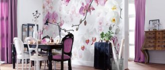
As the name suggests, they are distinguished by their large size; photo wallpapers and posters often do not differ today. If such large images are used to completely cover one side of the room, this is how the space is zoned. Posters on the wall of large sizes can have drawings of any theme: abstract, natural, urban and others. Large posters are more suitable for large spaces, because too large a poster in a small room will make it look even smaller.
Large size wall posters can have designs of any theme.
Photo posters
Photo posters on the wall involve printing large-sized photographs. They can be printed on glossy or matte paper, and decorated using a backing made of foam cardboard or hardboard. Various frames are also used.
You can use your own photographs; a good option is to place several photo posters on the wall with different photographs of family members, adhering to some common theme; there should be something uniting these photographs. Perhaps it will be printing black and white photographs, or one type of frame, maybe a color scheme, for example, photos taken at one time of year.
A good option is to place several photo posters on the wall with different photographs of family members.
Black and white
The combination of black and white is a classic in many interior solutions. A black and white image has its own mystery; the absence of bright colors makes you think. These colors look good when the room is also dominated by these colors. This is a more formal style and is also suitable for offices.
The black and white theme is also suitable for the rooms of teenagers who love these colors.
A black and white image has its own mystery; the absence of bright colors makes you think.
Other possible types
We can highlight the now popular trend of hanging, the so-called modular paintings. They represent the placement of one image on several posters, also differing in size. This design fills the space well; the unusual differences in the size of the frames make it interesting. Modular paintings look modern and original.
This design fills the space well; the unusual differences in the size of the frames make it interesting.
Art posters are most often printed on canvases, which are stretched on a stretcher, then covered with texture gel to make them look like paintings; they are most often framed in a baguette.
On sale you can find posters that have a limited edition; they will make such a poster unique; sometimes the author of such images leaves their signature, emphasizing the exclusivity of the work. They naturally cost more because of their uniqueness.
Art posters are most often printed on canvas.
Poster design options
Using illustrations of different sizes, you can completely cover an “empty” wall in any room. This decoration option will allow you to quickly and easily transform a room and stylize it. In the nursery, you can use a sign with the baby's name, which will be located above the crib. It can be complemented by a couple of vertical canvases depicting animals and fairy-tale creatures. Combining vertical illustrations will help you decorate a free wall in the living room in a non-standard way. There can be from 2 to 5 pieces. Images of the same size, hung at the same height, will look discreet. But elements with different heights will help to visually raise the ceiling. Arranging a pair of horizontal illustrations on top of each other will help divide the wall into 2 parts.
Family photos
Photos with children, parents, pictures of couples in black and white colors are ideal for decorating a bedroom. They are recommended to be located opposite the bed or above the head of it. An unusual option for using such illustrations would be placement in a niche. To highlight the decor, it is recommended to install bright neon lighting around the entire perimeter. A family photo is perfect for decorating a living room in your parents’ house.
Mom and dad will be pleased to look at the smiling faces of their children while drinking tea. Such images can emphasize the special comfort of a homely atmosphere. To properly style your apartment, you should select a high-resolution photo and print it on an A3-A2 sheet. Placing it in a thin frame under glass will help protect the image from dust.
When using a color photo, you need to evaluate in advance how well it will fit into the overall look of the room. Otherwise, the selected image may disrupt the style.
Vintage posters
Retro illustrations in sepia are perfect for decorating rooms in the style of the 50s and 70s. They can depict old newspaper clippings and interesting articles. Perfect for stylizing images from photos of actresses and singers of that time. For country and chalet areas, illustrations with old cars, airplanes, and motorcycles would be appropriate. To complement the French and English antique style, preference should be given to images of vintage greeting cards and pictures with floral motifs. Fans of female beauty will definitely love pin-up images of girls. For teenage rooms, you can choose retro-styled illustrations of superheroes, cartoon characters or heroes from popular video games.
Works by contemporary artists
An excellent solution for a spacious room with good daylight and artificial lighting would be to decorate the walls with modern paintings. Bright landscapes will help highlight the elegance of the dining room. Catchy abstraction will be appropriate in rooms with light decoration and a minimal amount of decor (or its complete absence). Images consisting of several identical illustrations made in different colors are also popular among owners of large houses. Painting is perfect for stylizing the classical style. Such posters can be hung in your home office or kitchen. They will become a harmonious complement to the French and English trends. They can be hung in a wide corridor or decorated with them in the hallway.
Personal creativity
Those owners who know how to sketch with pencils, crayons or paints can make their own home decor. They can draw inspiration from popular authors of our time or from classical artists. For those wishing to create a custom illustration with their own hands, the following master class is suitable. This is the easiest option for creating a bright picture with flowers that will decorate a bedroom or living room. For work, it is recommended to use gouache, a wide brush, a sponge and cotton swabs. It is better to use A3 sheet for watercolor painting as a basis. The work is carried out according to the following scheme:
- Draw green stripes on the leaf using a wide brush. Leave a distance of 1-3 cm between individual stripes.
- Dip a sponge in light pink, lilac or other gouache and leave it on the green stripes, with small curly spots next to them.
- Use cotton swabs to place stamen dots in the central parts of the flowers.
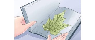
Herbarium
Dried leaves and inflorescences make good stylized decor. But at the same time, the quality of the materials used must be the highest. It is also recommended to choose only those works that are sold in glass frames. This will prevent dust from settling on the surface of the herbarium. Having prepared everything you need, you can make such decor yourself. Such applications can be used to decorate kitchens and dining rooms. For easier care, herbarium-style drawings are also suitable. They will look appropriate in any neutral design, complement the classics well and become a stand-out element of ultra-modern styles.
When gluing the herbarium to white paper yourself, it is recommended to use transparent thick glue. It will fix the leaves and inflorescences well and will not change their shade after drying.
Blueprints
Creating simple drawings will help you stylishly complement the design of bedrooms and spacious offices. For example, these could be light strokes against the background of several black thick stripes. You can also find completely ready-made drawings for stylizing different directions in decor stores. Drawings of plans for the construction of world landmarks are very popular. It would be interesting to see a set of drawings with parts of cars, motorcycles or airplanes on one wall. They can be combined with each other and used for zoning space. Such illustrations are perfect for teenage rooms and high-tech rooms. Finished images can take the form of small plates with mini-photos of the assembled equipment. Or they can be a large illustration that occupies almost the entire wall. The latter are optimal for complementing the urban or industrial style of premises.
Selecting posters for walls in different rooms
When choosing which drawing is best to take, you need to take into account the room in which it will be hung. Because the image must correspond to the purpose of the room and fit the theme.
The image must correspond to the purpose of the room and fit the theme.
Kitchen
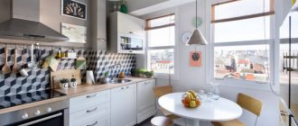
For the kitchen, of course, posters with fruits, flowers, and vegetables would be appropriate. That is, with a food theme, you need to choose a pattern that will add coziness to the room. And they will be combined with the kitchen set. Complement it.
For the kitchen, of course, posters with fruits, flowers, and vegetables would be appropriate.
Living room
Abstract images with a city landscape are perfect for a modern living room interior; modular paintings are also suitable; their images can be different.
Abstract images with a city landscape are perfect for the modern living room interior.
Bedroom
In this room, neutral landscapes, images of flowers, sunsets are more appropriate, Japanese themes are also suitable, it is possible to choose paintings with lightly erotic scenes.
In this room, neutral landscapes, images of flowers, and sunsets are more appropriate.
Children's room
The children's room should be gentle, and the images are suitable with various animals, children's drawings, scenes from cartoons. Boys will love dinosaurs and cars. Girls will appreciate flowers, cute animals and more.
The children's room should be gentle, and the images are suitable with various animals, children's drawings, scenes from cartoons.
Room for a teenager
A teenage room will be very different in the choice of images; abstract paintings, city landscapes, modern technologies, and space themes are more suitable. The topic should be close to the child. It is important that the teenager himself participates in choosing the poster. He may also decide to buy posters with some phrases. Or photo posters.
It is important that the teenager himself participates in choosing the poster.
How is a poster different from a painting?
The artistic canvas belongs to the category of fine art. A poster can also be included in this category, since the image on it was once drawn or photographed by someone. The main difference between a painting and a poster is that the former represents a unique subject.
Modular paintings in the living room interior Source remont-samomy.ru
Whereas the poster is not exclusive. After creating the original template, the drawing is put into circulation. The printing house prints as many copies as the client ordered. Even if the poster is printed on canvas, its price will still be significantly lower than that of the simplest painting.
Posters and paintings for the interior Source chinatovari24.ru
But in terms of decoration, interior posters become an indispensable thing when finances do not allow the use of original works. For creative people, choosing a thematic collage and decorating a certain room in the apartment with it will also be akin to creating a real masterpiece.
Posters for a living room in a Scandinavian style Source yandex.kz
Choosing a color scheme for a poster
If a poster is selected that matches the color scheme of the room, then it will be perceived as part of this room, and not as an extra link that was placed here without finding a better use for it. This criterion is important when choosing an image; an incorrectly chosen color scheme can ruin the entire effect and make the design tasteless.
In order not to make a mistake in the store in this matter, you can take a photo of the room, and looking at it, choose a suitable option; of course, the lighting of the room is also taken into account, because the photo may not accurately convey the colors.
This applies to almost all types of interiors, only options for interior solutions that involve the presence of bright accents, and welcome contrast, accept images that differ from the color scheme from the general mood.
In addition, the poster should be combined with the style of the room. After all, the image of space is unlikely to be suitable for an interior that belongs to “classicism”. There must be a single attitude, a single thought.
The poster should match the style of the room.
How to use a poster in a bedroom interior
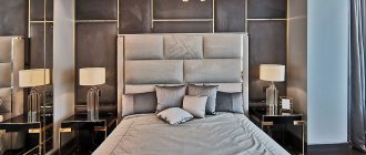
Posters in the bedroom interior are practically no different from the previous proposal. This is the same variety of images that can significantly improve the situation. Here you can use posters with various floral themes and advertising posters, portraits and graphics, landscapes and images of various patterns. It all depends on the general style and personal preference of the owners. Posters are usually placed on the wall at the head of the bed, at the bedside tables, or in another place where this type of decor will look harmonious.
Where and how to place posters on the wall
It is also important to choose the sizes of posters correctly; the size should fit the size of the room itself and the furniture located in it. If the poster will be located above the furniture, then it should be at least half the width of this furniture, because this way it will look proportionate. And not too small.
When placed on an empty wall, compliance is coordinated with the width of the wall surface. In a small room, a very wide image will look out of proportion. And in the end, it will visually make the room even smaller.
If we are talking about a piece of furniture that is not very wide, then the poster above it should be approximately the same size.
Posters influence the visual perception of the size of the room itself. To increase the length of the room, you can hang a modular picture, which will take up a lot of space across the width of the room. If you want to lengthen the room and visually make the ceilings higher, then purchase narrow, vertically located works.
To increase the length of the room, you can hang a modular picture, which will take up a lot of space across the width of the room.
The level of location also plays an important role in the correct perception of images. Experts say that the best option is to place the picture at a height so that the center is equal to eye level. The type of room is also taken into account here. For example, in the living room, it is taken into account that it is at the level of a standing person, and in the kitchen it is necessary to hang a picture lower. After all, people sit in the kitchen more often than stand.
The best option is to place the picture at a height so that the center is equal to eye level.
The article talked about the basic rules for choosing posters and their correct location. Of course, it is difficult to reveal all the nuances in one article, but this information will already be of great help in choosing a suitable poster for decorating a room. A poster can really become an excellent decorative element and play a fundamental role in the design of an apartment. You can transform a room with your own hands, you just have to take this issue seriously. Take into account all the parameters of the room and decide in advance on the place where the poster will be purchased.
Posters for the living room
Since the living room is always in plain sight, its design must be approached with special attention. Here, all interior details should be selected taking into account the general style and preferences of the owners of the room. When choosing suitable posters for the living room, it is recommended to take into account the area of the room, the material of manufacture and the style of the furniture, as well as take into account the design of other decorative products present in the living room.
The most popular option for placing posters is above the sofa, opposite the sofa, above the TV or fireplace. This can be one three-dimensional painting or a set of several products. The priority is beautiful landscapes and graphic images, posters in the form of maps, portraits, cities and botany.
About the main differences of the poster
Posters are usually created for commercial purposes, because their tasks are often to present the services or products offered from an advantageous perspective, as well as to provide consumers with information about upcoming promotions or discounts. A number of the main differences that all types of posters have are:
- large format (several meters long) single-sheet and multi-sheet bright, colorful advertising posters;
- good readability over a long distance and positive perception of the viewer;
- high quality is the main criterion in the manufacture of printed goods.
How to choose the right canvas
When printing images yourself or before purchasing ready-made illustrations, it is important to understand the main differences between the bases. After all, both paper and canvas can have different structures, densities, and wear resistance. The main types of fabric include:
- plain paper;
It has increased density and a rough surface. Optimal for budget styling.
- laminated paper;
A thin layer of film applied over the design will help prevent damage to it due to moisture. Easy to clean and can be used without a glazed frame.
- artificial canvas;
Attracts with increased wear resistance. Such a foundation is not afraid of either moisture or sun. They last for many years.
- natural canvas;
It has a higher price than artificial one. Less resistant to external influences. In addition, harmful microorganisms can grow in its fibers.
- photo poster
Printing is carried out on thick, large-sized photo paper. It retains its original appearance well for a long time.
