Cappuccino is a traditional Italian drink loved by many coffee lovers around the world. It is made on the basis of espresso with the addition of foamed milk. The result is a delicate caramel-colored liquid with a white head of foam. Cappuccino color is considered fashionable and is used quite often in interiors, and not only because it has a beautiful, sonorous name. Light shades of brown (coffee) combined with white (milk) have a calming effect and allow you to relax and achieve a state of inner harmony. The color of cappuccino is used more often in the interior of the kitchen, bedroom and “reading” corners of the living room than in other rooms. An environment decorated in a similar palette helps normalize sleep, promotes a good mood and provokes the creation of culinary masterpieces. Unobtrusive coffee-colored wall decoration and glossy surfaces of the “milk” set will help create a beautiful and stylish interior.
Psychology of color
The shade of cappuccino is lighter than brown, but darker than beige. It occupies an intermediate position in the color gradation between these tones. Unfortunately, on a subconscious level, brown is perceived negatively by a person. This is the color of street dirt and fallen leaves. In nature, it is associated with withering and death. The same cannot be said about its light shades, which are compared with natural landscapes, the fur color of many animals, clouds of fog in the rays of the morning sun and, of course, the coffee and milk whirlpool in the cup caused by the movements of the spoon. Associations with drinks and food (cakes, sweets, cakes) play an important role in the interior of the kitchen. They are used not to remind of the purpose of the room, but to create an atmosphere on which the comfort of staying in it depends. The shade of cappuccino is considered a warm color that unobtrusively “warms” the kitchenette. They create coziness, and in good lighting they begin to “emit” light themselves. Its options vary: from light yellow to gray tint. Room design in cappuccino color is chosen by people of open minds. Their psychological age does not exceed 30-35 years, since subconsciously the soul is already reaching for a state of peace, but to achieve it, fashionable solutions characteristic of the younger generation are used.
Color spectrum
The color of cappuccino goes well with both dark saturated colors and pastel ones:
- black;
- blue;
- cherry;
- chestnut.
- pale pink;
- the color of young grass;
- blue;
- ashen;
- orange.
A contrasting combination with black gives rigor and restraint.
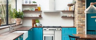
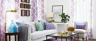
In the photo, a bright apron in a rich blue shade creates contrast in the interior.
In the photo, the cherry tile backsplash fits harmoniously into the pastel palette.
A bright light green apron brings notes of spring freshness to the interior.
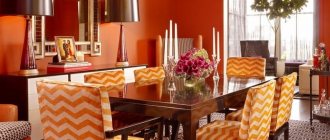
Interior designers note the emergence of a fashionable trend to combine cappuccino with a hint of orange peel.
Orange color began to be used as a complement to beige and light brown colors.
This is expressed in the finishing of the furniture, the color of the glass in the upper tier showcase, as well as in the drawings and other small design elements.
Combinations with other colors
The best options for combining cappuccino are considered to be combinations with its closest “relatives”, neighbors along the color spectrum:
- Brown;
- Beige;
- Orekhov;
- Sandy;
- Chocolate;
- Golden;
- Kashtanov;
- Caramel color.
The shade also harmonizes with neutral white, black and gray. To dilute the atmosphere and create accents on the coffee and milk fabric of the kitchen decoration, use:
- Rich lilac;
- Cool blue;
- Bright red;
- Cherry with splashes of gray (frosted berry effect);
- Herbaceous green.
The combination is carried out using contrasting decor: curtains, tablecloths, chair upholstery, kitchen accessories. It is not recommended to combine more than two or three shades. Combined options look impressive, where the contrasting one plays the role of a separator between two zones. For spacious kitchens, it is recommended to slightly mute the cappuccino color with black and dark brown, since the main shade visually expands the space. In small rooms, this effect is played with white and light walnut tones to enhance it.
When combining with other colors, the main thing is not to overdo it. The “leading” tone in the atmosphere should remain coffee with milk. It acts as a background that seems to fill the kitchen with the aromas of a coffee shop. If this illusion is destroyed by the influence of other colors that put too much pressure on the atmosphere, then their use is minimized.
The advantage of cappuccino color in the kitchen
This room is often a place where the whole family likes to spend time. Therefore, the cooking room should not only be comfortable, but also beautiful. Everything here needs to be arranged harmoniously: kitchen set, dining furniture, lighting and accessories. Cappuccino color can be a good base for creating such an interior, as it:
- will not lose its relevance for many years;
- will help you create a stylish look;
- goes well with a wide variety of colors;
- suitable even for small rooms;
- will become the basis for any style decision.
A wide palette of shades from vanilla and cream to darker chocolate will allow you to choose the most suitable tones and create a unique kitchen.
Finishing
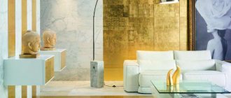
The choice of finishing materials is determined by the stylistic concept. Cappuccino looks expensive and impressive on both natural and artificial surfaces. The sheen of gloss will add elegance to the color and make the decor more expensive and luxurious. In the loft, cappuccino is combined with light brick, and in classic styles with floral patterns on the walls. “Supports” the color concept of ultra-fashionable high-tech, modest minimalism, rustic simple Provence, luxurious modern, extraordinary fusion and a number of elite styles. Cappuccino is universal and can adapt to any direction. Before finishing the room, you need to decide on the color principle:
- The walls, floor and ceiling will play the role of a cappuccino background;
- The “box” of the room will be neutral, and coffee motifs will be embodied in the furniture.
Based on the chosen concept, the type of finishing materials, their color, texture, and pattern are chosen.
Walls
The surfaces of the walls are covered with wallpaper (with a special coating for kitchens), plastered, covered with plasterboard, tiles, plastic and wood panels. The natural color of the latter may echo the cappuccino set. PVC panels, as a rule, are chosen with a complex texture: on a coffee background, there are white inclusions. As a result, the surface seems to imitate polished stone. The apron is finished with tiles, the color of which is accent: cherry, gray, lilac, green. If it is necessary to create a background, then white and pastel shades prevail in the wall decoration. Facing the “box” in dark colors is allowed only in spacious kitchens. For simple and austere options, the walls are simply plastered, and a relief similar to shreds of milk foam is created on the accent area. Ecostyle uses cork, which not only has a pleasant shade, but also a soft-touch surface.
To enhance the resemblance to a flavored drink, materials with milk-coffee stains are used. Cappuccino is universal and will be combined with any textures and patterns in wall decoration.
Floor
The kitchen floor is usually tiled. Large tiles of black, gray, brown colors are used. A dark floor will create the illusion of a “bottomless” coating. If laminate is chosen for finishing, then preference is given to gray, chocolate, chestnut shades. In expensive options, self-leveling flooring is used, which is not only durable, but also gives an elegant “varnished” shine. You can separately order a design that will decorate its surface. For the cappuccino kitchen, the coffee theme in the images will be relevant. In budget options, linoleum is used as flooring. Its range allows you to choose light shades that imitate wood. Linoleum is inferior in durability to other materials, but a high-quality product cannot be visually distinguished from laminate or parquet boards.
Ceiling
In “squat” kitchens, where the ceilings cannot boast of height, they are plastered or painted. Light shades prevail in the palette. If the decor and wall decoration will include coffee with milk and a couple of additional colors, then it is better to leave the top white. For multi-level plasterboard ceilings, use a combination of cappuccino shade with a neutral tone. If the “step” has a wave-like shape, then it is played out as an imitation of a milky wave that “floats” onto dark coffee. Decorate the relief surface with spotlights along the contour of the level difference boundary.
Interior features in monochrome colors
Wallpaper and kitchen furniture in coffee-with-milk colors create a warm and positive atmosphere. The room looks spacious, playing with shades of coffee, you can create the most incredible interior.
The choice of colors for the walls depends on the location of the kitchen and how well it is lit. For northern rooms, light, warm colors will be most successful; for the southern side, with good lighting throughout the day, cool grayish tones are recommended.
Tiles, plastic, wallpaper, paint and varnish mixtures - these decorative elements of the coffee palette, assembled like a mosaic, will become the background for the kitchen set. The area near work surfaces, stoves and sinks is most often laid out with ceramic tiles, but plastic panels, stone, glass and mosaics are also good options for decorating an apron. You can make it lighter than the main background of the walls, or, conversely, much darker. A good solution would be an apron painted to match the countertop.
The floors are covered with linoleum, tiles or laminate in coffee or milk chocolate colors, completely vanilla - they can be very easily soiled, stains and splashes are more noticeable on them. It will look good if the floor is a tone or two darker than all the furniture and walls.
Tiles with a mirror shine will create the effect of expanding the space; a chocolate floor will look good.
Furniture and kitchen set
Furniture is chosen according to the principle “lots of shine, few shades.” The color “mosaic” of its surfaces, as a rule, consists of combinations of two tones. Usually this is cappuccino and another, contrasting or neutral shade. Furniture handles can be finished with noble “gold” or chrome plating. Headsets whose surfaces are decorated with an ombre effect look organic and elegant. The color gradation from white to rich chocolate will imitate the mixing of the components of cappuccino in a cup. It is also relevant to use sets with modular facades, where each fragment is painted in a specific color. They can form complex geometric patterns or adhere to the classic pattern of division into identical squares. In rare cases, relief surfaces are used that imitate ripples on a coffee surface. More contrasting solutions are also relevant, when the top of the set is decorated in a bright color (blue, green, red, purple), and the bottom and “transitional” area (refrigerator or tall cabinet) are in soft beige, ivory or cappuccino tones.
Decor
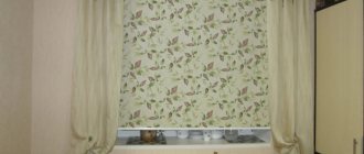
Particular attention is paid to window and door openings. To emphasize the lightness and airiness of the atmosphere, the first ones are decorated with Roman blinds or thin tulle surrounded by thick coffee curtains. It is recommended to decorate interior doors in light shades of wood or replace them with an arched opening. Light, natural fabrics with a rough texture are used in textiles. Burlap, cotton and iridescent silk will look impressive, adding depth to any shade. The walls are decorated with collages of paintings depicting cups with hot drinks, sweets or coffee beans. Open shelves provide storage space for decorative items: bottles, vases, figurines. A stylish addition would be to place a set of coffee cups on a stand in a place of honor. If you want to draw a parallel with the barista’s place of work, then hang a chalkboard on the accent wall and update the “family” menu on it daily. Also, the resemblance to a coffee shop will be added by the “highlight of the program” - a stylish coffee maker. The “confectionery” theme is embodied on the apron: it is decorated with thematic drawings (falling coffee beans, a sketch of a cup with “steam” above it from a hot drink). Indoor plants are welcome in the cappuccino interior, as greenery will add freshness to the atmosphere. One or two floor pots or a vase with fresh flowers on the table will be enough.
Lighting
Lighting is developed at several levels:
- Basics. The ceiling chandelier can be classic with crystal droplets or modern, hanging low on a spiral “leg” above the dining table. The shape of the lampshade is chosen to be extravagant. Groups of such chandeliers (3-4) look impressive, emphasizing the isolation of the accent zone;
- Complementary or directed. The main task of second-order lighting is to ensure comfortable work for the kitchen owner, so it is organized above the countertop;
- Decorative or diffuse. Typically, this type of lighting “polishes” the decor of a room and gives it a finished look. As mentioned above, cappuccino is closer to warm shades, but its “temperature” must be emphasized with light, which will add softness and depth to the color.
Decorative lighting is usually represented by spotlights that are installed in certain areas of the room along its entire perimeter.
Separately, it is worth noting the natural light. The sun's rays will help sparkle the colors of the kitchen with new colors, so if possible, install panoramic windows, which they try to “open” as much as possible.