Cappuccino tones, due to their neutrality, are excellent for decorating kitchen areas. They fit perfectly into any style direction and are liked by almost everyone. Cappuccino shades make interiors soft and airy and evoke associations with a coffee drink, which makes them extremely popular.
What colors does cappuccino go with?
Cappuccino can be combined with various tones to create successful duets. Let's list the most common combinations.
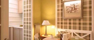
Cappuccino and vanilla
The combination of vanilla and cappuccino is as close as possible to pastel yellow. The most successful combination can be obtained if you use a matte coffee shade with milk as the main tone. Such design will have a positive effect on the psyche of residents. The decor looks stylish, but unobtrusive.
On a note! A duet of vanilla and cappuccino is an excellent solution for a small kitchen space.
The vanilla shade looks harmonious when combined with cappuccino, making the interior fresh and uplifting.
This duet is perfect for people who strive for harmony and tranquility, but do not want the kitchen interior to seem boring and monotonous.
White
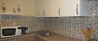
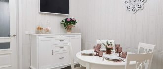
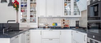
The soiling of white makes it necessary to use it in the kitchen interior with caution. Finishing materials must be selected very carefully. An excellent option for decorating the kitchen area is a white upper part and a lower part made in cappuccino color.
Floor tiles, exterior cabinet doors and countertop surfaces can be done in a light coffee color scheme, with a white area at the top.
Other colors
The cappuccino shade can be combined with almost any color, for example wenge. It will unobtrusively emphasize the softness and warmth of the coffee palette.
The dark brown tone of wenge organically complements the light coffee interior palette and contributes to the correct placement of contrasting accents.
Cappuccino goes well with turquoise, mint, lilac, pistachio, pink and many other colors. If you wish, you can create a lot of successful combinations.
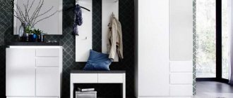
Different rooms of the apartment
The color of cappuccino looks especially beautiful in the kitchen. If the room is small, you should choose light furniture with dark elements. At the same time, they buy light-colored facades, and dark-colored tabletops, chairs, and lamps.
In the living room, cappuccino-colored wallpaper is matched with sofas and armchairs with brown upholstery made of leather or fabric. The ensemble is united by a coffee-colored carpet. As lamps, you should choose floor lamps and sconces. Bright lamps irritate the nervous system.
Cappuccino is especially suitable for the bedroom, as it allows a tired person to relax. It is undesirable to clutter the bedroom with many objects. A bed, bedside table and linen closet are enough.
The use of cappuccino in the office has its own characteristics. The walls can be covered with wallpaper of this color, but the upholstery of the chair, lamp, and paper folders should be bought in a bright color to activate mental activity.
Source
Which facade to choose: glossy or matte
In kitchen interiors designed in cappuccino color, both glossy and matte furniture are used. The advantages of glossy facades include:
- presentable appearance;
- visual expansion of spatial boundaries;
- with proper care, furniture does not become outdated;
- countertops are not afraid of contact with water and cleaning agents.
Disadvantages include the need for constant cleaning, the inability to hide scratches, and the visualization of fingerprints.
The advantages of matte facades are functionality and long service life. Scratches and dirt are invisible on their surfaces.
Disadvantages of sets with a matte finish: insufficiently presentable appearance, inability to visually expand the space.
Professional designers advise giving preference to furniture with glossy surfaces, despite the increased need for cleaning.
What else do you need to consider?
In the case of shades of brown, you don’t have to “bother” with purchasing accessories. You can display souvenirs from your last trip, your favorite books, and dishes. When you don’t want to radically change the decor, it’s enough to put a new coffee table, decorate the room with vases or place a bright poster on the wall.
Living room in the color of coffee with milk
Kitchen in the color of coffee with milk
Designers recommend using shades of your favorite coffee drink. Cappuccino, latte, black coffee or with milk - all these drinks have their own color scheme. Your favorite color will be suitable as an accent, then the kitchen or living room will sparkle with new colors.
Many restaurants use coffee color to decorate walls or furniture. Therefore, visitors get a feeling of home comfort, and their appetite increases. The shades of coffee are neutral, they are easy to choose yourself without resorting to the services of a designer.
See also: Cozy interior. What should it be like?
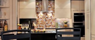
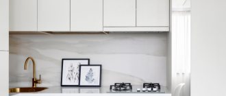
What color should I choose for an apron?
A good idea is to create a “confectionery” design on the surface of the work wall. This could be, for example, coffee beans or an image of a cup with steam rising above it.
Materials for making an apron in a cappuccino-colored kitchen can be:
- tile;
- glass;
- mosaic;
- natural or artificial stone.
Glass aprons decorated with themed photo printing are perfect for modern style and most classic styles. Usually the work wall is decorated with an image of freshly prepared coffee with a variety of spices and sweets.
Aprons that depict landscapes and reproductions of paintings also look great, especially if they are complemented by a frame in the form of relief inserts that create an imitation of brick or stone masonry.
The most popular coffee aprons are made from tiles. They look presentable, are durable and practical. Tile backsplashes fit organically into various styles.
Working surfaces made of stone (it can be either natural or artificial) also look beautiful and are durable. But they have a textured surface and caring for them is more difficult than their tiled counterparts.
Features of use in the interior
The interior is complemented with a variety of details; every item is important and serves its role. Therefore, it is worth considering not only the decoration, but also the arrangement of furniture and accessories.
The interior is complemented with a variety of details; every item is important and serves its role.
Furniture
Wooden furniture can be complemented with silver or chrome elements. Upholstery can be used on upholstered furniture; most often, the remaining parts are painted the same shade or made darker. When choosing furniture, you need to take into account the color of the flooring; it should be from a dark palette.
Wooden furniture can be complemented with silver or chrome elements.
Doors
Interior doors can be made to contrast with the walls and floor, and vice versa, adhere to their color scheme. If the doors are darker than the background, then the interior takes on a more austere look. In this case, it is important to think in advance what effect you want to achieve.
Interior doors can be made to contrast with the walls and floor, and vice versa, adhere to their color scheme.
Curtains, textiles and other decor
Bedspreads, curtains and upholstery on furniture are most often made similar to the decoration of the walls, but small accessories can be bright and eye-catching, then the design will not be boring. If lightweight textiles are chosen, the texture of the surfaces may be rough. Light curtains of beige variations will go well with cappuccino curtains. In the kitchen, you can use an addition in the form of a picture with coffee, then the effect of the coffee presence will intensify.
Bedspreads, curtains and upholstery on furniture are most often made similar to the decoration of the walls.
What color should I choose for my countertop?
The contrasting combination of a light cappuccino shade and a more saturated color of the tabletop looks great. The countertop should be much darker.
Wallpaper color
Wallpaper is a traditional way of decorating a wall surface. For the kitchen area you need to choose practical finishing materials. You can cover the walls with washable wallpaper.
Important! You can’t wallpaper your kitchen with liquid wallpaper; it will immediately swell from high humidity.
Paper, non-woven and glass wallpapers are suitable for kitchen premises. The finish can be plain, textured or with patterns. The composition of the wallpaper ornament should not contain large flowers and squares.
On a note! Coffee-colored wallpaper can be combined with stone inserts and wood panels.
Choice of curtains and lighting
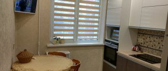
To decorate small window openings, it is better to choose Roman blinds.
Another popular decoration option is a custom-made lambrequin.
Thin tulle curtains are hung on standard-sized windows and complemented with thick coffee curtains.
Choose coffee curtains whose shade is close to the color of the set and wall surfaces. The material can be either natural or artificial. When choosing fabric, consider the decorating style of the room. Curtains with a pattern are best combined with plain wall surfaces.
If patterned wallpaper is used in the design of the kitchen space, they will be ideally complemented by plain curtains.
Important! The pattern on the textiles should be selected based on the style of decorating the kitchen. It is advisable that it be invisible - this will make the interior elegant.
In the interior of a coffee kitchen, it is appropriate to use LED spotlights, chandeliers and mixed lighting.
The advantage of LED strips is that they occupy a minimum of space and effectively transform the room. A chandelier with a lampshade will fit perfectly into such an interior. The backlight can be chosen with patterns or monochrome.
In coffee tones you can decorate a kitchen in any direction - from classic to high-tech. This palette is suitable for Provence, minimalism, loft and other styles.
The use of cappuccino color in kitchen design is becoming increasingly popular. A harmonious combination of decorative elements and surface finishes will make it possible to create a unique interior that will attract all household members.
Review of manufacturers
Laminate imitating an oak surface can be found in many collections belonging to various manufacturers.
Oak in the cappuccino version is produced under different brands. Naturally, there are some differences in shade between products from different manufacturers. In addition to pinkish, lilac and brownish colors, oak can have notes of gold and pistachio undertones.
The most famous manufacturers:
- Upoflor - produces 1.4 cm thick panels with a brushing effect and a metallic sheen. Laminate allows you to install a “Warm Floor” heating system in the room.
- Allok produces single-strip lamellas without a chamfer, which are water-resistant, which expensive natural oak cannot boast of. The thickness of the panels is 1.1 cm.
- Meister - offers panels that imitate vintage oak with a cracked matte surface. The thickness of the lamellas reaches 0.9 cm. The panels are antistatic and have a high level of sound absorption. In the laminate manufacturing process, a special moisture-proof impregnation is used.
- Classy - products are characterized by a standard width and thickness of 0.8 cm. The slats have a smooth surface with a four-sided V-shaped chamfer.
- Egger - this brand offers products of wear resistance class 32 with a single-strip design and a thickness of 0.7 cm. Due to the absence of a chamfer, this semi-commercial coating looks solid. As a result, the joints between the panels will not be visible.
- Aqua-Step - produces laminate with a rich dark shade of cappuccino. The panels are able to withstand sudden temperature changes and are not prone to thermal expansion. The coating is suitable for premises for various purposes (class 32). The thickness of the products is 0.8 cm. The pattern is single-strip and has a moisture-resistant coating.
- Dallrain - panels have metallized inclusions on a glossy surface. Abrasion class - 33, four-sided chamfer. At the base of the lamella there is a moisture-resistant plate. The texture pattern is single-strip.
Laminate is characterized by ease of installation. Thanks to the modern locking systems that the panels are equipped with, assembly of the covering is quick and easy. However, do not forget that laying laminate floors has its own nuances.
You can view the step-by-step instructions for installing laminate flooring in the video below.
It is very important to select the material not only in accordance with the color scheme of your interior, but also in accordance with the operational needs of the room itself. While a laminate of class 31-32 can be installed in the bedroom, panels of wear resistance class 33 with a waterproof coating are required for the kitchen.