Nothing evokes the comfort of home more than a cup of aromatic coffee with milk foam. One of the common design techniques is to use color combinations that remind a person of delicious food. The most commonly used color is coffee with milk in the interior, which looks great in any room. To make the combination bright and not irritating, it is important to be able to combine different shades. After all, coffee is a rich range from dark brown to cream.
Conservative people often choose the interior color of coffee with milk. This unobtrusive combination never goes out of style and serves as a good backdrop for realizing design ideas. In such a room you can place art objects, paintings, photographs. Coffee can lead the design of the room or serve as a background. In a small living room it is better to use it to decorate one wall, and in a spacious bedroom it can play the main role.
Room design in the color of coffee with milk
Beautiful kitchen in the color of coffee with milk
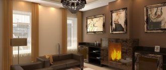
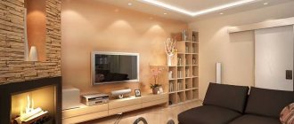
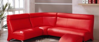
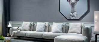
Beautiful living room design in coffee with milk color
Materials for body and facades
In order for the coffee kitchen to serve for a long time and not lose its appearance, you need to pay special attention to the choice of materials from which the set is made.
For the production of furniture frames they use:
- Chipboard (chipboard). This is the most affordable and budget option. Due to its low density, the material is easy to saw and other types of machining. Chipboard can be painted and covered with special films. But such furniture is exposed to water and elevated temperatures. In a room with high humidity, the body and facades quickly deform. Another disadvantage of chipboard: over time, the material may begin to release toxins.
- MDF. In terms of production, the material is similar to chipboard, but is of higher quality and reliability. Thanks to the addition of special additives to the composition of chipboard, it is possible to impart fire safety, moisture resistance and heat resistance. Due to the use of special impregnations, MDF is not afraid of mold and other fungi. You can decorate slabs of this type in a variety of ways: using paint, film, plastic. High-quality MDF boards are as similar in structure as natural wood and are environmentally friendly, but at the same time have an affordable price.
- Array. Only premium furniture is made from natural wood. Experts warn that solid wood furniture is susceptible to water and moisture. This set requires special care and frequent polishing.
Each of these materials has its own advantages and disadvantages. When choosing, you need to take into account not only the appearance and style of the furniture, but also take into account financial capabilities.
To give the facades a completed look, the following materials are used:
- Laminate. Most often used for finishing chipboard facades. Lamination is inexpensive and inferior in reliability to other finishing methods.
- Plastic. The material is resistant to mechanical damage, water and moisture. You can create both a glossy and textured surface.
- Polyvinyl chloride film (PVC) is an affordable and one of the most common materials for finishing buildings and facades. The coating lies flat on the surfaces to be pasted and is resistant to various types of damage.
- Enamel. Facades finished with enamel look stylish and modern. Glossy surfaces are created that are more suitable for modern style trends. A distinctive feature of this coating is its wide color variety. More than 700 color options can be found on sale.
- Acrylic. Environmentally friendly and reliable material. Acrylic not only looks great, but also prevents scratches and abrasions and does not fade in direct sunlight.
Each of these materials has its own advantages and disadvantages. When purchasing a set, experts advise giving preference to furniture made from MDF or solid wood. Chipboards have many disadvantages. It is recommended to buy furniture made from this material only if it will not be actively used.
Glossy or matte facades?
The appearance of the set and the entire room depends on the type of facades. When choosing, you need to consider the following points:
- glossy facades are most often used for modern trends, while matte ones are appropriate for classics;
- glossy facades visually make the room more spacious, so they are ideal for small kitchens;
- Any dirt is more noticeable on a glossy surface, but the surface is easier to clean than a matte one;
- abrasions and scratches on matte facades will be less noticeable than on a glossy surface.
Designers do not advise ordering furniture via the Internet and claim that before purchasing sets you need to carefully examine and touch them. This is the only way to evaluate the quality of the material.
Features of cappuccino color in the kitchen interior
The result of cappuccino is a soft caramel color with white foam. If you decide to carry your passion for coffee through your interior theme, start by defining its style and palette. These two elements will become important when you choose different coffee themed pieces for the space.
- If the interior is in a modern style, complement it with black and white frameless coffee bean prints and hardware.
- Shades of gray in the form of stainless steel on various kitchen equipment add an extra accent. For example, you can complete the look with stainless steel espresso equipment and stylish, modern coffee cups in bright colors.
- If you have an eclectic interior full of different palettes, look for fun art prints with coffee pots as accent walls.
- Colorful coffee pots and cups can be displayed on the upper cabinets.
- Consider adding artistic tiles to your kitchen backsplash with a coffee theme.
- Artistic tiles done in bright colors with black, white and brown prints in the center can add an interesting focal point to the interior.
Decorating the kitchen space in coffee and chocolate tones.
Kitchen makeover
Kitchens made in coffee shades are suitable for family people who like to spend time with their family in coziness and comfort. Choosing such a design for the kitchen is quite simple. To decorate the walls, you should choose wallpaper of different coffee tones, and against their background, a kitchen set made from dark wood species can stand out cost-effectively. You can also pick up various accessories in the coffee palette there. You can also use your imagination in the design of walls, windows, and tiles for finishing the work area. It will look very interesting and stylish if you place an image of a steaming cup of coffee on one of the walls. And you can add sophistication to such a kitchen with the help of appropriate decorative items. Various glass jars filled with coffee beans, as well as a coffee tree, will look just perfect. Photos of such decors can be found on the Internet and you can draw inspiration from them for your own kitchen.
Accessories and interior decorations
Latte can be used in interior design not only as a base, but also as an additional decor. For example, natural beige fabric materials made from cotton, wool, and linen warm up any interior quite eccentrically.
Latte accessories will help add warmth and light to the room. Figurines, pots, sculptures and many other porcelain and ceramic products of a certain color range can be used as decorations.
Latte color is valued by designers for its sophistication, delicacy and harmony. The shade is universal and popular, so there are many interior options for rooms for different purposes with a predominance of coffee color in all sorts of style variations.
Color care
As with any other color, mocha also washes out of your hair. To slow down this moment, fulfill several conditions:
- Use a specialized shampoo for colored hair. If tinted shampoos with mocha colors are available, then give preference to them.
- To maintain color, there are tint masks, balms and tonics; the main thing is to choose the right shade.
- If possible, try to wash your hair less often, as washing your hair tends to wash out the color.
Decorating different rooms of the apartment with colors
Designers offer the following options for decorating rooms in a cocoa tone:
The living room can be decorated like this - paint the walls with a whitened cocoa color, for which brown and white paints are mixed. The curtains on the windows are the color of coffee with milk. The floors are covered with wood laminate. The sofa and coffee table are purchased in a cocoa shade. It is better to choose leather upholstery for the sofa. 3 sets of chairs are chosen for the room - 2 in a set. One set of armchairs has milky upholstery, the second has brown upholstery, and the third has a combination of brown and milky tones. The dining table is purchased with a milk top. The bedside table against the wall is a combination one – with milky legs and a brown tabletop. Carpets on the floor with a geometric pattern of chocolate and milk tones. The pillows on the sofa are of different shades to match the main colors of the design. You can recreate this interior with 3 colors by adding gray, but it is more difficult.
A bedroom with cocoa colors can be created as follows. The floors are covered with wood laminate. Recreate the same color on the walls. Buy a trestle bed, which should be placed with the head against the wall. The wall above it and part of the ceiling should be made in the form of beige tiles. Place a golden blanket and brown and beige pillows on the trestle bed. Choose bedside tables near the bed and a chest of drawers opposite in a light wood tone. Hang light tulle without a pattern and heavy chocolate curtains on the windows. Place a striped carpet on the floor - stripes of chocolate and beige shades. Buy lamps with chocolate lampshades for bedside tables. This design will not visually reduce space, but has all the advantages of the chocolate range.
In a kitchen where cleanliness must be visible, and dark tones are not suitable, the cocoa color can be recreated on the countertop of the work area, in the color of the dining table and in accessories. If the walls in a cocoa-colored kitchen are painted in a chocolate tone, you can play with the contrast. To do this, the doorway and windows are made light, and the floors are decorated with tiles in shades of milk.
The bathroom can be decorated in chocolate shades. It will be beautiful to decorate the walls with cocoa-colored tiles and make a screen under the bathroom of the same shade. Against the background of a white bathtub, toilet and sink, you will get a rich interior.
See photos and videos of various rooms in cocoa color above.
The topic of the psychological impact that color has on a person’s health and mood is quite relevant today and has been widely studied. Traditional and unusual in design are wenge, zebrawood, acaju, carmelite, capuchin, cocoa color in the interior.
You can have a positive attitude towards the theories of chromotherapy or not recognize them at all, but a person will always react to the color palette. There are colors that are loved, others that are not so much, and some can even become a strong irritant, causing depression and depression.
So, cocoa color. Perhaps for some it is a reminder of childhood and sweets. But cocoa is a soft and delicate woody shade of brown. Very popular in traditional interiors, it is often used in the design of quite creative and ultra-modern projects.
The color of cocoa is distinguished by its extraordinary warmth and comfort, instills a feeling of confidence, and gives a feeling of peaceful calm. Photos of design solutions with a combination of different shades of cocoa color in the interior evoke pleasant emotions.
Origins of popularity
The demand for cocoa color increased at the end of the twentieth century, when naturalness and exoticism were at the height of fashion. The cocoa color itself was singled out as a separate color in the palette much earlier. But then it was tan, brown, light brown, dark brown.
Modern artistic variations are cocoa with milk, cappuccino, chestnut, tobacco, copper, cognac. The color texture was monotonous and represented exclusively by “marble” variations. Now there are an abundance of tones in catalogs: coffee with milk, terracotta, coffee, pale brown, brick, milk chocolate, vanilla, beige... There is room for the designer’s imagination to unfold.
Finishing a cappuccino kitchen: furniture and more
Contrasting combinations of furniture sets are effective, where the top tier of cabinets is light, almost white, like the foam of this delicious drink, and the bottom is dark.
By playing with all sorts of combinations of flooring, wallpaper, and window design, you can turn your kitchen into a real paradise, an island of calm in this restless world.
However, contrasting combinations are not the standard; in a monochrome design, cappuccino kitchen sets look no less stylish.
Walls
As already mentioned, the coffee-beige shade is universal and provides ample opportunities for experimenting with colors and textures; everything suits it.
The walls in the kitchen pleasantly absorb light furniture
When choosing a background, you should only take into account the size of the room; remember, dark shades will go well with large areas; light beige and off-white furniture will look the same color as them
This range adds elegance to the interior, drawing attention to the surroundings. Small kitchenettes are impressed by light brown walls, shaded with chocolate furniture
A similar color scheme is suitable for decorating an interior in the style of a French cafe, turning it into a cozy bistro, where it is so pleasant to gather with friends over a cup of aromatic coffee.
Floor and doors
For floor finishing, parquet or moisture-resistant cappuccino laminate, imitating natural wood species, is most often used. The color of the laminate in a coffee and dairy kitchen varies from light beige to chocolate, but it is advisable to choose a shade a couple of shades darker than the furniture set.
Cappuccino in the kitchen interior is used not only on walls and furniture; interior openings decorated in a similar color scheme look harmonious. Cappuccino-colored doors in the interior are combined with any decorative elements. The presence of glass inserts will make the space “breathable” and “airy” and will fit into almost any stylistic solution.
In the classic design of a kitchen, the principle of identity is applied, which consists in matching the colors of the floor covering and the door leaf.
To prevent cappuccino doors from getting lost in the interior, designers advise adhering to one more principle - contrast. The installed furniture set should be a couple of tones either lighter or darker than the door leaf.
Decor
The cappuccino kitchen is decorated using various elements: curtains, mirrors, paintings, useful household items, figurines.
WATCH THE VIDEO
Curtains are selected in milky, light beige and pale brown tones. The second mandatory element of window openings in a coffee-with-milk kitchen is pots of herbs; they will breathe life into the surrounding pastel space, giving a feeling of freshness and spaciousness. A cappuccino-colored kitchen is stylish and fashionable.
Rules for choosing furniture
“Choosing furniture for the interior of a cappuccino kitchen is not at all difficult - this color harmonizes perfectly with many tones”
A set of kitchen furniture does not have to be monochromatic. The cappuccino color can be present either in the upper or lower tier, contrasting with other, richer shades. Typically, wall cabinets from the upper part of a kitchen set are made of light-colored material, and darker shades are chosen for the lower cabinets. The color of coffee with milk looks great in gloss. Such furniture brings a special style to the interior and makes it more spacious and brighter.
Glossy facades bring a special style to the interior
Choosing furniture for the interior of a cappuccino kitchen is not at all difficult - this color harmonizes perfectly with many tones. In order for the shades to match each other, you first need to choose a color scheme for the walls. It is recommended to decorate the walls of small kitchens in light brown tones and choose dark brown furniture for such rooms. If dark furniture is decorated with blue or turquoise inserts, then such a kitchen will immediately be filled with lightness and freshness. If dark brown shades were used for the walls, then light beige or milky colored furniture would be suitable for such a kitchen.
For dark brown furniture, light wall decoration is suitable
Any materials can be used to make kitchen furniture. Facades made of wood or plastic in cappuccino color will look very impressive. The surface of kitchen furniture can be matte (suitable for classic style) or glossy (the best solution for modern style). Designers do not recommend purchasing non-staining furniture in very dark shades for the kitchen.
Interesting ideas
There are many different ideas to help you choose cappuccino-colored kitchen furniture. The only rule that must be followed is the mandatory balance between the selected set of furniture and the overall design concept.
We bring to your attention the main ideas for the kitchen:
- For a bright kitchen, it is recommended to choose furniture in a chocolate-coffee shade. An interior decorated in this way will look very elegant and rich.
- Kitchen furniture with a lower tier in dark coffee tones and an upper tier in pale beige colors looks very original. This is one of the best solutions using cappuccino color in kitchen design.
Upper and lower tier of the kitchen in contrasting colors
- For corner kitchens, designers recommend using an interesting technique in which one side of the kitchen is made coffee-colored, and the other is the color of coffee with milk. If you decide to implement this idea in your kitchen, be prepared to purchase custom-made furniture.
- For a kitchen in a classic style, it is recommended to use dark shades of cappuccino, and for modern trends – milky coffee tones and glossy surfaces.
- Upholstered furniture with light milky upholstery will look beautiful against the background of chocolate-colored walls. Textiles and cushions on chairs should be made in the same colors as the upholstery.
Light shades of cappuccino are suitable for modern style
What else do you need to consider?
In the case of shades of brown, you don’t have to “bother” with purchasing accessories. You can display souvenirs from your last trip, your favorite books, and dishes. When you don’t want to radically change the decor, it’s enough to put a new coffee table, decorate the room with vases or place a bright poster on the wall.
Living room in the color of coffee with milk
Kitchen in the color of coffee with milk
Designers recommend using shades of your favorite coffee drink. Cappuccino, latte, black coffee or with milk - all these drinks have their own color scheme. Your favorite color will be suitable as an accent, then the kitchen or living room will sparkle with new colors.
Many restaurants use coffee color to decorate walls or furniture. Therefore, visitors get a feeling of home comfort, and their appetite increases. The shades of coffee are neutral, they are easy to choose yourself without resorting to the services of a designer.
See alsoDesign features and design of a small room
Basic shades used in decoration
Don’t think that coffee color can only be dark brown; don’t forget another wallpaper color – coffee with milk. It is very different from the original shade, but, nevertheless, it is also usually classified in this group, so we will look at the features of each option in more detail.
Coffee color
This option is also very often called chocolate, so don’t be surprised if this particular option appears in the wallpaper article.
Let's look at the main features of this group of shades:
Premises decorated in the color in question create an atmosphere of peace and allow you to relax and fully unwind from numerous worries. It’s comfortable to be in such rooms, they don’t have an irritating effect on people and set them up for productive intellectual work; it’s not for nothing that this finishing option is very popular in offices.
A luxurious coffee-colored ornament on a light background is a win-win option for a study
As psychologists testify, brown wallpaper creates an atmosphere in the room in which you can relax and escape from worries
This option is especially good for people leading an active lifestyle, for whom complete relaxation is important. Since ancient times, the color of coffee has suggested a certain exclusivity and aristocracy. This color design was often found in noble estates and palaces of kings, which is why even today chocolate wallpaper creates an atmosphere of fashionability and solidity.
To further enhance the effect of luxury, you need to choose the appropriate furnishings: wooden furniture, leather upholstery and expensive carpets on the floor.
If you decide to use this option in your home, you should remember a few simple recommendations:
Coffee wallpaper for walls is great for spacious rooms with good natural light
But this does not mean that they cannot be used in small rooms, you just have to decorate only one of the walls in this way, covering the rest with light wallpaper, this will allow you to focus attention on a separate area of the space
To prevent chocolate walls from having a depressing effect, you need to use light accessories, as in the photo, and use high-quality lighting
It is very good to use this color option when finishing wallpaper for painting - the surface structure will be highlighted in the most favorable light. If you do the work yourself, then consider the following factor: a matte surface highlights the texture of the material much better than a glossy one. Very often you can find coffee bean wallpaper for the kitchen; this option is quite interesting and is perfect for this type of room. In this way you can decorate one of the walls or decorate an apron over the work area
It all depends on what you want to get in the end, but it’s important not to overdo it; coffee beans are good as an accent, but you shouldn’t use them as the main background.
A very stylish kitchen design option
Coffee with milk
The closest color to this option is beige, but it is several tones lighter. Coffee with milk wallpaper in the interior may not look very bright, but it’s worth diluting and complementing it with several shades - and you get a very cozy and stylish environment.
The color of the wallpaper coffee with milk can be the main color in the interior, but without appropriate decoration it will look inexpressive
This option has the following properties:
- It belongs to neutral shades and promotes mental activity and fruitful learning. That is why it makes sense to cover the work area in the nursery, office or library in a similar way.
- Using this background, you can highlight the most important elements of the interior and highlight them favorably. The combination with dark coffee color looks very good; this option is classic and has been widely used for at least several centuries.
Wallpaper in the color of coffee with milk in the interior of the kitchen looks great
You don’t need instructions on how to combine such wallpaper with the interior; they match almost all natural shades, so decorating it yourself won’t cause any difficulties.
This wonderful world of beige tones
After interiors in white, perhaps the most popular palette for decorating kitchens is brown, and its entire spectrum is actively used, from the severity of dark tones to the delicacy of light shades.
Combination of shades of brown – terracotta – vanilla
The attractiveness of the coffee palette
- Firstly, shades of brown are very warm, soft and cozy in themselves;
- Secondly, most of us associate it with natural wood and nature, which helps create an atmosphere of calm, regularity and tranquility;
- Thirdly, the color scheme is based on brown, it doesn’t get boring, and harmonizes perfectly with other colors;
- Fourthly, such a palette looks great in various stylistic solutions, both in majestic modern and charming country.
Rhymes in the interior
The main rule in creating an interior is rhyme. It can be determined by a combination of colors, patterns, textures, etc. For example, kitchens the color of coffee with milk perfectly rhyme with the color of orange.
Kitchen with milk and coffee in a chic frame of orange walls
This is a combination of warm shades, it can be recommended for apartments whose windows face north and have limited natural light. This design itself is a source of vital energy. Even in the cloudiest weather, it will make you smile and not fall into the blues.
Designers successfully use the play of tones and halftones, using beige as a basis, which acts as a canvas, and using decorative elements to create an exquisite picture of the interior.
An example of a successful design project is presented in the video at the end of the article. It would seem that simple and clear techniques were used to decorate the kitchen, coffee and beige shades, but the result was a very cozy and elegant room for the whole family.
If we talk about the rhyme of color using cold tones, then we can recommend the classic combination of light wood and emerald. The restraint and laconicism of the interior can tell a lot about the Nordic character of the owners.
Kitchen design coffee with milk - laconic rhymes
In general, if you are not sure of your taste, you can always seek advice from professionals. There is a detailed, one might say, instruction with examples that show the rules of beautiful harmonies in color rhymes.
Coffee mania in the kitchen interior
The coffee-colored kitchen deserves special attention. As a rule, shades of dark brown are used in the interiors of kitchens in a classic style, such as modern, conservatism. Modern styles have also fallen into the trap of aristocratic sophistication, which is why coffee shades are widely used to create interiors in the art deco, hi-tech, etc. styles.
Kitchen in coffee tones - a timeless classic
But for true lovers of this aromatic drink, the presence of a similar color scheme is not enough. And since the army of fans of the invigorating liquid increases year by year, the coffee theme in the kitchen is becoming very popular.
Manufacturers of building materials, furniture, household appliances, and decorative items actively use coffee as a design theme. These include bright kitchen aprons with photo printing, decorative ceramic tiles, paintings for the kitchen with coffee, posters, clocks, etc.
Skinali – modern motifs for modern design
What do you think about creating a cozy corner in your kitchen in the style of a French coffee shop? To do this, you do not need to invent something supernatural, but just a little imagination and desire.
To do this you will need:
- Install the kitchen countertop on a free section of the wall;
- Use a poster with a suitable image;
- Buy a pair of chairs in the style of “la Paris” and Voila;
and a charming mini coffee shop is ready. The cost of implementing such a design solution will depend entirely on your imagination and financial capabilities.
A fragrant corner of comfort in the style of “la Paris”
Coffee beans - original solutions
As it turns out, coffee beans can also be a great addition to your decor. Many craftswomen create very attractive little things with their own hands.
Examples of some of them:
"A coffee tree
Holiday coffee candle holders
What does a cappuccino-colored kitchen go with?
To make your kitchen look stylish and interesting, you need to decide in advance on the palette and decide what exactly the coffee tones will be used for - for furniture or wall decoration.
The following color combinations in the interior of a cappuccino kitchen are considered the most successful:
- light or straw walls and dark brown furniture interspersed with gold;
- pink walls combined with a coffee set;
- if the set is finished in gloss, complex tones such as salmon, emerald green or tiffany will go well with it;
- White, black, brown and gray tones are perfect for decorating a classic interior; the set can be either glossy or matte.
As for the choice of wallpaper, there are practically no restrictions. The canvases can be either plain or with a pattern. Also, in coffee and chocolate tones, embossing looks chic. When choosing wallpaper, designers advise following the following principle: the smaller the area of the room, the lighter the wallpaper should be.
Curtains can act as an accent in a monochrome kitchen. Gray, red, burgundy or pearl curtains will look best with coffee walls and a chocolate set. Designers advise giving preference to dense and heavy fabrics. Various decorative items will help give the room a complete look. They need to be selected taking into account the overall style.
Small kitchen in light brown tones.
There is one secret in creating a universal kitchen, thanks to which even an uncreative person can cope with the task of creating an effective and practical interior. The secret lies in the fact that the walls and floors need to be given light shades of brown, with which coffee-colored sets will look great. With the help of brown shades you can make the room visually larger, add warmth and comfort.
Brown in light colors close to beige is all that is needed for this. Therefore, there is no need to be afraid to use this color. Fits perfectly into the light brown interior, it has a luxurious look. The color of cappuccino is usually compared with home warmth and comfort. It fits perfectly with the matte palette. Thanks to these properties, different shades of this color have the ability to not appear too expressive. Coffee is truly magnificent, especially with decorative elements.
Advantages and disadvantages
A kitchen in coffee tones, depending on the color of the facades, can be decorated in both warm and cold colors. Psychologists warn that cold and warm coffee tones have the ability to awaken appetite because they remind you of coffee drinks and chocolate. If you want to decorate your kitchen in a coffee style, you should first understand what features this shade has.
The advantages of a kitchen in the color of coffee with milk include the following qualities:
- the cozy shade of cappuccino promotes relaxation and relieves stress after a working day;
- the color of cocoa with milk in the kitchen interior is considered universal because it is easy to match finishing materials and furniture to it;
- the coffee shade is practical, since drops and stains from water are not visible on it;
- coffee tones go well with both warm and cool shades, balancing bright colors and making pale ones more saturated;
- A cappuccino-colored kitchen set can fit into any style direction (Provence, hi-tech, minimalism, classic, etc.).
- the chocolate-colored set brings novelty to the conservative design;
- even if the room is decorated in the same color scheme, it will not look overloaded and heavy;
- cappuccino color visually expands the space (if the facades are finished in gloss), so this set is suitable for small rooms.
As for the disadvantages, the chocolate-colored kitchen with milk has practically none. One of the disadvantages is that a set in light shades will constantly become dirty and will have to be washed very often.
What do psychologists say?
Coffee shades are traditionally used in interior design of any kind. Psychologists believe that the color of coffee calms the nerves, creates an atmosphere of comfort and encourages communication. The coffee interior does not have an abundance of cool colors such as blue and cyan. Therefore, even in winter, a room in warm colors will not put pressure on the psyche.
Interesting information. Often, antique, classic or English style interiors are decorated in coffee tones.
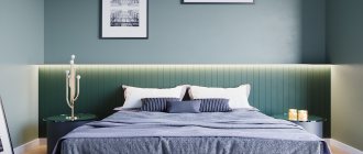
Bright bedroom in coffee with milk color
Room design in the color of coffee with milk
Bright room design in the color of coffee with milk
See alsoHow to create a modern design for a two-room apartment?
Windows and textiles
As for window decoration, the modern variety of textiles and other materials will allow you to highlight the aesthetics of your bedroom in coffee tones.
Depending on the chosen style of the bedroom, for classics you can choose cream silk or satin curtains with lamrequin; for minimalism, white Roman curtains are suitable; sea green linen and cotton can be chosen for eco-style.
To decorate the bed, you can choose a bedspread and decorative pillows to match the curtains.
Textiles are also used to make soft wall panels, for example, for the head of a bed or decorating the walls of a room. Such black coffee or cappuccino colored panels will add even more softness and comfort to your bedroom.
The headboard of the bed with a large floral ornament of chocolate color, enclosed in a wide, similar in tone, wooden frame with lighting, which smoothly goes to the ceiling above the bed, looks very impressive.
Coffee shades will add grace, splendor and even nobility to your bedroom, regardless of the chosen style. All colors in the interior should be in harmony and not contradict each other.
Photo
Natural colors and shades are very popular in the design of living spaces for a reason. They pacify, give tranquility, they connect us with nature, which makes the atmosphere in the room soft and enveloping.
Among the entire natural palette, shades of brown occupy a special place, especially those that are associated with pleasant and tasty things - chocolate, cocoa, coffee. Coffee color is very popular among them, because it gives the room rigor and style, inner nobility and at the same time comfort.
Coffee wall color: features, ideas and materials
The beige color scheme is the basis of the basic interior. The coffee-milk shade is part of the beige-brown spectrum. This is a complex color that is obtained by mixing brown (coffee color) and white (milk color). These two colors combine harmoniously and form the ideal shade for decorating any interior.
Coffee with milk on the walls, furniture and textiles is a sign of a cozy, but at the same time strictly and elegant design. The undoubted advantage of a warm brown color scheme in the interior is the optical expansion of the room.
The combination of two coffee shades - dark and light - makes the living room more spacious, and the presence of a fireplace adds a feeling of comfort
Other advantages of beige decor:
There are no special rules for interior design in the popular shade of coffee with milk. But there are tips for adjusting the space and decor of rooms:
If you are decorating a coffee and milk interior, make it multi-layered. Decorate the walls with paintings, hang curtains, lay a carpet and decorate the room with gold accessories. The more coffee and milk shades, the more multifaceted the room looks. Include close beige and brown shades in the design, and the room will stop being boring and faceless.
Coffee walls complement the beige sofa and brown carpet
The ideal furniture for a coffee and milk room is leather and wood. These materials emphasize the elegance of the coffee interior. The floor is also made of wood: light wood is used to expand the space, and dark wood is used to level it. The ceiling is left neutral - white or light beige.
The main attention when decorating a beige interior is paid to the walls. To decorate walls, paint, wallpaper or facing materials are used.
Paint
Latte color is a suitable option for painting: it goes on evenly and hides imperfections in preparing the walls for painting. An additional advantage is that you don’t need many layers for the perfect coffee shade.
Coffee-milk color, slightly darker than beige. To paint walls in coffee tones, choose a matte, non-glare texture of the dye. You can paint the walls in a neutral coffee shade and add a few bright accents. Suitable companion paints for the coffee-with-milk color:
Coffee with milk belongs to the gourmand spectrum and goes well with all edible flowers. But you shouldn’t get carried away with contrasts: the atmosphere of warmth and comfort will disappear from the room and a feeling of bad taste will appear.
Coffee-milk paint visually levels the walls and expands the space due to its matte finish and anti-glare effect
Source
Application of coffee wallpaper in the interior
The easiest way to bring something new into the interior is to hang beautiful wallpaper. The pattern of the paintings is selected based on the purpose of the room:
Kitchen – a design with coffee cups, cafe tables and other delicious motifs will look great.
Contrasting combinations are suitable for the living room. You can use the entire arsenal - panels, borders, ornaments. Don't limit yourself to one type of wallpaper.
In the bedroom, coffee color can be present only on the headboard or occupy the entire wall. Floral patterns and swirls are applicable here.
The color of coffee with milk in the kitchen interior
Kitchen design in coffee with milk color
Study - alternating several types of wallpaper will look impressive - dark on the bottom, milky on the top or with vertical stripes. A decorative border can be placed at the junction of the canvases.
The hallway is a rather cramped room, so it is better to use a light cappuccino, which will contrast with the wooden furniture.
Corridor – you can mix different drinks and create a cocktail. Wallpaper with patterns and shimmering colors is suitable for these purposes.
It is important to avoid dark tones
If one of the walls is empty and spoils the whole impression, you can cover it with photo wallpaper in which the color of coffee dominates. They can depict a still life, an old map or an engraving. For an informal industrial style, you can choose wallpaper with imitation brickwork or wooden planks.
Bedroom interior in coffee with milk color
Living room design in coffee with milk color
Kitchen interior in coffee with milk color
Subtleties of design solutions
Shades of coffee will soften the interior, allowing you to concentrate on work or study. The selection of curtains plays an important role in decoration. By changing the curtains alone you can radically change the perception of space. When the room has white walls and south-facing windows, a coffee curtain will allow you to block out the scorching sun and add a color accent.
The coffee shade enhances any room. To create an atmosphere of luxury, it is important to add matching accessories. These could be lamps, figurines, decorative fireplaces or antique furniture. Textiles will help you feel the warmth of the hearth - embroidered pillows, carpets, heavy curtains with fringe.
Against the background of milk and coffee, an avant-garde painting that includes spots of red and blue will look beautiful. It will add dynamism, but will not add unnecessary semantic load. It is better to choose accessories in pure colors; it is advisable to avoid purple and yellow. These colors will make the interior look heavy.
Living room design in coffee with milk color
Room interior in coffee with milk color
See alsoWhat you need to know about balcony design?
Interesting color combinations
Coffee combines well with gray tones, makes friends with white, looks original in a duet with shades of yellow and more.
Grey
The cool range of gray combined with warm shades of cappuccino works to expand the space
It is important to maintain color balance; do not overload the interior with an abundance of accent details, even in spacious rooms
Bronze
The neutral coffee and milk background will sparkle in a new way if you add bronze accessories. These can be floor lamps and lamps, a chandelier, decorative elements of a set, frames and moldings. Bronze figurines, candlesticks, vases and flower pots, and textiles of appropriate design are suitable.
White
Brown-white dominance attracts with its unobtrusiveness, freshness and amazing sensitivity to powdery colors of the natural palette. The combination of different textures is favorable: a luxurious set with a glossy facade emphasizes the noble appearance of leather furniture; the composition is successfully complemented by a thick woolen carpet and jacquard curtains with nylon tulle.
Orange
Light cappuccino and muted orange work well in a duet in modern, high-tech and ethnic interiors. Most often, the beige palette dominates; bright colors are used in doses. However, when creating stylish compositions, even use of milky coffee and orange colors is also allowed.
Green
The combination of natural shades of greenery and cappuccino with the addition of steel colors is considered successful in arranging a room for a teenager. The solution will easily fit into the design of an eco-style room if you use exclusively natural bases.
Ocher
Yellow in the shade of ocher with small splashes of brown is a winning combination for projects in the ethno style. In a small room it is worth adding light colors, cream, pastel colors. In the design of spacious rooms, the tandem of ocher and cappuccino is successfully complemented with muted blue, green and red-brown notes in small quantities.
All in chocolate"
Curtains in brown tones are successfully used in environments where there is no duplication of color.
The only condition is that the window drapery should not be perceived separately and fall out of the general context. For example, in an active black and white design, reed will also be appropriate and will add warm notes to the achromatic monotony. In small rooms, a dark palette will seem gloomy if you do not use curtains in a duet with light muslin, organza, or use fashionable “crinkled” tulle for the company; this solution will neutralize the visual effect. In this case, why not turn to golden ocher, light caramel and that “safe” palette that cannot radically change the space downward.
If you think that these combinations are banal, turn to other colors of the given theme, since there are plenty to choose from. Most likely, you will be surprised by the bold set with active colors: red, pale coral, apricot, light green, yellow. This choice is preferable for active people striving for action and a thirst for celebration. A fringe with metallic threads, an embroidered gold border or single yellow hieroglyphs will help get rid of boring monotony.
In a living room with blue tones, it is appropriate to hang an outfit made of light brown taffeta on the windows, attaching it to a chrome cornice with metal rings or hooking it with grommets. The decoration includes a mint-colored ribbon or a silver chenille stripe, which adds sophistication to the drapery.
What style does it suit?
It’s not for nothing that coffee cuisine is considered universal. As practice shows, a set designed in similar shades can be successfully integrated into almost all style trends, but such a set would look more appropriate in the following styles:
- Classic (combination of basic neutral colors with straight lines).
- Minimalism. To create such an interior, it is recommended to purchase modular furniture and built-in household appliances.
- Modern. The direction is characterized by red, white, and black tones. A coffee set with a bright stone-look countertop will fit perfectly into such an interior. The surface may differ radically from the color of the body and facades, for example, it may be red.
- Provence. Involves the use of pastel wallpaper and a kitchen coffee set with matte fronts. The shade of the furniture can be either light beige or chocolate.
Finishing materials
The choice of materials is determined by the stylistic concept. The cappuccino shade looks expensive and effective on both natural and artificial surfaces. The glossy shine of the surfaces will add elegance to this color and make the atmosphere more luxurious.
With this combination of colors, the kitchen looks expensive and elegant.
In the attic, cappuccino is combined with light brick, and in a classic style with floral patterns on the walls. This color can be emphasized by modest minimalism, simple “Provence” and luxurious “modern”. The cappuccino shade is universal and can adapt to any direction.
Option for coffee kitchen in Provence style.
Additional design nuances
The color of the walls, coffee with milk, has a huge advantage - it is unpretentious. You don’t have to worry too much about delighting your guests and emphasizing the chosen decor option. It is enough to periodically buy new things, for example, bring souvenirs from trips, purchase exclusive tables with carved legs, some rare books, decorative vases. The walls can also be decorated with colorful posters or artistic abstractions. Designers have found use for all shades of coffee with milk.
Fashionistas often confuse this color with chocolate or chestnut. However, experienced hairdressers are sure: all the listed colors differ noticeably in the depth of shade.
If you are a coffee lover, you can scoop up a handful of roasted coffee beans and take a closer look at them. You will see a color that is not too dark, brown, decorated with gold and rich in tints of light. Your hair will be the same if you choose a dye from this “family”!
Who is “Coffee” hair color suitable for?
The ideal appearance for dyeing your hair coffee color is considered to be: dark skin, green or brown eyes. He makes such a girl very noticeable, paying attention to all her advantages, and leaving her shortcomings “behind the scenes.” If you want to stand out more, add some color to your look!
Do you have brown eyes and a deeply tanned face, or, on the contrary, cold blue eyes and pale skin? This appearance is also not a contraindication to the use of such paint.
In general, experts believe that it will work equally well on both light and dark strands. Hairdressers recommend “coffee with chocolate” for brunettes or dark-haired girls, and “coffee with cream” for light-blond girls.
Of course, coffee hair color can be different. But its most “basic” version is rich in warm golden notes. Noble, expensive, sophisticated - this is what the shades of this paint are called in beauty salons.
Do you really like coffee-colored hair, but you are not sure that you will look beautiful with it? Start exploring your favorite undertone by purchasing a tint balm. If you don't like the color, it will quickly wash off!
Coffee hair color with highlights. Coffee with milk hair color: who is it suitable for and how to get it
Want to change your hair shade? Pay attention to the trend of this season - the color of coffee with milk. We'll tell you who this tone will suit and how to achieve it.
Photo: For Hair Growth
Hair color coffee with milk: who suits
The first step is to figure out what this mysterious shade of coffee with milk is? It is a medium color between brown and milky. Moreover, there are many variations of this tone - from light caramel to rich dark.
The color of coffee with milk is quite capricious, so it is not suitable for every woman. However, if you choose the right shade, both girls and older ladies can flaunt a fashionable color.
The length of the hair should also be taken into account: if the curls are short enough, choose light colors
But long-haired young ladies should pay attention to rich dark shades
Photo: Fashionable hairstyles and haircuts
Let's tell you who should choose a coffee color:
Is your skin tone olive or dark? Pay attention to the cool, rich tones of strong espresso. The color will look especially good on brown-eyed ladies
If your skin tone is cool, then coffee with milk is a great solution for your type
This color of curls will highlight the natural tone of the face. Moreover, both light and dark shades will suit you. Did nature reward you with fair skin and bright eyes? Opt for a caramel cappuccino shade. For green-eyed and gray-eyed ladies, warm tones of coffee with milk, such as latte, will suit them. They will make your appearance brighter. Is your eye color blue? Then macchiato hair dye is suitable. Ladies with blue eyes should try the shade of iced milk coffee.
Also be sure to take into account the natural color of the curls. The shade of coffee with milk is practically not suitable for girls whose hair is naturally black or red.
Before dyeing your hair the desired color, use a tint balm. This way you will understand whether you have chosen the right tone without damaging your curls.
Photo: Portal about beautiful hairstyles
If you decide to dye, use these tips:
- Apply dye only to unwashed hair.
- Paint your roots at least once a month. For the first three to four months, be sure to tint the entire length of the strands.
- Provide your hair with proper care: use conditioners and masks regularly.
- Protect colored hair from the sun.
Coffee with milk hair color: how to get it
Dyeing your hair to match the color of coffee with milk is not an easy procedure. It is almost impossible to choose the desired shade right away, so most often hairdressers mix several tones of paint.
However, now almost every girl can purchase professional hair dyes and achieve the desired color on her own.
Photo: Modnaya.org
It is quite difficult to obtain the shade of coffee with milk at home. However, try these folk remedies:
Cocoa mask.
Take 50 g of cocoa and mix with 100 ml of kefir. Distribute through hair, leave for one hour, rinse without shampoo.
Coffee mask.
Mix 30 ml of freshly brewed strong coffee with egg yolk and 15 g of cognac. Use only natural coffee: instant coffee will not work. Apply to hair, wait an hour and wash your hair without cleansers.
Cinnamon mask.
Combine 2 tbsp. l. ground cinnamon with 3 tbsp. l. liquid honey and yolk. Distribute the mask over your hair, leave for one hour, rinse without shampoo.
These homemade masks are suitable only for those with light brown hair. You shouldn’t hope for a magical result: such products will only give your curls a light coffee tint. For deep color, use professional paints.
Please note that dark hair needs to be lightened by 2-3 levels before the dyeing procedure (depending on the original color of the curls). Moreover, bleaching is carried out at least 2 times.
Photo: rascheski.spb.ru
The problem with dyeing dark hair after bleaching is that its reaction to an aggressive chemical composition is quite individual. Therefore, the color of coffee with milk may not work out the first time.
Blonde-haired ladies also often face troubles: the color may turn out too dark. Also, the paint washes out quickly. Therefore, if your natural hair color is closer to blonde, choose light shades of coffee with milk.
It’s easiest for owners of light brown hair: their natural color is as close as possible to the desired one, so you just have to choose the right shade.
Coffee with milk is the hair color chosen by stylish and confident young ladies.
Experiment with your appearance: perhaps this shade will be ideal for you and you will no longer want to part with it.
Combination with other colors
A beige room doesn't always look the same. Beige walls look different depending on the color combination you choose. Latte is versatile and there are many ways to combine it with other colors. The final effect depends on personal taste.
Supporters of classic solutions can combine latte with other muted colors:
Such combinations will create a calm, cozy, clear scheme that never goes out of style.
Fans of unusual solutions should combine lattes with flowers:
- salmon;
- powder pink;
- grey;
- pistachio;
- olive;
- blue;
- lavender.
This combination is not obvious, it will bring dynamics to the interior and give it a unique character. The classic, elegance of latte tones will be overcome by pastel tones, giving the room a light carefree, modern atmosphere.
Below are some ideas for combining coffee and milk tones with other colors.
In combination with earth flowers
Natural, delicate beige tone is perfectly presented in the company of earthly colors:
Dark wood furniture, cream linen fabrics, and ceramic accessories are ideal for the interior design of a cozy living room or bathroom. A beige interior with a somewhat colonial character will be decorated with furniture made from exotic wood species - rosewood, bamboo.
Nautical inspirations
The golden hue of café latte often appears in nautical arrangements. Beige is the perfect counterbalance to shades of blue and white and unpainted wood elements. The rough texture of the walls looks beautiful. Coffee and milk looks great in combination with soft blue; cold and warm shades balance each other, making the room fresh and cozy at the same time.
Dynamic interior with bright colors
A modern interior is an excellent opportunity to combine beige with expressive colors:
Brave contrasting colors combined with a tinted cream background will create a harmonious, original composition. The beige and black combination provides an interesting effect. This combination can decorate a spacious living room or office.
What is the best furniture for a guest room?
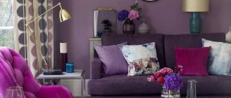
Traditionally, the layout of the living room is built around upholstered furniture - sofas and armchairs are located in the center or along the perimeter of the room overlooking the TV or fireplace. You can place coffee tables in the middle or along the edges. You can see examples in the photo.
Place other furniture, such as a chest of drawers or chairs, which will complement the living room functionally. In the center of this composition you can place a soft, cozy carpet. In the living room there is space for flowers and trees in tubs, paintings and family portraits. Memorabilia and souvenirs can also be placed here - they are pleasant to look at during moments of relaxation and can be shown to guests.