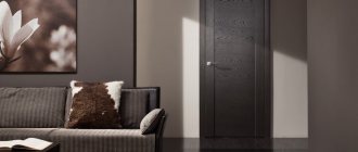
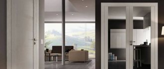
Choosing an interior door is quite difficult. Manufacturers offer a wide range of shades, decorative elements, and geometric shapes. Doors in coffee tones and cappuccino colors are considered a classic option. They fit well into any interior and enhance it.
Wardrobe with cappuccino colored doors
Psychology and features of color
The color of the cappuccino is quite light. It is slightly darker than beige, but lighter than brown, therefore it occupies an intermediate place between them in color tables. In psychology, dark brown tones are perceived ambiguously by a person: they can be associated with withering, fallen leaves, and melancholy. But light tones of brown are “warming” colors: they literally radiate the warmth of the hearth. They are usually chosen by people over 30 years of age who already strive for peace, but prefer to do this using fashionable solutions.
The color of cappuccino reminds not only of coffee, but also of natural landscapes, animal skins, and it is also associated with cakes and pastries, evoking pleasant thoughts. That is why cappuccino is used to create a certain atmosphere and ensure comfort in the home.
With sufficient lighting, walls, especially glossy ones, begin to glow, so this shade is well suited for northern rooms. In general, there are several tones that are combined into the “cappuccino” group: from yellowish to grayish.
Cappuccino is used very often in interiors because it has the following advantages:
- the ability to completely change the appearance of a room without drastic decisions (by introducing furniture, textiles, decor);
- relevance in all types of premises and in almost any style;
- compatibility with many popular colors;
- Suitable for large and small spaces.
Cappuccino is suitable for the background in the room, but it can also be used as an accent, as well as as a decoration for the ceiling and floor. This allows us to consider it universal, which only increases the list of advantages.
This is interesting: Solid wood doors: advantages and features (23 photos)
Peculiarities
Interior doors influence the appearance of the interior of the room as a whole. For a successful combination of floors and doors, the rules of tone matching are used: warm doors - a warm tone, and cold ones - a cold tone, and the law of the trinity, which will be discussed below. The door leaf should be lighter than the laminate or several shades darker. You should not take risks when choosing the same solution for the color of doors and laminate - you can get a dull interior, however, it can be used to advantage if the walls have a dark, expressive color.
With proper design, interior details create an overall picture of the room, where each of its elements is complemented by the other. The place of the door as an object in the design of a room is one of the key ones. Fitting into his interior style, it should look impeccable, look good against the background of laminate, furniture and materials used for wall decoration.
Also important are such interior items as trim, baseboards, door sills; as well as accessories.
What colors of laminate and door look best in combination, so that the latter does not blend into the decor or irritate the visual perception with excessive contrast? These and other features of choice are offered below.
Attention
To prevent these shades from being “lost” in the interior, you should adhere to several color rules:
- It is undesirable to use “flashy” colors in the interior, because they will create an imbalance.
- It is better to make the walls a little darker or lighter than the doors.
- You can enhance the color of the doors by complementing the interior with decorative elements in the same color.
Of course, you will choose the colors to decorate the room yourself, based on your own perception of color, but designers give several recommendations regarding the combination of cappuccino shades in the interior.
Important information
The concept of “cappuccino color” itself is very vague. In addition to the fact that it has many shades, you also need to understand that each manufacturer has its own. Thus, at the output we can get almost two different tones. You can see the cappuccino-colored doors that our company offers in the photo below.
Cappuccino doors in the interior: interesting combinations (20 photos)
Choosing an interior door is quite difficult. Manufacturers offer a wide range of shades, decorative elements, and geometric shapes. Doors in coffee tones and cappuccino colors are considered a classic option. They fit well into any interior and enhance it.
Wardrobe with cappuccino colored doors
Cappuccino color door materials
The choice of interior paintings is made based on a number of conditions: the attractiveness of the appearance and the style of the room. An equally important role is played by the building materials used in the manufacture of doors.
MDF cappuccino door
Tree
Cappuccino doors in apartment interiors, made of wood, are strong and reliable. Spruce and oak are traditionally considered the most durable species (Karelian birch was very popular in the 19th century). A light brown wooden interior door will suit any setting (with the exception of modern urban styles). Here are the main advantages of wood:
- the ability to create original carved and stained glass decor;
- reliability and long service life;
- beauty and originality of natural wood texture.
Cappuccino front door
Among the disadvantages, the rather high cost should be noted. Also, if there is high humidity in the apartment, the wood may become affected by fungus.
Typically, wooden door panels are installed in rooms (living room, bedroom, children's room). It is better to choose a different material for the kitchen or bathroom. A door made of coffee-colored wood, separated by elegant carved decor or glass inserts, will go well with a Provence-style interior.
A dark brown door with glass inserts will create a cozy atmosphere in your hallway or study
MDF
Doors made of cappuccino-colored MDF are lightweight and considered environmentally friendly. They will look good in a kitchen where the walls are decorated with light brown or light gray plastic panels. The main advantages of the material (in design and technical terms):
- go well with antique furniture and can be used in the living room interior;
- resistant to high temperatures, so they are perfect for a kitchen or room with a fireplace;
- thanks to a wide range of shades, it’s easy to match wallpaper, linoleum, floor and wall tiles to MDF doors;
- easy to process, so manufacturers often decorate the product with carved patterns or stained glass;
- MDF is a soundproof material, it is good to use when decorating a bedroom.
Blind door cappuccino
Branded doors made from this raw material are very expensive, and low-quality doors are quickly destroyed by water. Therefore, experts do not recommend installing them in the bathroom, or in homes where there are pets.
The cream color, vaguely reminiscent of coffee with milk, is ideal for the hallway. It fills the room with sunlight
Veneer
Very beautiful, easy to care for. Also, recently a new type of this material has appeared - eco-veneer. It is resistant to fungus and mold and does not cause allergic reactions, which is why it is often used to make entrance doors to children's rooms. The canvas will go well with furniture made of the same material, but of a different color. Main advantages:
- ease;
- decor consisting of stripes of different lengths and widths (vertical, horizontal, zigzag) goes well with geometric patterns laid out from tiles on the floor (walls);
- looks great in combination with massive glass inserts;
- the price is much lower than that of natural wood, although in appearance it is practically no different.
Cappuccino doors
There is also a drawback: to give the veneer strength, the door must be varnished. If the manufacturer uses a low-quality substance, then there is a high probability of developing allergic reactions (especially in children). Therefore, it is better to install veneer doors in the kitchen, bathroom or hallway.
A door with original decor immediately attracts attention
Plastic
Interior doors in cappuccino color, made of plastic, are light in weight, so they are easy to install. Plastic is a material that has many different shades of brown: from soft and delicate vanilla (for children's rooms) to dark, almost black. The advantages are as follows:
- well suited for children's rooms, since the presence of a plastic door significantly reduces the risk of injury;
- goes well with brown panels, which are often used for cladding bathrooms, hallways and kitchens;
- installation and dismantling can be done independently, without resorting to the services of a specialist;
- High quality plastic with an original texture, like veneer, may look no different from wood.
Cappuccino door in the living room
The main disadvantage of the material is that plastic instantly ignites in a fire, releasing dangerous toxins. In this regard, some experts, for safety reasons, do not recommend using doors made from this raw material in the kitchen. Also, plastic does not go well with antique furniture, so it is not always appropriate in the living room interior.
Paneled cappuccino door
Such doors in combination with a mirrored table surface will look good in a studio apartment where the office is combined with the kitchen. You can choose either a solid door leaf or a model with geometrically correct glass inserts (square or rectangular).
Veneered cappuccino door
A cream plastic door with decor visually increases the space
Metal
Metal door leaves in mocha or cappuccino colors will look good in high-tech or industrial styles. Advantages of the material:
- increased strength;
- metal of any coffee shade has a characteristic shine;
- light brown steel doors make the atmosphere more restrained;
- if the wallpaper, floor and ceiling in the room are pale, then a coffee-colored metal structure can become the main bright spot of color in the room.
Cappuccino doors in classic style
Among the disadvantages, it should be noted that the presence of metal doors in the interior implies the presence of other objects made of this material. If there is nothing else from this raw material in the room, you should at least lay metallic linoleum. Silver laminate would also work.
Cappuccino door with glass
Metal will look good in the hall or in the office. However, it is not recommended to use such doors in the design of a bedroom or children's room: they look bulky and heavy. You should choose light shades, since the abundance of dark can have an unpleasant effect on the psyche.
Steel cappuccino door
Cappuccino door with decor
TOP design solutions
The use of cappuccino interior doors will be an excellent choice for arranging any type of premises. With them you can easily add coziness and a touch of tenderness to your interior.
- Paneled cappuccino doors with frosted glass inserts look good in studios with a lot of mirror surfaces.
- Cream-colored plastic doors with organic decor expand the space well - convenient for decorating children's and playrooms.
- Metal cappuccino doors in combination with silver laminate or metallic linoleum are suitable for decorating a corridor.
- Doors with inserts in the form of horizontal stripes are suitable for low rooms, as the inserts visually increase the height of the room.
Cappuccino doors delight both owners and their guests. When using these products in office premises, the calm coffee-milk shades will not irritate either company employees or their visitors.
Cappuccino: characteristics and purpose
For the interior, both the shape of the product and the color are important. The play of shades creates an impression; with their help, you can adjust your perception and visually change the proportions of the room. So the color palette of the door turns out to be very important.
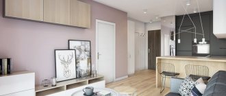
Hallway in light design
Cappuccino or coffee with milk is not limited to just one shade. This is a rich range of light brown color, rich, but delicate - this is exactly what this drink, beloved by many, is. This includes all imaginable grayish, pink shades, meling, milk chocolate, creamy velor, creme brulee and so on. The vast majority of them belong to cold tones.
Cappuccino doors
In the interior, light interior doors perform the following functions:
- visually increase the space. The fact is that light, and even more so cold tones visually distance the surface, which makes the room more spacious than it actually is;
- a light tone close to white allows you to separate the colors. If the room is overloaded with bright shades, a beige interior door allows you to structure the palette;
- the shade reflects light well, which makes the room not only more spacious, but also brighter;
- The neutrality and variety of cappuccino allows you to combine it with furniture, flooring and wall decoration in a variety of shades. So, with dark walls and floors, a light door creates a pleasant contrast. And with a light floor covering, it forms a single whole with it, which makes the room more spacious;
- Coffee with milk goes well with different textures: velor, for example, or smooth gloss. Velor creates a feeling of coziness, and shine will make the room brighter;
- cappuccino does not stain: house dust is hardly noticeable against its background, so there is no need to maintain perfect cleanliness all the time.
Hallway design
This is interesting: Brown door: classic combinations (25 photos)
Selecting a shade
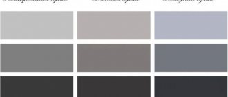
Cappuccino-colored canvases are distinguished by colors from brown (American and Italian walnut, wenge, milk and dark chocolate), to mocha and Scandinavian walnut. Gray tones also stand out: ash cappuccino, paloma and ash wenge, light gray metallic.
- The choice in favor of one shade or another is made based on individual preferences and the overall style and color scheme of the room. Those who like contrasts are better off choosing light colors against a generally dark background and vice versa.
- If pastel colors are preferable, then you should take a closer look at suitable shades of the same tone.
Coffee shades of doors
Interior doors in a brown palette occupy first place in the ranking of demand. The color of coffee with milk has many shades. The most popular ones will be discussed further.
Cappuccino door in the apartment
Nut
This color is well suited for doors to the bathroom, kitchen or hallway. For the bathroom, you should choose models treated with a special moisture-resistant coating to prevent mold from appearing on the surface. The main advantages of walnut canvases:
- the door looks impressive;
- any decor is suitable, including stained glass inserts;
- goes well with both light and dark colors;
- Comes in different shades, so each product is unique.
Looks best in a classic style. Brown would be an ideal option if you choose antique or modern antique-style furniture for your apartment.
Cappuccino door in the bedroom
Wenge
It will fit perfectly into the room if the surroundings are decorated in light brown or light gray colors. Main advantages:
- original texture;
- doors made of wenge are practically not affected by fungus and parasites;
- goes well with classic dark brown skirting boards, which are found in most apartments;
- goes well with synthetic materials (for example, plastic).
Cappuccino swing door
Very often accordion doors are made from wenge. They usually have a matte surface, but some manufacturers make it glossy or decorate it in the form of photo printing.
Cappuccino door in the hallway
Red tree
It fits well into an interior that actively uses black. The advantages of this shade are its noble appearance and dark matte surface, on which no dirt is visible. However, there is also a significant drawback - the abundance of mahogany sometimes gives the apartment a gloomy look. To solve this problem, you can liven things up with a light-colored rug.
Art Nouveau cappuccino door
Teak
Looks impressive. Doors of this color are best suited for decorating the entrance to a living room or bedroom. The advantages are as follows:
- the possibility of creating a relief or, conversely, convex decor imitating carving;
- beautiful natural wood color;
- It is convenient to apply photo printing and decor from self-adhesive film on teak doors.
Among the disadvantages, the high price should be noted.
Sliding door cappuccino
Where is the best place to put it?
Cappuccino doors are appropriate in any interior:
- Wooden cappuccino doors are usually used in living rooms, bedrooms, and offices. In living rooms, cappuccino gives the room space and status. However, when installed in rooms decorated in a youth style, cappuccino doors carry an accent of restraint.
- In offices where a lot of wooden items are used for the interior, cappuccino doors act as a color separator.
- Doors made of eco-veneer are usually installed in the kitchen; they meet safety requirements. The color resembles your favorite drink, and through this it not only improves appetite, but also gives the process of cooking and eating a good mood.
- Coffee-au-lait doors look good in the entrance area: corridor, hallway, toilet and bathroom.
A soft, calming, non-committal color attracts and emphasizes the individuality of any room.
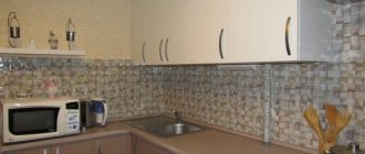
Kitchen cappuccino
The interior, made in this style, looks very natural. The color of cappuccino has a number of shades, depending on the intensity of gray, yellow and beige.
Impact on humans
The kitchen area, designed in a cappuccino tone, has a calming effect, bringing a feeling of stability and unity with nature. The very name of the color is associated with the coffee drink adored by many.
The shade of cappuccino is neutral. It cannot be classified as either warm or cold.
Advantages and disadvantages
The list of advantages of cappuccino color includes:
- use in various interior styles;
- great variability in the design of kitchen units;
- visual increase in room space;
- the shade of cappuccino is considered very noble;
- harmonious combination with wood, glass and stone;
- the color is suitable for rooms of any size and layout;
- variability in the degree of saturation.
The disadvantages of cappuccino tone in the interior are considered to be:
- mandatory presence of contrasting elements;
- overuse in design gives the kitchen a dull look.
Amount of color in the kitchen
To correctly plan the intensity of the shade in the kitchen, it is recommended to follow three rules:
- Use a color wheel to create the perfect balance with supporting tones.
- Dilute darker colors with lighter ones.
- In a coffee-colored kitchen, give preference to a glossy set.
Combinations of tones
The color design of doorways is not limited to monochromatic solutions. There are many other variations to create a sophisticated door look. To prevent the product from looking tacky and tasteless, you need to remember how to choose and combine colors correctly.
A favorite technique is contrast. It involves a combination of shades of opposite tones on the surface of the product. The classic version is the contrast of dark and light. In wooden structures with glass, light and dark brown shades of wenge are used. The contrast is usually made between the door arch and the surface of the product itself. The arch is often decorated in dark colors, while the door remains light.
Doors are often two-tone on different sides. This solution is resorted to if two adjacent rooms are decorated in different styles. In such a case, it is important to remember the compatibility of colors so that when opened, the structure looks presentable. For greater harmony, you can create a similar pattern on both sides or add a glass texture to the product.
Among the combined colors of doors, combinations of light green and coffee are popular. Gray color is combined with yellow or red. Brown and light colors can be considered a classic ensemble.
The noble shade of “black apricot” harmonizes with delicate shades of blue, while ivory combines with chestnut, and black with red.
Some styles use multi-colored models, the area of which is divided into color zones. Such products can even be designed in acid colors, combining turquoise and yellow, pink and green shades.
For two colored doors located close to each other, you can use the geometry technique and use figures of the same shape. This is done so that the design of the products does not differ too much from each other, and the doors of different rooms look harmonious in the common space.
Combinations with other colors
Cappuccino harmonizes best with “close relatives”: light brown, nut, beige, sand, gold, caramel, chocolate. No less beautiful is the combination of colors such as cappuccino with white, black, gray, wheat, ivory, champagne, olive. A light coffee tone can become the basis for shaping the interior, so richer accents will look great against its background:
- pink;
- blue;
- red;
- cherry;
- lilac.
Despite the variety of possible combinations, designers often use the three most popular duos with cappuccino.
White (vanilla)
The lightest shade of the palette is so delicate and beautiful that it will suit absolutely any color, including cappuccino. White will visually expand the space, give the room airiness and lightness; it is best included in the interior of small rooms. Vanilla is considered a warm undertone of white. It is not as cold as snow-white, so it looks better in rooms with windows facing north. In combination with cappuccino, white can be used as a background or used in details.
Beige and cream
Both shades are neutral, so they suit any color palette. Usually beige is used as the base color in a room: wallpaper, wall paint, and plaster can have this color. In the kitchen, furniture in beige tones is often used: a set or a dining group. Paired with cappuccino, the interior will look expensive, elegant, but at the same time homely. In a small room there is no need to add dark tones, but in spacious rooms you can introduce chocolate or black notes.
Olive
The olive shade is considered soft, warm, and is very beneficial for a person’s mental health. The combination of cappuccino and olive gives the interior a closeness to nature, therefore it can be diluted with other woody and sunny tones, as well as green. A duet of cappuccino and olive can be used to decorate a kitchen environment made in rich colors to reduce the excessive brightness of the colors.
Popular colors for interior doors to an apartment
The main function of interior doors is to separate two different rooms. The most popular colors are the following.
Cappuccino color
The cappuccino color is a classic. This tone fits very harmoniously into most interiors and ennobles it. The range of cappuccino colors is rich, so choosing the right tone will not be difficult. Shades such as melinga, milk chocolate, creme brulee, etc. come here.
Cappuccino-colored doors in the spacious hallway of a modern apartment
If the room is overloaded with different colors, a cappuccino-colored door can successfully balance the riot of colors and will also go well with any furniture.
Ivory
The advantage of light doors is that they can bring together all the disjointed attributes of the room. This color matches almost all furniture colors. Such doors in apartment interiors are often used in Provence, country, vintage and even baroque styles. These doors will find their harmonious reflection in Art Nouveau and Art Deco styles. This color will bring lightness, cleanliness and airiness to the interior.
Ivory color can be found in most classic interiors
It is worth installing an ivory-colored door and absolutely, the room will visually become much taller and wider.
Color bleached oak
Often on the Internet you can find photos of bleached oak doors in the interior of an apartment. This color is gaining popularity. A touch of aristocracy and dignity, chic and nobility will be brought into the room. Pairs perfectly with styles such as Scandinavian, Provence and country, vintage, classic, and will fit perfectly with any modern stylistic trends.
Door “bleached oak” to match the color of the floor skirting boards
Color dark ash
The use of this color adds elegance and nobility to the interior. Very often used in the design of living rooms and halls.
Doors “dark ash” in a room with window frames of the same color
And others
Doorways in an apartment are rarely decorated in shades such as stained oak, wenge or black.
Wenge doors look very stylish, but are quite expensive
Such colors are used less often, as they can visually make the room smaller. Most apartments are not large anyway, so dark doors are not very popular.
Product design
Cappuccino-colored doors in the interior can be classic, high-tech, or country. The shade allows you to highlight the texture of the product itself - milling, glass inserts, patterns, so the principles of any style can be implemented in interior doors of this kind.
- Classical - usually deaf. They serve as an excellent separator in a classic interior, which is characterized by a large amount of predominantly dark furniture and dim wall decoration.
- Baroque - rich carvings are not too noticeable against such a light background. But milling or moldings with a golden patina look absolutely luxurious.
- Art Nouveau style offers curved contours of glass inserts or asymmetrical relief decorations. On a beige background, all solutions are equally effective.
Design selection
When choosing the design and design of interior doors, they rely on personal preferences, as well as compliance with the interior design.
It is imperative to take into account the characteristics of the premises. Simple hinged doors are beautiful and provide good sound and thermal insulation. But it is not always convenient to use them, especially with large doorways. In such cases, folding or sliding doors are used. Pendulum doors are coming into fashion.
Door leaves are made both with glazing elements and in solid form, without any inserts. Doors with inserts add airiness, charm, mystery and lightness.
Color combination options
The most harmonious combinations are obtained by combining the shade of cappuccino with those closest in the spectrum, including:
- brown;
- walnut;
- gold;
- chestnut;
- beige;
- sand;
- chocolate.
Basic neutral colors that look good with cappuccino:
- black;
- grey;
- snow-white.
To dilute the interior and accentuate the light coffee canvas, you can use:
- bright red;
- cherry;
- grassy green.
It is not recommended to combine more than three colors.
White top - bottom cappuccino
Vanilla cappuccino
The kitchen shade of vanilla and cappuccino is close to pastel yellow. The best combination can be obtained if you choose matte coffee with milk as the main tone. This interior will have a positive impact on the psychological state of the residents. The design is stylish but unobtrusive. A great option for a small kitchen.
Use to create an accent
The cappuccino tone will be an ideal complement to a bright kitchen space made in the following colors:
- any pastel;
- light pink;
- cream.
Most often, countertops and aprons are decorated in this way. A combination of light coffee-colored lower cabinets, gray household appliances and retro elements will look interesting.
Using color in interior design
The shade of cappuccino is ideal as a background color in private storey houses where there is a lot of interior space. In the corridors and hallways of apartments, they are generally limited to only this version of brown. The main target rooms where coffee coffee is used are the hallway and bedroom. To a lesser extent, this applies to offices, bathrooms, kitchens and children's rooms.
The dark beige shade is similar to the pure color of cappuccino, and together with the latter it is popular as an alternative or replacement for brown. Solid brown rooms, supposedly classic, are gradually becoming a thing of the past, because light shades better reveal the features of objects, and the transitions between light and dark provide a wide field for the designer’s work. In the interior, coffee color looks much more organic if the corresponding color is naturally present on materials and fabrics.
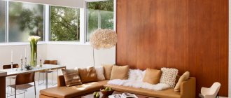
In the living room
Spaciousness and status - that’s what cappuccino color can give to a living room. The shade is combined with mirrors, crystal, ornaments, precious stones, and gilding. Coffee walls will organically emphasize the level ceiling or decorative elements on it. The light brown design has moves to combine technological details with luxury objects into one. The shade of cappuccino is played with curtains, shutters, lamps, carpets, capes. This often happens naturally, because these items usually match in color and “approach” a light brown tone.
Light shades of coffee also solve opposite problems. The furnishings are given sloppiness, simplicity, roughness - as, for example, in lofts. The industrial living room shows off more than the rest of the rooms combined. The shade of cappuccino is also suitable for a room in a restrained youth style.
To roughly understand how the living room wallpaper will look at different times of the day, its surface needs to be illuminated with a flashlight.
In the kitchen
Cappuccino-colored furniture fits perfectly with white walls and ceilings of kitchens - even if it doesn’t look as technologically advanced as green, blue and purple tones. The softness of the light brown color improves appetite, which is useful when eating and preparing food.
The light brown shade harmonizes with bright lighting and patterns. It also appears in the kitchen along with wooden inserts and wooden refrigerators.
Light coffee color is used in minimalist kitchens to avoid bright colors. We are also talking about kitchens in studio apartments, where they use every opportunity to unload the space.
Lighter shades of cappuccino are better in every way. For dark and cramped kitchens, for a light background, for an unusual dark design with the need for contrast. Light combinations make stripes and transitions much better.
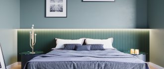
In the bedroom
There is no more suitable place for a shade of cappuccino than the bedroom. Soothing colors from a neutral or warm range are helpful in a room. The inhabitants “love” the coffee walls surrounded by a white ceiling, floor and textiles. The fabrics themselves come in cappuccino colors, from blankets to upholstery.
Light brown flooring finishes solid dark gray bedrooms, all snow white in Scandi style. Defiant red rooms are diluted with transition zones and partitions, which are made coffee, yellow, and white. Sometimes shades like cappuccino are given the role of inserts, door panels, and headboards.
Those who want to add brown color to the bedroom and lack options should think about patterns and wallpaper. You can allocate only one wall for this. The view will be excellent; it is not necessary to decorate the entire space this way.
Popular colors for walls:
- coffee and gold;
- cappuccino color, white and yellow;
- light brown, gray and silver;
- coffee and pink.
In the nursery
In this case, coffee shades are rather an exception, because adults try to decorate children’s rooms as brightly as possible. Cappuccino color is more suitable for teenagers' rooms. There you can arrange something unobtrusive in the spirit of a provincial setting or on an environmental theme. The younger generation will benefit from large shelving, spacious drawers for things, and light brown and coffee tones are commonplace for wooden items. A touch of cappuccino won't hurt if your child has a lot of soft toys. Light brown imitating animal skin will be included in a single color combination. The theme is developed by distributing “little animals” throughout the room.
A hint of cappuccino will not hurt where a small child under 2 years old sleeps and plays. We are again talking about the relaxing properties of the brown palette. Children cry less if there is no provoking color in the room.
In the office
Coffee color is sometimes replaced with banal brown. Offices usually have a lot of wood, so the idea of at least diluting the brown with light furniture elements or wall color is not a waste of time.
In the classic design, cappuccino color is used for the central sections of the walls. Paintings are often hung on a coffee background and figurines are placed. In addition to the usual green, red and brown upholstery colors, you can occasionally see a shade of cappuccino.
The coffee shade is meant to be dominant, so it's worth trying to arrange a bright office. In this sense, they implement something like a home office with a light desk and modern lamps. In a dark office with a classic design, you can purchase original coffee-beige armchairs and the same sofa.
In the bathroom and toilet
In the bathroom, coffee color is present on ceramic tiles, sanitary ware, and sometimes on wooden objects. As for the latter, we are talking about shelves, bedside tables, organizers, hangers. Coffee is one of the alternative shades for baths. White fonts are replaced with colored ones to emphasize the cost of finishing materials.
In bathrooms, a combination of brown and white colors is often used, and instead of the first, sometimes only coffee is used. This way they emphasize the texture of the cladding, making the room lighter and more spacious. There is another way to saturate your bathroom with the color of cappuccino. The shade of the screen, for example, paintings.
In addition to a light coffee-colored bathroom, an equally equipped toilet would not hurt. Single-color walls are diluted with several dark borders, but more often two main colors are used. The restroom is equipped with dim yellow lighting.
Types of kitchen units
All models of kitchen sets are divided into two groups:
- ready;
- modular.
A finished set is a complete set of furniture, finally developed by designers. Such sets are selected to fit the size of the room, but cannot be radically changed. The modular model is a constructor for the buyer. A unique cappuccino kitchen is assembled from individual elements.
There are several types of kitchen layouts:
- linear;
- parallel;
- island;
- corner;
- U-shaped;
- peninsular.
It is better to purchase a linear kitchen in cappuccino color for a cramped room. The location for this option is the area along one wall. A parallel cappuccino kitchen set is installed in a walk-through room and occupies two opposite walls. Corner furniture makes it possible to free up half of a medium-sized room. The classic U-shaped set occupies three adjacent walls. Suitable only for spacious rooms. Island and peninsular structures are equipped in studios where the apartment requires a distinction between the dining area and the living room.
Glossy or matte surfaces
The advantages of gloss are as follows:
- spectacular appearance;
- visual expansion of space;
- with proper care, furniture does not become outdated;
- countertops do not deteriorate from water and household chemicals.
Disadvantages of the cappuccino kitchen gloss coating:
- requires constant cleaning;
- fingerprints remain;
- inability to hide scratches.
- functionality;
- durability;
- scratches, dust and other contaminants are not visible.
Cons of kitchens with a matte finish:
- insufficiently presentable appearance;
- lack of possibility of visual expansion of space.
Design experts recommend choosing a glossy set, despite the increased need for care.
Shade palette
The list of cappuccino color shades includes:
- sand;
- dark beige;
- zinnwaldite;
- light khaki;
- walnut;
- pink-brown;
- color of withered foliage;
- light clay;
- ocher.
Latte
A cappuccino-colored kitchen made in this tonality is distinguished by sophistication and nobility. The shade of a latte can improve your mood. Due to the popularity of this color, the process of purchasing furniture or finishing materials will not be difficult. There are no visible stains, drops of water, or dust contamination on the surfaces of countertops and walls. Glossy furniture creates a visual effect of expanding space. Great for classic interiors.
Chocolate
The color of chocolate cappuccino is recommended for spacious rooms. Looks best with the following tones:
- white;
- brown;
- black;
- grey.
The best option for a cappuccino-colored kitchen set would be furniture with matte fronts.
Cocoa
A soft and universal tone can create a harmonious interior. Has a beneficial effect on the psyche. The sophistication of the shade makes it ideal for a classic interior. Refers to cool tones due to the presence of a slight admixture of gray. Combines with pink, lilac, mint and marsh.
Headset manufacturing materials
It is not recommended to choose plain furniture. It is best if the upper tier of cabinets is the same tone, and the lower one is darker. This will create an ombre effect.
The best materials for making a set are wood and stone. However, light coffee-colored wood is rarely seen. In addition, very fragile wood species are painted in similar tones. The surface of MDF furniture is veneered in the required shade. Headset models covered with glossy PVC film look great.
The magic of cappuccino: about the benefits and design abilities of color
Café au lait – this is how the color of a cappuccino is simplistically defined, relying solely on visual impressions. These are, first of all, light neutral shades that create comfort. They do not irritate, emphasize individuality and delight with color variations that fit into any decor. All these advantages explain the popularity of cappuccino-colored doors, which look equally good in large halls and small living rooms. Sizes do not matter; such canvases are valued for their unobtrusiveness. Their appearance decorates interiors, emphasizing nobility and intelligence. By installing cappuccino doors, you can achieve amazing results:
- Increase space. Optically adding square meters, such doors visually expand the boundaries of the room.
- If the room is overloaded with bright shades and there are too many flashy elements in its decoration, cappuccino color will balance this rainbow ensemble and make the interior less “flashy”.
- Light shades are good in any environment. Let's say you are one of those who prefer black and dark brown furnishings. By choosing a cappuccino-colored door, you don’t have to worry about the result. This shade allows you to achieve not only a calming effect, but also obtain beneficial contrasts. Completely different shades within the same room create chic compositions where there is nothing superfluous, and each decorative element takes on a special meaning.
- Cappuccino color is an excellent source of soft, unobtrusive radiance and an additional dose of light. For dark rooms with limited natural light, this is an ideal option.
- Light shades of the door structure mask not only the shortcomings of the premises. On coffee-colored doors, dust and abrasions are practically invisible, and this simplifies daily cleaning. Problems can arise with serious stains; they will be noticeable against a light background.
- When choosing a coffee-milk shade of an interior door, it is not necessary to focus on the color of the furniture, flooring and walls. An approximate match will be sufficient. It is no longer fashionable to subordinate the entire interior to one color scheme; it is boring and monotonous. It’s best to play on the versatility of the cappuccino color and use the door leaf to enliven the room with clever tint contrasts.
There are a lot of color advantages for cappuccino doors. It remains to understand other, no less important advantages and pay attention to the material and reliability of the design.
—>
Principles of creating an interior
When planning the interior, the main thing is to exercise moderation, otherwise staying in the room for a long time will be uncomfortable. This especially applies to the choice of contrasts and determining their quantity. Cappuccino should play the dominant role, all other colors are added in smaller quantities, although reverse combinations are possible.
In the kitchen it is better to use washable coverings: wallpaper, panels, which will be not only stylish, but also practical. Overloading the room with too dark tones should be avoided: usually an accent wall or textiles or decor in richer shades are enough.
If cappuccino is used, in addition to it, it is undesirable to introduce more than two colors into the interior in one room. It will look pretentious and unnatural, and the natural magic of cappuccino will be lost.
In any room, you should follow the rule: light colors are used at the top, darker ones at the bottom. In small rooms, it is recommended to select the lightest furniture for cappuccino-colored walls and install white or beige interior doors: this will create the impression of expanding boundaries.
Other important rules for room design:
- if the interior seems boring, you need to introduce 2-3 bright spots into it;
- you should avoid an abundance of gray and black in combination with cappuccino - the atmosphere will become gloomy;
- Cappuccino loves a combination of different textures, for example, wallpaper and plaster, or heterogeneous types of furniture facades, wood and rattan, and cork.
Walls
The choice of color for the walls is directly determined by the quality of the lighting. If the room's windows face north, it is better to choose only warm light colors for decoration. Southern rooms usually have excellent natural light, so they often use cool shades of cappuccino with a grayish undertone.
How can you decorate the walls? Depending on the purpose of the room, the coffee-colored material may vary:
- ceramic tile;
- paint on putty or drywall;
- decorative plaster – bark beetle, Venetian, stone-like, etc.;
- washable or paper wallpaper;
- natural and artificial stone;
- brick;
- tree;
- panels, including stone-like ones;
- cork;
- bamboo.
Cappuccino in the color of the walls is perfect for all the most popular styles. The color is ideal for hi-tech, minimalism, classics, modern, Provence. Depending on the style, natural or modern synthetic materials, gloss and matte finishes are welcome. In the kitchen, it is popular to decorate the apron with tiles of a contrasting tone, for example, chocolate, in combination with a light coffee set. The walls can also have a beige color, while one of them is made an accent: painted cappuccino or pasted on a fresco or photo wallpaper in these colors.
Light floors are usually chosen for small rooms to visually expand the space. If the room is dark, then light flooring will be the best solution. Where dimensions allow, use darker colors for the floor: chocolate, coffee, to create an interesting contrast with the walls.
In the kitchen, you can use a checkerboard type of floor finishing - a combination of white, beige tiles with cappuccino-colored tiles. It is possible to manufacture a self-leveling floor, which will provide an expensive, aristocratic look to the room. The most economical finishing methods are laminate and linoleum, which are sold in a wide range and include different cappuccino shades.
Ceiling
Choosing the right shade for the ceiling is very important: the overall appearance of the room will depend on it. Before painting or installing a suspended ceiling, you need to take into account light levels, square footage, and the color of large-sized furniture: sofas, walls, furniture. If you decide to use cappuccino for the ceiling, it is better to choose the most delicate, pastel colors: they will add airiness.
For low ceilings, you should also choose the lightest colors or still prefer white paint. A suspended ceiling can combine white and cappuccino: usually the center is decorated last, and the edges are made snow-white.
Doors
Often, choosing a tone for door panels is difficult. The door can be in harmony with the floor, baseboards, or be contrasting or repeat the shade of the walls or textiles. The darker the background of the doors, the more austere the interior looks.
Lighting Features for Color
The central chandelier is used more often than other light sources. We are talking about a lamp decorated with crystal, fabrics and metal with decorative patterns. The choice of lighting power depends on the brightness of the cappuccino color. A conventional strip of spotlights will make a shade that is too light watery. In this case, only two additional lighting lamps and 4 more spotlights will be enough. The latter are selected and placed in the way that is most convenient. Yellow lamps above the large sofa will come in handy in the living room. They buy white ones for the kitchen and install them above the apron. In the nursery, a play corner is allocated and lit in a way that is best for the child. The bathroom is made either very bright or in muted colors. In the bedroom and living room, devices are installed that provide diffused light. They buy floor lamps and wall sconces. Increasingly, they are being replaced by modern conceptual analogues.
Wallpaper selection
Wallpaper is a traditional way of finishing a wall surface. Options for kitchens should be particularly practical. You can use washable wallpaper.
It is impossible to cover the kitchen with liquid wallpaper - it swells from excessive humidity. The following types of wallpaper are recommended for the kitchen:
- paper;
- non-woven;
- glass.
The type of cladding can be as follows:
- plain;
- textured;
- patterned.
The presence of large flowers and squares in the composition of the wallpaper pattern is unacceptable.
Apron material and color
Tile is used to finish the apron. Select one of the accent colors:
- cherry;
- grey;
- green.
When creating the background, pastel shades or white prevail. Dark colors can only be used in spacious rooms. In a corner kitchen with coffee-colored facades, you can make a bright lime apron. You can create a “confectionery” decor on the surface of the apron. For example, draw coffee beans or a sketch of a cup with steam above it.
About color: properties, characteristics and psychology of color
The color is a caramel shade, which is observed in the drink of the same name. In the interior, light brown tones are often used, especially cappuccino - fashionable, soft, non-irritating and non-allergenic. Designers note the compatibility of this color, neutrality and ability to create transitions in light and dark interiors.
Cappuccino is a light "version" of brown, which is created by mixing two, three or four of the common colors - red, orange, yellow, green, blue and purple. The shade of the popular drink has a pink tint.
An environment with a predominance of shades of coffee drinks makes people feel protected and calm. The light brown design evokes thoughts of a delicious drink and sweets like milk chocolate. Residents and guests perceive the color of cappuccino almost always positively.
Color balance in finishing
To create a harmonious balance of colors, you need to carefully consider the design:
- flooring;
- doors;
- ceiling.
Flooring
The following floor covering materials can be used:
- linoleum;
- tile;
- laminate.
The most suitable colors are coffee with milk, light and dark wood tones.
It is not recommended to install parquet in the kitchen.
Ceiling
Light colors visually increase the height of the ceiling. Dark shades visually lower the ceiling level by several centimeters. A good option would be coffee-colored stretch fabrics.
Doors
Door decoration can be done in a coffee tone. The color of the doorway and the floor covering match in many design compositions.
Window curtains
It is better to decorate small windows with Roman blinds. Another design option is a lambrequin, which can be sewn to order. On standard-sized windows, it is recommended to hang thin tulle surrounded by thick coffee curtains.
What does the tone of cappuccino go with?
The good thing about cappuccino color in the interior is that by choosing suitable furniture elements, you can, without making drastic changes in the room, update the decor and give it a different accent.
The following cappuccino color combinations are possible:
- Cappuccino goes with all shades of brown. If you add dark brown walls or wallpaper in this tone to caramel-colored furniture, the set will sparkle with new colors.
- A grassy green shade would also work. The walls can be painted a light green color or you can choose wallpaper of this range. In the same tone, you can add several green shelves to the cappuccino furniture.
- You can match the cappuccino-colored wallpaper with white, gray or black furniture.
- Caramel washable wallpaper in the kitchen is combined with a set with rich lilac facades, cool blue upholstery, and bright red interior accents. In order not to overload the appearance of the room with bright colors, you can decorate only the tabletop and curtains, the upholstery of chairs in these shades, or paint one wall in a contrasting color.
Kitchen in coffee tones
It is not recommended to combine more than 3 shades in one room. Accents can be minor - a rug on the floor, the color of the lampshade, etc. In large kitchens, black furniture will look harmonious, since a light caramel shade visually enlarges the space, and dark objects neutralize this effect. In small kitchens, on the contrary, it is better to select white furniture for the cappuccino walls.
How to get a café au lait shade?
Light wood in a cappuccino melinga shade is rare. The fact is that, as a rule, soft wood has light colors, and it is not possible to make an interior door from it. Denser wood is always darker.
Glazed doors cappuccino
However, you can get a shade close to melinga by choosing young walnut, ash, or linden. Oak is not suitable for this task, as it has a pronounced honey tone, and pine is no less bright golden or even orange. The same applies to veneer, since veneer is a cut of natural wood. In the photo there is a door in the color of coffee with milk.
Treated and painted wood, of course, can be of absolutely any shade. The options may be different: the paint can lie tightly and completely cover the wood pattern: this is usually done with relatively cheap wood. More valuable species, such as walnut and oak, are painted so that the wood structure is preserved.
And finally, cappuccino interior doors made of eco-veneer. This is an artificial material, which means it can have any shade and at the same time imitate any wood. Eco-veneer allows you to get the tone of cappuccino meling on “wood”, which is generally not characterized by such a light tone. Eco-veneer reproduces any texture, but is also highly resistant to moisture and temperature changes. This option can be safely installed in bathrooms and kitchens.
Different rooms of the apartment
The color of cappuccino looks especially beautiful in the kitchen. If the room is small, you should choose light furniture with dark elements. At the same time, they buy light-colored facades, and dark-colored tabletops, chairs, and lamps.
In the living room, cappuccino-colored wallpaper is matched with sofas and armchairs with brown upholstery made of leather or fabric. The ensemble is united by a coffee-colored carpet. As lamps, you should choose floor lamps and sconces. Bright lamps irritate the nervous system.
Cappuccino is especially suitable for the bedroom, as it allows a tired person to relax. It is undesirable to clutter the bedroom with many objects. A bed, bedside table and linen closet are enough.
The use of cappuccino in the office has its own characteristics. The walls can be covered with wallpaper of this color, but the upholstery of the chair, lamp, and paper folders should be bought in a bright color to activate mental activity.
Lamps and decor
The following types of lighting are used for coffee kitchens:
- LED spot;
- chandeliers;
- backlight;
- mixed.
The advantage of LED strips is that they do not take up much space and can brighten and decorate a room. A chandelier with a lampshade will look good. The backlight can be chosen with patterns or plain.
Decor items
It is recommended to give preference to light, natural fabrics with a rough texture. A collage of photos depicting sweets or coffee beans is suitable for wall decoration. Vases and beautiful souvenirs should be placed on open shelves. You can place a set of cups on a stand on the tabletop. It is permissible to complement the design with indoor plants.
What styles can it be used in?
Cappuccino's uniqueness as a color is evident in its mixability and relevance to a long list of styles. The shade is considered a presentable version of brown, which is a real find for a modern interior. The color of cappuccino will not be out of place in a glamorous setting, Provence and loft styles, modernity and classicism, mixed in technological and ethnic directions. Pure brown, as well as white, gray and blue tones, for all their popularity, are inferior to cappuccino.
In a modernist design, a pinkish coffee hue will highlight intricate shapes in plain and dark brown tones, creating eye-catching contrasts. The color is suitable for the role of background. Thus, it is used in the interior rooms of houses in the classicism and baroque styles. In the high-tech style they use plain glossy furniture with a cappuccino finish. In lofts and rooms in the spirit of the province, coffee tones are combined with textures and textures.