Successful kitchen design depends in many aspects on the color palette. For the right design solution, you need to choose the main, dominant color, as well as shades that will complement it. It is important to choose shades that are in harmony and match each other, because with the help of one color or another you can hide some imperfections, or vice versa - emphasize and highlight the advantages of your kitchen.
Every housewife dreams of an exclusive kitchen interior.
What to look for when choosing tones
To choose the right color for your kitchen, you need to follow a few basic rules:
- Use no more than 3 (maximum 5) shades
Most of the space is occupied by walls, flooring and large kitchen furniture. Most often, they become decisive when choosing a range and neutral, natural, unobtrusive colors are selected for them. You can dilute a simple design with a few bright accents; this will give the kitchen brightness, unusualness and exclusivity.
With your own hands you can create an unsurpassed and unique project using vanilla tone.
- Combine colors with each other
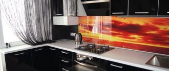
The color combination can be monochromatic. That is, you choose a specific color and select its various shades and variations. This solution will give the room calm and tranquility. The main thing is not to make the room too boring and uninteresting; to do this, we recommend playing with contrast: using both dark and light shades of color.
Vanilla is considered a neutral shade because it balances between warm and cool.
Advice. If we talk about contrast, you can generally choose different colors, but which will definitely combine and complement each other. Such a non-standard choice will make the kitchen expressive and original.
- Design in the same style
The color palette of the kitchen often depends on the choice of style:
- classic;
- Provence;
- Art Deco;
- Scandinavian style;
- loft.
All of them imply a characteristic set of color schemes. So don't lose sight of this.
At different times of the year it can be felt differently, it also depends on the additional lighting in the room.
Vanilla only
If you want to implement a real monocolor in your kitchen, you should consider the following rules:
- vanilla color has many shades, but this does not mean that they all need to be used in one kitchen;
- It is imperative to consider lighting, since dark and light areas will create contrast;
- You need to play not only with shades, but also with textures, textures, and materials.
Of course, implementing an interior in a monocolor style does not mean that other colors cannot be used. But, they can only occupy 10% of the space and be used exclusively for accents. Combining colors is an important stage in design development.
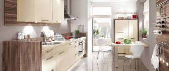
Vanilla finish
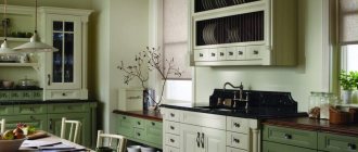
Delicate and attractive vanilla color is popular among kitchen designers. This prevalence is explained by the uniqueness of the color and the huge number of shade variations. This tone can be either cold or warm and belongs to a range of different temperatures. Therefore, a vanilla-colored kitchen is a reasonable solution that allows you to create many design variations and realize your most beautiful ideas.
In psychology, this color is described as a shade that has a beneficial effect on a person’s emotional state, since it gives a feeling of comfort and security.
Vanilla finishing will create a cozy atmosphere of warmth and friendliness, relaxation and tenderness in the room. The main thing to remember is that since vanilla color is quite neutral and universal, you need to carefully consider the transition of the color scheme from dark to light shades.
A room with a vanilla-colored set always evokes an appetite, because thoughts of something tasty and sweet arise in your head.
Combination with wallpaper, curtains and decor
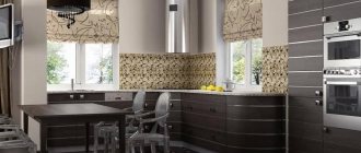
Wallpaper for the kitchen should not only be moisture-resistant and wear-resistant, but also aesthetically pleasing. Soft and delicate shades go well with milk-colored kitchens: beige, sand, pink, brown, olive, lavender. Depending on the style of the interior, the pattern also differs. For example, for a kitchen in Provence or retro style, pastel canvases with images of small roses are suitable, for an oriental style - contrasting and bright materials.
The choice of wallpaper also depends on the size of the room. For small kitchens, plain light-colored canvases or wallpaper with vertical lines are suitable. This technique will visually raise the ceilings and the kitchen will seem more spacious. It is not recommended to use large prints, photos or 3D printing in small rooms - the room will become even smaller.
Classic white tulle or light curtains go harmoniously with the dairy kitchen. Thanks to their transparent structure, they allow sunlight into the room and make the room fresher. If desired, curtains can be decorated with discreet tiebacks or satin ribbons. This combination is especially appropriate for country and Provence. Blinds or Roman blinds are also considered an excellent option for the kitchen. They are practical and easy to care for, effectively protect from sunlight and fit into a minimalist design.
Decorating a kitchen is an interesting and exciting process. Using accessories, the room is zoned and accents are placed. The following elements go well with a milk-colored kitchen:
- a vase with artificial roses or lavender sprigs;
- napkins, towels and potholders in delicate colors;
- wall still lifes or landscapes;
- candles;
- stylish tableware in pink or white;
- Natural flowers;
- multi-colored storage containers;
- soft covers for chairs;
- decorative mosaic on the wall;
- travel memorabilia.
Furniture in vanilla color: style and comfort of choice
A kitchen set in vanilla color will visually make the space wider and more spacious. Therefore, this solution is especially beneficial for owners of relatively small kitchens. Vanilla colors in classic furniture look incredibly attractive, and elements with shades of gold and platinum will add special sophistication to it.
Vanilla tone is becoming increasingly popular in kitchen design.
Note! Also, when choosing vanilla-colored furniture, you need to decide which surface to choose: glossy or matte. A more stylish option would be gloss; it will add bright colors and shine to the interior.
It is not necessary to use only one specific style; you can organically combine classic and hi-tech.
Glossy or matte kitchen set
The glossy version has its own characteristics. Thanks to the reflection of light, the room is visually enlarged and appears brighter. Such coatings are easy to wash, although they still leave a lot of streaks and stains.
Smooth, shiny surfaces are indispensable in modern high-tech or minimalist kitchens. One of the disadvantages is that ordinary products are not suitable for cleaning glossy furniture: only mild detergents, for example, glass cleaner. For dry cleaning, use a soft microfiber cloth.
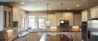
Matte surfaces are more discreet and fit harmoniously into a classic interior. Due to the porous structure, scratches and roughness are not visible on the facades; matte furniture is easy to care for. High-quality matte sets are made mainly from wood. You can wash matte facades with dish soap or soapy water.
Color combination: what to focus on
With a vanilla finish, almost every possible color will look visually attractive and harmonious. Any other shade will match the vanilla tone.
Vanilla can be used in furniture design both as the main color and as a finish.
- Light colors (from white to cream) will create an even brighter and more welcoming atmosphere in the kitchen.
- If a too light color scheme does not suit you, you can add red, wine, and purple colors. They, combined with vanilla, look luxurious, elegant, rich and expensive.
- It would be best to choose darker tones, such as burgundy, mocha, eggplant, etc.
- A kitchen combining the color blue with vanilla will be an original solution for the juxtaposition of two different colors that perfectly complement each other.
Adherents of natural style design can also freely choose the color of vanilla in the kitchen interior. After all, it blends organically with natural wood surfaces and various shades of brown. You can choose light wood, dark, antiqued wood, or a zebrawood wood surface that will add amazing brightness to your kitchen.
You can highlight the work area and make it darker, as can the chairs and dining area.
Which apron and countertop to choose?
For a vanilla kitchen set, you can use dark colors for the apron and countertops. Black, dark brown, burgundy, emerald and graphite look attractive.
A light tabletop and a similar apron give it a homely, cozy look. Imitation of stonework in a light beige shade or white marble looks expensive and stylish. Most often, amber or light wood, white acrylic, ceramic tiles or milky beige stone are combined with vanilla facades.
Chocolate and cappuccino colors for kitchen interiors
Kitchen chocolate and vanilla, as well as a shade of cappuccino, do not require additional bright accents, since these shades are completely in harmony with each other and do not allow homeliness, boredom and banality into the interior.
This neutral tone goes very well with wenge color.
In general, shades of cappuccino and chocolate are considered the most attractive and suitable for kitchen decoration. They create a friendly atmosphere conducive to family gatherings, conversations and communication.
Wenge itself is a very dark tone, you can slightly dilute the situation and use chocolate instead; some people prefer coffee.
It is also worth noting that these colors look especially elegant, chic and noble. They are ideal for lovers of coziness and comfortable space.
If you use a beige-brown palette, then there is no need to add accents.
Bottom line
Well, in conclusion, I would like to say that there is no need to rush in any matter. You need to study the question, proposal, select a design, and then search for exactly the elements you need. After all, the time and effort spent is a good price for the fact that you will feel great in your kitchen, and your guests will exclaim in surprise: “What a gorgeous vanilla kitchen you have!”
In the video presented in this article you will find additional information on this topic.
Gallery
Did you like the article? Subscribe to our Yandex.Zen channel
Great article 0
Secrets of vanilla kitchen design
The first and most important thing to remember is lighting! Lamps with warm light will give the room a special charm and coziness, and the vanilla-colored kitchen will become even more atmospheric. If you choose the wrong cool lighting, the color of vanilla can take on an unpleasant shade of gray.
Neutral vanilla cabinetry is a unique way to introduce a pale shade into your kitchen, allowing it to play freely with other colors and light.
It is better not to match household appliances with the kitchen, and also not to choose white. In this case, against the background of vanilla shades, the equipment will visually appear yellowish and old.
The simple lines and beautiful shape of the cabinets easily match the color of the walls.
Vanilla color should always be emphasized with bright details. The most successful accent options would be bright finishing elements, wood particles and tea or coffee decorating elements.
A muted vanilla shade combined with wood will change the atmosphere and make you feel comfortable inside the space.
Glossy or matte facades?
When choosing kitchen furniture, you should pay attention to the finish of the cabinets. Both matte facades and gloss have their advantages and disadvantages
When choosing the type of finish for a kitchen unit, you need to take into account the following parameters:
- room area;
- degree of illumination;
- style direction;
- how often the kitchen will be used.
Glossy furniture is more suitable for small rooms. Such facades reflect light and objects, visually expanding the room. Another advantage of gloss is the diversity of the palette. Manufacturers offer a wide range of colors, so finding a suitable shade will not be difficult.
The only disadvantage of a shiny surface is that all dirt is visible on it, including fingerprints. That is why such facades will have to be cleaned frequently.
Matte surfaces are more practical: traces of water stains and greasy stains are not so noticeable. But the matte finish is more suitable for classics. It is also worth considering that due to porosity, such facades are more difficult to clean.
Choosing a headset shape
What a vanilla kitchen will look like in the interior largely depends on the arrangement of cabinets:
Linear. A classic option in which floor drawers and large household appliances are installed along one wall. This arrangement of furniture is suitable for both large and small kitchens.
Corner. A corner-shaped set helps save space by containing everything you need.
U-shaped. With this layout, furniture is placed along 3 adjacent walls, and the sink is moved to the window.
Ostrovnaya
If the kitchen area is more than 13 m2, designers advise paying attention to this type of arrangement. It will make the room stylish and unusual
The island can be used instead of a desktop.
The last two arrangement methods are only suitable for spacious kitchens.
Combination with wallpaper, curtains, decor
Vanilla color is neutral, so you can choose any shade, both warm and cold. Vanilla can be the color of the headset or walls. There are no restrictions in the choice of finishing materials. The walls are decorated with wallpaper, tiles, textured plaster, wooden or plastic panels.
As for color combinations, the following options are considered the most successful:
- white, beige, cream, ivory;
- chocolate, coffee, cappuccino;
- pistachio, light green, mint;
- burgundy, purple, eggplant.
Another win-win combination is a blue kitchen with vanilla. This tandem can be used for both modern and classic styles. To make the room look organic, it is recommended to select equipment with metallized surfaces.
A kitchen in chocolate and vanilla is associated with something tasty, so the design is played up with the help of coffee or chocolate-themed accessories. All kinds of coffee pots, sugar bowls, spoons with unusual decor made of polymer clay fit perfectly into this design. You can hang pictures of coffee beans or photos of Italian desserts on the walls.
Another important decoration element is curtains. They can be combined with the main tone or contrast with it. If you want to use curtains as an accent, it is recommended to choose red, burgundy, purple curtains.
But it is worth considering that such curtains are only suitable for spacious rooms. For small kitchens, choose small curtains, blinds or roller structures in pastel colors.