Gray is a basic color, so it is often used in interiors. Available in numerous shades and undertones, it is ideal for creating interiors with clean, well-defined lines. According to Feng Shui, gray is considered the embodiment of metals. It has valuable qualities: it creates a neutral mood and gives peace.
Interesting! Scientists attribute the increased interest in gray to high levels of stress due to the accelerating pace of life. People are looking for a quiet and peaceful haven that will not depress or get on their nerves.
The ideal shade of gray is a mixture of black and white in equal proportions, but there are many other variations:
- Yellowish grey.
- Dark grey.
- Metal.
- Silver gray.
- Dusty grey.
- Platinum grey.
- Slate.
- Charcoal gray and others.
The mood of the entire interior will depend on which undertone you choose.
Important! Interiors consisting of only shades of gray are extremely rare. Such a design can depress and deprive life of color. But gray can be an excellent background for bright or pastel colors.
Using gray in the interior
Gray color can become the basis for the following interior styles:
- Classic. Gray shades can be combined with pastel colors (white, milky cream, beige). Furniture is mainly made from natural materials.
- Provence. As a complement to gray, you should choose light lilac, blue, pink. The interior turns out to be soft and delicate, and the deliberate coldness of gray is concealed by pastel shades.
- Art Deco. Gray can be combined with a monochrome palette (black and white) - you get a very stylish solution. Dark gray also looks great as accents. If desired, you can spot-dilute the interior with bright colors.
- High tech. In this interior, gray is a constant favorite. It goes well with red, black, white. It is also used as accents: chrome parts give it recognition and shine.
- Modern. Gray will be an excellent background for bright and rich tones - orange, red, yellow. Focus on unusual textures and prints.
- Scandinavian. Gray color goes well with white, beige, and natural textures. Minimalism and tranquility are the characteristic features of this interior. Avoid strong contrasts; the atmosphere should be calming.
- Loft. The “attic” style is not complete without gray. Gray paint can be used to paint walls or imitate the texture of brick. Dark gray roller blinds or sofa upholstery will be great accents. Don't forget about wooden beams and rough plaster - this is a feature of this style.
- Eco style. Neutral gray is complemented by natural textures: wicker furniture, natural textiles, stone. This simple technique will reduce the “urbanism” of gray and create an atmosphere for relaxation.
Gray color is universal: it can give the interior a calm elegance, or it can make it cold and gloomy. It is important to choose the right company for him.
Facade materials
Is a gray wood-effect kitchen your dream? Or do you want some other gray kitchen design in the interior? Let's look at the materials that will help you realize all this. This point is useful because it will help you speak the same language with furniture makers.
- MDF with enamel coating - the surface can be matte/glossy/semi-matte. The enamel tone can be selected according to NCS/RAL palettes;
- veneer/solid wood coated with paint;
- Chipboard/MDF coated with acrylic;
- laminated chipboard;
- Chipboard/MDF covered with plastic. In this case, plastic can imitate stone or concrete;
- MDF covered with PVC film.
What's better?
The most expensive and high-quality option is MDF with enamel or plastic coating. Such facades can be plain, smooth, milled, or textured.
A dark gray matte set looks great in a kitchen-dining room or living room. But if you have a small apartment and a kitchen space, for example, like in a Khrushchev-era building, then it is better to give preference to glossy options.
Of course, there are exceptions to the rules, but they are very few, and they are difficult to implement.
A light gray kitchen is a completely risk-free option because it will look great no matter the size of the room.
The benefits of gray
- It can become the basis of almost any style, it is universal. To spoil an interior in gray tones with unnecessary details, you need to try very hard.
- If you choose gray as the main background, you can always easily change the interior - just choose a different color for curtains or furniture upholstery - and your home will look different. This is much less expensive than a major overhaul.
- This is a practical color: it does not fade when exposed to sunlight and does not get dirty as quickly as light colors.
- Has a gentle effect on mood: helps relieve fatigue and tension.
A huge advantage of gray is that it can unite even incompatible and contradictory shades and elements. Experiment as much as you like!
TOP 7 designer tips for using gray shades
- Can be used as the main tone in a room of any size. It is worth remembering a simple rule: the larger the room, the darker the shades you can choose; in small rooms, limit yourself to a light palette.
- If your interior will be made in pastel colors, choose a light gray or pearl gray background. For bright accents, more saturated dark tones are suitable - graphite, wet asphalt, lilac-gray and others.
- Using the right combination of tones, you can emphasize the geometry of the room. You can visually enlarge the room by painting the ceiling light gray, and the niches and protruding elements dark.
- Be careful with monochrome interiors. Saturated gray color easily absorbs light, so the room can look gloomy. Provide high-quality multi-level lighting and combine several shades of gray.
- The right tone will help correct the shortcomings of the room. For very large rooms it is worth using cold light colors - silver, steel, for narrow and small ones - warm ones (yellow-gray, gray-green).
- In design, it is not advisable to use gray furniture of the same tone as the walls. If gray is the background, the furniture should be either very light or dark. The exception is small rooms, where some of the furniture is made in similar shades to appear less bulky. Often these are cabinets, racks, shelves.
- The gray interior itself can be called faceless. Be sure to use decorative elements that will attract attention. Posters, figurines, paintings, vases, green plants, photographs - everything is appropriate.
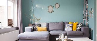
Advice! Gray color can also be used accentually. For example, a large gray shag rug or a sofa with a gray print will definitely attract attention. It is not at all necessary to turn to acidic and flashy shades.
Bedroom
As a rule, for many people, the bedroom is a place where you can hide from worries and hustle and bustle.
And the gray color has magical calming properties, which is very important
There is no need to adhere to monotony in everything. This amazing bed is proof of that.
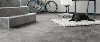
Wonderful dark gray flooring color.
It will be very cozy to sleep on such a bed, right?
Gorgeous print.
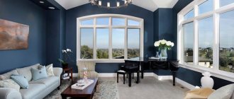
In the industrial space, steel color is indispensable!
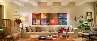
A nice combination of completely different colors.
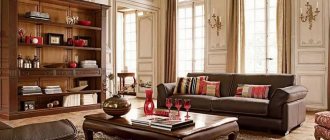
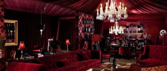
Luxurious men's apartments.
Don't want boring monotony? Gray has many shades (from pale to almost black).
Combination of gray with other colors in the interior
You need to choose a companion for gray depending on what result you want to get:
- Natural range. This includes natural colors and shades that are found in nature. Gray harmonizes best with them; the interiors are cozy and promote relaxation.
- Monochrome. This group includes similar shades (gray-beige, silver, gray-yellow) and others. It is important to use at least one dark and rich tone, otherwise all surfaces will merge into something inexpressive.
- Contrasts. Bright colors, as well as the classic black and white combination in tandem with gray, are an excellent solution for modern interiors. As a rule, gray serves as a background.
Successful and unsuccessful combinations of gray
| Gray + | Recommended Styles | Recommendations |
| Best color combinations | ||
| Black and white | Art Deco, loft, modern, minimalism | If you add more white, you can visually expand the room. Don't overdo it with black. |
| Pastel shades | Provence, Country, Classic | Give the interior airiness and lightness. If you want to make the room monumental, add dark furniture. |
| Beige | Classic, Modern, Scandinavian, Eco-style | The result is an elegant and seasoned style. The third color is dark chocolate. |
| Green | Eco-style, Provence | It is recommended to choose bright shades of green. Swamp and similar colors will make the room dull. |
| Yellow | Provence, Modern, Oriental and Ethnic styles | A simple rule: for dark gray - rich shades, for light - sandy and faded. |
| Red | Art Deco, High-tech, Modern | Choose bright and rich shades of red - they will add freshness to the monochrome design. |
| Turquoise | Modern, Eco-style, Mediterranean style | The third shade should be chocolate brown - it will be a great combination. |
| Blue | Marine, Mediterranean, Modern, Eclectic | Light shades of gray go well with blue. If you choose a very dark one, use a third color (white, red). |
| It is not recommended to combine | ||
| Burgundy | Gives the room excessive gloom and drama, creates an oppressive feeling | |
| Tan | Suitable only for warm shades of gray, may visually “dirty” the color | |
| Bolotny | Absorbs light, making the room darker and more uncomfortable | |
The best combinations with gray
Gray + black and white. This is an indispensable contrasting trio for minimalist interiors. If you give preference to light colors, you can visually expand the room. You can make one accent wall black and keep the others in light colors. Rough textures look stylish.
Gray + pastel colors. You can choose both warm and cool shades. They will make the room more voluminous and lighter. You can choose light, pearl or more saturated gray - graphite, cobalt gray.
Gray + green. It is more appropriate to make a light gray background with bright green shades. Do not use too dark shades - the interior will turn from lush to faceless and prim.
Gray + yellow. A cheerful and trendy solution. You can replace yellow with orange. Pinkish and pale yellow tones go well with light gray, and sunny yellow goes with dark gray.
Gray + red. Do not choose muted shades of red: scarlet, crimson, fuchsia look bright and fresh. Even a monochrome design will sparkle in a new way.
Gray + turquoise. This combination refreshes the interior and attracts attention. If you want to make the room darker, take the third tone - chocolate. Lighter - beige or sand.
Gray + blue. The rule applies: if you take dark blue, choose light, cold gray; muted shades go better with bright blue.
Important! Gray color loves light and shiny surfaces. It will go perfectly with bronze, glass, mother-of-pearl, and silver. Don't forget glass trinkets and mirrors!
In an instant, gray can give the interior an urban or light natural touch, it all depends on the companion colors! This is a great base color to experiment with!
More about colors in the interior:
- Green and its combinations in the interior
- Pistachio color in the interior
Ideas for images
Gray clothes allow you to create the most original color compositions.
♥ With skirt
One of the most versatile models is a pencil that will easily fit into your everyday or work set.
♥ Trousers, jeans
♥ Jacket, coat, parka, sheepskin coat
gray options
♥ Jacket, jacket, blazer
♥ Sweater, jumper
You can create casual sets with jeans (leather trousers) and ankle boots.
Wear a turtleneck sweater with a velvet pleated skirt, a leather bag and boots.
♥ Dress
This universal color must be in your wardrobe, because it is simply irreplaceable for those who like to experiment with shades in clothes, for those who like neutral tones in their outfits, for those who do not have time to select complex combinations.