When decorating your home, you will inevitably face the need to correlate several colors with each other. There are several basic rules, knowing which you can easily arrange any room. The article presents a table of color combinations in the interior, as well as many useful tips and theoretical materials. In this article you will learn about:
- color circle and the principle of its construction;
- tones that are used in a particular interior style;
- how to combine them correctly in the interior;
- how to choose shades and how to combine them.
We wish you happy reading.
Color combination in the interior of the room
Table of color combinations in the interior depending on the type of room
Since color affects a person’s psycho-emotional state and biochemical processes in the body, in rooms with different purposes, the combination of shades when decorating the interior will be different.
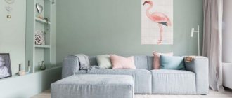
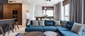
Living room interior
You need to be especially careful when choosing a palette when decorating rooms such as a bedroom and a children's room, since they are intended for relaxation. If done incorrectly, a person will not be able to rest normally, both physically and psychologically. Below is a table of color combinations in the interior, compiled by our designers.
| Room name | Recommended color combination palette |
| Kitchen | Soft and calm tones: yellow and turquoise. |
| Hallway | Tones that improve mood and digestion of food: green, beige, yellow, silver, as well as their combination with red and blue. |
| Color combination in the living room interior | Neutral, soft tones, which are diluted with bright accents. |
| Color combination in the bedroom interior | Pastel colors and shades of purple. Please note that the bedroom is a personal space, so there are no restrictions here, and it is decorated at the request of the owners. |
| Bathroom | Light colors with a bluish tint, as they give a feeling of freshness and cleanliness. |
Tetrad diagram
This scheme is similar to the previous one, but four colors are combined. Four tones are combined, which are located on the color wheel and form a rectangle. These will be two pairs of colors that are at the same distance opposite each other; they form analog combinations with each other, making the interior more balanced.
What is a color wheel, what principle is used to build the palette of color combinations in the interior?
Professional designers know how to choose the right palette of color combinations in the interior, so their work looks attractive and harmonious. To do this, they use a tool called a color wheel. What is it?
It is a symbolic representation of the visible spectrum of sunlight, which represents different color options. Over the years, different theories have emerged, so there are several circles:
- RGB:
- R.Y.B.
Color wheel
In sectors of the circle, shades are placed in almost the same order as in the spectrum of visible light, and to link the extreme tones, a conditional purple hue is additionally used
To better understand the correct compatibility, it is necessary to build a color wheel. A person distinguishes three main tones: yellow, red and blue. All others are obtained by mixing the main ones with each other, as well as the main and derivative shades. By mixing primary colors, composite colors are obtained, and the remaining empty cells are filled with third-order tones.
How to decide on a color?
There is a certain color wheel that was developed by a Swiss artist. It is perfect for choosing the right color scheme. The circle itself consists of as many as 12 parts, these are the primary colors, as well as the colors that are formed by mixing the primary ones.
In addition, there are six tertiary colors in the circle, which are obtained by mixing primary colors with additional ones. All colors can be divided into cold and warm. Neutral colors will be black, white and gray. These colors go well with other colors that can be found in the circle, and they also look good together. They can be used as a background for other colors.
Color combinations in the interior - layouts for different styles
When creating a specific design, you need to take into account not only your wishes, but also know and follow certain rules. This is the only way you can properly decorate your premises and avoid serious and gross mistakes.
Before studying the layout of color combinations in the interior, we recommend paying attention to the main points of correct design:
- choice of basis;
- the right combination of warm and cold tones;
- Warm colors are used to create coziness in a large room;
- in a small room, it is better to use cold colors, this will visually enlarge the room;
- when decorating a kitchen or dining room, keep in mind that shades can both enhance and suppress appetite;
- in the bedroom, the color palette of the combination of colors in the interior should provide a comfortable rest;
- For each interior style, experts recommend using certain tones;
Combination layouts
Each style has its own color scheme for combining colors in the interior. The table below reveals all the recommended shades when decorating a room.
| Style name | Recommended shades |
| Classical | Different tones, but must be white. |
| Provence | Blue, pink, light milky. |
| Eco style | Brown and dirty green. |
| High tech | White, black and metal color. |
| Baroque | Any pastel colors. |
| Modern | Green, blue, brown-beige. |
| Minimalism | White black. |
| Pin-up | Yellow, pink. |
| Loft | Green, red, orange, blue. |
| Country | Light yellow, brown, sand. |
| Futurism | Light green, white, ultramarine, lemon yellow. |
Complex combination scheme
This is one of the most popular schemes. It is absolutely universal and will suit any interior style. The main shades in this scheme will be white, gray and beige; they can be complemented with a variety of bright colors, as well as accents. If you want to change the interior, you can simply change the accent colors. After such a rearrangement of accents, everything will immediately sparkle with new colors. If you plan to create a classic interior, then you don’t even need to use a color wheel, you just need to use basic and bright colors. However, using a circle you can see what all these shades will look like.
Options for color combinations in the interior
Color plays a huge role in creating an interior; with its help you can create comfort and coziness, visually increase or decrease the space, so you need to take a responsible approach to such an issue as combination.
Complex combination
This option is considered universal. Classic shades are used, these include beige, gray and white. By combining these tones with others, you can create a classic solution that will always look modern and beautiful. In this case, you will not need to constantly change the interior of the room when buying new furniture, replacing flooring or other elements.
Complex combination
Triad or combination of 3 colors
The use of three primary colors, which always harmoniously combine with each other and can be used in equal measures. The combination of red, blue and yellow evokes a surge of emotions and cheerfulness. If they are used in their pure form, the result is a bright and rich solution. If you use halftones, the design of the room turns out to be less aggressive and more comfortable.
Triad of shades
The use of a triad helps fill the room with energy, so this solution is used to decorate the living room, sports rooms and children's rooms, but this design is not recommended in the kitchen or bedroom.
Similar combination
This option involves the use of 2-3 types of shades, which are located nearby in the color wheel. You need to choose the appropriate one in which you decided to decorate the room and select several tones in the color wheel to the right or left of it. This solution is simple and original, and choosing two or three similar colors is not difficult.
Similar combination
Separate-complementary combination
In a complementary combination, contrasting shades are used; they are located opposite each other on the color wheel. With a separate-complementary solution, instead of the color located opposite, choose the shade that is next to it. This allows you to create contrasting solutions, but they are not as intense as with a complementary combination.
Separate-complementary combination
Tetrad or combination of 4 colors
In this case, the scheme consists of a main color and there are two more that complement it, and the fourth serves as an accent color. This creates a rather interesting effect that evokes positive emotions. Basically, these colors are preferred by young people or people who are in constant motion and fast rhythm.
Notebook in the interior
Psychology of color perception for humans
When selecting color combinations when decorating premises, the peculiarities of the impact of different shades on the human psyche are taken into account.
Comfortable, bright, fresh living room environment
Eggplant
Symbolizes aristocracy and mystery. Equally suitable for both young and old people. It does not go well with all colors, so when choosing a “companion” it requires special care.
An eggplant-colored bedroom with a well-thought-out choice of finishing materials
Beige
Refers to color shade options that go harmoniously with almost all colors. This sophisticated tone has a calming effect thanks to its sophisticated notes. Has a quiet balancing energy.
Using beige color in interior design you can achieve maximum harmony of space and light
Beige goes well with brown and white; this tandem looks especially great when decorating a living room and bedroom
Spacious bright living room in beige color
White
It is considered the color of successful, self-confident people. Symbolizes concentration, purity, serenity. White space can energize, but if there is an excess of it, a person may feel empty, so it is important to combine this color with other shades. It is most often used for small spaces, as it visually expands them and blends organically with all other shades.
Beautiful design of a bright room in a modern style
White color is popular in many interior styles, but most often it is used in minimalist style.
Wenge
A natural color that serves as a sign of aristocracy and luxury. People who prefer this shade know their worth and value stability.
Luxury and brilliance in every detail
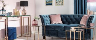
Blue
When using this tone as the main background when decorating a room, lightness and freshness are ensured. The blue shade symbolizes purity, calmness, and peace. It is relaxing, so it is good to relax in such a room. Often used to decorate a bedroom with soft purple, muted orange, chestnut, and red.
Stylish living room interior design with luxurious blue sofa
An unusual color scheme for a room in aqua blue
Blue color can visually enliven any interior, even the most boring and ordinary one.
Yellow
Given the brightness of this tone, do not use it as a dominant finish. It is considered the intellectual color of creative people, symbolizing knowledge, optimism, and warmth. Helps in replenishing energy balance, goes well with different shades.
Yellow color in the interior helps to concentrate attention, so it is often used in the office, living room, and kitchen. Can be included as an accent in a child's room. Creates a magnificent tandem with chestnut, green, and golden colors.
The combination of black and yellow in the bathroom interior
Psychologists say that the color yellow has a positive effect on a person’s emotional and physical state.
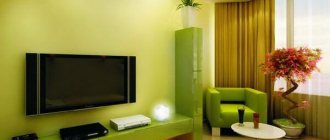
Green
Refers to varieties of universal shades. Symbolizes harmony, nature, naturalness. This color balances, calms and at the same time creates a working environment. Used in rooms of various functions. It organically coexists with yellow, white, orange, and black shades. It can be an unusual combination with red color.
Green color goes well with any colors, however, so that the interior does not seem overloaded, it is important to maintain a balance
A large green sofa has become the main accent in the elegant interior of a spacious living room
Interesting idea for wall decoration in a children's room
Brown
This practical, solid and elegant color is chosen to give the room respectability, luxury, comfort and coziness. The noble and velvety light brown tone helps you concentrate. It can be dominant and suitable for different rooms.
It is recommended to use dark brown color only as small accents. It harmoniously coexists with greenish-blue, silver, and golden tones.
Brown color can perfectly harmonize with most shades
Natural motifs in the interior of stylish apartments
Brown kitchen
Red
This bright fiery color is considered aggressive, so it is not used as a base background. Properly placed red accent spots improve mood, give energy, optimism, and confidence. It is recommended to include this color when decorating the hallway or kitchen in combination with a golden-yellow, blue, green, silver background.
Original lamps and flowerpots will help break up the monotonous red interior
Orange
This cheerful, invigorating, sunny extravagant color brings an atmosphere of warmth, comfort, and optimism to the interior. In order not to lose the festive, fresh energy, use orange as an additional tone in the decoration. Goes well with green, blue, chestnut, purple, pink, white.
A raw concrete wall provides the perfect backdrop for a stylish orange sofa.
The interior of an orange bedroom, which has the right combination of shades and colors
Pink
When using this romantic, delicate shade in the interior, you will be able to create an atmosphere of relaxation in which you can relax, get rid of anxiety and negative thoughts. It is recommended to combine it in equal parts with beige, cream or white. Brown, burgundy, and gray colors can serve as an accent.
Thoughtful to the smallest detail, the interior design of a room in the style of minimalism, the integral part of which is the color pink
Chic bed matching the color and style of the pink bedroom
Grey
With the right choice of shade of neutral gray, you can create a feeling of an elegant, stylish, noble atmosphere in the room in which you can relax and unwind. Gray is a universal shade that favorably emphasizes any color adjacent to it. It is considered the color of contemplation, intelligence, and self-absorption.
Apartment interior design in gray color
Regardless of trends and fashion trends, gray color in the interior will always be relevant
A successful combination of black and gray colors in apartment decoration
Blue
The calming and fresh tone embodies lightness, leisurely, and serenity. Blue tones in the interior help eliminate anxiety, bring peace and a feeling of coolness, and visually expand the space. In various combinations it is used in the bathroom and children's room. An excellent blue shade combined with a bold yellow color will fit into the living room. Can be used in tandem with red, golden, burgundy, silver tones.
Kitchen in white and blue
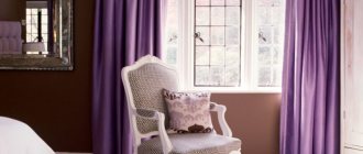
Violet
Mystical, mysterious, majestic color embodies nobility, wisdom, inspiration. It can have both a calming and energizing effect. Do not use a purple background as the main decoration. Organically combines with green, golden yellow, and orange tones.
A successful combination of contrasting purple color with other shades
Black
This refined, proud, solid color can, with the right selection of accents, play the role of the first violin. A black background in a bold interior can serve as a backdrop for almost all colors. It is used mainly in spacious rooms.
Black color in decoration, which is used as the main color, is suitable only for large rooms
Brutal masculine interior in black
The magic of color or the gradient effect in the interior
Gradient in the interior is a modern solution used to decorate various living spaces. It is based on a smooth transition from dark to light tone. This method can be used when decorating various interior details.
The gradient effect helps bring freshness and excitement to the room. Typically, designers use various shades of blue, as it gives a beautiful combination of colors in the interior.
Gradient effect
Experts recommend making the transition in such a way that the darker tone is near the floor and the lighter tone is near the ceiling, this will visually enlarge the room.
We select a combination of shades for different places in the room - a table with recommendations
To create a comfortable and cozy space in a room, it is important to choose the right color schemes when decorating the ceiling, floor and walls. With the help of a competent combination, you can breathe light and air into even a small room, and make a large room warmer and more comfortable. Further in the article there is another table of color combinations in the interior, which will help you choose the design of different places in the room.
| Floor, wall and ceiling design options | Recommended Solutions |
| Contrasting combination | The walls are made of bright colors, the floor is dark, and the ceiling is light. You can visually change the size of the room, hide existing shortcomings and highlight advantages. |
| Current gradient | The ceiling is light, the walls are a little darker and the floor is dark. The transition from a dark tone to a light one allows you to create harmony; this design is suitable for any room. |
| Light and air | The walls and ceiling are light, the floor is dark. Suitable for a small room with low ceilings. |
| Opposites | The ceiling is light, the walls are dark, the floor is light and vice versa. This option can be used in rooms with low and high ceilings. |
Combination of floor and doors
An important role in the design is played by the color of the floor and the texture of the doors. It is a mistaken belief that they must be the same color. Depending on the design decision, these interior elements can be:
- in one color;
- in a contrasting solution;
- white or painted doors and any floors.
Made in contrast, the doors are framed with a platband matching the color of the floor, or skirting boards are used to match their texture. The furnishings and decoration in such rooms are selected to match the door panels. It fits perfectly into the overall layout.
Psychology of color, or how it affects us?
Studies have shown that color affects a person’s mood through his subconscious. Perception is influenced by such factors as the state of health, age, social status of a person and his character.
Colors and colors
For women
Women are more sensitive to the perception of color and shades. There is no clear distinction between “male” and “female” colors, since each person is individual. Despite this, there are tones that women prefer more:
- blue, it has a calming effect and is loved by both women and men;
- green, associated with nature and the feminine, symbolizes health and tranquility;
- turquoise, this shade is one of the most favorite among women;
- purple – it is a representative of the “feminine” color, emphasizing the mystery and mystery of a woman;
- pink tones are associated with women, but this is not a preference, but a pleasant rule;
- Lilac color is also considered “feminine”, it evokes a feeling of romanticism and nostalgia.
Women and interior colors
With age, color preferences change; women love pink more, but give less preference to green than in their youth.
For men
It has been found that men perceive approximately 30% fewer shades compared to women. Often women are indignant that men cannot appreciate their efforts when choosing a color, but this is due to physiology, since for them pumpkin and peach colors may not be different from each other.
Men's perception of color
Most men prefer blue and its different shades. Some scientists believe that they symbolize it with clean water and clear skies. In addition to blue, men love green, but unlike women, they prefer cooler tones. Traditionally they like black, but most men cannot stand purple and pink.
For children
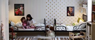
Newborn babies see everything in black and white and only after 2 months they begin to distinguish other colors. At the age of 2-5 years, they can already distinguish the entire visible spectrum. Children are attracted to everything bright, so they love pink, red, yellow tones, such preferences persist until the age of 10, after which the child may already like the blue tone and all its shades. Girls prefer pink and purple, while boys prefer blue and its shades.
How to choose good wall paint
On each package of paint or varnish you can find a special set of numbers and letters. To begin with, what are paints and varnishes? In modern construction, these include compositions in the form of powders or liquids, which on surfaces give the film texture or color. Paint and varnish materials, or paint and varnish materials, as they are called for short, include various primer mixtures, enamels, paints, varnishes, antiseptics and putties.
Varnishes are capable of forming a transparent film; they are usually used mainly for interior work. Putties are “inseparable” from primers, because one cannot be used without the other. These materials act as a kind of basis for the future layer of paint. Their main purpose is to prepare the surface and level it. Antiseptic solutions are applied to protect the surface.
Good to know! In order to make it clear what properties a particular paint or primer has, it is customary for manufacturers to apply special markings of letters and numbers, deciphering which you can obtain information about the required product.
Decoding alphanumeric markings
| The letters represent the base: | The numbers mean the following: |
| ShL – alkaline paints and varnishes | 1 – has increased weather resistance |
| BT – bitumen | 2 – protects against the negative influence of environmental factors |
| UR – polyurethane | 3 – not afraid of moisture |
| RP – petroleum polymer | 4 – is resistant to various oil mixtures |
| KCh – rubber | 5 – not afraid of chemical influences |
| – | 6 – conducts electricity |
| – | 7 – resistance to temperature changes |
| – | 8 – used for special coatings |
Combination of colors in the interior: curtains and wallpaper, as well as furniture - how to combine?
In most cases, textiles are purchased when the room has already been renovated and furniture has been placed. In this case, when selecting the right fabrics, many difficulties arise that affect the combination of colors in the interior. Curtains and wallpaper, as well as furniture, are much easier to select at the same time.
Successful color combination
The procedure for selecting the color of furniture and textiles will be as follows:
- determine the first and second basic shades;
- wallpaper is purchased in a light shade of the first color;
- furniture in two different colors of the second option;
- curtains should be made of fabric with a pattern consisting of the first and second colors;
- the same fabric will be used for decorative pillows;
- pillows can be made from fabric in a rich first color.
Bright room
This is a conventional algorithm and each designer can develop his own, but if you are new to this business, then focus on the described technology and you will be able to correctly design your home yourself.
What colors definitely won't go together?
There can be no categorical answer to this question. Modern fashion is characterized by extravagance and creativity. If earlier the combination of green and red in the interior was considered tasteless, now this will not surprise anyone.
Harmony and disharmony, or combination of colors in the interior - table.
When creating a classic interior, experts do not recommend combining cold and warm tones, but there may be small bright inclusions. If you want to combine contrasting colors, then it is better to do it with halftones.
Complementary scheme
This scheme is based on two colors. These colors must be located opposite each other on the color wheel. If you use this scheme, then both colors in your image will combine perfectly and make a pleasant impression. However, if you use bright colors, then there should be more of one color and less of the other, so the interior will look much nicer.
Combination of colors in the interior – 15 photos
In brown tones
In the recreation area City apartment Modern style
Cool blue tones
In red color
Relax zone
In a room with a fireplace In a country house
Green shades
In the cottage
In the kitchen
In the room with photographs
Cozy atmosphere
Mediterranean style
Warm and cool shades
Very often the circle is divided into two parts, where we perceive shades that contain yellow as warm. Such shades will create a feeling of warmth, comfort and coziness in a person’s soul, so with the help of these colors you can create a cozy atmosphere in your home. All of these colors are associated with summer, most often yellow, orange, red and purple.
If we talk about cool colors, then these are all shades that are close to blue, we associate such shades with winter, with them the house will feel cool and fresh, such colors seem very pure.