When creating an interior, it is very important to choose the color of the floor - this gray cardinal of the interior will certainly play its role. The right combination of colors of walls, doors and floors will help achieve any desired effect - from expanding to stretching the space. You don’t need to guess, because the laws of color combinations have long been developed by designers. Just use their tips to bring harmony to the interior of your home.
The combination of floor walls ceiling in the interior
Color combinations of walls, floors and ceilings can transform any room beyond recognition. By choosing the right shades, you can easily make the room visually lighter, more spacious and comfortable. Change the mood and atmosphere with decorations.
Create a formal living room, a strict, laconic office or a warm, gentle bedroom. We'll tell you how!
Monochrome and halftones
For several years now, interiors in the same range, but in different shades, have been in fashion. For example, combine a white ceiling with milky walls and beige laminate. Or bleached grayish parquet with gray walls and a tin-colored stretch ceiling - if you like non-trivial solutions.
This technique visually blurs the boundaries in the room and makes it visually larger.
Pale monochrome interiors are an excellent choice for rooms that are constantly lacking in light. But make the transition as smooth as possible and use only light adjacent shades. Avoid bulky furniture, too heavy textiles or bright massive parts.
If you have a large spacious room and you want to visually lower the ceiling, feel free to make it dark and the walls lighter. Cold gray shades on the floor and ceiling visually repel them, but warm brown shades attract them even more.
Light colors with a play of halftones are very popular in the fashionable Scandinavian style.
This is a rare example when walls that are darker than other surfaces do not narrow the room, but emphasize its geometry. Against this background, light wooden furniture and bright colored textiles look good.
Pastel colors
The absolute compatibility of everything with everything is the main advantage of pastel colors. This is a rare case where you can harmoniously combine 3-5 different colors at once. Due to the fact that they are muted, the decoration does not seem flashy and overloaded.
Pastel interiors are the atmosphere of French Provence and the eternal celebration of spring. They make the room visually lighter, lighter, airier, without pompous seriousness. This is a good choice for a bedroom, kitchen or girl's children's room.
Choose bleached wood laminate flooring or warm sand and walnut shades. It is advisable to make the ceiling a little lighter than the other surfaces - this will make the room seem larger and more spacious.
On the walls you can combine several colors at once: pink with lilac, blue with beige or lavender with turquoise. Use paint or companion wallpaper, alternate stripes, divide the surface in half or create accent walls.
But then it is better to take neutral and monochromatic furniture, without unnecessary decor.
In the kitchen, the floor, laid with a mosaic of multi-colored small tiles, looks interesting. It can be mirrored onto an apron above the work surface. Make the remaining walls one neutral beige or milky shade.
In fairy-tale children's rooms, multi-level ceilings that combine several colors look interesting. Combine fancy shapes from glossy canvases or make a blue ceiling “under the sky.”
Gradients
A smooth transition from shade to shade, which is also used in monochrome interiors, is called a gradient. But if monochrome interiors in general resemble monochromatic interiors, then gradients can be rich and bright.
For example, from white tiles to a red glossy ceiling through salmon walls. Or from a creamy ceiling through café au lait wallpaper to dark walnut laminate.
If you manage to find an intermediate tone, you can even combine two bright colors. On the walls there are very good transitions from pink to turquoise, from orange to blue and from green to purple. Modern interiors will be freshly complemented by a gradient from warm beige to graphite gray.
Contrasts
If you need to visually change the geometry of a room, your first assistant in this is contrasts. The principle is used in both classic and modern interiors.
Most often it is white and black, but any light or dark shades will do.
If the room has a low ceiling, paint it light and make the floor dark. Choose wallpaper with an elongated pattern, vertical stripes, or make one wall an accent wall. Avoid any wide horizontal lines in the decoration and interior that “cut” the height.
To visually balance a narrow room, make long walls light, and short walls dark and contrasting. This technique seems to compress the room in the right direction.
Make the floor and ceiling neutral, the furniture light, and bright accessories add color.
One of the classic combinations is a dark wooden floor with a white ceiling, walls and bright furniture. Light finishes with colorful details look good in modern interiors. And black and white classics are universal everywhere: from minimalism to artsy modernism.
Natural colors
Nowadays, naturalness in all its manifestations is in fashion: in materials, shapes and colors. Eco-style interiors combine all shades of wood and green. Other natural colors are used less frequently: yellow, red, blue, sea wave.
Complete the range with black if you need contrasts, or white if you need to add light.
A dark wooden floor with beige walls and a white ceiling looks good. They are combined with gray furniture and bright green textiles. And a corner with your favorite geranium or succulent seedlings in colorful clay pots will add freshness and life.
Wooden wall panels to match the laminate will help create the atmosphere of a country cottage.
Mediterranean style with rattan, woven floor rugs and turquoise walls also fits into the natural palette.
Cool and warm colors
Traditionally, we perceive warm colors as lighter and cozier, and cool colors as fresh and austere. In northern rooms, warm colors will greatly help maintain the mood. But in the south, cold finishing of walls and ceilings will save you during the summer heat.
It is recommended to use cool shades in an office or workshop - they improve concentration and help focus. But warm ones are needed to relax in the bedroom or feel that same feeling of home in the living room.
Previously, it was believed that the interior must be designed in tones of the same type. But now cold and warm contrasts fit well into eclectic fashion. For example, a restrained combination of gray and beige or an extravagant combination of red and blue. The main thing is that both shades are approximately the same brightness and saturation.
Practical tips for choosing the best color combinations
There are two universal rules when selecting colors for floors, walls and ceilings, which can be used in 90% of cases.
There is no need to read articles about what color and how to choose a floor, what goes together and what is not recommended for use. Remember that not a single advisor will live in your apartment, and accordingly, he will not “enjoy” the results of his recommendations. And since you live in it, then the decisive and final word is yours. All clever words about which color is friendly with which and which is not should be taken only as recommendations, and not a prerequisite.
The main rule is that the colors should be friendly to you and please you personally. If your tastes coincide with the opinions of the designers, great; if not, don’t pay attention to them, do what pleases you.
The color of the floor should match your favorite shades and match your psychological profile. These are two factors that have the maximum impact on the comfort of living in an apartment.
Conclusion - you can combine any floor colors with any walls and ceilings. But you can do this not only with pleasure, but also according to the rules.
First you need to familiarize yourself with two characteristics of color.
- Lightness. The hue gradually changes from standard to lighter or darker - the process of a smooth transition of color to white or black is called lightness change.
- Saturation. Changes when gray is added to the base color. As the concentration of gray increases, the saturation changes and eventually the color becomes gray.
Colors combine well if they have the same lightness, saturation, or both lightness and saturation.
Achromatic interior
To simplify the choice of floor color, you can use special color fans; they are sold in specialized stores. Each fan tab has a separate color with different saturation options. For ease of use, all shades have an international classification.
Laminate prices
Tarquette laminate
How to use color fans?
Step 1: Choose a wall shade that already exists in the room. Determine its location on the fan tab.
Step 2. Unfold the fan and pay attention to what colors the chosen shade goes with. All options are located at the same fan height.
Step 3. Decide on a suitable floor color option.
Color Guide
This is a theory, but in practice it is necessary to take into account the finishing floor covering materials currently in use. You should know their shades and focus on real options.
The combination of floors and doors in the interior
Until recently, designers sought to choose a single color scheme when decorating the interior. Now fashion trends are different, and the shades of doors, floor coverings, and baseboards may be different. The main thing is that the combination of primary colors is successful and corresponds to the main law of the interior: the trinity of tones.
Simply put, when selecting finishing elements, you should allow the presence of no more than three primary colors in one room.
Professionals have developed recommendations for choosing colors for doors and floors depending on the type of room:
- Kitchen. Due to the small size of the room, it is important to carefully select the color of the floor; it should not reduce the space or cause irritation. Light colors are more suitable: beige, white, yellowish, ashy, although for the washing area you can choose dark brown, chocolate tones of tiles or other finishing materials. It is also better to make walls and doors light, especially in low light conditions.
- Bathroom. Previously, designers believed that up to 50% of the bathroom space should be white. But now the opinion has changed: such a room looks boring, although it increases the brightness of the lighting. A good solution for walls is light gray, blue, light green, lavender colors. The floor is decorated in the same colors, but a little darker, the doors are also made light, dim. Brown doors are suitable for sand floors, which fits perfectly into the classic style.
- Hallway. This small room is the first to greet guests and creates the impression of home. Most designers prefer dark colors when installing floors, because they are more practical. In small hallways it is better to make the floor light or interspersed with dark areas in the center. The floor can be bright; it goes well with light walls and doors.
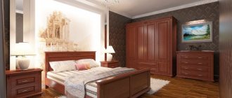
- Bedroom and living room. Here it is better not to allow extremes, too dark and light shades. The ideal option is cool or warm medium brown tones for the floor and slightly lighter for the doors.
What characteristics should you pay attention to when purchasing?
When a buyer chooses a laminate, he looks at the price, appearance, and sometimes the wear resistance class. The latter characteristic ceased to be important when production technologies were modernized and the market was replenished with Chinese brands. For example, coverage of class 34 from China may be inferior to class 31 from Germany. It is better to focus on the guarantee: if the manufacturer is confident in the quality, he will indicate a long warranty period.
All technical specifications are indicated on the packaging. Let's look at what markings are important if you plan to lay laminate flooring in a residential area:
- panel thickness: 8-9 mm is enough. If this indicator is higher, most likely the manufacturer used a material of low density. Such a lamella can bend under the influence of static loads;
- abrasion: for a corridor or dining room, the normal indicator is AC3 (W3). For a bedroom or nursery it may be smaller;
- moisture resistance: a must for the kitchen;
- density: from 850 kg/m3.
Sometimes icons are placed on the packaging, which also provide information about the product. This is convenient: the characteristics are clear, and it is easier to understand whether the coating is suitable.
- the image of shoes with heels is a sign that the laminate is scratch-resistant and furniture can be moved on it.
- if you see lightning, the coating is antistatic and does not attract dust.
- a picture with sun rays means that the decorative layer will not lose its brightness due to ultraviolet radiation.
The combination of floor and walls in the interior
- Dark floors and light walls will make the room appear wider. With this combination, a dark ceiling will reduce the height of the room.
- A dark floor and dark walls will create a closet atmosphere; it is not recommended for rooms smaller than 20 m2.
- Light floors and dark walls will highlight the contrast of the furniture and diversify the room, especially in combination with white wall decor.
- A light floor and a wall opposite the window will make the room deeper.
- A light floor and light walls will expand the room, but in combination with white furniture they will create a feeling of excessive sterility. To avoid this effect, add shades of warm wood to the interior in furniture - alder, walnut, beech, oak.
Painting laminate
I would like to note that if this coating is worn out and has an unsightly appearance, it is still better to simply replace it, since in general the difference in effort and finances is not very significant. But in this case, you can get a new floor covering.
But if you decide to paint the laminate, then it also needs to be prepared for the procedure.
First of all, you need to remove all the furniture, sweep the floors, and then thoroughly sand the laminate flooring. In this case, the paint will better adhere to the structure, and the coating will retain its original appearance longer. Afterwards you need to clean the floor from dirt; you can even wash it with a vacuum cleaner. Treat with a primer, and then, when it dries, you can paint. After the paint has dried, it should be coated with polyurethane or alkyd varnish.
How to choose the color of doors in the interior?
The combination of the color of doors and floors is very important for the harmonious perception of space, since the theater begins with a hanger.
Doors fit harmoniously into the interior when their shade matches the color scheme of the floor or contrasts with it.
- One color palette of doors and floors should be chosen for hallways when several doors open into one room, this way you can avoid confusion.
- The emphasis on the doors can be made using contrasting shades of the doors and floors, but in this case, the doors should be combined with the color of the furniture in the room.
- The plinth should be the same color as the trim to unify the composition.
The combination of the color of the floor and the doors in the interior gives us an idea of the room. You can choose a single palette or a contrasting combination, but try to adhere to the main rule - no more than five different colors in the interior.
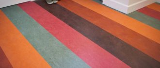
With patterns
The geometric pattern looks very interesting. You can create your own unique pattern. Or simply paint each board in different colors and combine everything together according to the scheme. Or, to begin with, you can play it safe and paint only a small area, making something like a small rug or path.
You can paint the floor a single color, and then draw an ornament or design in any order. Or select several colors and apply a design on top; this looks especially great in a nursery.
For small apartments, you can use the technique of separating zones, for example, the work area is painted in one color, the rest area in another, or the entire floor is painted in one color, but each zone has a different pattern.
The combination of a gray floor in the interior
Gray color is dearly loved by designers for its ability to be combined with most shades. It will add softness and texture to pastel palettes, dilute dark ones and soften complex colors, making them more natural.
A soft ash shade is irreplaceable in rooms with contrasting color schemes.
It removes aggression, makes a smooth transition in the contrasts of black and white, white and red, black and red.
Interiors that combine different variations of gray are stylish and elegant. In this case, it is better to make the floor in the lightest shade available or in the darkest. Bright details can add bright accents to a monochrome room. The latter can be yellow, orange, crimson, turquoise.
It is better if there are textiles, accessories, and finishing elements in a bright design. An excellent option is to paint one of the walls (or part of it) in the specified colors.
The gray floor forms a harmonious tandem with lavender, pale pink shades, as well as wine, pastel blue and green colors.
If we are talking about a room in a classic style, then it is recommended to use dark gold as a decoration.
It is recommended to combine a gray floor with doorways of the same shade. Another win-win option is a combination of a light gray floor with doorways and wenge or oak colored panels.
Thanks to the ash tone of the floor, wenge looks even softer and more elegant, and the oak shade looks even deeper and more majestic. By the way, wenge looks good with both warm and cold gray.
If the floor is a very light gray-beige, then milky, light brown and pastel doorways and doors will also work.
Gray color is capricious in combination with cold shades. The only exceptions are the blue and light blue palette.
Brown floor combination in the interior
When choosing dark brown flooring, you need to take into account the color scheme of the various elements of the room.
Chocolate coating goes well with light, gray doors.
The ideal option is dark brown floors and doors, beige walls with a white ceiling. The hanging canvas in such an interior is decorated with a gilded pattern. The classic combination is a dark, rich brown floor and snow-white doors.
Whatever material is used to decorate the walls, it is important to create a harmonious combination with the floor covering.
Modern interior design ideas allow you to create original design options. For bright walls covered with large-patterned wallpaper, choose a coating several shades darker. Light, pastel surfaces with floral prints and geometric patterns harmonize perfectly with dark brown materials on the floor.
The color of the baseboard for a dark, chocolate coating is determined by the capabilities of the room. They can be the same color and blend into each other. This is necessary when placing emphasis on other interior details. Often dark floors are edged with a white baseboard, which allows you to create a clear line of demarcation between surfaces.
For a brown canvas, choose a plinth of the same color or charcoal black (sometimes with gray veins).
Furniture on coverings the color of dark chocolate or a rich coffee shade looks more impressive if it has a different texture. Glossy floors do not tolerate a similar environment. Light wood balances the color scheme. The dark outline of the furnishings is combined with light upholstery, ornaments, and decorative elements.
Plain white furniture looks great on a dark brown floor.
A dark brown floor should not be combined with bright, flashy colors. He prefers calm pastel colors: beige, coffee with milk, caramel. Such a union provides warmth and comfort, creates conditions for relaxation and psychological relief.
The combination of white floors in the interior
All shades, from light to dark, go well with white. The selection of companion colors will influence the subsequent perception of the interior.
The classic combination is white with black and red. The contrast of shades allows you to highlight details and correctly place accents. An example would be the design of the floor in white, the walls in black, and the presence of red accents. Or, alternatively, a combination of black and white tiles.
White plus sunny orange and yellow lift your spirits and charge you with energy when choosing bright shades. Pale yellow and washed out orange and white look much calmer and more elegant.
The emphasis on purple is often made by creative individuals who have many interests and are constantly developing. The perception of design in blue and green, with the presence of a white floor, also depends on the selected shades.
It can be contrasting and catchy with bright blue and sleepy green, or create the impression of a romantic and soft atmosphere when choosing soft blue and light light green tones.
A multifaceted classic combination can be white, which is mixed with a brown range of colors. At the same time, the result is warm, creamy chocolate combinations that do not irritate the eyes and can serve as the basis even for a classic interior.
Features of the color of flooring in the kitchen
In the kitchen and in the hallway, unlike other rooms, you can use tiles or linoleum, which gives considerable scope for imagination. And there are no limits here, because in the kitchen you can put bright red, yellow, green tiles, and to avoid excessiveness, alternate them with white. By correctly combining this floor design with the tiles on the walls and the color of the facades, you will achieve a cheerful and cheerful atmosphere. In such a kitchen you will want to create exquisite and original dishes.
Related article: The most popular laminate flooring layouts
However, strict flooring colors are also popular in the kitchen. This is a classic style, Provence (How to decorate a kitchen in Provence style: tips and tricks), which has beauty realized in natural colors. The current trends in kitchen flooring are laminate flooring that imitates powerful oak floors in ash, chocolate and almost black colors.
When choosing Provence, keep in mind that the entire kitchen interior must match. Everything in a rustic style should be in harmony: textiles match the wallpaper, the shade of the furniture matches the floor.
Light brown floor combination in the interior
Brown color in the interior takes on special meaning. It symbolizes naturalness, naturalness and tranquility. Used in different styles. Goes well with all kinds of shades. Suitable for rooms of any purpose: kitchen, living room, office, hallway, bathroom.
It is rarely used for a bedroom or recreation room and only in lightened colors.
The brown shade is not recognized as the main one. It is obtained by mixing red and green tones. Therefore, when decorating any direction of the interior, it harmonizes so well with many tones of the palette.
It helps to unite all the colors that will be present in the room.
Brown and beige
This coloring remains characteristic of classic and Victorian interiors. In limited quantities, harmony of tones may be present in the loft and baroque directions. Beige and brown are similar tones. The interior immediately acquires pleasant and soft features.
This environment can be easily diluted with bright accents in the form of decoration and some pieces of furniture: chairs, poufs, armchairs, coffee tables.
In such a tandem, the role of the background is given to the lightened tone of beige. He must remain dominant. Brown will help focus attention on significant objects: dining area, tabletop, floor or wall accessories.
In rooms where beige predominates, a ceiling lamp or miniature wall sconces are decorated in brown. Such lighting sources are suitable for any room: kitchen, living room, hallway, corridor.
If the room has a large area, then complement the beige tone with a brown countertop, window sills or window frame.
Brown and white
The combination of brown and white remains relevant for any stylistic decision. This tandem turns out brown, symbolizing grooming and a sense of taste. Such harmony fits well into design styles such as modern, high-tech, Provence, and eco style.
For the listed areas, the use of several shades of brown is encouraged.
The outline of any room with a predominant brown color will be created by narrow baseboards, baguettes and door frames. Perfectly painted snow-white slopes on windows and interior doors will help improve the interior.
Don't go too overboard with white. A good option is equality of tones. A good combination of brown and white in upholstered furniture, living room armchairs, ottomans. Shades can be smoothly blending into each other or used proportionally.
In the bedroom, they try to use brown with restraint. After all, such a room should be in neutral colors that promote relaxation. The white walls of the room and the bright light from the window will be well diluted with dark brown curtains. The addition of a companion shade is welcome.
Turquoise or blue attracts attention. Its role is given to a chair or mini-sofa located according to Feng Shui for relaxation.
A strict minimalist or modern design looks good in a bedroom with a predominance of white and brown colors. Such harmony is used as equals. The dark wall at the head of the wooden bed looks good against the backdrop of natural light coming from the window. The effect of airiness, lightness and serenity is given by snow-white tulle from ceiling to floor.
Soft armchairs, bedside seats and bedside tables are chosen in the same style. They draw attention to themselves.
Brown and black
The combination of black and brown shades is appropriate for spacious living rooms, hallways, and corridors. Such harmony is appropriate for studio apartments or combined rooms. The use of shades in a retro style is typical.
A successful technique for such a tandem is brown laminate on the floor and black walls. The latter are coated with paint or decorative plaster. Several options for shades of the main tone are used: from dark brown to light: sand, mustard. The decor in the room is always done in richer dark colors.
The predominant materials are: parquet, tiles, laminate, wood. To optimize space and its functionality, strictly wooden furniture is used.
Rich brown is best left for upholstered furniture. In a black palette, choose ottomans, household appliances, and decorative elements: shelves, paintings, wall clocks. A matte charcoal shade in accessories will look good against the background of light brown, almost coffee-colored walls.
This situation will be diluted by a wall set with closed shelves. If it is open, then a plasma TV will take its place in the center.
Living rooms that have free space are decorated in dark tones of black and brown. The first can be seen in upholstered furniture finished with eco-leather; brown is used for walls with wooden paneling and parquet boards on the floor.
A TV and a floor shelf with a glossy glass facade will add richness to the room.
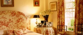
Brown and pink
The first place where brown color can be used in the interior in combination with pink is a children's girl's room. The main role is given to the light pink tone, which is used to decorate the wall at the head of the bed.
The bedspread is decorated to match the color of the walls. But the curtains and the area under the ceiling molding have a dark brown tone with white decoration. The role of adding a light brown tone is given to lamps with textile shades. They stand on white bedside tables.
In spacious adult bedrooms, brown acts only as an accent. It can be seen in upholstered headboards and throws. Oversized bedside tables with unusual fittings are made of dark natural wood. They are varnished, which gives the set a rich brown tint.
A combination of brown and purple shades looks good in any interior. But this option is very good for antique interiors: retro, rustic. Shades of pink are present in furniture, curtains, and decorative elements. The role of a dark brown shade is given to the ceiling beams, central lighting, and coffee table. If the house has a fireplace, then its doors are also painted brown.
Here one cannot do without a companion color for wall cladding. White, beige, peach or cream are suitable for this purpose.
Brown and blue
Blue is a noble shade. It is used for bedrooms, small rooms, halls and living rooms. Often present in the kitchen. This shade suits creative people, evokes positive emotions, encourages creativity.
Brown in tandem with blue can visualize space well. Therefore, it is used for small rooms.
A striking example is a soft brown sofa for the living room with blue throw pillows with a floral theme. The room should have plenty of blue and several tones of brown: from light to dark.
Lightened is used in laminate or parquet boards, looks good in wooden furniture: chests of drawers, bedside tables, as a frame for a glass coffee table.
A brown set made of natural wood harmonizes well with a soft sofa with blue square pillows. An elegant ornament and monograms are created as an accent. The decoration will turn out to be restrained if, in addition to the blue color, you add bright orange textiles or pillow cases to it.
A similar combination of brown with a predominant blue or turquoise is suitable for interiors in an old style. Brown pieces of furniture in a retro style and antique facade design fit perfectly into a room with high ceilings. The fireplace, located in the center and framed by stucco molding painted in a dark blue tone, will add an unusual effect to the living room.
Against the background of a blue wall, the following decor looks good: long vertical mirrors, photographs or paintings in frames, an abundance of lamps with round shades.
Brown and purple
Frame furniture made of wood with soft backs and seats is made of purple velor or other soft textiles. The wall is finished in brown and is made in the form of brickwork. Dark purple rugs are laid on the dark tiled floor. Transparent or perforated furniture is placed on top of them.
The decor includes metal ball ceiling lamps and a black floor lamp with ruffles.
Bedrooms in a modern style are well distinguished from others by the arrangement of furniture and the decoration used. The tandem of brown and purple fits well into the interior of the rest room. The headboard of the bed becomes a bright accent. The dark shade is repeated in the decorative pillows and pouf.
Otherwise, light brown walls go well with slightly darkened flooring.
A palette in which both brown and purple tones occupy the same proportions looks harmonious in the room. The latter belongs to upholstered corner furniture. The wall behind the sofa is finished in a light brown shade. A thin varnished board is used for this purpose.
The dark color of the armchair frame and coffee table in the center of the room adds variety.
Brown and green
A bedroom with muted shades of pistachio and brown will be original. In such an unusual design, an elegant high bed with lush pastel accessories in a green shade looks good. Brown predominates in armchairs, throws and bedside furniture.
Decorating in the form of a chessboard on the wall and bedside seat adds chic, uniqueness and richness.
A bedroom with a spacious bed and throws in brown and green still looks relevant. More suitable for modern and contemporary interior styles. In this combination, an equal ratio of tones is welcomed. This way the room will not be overloaded.