The brown palette is rightfully considered one of the most comfortable and calm. The color is not spectral, that is, it is obtained by mixing several basic shades: green and red; yellow, red and indigo; yellow, red, white and green; orange and blue. Depending on their ratio and saturation, different shades of brown are obtained, admiring their versatility.
The use of brown tones in the design of the living room allows you to achieve a number of positive effects:
- a feeling of warmth, especially important during the period of prolonged autumn rains and winter frosts;
- spiritual comfort and strong associations with the comfort of home, favorite drinks - coffee, cocoa, as well as aromatic pastries and chocolate sweets;
- a calming effect that has a positive effect on the nervous system, relieving stress and irritability;
- a huge charge of positive energy and a feeling of security, reliability;
- a slight touch of respectability, stability and conservatism, an excellent way to create a luxurious, expensive interior;
- close connection with natural materials, natural textures, in demand in most stylistic trends - eco, Provence, classic, Scandinavian, rustic.
When choosing a light or dark brown palette as the main color, you need to understand that a monochromatic interior looks unpresentable and boring. Experienced designers recommend using gradients with a variety of harmoniously combined shades, or additions in the form of other colors. And also, do not be afraid to experiment with unusual accents and pieces of furniture that create a unique, individual atmosphere.
Clearing the window opening
If you have chosen furniture in dark colors for the room, then the windows should be cleared. After all, as you know, good natural lighting has the ability to visually increase the volume of a room and provide a positive mood to the people in it.
In other words, sunlight will remove the gloominess of brown furniture and give a good mood.
Another tip: hang light voile curtains on the windows instead of heavy drapes. The rays of the sun will give a pleasant shimmer on dark furniture facades.
Peculiarities of perception, psychology and characteristics of color
The key advantage of the palette of coffee shades is its calming effect on the human psyche. The interior in dark brownish tones with well-chosen lighting allows you to relax, get rid of emotional and physical stress and feel protected. That is why almost all shades of elegant color are suitable for decorating the living room and bedroom.
The color brown is associated with naturalness and closeness to nature, since most natural building materials, such as stone or wood, are found in chocolate and earthy tones.
Shades of deep brown invariably symbolize unity with the earth and carry a message of reliability, stability, security and relief from problems to a person. This color is suitable for those who lack confidence in themselves and in the future. The calming effect of the tone helps to collect thoughts and find the right way out of any situation. Therefore, the use of positive and warm colors when planning the interior of an apartment has a beneficial effect on melancholic people who tend to dwell on life’s difficulties.
Illumination in the corners
Brown furniture in the interior will certainly make it darker. As a result, you should also take care of artificial light.
In addition to the ceiling chandelier, you need to purchase sconces or table lamps to illuminate the darkest places in the room.
Curtains
Curtains or blinds should also be in unison with the overall design motif, where the main instrument is brown furniture. If you are striving for a more lively style, then you can use a combined fabric.
You can combine golden yellow, green or dark red. If we are talking about delicate curtains, then they can be made in white colors.
- Dark furniture - 125 photos of optimal interior design and selection of a harmonious combination
- Furniture color - 155 photos of the most fashionable trends of the season and current combinations
Orange furniture is the best combination for creating a positive design. 100 photo ideas for interior design
Color palette
Do dark pieces of furniture predominate in the interior? Use the following colors in the design: pastel beige, creamy, cappuccino. For armchairs and sofas, do not be lazy to purchase light-colored covers.
A contrasting version of the situation is also acceptable. So, brown furniture can be combined with orange, raspberry, blue or green.
Note!
- Sofa with drawers - TOP-130 photos of sofa options with drawers. Design advantages. Types of transformable sofas. DIY making
- Modern sofas: types of designs and frames. Stylistics of modern sofas. Shapes and sizes of sofas. Photo and video reviews
- Wardrobe in the corridor: TOP-160 photos and videos of wardrobes in the corridor. Features of types of cabinets. Nuances of closed and open cabinets for the corridor
Wall decoration in a brown living room
- Vanilla finishing gives the room an airy, light, light appearance. You can use a plain coating or wallpaper with small stripes.
- A light pearl gray shade visually expands the space and creates a calming, neutral atmosphere.
- Shades of ivory and cream go well with wood tones.
Suitable for bold experiments: indigo and ultraviolet; burgundy and light green; orange and lemon.
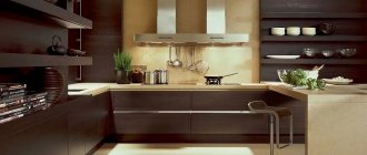
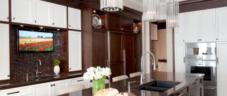
Kitchen furniture
This location is one of the most important. In its design you can often find brown shades.
Brown kitchen furniture will look beautiful against the background of sand, gray, pale yellow walls, a white ceiling and red curtains.
When arranging a kitchen interior, more daring combinations are allowed. For example, you can complement a dark set with green, turquoise or orange decorative elements.
Note!
- Assembling the cabinet: TOP-120 photos and video instructions for assembling the cabinet with your own hands. Selection of tools. Rules for installing walls and installing facades
IKEA cabinets: TOP-170 photos and video reviews of IKEA cabinets. Advantages and disadvantages of the manufacturer. Varieties of shapes and designs of cabinets
- Sliding wardrobes: pros and cons of sliding wardrobes. Varieties of designs, shapes and sizes. Materials for manufacturing the body and doors (photos and videos)
Selecting textiles for a brown living room
Home textiles are a great tool for creating coziness. They successfully complement classic styles and soften the overly strict lines of modern designs. Curtains, sofa cushions, rugs and carpets are selected so that they blend harmoniously with the rest of the decor.
- White and black, chocolate, dark purple and coffee fabrics look great against the background of cream walls and upholstery.
- For a light brown interior, choose milky coffee and dusty olive, powdery pink and cream, walnut and turquoise, gray-blue curtains and other textile elements.
- Floral prints, polka dots, vertical and horizontal stripes, checks go well with both dark and light brown walls.
In addition, with the help of home textiles it is easy to diversify the atmosphere, make it more elegant and festive. You just need to choose bright, eye-catching colors or prints.
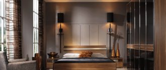
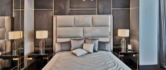
Bedroom furniture
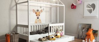
Brown bedroom furniture is an optimal choice as it provides a serene, warm atmosphere. It is also suitable for arranging a nursery (for the same reason).
Dark furniture products will fit perfectly into styles such as classic, oriental and high-tech.
Bright accents on a brown background: how to place them correctly
The rich highlights of bright accessories help refresh the interior in dark or subdued colors, adding freshness and a positive attitude to the decor. A classic description of this design can be considered a turquoise-brown tandem of colors, which can be used in the living room, spacious bathroom, kitchen and loggia. In a room decorated in this manner, the “highlight” of the composition can be light tulle and bright sea-green curtains, sofa cushions and poufs of a similar tone and paintings depicting spring landscapes.
You can expand the space with the help of mirrors that harmonize with the abundance of natural wood surfaces. Even a small living room in a small two-room apartment will seem larger if it is complemented with an interesting mirror plane that reflects light mocha-colored walls.
In a beige-brown living room, golden highlights look impressive: bright decor, imitating precious metal, makes the decoration more original and not boring, emphasizing its status.
Hall furnishings
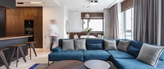
Brown furniture in the living room is a great way to add aristocratic luxury to the room. The main focus should be on the leather sofa. At the same time, a corner, sectional and small model will look equally appropriate.
As for cabinetry, today chocolate and bleached shades of brown furniture are in fashion.
Again, it is better to keep the walls in a light color scheme - beige or pastel gray. Rich red decor will add zest to the design. You can also use active tone for window decoration.
Note!
- Black furniture: TOP-160 photos and videos of design ideas with black furniture. Rules for combining colors and shades. Choosing an interior style for black furniture
Computer desk: TOP-130 photos and videos of types of computer desks. Choice of shape, size and material of manufacture
- Solid wood table: advantages of the material. Tips on choosing the type of wood and the shape of the countertop. Photo and video instructions for production
There are many variations of combining dark furniture with other colors:
- With green. This combination allows you to create a relaxed and soft atmosphere.
- With gray or white. This combination of colors will look especially luxurious and stylish if you decorate the room in a modern style.
- With yellow. This tone will bring a touch of positivity to the living room atmosphere.
- With black. This combination looks simple and elegant. The main thing here is not to add excessive gloom to the interior.
- With purple. This original solution is suitable for anyone who strives for ultra-modernity in the design of their apartment.
- With milky, beige. This is a classic. Such combinations are out of fashion.
Brown living room design
To prevent the interior from looking monotonous, the main color should be diluted with additional ones. There are a great many possible variations. You can choose colors that suit your mood, worldview and personal preferences, creating a unique design.
- Typically, the base shade is used either in wall decoration or furniture. Dark wenge looks elegant on the facades of the living room set against the background of beige, white or pastel walls and a golden-light floor. Or the owners prefer to highlight the leather or velvet upholstery of the sofa and armchairs with dark chocolate. You can also paint or wallpaper the walls in a suitable shade, or choose an interesting two-color combination.
- Richly bright colors go well with chocolate and coffee tones. To give the hall additional energy and an elegant look, choose solar-fiery helmets - scarlet, orange, ocher, lemon. Peach and coral, powdery pink and turquoise look more elegant.
- Any shades of green, including olive, light green or malachite, make up a natural, harmonious duet of woody tones. This natural combination has a calming effect and refreshes the space. In addition, lush, bright greenery, including living indoor plants, has a beneficial effect on the psychological state of residents.
- Combinations with white, light beige and cream shades look no less relevant. Unusual compositions can be made with lemon yellow and lilac flowers.
- Dark red, burgundy, as well as bronze and aged gold help create luxurious, respectable designs that reek of antiquity and conservatism.
- An ideal option for discreet, classic interiors is a combination of dark or reddish chocolate with black details.
When choosing a color palette, you should know: dark gray and black elements are added with caution so as not to end up with a gloomy, dull room.
Furniture products in the bathroom
Brown furniture for the bathroom is usually chosen by cottage owners. It is rarely used in apartments. If you still decide on this option, then do not forget to support the dark furniture with properly organized lighting.
Please note that one ceiling light will not be enough. All significant interior elements and the ceiling should be illuminated.
Furniture products in brown tones are an acceptable choice for country style. If you complement them with wooden decor and green shades, they will create the right atmosphere. When decorating a bathroom, brown tones can be combined with yellow, pink and blue.
Brown furniture is suitable for different rooms. If everything is done correctly, it will look respectable and luxurious, regardless of the interior style.
Combination of brown with other colors in the interior
Brown shades go well with the following color groups:
- Neutral;
- Contrasting;
- Accent.
The first group includes colors used in interiors as background colors. This is primarily white, but also gray and beige.
White and brown colors in the interior
The combination of white and brown in the interior is considered classic and fits any style. Moreover, they can have a variety of shades and differ in saturation. So, against the background of thick chocolate, a milky white tone looks great, and a rich creamy tone goes well with a light coffee shade. By combining shades and their saturation, you can get contrasting or calm interiors.
Beige and brown colors in the interior
Brown and beige colors in the interior are excellent partners, harmoniously complementing each other and creating coziness. Beige adds tenderness to brutal brown and brightens it. This combination reflects the harmonious combination of masculine and feminine principles, and is especially suitable for decorating bedrooms.
Taupe color in design
Gray color is combined with brown in cases where they want to “lighten” the room without adding other colors to it. Accent elements of the interior receive a particularly bright sound in this version.
The taupe color in the interior can be an excellent backdrop for showcasing the rich brown tone of the furniture, creating a pleasant contrast and at the same time, without boring with a variety of colors.
The second group includes rich, rich, but not too bright colors.
Purple and brown colors in the interior
Brown and purple colors in the interior, when combined, can add elegance to the room and add a touch of royal luxury.
Green and brown colors in the interior
The combination of green and brown colors in eco-style interiors has already become a classic, and is especially widely used for decorating living rooms. Moreover, green can be either more active in this pair and act as an accent color, or vice versa, soft and background in relation to bright brown.
Green and brown colors used in the same interior have great expressive capabilities, due to the difference in shades and saturation. This pair can be used in any style, and, in addition, it has a positive effect on the human nervous system.
The third group includes bright colors that are traditionally considered accent colors, such as orange, bright blue or turquoise.
Orange and brown color in design
By combining orange and brown in the interior, you can achieve a feeling of freshness and bring a “piece of sun” even into the darkest room.
Blue and brown design
The interior in blue and brown colors can be decorated in both classic and marine styles, and carries both the calm and reliability of the Earth, and the mobility and changeability of the air, adding expression.
Interior in turquoise brown
Turquoise and brown colors in marine-themed interiors have long become classics. They add romance even when there is no direct reference to the “marine” theme in the design.
In addition, turquoise and brown are often used in modern styles - in this case, turquoise can be used in accessories, decor or appliances, and brown in flooring, walls, furniture or window and door decoration.
Brown-pink color in the interior
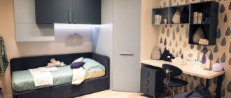
The use of brown and pink colors in the interior of a children's room may seem unexpected, but in fact this combination will be very beneficial for the child's nervous system.
Brown-blue color in the interior
Brown and blue colors also go well together; interiors in which the main goal is to create a calm, cooling atmosphere are often decorated using this color pair.
In addition, we cannot ignore the so-called “mixed” colors, which allow you to add paint directly to the main tone.
Yellow-brown color in the interior
A light yellow-brown color in the interior of a small darkened room will expand it and fill it with sunlight.
Photo of brown furniture
Kitchen and dining room
The presented color will also fit perfectly into the interior design of the kitchen or dining room. It is worth choosing dark tones; a chocolate shade will fit perfectly. It will create an atmosphere of comfort and have a positive effect on a person’s appetite and mood. It can be used to decorate walls; only one wall, decorated in this color scheme, looks beautiful. Despite the fact that the color is good for the kitchen, there is no need to overdo it; be sure to introduce fresh, light shades into the interior. Wooden furniture with a dark shade will fit perfectly into the dining room, especially for country or classic style.
Wallpaper
Brown wallpaper for walls is clearly distinguishable by its color shades
- Tuap is brown with a gray tint. Good in combination with Bordeaux.
- Sepia is most often used in photo wallpapers. Representing an earthy tone. Suitable for both retro and ultra-modern designs.
- Coffee color is a combination of milk and coffee, giving a great cool shade. When combined with beige, you get wonderful relaxation rooms.
- Chocolate ones look great even alone.