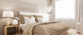
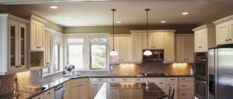
The universal cream color is an elegant solution for decorating the interior of any kitchen. All disputes about its practicality, although they have a basis due to the light colors, are suppressed by the functionality of modern materials used in interior decoration and furniture making. Therefore, shades of this unique color can be confidently used in the design of the kitchen space from the floor and ceiling to the facades of the furniture.
Cream looks surprisingly light and pleasant in any style: glossy and shabby, in strict or elaborate lines, light beige furniture will always be relevant. Neutrality of color allows you to paint the entire room in such light colors, using features of a variety of styles.
Advantages and disadvantages of beige in the kitchen
Kitchens in beige tones are often found in modern houses and apartments: the color is considered neutral and goes well with almost the entire palette. Along with this, beige has many other pronounced advantages :
- expands space - an absolute advantage in kitchens of 5-6 sq m;
- highlights well or, conversely, mutes other shades - because of this, it is often used as a companion when organizing color space;
- makes rooms on the north side warmer - despite the neutral temperature status, it perfectly compensates for the lack or complete absence of sunlight;
- fits perfectly into the format of any style - regardless of whether you have to deal with the wooden surroundings of Provence or the metallic accents of high-tech;
- is classic - this implies its eternal relevance and complete independence from design trends;
- creates pleasant confectionery and culinary associations - a delicate moment for such a functional room, which many do not pay attention to;
- calms and relaxes - important for those who spend a lot of time in the kitchen and do not accept flashy colors and intrusive details.
Of course, there is no ideal color: beige is often accused of being banal.
Designer tips
Irina
Irina Polyakova is the founder of an interior studio, architect and interior designer. The main area of work is kitchen design
This is precisely the drawback that - what a paradox! - is a direct consequence of its advantage: it combines so well with other shades that it is present in the design of, it seems, every second kitchen.
The disadvantages can also include:
- demanding care - a beige kitchen is quite soiled, gets dirty easily, and in combination with a matte textured surface it is also difficult to wash off dirt;
- can be frankly boring and monotonous - a direct consequence of its unsuccessful implementation, when the need to add more intense shades was not taken into account when developing a design project.
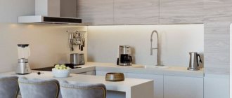
White glossy kitchen with wooden countertop
Gloss causes a lot of controversy: it looks more pretentious, adds a certain coldness, and requires constant care. But wood can balance out its visual coolness.
The glossy set fits perfectly into minimalism. This style is characterized by an uncharacteristic large amount of decor; emphasis is placed on materials and textures. And it is gloss and wood that can become such.
Instagram @my_hygge_my_home
Instagram @nasz_dom_nela
- Kitchen
Practical or beautiful: everything about the interior of a kitchen with white gloss facades
Which style is suitable?
Beige color can easily be integrated into any concept. Or, on the contrary, use it for effective genre mixing, where it will serve as a base for an organic combination of elements of different types. Such versatility liberates even the most constrained designer and inspires non-trivial creative solutions.
Modern
This style tends to combine a beige shade with a cold metallic texture. Golden or silver doesn’t really matter. Most often the latter role is played by:
- sinks;
- accessories;
- ovens;
- furniture and household appliances.
To complete the design drawing, you can “call for help” glass elements. For example, in the dining area. Marble motifs will also be appropriate.
Instead of thick and heavy curtains, it is better to use roller blinds. Or regular blinds. The main thing is to dilute the monotonous design with a suitable companion color.
Country
Mostly natural materials are used for finishing. Or synthetics that imitate them. Hence the emphasis on a large amount of wood texture in the interior. It can be:
- carved facades;
- wicker furniture (dining table, chairs, mezzanines);
- apron stylized as clapboard, etc.
It is most appropriate to decorate a beige kitchen in a country style in a private log house, where wooden beams are also used as decor inside.
Provence
The choice of those who are tired of the asceticism of modern interiors, but the country style discussed above is frightening with its obsessive woody motifs.
What is characteristic:
- lattice facades;
- carved geometric decors on furniture sets;
- upholstered furniture in covers with elegant ruffles.
Floral motifs are always present: in the form of hand-drawn floristry or living plants on the windowsill, shelves or dining table.
Another condition is low color intensity. Arrange a riot of color in another place and at another time: a beige kitchen decorated in Provence is an example of designer restraint, tailored for quiet contemplation at any time of the day.
Classic and neoclassical
Probably, in the minds of most people, a classic interior is inevitably associated with a beige kitchen. At least, it is in perfect harmony with the corresponding principles of organizing space and the materials used for decoration (wood, stone).
The expected move is a horizontal division into light and dark parts. The transition is smooth and harmonious, not at all annoying, but at the same time the space becomes more interesting and looks richer.
You can do it differently and dilute the light beige kitchen with furniture with a different color temperature. For example, make the dining table or any other element brown.
Characteristic neoclassical elements will enhance the impression:
- photographs on the walls;
- exquisite lamps;
- curtains with drapery.
Read about the features of the classic style in the design of the kitchen-living room here - go
High tech
Two key concepts - minimalism and pragmatics - define the philosophy of style. There are definitely no unnecessary details here, and their presence in the interior is determined only by a direct function:
- built-in household appliances;
- furniture with hidden handles;
- minimum furniture and decor.
Beige here acts as a background, and the geometry of space, verified to the smallest detail, comes to the fore.
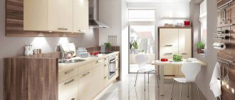
Finishing
Let's look at one example where cream color is the color of the trim. Then you can combine it with almost any other pastel shades. Some interiors even have a successful combination of blue or gray and cream.
Using a cream finish, you can install blue furniture and interior items. This may well fall under the category of Provence. The main thing is to choose the right pattern and place accents. For example, you can highlight part of the decoration with tiles in a beige or cream tone with delicate small flowers. Naturally, having such a wall, it is best to make all other parts of the decoration as monochromatic as possible, so that nothing distracts the eye from the perfectly chosen complex combination.
The cream kitchen in the photo shows how multifaceted the interior can be using such a seemingly dim color. But beige or cream has its superiority, when used correctly in decoration - this is the color:
- sophistication;
- elegance;
- friendliness;
- comfort;
- aesthetics.
All these options do have cream-colored kitchens.
Fashionable color combinations
In combination with other shades, a beige kitchen sometimes reveals itself in completely unexpected ways. By this, she completely refutes the opinion of some designers about the futility of looking for any companions for yourself.
Want to know what small kitchen design will look like in 2022? Read our article.
With brown
A combination that can be seen in many classic interiors. Brown color is in most cases located at the very bottom:
- floor decorated with ceramic tiles;
- lower cabinets with emphatically dark fronts;
- lunch group.
If curtains are used, they can also be made dark.
Designer tips
Irina
Irina Polyakova is the founder of an interior studio, architect and interior designer. The main area of work is kitchen design
Be careful: brown tends to eat up space, so add it in small quantities in small kitchens.
With white
In combination with beige, white makes the room unusually airy and light. Especially recommended for small rooms: the space visually expands, adding more comfort and air.
Designer tips
Irina
Irina Polyakova is the founder of an interior studio, architect and interior designer. The main area of work is kitchen design
An important point: avoid deliberately snow-white options. It is better to take a milky shade - this way you will avoid unnecessary color contrast.
Do you like white interiors? Look for more interesting ideas in our article: 120 photos of the most beautiful white kitchens
With green
This makes a very tasty color combination. It is ideal if the windows face south.
You can often find a green (or light green, mint) set against a background of light beige walls.
With gray
At first glance, this is an absolutely incompatible combination. However, in practice, everything turns out to be as harmonious as possible: the warmth of a beige kitchen ideally softens the overall coldness of gray and gives the room vital energy.
Options for implementation:
- creamy beige background - furniture in metallic color;
- gray background and curtains - beige set and dining table;
- gray apron.
Dreaming of a gray kitchen? Then this is the place for you
With red
A winning combination that gives the interior an expressive volume. Beige sits busily in the background, onto which elements that are more juicy and intense in terms of color expression are then superimposed.
The opposite way is to make the walls red, and a light beige kitchen will soften the flashy tone and add a touch of tranquility to the atmosphere.
With blue and blue
The main function of the bundle is to refresh the interior and give it lightness. This way you can get rid of beige monochrome without compromising the overall color harmony.
With orange
Orange is considered an excellent choice for the kitchen, as it triggers wonderful culinary associations in our minds. In this pair, beige plays the role of a kind of peacemaker and balances the overall color picture.
With black
Black color creates accent spots in the interior. It can be:
- table top;
- apron;
- dining complex;
- set or household appliances.
Designer tips
Irina
Irina Polyakova is the founder of an interior studio, architect and interior designer. The main area of work is kitchen design
In large quantities, it pushes any other shade into the background, so you definitely shouldn’t overdo it. The combination of black facades and a similarly designed apron looks good.
If you are choosing between a glossy and matte surface, remember: the first option is not so aggressive. It plays great in the sun, and in the evening it will be just as interesting to shimmer under the light of a lamp.
A hot combination - black, red and beige in one interior. Worth taking note!
With yellow
Undoubtedly, an excellent choice for energetic people who hate any monotony. Yellow acts as a companion and is used in furniture, decorative elements, work surfaces or dining areas.
Secrets to keeping white kitchens clean
Owners of a white kitchen often wonder why a recently sparkling white surface acquires a yellowish tint over time? The answer is simple - it is the influence of the sun's rays! And to prevent such a problem from occurring, hang some beautiful protection on the windows - curtains or blinds.
Photo from source: postel-deluxe.ru Tabletop Cedar 2047/S Country
And, of course, do not forget about timely cleaning - that is, immediately after cooking has been completed. Moreover, in this case it will be much easier to remove stains than when they have time to harden and dry.
At the very beginning of the cooking process, be sure to turn on the hood. It will help eliminate even the smallest particles settling on white surfaces.
Clean the headset monthly with warm water and soapy water. And don’t forget to wipe everything dry after that.
Are the tile joints dirty? To clean them, use a paste that contains vinegar and soda.
Design features
We have written a lot about how great beige kitchens are in combination with other shades. Another important question is how best to implement it in space. This is not so simple in the case of a room divided into functional zones.
Walls and apron
Monotonous beige wallpaper will be the ideal backdrop for organizing color compositions in your design. Their advantage is that they provide a variety of options for adding interesting details with a more pronounced color intensity.
If this layout seems too boring to you, try choosing texture options. For example, with patterns extruded on the surface.
You can do it differently and take yellow or pink walls as a basis. In this case, you should choose a beige set, and the wooden tabletop and apron will form a single composition, carefully maintained in the current eco-style.
An effective way to refresh the color perception of a room is to use mosaics. As a rule, it combines several shades at once, and this gives you complete carte blanche in terms of enhancing the decorative effect.
Tabletop
The exceptional friendliness of beige in relation to natural textures suggests the use of a wooden tabletop. Or stylized as a stone. The choice of color depends on how the facades of your set are painted: a beige tabletop will be in place where the set is an accent dark spot in the room.
The eternal question of “gloss or matte” can only be resolved in terms of the paradigm of your taste. Everyone has their drawbacks: gloss gets dirty faster, and stains on a matte surface are much more difficult to remove.
Beige kitchens with black or dark countertops are a good way to break up the monotonous design of the room.
Floor and ceiling
Laminate? Linoleum? Everything is suitable, but wood-look ceramic granite will perform much better. It is available in different formats:
- 15x60;
- 20x60;
- 30x60, etc.
Fits both straight and diagonally. In the second option, the material consumption is slightly greater, but the space visually expands.
When choosing a color and texture, be guided by the facades of the furniture set: the classic design of a room involves darkening the tone from top to bottom.
However, sometimes the opposite happens. The final result will not suffer at all if the rule of a single texture is followed and there are no flashy shades in the color composition.
Expert opinion
Dmitriy
Sales consultant in a ceramic tile store
One of the most common questions when choosing tiles for the kitchen is: will it withstand a collision with falling dishes? Absolutely all porcelain stoneware currently sold has strength class 3 or 4, which allows it to easily emerge victorious from such “mini-battles.” There will be no trace left on the surface after the fall.
But it’s better to leave the ceiling white. This is a classic that, even in high-tech format, often remains untouched and justifies itself perfectly.
However, you can always experiment. Tension fabrics are available in completely different colors, including those with the addition of decorative elements.
Curtains and textiles
If you are arranging a room according to the principles of minimalism and hi-tech, then you should avoid textiles altogether. As well as from draped curtains. These elements best realize their decorative potential in a classic or Provence format.
Curtains in general can become that lifesaver that will help correct the shaky color balance and restore lost harmony. This way you can introduce a third companion color into the color space.
Should I make them dark and bright? Definitely, if the overall design seems inexpressive and boring to you.
No, if there are already enough dark spots in the space. In this case, it is better to maintain harmony by choosing curtains to match the color of the background wallpaper. A tone lighter or darker is not that important.
Kitchen with access to the balcony? You will find the secrets of decorating a window with a balcony door here.
The same goes for textile elements. Properly selected, they create good volume and make the interior lively and soulful.
Types of countertops
Wood makes any interior cozier and warmer. You just need to choose the right material.
Made from solid or laminated wood
The best materials for a kitchen worktop are hardwoods such as oak or ash. The service life depends on the density of the wood. The softer the rock, the sooner the surface will become covered with scratches and dents.
Solid wood is a longitudinal cut of wood, it is quite expensive, but it looks great and lasts a long time. The surface is resistant to shock and temperature changes.
Glued, or typesetting, solid wood is made from thin, well-dried lamellas, which are glued together under a press. The cost of such an array is several times cheaper than that of a solid one, but in terms of properties and characteristics it is not inferior to it. For example, such a surface is more resistant to moisture and less susceptible to deformation during operation. Glued solids can be solid-lamella or spliced. In a one-piece lamella, long lamellas are connected only along the width. The texture of such an array is more uniform, the seams are completely invisible, and the pattern is not interrupted along the length. In finger-joint gluing, lamellas 40-50 mm long are glued along their length and width, so on such a surface the structure is more noticeable and a characteristic pattern appears.
Instagram @aventuremaisondecolasuite
Instagram @our.victorian.place
Instagram @mazale_
Instagram @makram.ka
Instagram @marylovedeco
Chipboard
For a white kitchen with a wood-look countertop, chipboard is also suitable. Of course, this material is inferior in properties to natural ones: it is less durable, more susceptible to deformation and is not resistant to moisture. But with careful care it can last quite a long time.
There are two options for chipboard: covered with veneer and laminated with plastic. Veneer requires the same care as solid wood - from time to time it needs to be coated with oil and wax. Veneer cannot be restored, so you should carefully monitor it, wipe it regularly and limit contact with moisture. Chipboard laminated with plastic is the most affordable option, but also the most short-lived. But the coating exactly imitates the colors and structures of different rocks.
Instagram @amparo_lasnubes
Instagram @lacasadubonheur
Instagram @hello_nhome
- Kitchen
Decorating a kitchen in a studio apartment (50 photos)
Furniture selection
The final choice depends entirely on the style in which the interior is decorated. It is clear that if you are building a room according to the ascetic canons of pragmatic high-tech, then there is no question of deliberately wooden tables and chairs. You will also have to forget about carved facades and lattice inserts on the doors.
Designer tips
Irina
Irina Polyakova is the founder of an interior studio, architect and interior designer. The main area of work is kitchen design
Do not overuse the abundance of elements and clutter the room with unnecessary furniture. Proceed from the fact that the priority in any kitchen is freedom of movement. If there is an abundance of square meters, then you can add discreet upholstered furniture: a sofa or an armchair. Black color will be in place.
In all other cases, a set of furniture and a standard dining set will be enough to complete the design of the room.
Kitchen set
If beige is the background color, then the set can - and even should - be made darker. At the same time, you don’t have to go beyond the boundaries of color: play with variations. Or always use a working scheme with a light top and dark bottom: brown or completely black lower cabinets will harmoniously complement the upper beige facades.
Are you building an interior according to modern standards? Then use hidden fittings: without handles the set will look more impressive. Pay attention to the corner option if you have a room of more than 6 square meters.
Other, less obvious companion options:
- grey;
- mint;
- white;
- red, etc.
Designer tips
Irina
Irina Polyakova is the founder of an interior studio, architect and interior designer. The main area of work is kitchen design
When it is not possible to dilute the monochrome, you can use a little trick and use a set with black handles. It would seem like a mere trifle, but it looks so bright and impressive in any format: no matter what kind of beige kitchen you have - matte or glossy.
Lunch group
If you have a classic look, then a discreet wooden table and matching chairs will fit well into the interior. Wood can be replaced with tempered glass.
Choose massive carved furniture if you are leaning towards Provence or country. It’s good to add a small chair and put a cover that matches the genre over it: the atmosphere you need will be enhanced significantly.
The standard modern style is characterized by the use of tempered glass: transparent or intimato. The lack of space can be compensated for by a suitable shape: a round table will significantly optimize the space.
Stone stylization is also in use. Dark or light brown marble will look especially impressive in a beige kitchen. It is important that the stone motifs of the dining table and countertop overlap or at least do not conflict with each other - the room will look more harmonious from the point of view of internal harmony.
Examples of dining groups with a finely calculated balance. It is important that they meet modern design standards and can be easily implemented even in the format of small Khrushchev-era rooms.
Making a kitchen apron
White
Can be made of tiles, glass, bricks, panels. This option will be good in white kitchens whose facades are colored.
Photo from source: mfleko.ru Tabletop Cedar 3230/S Light Sonoma Oak
Grey
This apron will make a super duet with every shade of white that exists. This is a suitable option for loft, minimalism, and industrial. If we talk about the materials used, the most appropriate ones are natural/artificial stone, concrete, decorative plaster.
Photo from source: couchstyle.de Table top Cedar 1205/BR Diamond light gray
Color
It could be mosaic, photo printing, decorative plaster, just colored tiles - there are many options (ceramic, matte, structured, brickwork, natural wood). The main thing is that the material provides reliable protection for the wall from dampness, steam, temperature fluctuations and dirt. In white kitchens, bright colored backsplashes will look especially cool.
Photo from source: designwiki.ru Tabletop Cedar 7110/1A White crystal
Contrasting
Blue-black, red-gray, black-white... there are unlimited combinations. A solution that looks 100% interesting. Contrasts can be sharp/soft - choose at your discretion. Remember: this backsplash looks best in kitchens that are decorated entirely in white.
Photo from source: inmyroom.ru Tabletop Cedar 1021/Q Black
Real photos
We have selected for this block the most interesting examples of real photos with beige kitchens of various formats: small and kitchen-living rooms, in apartments, houses, classic and high-tech.