Pink is a color that is traditionally associated with femininity, and everything seems to be in pink overload when you start shopping for little girls. But it can be an effective color even when used in rooms outside of girls' bedrooms. We've noticed that the color has been a big hit over the past few years. But, the latest trends are taking it a step further and entering the modern kitchen. Pink kitchen is a trend for 2021.
A pink kitchen is not a natural choice for most. In the modern kitchen, where bright color seems to be a rarity, pink is a shade that attracts even less attention. But if you use accents of this color, you will immediately see its visual impact. Besides the frequently used blue and yellow colors, it feels like a breath of fresh air.
Advantages and disadvantages
On the one hand, the color of rose in kitchen design:
- reduces aggression and emotionality, sets a romantic mood;
- promotes healthy appetite;
- makes the atmosphere warmer.
On the other hand, it can be annoying:
- if it dominates the design;
- if too saturated shades are used;
- if there is individual rejection.
Psychology of color
The color pink symbolizes the feminine principle and creates a positive, creative mood. Its excess in the interior can be tiring, but its moderate inclusion creates a calming and slightly sentimental atmosphere.
The peculiarities of perception are such that pink pieces of furniture seem larger, and a room in pinkish tones seems warmer. In small rooms the color seems richer, in spacious rooms, on the contrary, it softens. It is also believed that pinkish shades improve appetite and confectionery shops often use this.
Glossy facades when arranging a pink kitchen
The pink color looks great in gloss; this texture is used in modern interior styles - high-tech and minimalism. To make the kitchen look quite laconic, you should not use more than three shades. Pink gloss will go well with black gloss, as well as with metal chrome surfaces.
To make the room look really very modern, it is worth equipping it with a black self-leveling floor. All materials used must be predominantly synthetic. Textiles, all kinds of ruffles and frills should be completely abandoned, since they are inappropriate in a modern interior. The pink color should be quite rich and deep.
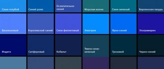
Which shades of pink to choose
With more than 150 shades to choose from, it’s not so easy to choose the “right” ones for your kitchen. Here are the most popular among them.
Powdery
A slightly cool shade that brings style and originality to the design of the premises. More suitable for active people than romantic people. When used in monochrome it is heavy, it looks more successful combinatorially.
Coral
Warm coral fills the room with light and comfort, but cheerfulness is more appropriate in the details. The north side is visually insulated with ornaments on furniture, wallpaper or decorative details. An excellent background for coral would be white, pistachio, mint, beige and its light variants. Black and dark brown create an aura of strict aristocracy.
Metallic pink
The ability of color to play with the rays of the sun limits compatibility. Metallic pink works great in a gray-pink or pink-blue pair, but is very selective about beige.
Light pink
A fabulous color that makes women feel younger, but it makes men nervous. If you limit the volume of soft pink and add something from the dark palette, the room will take on a universal style.
Crimson
Too bright for facades and walls, but as an accent it can add freshness and energy.
Pink mother of pearl
A neon tone is suitable for a modern style kitchen idea. Pink mother-of-pearl will be attractive on the facade, kitchen apron or wallpaper.
Pink antique
Cold pink antique gravitates towards related gray shades. Combinations with matte black and glossy white, along with contrasting colors, are enlivened by the juxtaposition of textures.
Chameleon
A provocative color is good for active people. The intensity of color, transitions of tones and the constant play of reflections on a glossy surface will quickly bore a calm person. On the facade, the color looks impressive, fitting into modern and high-tech styles.
Chameleon is used to a limited extent in small kitchens. It seems brighter against a matte, nondescript background.
Salmon
Warm color can create a friendly atmosphere and defuse the situation during a tense conversation. By adding yellow and orange to salmon, you get cheerful harmonies.
Salmon and sea green, light blue, warm green are consonant in tone. The color does not lose out when compared to other colors, acquiring fragility, chic or brightness.
We use retro style
A kitchen in a pink retro style is suitable for elderly and wealthy owners, as it has some special features. Firstly, it is expensive. Secondly, very reserved and conservative. But much depends on the era and region on which the owners decided to rely.
Although designers have invented a middle option based on the use of antiques and the contrast of fashionable things in the modern world. It is in this case that pink color is optimal. Thanks to it, delicate facades, wooden furniture, and marble floor imitation are created.
But it is allowed to use a restored set in conjunction with new equipment. To do this, she may hide behind a decorative facade. Although the emphasis is on “granny” pink accessories and stylized hardware to ensure functionality.
Facade coating
The eternal debate about which facade to prefer is not able to convince anyone. Supporters of both options remain committed. However, the choice is not always dictated by personal preferences. The location of the room, the overall design of the kitchen, and the level of lighting make adjustments. A compromise solution is a matte bottom and a glossy top.
Glossy
It has already become traditional to use natural shades for glossy facades. Tones that are unprepossessing at first glance acquire a new sound. Most of the glossy palette does not cause emotional tension, except for the brightest ones - fuchsia, raspberry, magenta and others.
A pink metallic, mother-of-pearl, chameleon kitchen set on the shaded side of the house will make up for the missing sun thanks to glare. But in the bright sun they lose their attractiveness. Every speck is visible on the surface, and the rays of light, when reflected, blind the eyes.
Matte
Matte kitchens look solid, without any provocative gloss. The rich color of the facade, a glossy pink apron or a glass panel with a spectacular pattern will add brightness to the decor.
Kitchens with a large area are usually chosen in a matte version, so as not to add extra bulk to the furniture.
The combination of green and pink in the kitchen
The combination looks shocking, which is why such bright shades are most often used to decorate the kitchen and nursery. Colors can be safely combined and combined with each other on furniture, a large panel, or one of the walls.
The pink and green kitchen looks very fresh, reminiscent of summer and sunshine. Therefore, it would be appropriate to complement the room with large fresh flowers in pots and abstract paintings, one of which can become an accent.
To smooth out the brightness of the room, you can add a small amount of white to the main shades.
Kitchen Design Styles
Color that promotes relaxation is not organic in every style. Some of them are presented to your attention.
Classical
Classics favorably perceive restrained, pastel colors. Pink wallpaper can be plain or with a faint pattern. A solid wood kitchen can be complemented with a rose quartz countertop. Pink-gold and gray-pink combinations are acceptable.
Retro
Retro involves a mixture of memory styles, the main features of which remain striped patterns, polka dots, and floral patterns. There is no place for soft pink colors here. Instead, coral, ash pink, peach.
Provence
In the Provence style, hot pink can only be present in the design of textiles, curtains and wallpaper. Chains of powder colors, gray-pink and green, blue, and beige are possible as primary colors.
Modern
Modern style or Contemporary is characterized by laconic forms and colors. Modern materials can be used on a par with classic wood and stone.
A gray and pink room might include pink walls, a gray kitchen with wood countertops, and a breakfast bar by the window.
Mass-produced furniture is functional and its color is far from saccharine. The dusty shade acts as a leader in combinations - pink with green, pink with black, pink-brown.
Ethnic
From a long list of ethnic groups, color is characteristic of the exotic India and Arab countries, and mainly in a bright, saturated version. Arabic and Indian style are fans of the crimson tone in wall painting, carpets and textiles.
Egyptian and African prefer the sandy shades of their native deserts. In Italian, light pink, borrowed from natural stone, predominates.
Shabby chic
An example of a shabby chic style would be a white kitchen with a pink backsplash and matching chair covers. The combination of pink and white, which is a must on the ceiling, is soft. Only pastel colors are used.
Japanese style
The style stands out from the general ethnic trend due to its minimalist furnishings, external fragility and simplicity. Pink is reminiscent of cherry blossoms, but is only present in the details, of which there are few.
For the most part, natural colors from sand to black are in demand. A pink kitchen with a black countertop will be a compromise between tradition and the desire to bring freshness to the interior.
Japanese style has much in common with minimalism, but the furniture is devoid of massiveness. A kitchen set with pink facades can be adjacent to open shelves.
As for the dining table, the Japanese have a low table. In Russia, people are not used to sitting on mats or pillows, so they set up a regular table with a brown top.
Furniture and appliances
A stylish and bold solution would be a kitchen set with glossy facades in a colorful fuchsia color. Matte surfaces significantly mute rich and intense tones and look more elegant.
Pastel, soft pink furniture fronts will harmoniously combine with natural wood, and chrome, metal or glass are suitable for flashy gloss. Cabinet doors can be decorated with photo prints of flowers or more contrasting patterns.
The design of the kitchen is originally emphasized by individual pink elements in the form of a sofa and chairs with bright upholstery or contrasting fittings.
The photo shows a black and pink set with matte fronts combined with a wooden table and chairs.
A pink, white or steel hood, oven, refrigerator, microwave oven and other appliances will add integrity to the interior.
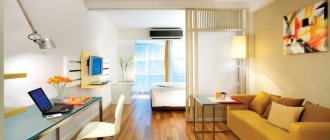
The photo shows a dining group with a white plastic table and fuchsia chairs.
Which color goes best with?
The predominance of pink in the interior can be a mistake. Successful combinations with other colors highlight its advantages much more advantageously.
With gray
A gray-pink interior will be visually pleasing. The color adds a cool elegance and nobility to the combination. The connection is trouble-free in any variation.
Gray wallpaper under a pink set will smooth out the impression of the most defiant shade, like a gray kitchen with pink wallpaper. The gray-pink set is harmonious in itself, and therefore will sound the same note even with white, brick or wood-trimmed walls.
With white
In a white-pink combination, the brightness of pink intensifies, and over time it becomes dazzling. Combinations with muted dusty pink and ash pink will last longer.
A white and raspberry kitchen will quickly begin to irritate.
This can be avoided in a gray, white and pink kitchen.
With black
Partly demonic union, in which black enhances the power of pink. A black and pink kitchen is a compromise between masculine and feminine, where both feel equal.
With black and white
It doesn’t look so gloomy, white brings lightness, but the contrast remains. Pink gloss will favorably set off matte black and support white, but in order not to dissolve in them, the color must be rich.
With green
The tandem exudes freshness and coolness. Suitable for lovers of natural flowers, for whom a pink and green room will remind them of a summer blooming garden.
With blue
The pink and blue combination in the interior looks gloomy, but the pink and blue carries the spirit of the free wind and the pre-sunset sky.
With beige
A safe beige-pink compromise is less spectacular. Despite the outward modesty, the combination of colors of different saturations will satisfy any taste. A kitchen with a beige top and pink bottom will look original.
With blue
For greater harmony, the rough compound is diluted with gray, dim green or milky white.
With brown
The combination of pink and brown can be played up by choosing from a range of shades. In a real interior, colors look different than in the photo, so it is advisable to apply samples to each other and examine them in the natural light of the room. Dark brown is not suitable for a cramped kitchen in a Khrushchev-era building, but in a spacious kitchen-living room it will add an element of rigor to the design.
With gold
Gold brings rays of sunshine, and in combination with pink creates an optimistic mood. Gilding makes the interior chic, but in excess, a bit of vulgarity can appear.
With lilac
A kitchen in pink and lilac tones can look elegant or cloying. The result follows from the careful selection of proportions and tone. One of the colors must be diluted.
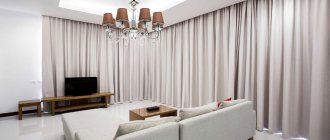
What curtains are suitable?
White, cream, beige, gray or milky curtains will help soften and highlight pink shades. Thread curtains or curtains made from fabrics such as taffeta, tulle or organza will add real airy lightness to the atmosphere.
An excellent solution would be a combination of a pinkish palette with soft yellow curtains. This way the room will be filled with warmth and sunlight.
The design of a pink kitchen with curtains in black, wine, burgundy, raspberry or dark cherry color looks amazing. In order to enliven the space, you can use canvases with prints. Small patterns will add a casual look to the room, while larger patterns will give it rigor and solidity.
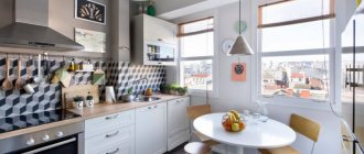
The photo shows the interior of a white and pink kitchen with thread curtains on the window.
Finishing
The nature of the finish is influenced by the kitchen area, lighting and layout.
Walls
A kitchen with pink walls seems warmer, and rich colors even give a feeling of heat on a sunny day. This feature of pink comes in handy in the northern part of the house.
At the same time, color visually expands the space. A compact room is transformed in this way, shading the walls with light kitchen units and adding light with reflections of the glossy surfaces of the facade.
Floor
The kitchen option of pink bottom, white or dark top is rarely used in practice. Plain tiles or stone tiles are laid on the floor. Carpeting in the kitchen is not appropriate, but in the spacious kitchen-living room they combine one with the other. Instead of flooring, a traditional floor can be decorated with a carpet with a pink pattern.
Ceiling
Pink ceilings may resonate with the decor of the kitchen, patterns on the wallpaper, but too dark ones will seem oppressive. Complex stepped stretch ceilings and suspended structures are made in combination with white, stucco, and gilding.
Color and materials in design
Materials are chosen in accordance with the overall design style. If any color can be recreated on artificial parts, then natural wood and stone are valued for their unique beauty.
For headset:
- Wood remains the most expensive, elite material for facades.
- Laminated chipboard and MDF, after covering with veneer, can replace wood at a lower cost. Other methods of decorating them with plastic and acrylic make it possible to diversify the color of the set.
- Glass facades are divided into transparent, patterned, photo printed and matte. Although they require special care, they are valued for their original appearance.
- Ceramic ones look stylish and weigh a lot; often the surfaces give the appearance of natural stone, concrete, or textiles.
For the apron:
- Ceramic tiles have earned plaudits for years of trouble-free protection for kitchen workspaces. Universal in any design solution.
- Plastic panels remain the cheapest alternative to tiles. Decorative and varied in the choice of color and pattern.
- Porcelain tiles and pebbles in the hands of an experienced craftsman will turn into a masterpiece. The cladding lasts for decades.
- Glass panels are unusual, spectacular and extremely popular. You can order any design and color, arrange lighting with LED devices and a 3D effect.
- The steel panel looks non-standard and boasts good performance characteristics.
The apron can be designed in the same style with pink wallpaper pasted on one of the walls, or made to look like pink marble, like a tabletop.
What does pink tile go with:
- with wood motifs;
- with soft tones of milky, creamy shade;
- with natural materials.
For table top
For a pink countertop the material chosen is:
- The wood is far from pink, but it is beautiful and goes well with it.
- Acrylic allows you to choose any desired shade.
- Natural or artificial stone is selected to match the apron.
- Chipboard or MDF are inexpensive; protection made of film, veneer, or plastic is at the same time a decorative component. The choice of design remains with the customer.
For classic, Provence, shabby chic style, the color is selected in several tones lighter than the facade or contrasting. For example, a tabletop made of pink onyx will suit a set in powdery tones.
Like it or don't like it
This option for decorating such an important place for eating is not suitable for every person. Therefore, together with your family, it is worth studying many photos of a pink kitchen or viewing computer models created by popular designers. This will help you make your choice.
Benefits of pink:
- Easily fits into almost all style trends;
- Looks harmonious and natural based on any interior;
- Can be used in conjunction with deep and multi-component tones;
- Positively affects mental state. Due to its calming effect, it is suitable for families with children. It will help relieve tension in the kitchen when everyone gathers for a meal.
Thanks to numerous experiments, designers have learned to fit it into classic and modern styles. It can become the basis for the formation of casual warmth between family members.
What else could be pink?
If traditional colors are chosen for the decoration of the room, the color of rose may be present in the mobile parts of the kitchen.
Curtains
If the window is chosen as an accent, in a country style it is highlighted with pink curtains, in a classic style - with long curtains.
Pink tulle will visually enhance the light spot, and curtains of rich colors will attract attention. You can keep the textiles in the same color as the pink armchairs to give a laconic design.
Wallpaper
To introduce pink, it is often enough to paste over one or two walls. Using different undertones, you can combine pink tiles and pink wallpaper. The juxtaposition of pale pink and coral or pearl and salmon creates the necessary tension.
Table
If you decide to highlight the furniture with color, the pink table can be combined in color with the lower part of the set. In a wooden kitchen, a pink table is matched with pink walls, photo wallpaper or small decorative elements.
Chairs
Pink chairs can create a separate accent spot or echo pink curtains or kitchen backsplash.
Washing
An interesting addition to pink wallpaper can be a pink sink.
Hob
One style solution will help to combine the work surface, including the sink, hob and countertop, into a color ensemble.
Decor
Accessories and decorative elements in pink tones will make the room fresher. In addition, they can be removed at any time if you want changes.
Decor
Decor of bouquets of flowers and lace is suitable for shabby chic style
Design ideas for a gray-pink kitchen go perfectly with chrome, stainless steel surfaces of the sink and household appliances. Metal fittings, shimmering velvet or silk curtains, and shiny decorative details will help highlight the richness and beauty of the interior.
Stylish prints on a bright background look fashionable
Open wall shelves with shiny metal holders, high-tech style elements will fit very well into a kitchen that combines these two basic tones.
You can use bright decor to decorate a dull kitchen.
You can make the kitchen set bright, and use concrete and natural stone to decorate the walls.
The combination of pink and gray in the kitchen, the designers' decision:
Layout
Each layout scheme has its own design techniques and rules for space distribution.
With bar counter
The bar counter can continue the desktop, occupy one side of the peninsula, or retire by the window. The last option is especially successful if there is a pleasant view. In tight spaces, the stand can be made folding. Under it you can place shelves or a refrigerator for drinks.
Kitchen-living room
The kitchen-living room has a dining and work area. The division can be purely visual, using a peninsula, in color, in different textures of the floor covering.
A large room can be made more compact by combining contrasting colors (black-pink) or highlighted zonally using similar combinations (bright pink with gray, pink with blue).
With an island
An island is an advantage of a kitchen with a large area. Sometimes it looks heavy, but integrating open shelves fully or partially optimizes the appearance. The island can be decorated in a bright dark pink color or combined in one tone with the bottom row of the set.
U-shaped
The U-shaped arrangement of the furniture does not allow for a dining area, but there is enough space to place kitchen utensils. If one side is made in the form of a peninsula, it can be used as a table.
The somewhat bulky look of the kitchen can be alleviated by making the top row of cabinets lighter or with transparent doors, demarcating areas with a contrasting apron, and dividing the sides with color.
Corner
The corner arrangement of the furniture is ideal from an ergonomic point of view. You have to move less when cooking. In a studio apartment, the kitchen area can be highlighted with color and limited by a bar counter.
A monochromatic kitchen is expressionless. The color scheme of the headset may include 2-3 colors - pink top, gray bottom or beige top, deep pink bottom row.
Small kitchen
- to move the walls apart, use a light tone; a white kitchen with pale pink walls looks spacious and fresh;
- in a room facing north, only warm colors are applicable;
- photo wallpapers, drawings or painting a couple of shades darker will visually move the wall away;
- The technique will also work when highlighting the backsplash with tiles or panels for the kitchen in the color of Persian rose or magenta;
- a pink ceiling is acceptable in a light version, for example, pink top and gray bottom;
- The headset and curtains with sparkles will add shine to the light;
- any decor in a small area will be superfluous.
Useful tips
- A kitchen with dark pink walls needs space. The smaller the area, the lighter the tone should be.
- Use a shade that makes you happy, not one that is in fashion. Fashion is fleeting, and repairs are expensive.
- Pink improves mood and appetite, but at the same time reduces work spirit.
- Glossy surfaces look defiant, along with an abundance of gilding.
- Too pale shades of pink are optimized with areas or spots of a darker color.
Peculiarities of color perception
Light shades of pink tones make a pleasant impression. Moderate colors refresh, evoke a feeling of tenderness, and set the mood for relaxation and romance. These shades are confidently used as the dominant background. It is possible that there are delicate inclusions playing secondary roles.
Use options such as fuchsia with caution. Bright pink shades, which have gained the right to quickly dominate, risk causing rejection. The interior also looks intrusive and tasteless.
Few people will like a design in the spirit of a Barbie room. Intense tones are only suitable for highlighting accents. They should not occupy more than 30% of the room's area.
Real photos of kitchens in pink tones
Information about design patterns is useful, but still the main thing in choosing an interior is to see and compare it with your concept of comfort. Look at what a pink kitchen looks like in photographs, they will point you in the right direction of your search.
Did you like the article? Tell your friends about it:1 1
Types of lighting
A kitchen like this needs several lighting options.
The kitchen in this lighting solution should be very well, even excessively, illuminated. Gray color itself is a shadow color, an absorber of light, and with its deficiency it darkens and does not look very beautiful.
Light up the kitchen and its individual areas using different types of lamps: spotlights, LEDs, ceiling chandeliers, lamps, sconces.
The work area can be lit very brightly, while the dining area can be more subdued and diffused. The play of light will create additional accents, and your kitchen will sparkle with bright colors.
Pink kitchen all the nuances of color: