In typical apartments of the Khrushchev and Brezhnev eras, there is often an extremely inconvenient layout. Owners spend a lot of effort and money on refurbishment of premises.
They connect rooms to each other, expand their areas by redrawing walls and niches, and try to make the interior more comfortable and cozy.
But what if redevelopment is strictly prohibited, and you inherited an apartment with an uncomfortable narrow kitchen? To solve this problem, there are several useful tips, which will be discussed.
Features of arranging a narrow kitchen
Narrow kitchens can be found not only in old standard panel houses, but also in some modern developers. And, despite the fact that the total area can be relatively large - from 7 sq.m., the shape itself, like a carriage, creates many difficulties in arrangement.
It is necessary to take into account not only the location of communications, water supplies, ventilation ducts, but also the location of windows, doorways, and a bay window (if there is one). With all this, the same ergonomic rules apply that need to be taken into account when planning repairs:
- leave the minimum permissible dimensions of passages - ideally 1-1.2 m;
- create a comfortable work triangle by providing buffer zones of at least 25 cm between the refrigerator, stove and sink and at least a minimum area with a work surface of 60 cm;
- provide space for all the necessary equipment: primarily for a refrigerator, oven, microwave, dishwasher, as well as for smaller ones - a multicooker, toaster, coffee maker, etc.;
Built-in appliances are always preferable, as they save space and visually do not stand out from the general furniture ensemble.
- Properly organize storage, having thought through the configuration and filling of cabinets in advance.
It's best to plan your headset in advance using a free online planner. See a review of the best free kitchen designers for beginners in our separate article ⏩ watch.
Below we will consider the main problems of narrow kitchens that should be taken into account when renovating and furnishing.
1. Often there is insufficient natural light, since the light from the window at the end may not be enough to cover the entire room, and the shadow created can make the room visually even cramped and narrow.
2. The width of the room, poor placement of doorways and windows can create problems when installing kitchen cabinets. In some cases, they are even forced to make a narrower doorway to add 15-20 cm in order to make it possible to install kitchen cabinets.
3. When arranging furniture in a narrow kitchen, you often have to use the window sill. To install kitchen cabinets under the window, you need to move the radiator, but it is better to make holes in the countertop through which warm air from the radiator can circulate freely.
You cannot tightly close the radiators with kitchen cabinets, otherwise the window will fog up in the cold season.
4. A swing door takes up a lot of space. Replace it with a sliding one or completely remove it from its hinges and make an arch if you have an electric rather than a gas stove.
Passage narrow kitchen
See also interesting solutions for narrow kitchen design in the video:
Masking doorways
To make the interior of a walk-through living room look seamless, sometimes it is necessary to hide passages and doorways. One successful way is to use furniture. The walls can be decorated with a pattern that continues on the door leaf. If this option is combined with the overall style of the interior, then the door will look like a continuation of the wall, which will make the design lively and original.
Kitchen with oven Source cozyblog.ru
Types of planning and zoning
Depending on the area, width of the room, location of communications and some architectural features, in a narrow kitchen it is possible to install not only a straight single-row set, but also a U-shaped, double-row, and very rarely an island.
Let's see what planning options there may be in different cases.
Straight
The most universal, and sometimes the only possible layout of kitchen cabinets. If your family is small and you don’t cook often, then even a wall length of 3 meters may be enough to place all the necessary furniture and appliances along it.
It is best to swap places with the sink and place the refrigerator in a corner.
With a single-row linear layout, there is space left for the dining area opposite the set on the opposite wall or at the end of the room.
Parallel
This option allows you to easily place all the necessary equipment and furniture even in a very small kitchen, and create a comfortable cooking space with a large work surface. But there are also disadvantages - there is not enough space for a normal dining table.
For a small family of no more than 3 people, you can install a compact table between the rows of cabinets or make a built-in bar counter, the tabletop of which will be a continuation of the working surface of the set.
The area may not be enough to install a large dining table for a family of 4 or more people. Therefore, the only possible solution is to allocate space for the dining room in the next room.
To prevent table setting in a separate dining room from turning into an obstacle race, it is necessary to install comfortable sliding doors, or better yet, remove them from their hinges, freeing up the passage and visually uniting the spaces of the kitchen and living-dining room.
Corner
If the width of the room allows, then the end part or part of the wall at the entrance can be used for installing kitchen cabinets. This will smooth out the incorrect proportions a little and make the kitchen more functional.
Built-in appliances save space
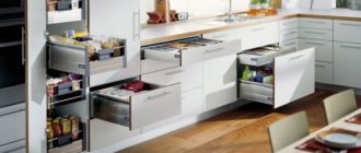
Buying cabinets of the required depth is not difficult, but with household appliances everything is different. You probably won’t be able to buy a refrigerator or stove with a depth of less than 50 cm. There is only one way out - to build it in. This technique has a drawback - it reduces the volume of sections for storing dishes, but here various functional inventions come to the rescue. For example, an additional shelf can be hung from the ceiling and used to store glasses or various kitchen utensils.
Built-in household appliances
Choosing a color scheme
The rectangular elongated kitchen is shaped like a cramped carriage. In order to be comfortable in such a space not only physically, but also psychologically, it is necessary to let more air and light into the room. The light color scheme is ideal for this task.
This does not mean that absolutely all items should be made exclusively in pastel colors. The main thing is to give them the main advantage, and use dark and bright shades as accents.
An excellent solution is to decorate the upper cabinets to match the light walls so that the set looks less bulky in such a cramped space.
To create a light background you can use:
- cool colors if the kitchen windows face south (white, light gray, pale blue).
- warm pastel shades, if the windows face north and there is not enough natural sunlight in the room (pale yellow sand, beige, peach, etc.)
Another interesting technique that will help visually dissolve the boundaries of a room with the help of color is the use of black or a bright and complex shade in the design of the walls. For example, one of the walls or the apron can be made accent black or blue. This bold technique allows you to play on contrast and add volume to the interior.
The bright yellow hue is repeated in the backsplash design and floor finishing. This combination creates a visual effect of expanding space
Lighting
A narrow, long room with one window a priori cannot be well illuminated with natural light. The kitchen is a work space, and there should be enough light in it. In no case should you use one chandelier, as we are used to in the USSR; firstly, it will make the room dark and uncomfortable, and secondly, it is unsafe.
Designers recommend using at least 3 light sources for such rooms:
- Use spotlights evenly distributed throughout the ceiling as the main light source. This organization will allow all areas of the kitchen to be illuminated equally, regardless of the distance from the window.
- Illumination of the working area. No matter how well the overhead lighting is organized, a shadow still falls on the work area due to the wall cabinets. To avoid cutting your hands with a knife when cooking, you need good lighting. An LED strip with a diffuser located on the bottom of hanging cabinets or shelves is perfect for this function.
- If the dining area is located in the kitchen, then a stylish pendant lamp with a shade will add coziness and warmth. They can be placed one or more, identical or different - it all depends on the owner’s imagination and the general style of the room.
If your dream apartment turns out to have a not-so-pretty kitchen, elongated and narrow, don’t despair! Proper planning, working with light and selecting furniture can make it a comfortable and functional room. The main thing is to think through everything down to the smallest detail before the renovation begins.
Which style is suitable?
The easiest way to decorate a small and narrow kitchen is in a modern style. Trends such as scandi, eco, hi-tech, modern, minimalism are perfect for the design of a narrow and rectangular kitchen, as they imply a minimum of decor and a maximum of free space due to functional, “smart” furniture and built-in appliances.
The classics, with all the desire, will be impossible to realize in such a cramped space. But if you really love classic interiors, then you can use individual elements in the design. The combination of classic and modern trends allows you to find a compromise and harmoniously and beautifully equip even a very small narrow kitchen.
You can also implement such trends as Provence or country, but in this case you will have to observe moderation in the decor so as not to visually overload the interior.
Product materials
Considering the aggressive environment in the kitchen (high temperature, high humidity, dirt), you need to carefully consider the choice of upholstery for upholstered furniture.
- The leather looks chic, is easy to clean, lasts a long time, but it is expensive and in the heat it is uncomfortable to sit on such a surface.
- Faux leather is similar in properties to leather, although it is more affordable.
- Flock (synthetic fabric) does not absorb odors, moisture, or fat. Cleans with a dry cloth.
You can use ecological cotton fabrics, but remember that they are not durable.
Good fillers for seats and backs made of polyurethane foam or holofiber. Foam rubber is much cheaper, but short-lived. You need to choose a dense one.
Wooden frames must be treated with special compounds, metal structures are protected by a coating, aluminum bases are welcome. Photos of a narrow kitchen can be viewed in fashion magazines or on Yandex.Pictures.
Design secrets
Incorrect proportions of the room impose certain design limitations. However, some tricks and tricks will help minimize architectural shortcomings.
Finishes and materials
With the help of finishing materials, you can correct the imperfections in the shape of the kitchen space. Here are some useful ideas on how to use finishing to solve a design problem.
- Extend the wall decoration to the ceiling. This way you will visually push the boundaries.
- To make a narrow kitchen visually more spacious and free, in combination with a light color scheme it is good to use glossy and mirror surfaces, which create the effect of visually expanding the space. For example, kitchen facades can be glossy, and a mirror can be used in wall decor in the form of a beveled panel or in the design of wall-mounted kitchen display cabinets.
- Lay floor tiles diagonally or choose a diagonal pattern for your flooring. This way you can make the room visually more voluminous.
It is better not to choose dark finishing materials for finishing the floor and ceiling.
- The effect of visual expansion can be given by horizontal lines in the design of a short wall. This could be wallpaper with a striped print or a horizontally oriented pattern, a combined finish, etc.
Which apron to choose?
Using a mirrored or glossy apron you can visually expand a narrow kitchen, but maintaining such a surface will be troublesome.
A more practical option is to make a backsplash in a deep dark shade or with a 3D pattern to create a feeling of endless space.
Proper arrangement of furniture and equipment
As a rule, arranging a narrow kitchen begins with choosing the layout and location for installing the kitchen unit, and the issue of choosing a place for the dining area fades into the background. Ideally, it is necessary to plan the arrangement of furniture taking into account all zones at once. There may be several options here.
- Double-row or single-row straight set with a dining area at the end. A table with chairs or a kitchen corner with a sofa, installed at the end of the room, allows you to visually smooth out irregular proportions.
- Double-row or single-row set with a built-in bar counter.
- A kitchen with a bar counter along the wall or a small table with a folding tabletop.
- Using a window sill under a dining area or under a work surface.
- Installation at the end of tall cabinets.
Lighting and backlighting
Lighting is an effective tool in adjusting the proportions of a narrow, elongated kitchen. In addition to general lighting in the form of a chandelier with diffused light, it is necessary to provide lighting in the working and dining areas. These can be built-in spotlights or compact pendant lamps, wall sconces.
Floors
Almost anything can be used as a floor covering; you just need to choose the right pattern and lay the covering correctly.
It is better to lay the tiles diagonally, as in the photo below.
When choosing the color of the floor covering, it is important to keep in mind that it is better to choose either one that contrasts with the main color of the room, or that repeats it. For example, a dark color on the floor will make a narrow room visually taller, while light floors, similar in color to the furniture, will add light.
Advice! A coating made of rectangular elements will look good, where the narrow side faces the long wall - this is how you can lay, for example, laminate.
And here are some more successful examples of floor coverings in a narrow kitchen in the following photos:
Narrow kitchen with window
The location of the window and its size largely influence both the arrangement of furniture and the design concept as a whole.
If the window is small, then it is necessary to free up the space around it as much as possible so as not to interfere with the penetration of natural light. It is also worth abandoning multi-layered and thick curtains in favor of a single lambrequin or roller blinds.
A dining area or work surface is often located at the end of the window.
If the window is located on a long wall, then there are most likely no problems with natural light. In this case, you can leave the space by the window empty or install a dining table, a row of kitchen cabinets or a bar counter underneath it.
Passage room design rules
The openness of the room can be both a disadvantage and an advantage. It all depends on how this moment is played out in the interior design. The walk-through living room should be very bright, with lots of reflective surfaces and glass. It needs to create a feeling of lightness and airiness. It is better to remove some walls altogether, replacing them with glass partitions.
Kitchen with linear arrangement of furniture Source vashakuhnya.com
Kitchen with wood trim Source pinterest.com
You should be careful about zoning space. If the living room will perform only one function, then it is better to leave it visually integral, without dividing it into sections. It is also worth carefully considering the arrangement of furniture, since traditional options will not work here. A walk-through room requires constant movement, so first of all you need to take care of the convenience of all residents.
White tiles in the kitchen Source vashakuhnya.com Lamps on the kitchen ceiling Source design-homes.ru
With loggia
A spacious and insulated loggia, which is a continuation of the narrow kitchen, makes it possible to increase the usable area.
At the same time, it is not necessary to break the partition and remodel it: if there is enough space on the loggia, you can make a small dining room here.
To make setting the table convenient, install sliding doors between the kitchen area and the loggia.
If the loggia area is small, then here you can create an area for snacks and relaxation with a bar counter.
Some modern developers offer apartments with fairly spacious loggias, to which owners of one-room apartments often move kitchens. And although this arrangement option is attractive, since it allows you to turn a one-room apartment into a full-fledged two-room apartment, from the point of view of legislation it is very problematic.
Selecting a headset
The best option, which will take into account the features of an elongated kitchen, would be to make a custom-made kitchen, because standard sets are usually made for standard layouts. You can maximize the usefulness of a narrow space by ordering open shelves (visually increasing the space) or cabinets that will “stretch” all the way to the ceiling - this will solve the storage problem when the most rarely used utensils are placed at the very top, and the most needed ones are placed below.
Advice! It is advisable that the cabinet doors in this case be made with transparent glass, possibly semi-matte.
The doors of the set, by the way, can open upward - this will add a spirit of modernity to your kitchen, and nothing will get in the way.
Among other things, a set made according to your requests, in the case of a narrow kitchen, will allow you to bring to life the most daring ideas: what about retractable countertops and folding tables? They can be used both for eating and preparing food.
See also the material: How to arrange a kitchen of 6 square meters. meters.

