Photo: instrurents.ru Boring monotonous shades have not been in fashion for several seasons. Complex, multifaceted colors come to the fore, playing completely differently in each interior. Including elegant turquoise in all its diversity from delicate pastel to dirty dark. Do you want something bright, but still elegant and not too flashy? Then the turquoise color in the interior is created just for you!
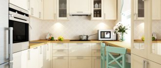
Turquoise kitchen interior
It’s worth starting with the fact that photos of a turquoise kitchen can be seen in various room design magazines and online resources dedicated to this area. This will allow you to clearly see the advantage of color.
Turquoise color will add lightness and freshness to the space. The rich color blends into any palette, complements any interior, design and goes well with all shades.
The main thing when choosing a turquoise color for the kitchen is to consider which side the windows face. If the windows are on the sunny side, then the kitchen will look more impressive and more delicate. And on the dark side it is colder and gloomier.
In order to soften the design a little, you can dilute the decor with wooden products or warm shades. You can also use tan or peach colors.
The peculiarities of turquoise shades lie in the ability to complement the interior and create complex combinations. The turquoise color itself is complex and includes a ton of blue-greens, so it should be complemented with mixed or solid colors.
Since the combination of blue and green shades calms and balances, turquoise color in the kitchen interior is widely used in the design of modern apartments. Thanks to the harmonious combination of colors, you can create the perfect kitchen.
There are many turquoise shades, but each of them is associated with a blue lagoon or stormy sea. More delicate shades give a feeling of airiness and blue heaven. Bright shades create abstraction and an association with precious stones.
Regardless of how the design of a turquoise kitchen is created, the main thing in such a room is relaxation and joy. But not all kitchen styles are suitable for turquoise shades. The best options would be Scandinavian style or Provence.
Color combinations
Despite its brightness, the turquoise color remains natural, and natural shades are most easily combined with any other colors. So feel free to use the principle of adjacent tones, contrasts or all the options for elegant classics.
Turquoise with white
The simplest and most obvious solution is turquoise on a calm and neutral white background. This tandem creates a feeling of freshness, lightness, airiness and cleanliness. And to avoid excessive sterility, dilute it with warm or bright colors.
Turquoise with beige
Turquoise combines softly and elegantly with delicate warm shades of beige, cream and ivory. Pastel combinations are good for Provence, while more contrasting ones are good for modern Scandinavian interiors with bright details.
Turquoise with gray
Rich turquoise with cool steel or graphite gray looks surprisingly futuristic. This combination in glossy or metallic will fit into the cool and original high-tech. Such interiors look especially fresh in the kitchen or bathroom.
Turquoise with brown
The simplest and most traditional combination with chocolate and coffee shades fits harmoniously into classic interiors or Mediterranean style. Bright, juicy turquoise looks good with dark wood with an expressive texture. And delicate shades with light wood create light, airy and bright interiors.
Turquoise with pink
The contrasting combination of red and blue is a real trend in recent seasons. Elegant turquoise harmonizes best with a delicate coral or salmon shade. The main thing is that the colors match in saturation - and then they will come together in an original and neat way.
Turquoise with yellow
Another fresh and bright combination, reminiscent of a cloudless sky and summer sun, is turquoise and yellow. This duet invigorates, lifts the mood and creates a festive atmosphere in the room. Dark turquoise and mustard look noble and elegant in neoclassical or modern style. Turquoise and gold are one of the basic combinations in Oriental and Arabic interiors.
Turquoise with blue
The closest shades harmoniously complement each other, because in nature they go side by side. Turquoise and blue are the colors of the sea or sky, calm and creative at the same time. Depending on the intensity, the tandem will fit into any style, from strict classics to catchy pop art or elaborate art nouveau.
Turquoise with purple
One of the most extravagant combinations actually looks very organic if you choose the right depth. Saturated and dark tones look calm and noble, while bright neon and acid colors look kitschy and futuristic.
Turquoise kitchen: 80 beautiful design ideas (photos)
Yellow and turquoise solutions
The combination of bright yellow and soft turquoise shades will give you the feeling of being closer to a summer holiday and a sunny beach. Warm shimmers will put you in a good mood.
Spending time in the kitchen will become much more interesting and calmer. The classic style of Arab and Eastern countries is turquoise and gold. This combination is very pleasant.
If you choose dark turquoise and bright gold, you can create the perfect turquoise kitchen in the interior of a modern apartment. These colors invigorate and give activity to the owners of the room.
Photos of fashionable furniture in shades of turquoise
Whatever style the interior design of an apartment or house is decided in, there will always be turquoise furniture that will fit perfectly into it. Kitchen furniture, armchairs, sofas, poufs, dining or bar chairs - the choice of products in this color scheme is huge. And among them there are both ultra-modern models and things with a special vintage charm.
A splash of color in the living room dining area
In the photo: Turquoise armchairs in the interior of the living-dining room
Textile upholstery in a rich cyan shade is an excellent solution for armchairs in a modern dining set. Especially if we are talking about a fusion-style living room with unique loft lamps, metallic gold decor and bleached oak parquet flooring. Such furniture will definitely not go unnoticed and will make its contribution to creating an original environment.
Vintage charm of a neoclassical kitchen interior
In the photo: Furniture in the shade of whitened turquoise in the interior of a neoclassical kitchen
Thanks to patinated fronts with classic panels and vintage handles, kitchen furniture in a delicate light turquoise color looks elegant and noble. Using such a set in a neoclassical interior is a great idea, because it will give the atmosphere a soulful Provençal flavor and give the feeling of a country house with an aristocratic flair and without obvious rustic features.
Gray-turquoise interior of a room for a teenage boy
In the photo: Wardrobe with turquoise fronts in the interior of a children's room
The monochrome basis of the interior of a children's room for a teenage boy with a graphic print forms a harmonious combination with a shade of bleached mint. Plain glossy fronts of the wardrobe and a tabletop in a beautiful aquamarine shade bring bright accents of the color of the sea lagoon into the interior.
In the photo: Monochrome interior of a children's room for a boy with turquoise accents
Morning coffee
In the photo: Armchairs with mint upholstery in the interior of a modern bedroom
Modern style is unusually democratic and favors original design solutions. Therefore, a pair of armchairs with mint upholstery will be more than welcome in a modern, bright bedroom. And if you complement them with a light coffee table with an airy metal frame, you will get a cozy seating area where you can while away the time with a pleasant conversation, read a book, drink a glass of wine or a cup of aromatic coffee.
Cozy urbanism
view album in new window
In the photo: Turquoise decoration of the loggia in the apartment
The decor of a pleasant turquoise shade, wallpaper and Roman curtains with a damask pattern make the interior of this loggia homely, giving an amazing effect of softening the urban panorama outside the window.
view album in new window
In the photo: Textile upholstery and turquoise curtains in the decoration of the loggia
Beige and turquoise options
Thanks to the combination of soft beige and turquoise colors, the kitchen room will become much cozier and more comfortable. In order to create the ideal kitchen where you can just relax and unwind, you should take vanilla or cream shades as a basis. Champagne or ivory shades are widely used in fashion trends.
Mostly beige shades are used to decorate walls or floors. If you highlight a turquoise base and a beige set, you can get a very elegant design.
Turquoise green color goes well
Turquoise green is rare, bright and calm at the same time. He inherited the versatility of turquoise shades and the calmness of dark turquoise. It will fit into any wardrobe. Combinations with it can be restrained, modest and intelligent. Turquoise green can be present both in a business style and in a casual one for relaxation.
Jewelry made of gold, silver, emeralds will look good next to it. It is better to choose transparent stones: pink, blue, orange, cold green shades. Wooden decorations will go well with it.
Brown and turquoise colors
If the kitchen consists of turquoise and brown shades, it can be slightly diluted with delicate coffee colors. Classic style is often used in Mediterranean and Scandinavian interiors.
To transform the kitchen and add a play of colors to it, you can dilute it with tons of sand. It is also better to use a glossy texture or the color of carved wood. The combination of these colors will express neatness and tenderness of character and will bring peace of mind to the preparation of new dishes.
What does turquoise go with?
When choosing successful color combinations, it is worth taking into account the different characteristics of the color - its undertone, degree of brightness and saturation.
With white
White will always help out when you need to dilute an overly colorful, bright interior. Paired with turquoise it will create a spectacular contrast.
The combination with white refreshes the interior, but at the same time makes it cold. Warmth and coziness could be added, for example, by a light wood countertop or yellow and green accessories in the kitchen work area.
If the shade contains more cold blue, this combination may seem boring and repulsive, so it is recommended to dilute it with textured surfaces under natural materials. You can also soften the turquoise and white combination by adding warm shades.
With gray
Turquoise can be diluted with gray. Unlike white, the combination with gray will not be as sharp and contrasting. Softer color transitions will make the interior strict and calm. If you get tired of the monochrome and dusty color scheme over time, then it won’t be difficult to add carrot-colored details to it - this is the accent that will stand out most effectively in the turquoise-gray color scheme.
With black
The combination of bright turquoise with black (especially glossy) will add extravagance and glamor to the kitchen interior. If you are not a fan of art deco style interiors, then you are unlikely to like such an active duo.
To make the interior harmonious and calm, use black as an accent in the design of small elements, and you can choose light gray or beige as the main background.
Another option is to use black in combination with pale turquoise. Then the colors will not conflict with each other, and the color scheme will be less aggressive.
Beige and brown shades
If you want to decorate the kitchen interior in calmer colors, then it is better to balance turquoise with a calmer brown or sand color scheme. Beige, ocher and earthy shades will perfectly highlight its brightness.
This may also be interesting: 110 best cappuccino-colored kitchen design ideas
Like a bright accent
The safest option is to layer bright accents on a neutral background. For example, you can decorate your kitchen in a gray and white color scheme with the addition of wood and wicker elements. And add bright turquoise chairs or armchairs, curtains, decorative dishes or a lamp as accents.
If the main palette of the interior is neutral, in basic colors, then in addition you can use another bright color, for example, red, orange or yellow, as an accent.
If turquoise is already present in sufficient quantities in the design of larger items, then a couple more small details will be enough, which will slightly affect the color proportions already established in the interior.
Combination with other bright colors
If you are not afraid of bright interiors, then you can add one or two more equally rich colors to turquoise. Red, raspberry, orange, yellow, purple, light green are good colors. To ensure that the color scheme is not too variegated and harmonious, use them pointwise, in small quantities, and apply them to an already created neutral background.
Pink and turquoise options
Interior experts and designers recommend combining contrasting colors, such as warm pinks or reds with cool blues.
Turquoise shades, whether bright or more restrained, will fit perfectly here. The direction of the latest season is designed to create abstract and independent solutions.
For a more restrained interior, you can choose soft pink and turquoise colors. These two colors will combine and will not stand out from each other too much. You can also create a kitchen using coral or soft red shades to whet your appetite.
Lighting secrets
A certain lighting angle and its brightness can greatly affect the color and its perception. This is especially true for glossy surfaces and very bright shades - aquamarine, cyan, sea wave.
Light can change hue. For example, under a warm light stream, a green tint will appear, and a cold light stream will enhance the blue tint. If such scenarios are undesirable, then it is better to choose lamps with neutral or soft light.
Regardless of the color scheme, remember the basic rules for organizing lighting in the kitchen, which are stated below.
Artificial lighting should be uniform and sufficient. To do this, it is necessary to provide several light sources and correctly distribute the lamps across all main areas of the kitchen. At a minimum, it is necessary to provide lighting for the work area, dining area and basic, general lighting. The latter can be represented by one chandelier or several spotlights.
Black and turquoise solutions
As a rule, black in combination with turquoise is used for a tabletop or as an addition to a set. To mark the accent in the kitchen, black is used with the addition of white shades.
Black color is rarely used in the kitchen at all, as the look is gloomy and gloomy. However, designers recommend making an accent only to highlight the inside of the headset. You can also use a soft shade of black, such as taupe or matte black.
Yellow
Read also: colors of nature IN COLOR BALANCE
A successful combination of turquoise and yellow in the photo above. One rather large yellow object (lamp) next to a large turquoise object (chest of drawers) - it turns out very stylish.
Or vice versa - a yellow background and one large turquoise accessory, as in the photo above on the left. It also looks very beautiful and stylish, and without any fuss.
Where there is yellow, there is orange - and indeed, turquoise and orange go well together.
Gray-turquoise color and design direction
The gray-turquoise kitchen belongs to the modern high-tech trend; the colors perfectly complement the space. Gray color is considered harmonious and calm, so it is great for the kitchen.
But the room will be too restrained if it is not diluted with white flowers. You can also use bright decorative elements.
If there are a lot of different appliances in the kitchen, turquoise and gray shades should not be complemented with anything. This combination is perfect for a spacious kitchen.
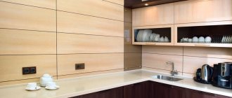
Decoration Materials
Pay attention to how cheap the interior is made of artificial materials in turquoise color - plastic, PVC. And this marine shade is revealed in a completely different way through noble natural materials - wood, ceramics, glass, stone, etc.
Wood painted turquoise in the interior will look more stylish and beautiful than plastic in the same shade, and cheap aquamarine wallpaper will look less advantageous than decorative plaster with a chaotic pattern, painted in the same color.
There are many more such comparisons that can be made, and you can clearly see this for yourself using the example of the interior photos below. Next, we’ll talk about whether it’s worth using turquoise in finishing materials, and how to do it correctly.
Floor, walls, ceiling
If you are not sure that this color will not get boring in a year or two, and its large content in the interior does not scare you, then you can buy wallpaper or paint in this shade.
It is not recommended to decorate all the walls in bright turquoise; it is better to choose only one plane for emphasis. Another option is to reduce the degree of color saturation; a paler shade can now be safely used in the design of all walls.
A non-standard solution is a bright turquoise floor, which can be obtained by laying tiles of this color or painting parquet boards. Colored linoleum or PVC tiles have their place, but if the material is of poor quality and cheap, it can greatly spoil the overall appearance.
Is it possible to make a turquoise ceiling? Easily, using stretch fabric, paint or a hanging structure. But the question is: is it worth it?
In a small kitchen or a kitchen with low ceilings, you should definitely abandon this idea and use more familiar, traditional solutions. In a spacious room with a high ceiling, this idea has a place, provided that the finishing materials are noble and natural (and, as a rule, expensive).
For example, a wooden ceiling painted turquoise will look beautiful in a Mediterranean-style kitchen.
You should not use plastic and cheap glossy PVC fabric to decorate the ceiling in this color.
Apron
You can focus on the apron by choosing ceramic tiles of the desired shade, mosaic or skins to decorate it.
The tiles laid out in a pattern with contrasting white or black grout look beautiful.
To bring together the color scheme of the interior, the shade of the apron can be supported by other interior elements, for example, by purchasing chairs or curtains in the same color.
Tabletop
The most successful and win-win tabletop design options:
- white or light with a tint and pattern similar to natural stone;
- gray for concrete or granite;
- under the tree.
Wood in its natural shade neutralizes the coldness and activity of turquoise, so a beech, oak or walnut countertop is the best solution if you want to add coziness, softness and warmth to the kitchen.
You can find successful combinations of cyan facades and black glossy countertops. For a kitchen in the Art Deco style, such an active and bright duo would be appropriate, but the glossy black countertop is very difficult to maintain. If practicality is of great importance to you, then when choosing a dark countertop, it is better to choose a matte dark gray rather than black.
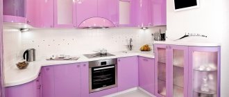
Plain turquoise kitchen
It is extremely rare that only one color is present in a kitchen room. If the decision fell on creating a turquoise kitchen, then you should use several shades of turquoise.
The emphasis should be on the bright base of the kitchen, and for the set it is recommended to choose delicate shades of turquoise. It is quite acceptable to paint tons of white on the walls or the front of the furniture.
Basic shades of turquoise
The uniqueness and practicality of the base color lies in its correspondence to two color types - “winter” and “spring”. This is due to the fact that the tone includes warm and cool shades. However, the dark turquoise color also suits the “autumn” color type. In the demi-season, it can be used in the colors of shoes, as well as in outerwear and accessories.
Turquoise has many shades, the most common are:
- Soft turquoise. Considered to be the warmest and purest shade of color tone. Fading occurs when there is low light in the room. The use of shade in large quantities is associated with sterility.
- Turquoise blue. Refers to bright and expressive shades that must be used in individual clothing items or attributes. When wearing turquoise, you feel invigorated and energized.
- Bright turquoise. Refers to rich, but rather calm tones. It is associated with the blue sky on a summer day.
- Pure turquoise. This is a shade of the precious mineral turquoise, which is found in natural conditions in this color. The basic color tone gives a feeling of freshness and has a calming effect on the psyche.
- Medium turquoise. Combines two shades: rich and pale. You can combine clothes of different styles, the image turns out to be discreet and businesslike.
- Dark turquoise. Refers to deep color ranges, including more green than blue. Green-turquoise can be used in one color in clothing or in the form of individual attributes (handbag, scarf).
Modern style
Modern style includes poise and homely warmth. Turquoise is a cool shade, so it creates a feeling of coolness and calmness. Practicality and sophistication are characteristic of this style.
Thanks to the influence on additional different colors, with turquoise shades you can create all sorts of combinations by mixing just a few decorative elements. In this way you can get an interesting and simple result.
You can decorate the kitchen with wooden furniture with glossy or acrylic inserts. The stronger and thicker the gloss, the more expressive the kitchen will look.
Furniture and textiles
Any wooden set goes well with the turquoise finish of the kitchen: from the lightest to the darkest woods. At the same time, modern technological furniture with an abundance of metal and glass harmonizes effectively with it. And against the background of neutral, plain walls, feel free to use bright turquoise facades.
You can dilute the existing interior with colored accents: towels, potholders and coasters in turquoise color are always appropriate in the kitchen. Complement them with a tablecloth, decorative pillows, light curtains or matching chair upholstery - and this will suit even expensive classic interiors.
Small kitchen in Khrushchev: 80 photos and design ideas
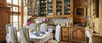
Provence style
Provence is a very complex style and prefers light and muted shades. The peculiarity of this direction is considered to be the maximum fusion of all colors together, without highlighting each other. In this style, the main colors are white and warm tones.
Saturated colors are best used on fittings or furniture. The walls and floor can be highlighted with brighter colors, without sharply highlighting the base.
It is best to choose a light matte tint, which will significantly transform the kitchen. In Provence, shiny or varnished surfaces should not stand out. Any bright and provocative decorations or shades that catch the eye are prohibited.
In a turquoise kitchen in the Provence style, everything should be calm and unnoticeable. The main principle of this direction is to preserve the naturalness and purity of natural colors. You can add a small ornament in the form of flowers on the curtains or tablecloth.
Decorate furniture and chairs with discreet beige flowers. Among the headset, it is allowed to add soft pink, peach shades, as well as light wood finishes. For curtains, it is best to use natural fabric.
What furniture to choose
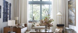
In any living room, each owner selects the interior depending on his desires and preferences. But if this room is decorated in turquoise tones, then the choice of furniture must be approached responsibly in order to create a unique and at the same time unobtrusive design.
- If the living room is well lit, then furniture can be chosen in dark colors.
- But if the room faces north, then it is better to choose light furniture so as not to make the room even duller and gloomier.
- When there is turquoise wallpaper on the walls, you can choose beige and light brown colors for upholstered furniture and cabinets.
- Bright pillows are placed on the sofas to create a sunny mood.
- It is better to choose not heavy curtains for the windows, but to give preference to thin snow-white tulle.
- If you can’t do without curtains, then you can choose them with a gold or mother-of-pearl pattern.
- If the room is decorated in other colors, then turquoise furniture with the addition of light colors will elegantly decorate the living room.
Modern style
The peculiarity of this direction is the smooth corners of furniture and surfaces of objects.
The surface should have an expressive and glossy character. There should be no sharp transitions in this direction at all. For Modern, it is acceptable to use turquoise curtains in the kitchen. They will not disturb the harmony of the room, but will only add sophistication to the room.