The shade range of purple colors is very rich. It covers both cool tones with a clear presence of blue, and warm, delicate shades with a hint of red-pink. A shade that is too dark evokes sadness and creates a heavy emotional background, so it is not used often. But light tones close to lilac enliven the room and cause uplift.
Have you chosen this particular color for the walls and are now wondering what curtains will go with purple wallpaper? A few photo tips will help you make a good choice.
Characteristic
Curtains and curtains in lilac colors are a very popular decorative element that not only looks stylish, but also has a large number of advantages. This color creates an atmosphere of magic and wonder in the room. It is often chosen by dreamy and creative people. Shades of purple can be used in apartments of various sizes. If you correctly combine color with textile material, you will end up with a stylish accessory for the room.
The beauty of lilac curtains can be made more expressive with the help of other decorative elements, such as pillows, blankets, bedspreads, etc. They will also go great with a purple carpet. When choosing a shade, do not forget about the size of the room. Thicker and darker colors can be placed in a spacious room, while for a compact bedroom it is recommended to choose light options.
Ornaments
The pattern on the fabric is no less important than the color of the curtains. So, for example, in a well-lit room of medium and large size, a large pattern on lilac curtains is suitable, and in a small room, on the contrary, a small one. These can be: monograms, abstractions, geometric shapes, flowers, leaves, stripes. By the way, the latter are relevant from year to year. Their location also influences; a vertically applied ornament visually raises the ceilings, and when applied horizontally, the room expands.
Geometric patterns fit into any design. With the correct geometry of the room, curtains fit well with the image of squares, rhombuses and triangles. Thereby emphasizing the stability of the situation. And you can add light romance with the help of curtains with wavy lines and floral patterns.
If you need to visually enlarge the window opening, designers recommend using wide stripes. Narrow ones give the room austerity.
Shades of lilac
In nature, shades of lilac in pure form are rarely found - mainly in the flower petals of lilac and some other plants. But even there are more than forty varieties of lilac, and there are many more artificially created lilac tones. Using shade tables, designers determine the tone that is suitable for a particular situation, and then select companion colors to match it.
The most popular colors in interior design are:
- classic lilac;
- gray-lilac;
- soft lilac;
- soft violet;
- bluish-lilac;
- pale lilac;
- lavender;
- blue-lilac;
- blurry purple;
- beige-lilac;
- lilac pearlescent;
- cyclamen;
- silver-lilac;
- amethyst, etc.
Applicable colors
Representing a mixture of pink and purple, the shade range of lilac is quite diverse: from delicate muted to clear bright shades. The saturation of the lilac background determines the choice of curtain tone.
Companion colors of lilac:
The lilac interior requires the following inclusions:
Shades to avoid in combination with:
Color options:
Source
Subtleties of shade combinations
Moderately neutral wall colors can create the right atmosphere in any room. It will help make the living room elegant and the bedroom romantic; In the kitchen, beige finishing will promote appetite, and in the office it will help to concentrate.
To get the desired effect, you need to take into account the nature of the warm, cold and neutral parts of the beige palette, and also select other shades based on their compatibility. When choosing curtains, the following factors are additionally taken into account:
- Saturation of beige color.
- Furniture color.
- The nature of the pattern on textiles.
- Light level of the room.
Sheer curtains balance the rich color of the wallsSource pinimg.com
Warm palette
This includes wallpaper with a distinct shade of warm colors: peach, yellow, orange. Such colors are defined as cream, vanilla, ivory (ivory). The wallpaper looks elegant and fills the room with light. Window decor is chosen for a warm finish, guided by the following principles:
Brown curtains. Give preference to textiles in warm, chocolate tones, while focusing on the size of the room. The larger it is, the darker and more saturated the color of the fabric can be. For a small room, purchase curtains in light brown tones.
Kitchen design in Provence styleSource hochu.ua
- Cappuccino colored curtains. They are suitable for walls with beige-pink finish. Saturation is selected according to the size of the room.
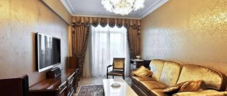
- Warm brown shades look good against a beige-yellow wall. The design with the use of golden decorative details, both on wallpaper and textiles, is worthy of attention. This option looks luxurious, but requires support in other interior items (for example, gilded frames, fittings).
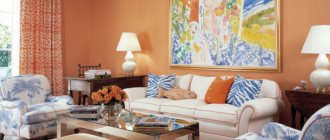
Bright living room in warm colorsSource architecturaldigest.com
Curtains in yellow tones are chosen carefully. Textiles of a rich yellow tone are suitable if a similar paint is present in the wallpaper design
In other cases, choose muted, as if slightly faded, curtains. Beige curtains. The main task is to avoid matching shades of textiles and wallpaper, otherwise the decor will be blurry and the interior will be boring. The shades of both can be anything: from pale to deep beige (almond). The tulle is preferably white or milky white. It will highlight the color of the curtains and prevent them from blending into the background.
Caramel curtains in the bedroom beigeSource ishtory.ru
Cold palette
Cool beige tones of wallpaper mixed with gray, sand, green, and purple look elegant in modern interiors. In such an environment, curtains in the following colors will look impeccable:
- Subtle shades of brown: walnut, chocolate, cappuccino.
- Any smoky, watercolor tones that are in harmony with the rest of the decor.
- Textiles with metallic effect.
- Some rich colors: purple, turquoise, dirty pink, blue.
- For modern minimalist interiors, plain curtains in white, gray or coffee tones are suitable.
Strict interior in cold colors Source pinimg.com
Neutral palette
Neutral beige shades of wallpaper are universal, they can be combined with any textile, however, it is better to avoid sharp contrasts - they can soon become boring. For those who are wondering how to choose curtains for the bedroom to match beige wallpaper in a neutral palette, it is useful to take a closer look at the following tips:
- For a romantic bedroom interior, pale pink or lavender curtains are suitable.
- For a living room in a modern style, choose bright textiles that include purple, red, and pistachio tones.
Modern interior in neutral colors Source woodynody.com
- The traditional furnishings with beige walls are complemented by curtains in coffee, wood and moderate chocolate shades.
- If you like minimalism or Scandinavian style, complement the living room interior with simple-cut curtains in gray, blue, and silver tones.
- The window in the nursery is decorated with brighter (but not flashy) textiles: peach or soft pink for a girl, blue or gray for a boy.
- Neutral beige curtains are chosen if you need to create an accent on furniture or decor.
Cozy bedroom in a harmonious paletteSource dizainexpert.ru
Features of purple color in the interior
Several centuries ago, purple was considered an expensive color. Even dye of this shade was in short supply. The main feature of this shade is that it contains several opposing colors.
- Dark blue. It denotes calm and composure. Characterizes a strong personality, emphasizes her status and dignity.
- Bright red. This tone adds impulsiveness, calls for action, and sets boundaries.
If a person reacts calmly to both shades, then he will also like purple. As a result, curtains of a similar tone will symbolize the strict character traits of the owner. This color is more suitable for creative people. This shade personifies the presence of a secret in the room.
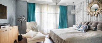
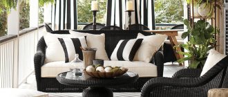
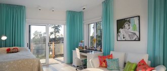
Purple curtains in the living room window with additional decor in the form of a pattern on the canvas Source bouw.ru Combination of lilac and beige shades in fabrics for living room curtains Source domshtor.ru Pale purple color of curtains for decorating a living room Source art-interior.moscow
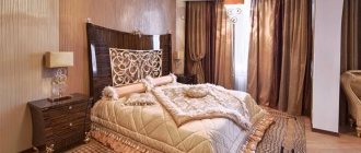
Rich purple curtains for the living room Source berkem.ru
Purple curtains tend to influence a person’s psychological state. Therefore, it is necessary that there be a limited number of shades of lilac in the room. If there are a lot of them, they will begin to load the environment, and this greatly irritates the nervous system.
If the tone fits harmoniously into the interior, it will be relaxing. To do this, they try to use different shades: lilac, plum, lilac. This breaks up the design well.
Lilac night curtains with full-length ornaments Source fedsp.com
Purple rich curtains for a small, bright living room Source roomester.ru
See also: Catalog of companies that specialize in interior redevelopment.
Which curtains will look harmonious with lilac wallpaper?
The lilac color of the walls requires the choice of a certain type and color scheme of curtains. Curtains should match the style of the room and complete the design look.
When all the repair work in the room has already been carried out, it is time to design the window opening. This means it's time to choose curtains that will be the finishing touch. What to rely on when choosing? On the color of the wallpaper!
Why is this so important? The thing is that if the curtains do not match the color of the walls, disharmony will arise, and this will prevent you from creating a complete image. In this case, all your efforts will go down the drain.
So, let's look at which curtains will suit lilac wallpaper.
Basic Rules
Before deciding on a style, you need to consider some factors. Firstly, if the room is small, then the curtains should be modest. Is there not enough light coming into the room? Then it is better to choose tulle rather than curtains.
If, on the contrary, there is an excess of sunlight in the room, you can safely choose silver or gray curtains. Brightly colored textiles will make the room more comfortable, but will visually reduce the space of the room. All of the above rules must be followed when decorating windows in any room. The color of the wallpaper does not play a role in this case.
Patterns
When choosing curtains for lilac wallpaper, you need to know that textiles can be either plain or have patterns. The designs can be the following: contrasting print, abstraction, stripes, flowers. How to choose the right pattern? It all depends on your preferences.
You can choose an abstract design with waves, circles or geometric shapes. Those who follow fashion know that a real trend can be called striped textiles - transverse, longitudinal, bright, wide or narrow. If you choose a floral print, it can be green, orange, yellow, or terracotta. Chocolate flowers on a cream background are also a good option.
It is also important that if the room is small, the pattern should be small, and in a large room it is recommended to use curtains with a large pattern
Choosing the type of curtains
What kind of curtains should be for lilac wallpaper, you can look at the photos you see below.
What to choose? Rolled products, curtains, and perhaps blinds? Let's consider several options.
- Lightweight fabric blinds are suitable for the living room or bedroom. Light tone only! Colors – soft green, mint or coral. Curtains should add light and visually expand the space;
- heavy long curtains are an excellent option for an antique or classic interior. They will look great in a large room where the window openings are large and the ceilings are high. The products will fit perfectly into the dining room or living room. Color – beige or beige with silver and carmine;
- roller blinds are suitable for the dining room or bedroom. It is best if there are several windows in the room. Color - beige, turquoise, mustard, aquamarine or light pink.
What type of curtains is better to choose, what products will suit lilac wallpaper? If the room is small, the best solution is roller blinds. They are mounted on the frame, which means they will not clutter up precious meters. Do the windows face south? Then you should choose ice blue curtains.
Details about color
What color should the curtains be if they match the lilac wallpaper, you can look at the photo below. Let's consider the most winning options. If the color of the walls is pale lilac, the textiles should be more saturated. Cherry and coral curtains will create a romantic interior. Lilac-blue, turquoise and pale blue will add spaciousness.
For blue-lilac wallpaper, you should choose contrasting or deep colors. A secluded and cozy interior is achieved by using chocolate or brick-red colors in combination with milky patterns. Light lilac will add integrity to the interior. Orange will make the room brighter.
Lavender walls go well with fuchsia curtains.
General recommendations
Today there are practically no boundaries in interior design. However, it is necessary to observe certain design nuances so that the textiles fit harmoniously into the overall style of the room. There are quite a lot of shades of the same color, so you need to be careful when combining them. The same goes for different colors. Designers advise choosing no more than 3 basic shades to decorate a room. If multi-layer curtains are used, then at least one layer should match the wallpaper in color.
The abundance of patterns visually overloads the room. If there is no specific stylistic idea, then it is better to choose the option when the pattern is either on the curtains or on the walls. The most popular combination is wallpaper with a large pattern and a plain curtain fabric.
It's no secret that curtains can visually change the geometry of a room. Light shades seem to bring the window closer, dark shades move it away. However, a lot also depends on what color the curtains are chosen for the walls. For small rooms it is not advisable to use contrasting combinations. It will seem that there are a lot of different parts in the room, and this will create a cluttered effect. It is better to choose textiles that are close to the color scheme of the walls. Curtains should not be too colorful or heavy. It is better to give preference to light, airy fabrics. But the spacious rooms are not so modestly decorated. If the curtains repeat the shade of the walls, the room will become gloomy and boring.
The location of the windows should also be taken into account. When there is not enough light in a room, dark wallpaper and textiles will make it even gloomier. Transparent fabrics and light shades will add light. In addition, it is better to decorate northern windows with textiles in warm and bright colors. Excess light in a room usually occurs when the windows face south or east. Curtains in cool shades, as well as thick drapes, will help darken the room a little.
You may also be interested in: Design of lilac curtains with photo examples
The style of the room is also important. Rich colors, multi-layered textiles and an abundance of patterns are more suitable for rooms in the Baroque or Empire style. Fabrics must match the sophistication of the finish. For these areas it is worth choosing curtains from expensive materials.
For modern trends of high-tech or minimalism, light, plain textiles are selected. The metallic sheen of the fabrics goes well with these styles. Country and Provence require natural fabrics. Most often, textiles in these directions have a geometric or floral pattern.
Plain or patterned
Against the background of monochrome walls, curtains with patterns, prints, ornaments, and appliqués look better:
- A large pattern is suitable for large rooms; in small ones, small patterns are chosen.
- Striped patterns are trending - wide, narrow, longitudinal, transverse.
- Abstract drawings and geometric patterns emphasize the modern style of the interior.
If the lilac walls are not monochrome, but with some kind of pattern, it is better to choose plain curtains, combined models, and double-sided options.
- It is better to dilute cool tones of curtains in sunny, warm rooms with patterns of lemon, salmon, and coral shades.
- Contrasting floral prints in rich chocolate color on a cream background are one of the traditional solutions for rich lilac color.
White
The combination of white with all shades of purple is considered elite. Set off richly colored walls with a translucent white curtain or thin, weightless tulle - this will give the interior a sophisticated look.
If the walls are not monochrome, but, for example, with a pattern of white lace lines, geometric shapes or stripes, then you can buy plain curtains to match the white on the wallpaper. When combining these two colors in the interior, it is not advisable to decorate the room with accessories of the same shades of purple. It is better to choose decorative items one or two shades darker or lighter.
Types of premises where they are used
The lilac background is quite popular in design:
- Cafes, restaurants, banquet halls, hotels - with decorative elements in silver, white, bronze tones. The luxurious atmosphere is emphasized by complex curtains with draperies, lambrequins made of silk, brocade, satin, organza or veil.
- Furniture stores, children's goods stores - floor-length curtains of deep colors are used against a bright lilac background. The freshness of a light lilac tone is emphasized by curtains of pure shades with a rich pattern.
- Offices, offices, creative agencies and studios - against a lilac background, catchy elements of bright mustard, lemon, mint shades are required. Curtains are functional, lifting and comfortable: roller, Roman, pleated, Japanese.
In an interior with a lilac background, there is always the opportunity to experiment and find your own unique solution.
Apartment interior with lilac accent:
Decorating the bedroom
Combinations of lilac and yellow (green, orange) are harsh and kill comfort. It is better to dilute the palette with white - this color is an undying classic of bedrooms.
Romantic lilac in the bedroom willingly gets along with white blinds, not only with curtains
Textural contrasts work well for comfort:
5 color ideas useful in the design of sleeping rooms:
It is useful to know what style trends are current in bedroom design.
In the most spacious rooms of a house with a refined atmosphere, the following are appropriate:
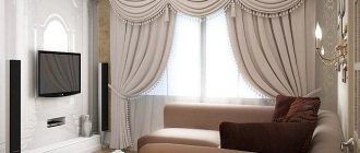
For classic living rooms with smooth wallpaper, the following are suitable: translucent fabrics, heavy curtains in delicate shades, two-layer options.
White and purple paints will add intimacy to an active modern interior while maintaining its style.
The overlay of two types of tulle, painted blue and pink, gives a “cool” interior that visually expands the walls: the decor is suitable for small rooms with windows facing south.
Other visual expansion techniques used in living room design:
Long canvases in rich purple, brown, even red shades, covered with translucent pastel muslin, are suitable for “northern” living rooms.
It is important to remember about the matching intensity of color shades - the darker the wallpaper, the brighter the curtains can be.
Basic Rules
The main rule for selecting curtains to match certain wallpapers in a room is that you cannot purchase models made of fabric of a similar shade that completely matches the color of the wallpaper. So the interior of the room will become boring and tasteless
If you want to choose very similar colors for these two interior elements, then it is important to consider the rule: the color of the curtains should differ by several tones; it is better if the curtains are slightly darker than the wall coverings. But it’s still better to purchase products that will be similar in color, that is, they will combine well with each other, but not repeat each other’s shades
It is also very important to consider that pastel wallpaper colors are the most versatile, since they can be combined with absolutely any color wall coverings. Nude tones will be acceptable in both light and dark rooms
The rule for selecting colors from the same range is fundamental, but you can deviate from it when you want to get a brighter combination. In this case, you need to give preference to a contrasting design, combining completely opposite colors - the wallpaper should be darker or, on the contrary, brighter than the color of the walls.
If you want the wallpaper and curtains to match in color, it is better to purchase wall coverings of a certain color, and curtains of a completely different shade, but with a pattern similar to the color of the wallpaper.
For bright rooms, try not to purchase window decorations with discreet light patterns; they will look uninteresting. If you want to somehow liven up your room, you can hang perfectly white curtains in it, they can even have a slight pearlescent tint.
Also, some people seek to add a third shade to the interior of the room by purchasing curtains, two layers or two sections of which differ in color. This is a risky solution, but it is easy to implement. In this case, one rule must be taken into account: the third color must be chosen so that it is brighter than the other two, and at the same time it must go well with both of them. Compliance with all the above rules will help create a harmonious environment in any room.
Yellow
This color forms one of the most successful combinations with purple. It surprises, invigorates and charges with positive emotions. You shouldn’t choose such a “turbulent” mix for the bedroom. But in the kitchen or living room, mustard yellow curtains and upholstery of upholstered furniture or painting of facades of the same color form a wonderful composition. The lighter shades of these two colors also harmonize well with each other.
One idea: pale yellow curtains with a pattern of purple elements, combined with the same plain wallpaper for the walls.
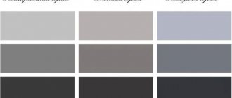
Possible combinations of gray and other colors
When decorating residential premises, many people wonder what curtains will go with gray wallpaper. The answer is quite simple - any color. The gloomy color is universal, so curtains with bright, dense colors and neutral, transparent curtains will be good next to it. The only thing you need to remember is that the main color of the curtains and the color of the curtains were not identical.
The fabric on the curtains should have greater saturation. Although the option when steel curtains are used is also appropriate, this requires that a contrasting pattern be placed on the fabric. In the photo of curtains for gray wallpaper you can see a variety of design variations.
Before you start decorating a room, you need to choose the basic shade of the room. Basic tones are divided into two types: warm and cool shades. “Warming” shades include yellow and red shades. “Cool” tones include blue. In this regard, curtains that have cool colors are ideally suited for walls with a cold base.
Features of color and its psychology
Lilac is one of the classic colors that is usually used in a pastel version. Lilac flowers are used as a sample. Very often young people, as well as those who are in search of new ideas, or those who have already established themselves as mature individuals, pay attention to it.
Initially, lilac consists of two energetically strong shades - red and blue. And therefore, the final lilac can have a depressing effect on the nervous system. For this reason, psychologists do not recommend using it in rooms for long stays (bedroom, nursery, study). As for rooms such as a bathroom or hallway, this shade will be appropriate in them.
Since the color itself belongs to the cold category, it should be used in rooms that face the south.
Lilac palette
Style and features of burgundy kitchen implementation
The ruby palette is universal in its application - it is appropriate in both classic and modern interiors. Design options and combinations can be completely different.
Classic in burgundy color
A classic kitchen in a burgundy palette is an exceptional, sophisticated solution. Here color is not the only decoration. The style is formed by such details as carvings, moldings, stucco, and gilding. As a rule, in this design, the kitchen set is made in one shade - the bottom and top completely match each other, only glass inserts are allowed.
Classic also includes wallpaper with a large rosette pattern. It can be burgundy on a white, gray or beige background. The wine background can be used in small quantities - in the dining area. When choosing wallpaper for a kitchen with a cherry set, you may prefer canvases in a background shade with a gold pattern. If the furniture is presented in a neutral color, then burgundy is present in the wall decoration in patterns.
In this style, instead of an accent wall, you can install a multi-level ceiling with a berry insert above the dining group. Along with the burgundy set, a curtain in the same color, elegantly assembled to frame the window, will serve as an organic addition.
The photo shows a classic design in burgundy.
Expensive wood species look luxurious in a classic interior. By choosing an unusual array in a ruby or wine palette, you can decorate your kitchen with natural carved elements. Wenge, mahogany, amaranth, and paduk wood are suitable for such a setting.
These varieties also come in different shades, so it is important to choose an array from one batch to ensure a harmonious set. You can decorate a design with a predominance of wood with elegant details: gilding for wenge furniture, darker or lighter wood tones for other species
High-tech in berry design
Such a detached and technological interior in a wine palette will be more elegant and sophisticated. Burgundy will add warmth to a setting where glass and metal predominate.
This design direction is characterized by:
- The use of gloss, which makes garnet facades less saturated. The glossy surface reflects light, visually expanding the space, smoothing out contrasting combinations, for example, with a white or light gray shade.
- Maximum functionality of solutions. There will be no textile curtains or decor, so you need to add bright accessories in other details. It could be the utensils, the color of the glass dining table.
- Wallpaper is not suitable here - in industrial areas of design, paint, plaster, and wall panels are used. Of course, in a burgundy palette they will be too “bulky”, so the walls in a high-tech interior will be neutral.
Here you can often see combined facades - for example, white top, burgundy bottom. Another option is that the top may not be monochromatic either. Both wine and white inserts may be present here. Instead of white, you can use light gray and metallic or beige to the same extent.
Minimalism of ruby kitchen
A certain asceticism of this style limits the use of luxurious details in the interior. But color can serve as an original decor. Here burgundy decorates the decor, becoming the center of the composition. A rich tone can be present not only in the facades of the kitchen, but also in other details.
Burgundy color decorates:
- textile;
- wallpaper with a pattern;
- utensil.
The photo shows a minimalist interior with a predominance of burgundy.
Loft in burgundy kitchen
Here burgundy will rightfully become the leader - close to the “native” color of brick, rich enough to independently decorate an industrial interior, harmonious with gray and black. The color of the wine looks luxurious against the backdrop of rough concrete or brick walls, emphasizing the brutality of the “attic” design, adding a little warmth, originality and sophistication of bohemian life to such an environment. Loft is not wallpaper, not traditional curtains and not standard furnishings.
Here berry can be organically used in the following details:
Facades of the built-in headset. As a rule, they cover only the bottom or the entire pencil case from floor to ceiling. The top of the furniture consists of open shelves - wooden, metal, lattice.
The photo shows a built-in burgundy-colored set in the loft style.
- Cushioned furniture. In this direction, the kitchen is usually combined with the living room, since the loft “prefers” open spaces, so sofas, armchairs, and poufs can be cherry in color.
- Dining chairs. Even one chair in this range looks organic if the rest are presented in a background gray, white or translucent design.
Which curtains should I choose for other rooms?
When decorating a kitchen, you can use the brightest colors, but the textiles must be light and weightless. Heavy, thick curtains will look ridiculous in this room of the house.
Textiles in light gray, calm green, beige, and milky colors look harmonious with purple shades in the kitchen.
Bright and calm purple shades are suitable for rooms where children spend time. They have a beneficial effect on the child’s psyche, calm it down, and relieve nervous excitability. A bright yellow curtain would be appropriate for a window in a child’s room. If the room is being arranged for a girl, you can hang pale pink curtains; for boys, gray and light green ones are suitable.
Purple color is luxurious, noble and rich, but at the same time it is also quite complex. Taking into account the recommendations of experts regarding the combination of this color scheme with other shades, you can give your home a cozy, comfortable and warm atmosphere.
Spring comfort at any time of the year: photos of using lilac wallpaper in home interiors
Fashion trends in design are dictated by our own preferences, so it is not surprising that spring and natural shades are rapidly gaining popularity in modern interiors.
One of the most spectacular and harmonious shades used for wall decoration is lilac.
Although lilac wallpaper can be quite difficult to fit into the interior without compromising the style and color scheme of the room, some combinations and effects allow you to advantageously present such shades in space. And now we will figure out how to emphasize the advantages of your room with the help of different lilac wallpapers, as well as which curtains are best suited to lilac wallpaper.
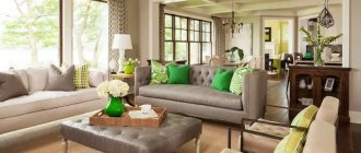
Green
This is one of the most difficult, but very harmonious pairs of colors in the interior. The combination of purple walls and light green curtains creates a spring atmosphere in the room, evoking associations with a violet flower bed and a lavender field. These are shades of May greenery and fresh flowers.
A good option for coloring curtains that match lilac wallpaper is alternating blurred stripes of light green, mustard and lilac. Monochrome green curtains and walls in one of the shades of purple without a pattern will also look original. When choosing this combination, it is worth considering that the more green and purple there is in the interior, the cooler it will seem.
Lilac kitchen
Since the kitchen is a place where wallpaper is constantly exposed, the choice of covering for this room should be based not only on aesthetics, but also on practical properties. Therefore, the lilac color in the work area should be dark. But lilac wallpaper in the kitchen and dining area can have a light shade.
It is advisable to choose furniture for such wallpaper that is wooden, dark in color and massive in shape. This way you can highlight the antique design of the kitchen interior. On the wall next to the table, a large-format canvas with large classical patterns will look impressive, and in a modern interior - realistic photo wallpaper with lilacs, lavender, bunches of grapes or other natural scenes.
Setting up the bedroom
When arranging a bedroom, you should avoid combining purple with yellow, orange, and green. Such compositions will add sharpness and spring coolness to the atmosphere. We select calmer and warmer colors, and the bedroom will immediately become cozy, and your stay in it will be comfortable. White, beige, cream, light gray paints are suitable for this. This range is suitable for bedrooms designed in the Empire style.
If you want to add comfort to a room, designers recommend playing with contrasting techniques:
- matte wallpaper - shiny curtains;
- rich textile color and transparent texture;
- heavy curtains and translucent weightless tulle.
Rich shades, floral and geometric motifs, and Japanese-style flowers are relevant for the bedroom.
Violet
Designers do not recommend choosing curtains of the same color as the wallpaper. But for small rooms, this solution justifies itself, since the presence of contrasting colors will visually reduce the volume of the room even more.
It is not necessary to choose the same shade for walls and curtains. By playing with tones, you can achieve visual correction of the shape of the room. So, if you hang curtains of a richer shade, then the wall with the window will visually move closer to the central part of the room. This way you can “make” a rectangular room square. A similar technique is used for the opposite purpose.
The interior, the main color of which is purple, is memorable for its unusualness. By harmoniously diluting it with an additional color, including other shades if necessary, you will create a unique design for your living room, kitchen, nursery or bedroom.
Pink
You should not combine these two colors in their pure form: the interior will create a somewhat heavy impression. But by diluting the combination with other colors, you can achieve a spectacular result. White, beige and cream work best for this purpose.
Since the combination of pink curtains and purple walls makes the room visually colder and more spacious, it is best to use it for the interior of a small room, which is located on the south side of the house. This combination of colors can make a large living room facing north look gloomy and uncomfortable.
Types of curtains
Curtains can change a room beyond recognition and emphasize the exclusivity of the environment.
Thread
Thin threads create a feeling of lightness and airiness and can be used to frame a window or doorway; they look interesting and certainly beautiful.
Roman
They are attached directly to window openings; when lifted, thanks to the longitudinal strips sewn into the fabric, they are assembled like an accordion and draped beautifully.
Rolled
Practical, stylish and comfortable option. The fabric attached to the roller allows, using a special mechanism, to lower, raise or fix the canvas at the desired height, thereby adjusting the level of lighting.
Tulle
Translucent tulle can be smooth, mesh or patterned, and is made from natural fibers. This lightweight material is quite easy to use and maintain.
Blinds
Highly functional, have high levels of light protection. Vertical or horizontal blinds, in addition to their main function, also play an aesthetic role.
Photo curtains
Images on curtains visually expand the boundaries of the room. Thanks to modern technologies, photo printing looks very realistic and high quality.
Double curtains
This is an independent decorative element. Different textures and shades are used for combination, which allows you to achieve an extraordinary effect.
Which texture to choose
According to classical design rules, the texture of walls and curtains should match. It is recommended to hang heavy fabrics on the windows if the wall covering in the room is dense. With lighter materials, curtains should also be weightless.
Pale purple walls suggest the presence of cherry, lilac, turquoise, blue, violet, yellow, orange, beige, brown curtains.
Note! The same color on curtains made of different fabrics will look different. Dark purple on velvet can look like black.
Designer tips for a fashionable interior:
- Fabrics with a clear sheen should be abandoned in favor of matte material.
- A popular trend is natural textures. Linen, cotton, and natural silk on the windows will emphasize the modernity of the interior.
- We choose velor and velvet for rooms in a classic style.
- Printed patterns are becoming a thing of the past; it is better to use smooth, plain fabrics.
- Don't be afraid to ditch the tulle. Single-layer looks great even in classic interiors.
Long curtains in lilac shades emphasize the modern design and are combined with the overall concept.
When choosing a fabric texture for curtains, you need to understand how the fabric will behave during use. Heavy and dense materials will not allow you to create light draperies and folds on the window, but will emphasize the sophistication of the interior. At the same time, lightweight fabrics will not prevent light from entering the room.
Lilac living room
The living room is our comfort zone, so any shades of lilac should be chosen in accordance with the furniture. If you have light furniture, you can choose dark lilac wallpaper for the living room. Dark and gloomy furniture requires the use of the lightest shades on the walls.
Remember! Bright and rich lilac wallpaper in the living room can only be used with sufficient lighting. Make sure there is a constant supply of light from wide windows (do not use massive curtains), and also properly place lamps around the perimeter of the room.
In the interiors of a lilac living room, you can use crimson and purple textile accessories: carpets, decorative pillows, curtains or curtains
It’s easy to guess what color of curtains will suit the lilac wallpaper in such a room, based on the chosen palette: in a dark interior they should form light contrasts, and when using delicate shades for the walls, they should attract attention due to bright and catchy colors
Grey
Gray with purple is a sensual, unusual combination. Matte purple walls in a muted shade contrast very nicely with elegant curtains made of shiny fabric in a deep gray color.
In the bedroom or living room, you can decorate the curtains with swags and molds to match the color of the walls. For a child's room, a combination of gray and soft purple, close to lilac, is suitable. If you want to add a third color to this pair, choose white or light beige - all three colors combine perfectly with each other.