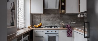
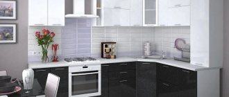
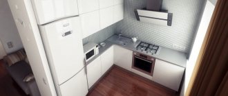
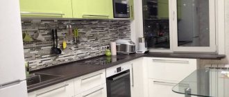
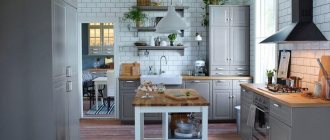
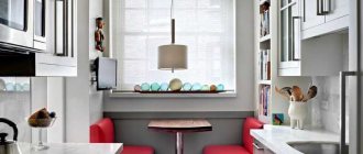
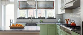
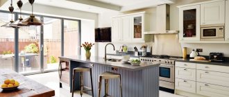
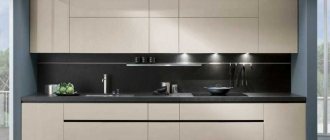
If you are interested in this topic, then you understand that design plays not the first role here. Functionality and convenient layout are of concern to the owners of such kitchens. The good news is that you are not the first to encounter this problem, so there are already ready-made solutions. All you have to do is choose.
Basic Rules
A small room, whether it is a kitchen or a bedroom, puts forward special requirements for decoration. What is permissible on 10 or more square meters is impossible on 6 square meters. m. More precisely, you can allow it, but the result will be far from optimal.
Experts identify 7 main rules for arranging a small kitchen.
- Light color. This is banal, and has already set teeth on edge, but a more confident and competent solution cannot be found: a light color visually expands the space, a dark color makes it visually even smaller.
Choose from a rich palette of light colors: beige, cream, milky and many other tones.
- Moderation of print on wallpaper. A 6-square kitchen design that involves wallpapering excludes options with large patterns, just as it excludes options with small prints. Choose either a blurry middle pattern, or samples without it - monochromatic, with not the most expressive texture.
The purpose of wallpaper is to make the space lighter, airier, and “expand” the walls.
Light and mirror surfaces
- Any surfaces that have reflective properties will help in the design of a small space. The only question is practicality - whether the stretch glossy ceiling will be inconvenient, and whether constant fingerprints on the glass dining table will be annoying.
But if you are not afraid of the need to care for such surfaces, then a set with expressive glass display cases, a glass table, and glossy worktops will help make the interior more interesting and visually more spacious.
Unload the window
If you can avoid curtains altogether, do so. It will be a little Scandinavian and will definitely add light to your kitchen. There are many examples that an open window does not make the room uncomfortable or rude. If you can’t do without curtains, let them be light and airy curtains (maybe a very laconic tulle).
Do not clutter the window sill - if its tabletop is filled with all sorts of little things, the chaos will make the room visually even smaller.
Practicality and minimalism
An empty kitchen and a kitchen where there is nothing superfluous are two different things. Think about how to set up a storage system for bags, vegetables, and various household appliances. Often all this is constantly in sight, making the kitchen seem disorganized and even cluttered. It should not contain anything that is rarely used. And especially don’t overload it with decor, souvenirs and other things.
Leave what is cute, valuable to you, and in which the aesthetics of brevity will be clearly visible.
Don't overdo it with textiles
Many people really love cozy kitchen spaces, where the tablecloth is beautiful, the cushions on the dining chairs, and the curtains are somehow unusual. But at 6 meters it will be a definite overkill. Have changeable decor - buy a few modest runners for the dining table, make chair covers for the seasons or holidays. Leave plenty of open space against which the same napkin or table runner will be visible. Please note - noticeable, not intrusive.
Consider options with a refrigerator
For example, metallic-colored appliances will also be an item with a reflective surface that is valuable for a small kitchen. And if the set includes a cabinet for the refrigerator, and all this does not look bulky, this is a sound decision. And also, do not place it so that it blocks the light flow.
A little about taboo. A small kitchen should not have massive, heavy furniture. There is no place for heavy long curtains and curtains with complex decor. A colored ceiling is simply a knockout for the interior of a small kitchen, only one color, preferably milky white.
Space layout
The key to a well-structured kitchen is planning the space and conveniently placing the most important appliances so that frequently performed tasks can be completed easily and efficiently. For example, to make coffee, you need to fill the kettle with water, remove coffee and milk from the refrigerator, and find coffee cups.
They must be positioned at arm's length for the task to be completed efficiently.
Professional designers call planning their workspace the “work triangle.” Its total distance should be from 5 to 7 meters. If it is less, then the person may feel cramped. And if it’s more, then a lot of time will be spent searching for the necessary cooking utensils.
Linear kitchens are becoming increasingly fashionable these days as they allow for an open floor plan. If this option is used, it is better to consider placing the work area inside.
A must in the kitchen, even one that has only 6 square meters. m, there should be space for cooking, serving and washing dishes. Compactness will allow the relevant equipment to be stored close to the occupied area, with enough space to operate and complete the task at hand.
White color expands space
Use white as a base color, which goes well with the entire palette of shades and creates harmony with the wood. Numerous shades of white make other interior items look more expressive.
A white kitchen looks noble, stylish and elegant.
Headset placement options
If you are planning a narrow kitchen, then the only option for preserving free space would be to use large niches and built-in drawers, where both equipment and equipment are stored. Often a refrigerator is also installed in a niche.
The height of the set can take up the entire space up to the ceiling, and, if possible, the drawers should open upward and not to the side.
A folding table is placed in such a small area so that after lunch you can partially fold it and free up space. As for the refrigerator, it does not need to be installed against the door or close to the wall, since its door, when open, can hit the wall or interfere with the passage. The best place is near the window in the corner.
A U-shaped kitchen allows you to create optimal space for working and storing utensils. L-shaped is also a good option if the sink is on one side and the stove on the other.
As for the space in the middle, this design is more useful for large kitchens where the units are placed around the perimeter of the room. It can be located at a distance from the work triangle, providing seating and additional storage space for instruments. If you have a kitchen of 6 square meters, you won’t be able to run wild with your imagination. Somewhere you have to make room, part with something.
When placing the refrigerator, you need to make sure that it is not next to the wall, as this will limit the opening to 90 degrees. Do not place equipment near the oven or stove, as such a position will affect the efficiency of work.
When installing such large appliances, you should make sure that there is enough working space between the hob and the sink.
One of the more modern design ideas is the use of a built-in refrigerator with drawers. From the outside it is impossible to immediately understand what these actually are - departments for storing dishes or drawers for food. The total capacity of such a unit is 170 liters. It includes 2 outer drawers and an inner one.
If you have a small space in a compact room, this will be a great kitchen design idea with a minimum number of squares.
Where to put the refrigerator?
A refrigerator is the largest and most necessary attribute for any kitchen. But placing it in a small room is not so easy. However, you can cope with such a task!
For example, you can put a pantry under the refrigerator or place it in a niche. If there is no such place, then you will have to place the refrigerator next to the rest of the appliances and furniture. In this case, you need to select an oversized model, and, if possible, disguise it to match the rest of the furnishings.
Kitchen design 3 by 3 meters: beautiful ideas (70 photos)
Style and colors
We have looked at the features of the layout and placement of certain accessories; all that remains is to tell you what color and stylistic solutions will visually expand your kitchen.
To do this, remember a few simple truths.
- Light shades in the wall decoration will make the room a little larger. I have written about this about 482 times, but I will not tire of repeating such a recommendation because of its proven effectiveness.
- To create a cozy atmosphere in a small kitchen, use golden, beige, white or light orange tones in the design. You can dilute them with brown, grassy or yellow flowers.
- Bold contrasting combinations can ruin the interior of a small kitchen if used ineptly. To play it safe, you can use several decorative elements as bright accents.
- Wallpaper with vertical stripes or a pattern will help visually make the ceilings higher. Naturally, the interior will only benefit from this.
Nuances of surface design
Looking at real photos of the kitchen, you can see that there are many ideas for decorating surfaces. You can stick with traditional options or try something new. When choosing ideas, it is important to take into account the advice of designers.
Six effective solutions for a 6 sq. m kitchen
Redevelopment
In some old panel houses, the partition separating the kitchen from the living room is not load-bearing, so there is a chance to approve the redevelopment by submitting a package of documents and an application to the relevant authorities.
Combining the kitchen and living room is a labor-intensive decision and may take time, but the result is worth it.
The exception is gasified kitchens.
In rooms with a gas stove, breaking the wall will not be allowed. In this case, you can install sliding or hinged translucent, tightly closing doors.
Functional headset
Redevelopment is a troublesome and financially expensive task. You can comfortably and stylishly furnish a small kitchen without demolishing a wall. The selection of photos below is proof of this.
Having only 6 square meters, it is necessary to abandon bulky, voluminous furniture with complex shapes. It is better to replace a wide set with a narrower one, with dimensions slightly smaller than standard ones.
It is possible to install the set without the top row, if there is enough storage space, if you are willing to bend over for dishes more often than usual. But the room will be more illuminated and visually spacious.
To free up more space but maintain the functionality of the kitchen, the top row of cabinets can go up to the ceiling. In a store, it is difficult to choose the perfect option for the size of your room. In this case, the best solution would be to make custom-made furniture.
The secret to a successful small kitchen design lies in the correct choice of furniture layout. The choice is determined by the shape of the room.
In a square kitchen, the L-shaped (or corner) option will not disturb the proportions. It makes excellent use of the space in the corner, further opening up additional storage space here.
In a rectangular kitchen it is better to install a linear set.
- A compact U-shaped set in a small kitchen is also possible. But it should be multifunctional furniture, serving at the same time as a working area for preparing food and a dining area.
- One part of the headset will run along the window. The window sill is dismantled. The other part is made with a niche for the refrigerator.
- The U-shaped layout allows for more storage space.
- In a narrow kitchen, a two-row set can be a good solution.
Built-in technology
In a small kitchen you cannot afford appliances that stand out in color and design. This immediately visually “steals” the space. Built-in equipment is not cheap. An alternative is to hide an unsightly refrigerator behind the facades.
If the refrigerator with the set is in the same color scheme, then it is possible to leave it open.
The hob looks more compact and ergonomic. A gas or electric stove in color that matches the kitchen design looks good.
It is not always possible to hide a gas water heater behind facades due to safety regulations. Leave it open, but play it up with color - to match the furniture or walls.
Compact dining area
Options suitable for this quadrature:
- small, round table. The absence of corners will save space;
- window sill table.
The countertop can also be a continuation of the kitchen unit or installed separately after dismantling the narrow window sill. The radiator under the table needs to be shielded so that it is comfortable to sit here even in cold weather when the heating is turned on;
- hanging narrow table.
The wall-mounted tabletop on the wall opposite the set is practical and convenient. This option is good for a narrow kitchen;
- retractable or folding table;
If there is a lot of equipment and you need enough storage space, then the kitchen should be made just a room for cooking and placing appliances and utensils.
The correct color scheme is light and monochromatic
Use predominantly light colors in your design. They give a feeling of freedom and spaciousness in the room.
Do not choose wallpaper, furniture, curtains with patterns. Where it is necessary (for example, in a Provence-style kitchen), give preference to discreet, unobtrusive options, as in the photo below.
The less decoration the better
The decor is determined by the style.
The most actively used decorating elements are in Provence, country, and classic interiors. Use moderation here. A minimum of flower pots, vases and other unnecessary objects that clutter up the space. They can be replaced by a bright ornament on the apron, which will support the style.
Modern styles are best suited for the design of a small kitchen of 6 sq.m. Here there is a preference for light colors and restraint in decor. Suitable, for example, are hi-tech, Scandinavian, minimalism, modern.
High-tock, which is characterized by glossy surfaces, metallic, and mirrors in the interior, can also serve the purpose of expanding space. This style is strict and does not like excesses in the use of decorative elements.
What style is suitable for a small kitchen?
It is optimal to choose modern designs that involve a small amount of decor, things and are reduced to minimalism.
Minimalism
From its name, the essence of the style is clear in itself - a minimum of things, the presence of only the most necessary. Usually no more than three colors are combined, light and calm. Built-in appliances are chosen because they are more compact and functional, and it also allows you to fill the room with light.
High tech
It is similar to minimalism, since its main ideas are also simplicity and functionality. But here it is important to use every centimeter of the working surface as usefully as possible. If we talk about external differences, then there is a large number of chrome surfaces, which at the same time expand the space with their glare.
Modern
Another style similar to minimalism, but here there are floral decorative elements and a larger number of shades. The combination of geometric and smooth lines with glossy surfaces just visually enlarges the room.
Scandinavian (eco-style)
Its main idea is in harmony with nature. There should be a lot of light, natural materials, if there is decor, then it is also of natural origin. The furniture is simple, bright, light, the windows are not curtained and provide maximum light.
High tech
Simplicity in the spirit of minimalism is inherent in modern high-tech. The difference from the original source is a more interesting design. Progress rules the roost here. A full set of built-in household appliances is required.
The design is based on the principle of contrast. At the same time, it is important not to overdo it with a riot of colors. An abundance of accessories, as in minimalism, is not welcome here.
Kitchen design ideas 6 sq. meters - a selection of designs with refrigerators
Usually for a “Khrushchev” with a kitchen measuring 6 square meters. m, the design must be worked out carefully, thought through to the smallest detail, using the free space with maximum benefit. The first step is to develop a project and decide in what style to carry out the renovation. The main thing is to use the space as efficiently as possible, every centimeter of free space should “work”, there should be practically no empty spaces, and no unnecessary items either.
With refrigerator
It is impossible to do without these household appliances, the refrigerator is the largest item, you need to place it in such a way that there is a convenient approach, does not block the window, or interfere with the passage.
Tabletop-window sill
A life hack that has helped most families, ideal for the design of a small kitchen of 6 square meters. m. There is no need to create an extra work surface, which frees up space for installing the same refrigerator, dishwasher and washing machine. During the day, you don’t have to turn on the lighting; there is enough light from the window, and this saves on electricity costs.
To the ceiling
Having looked at the photo of the design of small kitchens of 6 sq. m, we see: the useful space has been used to the very top. Previously they said that not a single piece of the room should remain empty - the walls are no exception. You can install shelves, add pencil cases and a set, and realize ideas about visually increasing the space.
Accessories and appliances
Particular attention when developing the design of a small-sized kitchen of 6 square meters. m need to be paid to fittings and household appliances. In a room where you cook all the time, you cannot do without a stove, microwave, and much more.
The correct placement of such “helpers” will have a positive effect on the equipped space.
A small family of two can get by with a two-burner stove; a dishwasher is also not always a priority purchase. Think carefully - without which the quality of life will definitely not deteriorate: why use a bread maker if you use it a couple of times a year?
Geyser
It is usually mounted on the wall in a corner using strong brackets. Compliance with safety precautions will be a priority - you should listen to the advice of the gas service technician and do not try to install the water heater yourself.
Railings
Any catering unit involves placing a large number of various utensils: dishes, towels, household items. To unload the space, roof rails will help - these are ordinary metal pipes made of light alloys installed on the walls. This way there will be no “empty holes” left, all areas of the room will be working.
Single row
Represents the placement of kitchen utensils along the length of one wall. This method is most suitable for narrow kitchens, and if there are few people living in the house.
Design of a functional terrace. Partial or full deck coverage?Which kitchen sink to choose? Pros and cons of different materials
Window sill-countertop in the kitchen: photos of design options, ideas for arranging a kitchen with a countertop under the window
If the room is wider, you can use a two-row layout, the downside is that there is no room left for a meal.
Designer "taboos"
When the apartment has a kitchen of 6 sq. m, does design have its limitations?
Bulky furniture
Many people want to put up antique furniture in the English style, but there’s nothing you can do – you’ll have to give up this desire. A small room will become even smaller, not only physically, but also visually.
The interior needs to be lightened: purchase a set of table with chairs made of transparent plastic; transformable furniture that can be folded or completely removed if necessary is perfect.
Dark color
Light shades will make the interior design of a 6 sq. m kitchen. m more spacious, lighter. This applies not only to walls, but also to furniture, curtains, and floors. Beige, milky with small bright accents will make the kitchen lighter and visually larger.
Multi-level ceiling
Kitchen design 6 sq. m should not include a multi-level ceiling. It can be used exclusively in large rooms, where it will “eat away” the space, making it oppressive and awkward.
Large chandelier
Kitchen renovation design 6 sq. m has a lot of useful things in its arsenal, but a huge chandelier is definitely not on the list. Small sconces on the walls are suitable; spot lighting is ideal.
Door
It seems that what does the door and the design of the 6 sq. m kitchen have to do with it? m? Massive doors “break”, cut off a small room, isolating it from the rest of the area, making the space visually even smaller.
Drawings and patterns
There is no need to glue wallpaper with large patterns, choose tiles for the “apron” with a bright, huge pattern. The kitchen design project has 6 sq. This technique will look disgusting, reducing the space, as if “squeezing” it.
No more than three shades of color
The more colors in the Brezhnevka kitchen design 6 sq. m or any other, the visually it will become smaller. The tackiness hurts the eyes, the space “beats” like a mosaic, and it will be difficult to even be in the room. Opt for a main color and a couple of additional ones to add an accent.
A few more important tips
- Do not clutter the space near the window. Plan the arrangement of furniture so that it does not interfere with the free penetration of light into the room.
- Don't hang voluminous curtains. No lambrequins; curtains with a prominent pattern, large pattern, etc. are not suitable.
- More lighting. Several miniature lamps with a simple design are better than one large chandelier.
- Avoid colorful wallpaper. A simple pattern is only possible if it serves the purpose of expanding the space. For example, a low ceiling will be raised by wallpaper with a vertically oriented pattern.
Useful tips
The most obvious option for the most practical kitchen arrangement is to manufacture a set to personal order. This will make it easier to adapt to existing furniture, make a niche or cabinet for the refrigerator.
Little tips for owners of a small kitchen:
- you can make a false mirror on the wall near the dining table, which gives an interesting effect and works great to expand the space;
- do not make the refrigerator a board for magnets - this is no longer fashionable, and the main thing is that it also works to visually make the kitchen smaller;
- use railing systems, they are practical and can eliminate the need to order a very large set;
- colorful floor mats are only suitable for a plain, preferably white, space;
- use side tables that are round when unfolded, and half-circle when folded; if the family is small, then the unfolded version is not needed for everyday use;
- If you decide to use photo wallpapers, they should not be very colorful and depict a perspective.
Moving the dining room into the living room is an option that many people like, but excessive conservatism does not allow people to decide on this.
If you and your whole family never dine in the kitchen (because there is not enough space), feel free to move the table into the living room and do not deny yourself the pleasure of family meals.
Photo gallery
Read: Hobs in the kitchen
Let's discuss this article together:
Click to cancel reply.
Beautiful examples
And to conclude the review, 8 very successful examples of arranging a 6-meter kitchen with a refrigerator. Perhaps you will find a source of inspiration for your renovation in one of them.
- The work area is located near the window, and this is indeed a good solution, although it requires some hassle.
- This option has a dining area by the window, which also looks nice and fashionable.
- An unexpected solution with rounded shapes and bright colors. Bold and fresh!
Functional window sill
The window sill is another chance to benefit from every free centimeter of the kitchen. So why use it for potted plants or leave it empty altogether? It is better to replace it with a countertop and thus extend the cooking area. In addition, such a surface will allow you to sit here with a book (natural light will allow) and a cup of aromatic coffee.
