Here we've rounded up kitchen ideas in cream colors that are classic and will stand the test of time. These neutral shades are a far cry from "boring beige" and will bring a sophisticated, understated look to your kitchen.
Cream color is used to convey the warmth and elegance that many homeowners love. Because it is so similar to white, cream kitchen cabinets can be paired with almost any other color. Here are some cream kitchen ideas for your interior design:
For years, many have been in love with all shades of peach, and this color choice has borne the brunt of the jokes of many artists and decorators. However, things have changed now, and those creamy neutrals have been updated with a new, sophisticated gray and coffee palette. This color creates a variety of styles, from rustic to modern.
A new kitchen is a huge investment, so it's no surprise that many of us choose a shade that will stand the test of time. Cream kitchens are one of the most popular styles today.
Cream-colored kitchen: arguments for delicate finishes and furnishings
Many are skeptical about the light cladding of the kitchen space due to the sterile cleanliness, which is extremely difficult to maintain due to the multifunctionality of the room. In vain! Arguments in favor of a kitchen in cream tones will once and for all dispel all doubts about its practicality:
- Any design solutions look expressive against the neutral background of the interior painting. It perfectly highlights the subtlety and expressiveness of hand-made decor, manifested in decorating the kitchen with homemade panels or original paintings depicting still lifes.
- Finishing with a restrained color never gets boring, unlike a rich tone.
A light palette will visually increase the size of the kitchen
- A light palette visually expands the boundaries of a cramped and disproportionate kitchen space.
- The ability to reflect light eliminates the gloominess of a room with small openings or windows located on the north side of the house.
- The cream color, pleasing to the eye, looks exquisite when decorating furniture products in the premium and economical segments.
Cream colored kitchen looks sophisticated
- A pleasant perception of a gentle tone has a beneficial effect on the emotional state of others. In color therapy, it leads in its ability to relieve stress.
- Easy to care for. Beige washable wallpaper, waterproof ceramic tiles, and stain-resistant floor coverings are easy to clean. If you choose facing materials, furniture, and textiles that are resistant to external factors, then even snow-white interior items will look spotlessly clean for a long time. In addition, on a light-colored set or dining table it is much easier to notice all kinds of dirt and immediately remove it. Old stains on furniture are much more difficult to get rid of.
The unobtrusiveness of the creamy color, associated with the delicious filling of pastries and layers of cakes, can please all the inhabitants of a kitchen with a similar finish.
Characteristics and psychology of color
Olive color comes from the green palette, which is considered the color of nature itself; it is characterized by youthful freshness and youthful enthusiasm. He is the personification of a bright and interesting life. The dark tones of this color indicate wisdom and nobility. Representatives of the green spectrum in people's minds are inseparable from the categories of mutual understanding and devotion. They give rise to a feeling of security, confidence in the future and a solid foundation under your feet.
Natural olive is characterized by some conservatism and solidity. That is why fundamental people who are confident in themselves and in their capabilities fill their lives with it.
Olive color is a natural healer that can heal a weary soul. It relieves stress, calms you down, and allows you to abstract from everyday worries. Just like other shades of green, it sets you up for a calm pastime, relaxation, and reflection. Color increases sensitivity, encourages communication, and provokes the activation of thought processes. It has a positive effect on the nervous system and regulates blood pressure. Psychology characterizes this shade as a symbol of the desire for something new, for the manifestation of dormant resources. It can become a catalyst for a young family seeking self-development. The choice of a shade that contains a significant proportion of brown indicates the ability to perceive the surrounding reality through the senses.
So, if you like olive shades, and you are convinced that they should definitely appear in your interior, we suggest moving from psychology to practical advice on using this color.
Subtleties of arranging a creamy kitchen
If you want to create a calming environment in the dining room, it is wise to choose most of the furnishings and finishes in ivory, ivory, cream or baked milk. These gradations of cream tone create a luxurious looking interior painting that represents the foundations of rich looking design concepts.
When drawing up a volumetric-spatial composition for the kitchen, it is worth paying attention to many nuances:
- The color palette of the kitchen interior painting should contain not only cream shades. Otherwise, the room will look boring and monotonous. It is reasonable to place focal points of different colors on the facades of the furniture, the table top of the dining table, chair frames, and panels of household appliances. Nickel-plated steel, natural stone, genuine leather, glass-ceramic coatings, embossed wood combine flawlessly with light finishes.
Color accents in a pastel interior
- A multi-level lighting system will emphasize the elegance and chic of the pastel palette. Subdued lighting is not able to maximize the rich appearance of a delicate color scheme. Therefore, it is rational to organize LED equipment for curtain rods, integrate spotlights into the suspended ceiling, the upper base of the set, and illuminate the kitchen apron. Light streaming along the walls will create a soft effect in the design of the surrounding space. Above the dining area it is important to place a galaxy of stylishly decorated spots or a chandelier with a glass lampshade.
Multi-level lighting system will create a soft effect
In a well-lit room, the nobly decorated kitchen interior looks brilliant. A photo of a cream color will allow you to choose a shade that perfectly suits a room of every possible size, shape, and style.
Lavender color in clothes
The soft lavender shade is the highlight of a woman's wardrobe. The color combines richly with various tones, creating amazing images. This is a good accent for a basic set of things. The color is mainly summer, homey, romantic. Perhaps this is not the best solution for a business meeting, but it is almost ideal for leisure and travel. It is neutral for everyday use, but do not overdo it, as its relaxing effect is not always appropriate in our ever-accelerating pace of life. This tone looks especially good on representatives of the “spring” color type. Their yellow-accented skin tone is a perfect match for lavender. However, other color types will be able to choose shades in this range: for “winter” - all bright and pure tones, for “autumn” - with a blue tint, for “summer” - hazy, purple colors.
The combination of lavender color in the wardrobe
The combination of lavender in the wardrobe is a kaleidoscope of expressive, subtle images. Let's take a look: Black makes the main tone brighter and more saturated. The difference in lightness makes you focus on it.
Gray, on the contrary, makes it less noticeable, but the pair is light and harmonious.
White – focuses on the tenderness and fragility of the shade.
The combination with beige and brown in the wardrobe is very soft and natural. The pair can be enhanced by using both shades.
Gold is always preferable to yellow, but if you want to increase the brightness of the look, use sunny yellow shades.
Soft orange tones are an excellent match for lavender: juicy and exotic. You can always add a little pink to it.
Delicate peach and light pink shades create a romantic weightlessness in which you can drown in freshness and blossom.
The shade of red greatly influences the overall look: from a bold to an almost homely look.
Green and lavender are a bold, stylish solution. You can always add a red, orange or blue accent to radically change the look of everything.
But most often light menthol and mint shades are used; they emphasize the fragility and lightness of the main shade.
Gray-blue is another favorite to pair with this color. The light range, although gentle, has an ordinary, everyday character.
Blue tones are often mixed with white, pink, green, and gray.
Selection of finishing materials for a cream-colored kitchen
A room designed in a white tone with a yellowish tint requires thoughtful composition of color schemes. If the color is too monotonous, the appearance of the kitchen space will look faceless. An overabundance of bright interior details will distract the attention of others from the delicate background. Therefore, it is important to correctly maintain the balance between pastel and colorful finishing elements:
- After painting the walls with cream paint, you definitely need to edge them with golden, pink, chocolate ceiling cornices and baseboards.
- To focus attention on the kitchen walls, you need to choose finishing elements with subtle ornaments or patterns that are a shade brighter than the base.
Finishing the apron with tiles with ornaments will make the interior more expressive
- To conditionally separate the cooking and dining areas, one part of the room should be decorated with light cream finishing elements, and the other with darker tones (cappuccino, creme brulee).
- The light floor should be highlighted with an atypical checkerboard layout, alternating faded and bright details of the coating.
Floor tiling with atypical layout
- The cladding of large-scale planes of the kitchen space (walls) with decorative bricks or ivory-colored Venetian plaster looks original.
- The arrangement of cream countertops, floor and ceiling coverings can conventionally expand the boundaries of a cramped room, filling it with a warm aura and light.
- The discreet decoration of the kitchen will be expressively emphasized by dark brown wooden parquet, arches, doors, and window frames.
A dark brown floor will break up the monotony of the finish.
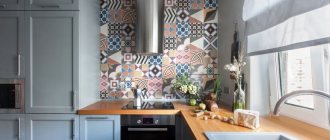
- To decorate an accent wall or kitchen backsplash, it is advisable to choose a colorful composition - a set of glazed ceramic tiles with a delicate pattern, skins or photo wallpapers with images of desserts that highlight the surrounding background.
When choosing finishing materials, you should remember that a cream kitchen should prevail in the interior. Photos of pleasant-looking spatial compositions inspire and encourage you to choose the optimal arrangement option, designed in exactly this color scheme.
The combination of milky color in the wardrobe
Milky color brings sophistication to the wardrobe, and the possibility of combinations reveals the richness of color. What scales are the most successful? Let's look at examples.
Pearly milky shimmers - this is how you can call a combination with milky white color and very holy shades of beige, cream, pale pink, silver and gold.
Milky gray, where gray can be matched with light. The pair can be diluted with white to increase contrast.
Milky black is a strict, classic combination, but note that the brightness of black is reduced and in some places it even turns into black and gray. This dampens the resonance and softens the combination
Milky beige, where beige is a juicy, sunny shade or mixed with pink. This is a variant of a light combination, but with a more pronounced contrast.
Milky yellow is a light, airy, juicy combination. It is joined by gray, pink, cold beige tones to create a balance between warm and cold shades.
Milky-gold is a rich, shining range, where milky seems to catch the reflection of gold, and it, thereby, creates the illusion of greater radiance. The palette can be diluted with black and red.
Milky orange, where orange is sand and clay tones - natural, warm, summer. The combination is complemented with details of cooler light gray-beige and white.
Milky brown sweet pairs with coffee, cinnamon, chocolate. Strict and natural, lively and prim. They can be complemented with orange, beige, white, leopard print, pale pink.
Milky red-black triads, as a derivative of the classic red-white-black combination, where red is only an accent that attracts attention, and milky black is a contrasting neutral background. Softer and thinner than white and black
Milky burgundy reveals the depth of a rich dark red color and emphasizes its undertones. You can complement the combination with pink or red, depending on the shade of burgundy.
Milky red is a classic range, where the milky color increases the value of the latter, bringing it to a new level of luxury. You can add black or gold to this composition.
Milky purple will diversify your evening wardrobe, because these two tones highlight each other so perfectly. What if you add glitter to it? Brown, blue, warm pink will be good companions for such a couple.
Milky pink is one of the gentle options for presenting the main color. Pale pink shades add a pearlescent sheen, especially when paired with light beige and gold elements.
Milky pink-blue is one of the stylish options for serving milky white color. Thermal contrast is introduced into the white-pink palette, making the overall picture look more harmonious.
Milky brown-blue is another triad built on thermal contrast and makes it pleasing to the eye. Relaxed, bright, active - she stimulates you to enjoy life.
Milky blue can be combined in a very diverse way, but in my opinion, the blue-green composition has a more effective look. Gold, pink, black, and gray can complement such colors.
Milky blue can be divided into warm and cold: combination with soft blue, heavenly shades creates a feeling of winter, when water tones tilt the palette into summer, especially if complemented with warm green or brown.
Milky green, like milky blue, has many variations, but in the case of green, they can be divided into cold and warm colors, depending on the shade of the pair. Cold combinations are very bright, while warm ones are light. Both can be decorated with gold.
Variations of kitchen textiles in cream tones
Textile decoration is responsible for creating a warm and cozy atmosphere in the house. In the kitchen it can be represented by different interpretations:
- Snow-white or straw short curtains made of translucent fabrics will beautifully frame the window opening, which should be as open as possible during the daytime. Therefore, it is worth fastening them with creamy decorative clips.
Short straw curtains will create a cozy atmosphere
- With panoramic or bay windows in the kitchen, draping with curtains is relevant. Their design must correspond to the chosen interior genre. The radiant shine of jacquard or satin curtains in milky colors looks advantageous in a classically decorated setting. The chic gloss of cream tapestry curtains shimmers spectacularly in the light in a kitchen designed in the Baroque, Empire or Art Deco style.
- The upholstery and covers of chairs or armchairs in sandy, creamy colors look elegant in tandem with a kitchen furniture ensemble painted in pastel tones. To ensure that the geometry of the joinery stands out clearly, you need to choose models with black or chestnut frames.
Dining room for a cream-colored kitchen
- A linen or chintz tablecloth with a natural color on the dining table will ideally complement the appearance of an interior with a dominant cream color. The effect of excessive simplicity can brighten up rich decor in the form of a gold or silver lace frill.
An abundance of textiles is acceptable when decorating a vintage, Provençal, or rustic kitchen. In minimalist interiors with a predominance of ivory or ivory colors, it is appropriate to decorate windows with laconic Roman blinds with a typical color.
Little secrets of a beige sofa in the interior
This is a unique piece of furniture, a kind of “chameleon”. It adapts to any textures, shapes, and colors. A dim sofa goes well with pastel tones in the decoration, and a sofa in a rich, bright color goes well with the same expressive shades.
For variety, original decorative pillows are used. They can be plain or with pillowcases on which an animalistic pattern is applied. The most successful solutions will be products in dark blue, green, burgundy, brown and black, with leopard prints, zebra, tiger or giraffe. Instead of chair covers, they sometimes use artificial skins, and, of course, place nearby flowerpots with houseplants that match the style.
What else can be done to avoid the dominance of beige and to maximize its positive qualities? Add bronze, copper and gold elements, cover the walls with original wallpaper, hang beautiful Roman blinds on the windows, place a fancy-shaped floor lamp near the chair.
If we talk about the models themselves, then the classic is a formal sofa with a curved back, armrests and graceful legs, fabric upholstery with embroidery or a pattern. For modern styles, corner beige sofas or products in the shape of “U”, “C” with plain upholstery are more suitable.
PERFORMA | VIP sofas also invite you to take a closer look at the beige color scheme. It can decorate any interior, you can see this for yourself. Look at ready-made solutions in our catalog or order the production of a sofa, bed, chairs, armchairs or chest of drawers according to an individual project. Our specialists will be happy to make your dreams come true! Hurry up to place your order before the New Year!
Expert: Nadezhda Gumennaya
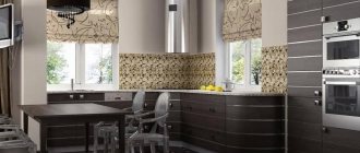
Kitchen style with a cream palette
Due to the neutrality of cream color, it is actively used in design art. In delightfully decorated apartments and houses, you can often enter the kitchen in cream tones. Photos of unusually delicate interiors fascinate with the grace and comfort of their spatial compositions.
A cream kitchen in the interior of a home can appear in different forms:
- Eternally relevant classics welcome the filling of the culinary and dining areas with representative-looking design elements - a fireplace portal framed with carved white and yellow panels, a kitchen set made of natural wood with ivory color.
Cream-colored kitchen in a classic style
- Modern interiors are furnished to the maximum with innovative kitchen appliances, multifunctional sets, and compact furniture in natural colors. At the peak of interior fashion, pastel colors, which were previously used exclusively for decorating bedrooms and living rooms. Today you can admire their calming energy during breakfast or dinner. Cream-colored gloss looks elegant on kitchens. Photos of sparkling furniture facades with a reflective coating of delicate color demonstrate in all their glory the variations of their use in interior design. The shine of light furnishings looks elegant, while dark ones look pretentious and clumsy.
Cream-colored kitchen interior in a modern style
- Muted, as if bleached by the sun, furniture and decoration of the kitchen space in cream tones silently point to the aesthetics of country, Provence, Scandinavian, colonial, and ethno-style. This natural tone, emitting light, contributes to the creation of an airy, natural atmosphere.
Airy Provence for a cream-colored kitchen
This noble-looking color and its varied gradations can easily be used in any design direction.
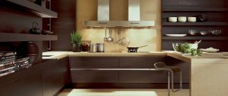
Glossy kitchen set in vanilla and chocolate colors (photo selection)
The gloss on the kitchen facades looks quite original. And due to the shine of the material, it allows you to visually expand the space a little.
You will need to decide not only on the color and finish of the set, but also on the material that will be used for the work surface.
Often, glossy kitchens are made in two colors. Darker shades are found on the lower cabinets. While a light shade is used on hanging structures.
If we talk about color combinations, vanilla is the most neutral - almost all other colors in the palette go well with it.
It is not necessary to use only one specific style; you can organically combine classic and hi-tech.
But when combining colors, you should take into account what style the room will be designed in. If this is a classic option, then it is better to use the traditional cream and chocolate range.
If you choose the lightest vanilla color and a light shade of milk chocolate, you can get a warm space that will harmoniously reflect classic interiors, colonial style, art deco, and modern.
Vanilla can be used in furniture design both as the main color and as a finish.
If you choose a brown of a darker shade, for example, the color of dark chocolate, then in this case the combination with vanilla is also suitable for modern styles.
What is good about the tone described is that it is ideal for small spaces.
The photo demonstrates quite clearly and representatively how original the chocolate and vanilla gloss kitchen looks. Only a part of the classics remains here, and the polished texture gives the interior originality and style.
Visually, such a set will expand the space.
Interior combinations of cream with other tones
An unusually delicate color with a yellowish tint and a pale pink tint perfectly harmonizes with both light and dark tones. It has a large number of gradations, determined by the proportionality of additives when mixing white with beige, yellow, red, and brown.
Its calm “temper” allows you to set off contrasting colors, create the basis of pastoral aesthetics, smooth transitions, proportionate and balanced combinations. As a result, it is possible to obtain a beautiful kitchen interior, treated as a single space.
It will be possible to reveal all the richness of cream color if you select tonal companions wisely and in doses:
- The excessive warmth of pastel colors should be tempered with cool tones - blue, ultramarine, gray, turquoise, ocher.
Cool tones will dilute the excessive warmth of pastel colors
- Combinations of cream with summer colors - yellow, orange, crimson, crimson - will help to warm up a kitchen that radiates frosty cold.
- A sickly sweet atmosphere can be created by mixing “delicious” tones - cream, peach, vanilla, marshmallow.
- Combinations with light green, pink, violet, and herbal colors that imitate natural renewal look fresh in spring.
The combination with green color looks fresh
- The richness of the kitchen in cream tones will be emphasized by patinated fittings and accessories in silver and gold.
If you need to create a delicate palette without sharp contrasts, you should use light colors to decorate your kitchen. The ivory set is cream, the combination of a dark floor and a light ceiling interspersed with bright interior details will focus attention on the tonal saturation of a balanced color scheme. To form a subtle and delicate interweaving of pastel colors, it is worth drawing smooth transitions from darker to lighter from the bottom to the top of the room in a picture of the kitchen interior.
The richness of the kitchen will be emphasized by the gold-colored decor
The cream-colored kitchen radiates inspiring feminine energy. The colors of pistachios, pearls, cocoa, lilac, coral, and other visually pleasing tones organically complement and supply the interior with vital energy. This facilitates the implementation of intricate culinary ideas that turn into delicious dishes.
The cream-colored kitchen of a spacious country house and a miniature apartment looks equally chic. The space is abundantly filled with air, light, and dessert flavor. To stylishly decorate the interior, you need to boldly create contrasts in the form of a combination of matte and glossy surfaces, perfectly smooth with convex textures, calm with dynamic colors.
Pastel colors will fill the space with air and light
The stylish furnishings of a spotlessly clean kitchen in cream tones will definitely become the pride of the home owners. Here you will not only want to dine, but also organize family leisure, celebrate celebrations and meet with friends for no reason, because the atmosphere is thoroughly saturated with the vibes of home warmth and peace of mind.
What colors to combine beige walls in the living room?
One of the most natural combinations is a duet of beige and blue colors, reminiscent of a seascape. Light beige walls combined with a blue sofa with accents such as rugs or pillows will create an interior with a calm and relaxing atmosphere. However, a beige and blue interior doesn't have to be bland - to add a little pop to the interior, let's opt for darker shades of blue such as lapis lazuli, navy blue or ultramarine.
The combination of beige with lilac, turquoise and cream colors is a proposal for those who love a slightly romantic shabby chic style. If we like interiors in warm, friendly and positive colors, we will focus on compositions - beige walls in the living room plus wooden furniture and accessories in olive, plum and chocolate tones. Also noteworthy is the extremely subtle combination of beige and powdery pink.
Those who like simple yet timeless solutions may like the combination of beige walls with warm white accents. Designers willingly use this color pair because it brings an interesting contrast to the composition - on the one hand, it invigorates, on the other, it calms. If we like harmonious color combinations associated with the colors of nature, it is also worth considering sandy beige and accents in deep shades of brown and blue.
Photo gallery – cream kitchen
Champagne color combination in palettes
Summer freshness Watery shades of blue and green effectively highlight pale yellow tones. This picture captures summer freshness, lightness, and positive light colors. The emphasis on cold-warm interaction fills the composition with sunny harmony, which feeds with energy and lifts the mood. Combinations include champagne, beige, aquamarine, grey-mint, brown-orange, greenish-gray.
Yellow cactus Nature plays with shades and teaches us how to do it. The center of this composition is a yellow cactus, around which natural shades harmoniously unite the picture. Soft grays, gray-greens, and muted reds give pale yellow the opportunity to fully reveal itself. The palette includes champagne, yellow-beige, pale coral pink, pale red, steel, khaki.
Pigeon meeting The shades of this photo are deliberately distorted for the sake of harmony and a new impression from the bright meeting of two purebred pigeons. Warmth was added to the composition, which was reflected in the white and dark plumage, turning them into a soft shade of pale yellow and orange, which also combined with the acquired warmth of the surrounding objects. The composition included white-gray, cream, champagne, bright orange, red-orange, dark red.
Cornflower blue bouquet A bouquet of flowers is always an inspiration, and if you add a colorful background to it, the impression will be enhanced many times over. The violet tone is complementary to yellow, so this particular combination will be the most expressive and juicy of all possible. The combination includes white-gray, champagne, gray-beige, bright orange, red-orange, dark red.
Shades of coffee color
All coffee tones will look great in the hallway. But in this case, an unmistakable level of lighting should be arranged. Milk can look good even in low light, but darker shades will require a good light source or even steam. The colors of café au lait, peach and beige will look just great in the bathroom.
According to the recommendations of the designers, this design can be complemented with dark accents, which will be in the form of independent details. The main advantage of this color is its fidelity. Café au lait can be the perfect backdrop for any room, and pairing it with other color schemes can create a truly cozy design.