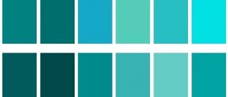
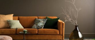
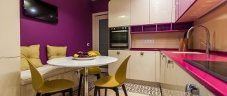
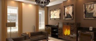
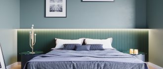
An unusual, deep and calm shade of sea wave allows you to create a relaxed atmosphere. This color looks advantageous in combination with sand tones and brings back associations of the sea coast.
Sea wave is a combination of green and blue, in the center of the spectrum. The shade is distinguished by its harmony. Color has a beneficial effect on a person, relieves stress and irritation, calms and helps to tune in to sleep.
Marine palette in interiors of different styles
Marine colors are often present in interiors decorated in Mediterranean styles and are associated with the warm sea.
Because it is so versatile, it can be incorporated into almost any style of interior as a sophisticated backdrop or accent. It will decorate a room decorated in both traditional and modern styles. The marine palette is used for paintings, curtains, furniture, surfaces, including floors and ceilings. Living room in Mediterranean styleSource arkadiaplus.com.ua
In this photo, the designer combined marine shades with white, gray, beige, sand and milky blue
Marine style kitchenSource bucwar.ru
Deep rich or delicate shades are used in the decoration of walls, furniture, and accessories. With the help of sea blue you can add originality to the classical style, to add nobility to the art deco style, and to give spectacularity to the Scandinavian style. By correctly placing color accents, you can add luxury, sophistication, and lyricism to your style. In high-tech, cool tones will emphasize the shine of metal, and in oriental styles they will make the celebration of colors more harmonious.
Office in a classic style. Colors create an atmosphere of peace and comfortSource st4.styapokupayu.ru
Neoclassical. Deep sea green is less pompous than burgundy and red. Source i.ytimg.com
The color scheme is perfect for creating an elegant formal interior
Pop art designSource stemcellglobal.info
Marine shades in a fusion style interiorSource roomester.ru
Photos of fashionable furniture in shades of turquoise
Whatever style the interior design of an apartment or house is decided in, there will always be turquoise furniture that will fit perfectly into it. Kitchen furniture, armchairs, sofas, poufs, dining or bar chairs - the choice of products in this color scheme is huge. And among them there are both ultra-modern models and things with a special vintage charm.
A splash of color in the living room dining area
In the photo: Turquoise armchairs in the interior of the living-dining room
Textile upholstery in a rich cyan shade is an excellent solution for armchairs in a modern dining set. Especially if we are talking about a fusion-style living room with unique loft lamps, metallic gold decor and bleached oak parquet flooring. Such furniture will definitely not go unnoticed and will make its contribution to creating an original environment.
Vintage charm of a neoclassical kitchen interior
In the photo: Furniture in the shade of whitened turquoise in the interior of a neoclassical kitchen
Thanks to patinated fronts with classic panels and vintage handles, kitchen furniture in a delicate light turquoise color looks elegant and noble. Using such a set in a neoclassical interior is a great idea, because it will give the atmosphere a soulful Provençal flavor and give the feeling of a country house with an aristocratic flair and without obvious rustic features.
Gray-turquoise interior of a room for a teenage boy
In the photo: Wardrobe with turquoise fronts in the interior of a children's room
The monochrome basis of the interior of a children's room for a teenage boy with a graphic print forms a harmonious combination with a shade of bleached mint. Plain glossy fronts of the wardrobe and a tabletop in a beautiful aquamarine shade bring bright accents of the color of the sea lagoon into the interior.
In the photo: Monochrome interior of a children's room for a boy with turquoise accents
Morning coffee
In the photo: Armchairs with mint upholstery in the interior of a modern bedroom
Modern style is unusually democratic and favors original design solutions. Therefore, a pair of armchairs with mint upholstery will be more than welcome in a modern, bright bedroom. And if you complement them with a light coffee table with an airy metal frame, you will get a cozy seating area where you can while away the time with a pleasant conversation, read a book, drink a glass of wine or a cup of aromatic coffee.
Cozy urbanism
view album in new window
In the photo: Turquoise decoration of the loggia in the apartment
The decor of a pleasant turquoise shade, wallpaper and Roman curtains with a damask pattern make the interior of this loggia homely, giving an amazing effect of softening the urban panorama outside the window.
view album in new window
In the photo: Textile upholstery and turquoise curtains in the decoration of the loggia
Black color
Black is not a very popular color for decorating a space, as it is associated with mourning and depression, but in the right hands it will create a unique and stylish design. With the help of black you can create an atmosphere of mystery and security. Combination options:
- The classic combination of black and white has an invigorating effect and is perfectly reflected in the interior of bathrooms.
- For a stylish and youthful design, a tandem of black and yellow colors is used, the interior turns out rich. Black can act as the main tone, and yellow is added for accessories: pillows, lamps or chairs.
- The combination of black and green looks harmonious in a country house. Grass or emerald green can be used to decorate the walls along with black furniture.
- The combination of brown and black harmonizes in a classic interior.
In a combination of red and black colors, it is better to use white to dilute their aggressiveness.
What to combine with
The aqua color goes well with other neutral colors. As a recommendation, designers advise paying attention to a number of combinations:
- Sea wave and orange. A bright combination that evokes summer associations.
This combination is most suitable for spacious rooms;
- Sea wave and coral. Another accent combination option, inspired by a marine theme. This solution is also more suitable for large spaces.
- Sea wave and black. The most neutral combination, which is accentuated, but does not create a feeling of overload with color. Black sets off the noble aqua color well;
- Sea wave and gray. This calm combination is perfect for a bedroom or children's room. The colors create the ideal environment for sleep and relaxation.
- Sea wave and white. A fresh solution that will look great in spaces of any size. The sea wave will beautifully reveal itself against a neutral, plain background;
- Sea wave and yellow. As with coral, this combination occurs naturally and is associated with Mediterranean style.
Each of the presented combinations provides for the introduction of additional colors. Blue, blue and green shades will look most harmonious. It is also acceptable to use basic colors.
Three main "don'ts"
There are strict restrictions when decorating kitchens using turquoise tones, which only people with developed taste and a sense of harmony can bypass:
- You shouldn’t “set fire” to a cold interior with bright red elements. Such a bold contrast if the proportions are not respected will make the atmosphere aggressive and tiring.
- Green-blue paints should not be used on the ceiling. Most likely, instead of the feeling of a clear sky above your head, you will get frightening sea waves that are about to crash from above.
- Don't let turquoise dominate everything. It should be present on equal terms with other paints. Still, the capricious color is intended to decorate and refresh a boring space, and not to subjugate it.
Floor
It is clear that a marine theme cannot exist without shells, dolphins and fish in the interior. Therefore, you can choose porcelain tiles with this design, or you can go even further by choosing a self-leveling floor that will contain elements of a marine theme:
- sand;
- crabs;
- exotic inhabitants of the deep sea;
- stones;
- other components.
Instead, you can do it simpler - choose a laminate of the appropriate color, which will become a good basis for a cozy interior.
Room design
The color of the sea wave has a calming effect on the human psyche, so it is often used as a base color, as well as to create focal areas when decorating bedrooms. Sea-green bedrooms are chosen by representatives of all generations: from children to the elderly.
Attic bedroomSource i.pinimg.com
The interior is laconic and simple. Bright colors give energy. White, beige and metallic shades emphasize the depth of the main tone.
Key elements have been carefully thought out, resulting in a coherent, harmonious look. Source casaomnia.it
Cozy combination of navy blue, gray and petrol Source cdn.deringhall.com
Along with paintings and designer bed linen, the interior is decorated with bright walls.
Marine shades are widely used to decorate rooms for children of different ages.
The nautical style is set by the wallpaper and the original bookshelf in the shape of a huge steering wheelSource freepvpgame.com
Neutral shades are used as a basis. Bright accents are placed through furniture and carpetSource img.edilportale.com
The palette is restrained. The interior looks interesting and unobtrusiveSource xiaoguotu.sj456.cn
The frost pattern looks great in the design of rooms decorated in cool colors. Source topdizz.com
For those who do not like the dictates of loud or faceless neutral colors in the kitchen, the marine palette is the best option. Combinations of cyan shades with natural wood fill the rooms with coziness. Bright colors - pink, yellow, red - bring cheerful energy.
A cozy combination is provided by teal and dark wood, complemented by white and light gray accords. Source www.casanaute.com
A classic technique in interior design is the use of three colors. Source avatars.mds.yandex.net
Variations of a kitchen interior in a marine styleSource i.dobrzemieszkaj.pl
Minimum detailsSource rehouz.info
Colors play a big role in shaping style and mood. For the relaxation room, choose calm blue-green tones.
A place for reflection and emotional rechargeSource res.cloudinary.com
The interior decoration is based on a green-blue shade, fireplace tiles and complementary accessories that create a home styleSource st.hzcdn.com
Color blocking technique in oriental styleSource stroyfora.ru
Blue-green shades are considered traditional for decorating bathrooms. Against their background, chrome-plated plumbing fixtures and snow-white earthenware look elegant.
White and mirror counteract the effect of visual narrowing of space caused by dark tonesSource www.myboutiquehotel.com
In a small bathroom, the space should be as organized as possible Source topdizz.com
Bathroom in turquoise Source i.pinimg.com
Self-leveling floorsSource ae01.alicdn.com
As a rule, almost no natural light enters the hallway. Therefore, many people prefer to decorate the walls of the room in light colors. However, even the dark range of sea blue can be successfully used. So that the space is not hidden by rich colors, they are balanced with light neutral tones: white, gray, beige.
A small irregularly shaped space is visually expanded due to the light ceiling, floor and furniture.
The space is visually enlarged by a white ceiling with built-in LED lighting. Source vivbo.ru
Bright expressive accents create the mood.
In the fusion style, rich colors set the tone; white “controls” the space. Source decor-design.me
Furniture and curtains in blue-green colors are suitable for different style trends, but they look especially harmonious together with wood, sand, white and gray shades.
Soft corner in marine shades. Source mc.bk55.ru
Pillows in faded colors, a fireplace and a solid wood coffee table create coziness.
Soft colors for children's roomsSource art-interior.moscow
Sea green partitionSource coffeesummit.org
And more options for using sea green color in the video:
https://youtube.com/watch?v=H-pcL1N6z1g
Color combinations of warm and cold colors in the interior of different rooms
Each person has his own perception of color schemes in the interior and preferences. When decorating a room, designers recommend remembering the most comfortable places; you can even borrow a palette from nature.
Living room and hallway
The whole family gathers in the living room in the evenings, and friends are also received here
Therefore, it is important to make this room as comfortable as possible. Warm colors are suitable for a spacious room, while cool colors should be emphasized and highlighted with decor and accessories.
For small spaces, preference is given to cold colors, which will visually open up the boundaries. To prevent the interior from looking boring, you can highlight accents using bright colors.
When decorating a hallway, it is important to consider lighting and area. Designers recommend the following:
- cold shades will enlarge the hallway and fill it with air;
- dark colors are chosen for spacious rooms or as an accent.
Bedroom and children's room
In the bedroom, a person should rest well and gain strength before the working day. Pastel shades and neutral colors contribute best to this. Designers recommend:
- for sleep disorders, pastel blue is suitable;
- to add softness to a cold interior, you can combine blue and beige;
- For maximum relaxation, you should choose a natural ecru color.
When choosing cold and warm colors for children, it is important to build on their character and level of activity. Cool colors are suitable for dynamic children
It will have a calming effect on the child. For calm babies, a warm palette is preferable.
Kitchen and bathroom
In the kitchen, emphasis should be placed on shades that evoke appetite. The yellow and orange palette, as well as light green undertones, are best suited.
It is important to observe moderation here. You can highlight only the facades, while leaving the walls neutral
And also use calm shades for furniture and decorate the dining and work areas with an accent.
When decorating a bathroom, practicality comes first, so the color should be chosen not from the point of view of visual perception, but how long it will take to clean. The monochromatic range can be diversified with an additional color or pattern. Since there is a lack of natural light in the bathroom, it is permissible to use contrasts to add dynamism.
Color combinations in the bedroom interior: warm colors
The bedroom is the calmest and quietest place; in its design you can use both cold and warm colors in calm undertones (from blue to pastel pink). But there are exceptions here too. To create an atmosphere of passion and love attraction, the sleeping area around the family bed can be decorated with sharp contrasts of boudoir colors (provocative red and black, cherry, lilac, etc.).
On a note! Not everyone can fall asleep calmly after a hard day in such a bright finish. In this case, you can recreate an intimate atmosphere with mobile decorative accessories in the form of candles, mirrors, and canopies.
Harmonious combination of light pastel colors
The main rule when decorating an interior is to highlight the main and auxiliary tones, as well as the shade that will act as an accent.
Accessories
Photo: gray-blue color in the interior
It is thanks to the pleasant little details in the design of the kitchen that it is easy to guess the maritime style. You can place small models of sailing ships on the shelves, and place a mirror in a metal frame above the dining area. Photos and paintings with marine scenes would be appropriate on the walls, as well as an aquarium placed in a niche. Such things as a barometer, a telescope, an anchor, a steering wheel, a fishing net on the wall and bottles with a note inside will create the right atmosphere. You can also take shells and starfish brought from your vacation and make an original and very beautiful wall panel out of them.
Lighting
What kind of light will be in the kitchen depends on the intended design. For a “ship cabin” it is better to use selective lighting with lamps with warm light. A “sea house” or “outdoor deck” needs more natural light, and lamps should have diffused white light.
The design of lamps for the “ship” style is characterized by metal shades or chandeliers made of steel or polished to a shine, and in some versions, darkened brass.
Chandeliers often use light bulbs that imitate candles. All this reminds us of those times when there was no electricity on ships, and only natural light from fire was used.
For lighter and lighter marine designs, it is permissible to use modern spotlights, various thematic or neutral chandeliers.
If the size of the kitchen and funds allow, you can “break away” and build an entire suspended structure in the shape of a boat with lighting above your head.
Or you can be more original and, using rope ropes, hang unusual Edison light bulbs on them, and at the same time flower pots to continue the theme.
Contrasting combinations
To compose color schemes, the color wheel, which was invented by I. Itten, is often used. This projectile helps you find the opposite shade and think through a combination of colors. The color red is in direct opposition to the color of the pelagic wave. This is the most striking juxtaposition to blue-green. But straightforward contrasting combinations can be too expressive to be used when creating color solutions for a costume or interior. Therefore, adjacent shades are usually selected from the color wheel near the overlay of a triangle. And in relation to the color of seaworthy waves, pairs with yellow and orange are contrasting. Such combinations are more complex and interesting than combinations with red. The ideal contrast for blue-green is unresponsive white. This combination looks very formal and expressive, but also very elegant.
Mustard curtains
Mustard curtains in the interior are the best way to double the sunlight entering the room, tune in to an optimistic mood, and place the right accents.
Window framing can be done with plain textiles, printed models or curtains of several shades. The most spectacular duets are with dark blue, gray, turquoise, and brown.
Combinations with companion fabrics look original when white tulle is placed closer to the window, the second row is curtains with a mustard print, and the third row is plain curtains in the color of the pattern.
For the kitchen, instead of heavy classic floor-length curtains, choose shortened models. Or completely replace the standard solution with Roman or roller blinds.
The photo shows a combination of tulle and roller blinds
Psychology of color: why this and not otherwise?
It is a well-known fact: our brain receives up to 70% of information through vision.
We distinguish objects by shape, size and...color.
We like some colors, but we categorically reject others. We want to surround ourselves with some, and see others as rarely as possible.
Why is that?
From a physics point of view, color is nothing more than light waves of different lengths. Their effect on our brain triggers characteristic reactions in it.
This impact is purely individual, but has more or less general trends. In practice, this means that the same color (light wave) can be perceived as different shades by different people.
Remember, in product descriptions on AlieExpress it is often stated that the color may differ from the actual color, depending on your monitor settings?
It's the same with the eyes.
If we dig deeper, it turns out that light waves influence not only how we “think” about them at the moment of perception, but also how we relate to them. There are colors that seem larger, more intense, more saturated to us. They are usually called “warm”. Others, on the contrary, seem smaller, calmer, more inconspicuous to us. They are called “cold”.
This feature of color perception can be advantageously used to create the interior of small rooms.
From a psychological point of view, each of us is a walking set of cliches and personal experiences that subconsciously generates associations. It is through associative thinking that psychology explains the sympathy of different people for different colors.
The color that some people associate with something good and pleasant, for others it evokes only the worst memories.
Let's take red for example: some associate it with strawberries and summer holidays, while others associate it with blood and a hospital.
Associations can be strengthened if the colors are in combination - green with red or white with red.
Compare:
Sometimes associations are so strong and subconscious that our brain acts out wishful thinking. Remember the epic with the ill-fated dress, the color of which was guessed by the entire global virtual community? Same thing.
It is important to remember about the psychological background of the influence of color when choosing a color palette for the future interior. The designer should be aware of your preferences and (especially!) what is categorically unacceptable for you (it is not at all necessary to go into detail why). It is also worth discussing this issue with the other tenants of the room or apartment if you do not live alone
It is also worth discussing this issue with the other occupants of the room or apartment if you do not live alone.
This also has its advantages.
For example, the interior of a bedroom can and should (!) be done in a color scheme that has a relaxing and soporific effect on you. Most often, this is exactly how a light beige color palette affects a person. But there may be exceptions: if you can only sleep in complete darkness and silence, give preference to a bedroom interior in dark colors.
Bright rich colors can provoke appetite, so they are appropriate to use in the kitchen interior. But a strict black and white color scheme stimulates brain activity, which is why it is most often found in office interiors.
The choice of color and even shades for the interior is also important because in many ways it is the color that can become the main argument in choosing a stylistic solution. The dark range of natural colors is typical for loft, and the light white-lavender color scheme is typical for Provence. Bright and rich colors will look appropriate in an interior in high-tech, eclectic, fusion, pop art styles, and natural wood shades - in classic, country, eco.
It often happens that in the wake of a trend, it becomes fashionable to decorate the interior in a certain style or in a certain color. But don't forget that in the pursuit of fashion you can easily lose yourself. What everyone likes may be an inappropriate and uncomfortable solution for you. And the interior is not a dress; you can’t change it in half an hour. So is it worth the risk?
The combination of sea waves in clothes
Sea wave combinations in clothing are stylish and bright. Any color type can choose a contrast for themselves, dilute it with neutral shades for severity or emphasis, add explosive contrast, or simply deepen the main tone with similar tones.
The combination of black and sea green in clothes is emphatically elegant. It does not require any additions, but if you add sparkle with gold or silver, it will enhance the impression.
Gray is no less elegant, but more modest and stylish. This is a godsend for the “summer” color type - calm, graceful. You can add contrast using black.
White and blue-green are a bright pair, the contrast of which will increase black and decrease gray, both options look impressive.
The brighter the beige, the juicier the pair. Gray-beige looks easy, almost imperceptible, but a bright shade of orange-beige helps to enliven the image.
Brown brings an element of relaxation and naturalness. Note that printed blouses add their charm to the look. Denim blue or red will fit well into this range.
Burgundy and sea wave are a playful but moderately restrained pair. It is good because it stands at the junction of brown and red, taking the best from both. It can be complemented by white, brown, orange, gold, yellow.
Red and blue-green are a bright pair, only for contrasting appearance, for example, “spring” and “winter”. The combination is often accompanied by turquoise and yellow.
Pink will help you take a fresh look at the sea wave. Strict blue-green indulges any manifestation of pink. To avoid being too colorful, the combination is diluted with white and black.
Orange will help you create an unusually rich look, more summer than autumn. And shades of beige will help make it more stylish.
Yellow will always complement blue-green. For “summer”, muted tones will be more successful, and for “winter” - bright yellow. Refresh the combination with white, beige or add contrast with black.
Delicate blue will highlight the richness of the sea wave. But it will be much more attractive if you add white, gray-beige-brown with gold to the combination.
Blue combines boringly with blue-green, but if you combine them with white, it’s a different matter.
Warm green shades barely set off the main tone, so they need to be diluted: white, brown or gold.
Purple is a good pair for blue-green - bright, contrasting, attractive, maybe a little eccentric, but it’s not for everyone. White and black will enhance the contrast, yellow will add a new flavor.
Stylistic directions for color
The sea green color is universal. It will find a worthy place in any interior. In some it can act as a noble background, while in others it inlays with restrained, calm accents. It will wonderfully decorate not only marine and Mediterranean decorations, but also any other solutions - from traditional to ultra-modern. The deep and alluring color can be used in decoration, furniture, and accessories. It will add nobility to the classic or art deco style, highlighting luxurious golden nuances and white stucco elements. Pop art or loft will reward you with spectacular decor or bright designer furniture. Provence will be decorated with discreet, elegant accents. In high-tech, the shine of metal and the shine of glass will be emphasized. In oriental interiors it will help to curb the riot of colors.
What shades are there?
The color palette is multifaceted. It comes in many shades. All of them were born from a mixture of discreet blue and natural green. Turquoise, sea green, peacock blue, Pacific, Cypriot breeze, deep sea, lapis, pagoda blue - there are simply countless options for sea green. Transparent and saturated, greenish or deep blue, these tones provide immeasurable scope for creativity. The choice of certain shades depends on the taste and preferences of the inhabitants of the house. For some, the sea is associated with a static blue surface. For others, it’s the continuous movement of waves and foamy splashes. That’s why everyone has their own sea green color. Some people like lake blue, others dark turquoise or deep Atlantic.
Sea green color combination in the table
Combinations with sea green color are often rich and attractive due to the fact that they are mainly based on color and light contrast, which are the most expressive. Pure, dark, saturated shades prefer medium-bright and bright tones when paired, which affects the expressiveness of the combinations. Thermal and light contrast plays an important role in combinations. We have compiled 10 combination tables for you with this shade. Review them and make notes for yourself.
The combination of sea wave and pink is bright, fresh, impressive. The juicy contrast of these shades is in its diversity: almost any pink can suit, create its own unforgettable atmosphere: tenderness, audacity, lightness. The palette consists of light pink, white-lilac, coral pink, raspberry, purple pink.
The sea wave is combined with red - boldly, defiantly. The complementary color to red is green, so blue-green is indirectly related to impact. The richness with which these two shades come together borders on vulgarity, but if you want to create a powerful color punch, this is the pair for you. Burgundy shades are combined more restrainedly and gracefully. The color range includes watermelon, coral red, ruby, red earth, wine.
The combination of colors: sea wave and orange is another pair that provides additional contrast, but in it it is expressed not indirectly, but openly. Any bit of orange to blue-green, and we see a riot of color, so muted shades are preferred, like light peach, orange coral, tangerine, copper, red. They look more noble in pairs.
Sea wave combines with yellow into a juicy pair built on thermal and light resonance. Unlike previous thermal contrasts, this one also carries a kinship that is tied to the yellow undertone of blue-green. Such colors are striking, but do not cause irritation if the yellow tint is muted. The table is composed of champagne, sunny yellow, mustard, amber, old gold.
The combination of sea wave and warm green is soft and iridescent. It is defined by a slight thermal and light contrast, but since most greens are medium light, the shades shimmer into each other, creating the feeling of distant foliage or pine needles. Green pea, chartreuse, herbal, love toad, dark green were used in combination.
Sea wave and cold green are combined into a range of one tone. Cool green colors are the same marine shades that look like shadow or light on the surface of the water. This composition is good as a background for warmer tones, but can also be used independently. For example, consider a combination with the color of green water, menthol, jade, emerald green, malachite.
Moravian wave, light blue and dark blue: a combination of colors also includes shades of the same range, but in this case, the blue in the total mass is cooler than blue-green, so we can observe a slight thermal contrast, where our shade will be warm. This combination has both “shadow” and highlight colors, which significantly deepens the composition. The palette consists of aquamarine, bright blue, turquoise, Prussian blue, cobalt.
The combination of sea wave and purple is juicy and exotic. A light warm-cold contrast helps the colors to open up, and the unifying blue establishes harmony. In principle, everything goes together colorfully with purple, just like with blue-green. And in this tandem, the tones increase their attractiveness effect. Consider a composition with lilac-lilac, lilac amethyst, blackberry, plum, grape.
How to combine sea wave and brown? Blue and orange are an additional pair, and brown can be imagined as a shade of the latter, which is why they are combined into a super-effective composition - natural, soft, pleasant, and blue-green is no exception in this regard. The table includes oak, golden chestnut, mahogany, chocolate, dark chocolate.
Sea wave and white, beige, gray and black are combined as neutral shades, each of which has its own effect on the main color: white brings freshness, beige - sophistication, gray - lightness, style, and black - evening, expensive gloss. For example, consider pairs with milky, beige, lilac-gray, anthracite, black-gray.
Beige tones
Beige has many attractive tones such as:
- With brown – coffee, milk coffee, chocolate.
- With yellow – the color of sand, the color of wheat, and the like.
- With pink – beige with pink, creamy.
Also often used for apartment design are ivory, cream, pearl, caramel, and the like.
The beige range can be roughly divided into two groups:
- Classic - to natural beige (caramel, sand, milk color) - it turns out very elegant.
- Natural – can be found in surroundings (with grey, grassy, sea tones) – great for relaxation.
You can also use different contrasts: beige with rich, bright colors (purple, red, orange). This results in a very attractive style, with a touch of extravagance.
Warm and cold colors in interior design
There are a huge number of shades, in combination with which warm tones smoothly transform into cold colors and vice versa. Their correct choice will make the interior harmonious and cozy.
Cool shades of red in the interior
Despite the fact that red color belongs to a warm palette, its range of shades also includes a cool range. Several subgroups can be distinguished:
- light red with a pink tint;
- cold cherry and pink-burgundy;
- rich ruby;
- dark burgundy purple.
To generalize, cold shades include light shades, as well as rich reds with an admixture of black and blue. The interior looks much more advantageous if it contains both warm and cold tones, without contrasting highlights. Lines should flow smoothly from one shape to another; they give volume to the space.
Warm and cool shades of red
The warmest blue color, turning into aqua shade
Psychologists have proven that the use of blue in the interior relieves nervous tension and fatigue. In addition, it has a beneficial effect on sleep. Therefore, it is often used in bedrooms, recreation areas and offices. Expressive shades hint at the well-being of the owners and delicate taste. The deeper the color, the more all these qualities appear.
However, in its only form, blue can cause melancholy or sadness, so it is recommended to dilute it with warm shades. A more harmonious combination appears when green is added. This color is called teal or seascape shade.
Blue palette
All shades of white and warm gray
White is a universal color. It goes with absolutely any shade and is suitable for different styles. As an independent tone, it gives the environment a feeling of airiness and incredible spaciousness. In combination with warm colors, white color sets the same soft background, and with cold colors it will refresh the interior.
The Benjamin Moore collection includes more than 140 shades of white. It is organized by shade, so you can always choose a cool color with a blue, green or gray tint, or a warm palette.
Shades of white
An incredible number of gray shades allows you to create an interior in both warm colors and cold ones with a lilac tint, as well as warm or cold pink colors. There is no need to be afraid to experiment, the main thing is to choose the right composition. It is suitable for classic and retro styles, as well as ultra-modern designs.
Who is it suitable for?
Turquoise has more than 100 shades. You can find out which one is right for you through practical selection. Or find out your type and color type. This will help you save money, because you will know exactly which item is suitable. And learn to emphasize your figure and appearance.
A simple test will help you identify the right color tone:
- Buy sheets of paper of different shades and saturations
- Place them under your chin and see how each of them is reflected on your face.
Ideally, the test should be performed without clothes or with bare shoulders and décolleté. If you still wear clothes, then a tone close to your skin.
As a result, you will see how a certain shade can affect your appearance: add redness to your face and freshness to your eyes. It can even shade hair and teeth. This way you will understand which colors suit you and which have no place in your wardrobe.
This test will not take much time or money. Sheets of such paper can be purchased at an art store.
