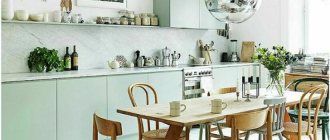
Cappuccino tones, due to their neutrality, are excellent for decorating kitchen areas. They fit perfectly into any style direction and are liked by almost everyone. Cappuccino shades make interiors soft and airy and evoke associations with a coffee drink, which makes them extremely popular.
What colors does cappuccino go with?
Cappuccino can be combined with various tones to create successful duets. Let's list the most common combinations.
Cappuccino and vanilla
The combination of vanilla and cappuccino is as close as possible to pastel yellow. The most successful combination can be obtained if you use a matte coffee shade with milk as the main tone. Such design will have a positive effect on the psyche of residents. The decor looks stylish, but unobtrusive.
On a note! A duet of vanilla and cappuccino is an excellent solution for a small kitchen space.
The vanilla shade looks harmonious when combined with cappuccino, making the interior fresh and uplifting.
This duet is perfect for people who strive for harmony and tranquility, but do not want the kitchen interior to seem boring and monotonous.
White
The soiling of white makes it necessary to use it in the kitchen interior with caution. Finishing materials must be selected very carefully. An excellent option for decorating the kitchen area is a white upper part and a lower part made in cappuccino color.
Floor tiles, exterior cabinet doors and countertop surfaces can be done in a light coffee color scheme, with a white area at the top.
Other colors
The cappuccino shade can be combined with almost any color, for example wenge. It will unobtrusively emphasize the softness and warmth of the coffee palette.
The dark brown tone of wenge organically complements the light coffee interior palette and contributes to the correct placement of contrasting accents.
Cappuccino goes well with turquoise, mint, lilac, pistachio, pink and many other colors. If you wish, you can create a lot of successful combinations.
Designer interiors
A Baroque style kitchen allows you to combine both wood and glass in the furniture. Cabinets with small glass inserts will look incredibly beautiful. Baroque style is appropriate for large and bright kitchens.
Give preference to wooden furniture finishes and natural stone countertops. The same techniques can be used in country style.
For a studio apartment, the kitchen and living room are always done in the same style. A kitchen in a classic style would look out of place, but a room in the Provence style would look out of place. Also, all furniture should resonate with each other and create an overall holistic picture. Combine two, maximum three shades in such a room.
- Straight and clear lines, without roundness or bulges - the best matte kitchen for loft and high-tech styles.
- Unlike high-tech, in a loft you can use almost the entire palette, the main thing is to correctly combine the shades with each other. So don't be afraid to experiment.
- A kitchen set in the Art Deco style will truly become an art object. Please note that art deco does not accept flashy shades. Everything should be restrained, but tasteful.
- Matte facades can be matched to any stylistic decision of your kitchen.
If your kitchen is designed with an island, opt for a glossy countertop and make the rest of the table matte. Thanks to the gloss, the kitchen will not look boring, but stylish.
But pay attention to the fact that the material is durable and of high quality. If you want to save money, then soon your countertop will have to be thrown away and replaced with another.
Which facade to choose: glossy or matte
In kitchen interiors designed in cappuccino color, both glossy and matte furniture are used. The advantages of glossy facades include:
- presentable appearance;
- visual expansion of spatial boundaries;
- with proper care, furniture does not become outdated;
- countertops are not afraid of contact with water and cleaning agents.
Disadvantages include the need for constant cleaning, the inability to hide scratches, and the visualization of fingerprints.
The advantages of matte facades are functionality and long service life. Scratches and dirt are invisible on their surfaces.
Disadvantages of sets with a matte finish: insufficiently presentable appearance, inability to visually expand the space.
Professional designers advise giving preference to furniture with glossy surfaces, despite the increased need for cleaning.
Furniture and kitchen set
When developing an interior design, it is not necessary to focus on installing the headset exactly in the color of the main furniture. It is important to maintain a uniform style, but colors may differ, both in tone and contrast. These are acceptable points, since here functionality goes hand in hand with style.
A set of kitchen furniture does not have to be monochromatic; a cappuccino shade can be present either in the lower or upper tier, harmoniously echoing other rich tones
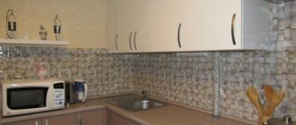
What color should I choose for an apron?
A good idea is to create a “confectionery” design on the surface of the work wall. This could be, for example, coffee beans or an image of a cup with steam rising above it.
Materials for making an apron in a cappuccino-colored kitchen can be:
- tile;
- glass;
- mosaic;
- natural or artificial stone.
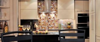
Glass aprons decorated with themed photo printing are perfect for modern style and most classic styles. Usually the work wall is decorated with an image of freshly prepared coffee with a variety of spices and sweets.
Aprons that depict landscapes and reproductions of paintings also look great, especially if they are complemented by a frame in the form of relief inserts that create an imitation of brick or stone masonry.
The most popular coffee aprons are made from tiles. They look presentable, are durable and practical. Tile backsplashes fit organically into various styles.
Working surfaces made of stone (it can be either natural or artificial) also look beautiful and are durable. But they have a textured surface and caring for them is more difficult than their tiled counterparts.
Playing with shape and filling
The filling of the kitchen depends on its size. For a small kitchen, the layout of the work area in an angle or the letter L is very popular. In such kitchens, every centimeter of space is saved, for which they often turn the window sill into a work surface or an extension of the dining table.
Every housewife dreams of a large and ergonomic kitchen, because it is a real gift
In spacious kitchens, corner kitchen units are also installed, because this allows you to make a spacious kitchen even more spacious, and the work area more comfortable. After all, when placing the main objects: stove, sink and cutting table in a triangle, you will have to take fewer steps.
In spacious kitchens, a bar counter is often used; it allows you to divide the space into a technical area and a food area. A bar counter is an excellent option for a studio apartment.
Designers recommend keeping countertops in the technical area and furniture in the dining area in the same tone; this gives the room a finished, harmonious look.
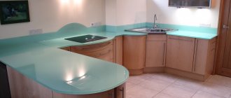
What color should I choose for my countertop?
The contrasting combination of a light cappuccino shade and a more saturated color of the tabletop looks great. The countertop should be much darker.
What style does it suit?
Vanilla shade is used in the following styles:
- Provence. This romantic style involves the use of natural materials and delicate pastel shades.
- Classic. When decorating a room in this style, it is recommended to use no more than three colors. An integral part of such an interior is high-quality wooden furniture.
- High tech. The vanilla set, finished in gloss, emphasizes the originality of the interior and makes the kitchen elegant.
Lighting Features
If beige and vanilla tones predominate in the kitchen, then many lamps should be installed in the room. It is advisable that they give a warm light, otherwise vanilla shades will appear dirty
Particular attention should be paid to the work area. In this area you can install spots and spotlights
In the dining corner, wall sconces with dark matte shades look interesting and unusual, creating a romantic atmosphere.
Wallpaper color
Wallpaper is a traditional way of decorating a wall surface. For the kitchen area you need to choose practical finishing materials. You can cover the walls with washable wallpaper.
Important! You can’t wallpaper your kitchen with liquid wallpaper; it will immediately swell from high humidity.
Paper, non-woven and glass wallpapers are suitable for kitchen premises. The finish can be plain, textured or with patterns. The composition of the wallpaper ornament should not contain large flowers and squares.
On a note! Coffee-colored wallpaper can be combined with stone inserts and wood panels.
Features of “vanilla” decor
This color can be used as a main shade for kitchen decoration and kitchen furniture, or as an additional one. Vanilla is considered the color of calm, so the contrasting interior must be enriched with bright and expressive elements.
A vanilla-colored kitchen will create the effect of visually expanding the kitchen area, which is why this option will be ideal for relatively small rooms.
Kitchen "vanilla" in country style
Cuisine “vanilla and cappuccino”
Choice of curtains and lighting
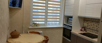
To decorate small window openings, it is better to choose Roman blinds.
Another popular decoration option is a custom-made lambrequin.
Thin tulle curtains are hung on standard-sized windows and complemented with thick coffee curtains.
Choose coffee curtains whose shade is close to the color of the set and wall surfaces. The material can be either natural or artificial. When choosing fabric, consider the decorating style of the room. Curtains with a pattern are best combined with plain wall surfaces.
If patterned wallpaper is used in the design of the kitchen space, they will be ideally complemented by plain curtains.
Important! The pattern on the textiles should be selected based on the style of decorating the kitchen. It is advisable that it be invisible - this will make the interior elegant.
In the interior of a coffee kitchen, it is appropriate to use LED spotlights, chandeliers and mixed lighting.
The advantage of LED strips is that they occupy a minimum of space and effectively transform the room. A chandelier with a lampshade will fit perfectly into such an interior. The backlight can be chosen with patterns or monochrome.
In coffee tones you can decorate a kitchen in any direction - from classic to high-tech. This palette is suitable for Provence, minimalism, loft and other styles.
The use of cappuccino color in kitchen design is becoming increasingly popular. A harmonious combination of decorative elements and surface finishes will make it possible to create a unique interior that will attract all household members.
Design of various rooms
The following room designs in the apartment are recommended:
- We buy the kitchen in mocha color. You can choose a gray hood above the stove, but then you should paint the walls the same shade. The floors should be covered with beige and brown tiles in a checkerboard pattern. The doors are beige. We choose mocha colors for the table and the base of the chairs, and beige for the upholstery of the chairs. We place the tabletop in the work area in beige color. Designers will advise you on which accessories to choose. For example, purple napkins for dishes on the table and green plates will help to dilute a strict set. A bouquet of daisies in a crystal vase will complete the kitchen interior in mocha color.
- In the dining-living room with a touch of mocha, do not go overboard. It would be nice to put 2 sofas in the relaxation area - one upholstered in brown leather, the other in milky leather with brown velvet pillows. Ottoman - a table should be chosen with a brown top and a milky base. Curtains for windows should be of two types - white tulle and thick beige fabric. Lampshades on the overhead lamps can be chosen in walnut color. We decorate the ceiling, doors and walls in the color of milk. We put mocha-colored furniture in the dining area - a table and chairs.
- A bedroom in a mocha tone suggests a trestle bed with brown leather upholstery and a milky base. The floor and accent wall to the side of the bed are in mocha shade. The cabinet next to the accent wall is made of milky chipboard. The bedside tables and chest of drawers have mocha fronts and milky side walls. A piece of the wall above the head of the bed is covered with beige wallpaper up to the ceiling, and there is a beige carpet under the bed. The rest of the wall is painted a café au lait shade. This color is supported by the same tone ottoman. It will be beautiful to place lamps in the form of carved beige balls on the bedside tables. Light oak doors complete the design.
Many housewives love mocha color. The ability to create an interior of different styles that will have a calming effect on the nervous system is appreciated by many clients.
In reviews on the Internet, buyers recommend decorating rooms in mocha color. Photos of various rooms in mocha colors are shown above.
Kitchen design in cappuccino color (real photo examples)
Variety of color palette
In order to understand the color palette of doors, it is not enough to know all the names of the colors. It is important to remember such components as texture. Each texture has its own unique shades.
For doors made of solid wood, chipboard and plastic, the following colors are selected:
Brown
- American Walnut is a rich brown shade that comes in a variety of interpretations. It is typical for a classic interior and is suitable for decorating both entrance and interior structures.
- The deep brown shade is inherent in wenge wood. This color is similar to the color of rich dark chocolate. It eliminates the mixture of shades and in most cases has a matte texture.
- Italian walnut has a brighter tone, falling on the border between brown and red. This color is used for the Orchid design, which is a popular type of interior doors.
- Mahogany has a rich burgundy color, which does not have a “flashy” tint and looks very noble.
- The most neutral shade of brown is teak wood. It does not contain additional tones and is often used to create entire sets.
- For both wooden and plastic doors, a popular coating color is mocha. Like the drink of the same name, it is a noble brown shade with slight tints of texture.
- For lovers of light brown tones, a Scandinavian walnut color design is suitable. Both the panels and the solid mass will look good and combine with almost any interior. The doors of the Sonata model are often embodied in a similar shade of walnut.
Gray
Ash and asphalt shades are increasingly popular in various interior styles.
To decorate the door, colors from the following palette are suitable:
- Dark ash anchor has an unobtrusive light gray color that will not attract undue attention to the door structure.
- Ashy cappuccino, located on the border of beige and gray colors, looks very elegant and unusual.
- Paloma is a shade of gray, dotted with light stripes, making the surface look more prominent.
- Ash wenge is perfect for lovers of solid shades. It is a rich tone with a discreet dark relief.
- For MDF material, light gray metallic is used, often used in modern interior styles.
White
White colors always look catchy and sophisticated.
They come in a variety of shades that will make your room door truly impressive:
- Milky oak is a very pleasant color. Despite the light shade, it has a pronounced texture that looks great over the entire surface of the product or in combination with contrasting dark materials.
- Ash is often used as a light-colored door covering. Varieties such as Sonoma ash and Shimo ash give doors a delicate, but at the same time noble appearance. Shimo has a cooler shade of light, while Sonoma is closer to beige in color.
- Ivory color is used for designs made of various materials. It is often found in paneled products, popular in antique and classical styles. Ivory can often be seen on vintage designs, sanded down for added effect.
Advantages of decorating an apartment
Decorating an apartment in mocha color has the following advantages:
- The shade looks good both on individual objects - accessories in design, and in the tone of the set or as the main color of the walls and floors. With the right combination of cool and warm tones, you can create a rich and stylish room.
- The mocha color in the interior helps a person to calm down and relax. For excitable and nervous people, this color in the apartment is recommended by experts.
Comfortable studio apartment design
- Mocha works great in combination with other tones. When using bright accessories, this shade “quenches” the excessive brightness of objects.
- Using an interior in mocha tones, you can create a design of various styles. This includes eco-style, Provence, retro, chalet, loft and other options.
Modern interior style
- The texture of mocha-colored furniture can be very different - matte and glossy, carved and smooth, aged and ordinary. The shade goes well with other materials - wood, glass, stone, metal.
Designers nowadays do not shy away from new ideas. The most daring solutions in the interior of apartment rooms are offered to the demanding customer. You just have to remember that rich brown color optically reduces space. In small rooms it should be used in shades of accessories. You can recreate a bedroom with brown furniture. It is better to decorate wallpaper, doors, windows in cold or warm light colors. You can experiment with large rooms by making the panels on the walls dark brown. At the same time, it is worth decorating the floors with light colors and buying furniture combined with milk and brown.
Living room in light brown tones