Subtle and easy on the eye, it creates flattering color combinations and looks great in any room - which is probably why powder pink has become so popular lately and there's no sign of that changing in the future.
Powdery pink in the interior has other advantages - it is not cold and not too warm, it does not evoke strong emotions, does not excite or irritate, does not get boring quickly, for example, like bright red, yellow, purple, and therefore suits almost everyone .
In short, powder pink has the value of neutral colors, but is more expressive and eye-catching. It is for these reasons that this shade has increasingly taken on, until recently, the role of beige and gray, becoming the color basis of the composition in interiors.
Powdery pink color on a fragment of the wall and on some details, incl. on the mirror. Even though it is used in moderation, it still attracts attention.
What interiors is powder pink suitable for?
Powdery pink is a universal shade. So it can be used in spacious and small interiors and decorated in many styles. It will fit into a classic living room, glamorous bedroom or retro dining room, as well as a modern kitchen or bathroom. It will look great in any room and in almost any setting!
Powder pink in the living room design
In the living room, as in the bedroom, powder pink can be used as a backdrop for decorative elements in other colors (if you decide to do this, remember that its shades should also be repeated in some details).
Powdery pink is great as a background.
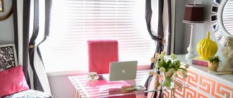
The second solution, which is used much more often, is the choice of powder pink as an additional color in the color composition, i.e. using it in accessories. Powdery textiles will warm a modern living room. This could be pillows on the sofa (for example, gray ones), curtains on the windows and carpet on the floor, a picture hanging on the wall, or a vase standing on the chest of drawers. You can also choose all of the upholstery in this color or just some of it, such as sofas. This makes the interior look more interesting and modern.
An armchair and vase in light pink shades take center stage in a living room decorated in neutral colors.
Pink in bedroom decor
For this room, powder pink seems just perfect. If there is a lot of it, the bedroom will acquire a feminine, romantic character, which promotes intimacy, tranquility, forgetting about everyday problems and, thus, good rest. However, a lot of powdery pink does not mean that this is the only color for creating an interior - a monochrome combination, even consisting of many shades, can look too sweet and soft. Therefore, we recommend using this color only on some decorative elements.
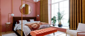
Powdery pink makes a very clean and attractive color combination with a dash of gray and white. The Scandi copper mirror perfectly complements this composition.
Powdery pink in the bathroom
Yes, he sneaks into the bathroom too. Most often, it is chosen and pink ceramic tiles are placed on wall fragments (the rest is painted with paint in the appropriate color, preferably light, neutral), as well as towels or other textiles. However, we do not recommend choosing pink bathroom accessories. Mugs, dispensers and boxes made of glass or transparent plastic with elements made of gold, copper or silver will look more elegant, to which you can choose hangers and a mirror frame made of the same metal. It would also not be a mistake to introduce a contrasting element - black or anthracite.
Finishing
Floor
Carpet will decorate and eliminate unnecessary noise from a children's room, living room or bedroom. Floor slabs with imitation marble deserve special attention; they look very impressive even in small rooms. Suitable for corridor, living room and kitchen.
Ceiling
A suspended ceiling made of plasterboard allows you to recreate a multi-tiered structure of an unusual shape, and thanks to the tension fabric, you get a perfectly flat surface, which can also visually enlarge the space due to the glossy material. An interesting idea would be to decorate with wallpaper with photo printing, for example, a pink sky with snow-white clouds.
How to use pastel pink color in the interior?
The atmosphere that pink creates depends on how large of a surface it covers, as well as the proximity of the other colors it will be combined with.
Powdery pink on the walls
All walls can be painted with dusty beige or gray paint - they will become a good background for mirrors or paintings and furniture, both in light and dark colors.
A dark shade of powdery pink dominates here, complemented by beige and black-green accents. This is an attractive and calm color palette.
Powder pink, gray and brightening white are also a color combination worth recommending.
The second option is to paint only some walls or their fragments. Let the interior colors consist of various shades of pink combined with other colors that should also be present in some other decorative elements. This is the best way to separate zones and create a harmonious, memorable interior!
Powdery pink color on a fragment of the wall and ceiling separates the dining room from the living space.
Powdery pink in additions
Of course, you can choose a completely different wall color, and only powder pink accessories, mostly textile. Since there are usually a lot of them in interiors, this color will still dominate the color scheme.
Even a small amount of powdery pink will warm up a cool white and green bedroom enough. And mirrors complement the space.
Pillows, bedspreads, curtains and lampshades can be pink. Of course, you should distinguish between their shades and texture of fabrics and the degree of gloss, and also combine uniform surfaces with patterned ones, because only then the arrangement will not seem monotonous. Other decorative accessories such as candlesticks, mirror frames, photographs, paintings and graphics should be metallic - copper or gold. Each of these metallic colors pairs perfectly with pink. What to choose should depend only on the other colors that should appear in the interior.
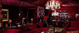
Pink sofa is the king of the interior
The velvet pink quilted sofa is the latest hit in living room decor! It catches the eye and gives character to the entire interior. Since it is better suited as a star, it cannot compete in the form of armchairs or poufs upholstered in the same fabric. And just as every star loves the glow of spotlights, it is worth illuminating it - placing a table or floor lamp next to the sofa, and hanging a mirror on the wall behind it, which will catch and reflect the rays of light. They will not only decorate the interior, but also emphasize the delicate beauty of the upholstery color.
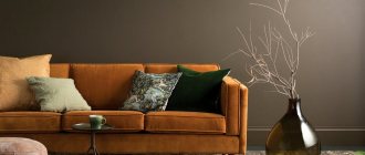
Against a dark background (bottle green here) the powder pink looks even more beautiful.
Mirrors are pink, copper and...
Although powdery pink makes interesting combinations with all metallic colors, it looks best next to copper.
We also recommend combining pastel pink with gold. It's also a well-chosen pair, especially when accompanied by white, gray or mint green. Therefore, it is worth turning to mirrors with a gold frame or with gold elements.
Ash rose color combination
- with aquamarine - adds freshness to pink-lilac, entering into a slight contrast of warm and cold. The overall feeling of softness does not change, and the light-dark contrast is barely noticeable.
- with cinnamon color - slightly shading. The contrast of the pair is minimal, but this gives the feeling of the presence of additional shades that our eye completes.
The combination can be complemented with milky white, olive, black.
How to use powder pink in the interior - summary
As practice shows, powder pink can dominate or appear only in details - and either way it looks great. Moreover, it is very easy to combine with many colors, creating successful color compositions, and they largely determine the beauty of the interior. These features of the powdery pink color are certainly one of the reasons for its use in modern interiors. Manufacturers of paints, ceramic tiles, as well as furniture and accessories are not indifferent to the popularity of this color.
In floristry
It is clear that the color dusty rose was taken from nature. The flower has this color during its wilting period. It becomes pale, its leaves shrink and fall off. But today floristic art is at its best. Therefore, flower designers can give a rose absolutely any shade using paint. The flower is not painted with a brush or an airbrush. The pigment is added to the water in which the rose stands. The flower is saturated with vital energy, and at the same time it takes away color granules. So, within 2-3 days you can turn a standard white or cream rose into a fashionable dusty one.
Where are flowers of this shade used? Well, of course, in wedding bouquets. Most often they are supplemented with decorative greenery and gypsophila. Also, ash roses are often adjacent to white or pink. A bouquet of such flowers is perfect for blondes who want to opt for something delicate.
Guys also present ashen roses to their lovers. But not as a flower of parting, but vice versa. They believe that love will always live, just as a rose can do. After all, even in a dried state, the flower remains beautiful.
Outfits
Stunning bridesmaid dresses - delicate and feminine! We are sure that even ardent opponents of pink will approve of this shade and will feel comfortable in it.
The groom's look can be complemented with a boutonniere.
called the color of ash This color was the primary color The combination of colors dusty throughout the color gamut deepens the color dusty and the color dusty Neutral colors (black) owners of the “summer” color type make the color dusty this shade is sewn with shades of blue saturated shades - to the skin tone the character of the shade is manifested in this shade of the model this shade is especially pastel shades but
dustyfashiondesign