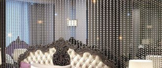
The question “What color furniture to choose?” has always been and remains undeniably important. The color combination of furniture begins to excite us long before the renovation begins. The interior of an apartment or country house is a complete and unified ensemble of the style you have chosen. How to choose the right color? How not to make a mistake with a shade? How to combine wall, floor, furniture, textiles and accessories? The color options for furniture are so varied and numerous - how not to get lost? How to grab from a huge assortment what is right for you? You will read about this and more below.
Each color or combination of colors carries only its own inherent thought, which can quite strongly influence our mood. In addition, color affects the visual and emotional perception of the space of the room - it can make the room larger or smaller, more gentle or more aggressive; can divide into zones or wash away all boundaries. Warm colors (such as yellow, orange, red) visually make objects closer, warm, speed up the breathing rhythm and create a feeling of celebration. Cold (blue, blue) - calm, psychologically perceived as strict and mysterious. However, there are colors that have shades of both the cold and warm spectrum (for example, purple or green).
In a combination of several colors, only one should prevail. As a rule, it should be chosen for the main background of the room. For example, wall decoration. You can always “support” it with small accessories.
Three types of color combinations have long been considered the most favorable - monochromatic, harmonious and contrasting. Monochromatic means choosing shades of the same color (rich blue with pale blue). The harmonious type combines different colors that are close in spectrum and those that can be easily combined (red with orange, green with blue). Contrasting shades combine completely different, but quite comfortable shades that exist with each other (blue with yellow, green with purple). Combining three or more colors in an interior is a very difficult task and should be based on the principles of color selection - the so-called color palette. To help you, we offer you one of the principles of color selection: “Theory of harmonious combination of colors “Seasons”.
“Spring”: yellow (main), pink, white, red, purple, beige, green, blue. Recommended accessories: yellow metal.
“Summer”: blue (main), brown, white, red, gray, purple, blue, yellow, green, beige, black, pink. Recommended accessories: silver or silver metal.
“Autumn”: red (main), blue, purple, green, yellow, white, beige, brown, pink, gray. Recommended accessories: yellow and red metal (bronze and copper).
“Winter”: blue (main), red, black, brown, yellow, white, green, purple, gray, pink. Recommended accessories: white and black metal.
Let's talk in more detail about each of them.
Red color
Red color makes your furniture heavier and visually increases its width. This choice is not for the room in which you plan to relax, it is very dynamic and whets the appetite, so it is more advisable to choose red furniture for the kitchen, study or office. A red kitchen will truly become the heart of your home! It will be warm, sunny and comfortable to gather there in a narrow family circle, or a cheerful company of old friends. Red coexists perfectly with rich shades of green, turquoise, and aqua. The combination of red and brown looks sophisticated and elegant. You can get an elegant trio by adding beige. In interior solutions designed in the now popular high-tech style, red looks beautiful and even a little ascetic in combination with white, black, and gray.
How to combine colors in the interior: tips
Designers have long developed several unspoken rules that they use to combine different tones when decorating the interior of a house. It’s worth listening to their advice to create a unique environment yourself:
- the saturation of lighting increases the contrast and brightness of the color of the finish;
- when choosing cool shades, you can use black furniture to create accents;
- to decorate living rooms, it is better to use no more than 3 combined colors (this will avoid eye strain);
- there is a special table according to which you can combine shades yourself;
- one main color is chosen, and a less saturated tone is taken to match it - then the room will look attractive and unpretentious;
- the floor is always made darker than the walls;
- if monochrome combinations are used, they can be diluted with bright furniture or stylish photo wallpaper.
A skillful combination of colors allows you to get a functional and comfortable interior
Using the table and basic recommendations from experts, you can easily select several shades for the design of a bedroom, living room, kitchen, or office.
Combination of warm shades in the interior
Orange color
Orange is the color of warm autumn weather, an excellent sunny mood. Just like red, it makes the furniture visually larger. Juicy shades of orange combine extremely well with more balanced tones - brown, beige, gray. Such a tandem will work great for a children's room. Moreover, both boys and girls! It encourages action and is perfect for calm children who don’t like to pore over their lessons for a long time. The combination of orange and white is one of the most successful options, where white reduces the activity of orange. The duet of orange and blue is characteristic of the Mediterranean style, now popular “Provence”.
Yellow
Yellow is a sunny color. The color of happiness, light and airy. A win-win choice for the living room. You will feel rested after a hard day of work. If you choose it as a decoration for the walls, pastel shades are best suited - cream, lemon, golden, which can make even the darkest room more transparent. Furniture in red, green, blue, and brown colors will go well with yellow walls. Yellow and blue are a classic. However, a lot depends on the given style of the room. Dilute your yellow with light brown and you will get a natural, natural combination. Do you want contrast and shocking? Adding black and white will help you with this.
Choice of color and interior style
Often the selection of colors depends on the chosen interior style. For example, the classic direction is more characterized by light colors, while shades of gray and metallic are suitable for modern technological interiors. Provincial settings are characterized by the use of pink, purple and other warm colors.
Shades of colors in the interior
Classic: style characteristics
A prerequisite for classics is the presence of white. To ensure that the furniture is in harmony with the decoration, it is recommended to listen to the following tips:
- use restrained and muted shades when decorating the environment;
- You can choose blue, light yellow or green as one of the main tones;
- the walls should be painted in one shade or covered with discreet wallpaper;
- Beige or cream furniture with soft smooth lines and airy upholstery is perfect for such tones;
- the floor is decorated with a slightly darkened laminate; a light carpet can be placed in the center.
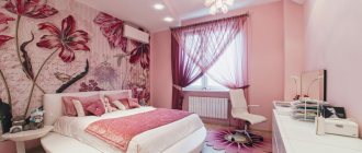
Combination of pink color in the interior
It is advisable to make the ceiling snow-white, framing it with elegant white baguettes. If mirrors are used, it is better to enclose them in a white frame.
Rustic color combination
Modern style: how to choose a shade
This direction involves the use of bright colors, so in a room made according to modern rules, you can give free rein to your imagination. Designers advise painting one wall in a bright shade (for example, turquoise). The remaining partitions should be in harmony with the original idea, so they can be decorated in gray or beige.
Modern style is characterized by clean lines, square shapes and a small number of different shades.
Interesting combinations include the use of emerald, gray, blue, bright light green shades with white or sand. It is better to choose furniture for this room that is as bright, for example, to match the color of the main wall, combining it with light colors. A cozy black sofa is combined with light gray armchairs, a blue bookcase looks great with white inserts on the shelves.
Combination of carpet and textiles in the interior
Country: rustic motifs
In country interiors, shades of yellow are used (for example, sand and light brown). This rustic style suggests:
- demonstration of ceiling beams;
- furniture in floral motifs;
- walnut laminate design;
- the use of stripes and checks in the upholstery of upholstered furniture;
- a combination of white cabinets with light brickwork and striped wallpaper.
Blue, white and brown colors in the bedroom
For walls, you should choose natural colors - brown, gray or green: they best convey the rustic feel.
Color combination in the bedroom interior
Loft: unpredictable combinations
One of the most interesting styles - loft - involves the use of bright colors: orange, green, blue or red. You can decorate any room in a stylish and modern way: choose leatherette sofas in sand tones, lay a large but thin blue carpet on the floor, and choose black shades for furniture. A living room in this direction will look bold if the walls are decorated with brick and a light laminate is laid on the floor.
Orange furniture in the living room
Scandinavian: how to plunge into the northern world
Nordic or Scandinavian style always uses a lot of white and other cool shades. Beige and blue are used most often here. The furniture has smooth right angles and few smooth lines. For example, a gray sofa goes well with a patterned rug laid on shallow light brown parquet. Snow-white walls are reminiscent of northern places if the curtains are chosen to match them.
Contrasting colors in the interior
Provence: colors of a romantic province
The French style of provincial villages is the choice of romantics. This trend is characterized by the use of light pink, milky and blue colors. A few rules for combining furniture and Provence finishing:
- wall decoration. White brickwork or wallpaper with romantic flowers are perfect here;
- furniture. White or cream sofas, equipped with lilac checkered pillows, light chairs and stools, a round dining table on a leg - all this is Provence style;
- floor finishing. Light laminate with imitation wood texture will suit pink walls.
Example of a Provence interior: decorating a living room in a delicate color palette
Designers recommend paying attention to accessories: placing vases of flowers in the living room or purchasing romantic floor lamps for bedrooms.
Combination of light colors in the interior
Shabby chic: bringing an antique home to life
Another romantic antique style is shabby chic. Vintage design allows you to use this solution for the bedroom, living room, and children's room. The main colors are pastel colors, as well as cream, butter, turquoise, white and soft pink.
Turquoise accents in the room
Combination of blue color in the interior
A good example of shabby chic would be a kitchen-dining room. There may be a large square table with a turquoise tablecloth, wicker rattan chairs in cream design, and light blue cupboards. The walls are made in a light lime color, and the floor is covered with discreet parquet.
Green-blue color combination in the interior
Spicy colors in an oriental interior
Eco-friendly: all shades of green
Swamp and brown are two main colors that set the mood in an eco-friendly style. Natural wood, glass, stone and clay are used here. For example, a living room may include a large white sofa with light green pillows, an abundance of potted plants, and brown oak bookshelves. The lighting here is good, but sectional: several wall lamps are placed above the sofa. The partitions are made in a light green shade, and the floor is light brown.
White and blue bedroom
Earthy colors in the living room
Ethnic: choose your culture
One of the common styles where you can use incompatible colors is ethnic. Several features for arranging and combining furniture with decoration:
- contrasting combination of white and beige with dark lines in the decoration;
- wooden furniture decorated with asymmetrical natural patterns;
- warm brown colors echo shades of dark chocolate;
- golden painted decorative items are harmoniously stored on wenge-colored shelves.
This example demonstrates the color combination
Cream and blue living room
Ethnics allow you to decorate a room in African, Japanese, Indian style, where every little detail reminds you of the chosen country.
Dark beige color combination in the interior
Combination of turquoise color in the interior
Minimalism: simple and convenient
The simplest arrangement of a room in a minimalist style is a combination of black and white colors. This win-win option will help highlight the furniture against the background of light finishes. For example, in the kitchen it is better to paint the walls white and lay gray porcelain tiles on the floor. A bar counter with a light base and a gray tabletop is perfectly complemented by high white chairs with metallic legs. The work surface should be chrome-plated, and the cabinets can be colored (for example, green).
Beige, green and brown colors in the living room interior
Combination of earthy and beige in a small bedroom
Eclectic: Elegant edge
Before choosing the color of the walls in an eclectic apartment, it is worth remembering: the main range of the style includes a combination of warm and cold shades. For example, a bed with beige upholstery is chosen for the bedroom, the color of the furniture is dark brown. Light wallpaper with a picture of a flowering tree is glued to the walls; it is better to hang black Roman blinds on the windows.
This interior exudes elegance and restraint: eclecticism suits conservative people well
Color combination in the living room
By following these simple tips from designers, you can independently create a unique style in your bedroom or other room. The right combination of different shades of furniture and decoration will allow you to create your own interior.
Combination of dark shades in the interior
Combination of textiles in the interior
Green color
Green is the most “natural” color, calming and relaxing. Green can serve as a background for a very large number of colors. Delicate shades will make the living area lighter and airier. Green looks very natural in combination with furniture made to match the color of wood. Gloomy shades of this color are suitable for dynamic and modern design - marsh, grass, dark olive. The listed colors will look succinctly in combination with red, burgundy, and the entire palette of white. The combination of green and soft beige will be extremely winning. Particular attention should be paid to the following combinations: green-white-blue, green-red, green-beige. Green will suit any room in your home! You will never get tired or bored!
Types of wallpaper
Types of wallpaper
Indoor walls can be covered with wallpaper of various categories - paper, vinyl, non-woven, liquid, fabric, and so on. Below we will briefly look at them.
Vinyl
The surface of vinyl wallpaper has water-repellent properties. Therefore, they are an excellent option for finishing a bathroom or kitchen. If you often cook in the kitchen, then the material must be washed periodically - say, 2-3 times a year (the best option is every season).
Vinyl materials are thick and do not allow air to pass through. Therefore, they can hide small irregularities or defects in the wall. However, air retention can be a disadvantage, since the room will be very stuffy, so such materials need to be glued in well-ventilated rooms.
Attention! Some manufacturers make vinyl wallpaper with perforations so that they allow air to pass through - this solution does not look very aesthetically pleasing. Therefore, you need to choose perforated material wisely.
Non-woven
Non-woven fabric is an excellent option for finishing the wall of a living room or bedroom for further painting. But it is not recommended to use it in the kitchen, bathroom or hallway - it absorbs water and debris well, and it is not recommended to wash or clean it (it will become unusable quite quickly).
The material allows air to pass through well, so non-woven fabric can also be used in a nursery - the wall of the room with this option will breathe well. Non-woven wallpaper is of medium thickness, so it can also hide small defects in the walls.
Liquid
Liquid wallpaper is medium durable, and with its help you can only get a monochromatic pattern (although you can paint the wall in several “colors”). Therefore, they are most often used to decorate bedrooms or technical rooms. They are also well suited for additional finishing of rooms with laminate on the wall.
Liquid wallpaper does not absorb dirt and water well, but it is not recommended to install it in rooms with high humidity. Therefore, such wallpaper should not be used in the kitchen, bathroom or nursery. They are also not recommended to decorate the house from the street side.
Paper
Paper wallpapers are distinguished by a wide variety of patterns, so they can be used to decorate any room - from the hallway to bedrooms or technical rooms. Although in practice they are most often used for finishing cottages and technical premises, as well as in the case of a limited budget for repairs.
After all, paper is a very fragile material that can be easily damaged or scratched. If damaged, paper wallpaper cannot be repaired - you only need to re-glue the wallpaper sheet. In addition, paper absorbs water well, so gluing them in the bathroom or kitchen is not recommended.
Fabric
Fabric materials are distinguished by high-quality patterns that will retain their brightness for many years. You can hang fabric wallpaper in any room. Water does not cause serious harm to the material, but the fabric takes quite a long time to dry, so it is recommended to use other wallpaper in the bathroom or kitchen.
The fabric reduces noise levels well, so this material is often used to decorate a bedroom. The fibers of the fabric absorb dust and debris quite well, so it is recommended to periodically clean or vacuum such wallpaper (at least 1-2 times per season).
Blue color
Blue is a calming, sometimes even a little depressing color. However, the spectrum of blue compatibility is very wide. The combination of dark blue and gold looks “expensive” and pompous. This color combination is suitable for the interior of an office or living room. Fine porcelain, textiles, a coffee table and aromatic tea draw the imagination - the dream of any housewife! Of course, no nautical style would be complete without blue. Medium and light shades of blue go well with white and beige. A strict blue interior will become brighter, warmer and more creative if it is diluted with yellow or orange accents.
Color combination in the apartment
If choosing the color of the walls to match the finishing of the floor and furniture according to the style is not a problem, then correctly combining tones in different rooms is a responsible matter. Incorrectly selected combinations will negatively affect a person’s perception, so here it is also worth adhering to some rules that will help you create a beautiful interior.
White walls and furniture in the living room
Combination of red color in the interior
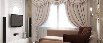
Living room: colors for relaxation
The choice of finishing shade and harmonious combination with the color of the furniture sets the overall mood of the living room. Since this is where a person receives guests and relaxes, the walls should not be flashy. A few examples of a successful combination:
- furniture: a light soft sofa without armrests goes well with pale armchairs and chairs, but it is better to decorate a glass coffee table in black to create contrast. Dark gray shelves for books will not distract from the overall composition;
- finishing of the floor and walls: gray laminate with a wood pattern combines well with mustard light wallpaper;
- accessories: a black openwork chandelier looks great in the center of the room, and it is better to hang lamps around the perimeter and above the TV. The curtains can be made turquoise, and a round rug of the same color can be laid near the sofa.
Combination of purple flowers in the bedroom
Combining colors in the interior
If you are using a large-sized set, it is better to make it from light wood. For example, Sonoma oak in a light beige design would be an excellent option for a living room wall.
Combination of gray color in the interior
Warm colors make the bedroom cozy
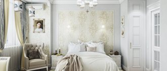
Bedroom: how to design a sleeping area
Before choosing furniture in the bedroom according to the color of the floor or the color of the walls, it is worth remembering that this room is the place where a person relaxes after work. Here you can use calm colors, and if you decide to choose something dark, for example, wine color, then it must be combined with white accents.
Stylish, cozy and functional: decorating a bedroom in these shades sets the mood for relaxation
Beige, white and gold colors in a classic living room
A good option would be to use a shade of cocoa with milk. Fashion trends suggest purchasing a bed made of dark cherry and making the upholstery in beige. You can lay yellow laminate on the floor, and choose brown or coffee-colored wallpaper with a discreet ornament. The curtains here will be light brown, and the chandelier will be beige.
Color combination in the kitchen interior
Color combination in a retro interior
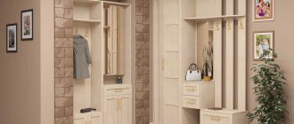
Hallway: a combination of contrasts
This room always lacks squares, so the unwritten rule for choosing colors is to use light colors. Cappuccino color in the hallway can only be used as an insert into furniture. A good technique is to use vertical stripes, which will also visually expand the space.
White and yellow interior
White walls and furniture in the interior
When choosing a finishing color, you should give preference to peach, beige or sand. If the hallway borders on a corridor, you can install a tall beech cabinet here that will accommodate all your outerwear. The floor must be made a tone lighter than the wallpaper. The front door should contrast with the overall design.
Colored bed in the interior
Combination of pastel colors in the interior
Children's room: choosing colors from a psychological point of view
You can combine different shades in the nursery together with your child. If the baby is already able to think logically, it is advisable to ask about his desires. The main principle will be the ban on the use of dark shades, as they will put pressure on the child’s psyche. Basic recommendations:
- The combination of white with lilac, yellow with blue, pink with sand, purple with light green looks impressive and interesting - such palettes lift the child’s mood;
- It is better to choose furniture that is functional and non-staining – white chairs will not do;
- if the room is for 2 children, a brightly decorated partition is made between the beds;
- a writing corner with a computer desk can be ordered from dark brown wood (pen marks will be less visible on it).
Pink bedroom
Combination of burgundy color in the interior
A competent combination of colors in the interior of a child’s room will contribute to his development and correct thinking.
Selection of colors in the interior
Black and green interior
Kitchen: rich and bright motifs
Designers insist that the kitchen should be rich and bright. There is no point in using delicate pastel colors where work is constantly in full swing and food is being prepared. Do not forget that surfaces that are too dirty must be washed frequently.
Each zone performs its own function, and the color scheme increases appetite
Combination of green color in the interior
Olive or light green wall colors, bright yellow or orange are perfect for this room. The kitchen set can be decorated in a combination of bright colors with metallic motifs, if the interior is modern. If the kitchen is made in Provence style, the walls should be painted using light pink, and the floor should be tiled with brown tiles.
Purple and white bedroom
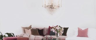
Pink accents in the living room
Bathroom: comfort and relaxation
The bathroom is traditionally decorated in blue, green or beige, but you can deviate from the standards and make the bathroom original. Bright orange is well suited for this: such tiles combine perfectly with green ceramic decor, creating a favorable atmosphere in the bathroom.
The combination of terracotta color in the interior
Bright accents in the interior
Furniture should be chosen in a traditional white color, the same applies to plumbing fixtures. If the bathroom is combined and the toilet is located next to the bathtub, then they can be separated by bright floor decor.
A bright orange bathroom will be the highlight of the apartment
Beautiful combination of spicy and blue colors in the interior
Photos of some examples of combinations can be found in this material; they will encourage you to create your own ideas and help make your wildest dreams come true.
Color combination in the nursery
Green walls in the room
Blue
Blue is a fairly cool but airy color. Calms, does not bother, goes well with the greater half of the spectrum. Blue is great for the kitchen, as long as there is not too much of it. Kitchen facades in blue will shine pleasantly in the sun. For a contrasting color combination, cool blue and warm red tones are often used. Oriental interiors are characterized by a combination of blue or turquoise with orange. Turquoise with black – Art Deco and Art Nouveau style. Turquoise color, as a variety of blue, is very fashionable and is widely used in creating modern interiors. Which is justified, because it looks incredibly beautiful.
Nuances of human psychology
When choosing shades, it is recommended to take into account the psychology of human color perception:
- Some colors come under strict supervision - red, deep orange, bright yellow, purple, deep blue. These colors are quite aggressive, so a person in the room can quickly get a headache and worsen their mood.
- Green, blue and turquoise shades are your saviors in difficult times. After all, they are suitable for almost any room, since they remind a person of the natural beauty of nature. If you are in doubt about the choice of color, use green, blue and turquoise shades.
- Cool shades create a calm, even a little sleepy mood. Therefore, it is recommended to select them for kitchens, bedrooms, and bathrooms. Warm shades have the opposite properties - they create light tension and fun. Therefore, use them to decorate the hallway, living room, and guest room.
Purple
Careful and measured use of purple will help you create a very interesting, calm and mysterious interior. Purple is the color of accessories, small but very necessary touches. For wall decoration, dark purple must be used very carefully. Good in combination with green, gray or cream. The atmosphere of your home will become airy if you add delicate shades to purple; if mixed with bright ones - lively and dynamic. A children's room, diluted with purple, is suitable for both a baby and a teenager. Instill refined taste in your children from birth! Take a serious approach to solving such an issue as the color of furniture for the nursery.
A few more tips
How to choose the color of furniture? Keep the color scheme of the rest of the room in mind. This includes flooring, wall color, carpets, lighting and so on.
Buy furniture in basic colors that will never go out of style. To refresh the color scheme of the interior, add throws and decorative pillows.
Remember the main rule when choosing a color: from dark to light. Dark colors should be closer to the floor, gradually moving towards the light ceiling.
As designer Mark McCauley says, any interior space mirrors the outside world: “The exterior environment tends to be darker under our feet (the ground itself), the mid-range is dominant when you look straight ahead (buildings/trees) and gets lighter towards the sky.”
Notice how the colors are arranged on the color palette. Use several adjacent shades of brown, blue, etc. in the interior.
What color furniture should I choose if the floor is dark? Choose a sofa that is a shade or two lighter than the floor color. If the floor is dark brown, then furniture in coffee colors, from cappuccino to light sand, will look great against its background. A good option would be very light furniture with a black floor. This way you will play on the contrast of opposite shades, and more neutral accessories will help to mute such a difference.
Pink color
The pink color scheme is familiar to us when used to create the interior of girls' rooms. Pink benefits most when combined with white - this is a very delicate, but at the same time flexible combination. You can combine it with purple, but also quite carefully. An indispensable condition for a successful combination will be the third one - white, gray or beige. Complement all this with simple accessories and you will get a sophisticated and light room.
Brown color
Brown is a warm, rich and deep color. It attracts the eye, makes the room heavier, and gives it a breath of antiquity. It has a very good psychological effect - an ideal solution for the bedroom, rest room. You won’t want to leave the bedroom – wood-look furniture will make it so cozy and warm. Brown is laconic and versatile; it will fit into any interior style without any problems. The classic combination is brown and white. Brown and green are a very beautiful combination, so often found in nature. Furniture in two colors is quite a popular phenomenon! Textured brown and monochrome beige look perfect together. Brown feels great in spacious rooms, because... visually makes the space denser. An interesting and always unexpected solution is brown and blue. Light shades will serve to create classic interiors; dark - for more modern ones. Brown will perfectly complement any living space - kitchen, dining room, living room, home office.
Spectral circle and seasons
Combining more than three similar shades in one interior will be quite difficult. If such a task is set before an experienced designer, then he will find the optimal solution using a color ring.
The theory of seasons will also be a good help in this matter. She claims that in nature you can find pleasant combinations of different colors by following the color schemes of the seasons. For example, the spring season gives designers such pleasant ideas as a combination of yellow and pink, red and beige.
Black color
Black is very cold, it cannot be called cozy. The predominance of black in the interior can even cause an unpleasant feeling of anxiety, so you need to add it very carefully and in small doses. However, it should be noted that this is the color of sophistication, severity and nobility. Has the ability to highlight bright colors. Therefore, just a little black will brighten up your interior. A wall finished in black will be an incredibly beautiful backdrop for an expensive painting or a bright piece of furniture. Black will make a bachelor’s living room memorable if you choose it as a wall decoration and place furniture in bright colors along them. Moreover, the color options for furniture in this case are limited only by your imagination!
Secrets of choosing wallpaper for furniture
Let's also look at a few important points that are important for the master to remember:
- The color and design of the wallpaper should be such that it either shades or emphasizes the color of the furniture. Therefore, they should not be completely identical in color (otherwise the furniture will be lost against their background) or be too contrasting (otherwise the wallpaper will draw all the attention of the person in the room).
- A surface with a variegated pattern or voluminous relief quite tactfully and non-aggressively draws attention to itself. Thanks to this effect, you can hide some furniture defects (for example, that it is very old or has minor damage or scratches).
- If you can’t choose the color of your wallpaper for a long time, but you have creative abilities, then buy non-woven fabric that can be dyed. In this case, you can hang wallpaper, and then paint it in the desired color or even make your own design.
Note! Use LED lamps to highlight a shadowed area of the room and highlight the natural color/pattern of the wallpaper.
Grey colour
Gray color is neutral and quite cool. Gray, like no other, is beautiful for a background. A kind of “tray” for serving bright and intricate accents. Gray is incredibly good in combination with green, blue, crimson, and bright red. Thanks to its monochrome, gray “shades” and at the same time emphasizes bright colors, creating a cozy atmosphere in the house. Medium gray goes well with pale pink, darker gray is suitable for a modern interior with red accessories. This is a win-win option for decorating living rooms, kitchens, offices, and children's rooms. Combinations of gray and purple always turn out to be unusually expressive and eye-catching.
The meaning of careful selection
Properly combined fragments of the spectrum can significantly lift your mood, inspire new achievements and evoke pleasant memories. They advantageously modulate the living space and create a friendly atmosphere in it.
Judging by the photos of the ideal combination of furniture published on the World Wide Web, skillful manipulation of areas of the gamut alone may be quite enough to turn standard housing into real palace chambers.White color
White color – lightness, air and coolness. White will make any room appear larger. White furniture will fit into any interior and will become an excellent backdrop for patterned and complex textiles. White is rich in its shades: eggshell, ivory, milky, dazzling white, gray-white. All this goes perfectly with any shade of any color! The white color of room furniture, so popular lately, will bring aesthetic pleasure to even the most demanding buyer.
Plain furniture
Furniture of the same color always looks decent and attractive. Light shades look especially advantageous. If you doubt the compatibility of a particular color, the easiest way is to stick to white furniture.
- It is practical, dust and finger stains are not noticeable on it.
- White furniture looks stylish and fashionable.
- It visually expands the boundaries of the room.
- It's easier to breathe in bright rooms.
If you want to dilute the monotony, you can always add brightness with the help of chic curtains, a rug on the floor or sofa cushions. It is convenient to replace textiles depending on the season. And the room will constantly change, remaining furnished with the same furniture.
The furniture chosen for the home remains there for many years. Therefore, you need to carefully consider the selection of colors, which should bring joy and peace.
Beige color
Beige color is almost as neutral as white.
It will serve as an excellent background for you and will never get boring. Good in combination with bright red, rich brown, azure, turquoise, purple, pink. Beige always “asks” for bright accessories. Universal beige will emphasize the whiteness of the ceiling and the depth of color of the wood-look flooring. It will serve for any room and will bring lightness and cheerfulness to your interior. Whatever living area you choose to use beige, you can’t go wrong! Light colors of furniture will delight you every day! You can choose the colors, shades and materials you need in our catalogs, or by visiting any of. You can see for yourself the variety of colors, textures and finishing options. Experienced designers will help you decide on such important issues as furniture, color and style.
Choosing the color of kitchen furniture
What color of furniture should I choose for the kitchen? Most of the kitchen space is taken up by cabinets and shelves, so choosing the right color is important. The shade of your kitchen furniture will affect the overall feel of the kitchen.
Pay attention to the kitchen design style. The choice of color for kitchen cabinets also depends on it. Typically, traditional kitchens look best with classic colors such as cream and white, and shades of brown.
For more modern designs, bright colors and contrasting shades work well.
The size and lighting will also determine which color of kitchen furniture to choose. If the kitchen is small, then most likely there is not enough light in it. Darker colors of furniture will visually reduce the space. The kitchen will look uninviting. Choosing cabinets in light colors will make your kitchen feel more open and spacious.
The color you choose for your kitchen cabinets will also affect the color of your kitchen walls. In order not to be mistaken in the combination of colors, give preference to furniture in neutral and pastel colors.
Pay attention to fashion trends. Today the trend is simple frameless kitchen furniture in warm colors. Wooden kitchen furniture has gone out of fashion. More and more people are choosing basic white and gray as colors for their kitchen cabinets.