Powder pink is no longer just a color reserved for children's rooms. Boldly entering other rooms, it surprises with its rapacity and sophisticated elegance at the same time. Although there are different shades of pink, the interior design industry loves it most in its soft pastel version - the color of dusty rose.
dusty rose color, powdery interior
We'll tell you which shade of pink to choose and what to combine it with to create a successful composition and avoid a candy effect. What is pastel pink in the interior? Learn about proven uses for it.
The Pink Revolution: from the embodiment of kitsch to the manifesto of a generation
color ash pink
The color pink had to go through a long and difficult journey before its noble face was noticed. In previous decades, it was associated with everything petty, infantile and kitschy. However, recent events have caused a real pink revolution - dusty pink
In 2014, Wes Anderson captivated audiences with The Grand Budapest Hotel in pastel, pink and peach tones. Two years later, Apple introduced a new iPhone model in rose gold, and Pantone announced rose quartz as one of its 2016 Colors of the Year. Pastel pink quickly gained popularity.
He was especially loved by young people, immersed in the world of social networks, open, full of nostalgia for the carefree childhood spent in the 80s and 90s. The warm, peachy shade of pink has been hailed as the color of the new generation and is appropriately named: “millennial pink.”
Wine + charcoal
The Norwegian company Jotun, one of the leading manufacturers of decorative paints, presented its palette of 12 trendy shades at the beginning of 2022. The specialists of this company rely on warm and muted tones. In the palette you can find powdery red, dark wine, sea, plum. All shades combine perfectly with each other; for contrast, designers use the classics - white and black.
The trend is anemone shade and beaujolais tone.
Design: architectural studio "Akant"
The trend is anemone shade and beaujolais tone.
Design: architectural studio "Akant"
Wine shades are transformed on textured velvet surfaces.
Design: sofological.com
Wine shades are transformed on textured velvet surfaces.
Design: sofological.com
Pastel pink: which shade to choose?
dusty pink
Pastel pink, also called powdery, is everywhere - in clothes, accessories, toys and even on hair. Perfectly reveals itself in the interiors of apartments, houses, cozy cafes or fashionable restaurants. However, you should carefully dose the dusty pink color so that the decor is not too sweet. Choosing the right shade is also important.
Dirty pink (dusty pink) has a slight admixture of gray. This is a neutral option, a dusty rose in the interior, which will appeal to even the biggest skeptics. Warm shades of pink with a hint of beige or juicy peach (millennial pink, rose quartz) are also a safe choice. However, the best combination is pastel pink with the addition of pure white. Used in reasonable quantities, the combination of pink color in the interior brings freshness and refreshing energy to the interior, in excess it makes it sickly sweet.
Which ones should you be careful with?
Pink with blue
These are recognized “antipodes”, so you need to be extremely careful with their combination. An exception is the design of a children's room for children of different sexes. Only there it is really justified and looks successful.
Photo: Instagram love_scandi_kids
Photo: Instagram love_scandi_kids
Photo: Instagram love_scandi_kids
Pink with black
A bold mix, but not everyone can make interiors in such colors look vulgar. You can and should add wood and white tones.
Photo: Instagram scandi_with_love
Pink with orange
This combination is common in the oriental style and, perhaps, is justified only in this case. Today, oriental accents are very relevant, but it is important not to overdo it - add them in doses in textiles and patterns. For example, the option in the photo is rather an anti-standard.
Photo: Instagram formulakomforta40
Pink in a harmonious duet: what colors to combine with powder pink?
combination of colors in the interior pink
Combination of dusty pink and light gray Shades of dusty pink and light gray create calm, harmonious combinations. A pink-gray room, the gray color always remains in the shade and effectively balances the pink. The presence of pink adds subtle notes to gray. Gray and pink can be combined with other colors: especially white, beige and black.
dusty rose color in the interior
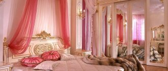
A combination of dusty pink and gold.
The color of a dusty rose in the interior and gold complement each other perfectly, bringing the discreet charm of a French boudoir, a touch of exoticism and luxury. Both colors like to dominate, so they should be used in moderation.
It is best to bring gold in the form of accessories (pens, photo frames, vases, mirrors) or original furniture (openwork chair, coffee table). Paired with pink, metallic accents in copper and rose gold are also stunning.
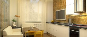
powdery color in the interior, dusty rose kitchen
Dusty pink and green The duet of dusty pink and green is an unobvious, but very successful combination. It is suitable for interiors decorated elegantly, as well as with a large amount of eccentricity. The expressive duo of dusty color and green will especially appeal to those who are tired of the look of white walls and minimalist apartments.
To create an elegant decor, use powder pink and bottle green. Add gold accessories, good quality fabrics and mood lighting. If you prefer a calm atmosphere, add exotic motifs: cacti, pink flamingos, palm leaves.
what goes with pink in the interior
Combination of dusty pink and blue
A duet of dusty pink and dark blue is another tandem. By choosing slightly brighter, darker shades of blue, you will create a cozy and intimate atmosphere - perfect for sleep, meditation or evening relaxation. The combination of pink in the interior with dark blue will give the interior sophisticated character and depth.
combination of pink color in the interior
Pink and blue in the interior
What else can be combined with pink? Of course, white or another pastel color, especially blue. It also goes well with burgundy.
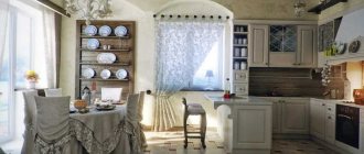
Veranda, living room, kitchen
A summer veranda with sophisticated furniture, painted white in the Provence style, is decorated with live indoor plants: they are hung on wooden partitions and placed along the window sills. One of the pieces of furniture that will perfectly complement the summer veranda will be a soft corner upholstered in textiles in the color of a dusty rose.
A bright dining room in a Scandinavian or rustic style will be enhanced by small chairs upholstered in soft gray-pink fabric. Placed around a round wooden table with a pot of fresh wildflowers, they will add unobtrusive pastel colors to the space.
In a room or gazebo with natural flooring and wooden wicker furniture, we recommend adding a small cozy sofa in a light pink shade. In a hall or living room, a shade of dusty rose will set a calm, measured tone - it looks very good in a room with modest or old wooden furniture.
Kitchen drawers painted pastel pink will draw the sun's rays into the room on cloudy, cold days.
Pink color in the interior: how to use it?
powdery interior, colors combined with pink in the interior
Pink walls Decorating the walls in pink seems like a crazy idea. And in vain! This is the perfect way to add variety to your living room or bedroom decor. A pink wall in the interior is a spectacular backdrop for a designer sofa, table or bed. Remember, however, that everything needs moderation. Instead of painting the entire room pink, it's better to limit yourself to one wall or a selected corner.
If you want to avoid any associations with a little girl's room, choose dirty, dusty tones or heavily bleached shades of pink. Also avoid infantile motifs (including hearts, flowers, animals), or exaggeratedly decorative furniture or accessories.
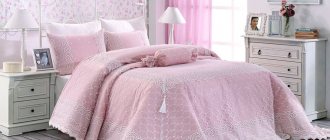
Pink furniture Sofas, poufs and armchairs with pink upholstery are one of the most current trends in interior design. Particularly popular are models in the mid-century style: elegant, complemented by soft pillows, standing on thin, curved legs. Pink upholstery can be made from inexpensive polyester fabric, but velor chairs and sofas look much better. The combination of fleecy material, slightly shiny texture and soft pink creates a sensual and at the same time extremely elegant combination.
Pink accessories
Buying a pink sofa is a bold move. It is much easier to incorporate pink into the interior using tasteful details. Items of simple shape, without fancy decorations, are best suited: pillows, vases, picture frames, handmade ceramics. Designer lamps or rose gold sconces can hang above the dining table, near the bed or sofa.
Soft pink + grey-green
The American paint manufacturer Benjamin Moore & Co presented its main color of 2022. It was the warm, soft pink shade First Light. It was included in the company's new pastel palette Color Trends 2022.
Other key colors in it are jade green Crystalline AF-485 and beige Golden Straw 2152-50. For contrast, the company's color and design managers recommend using matte black or dark brown.
Powder pink is universal: suitable for classic and modern interiors.
Source: dulux.com
Powder pink is universal: suitable for classic and modern interiors.
Source: dulux.com
In the bedroom, designers recommend combining complex pink shades with similar colors - lavender, gray-blue.
Source: designcouleur.com
In the bedroom, designers recommend combining complex pink shades with similar colors - lavender, gray-blue.
Source: designcouleur.com
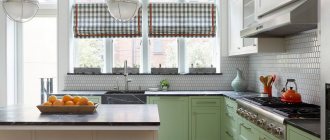
Decorating the floor, walls and ceiling in a pink kitchen
When covering walls, floors and ceilings, you should take into account how a particular color option will look in a specific style, in a specific kitchen that has certain dimensions, layout and a number of other features. The functionality of the kitchen space will depend on this. As mentioned above, the correct selection of shades helps to hide architectural flaws or highlight the advantages of the kitchen.
Floor
The pink kitchen space “loves” a light-colored floor, which can be finished with various coatings:
- laminate
- tree
- linoleum
- ceramic tiles
Warm light tones of light beige flooring are harmoniously combined with walls decorated in cold colors.
Light tones of the floor in a pink kitchen
Dark flooring will make the kitchen more grounded, voluminous and full. You should be careful with this color choice so as not to overwhelm your kitchen visualization.
Dark floor tones in a pink kitchen
For the floor you can also use gray, beige, light brown shades. They go well with walls of gentle and calm notes. Such a floor does not attract attention, due to this it will be possible to consider the other interior beauties of the kitchen.
Gray floor in a pink kitchen
Ceiling
Today, kitchens increasingly prefer to use suspended ceilings. They are usually installed in rooms with high ceilings. If the kitchen space has a large area, then you can use canvases of different levels and shades, including bright ones:
- white
- glossy black
- cream
- hot pink
Colored stretch ceilings in bright shades are suitable for large kitchens. For small rooms, the ceiling space should be finished in a neutral white or light beige, light blue, light gray tone. These colors are used to ensure that the ceiling does not “press” and gives a feeling of volume.
White ceiling of a small pink kitchen
On a pink ceiling, white lamps are mainly installed, which visually enlarge the space and also emphasize the freshness and depth of color of the ceiling.
Pink ceiling of pink kitchen
In large rooms, you can use combined suspended ceilings, the central part of which will be in the same color scheme as the furniture facades.
White and pink ceiling of a large pink kitchen
Walls
To decorate the entire surface of the wall, you can use light pink or any other gentle, unobtrusive colors. The exception is the case when the wall becomes a bright, important “accent spot” of the room, even if it is a kitchen.
Pink wall as an accent in the kitchen
If you use a deep and bright shade, then the design of the walls should be contrasting. You can also decorate one small section of the wall in bright pink.
Hot pink accent wall in kitchen
The choice of shade for the walls depends on the size of the room and the level of natural light. For small kitchens with windows facing north, the walls can be finished in a monochromatic light color scheme. In large spaces, the walls can be decorated with bright contrasting combinations, with the help of which you can zone the space.
Zoning space in pink
Using pink tones when decorating a kitchen allows you to recreate different interior styles. Using this color you can hide the shortcomings of the architectural layout, emphasize the advantages or focus attention on something specific. It's all about the ability to combine colors, but also not being afraid to experiment. And then the kitchen will turn out stylish, elegant, comfortable for every family member.
In the shade of the trees
This house is located in a green area, on the outskirts of Moscow. In the interior design, the English architect James Soane from the PROJECT ORANGE bureau used natural shades of ocher, greenery, and tree bark, because the main decorative element in the house is the green landscape outside the window.
James Soane: “When I look at our house, I can easily imagine it somewhere in Surrey, England. At the same time, it does not stand out from the Russian context. This is a completely organic building for Moscow.”
James Soane: “When I look at our house, I can easily imagine it somewhere in Surrey, England. At the same time, it does not stand out from the Russian context. This is a completely organic building for Moscow.”
The kitchen facades (an individual project made according to the architects' sketches) are painted in the most delicate shade of green, in harmony with the parquet flooring and warm-colored wooden furniture. Lunch group, Conran Shop.
The kitchen facades (an individual project made according to the architects' sketches) are painted in the most delicate shade of green, in harmony with the parquet flooring and warm-colored wooden furniture. Lunch group, Conran Shop.
Psychological implications of color
Color therapists say that pink appeals to the feminine. This is the color of sensuality, joy, touching tenderness and touching defenselessness. Variations in the light spectrum have a calming effect, promote relaxation, and require love. At the same time, spending a long time in a room with a predominance of pink tones increases infantility and generates laziness.
A light pink kitchen is an atypical solution for the interior. To create a bedroom, bathroom, nursery for a girl, they prefer to use shades of a low activity spectrum.
Intense berry shades will appeal to active and powerful people. The option indicates the desire for perfection. Saturated shades of the pink spectrum in moderate quantities have a positive effect on well-being and increase vitality. The excessive presence of active colors leads to the abolition of sobriety of thought, and complete control over individuality and consciousness is lost.
A pink kitchen design in berry tones is considered acceptable. In this case, the color must be diluted with neutral paints.