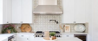
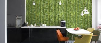
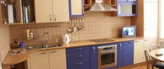
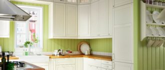
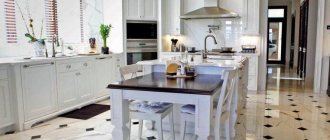
One of the most comfortable and popular places in any home can be called the kitchen. At the same time, the kitchen decoration should not only be pleasing to the eye, but also withstand temperature changes, high humidity, and surfaces should be easy to clean from dirt and grease. Experienced housewives primarily value functional design, which is not devoid of originality. Wall decoration in the kitchen has no restrictions; it is the most versatile field for implementing bold design ideas. Each material has its own characteristics, advantages and disadvantages. In practice, traditional finishing materials have a clear superiority, which is why finishing the kitchen with tiles and wallpaper, photos of which are collected in the selection, is especially popular.
Which wallpaper is better to choose for the kitchen?
If you decide to cover your kitchen walls with wallpaper, you need to remember that the wall covering must be non-staining, moisture-resistant and wear-resistant and match the design of the room (at least harmonize with the color of the furniture and floor).
The modern market offers the following types of wallpaper:
- paper ones are an inexpensive option with many colors and patterns. But finishing the kitchen walls with this type of coating is short-lived, since it cannot be washed and will not withstand mechanical damage. Such wallpaper can be combined with more durable materials or used to decorate a dining area, which has much less load. A popular design for the dining area is a photo of the cityscape in black and white, which occupies the entire wall;
- non-woven wallpaper is similar to paper wallpaper, but is an improved version of it (cellulose fibers are bonded with polymer). Most often this is paintable wallpaper with a textured surface. They are easy to glue, quite dense and breathable (fungus will not grow under the wallpaper), are not afraid of moisture and are easy to clean. Also, such a coating can be repainted several times, which is suitable for people who tend to frequently change the design of their walls;
- vinyl wallpaper is the most popular option. Non-woven or paper-based canvases are covered with a layer of durable vinyl, which is wear-resistant and resistant to mechanical damage. Such wallpapers will ideally mask small unevenness in the walls, they will not fade in the sun, and their design can replicate any texture. For example, the imitation of natural stone or brick is absolutely invisible in the photo, the difference is noticeable only upon close examination, and the savings on the cost of materials are obvious. However, vinyl wallpaper does not allow air to pass through (for this reason, it is recommended to treat the surface of the walls with an anti-fungal coating before pasting) and accumulates dust, which can be easily removed with a vacuum cleaner or a damp cloth;
- Glass wallpaper is a relatively new material, but it has proven itself as an ultra-durable wall covering. They are absolutely impermeable to moisture, allow the walls to “breathe”, are not afraid of fire and are antistatic. Their service life is from 20 to 30 years, and their color can be changed with paint up to 20 times. Wallpapers are suitable for perfectly smooth walls; their application requires special skill and they are more expensive than the above options;
- other types - bamboo, textile, liquid, wallpaper with photos. Suitable for decorating a dining area.
Vinyl flooring can be foamed, smooth (kitchen vinyl), flat (silkscreen), or hard. Due to its low moisture resistance, foamed vinyl is not suitable for the kitchen, but other types are ideal for decorating kitchen walls. The advantage that unites all types is the ease of sticking and dismantling wallpaper. The design of a kitchen decorated with their help can be quickly and easily changed, while having insignificant financial costs.
Bamboo Paper Vinyl Textile Fiberglass Wallpaper Non-woven Photo Wallpaper
The right color combination
You need to select colors in accordance with the overall design of the kitchen. The wall covering should become a background that improves the mood and creates comfort. It is not recommended to use many colors on wallpaper at once. A harmonious design is obtained by combining 2-3 colors.
- Cool colors - gray, blue, blue, green - combine well with each other.
- Warm colors are yellow, red, orange, they allow you to make the kitchen lighter.
- Neutral colors are gray, beige, white, black. Combine with any shades, patterns and prints on wallpaper.
Ceramic tiles for kitchen walls
Ceramic tiles are a classic of the genre when decorating walls in the kitchen. Due to its ease of care and practicality, this finish is the choice of many housewives. Manufacturers offer tiles that vary in size, color, pattern and texture. Modern design involves decorating the work area or kitchen apron with tiles, which significantly reduces the cost of material and its installation. It is obvious that the tiles will withstand any humidity and even the greasy stains.
Kitchen wall tiles are:
- square shape (10x10 cm, 15x15 cm or even 60x60 cm);
- rectangular shape (25x40 cm, 31x50 cm and so on). This format is popular when designing an apron, and in the collections of different manufacturers you can find all kinds of size options;
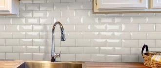
- “hog” or brick-like tiles have a beveled chamfer at the edges. The classic size is 7.5x45 cm, usually plain and glossy, in soft colors;
- mosaic or its imitation. Small mosaics are an impractical solution for the kitchen, because dirt accumulates in the numerous seams. Imitating mosaics on tiles of different sizes will help you decorate your kitchen in an interesting way and not have problems with cleaning the surface;
- tiles with beveled corners are a classic floor design option. The tiles have 8 corners, the space between the tiles is filled by a smaller square;
- decorative elements, decorative panels, frieze. A monochromatic wall design is quite a rare occurrence in a modern kitchen. As a rule, tiles are diluted with decorative elements. Popular motifs for the kitchen are elements of kitchen utensils, photos of flowers or berries, landscapes or geometric motifs.
Square Pig Mosaic With beveled corners Rectangular
In appearance they distinguish:
- glazed or glossy tiles - they have a top coating of thin glass;
- unglazed, or matte - without coating. These tiles are often used for flooring.
Matte Glossy
Experts recommend using glossy tiles without relief patterns - they are the easiest to clean, stains and stains are less visible on them, and the absence of protruding elements does not allow fat to accumulate. It also reflects light, making the space visually larger, as can be seen in the photo.
Combination options
There are several ways to combine wallpaper. In a modern interior, you should avoid combining dark shades, gloss with floral patterns, and the presence of more than two colors in the kitchen.
How to combine wallpaper with a pattern
Large ornaments on wallpaper look appropriate only if they are of the same color scheme. A large number of different patterns will make the kitchen uncomfortable.
Large ornament
Solid stripes go well with any pattern. Floral wallpaper motifs can be combined with stripes, polka dots or wood patterns. Stripes and abstract patterns are combined with geometric ones. Alternating types should be the same color, but different shades. If you combine wallpaper with a cage and a geometric pattern, you need to take into account the location of the lines so that they are in harmony.
Harmonization of geometric patterns
Plain and accent
Contrasting shades of the same color go well together, for example, blue and blue, brown and coffee with milk. The whimsical effect of light and shade allows you to zone or expand the space. You can insert bright accents between different shades.
Combination of shades of the same color
Another option for arranging combined wallpaper is to create an accent wall. Bright, saturated colors or large patterns are used. To decorate the remaining walls, you need to choose restrained colors. The apron on the headset should be monochromatic and dim.
This option can correct the design flaws. If the kitchen is narrow, it is better to make the far wall bright. It is better to decorate a wall niche with canvases with large patterns or denser textures. With a harmonious layout, the dining area stands out. In this case, it is better to place washable thick wallpaper above the sink. You can highlight the wall around the window, this eliminates the need to hang curtains.
Visual expansion of space
Vertical combination
Vertical combination of wallpaper is the most popular way to decorate a kitchen in an unusual way. More often stripes of the same color alternate after one or two. This creates a play of light, which gives the interior originality. This allows you to visually increase the height or expand the space. Vertical combination is suitable for small or narrow kitchens.
The stripes must be the same thickness. Then it will be easier to cover the wall without a noticeable transition between them. Wallpaper in the kitchen can be of different textures, for example, matte and glossy.
- The method of vertical combination of wallpaper is its symmetrical arrangement.
The walls begin to be covered from the middle, alternating one or two stripes of different colors, possibly contrasting ones. Suitable for narrow elongated kitchens. When designing walls in this way, you need to think about the placement of furniture and accessories so as not to disturb the symmetry.
- Asymmetrical combinations
Asymmetrical combinations of stripes of different widths enliven the kitchen interior and expand the space. Accent inserts can be placed in different corners or only on one wall. This method is suitable for highlighting a resting place, dining or work area.
- Interesting combinations of canvases with drawings of plants and plain ones that match the color. Multi-colored stripes can be glued with wide or narrow inserts.
- They add dynamism to the interior and neutralize incorrect layouts by combining contrasting colors. Black and white, blue and white, yellow and blue go well.
Horizontal combining
Horizontal combination is suitable for kitchens with high ceilings, otherwise dividing the wall in a horizontal plane will visually reduce the height. This technique is suitable for classic, country or Provence style.
You can combine wallpaper of different thicknesses with wood panels or tiles. It is better to make the lower section darker in color. To disguise the joint, moldings, borders, and strips are used, which should be the same color.
Combination of large pattern with panels
Walls are usually divided horizontally into two parts. The lower section is narrower; it is better to draw the border along the level of the window sill or table surface. You can decorate your kitchen with two types of wallpaper, combining them horizontally, in different ways:
- the top is plain, at the bottom there are stripes imitating wooden panels;
- at the top there are pastel colors, at the bottom there are floral motifs, ornaments or prints on the wallpaper;
- if there is a small pattern on the bottom, you can stick a coating on the top with a large pattern or stripes in the same colors;
- if there is a large expressive ornament at the bottom of the wallpaper, the top should be plain;
- Decorate the top and bottom with monochrome coatings that match in color.
Combination of vertical and horizontal
Vertical and horizontal combinations can be combined, making horizontal stripes on one wall and vertical stripes on the other. Also, with a horizontal combination, you can stick stripes of different shades at the top or bottom. The main thing is not to use bright, saturated colors, otherwise the variegation will have a depressing effect.
Combination of horizontal and vertical
Combination with photo wallpaper
Beautiful panels, bright paintings or photos are appropriate in kitchens of any size and style. The 3D effect or perspective on such wallpaper visually enlarges the space and creates a more comfortable atmosphere. Landscapes and city views look good. They are placed on the entire kitchen wall and surrounded by plain, dim wallpaper. This is usually how a recreation or dining area is designed; it is advisable that the panel is not covered by furniture.
Photo wallpaper with perspective effect
Recently, the use of small inserts of colored wallpaper enclosed in a frame has become popular. Geometric patterns, floral motifs, images of fruits and vegetables are suitable for the kitchen. They are placed on plain wallpaper, often limited to moldings or borders. Thick or textured fabrics are chosen, preferably on a non-woven basis.
Bright insert
Combination of textures
You can experiment with combining different textures. Plaster, cork, fabric or wood coverings should be placed far from the work area. The wall near the stove and sink is usually decorated with tiles. This coating often becomes an accent, so there should not be a large pattern on the wallpaper.
Different textures
Patchwork
Patchwork or patchwork techniques are popular in modern interiors. This is a combination of pieces of different sizes, colors, patterns. You can use no more than 4 varieties. Individual shreds should be in harmony with each other in color and thickness. To decorate a kitchen in this way requires imagination and patience. It is appropriate for interiors in country, Provence, and ethno styles. It is better to paste over no more than one wall or even a fragment of it.
Patchwork technique
Combination in a small kitchen
By correctly combining shades and patterns on wallpaper, you can visually enlarge a small kitchen. The basis should be a single-color coating, preferably light pastel colors. You can dilute it with bright inserts with patterns or geometric shapes. Photo wallpapers with landscapes and perspective effects are suitable. Vertical stripes are used to increase the height, and wide inserts are used to increase the width of the kitchen. You should not choose combinations with dark shades or large, heavy patterns on the wallpaper.
Note to the reader! You might also be interested in what wallpaper to choose for a small kitchen
Combination of materials
Most modern kitchens combine a cooking area and a dining area. Combining materials is a great way to take into account the load on each zone. In areas of high humidity and dirt (primarily near the sink and stove), the wallpaper will quickly fail, so it is better to use ceramic tiles for the food preparation area. Finishing the rest of the space with wallpaper is cost-effective, functional, and allows you to create a modern design. Wallpaper in the dining area will add coziness and warmth to the kitchen.
Combination allows you to use additional materials, for example, glass panels on which you can apply any photo, decorative plaster imitating various textures or wooden lining.
Types of tile panels for the kitchen
Ceramic tile panels are made in various designs and formats - from miniature length and width parameters to large-format ones designed for covering several square meters of wall.
Mosaic panel
Mosaic is a scattering of small ceramic or glass tiles ranging in size from 1 to 5 cm, called chips. For tiling a kitchen apron, mosaics with tiles ranging in size from 2×2 cm to 5×5 cm are most often used.
Mosaic panels received recognition for the absence of design restrictions - the material is in harmony with such styles as Provence, loft, and modern.
Another advantage of using ceramic mosaic is the visual increase in space. Also, a varied color palette allows you to create three-dimensional designs of various variations, for example, geometric patterns, floral arrangements.
The materials for the mosaic apron are glass, smalt, ceramics, and marble. But the disadvantage of this “application” is a large number of seams. When applying mosaic backsplashes, glass grout is required for the seams.
Glass panel with photo printing
Skinali is the name given to large sheets of glass with an image printed on them using digital printing.
A common location for kitchen panels is on the wall for the apron above the stove, since glass is an easy-to-maintain material.
To make the skinali, especially strong glass with a thickness of at least 5 mm is used. For greater confidence, tempered glass is used - it is 5 times stronger, but its cost is also noticeably higher.
The skins are easy to install; the glass is attached to the wall using various fastening systems. Professionals never use glue when installing glass, as it spoils the image.
Hand-painted panels
The main distinctive feature of the tiles, the pattern which is made by hand by a master, is the originality and uniqueness of the design. The painting on such tiles cannot be washed off, it practically does not fade, but if this happens, it will be to a small extent and very slowly.
Hand-painted panels are laid out using large kitchen tiles. The tiles on the kitchen panels are painted, then fired and covered with glaze. The result is a product similar to the one sold in stores.
Photoceramic panels
Photo printing technology is distinguished by the reliability and durability of the image. A “picture”, previously printed on decal paper using ceramic inks, is transferred to the plates. After drying and prolonged firing in a special oven for 10 hours, where the temperature reaches 900 degrees, a product called photoceramic tiles is obtained.
The main secret of the technology is ceramic dye. This is a special paint that includes organic and inorganic compounds. During firing, organic components burn, and inorganic dyes are fused into the upper layers of the tile surface. After this, the applied pattern and the enamel surface form a single whole.
The process of producing photoceramics is manual, painstaking work that takes a lot of time. At the same time, as a result of this process, kitchen tiles with a high-quality image are obtained.
Another option for applying an image to ceramics is sublimation. Its manufacturing technology is as follows: a polymer composition is applied to the tile, then a printed pattern. The printing method is relatively cheap, allowing you to print an image of any format. Its main drawback is the short warranty period, about two years.
Tile laying methods
The method of laying the tiles depends primarily on their size, the presence or absence of decorative elements and the design that must be implemented. There are three standard installation methods:
- traditional - tiles, regardless of their size, are laid in even rows, its seams form an even grid;
- laying with an offset or “staggered” pattern resembles brickwork, when the tiles of the next row are laid so that its middle is above the seam of the previous row;
- diagonally - the main direction of laying from one corner of the plane to the other. For this method it is better to use square tiles.
Options for laying tiles
The listed laying methods can be used for both walls and floors, but when using one or another method on different planes, there are specific features. It is better when the walls and floor are tiled with tiles from the same collection, then the different planes visually become a single whole. If an unconventional method of laying tiles is chosen, then an additional 15 percent must be added to the required amount of material, which will be spent on trimming and creating the desired pattern.
Is it possible to paint tiles?
One of the effective ways to refresh the interior of a bathroom while spending a minimum of money is to properly paint the tiles. It's no secret that over time, tiles lose their former appearance: they become dull, fade, and from constant contact with abrasives and detergents during cleaning they acquire an unpleasant roughness. Often, streaks or deposits appear on the tiles in the bathroom, and sometimes chips and cracks. All these defects can be eliminated without replacing the tile by covering it with paint.
What paint is suitable for tiles? There are now a large number of paints for glass and ceramic tiles on sale. But if you couldn’t find a paint with such an inscription on the label, then latex, oil-based or alkyd are suitable for painting tiles. Other types of paints are inferior in some ways, because they have various kinds of disadvantages (less resistant to abrasion, moisture, or have poor adhesion to the tile surface).
Is it possible to apply paint directly to the tiles? No. Ceramic tiles have a protective layer of glaze on the surface. In addition to the fact that the layer gives the product shine, preserves color and pattern, it protects the tile from external destructive influences (moisture, dirt, fungus). Before painting, the surface must be prepared: • Clean off the glaze layer with fine sandpaper or a special abrasive attachment on a drill - a roller cutter. This will expose the porous structure of the ceramic and improve the adhesion of the paint or primer to the tile. • Scrape out the grout from the seams in those places where it can be scraped out (falls off).
The second step is applying the primer. In some cases you can do without it. For example, latex and oil paints adhere well to an unprimed, cleaned surface. But using primer gives us another advantage: the ability to hide most defects (such as chips, dents, bumps and cracks). The primer must be epoxy based. The best results are achieved with a two-component epoxy primer. It is easy to work with because it has the consistency of liquid sour cream and excellent coverage. Prime with a brush with soft synthetic bristles. • Before applying the primer, the entire surface must be washed with water to remove dust that has settled on the ceramic tiles during sanding. • After rinsing, wait until the water is completely dry. • After priming, lightly sand the tiles again with sandpaper or sanding mesh to achieve a slight roughness.
Direct painting of tiles. Before painting, you need to allow the primer to dry thoroughly and polymerize. Typically it takes about 12 hours for complete polymerization. After this, you can proceed to coloring. The paint must be applied with a foam roller or foam sponge. The latter option is preferable, because if you have insufficient experience with a roller, it will be difficult for you to get rid of the streaks that will appear from the edges of the roller. Don't try to apply thicker paint. Apply a thin layer. For best results, 2-3 layers will be required.
If you approach each stage responsibly and carefully, the result will exceed your expectations, I assure you! Your tile will find a new life, which may be even brighter and more beautiful than the previous one. Good luck!
Floor
In addition to the standard methods of floor design, the herringbone looks original - the tile layout resembles a parquet pattern. For such a pattern, a rectangular elongated floor tile without a colorful pattern is suitable.
“Labyrinth” or “braid” is a combination of rectangular and square tiles, and the dimensions of the tiles must be proportional. For this floor design, it is better to use tiles of different colors. Square tiles are covered on four sides with rectangular tiles, creating the impression of interlacing stripes, in the middle of which a square of a lighter or darker shade stands out. Examples of when this finish is used can be seen in the photo.
If the design of the floor in the kitchen occurs according to the residual principle, when after the renovation of other rooms there are a lot of different tiles left, then you can try to create a kaleidoscope. In order not to get confused in the prepared elements, you need to make a sketch of the desired ornament. You can also mark the floor surface, which will help you avoid mistakes during installation.
How to decorate the wall?
Basic ways to decorate walls.
Decorative stickers
Stickers are the most democratic and affordable wall decoration. Thanks to the huge variety of sticker options with complex or simple, multi-colored or monochrome designs, for example in the form of animals, birds, butterflies, flowers or trees, it is possible to create a unique atmosphere in the kitchen.
The photo shows a modern kitchen and wall decor with a tree sticker.
Inscriptions and interior letters
Various inscriptions and volumetric letters are considered very original wall decor and allow you to create beautiful design accents in the room. From them you can put together words and sentences that carry a certain philosophical message.
Open shelves
They are not only decorative, but also a practical element of the interior. You can place colorful jars of spices, glasses, cups, beautiful little things or souvenirs on them, which will provide an excellent opportunity to significantly save space.
Plates and saucers
Plates and saucers that harmoniously combine with each other create a stylish and fashionable composition. This alternative decor is quite relevant when creating various interiors. To decorate the walls in the kitchen or dining room, it is not necessary to purchase souvenir or decorative saucers, since such wall compositions can be made using ordinary dishes.
The photo shows wall-painted plates and saucers in the kitchen interior.
Cutting boards
Ordinary cutting boards using the decoupage technique take on an unexpected and completely new look. Such decor will significantly enliven the atmosphere and bring originality to it.
Stucco molding
A bas-relief or panel of stucco patterns is not just a design element, but a real highly artistic work of art that can fit perfectly into a given room and undoubtedly attract attention.
Kitchen paintings
It’s not quite a new design solution, but at the same time it doesn’t lose its relevance. A variety of paintings with an image selected in the desired style, in a competent frame, will form a single interior composition.
Living wall
The phytowall is an original vertical garden. Greenery creates a favorable indoor microclimate, makes the atmosphere indescribable and fills the space with naturalness and freshness.
The photo shows a floral decorative wall decoration in the kitchen interior.
Posters
Bright, bold and stylish posters enliven and transform the entire interior. Thanks to modern technologies, you can come up with and implement your own unique posters that perfectly match the design concept.
Original watch
A classic decor option that is suitable for decorating almost any interior. A clock is considered a very aesthetic addition to a room and undoubtedly becomes its bright semantic center.
The photo shows an original clock on the wall in the interior of a kitchen made in light colors.
Plants and flowers
Artificial or living green compositions add color expressiveness to the environment and visually ennoble the space.
Chalk and slate boards
They can be placed on the wall, either entirely or partially. Chalk or slate boards are not only an original decoration, but also very convenient, because on their surface you can write down important nuances or recipes, as well as simply make drawings, short notes or leave wishes.
The photo shows the kitchen interior and wall decor in the form of a slate board.
Photos framed on the wall
A fairly common option for decorating walls. A composition of several photographs can have a variety of different arrangements, for example, symmetrical or tiered. Pleasant moments in the photo will bring joy, happiness and incredible comfort to the atmosphere.
Mirror
Transforms the room and changes the geometry of the space, so that its image is perceived completely differently. Mirrors have enormous decorative potential, making the design truly unique and making it sparkle with a new radiance.
Lighting and luminaires
Large and small lamps or lighting favorably emphasize individual parts of the wall and its decoration, make the design softer and more sophisticated and completely change the design of the room.
New Year's decor
Festive decor in the kitchen will give it a New Year's mood and a feeling of celebration. Decorative elements of different colors, shapes and sizes in the form of garlands, Christmas wreaths, bright ribbons or bows will fill the atmosphere with homely warmth, comfort and some magic.
Ceiling
Finishing the ceiling in the kitchen can be done in many ways: plasterboard and suspended ceilings, foam boards, plastic panels, painting. Wallpapering the kitchen is the easiest, low-budget and fastest option. Even if for some reason the appearance of the wallpaper deteriorates, gluing new ones will not be difficult, unlike dismantling the same drywall. It is better to choose smooth wallpaper that will not accumulate dust and grease, and a coating of light shades will help to visually “raise” the ceiling. This finishing is simple and can be done independently.
Walls and work area
The wall covering used for kitchen design should be in harmony with the kitchen furniture. Walls outside the work area, as a rule, are decorated with wallpaper, and tiles for the apron are selected to match them. Bright walls are recommended only in kitchens with a large area; in small rooms it is better to make only the apron catchy, laying it out with non-embossed tiles. Another modern design technique is to create a bright accent wall, for which you can use paintable wallpaper. In this case, the work area should be decorated with tiles of a universal color, so that if the wall is repainted, the overall appearance of the kitchen remains harmonious.
If additional decorative elements are used to decorate the work area - a narrow frieze, slabs with photos or tiles of several colors and sizes, then it is worth thinking about options for their placement.
The standard technique is the formation of a vertical or horizontal line. Thus, a narrow frieze laid out along the work area will unobtrusively decorate the room, and a vertical line of decor running from the stove to the hood will delimit the space.
An equally universal technique is staggered alternation. In this case, the method of laying the tiles or its size does not matter much. The main thing is to find a successful combination of colors or optimal repetition of motifs that will resonate with the wallpaper.
Beige kitchens: light sets in fashionable colors
view album in new window
Photo: Beige kitchen with white upper cabinets and island
Next, we will look at specific beige shades and their combinations with other colors: white, gray, dark brown, black and other dark shades.
White and beige kitchen-living room with white furniture
view album in new window
In the photo: Kitchen-living room in beige tones with moldings, without wallpaper
The linen shade of this sofa and the gold accent elements (pouf, lamps, coffee tables, partition) look very harmonious together. And if you add beige engineered wood and white furniture, you will get a truly elegant interior! Accents are made in shades of plum and lavender.
Light beige kitchen-dining room in Art Deco style
view album in new window
In the photo: Pale beige kitchen in an unusual cold cream shade
A particularly noble shade of ivory looks great in this interior in the design of the kitchen and dining room.
Beige-brown classic kitchen with marble trim
view album in new window
In the photo: Beige kitchen with brown furniture, floor and apron
Here, the gray-beige shade of the set and traditional beige marble made an excellent pair with each other, as well as chocolate and black marble and dark wooden furniture.
Gray-beige modern interior with lighting
view album in new window
In the photo: Beige gray kitchen in a modern style
In modern style, a combination with any gray and wood shades is popular.
Dark beige classic kitchen with dining area in living room
view album in new window
In the photo: Beige kitchen with dark floors
The dark accents in this kitchen (carpet, upholstery, countertops) look very traditional and presentable!
Green and beige corner kitchen with charming buffet
view album in new window
In the photo: Beige green kitchen with white upper cabinets
The perfect combination for a feminine and romantic kitchen!
Blue-beige kitchen-living room with a bright sofa
view album in new window
In the photo: Beige-brown kitchen with a stylish design project
A great option for a modern interior with neoclassical charm!
Beige and blue kitchen in Provence style with stained glass windows
view album in new window
In the photo: Blue beige kitchen renovated by the Fundament Group of Companies
A stunning color combination in Provence style!
Black and beige luxury kitchen in Art Deco style
view album in new window
In the photo: Kitchen in beige tones with a dark floor
A very subtle and stylish combination of colors with a luxury atmosphere!
