Photo: idei.club Wallpaper is a classic wall decoration, but don’t you think a solid monolithic canvas with the same pattern is too boring? After all, even the most original textures and colors are lost if you cover the entire room with them at once. Moreover, eclecticism, contrasts and bizarre combinations are in fashion now. But we found a way out - feel free to combine different wallpapers in your bedroom, and we’ll tell you how best to do it!
What problems can be solved by combining wallpaper in the bedroom?
Now sticking different wallpapers on the walls is not just fashionable, but also allows you to solve several issues at once.
- Room zoning. The use of several colors, patterns, textures makes it possible to divide the bedroom into zones, due to which the room becomes more functional. So, for example, for people working at home, the bedroom can also become a work office, thanks to a specially designated area.
- Visual expansion of space and the possibility of lengthening the room. The premises do not always correspond to the desires and needs of the apartment owners, but this is not a reason to put up with inconveniences. For example, a typical option for implementing such a design is the possibility of using light wallpaper in warm colors with wallpaper with vertical stripes. To create the correct proportions in an elongated bedroom, you should use a small, light image for one wall, and a large and bright image for the other, which suggests the presence of dark tones.
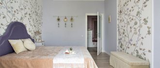
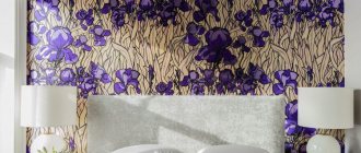
- The ability to focus attention on certain decorative elements and disguise imperfections. This is usually the main goal when using combined wallpaper in the bedroom. Using wallpaper you can mask problems such as uneven wall coverings, crooked corners, low ceilings, etc. To create an accent, the sleeping area as a whole or just the bed is used. The walls are decorated with bright, contrasting wallpaper, which often extends into the ceiling. You can attract attention with the help of unusual photo wallpapers, which contain large and voluminous objects: flowers, geometric shapes, etc.
- Formation of an appropriate atmosphere in the interior. Warm colors and soft shades make the room feel cozy: dark colors add intimacy to the bedroom, bright colors add dynamics and energy.
- Bringing light into the room. Combining helps make the bedroom brighter if you use a pastel palette consisting of warm colors. So, for example, a typical embodiment of this design is the use of yellow wallpaper without images, which are placed opposite the window.
TOP 4 selection criteria taking into account the specific situation
The main indicators of the material are environmental friendliness, because toxic components in the decor can negatively affect health by polluting the composition of the air. The texture allows you to distract from imperfections without leveling the surface.
Paper wallpaper is environmentally friendly and safe
1For decorating a room in a new, not yet settled house, fiberglass canvases are better suited. They are more durable and are able to keep the surface smooth even if a crack appears.
2It is more rational to update the interior space of a room using non-woven wallpaper. They are cheaper and do an excellent job of leveling.
3If you want to emphasize your status, it is preferable to use textile options. They will add a special coziness to the atmosphere and go well with their vinyl counterparts.
4Allergy sufferers and those who are tight on finances are better off choosing paper wallpaper.
Fiberglass sheets are durable and crack-resistant
"Pros" and "cons" of combining wallpapers
The combination of wallpaper in the bedroom when selecting different colors, patterns or textures is characterized by a number of advantages over monochromatic options.
The main “advantages” include the following.
- Playing with proportions. The right combination of two types of wallpaper allows you to visually adjust the bedroom so that the space looks larger. For example, vertical combination will help create the effect of higher ceilings. In addition, the very fact of combining several colors helps to expand the space, which helps when working with small rooms.
- Dividing the bedroom into zones. Zoning is a relevant option for bedrooms that have not only a bed, but also a dressing room, dressing table or desk. Wall hangings in different tones will delimit these areas without the need for additional accessories.
- Placement of accents. Wallpaper of two types can become an interior element that helps highlight the design features of the bedroom. For example, they can be used to emphasize two-level floors, niches, etc.
- An opportunity to refresh the space. The combination of different wallpapers creates bright accents that help make the space more decorated and modern. Using this technique will not leave the bedroom “empty” even if its design is made in a minimalist style.
- Adaptation to personal characteristics. Due to the remoteness of the room from the rest, the bedroom is considered a personal space that allows the owner to embody all his fantasies and ideas. Experimenting with wallpapers that differ in color and pattern will add personality to the room and be a great way to express design ideas.
At the same time, using combined wallpaper in the bedroom interior also has its disadvantages , among which are:
- high repair costs due to the need to purchase finishing materials from different batches;
- the need to apply point markings to the surface, failure to comply with which will lead to visually incorrect joining of the wallpaper;
- the selection of decorative items must match the style and color scheme of all the wallpaper presented in the room.
Choosing two types of wallpaper can be a difficult task, since in this process it is worth taking into account many nuances: from matching the color palette to choosing the same decor.
In addition, if the owner’s preferences in the interior often change, it is best to choose plain combinations . The appearance of the bedroom can be further diversified with the help of paintings, panels and other decorative elements.
What do photo wallpapers go with?
Photo wallpaper is not a new, but very popular interior solution. Modern paintings have taken this idea to a new level. They can imitate an additional room, a window overlooking the sea, or add a bright, rich accent to an ordinary interior. Good for a teenager's room. The design method is to embed a TV under the base of the picture on the photo wallpaper.
Considering that photo wallpaper is a large-scale, bright element of the interior, it must be carefully integrated into the surrounding environment. This is especially true for small rooms in Khrushchev-era buildings. It is necessary to create a combined interior with walls, choosing furniture and location. The rest of the background in the room should definitely be monochrome, in a color scheme that matches the chosen pattern. Moreover, this could be wallpaper, wall painting, textured plasters. The background should be extremely boring. In this case, even wood, with its pattern and variety of textures, will not be suitable as a background.
Photo wallpapers are glued to an entire wall, a separate area, or stand out in a panel. Introduce not one, but two areas with canvases into the interior, but only if they support and continue each other at the level of idea. To glue them, use wallpaper glue. They are inexpensive. A person who does an economy class renovation can use this type of wallpaper.
Choosing how best to combine wallpaper in the bedroom should be based on your preferences. And they will help you decide on photo options for interior solutions.
Rules for selecting two types of wallpaper
Selecting two types of wallpaper requires compliance with some rules that will help create a harmonious design of the room.
Expert opinion
Irina Klimova
I am 29 years old. I'm an interior designer. I love my profession and have been doing this activity for more than 8 years. About 100 projects have been implemented. I provide professional advice.
It is best to use wallpaper from the same collection or purchase it from the same manufacturer. This way the room will look like a single space that is not divided into pieces and does not seem overly pretentious.
When selecting 2 types of wallpaper, you should pay attention to several main points.
Ceiling height
Depending on this characteristic, the owner of the bedroom determines the type of pattern, its color and texture. For ceilings less than 2.5 m high, choose canvases of light colors that do not have large patterns or rough textures.
If the ceilings are very low, combining a light background with a soft texture or vertical stripe pattern can help.
For ceilings higher than 3 m, a large pattern is required, which is stretched across the width. For such options, it is possible to use horizontal divisions of walls using different colors at the top and bottom.
Room size
In addition to the standard indicators of width and height, it is important to pay attention to the geometry of the room itself. First of all, this concerns the area.
If the bedroom is large , it is allowed to use dark or rich shades. They visually reduce space, so you should be careful when using them.
Light colors are used to expand the area.
If there is texture, it should be small, if there is a pattern, then it should be implicit.
Question to the expert
What to do with a long and narrow room?
If the bedroom is long and narrow, light wallpaper is placed on the short walls, some of which seem to be “hiding” around the corner. This helps to align the geometry of the bedroom.
Wallpaper texture
Wallpapering two types should be based on careful selection of texture and thickness. It is recommended to use the same type of canvas.
If the joint is formed exclusively in the corners, the thickness and texture can not be particularly taken into account, since in such a place it will still not be noticeable.
However, if the connection occurs on a flat wall, differences in thickness will be very noticeable. The transition effect that appears can ruin everything, as it will look inorganic.
Color combinations
When choosing a color palette for wallpaper companions, you should be guided not only by personal preferences, but also by the rules for selecting colors.
The easiest way to navigate is by the color wheel, which is called Itten’s wheel after the Swiss artist.
So, to combine wallpaper in the bedroom, you should use tones that are adjacent to each other . This will help create a harmonious color scheme.
Shades that are opposite each other are considered contrasting and should be used with caution.
It is important to dilute this combination with appropriate decor, otherwise the transition will look too sharp and unusual for the eye.
In the bedroom it is permissible to use not only light or pastel shades. Bright and warm colors that go well with pastel colors will look appropriate in the room.
Combination of patterns
There are several options for combining wallpaper.
Background + pattern. This is a classic option, which is considered the easiest to select. It is suitable for situations where the walls are decorated as a single color. In this case, companions with the same background are used to place accents. For contrasting options, it is worth purchasing something lighter or darker than the main background.
Large pattern + small pattern. When choosing this option, it is important to understand that large images visually reduce the surface, while small ones, on the contrary, make it slightly larger. To place accents, you should choose wallpaper that has a large pattern, while a small one should be used as a background.
Pattern + geometry. This combination looks good in a classic design, where geometry becomes a complement to the design. The geometry is chosen to be calm and dim - then it will not become boring and will look unobtrusive in the bedroom interior.
Geometry matters too
In some cases, using companion wallpaper will not work. Perception also depends on the shape of the room and lighting. Natural lighting makes the finish lighter, artificial lighting adds yellowness. Reflecting from colored surfaces, yellow particles slightly mix the shades, so cool tones will be warmer.
For large rooms it is necessary to use decoration in dark colors
A bright stripe on a light background of the opposite wall will mask the unevenness of the walls, details that spoil the interior.
If there is insufficient lighting in a room of irregular configuration, pastel and neutral colors are preferable. vertical or horizontal division of a surface to give height to a room. Variants of horizontal combinations look good:
Vertical lines give height to a room
- there are horizontal stripes at the bottom and vertical stripes at the top;
- there is a dark shade at the bottom and a light shade at the top, or vice versa;
- below there is a smooth monochromatic surface, above there is a relief;
- on top there are horizontal stripes, and on the bottom there is a plain surface;
- there are vertical stripes on top and a pattern on the bottom;
- there is a pattern on top, a plain surface on the bottom;
- There is a plain surface on top and a pattern on the bottom.
A plain surface on top, a pattern on the bottom - a great way to add height
For horizontal division, it is preferable to use wallpaper with large, contrasting patterns.
The vertical method of combining wallpaper visually “pulls” the walls upward. The most successful option is a series of plain and patterned stripes of the same width, breaking the stereotype of the interior.
More than two variegated patterns and more than three colors cannot be combined in one room.
Wallpaper companions - a universal option
Companion wallpaper refers to canvases that are different in color or texture and that harmonize well with each other. Manufacturers specially produce batches that differ in shades or patterns, which are recommended for gluing in pairs.
In order not to make a mistake with your choice, you should pay attention to the fact that the wallpaper belongs to the same batch (the same combination of symbols must be present on the label).
If wall decoration is selected from different batches, then they must be glued to different surfaces: some are placed on one wall, others on the opposite wall, where the light falls at a different angle.
Despite the fact that partner wallpapers differ from each other in decor and design features, they are created in a common style and with a common color scheme. Therefore, they should also be purchased as canvases from the same batch.
Wallpaper companions in the bedroom become a successful design move, combined with various images and textured surfaces.
In addition to creating an aesthetically attractive appearance, they visually adjust the space.
Thus, companion wallpaper with a striped pattern visually makes the room longer.
Watch a short video with recommendations and tips for choosing wallpaper companions.
Wallpaper combination options
The combination of two or three types of wallpaper suggests the possibility of combining different directions, geometric shapes and color schemes to achieve the effect of a harmonious space.
With well-chosen combinations, the room acquires the correct shape and size, the interior is filled with light, individual zones are highlighted, and the characteristic features of the interior design are emphasized.
There are several basic options for combining different types of wallpaper.
Plain wallpaper
This is a combination technique in which monochromatic canvases are selected for work, differing in halftones or acting in relation to each other in the form of contrasting colors.
This combination is considered a classic option. Rich shades are given a higher priority zone, while the rest are located at the edges.
Expert opinion
Irina Klimova
I am 29 years old. I'm an interior designer. I love my profession and have been doing this activity for more than 8 years. About 100 projects have been implemented. I provide professional advice.
This design is suitable for small bedrooms where complex patterns and flashy accents are inappropriate, as they reduce the work space and create constant tension.
To create a harmonious design, single-color canvases with a neutral shade and a color that will be more active in tandem are selected.
Vertical
This design uses wallpaper that has vertical stripes. The point of their use is usually to visually raise the ceiling level.
The height of the bedroom will depend on the thickness of the picture : the thinner the fragment, the taller it will seem. It is not necessary to combine stripes of only one size. They may differ in width if this is part of the author's idea.
For interior decoration, coatings of the same color but with different color intensities, alternating dynamic shades with calmer ones, and using patterns in combination with plain-colored canvases are becoming popular options.
Horizontal
This type of combination should be used in cases where you need to cover the bedroom with wallpaper of different tones and textures.
Using this method you can visually raise the ceiling level.
Horizontal stripes are distributed in height with alternating colors and patterns.
If only two types of wallpaper are used, the parts should be in proportion.
To mask the joints, it is worth using moldings or baguettes, since in the case of a horizontally oriented combination it is more difficult to mask the border.
Patchwork
This combination option is implemented by selecting patches that are made up of wallpaper that harmonizes well with each other.
They are cut into pieces of the same or different sizes, glued end-to-end or overlapping, and their arrangement resembles the distribution of pieces on a chessboard.
The patchwork combination can be two-color or have a larger number of colors , implemented through different geometric shapes, patterns, etc. They are cut out in the form of circles to create a composition on prepared surfaces.
Different wallpapers
Decorating a bedroom can be more experimental and creative if you choose wallpaper that differs in color, texture and pattern.
Most often, contrasting colors are used for this, which give the design dynamism and originality.
However, the process of selecting different wallpapers requires taking into account various nuances associated with interior design. There is a big risk of making a mistake and getting a result that is not what was expected.
Therefore, you should trust the selection to professional designers who know how to create compositions of contrasting colors in accordance with the characteristics of the room.
Combining by blocks
Another way to combine different wallpapers into a single composition is block combination .
This option involves the design of a rectangular space, which is covered with one type of wallpaper, often quite bright, and wallpaper of a calmer color becomes the background for the panel.
If there are niches in the bedroom, they should be highlighted with dark-colored wallpaper.
Combination with photo wallpaper
Photo wallpaper, like other decorations with active patterns, can be combined exclusively with plain walls.
For the bedroom, it is best to choose calm, static scenes that will not once again disturb the imagination but, on the contrary, will create calmness, tranquility and give strength.
White, beige or gray backgrounds look good with almost any photo wallpaper.
Inserts
The complexity of this method lies in the fact that all elements must be prepared in advance. First of all, they are cut to specific sizes. If necessary, the parts are painted in the selected shade.
It is easier to make inserts from non-woven wallpaper. These elements are placed near the bed and other pieces of furniture.
Basic rules for color combinations
The combined use of different colors is based on several basic schemes.
Monochromatic. This is a combination option in which shades of the same color are used, differing in the degree of saturation.
Using this technique, you can make the interior quite calm, visually divide the space into zones, and, if desired, add bright accents in the same color scheme. Complementary. This method of combining colors involves combining opposite shades that appear on the color wheel. For example, orange and blue, purple and yellow are considered contrasting to each other.
Similar. Externally, the colors may be completely different, but their combination forms a harmonious combination, within which one shade smoothly transitions to another. Typically, for this type of combination, colors that are adjacent to each other on the color wheel are used.
The choice of color scheme is largely determined by the location of the bedroom in the apartment. So, if the room is northern, sunlight rarely enters it. The overall color of the room is directly affected by the color of the sky. In winter and autumn, the weather is usually cloudy, which creates a gray cast in the room.
Therefore, for the northern room it is important to use rich, non-boring colors that could help highlight the outlines of objects.
For northern bedrooms, warm beige shades, yellow and brown are most often chosen.
Southern bedrooms receive plenty of sunlight, making them appear cheerful, bright and more spacious. However, in summer it is quite hot in such bedrooms, and the wall decoration itself can fade in the sun.
Therefore, it is important to choose a canvas that will withstand the effects of the sun well. This can be vinyl wallpaper, textile wallpaper with a top layer of linen, silk, and a bottom layer of paper, glass wallpaper, etc.
For southern bedrooms, you should choose deep, rich tones that will look good in direct sunlight.
Cool shades can be a breath of fresh air for a constantly bright bedroom and bring a feeling of coolness.
An earthy palette that includes the colors of natural minerals, rocks or soil also looks good.
The following combinations can be called poorly combined colors in the interior of any bedroom.
Pink and red. These colors do not combine well in the interior, as they begin to merge and argue with each other, constantly irritating the eye. The combination of cold pink and rich red looks especially problematic - such options should be immediately discarded.
Lilac and orange. This combination of cold and warm colors is quite difficult to successfully design. Orange becomes overly bright and noisy, as a result of which all the calm and restraint of lilac ceases to work in the interior.
Blue and light green. Regardless of whether light green is warm or cold, it will not look harmonious with blue. Therefore, this combination should be avoided not only in wallpaper, but also when selecting furniture and accessories.
Black and purple. Both colors are quite rich and deep, and their combination creates a oppressive, mournful atmosphere in the interior, which creates a depressed state of the residents, which is completely unacceptable not only for the bedroom, but also for the living space as a whole.
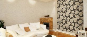
Accent wall
This is the name given to a zone in the interior that stands out from the rest due to bright accents. Typically, the wall at the head of the bed is selected for this purpose, or a certain part of it is used if the wall is too long.
In order for the accent on the wall to correspond to the overall design concept of the room, you should adhere to some rules when decorating it:
- The focus should be on one wall , rarely on two. Otherwise, dissonance is created and the accents do not work as intended;
- It is not necessary to focus on the entire wall . To do this, you can use part of the wall or individual architectural elements such as arches and niches;
- accent colors do not have to be bright ; softer combinations are possible.
An accent wall can be decorated using bright plain wallpaper, canvases with large drawings, digital images, etc. At the same time, the color scheme of other walls should be as neutral as possible.
Wallpaper combination ideas for different styles
When decorating the interior of a room, you should adhere to a single style of the room, which is chosen in accordance with a person’s ideas about convenience and comfort.
I will give examples of combining different types of wallpaper for the most popular interior styles.
Modern style
This is a large direction within which one can distinguish such styles as minimalism, hi-tech, modern, etc.
These design styles typically use plain canvases for the background and a pattern as an accent.
They can differ in texture and contrast with each other, thereby achieving a combination effect.
Provence
This way of decorating a bedroom gives the room a romantic atmosphere in the style of a French village. It gives the room air, light, creates lightness and comfort.
For combination use wallpaper in the Provence style with small floral patterns and patterns.
Classic style
A bedroom in this style is luxurious and large-scale. The design involves creating an elegant room with a cozy atmosphere, in which every element emphasizes the aristocracy and representativeness of the owners.
Wallpaper in a classic style is usually chosen in pastel colors.
Scandinavian style
Scandinavian design often uses white and plain wallpaper. To “revive” the interior, designers use wallpaper with discreet patterns that do not contrast with the main color scheme.
Country
The main principle of this style is simplicity of decoration. The room looks cozy and homely, thanks to the use of natural shades like brown, sand, olive, which are diluted with white.
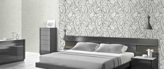
Varieties of ornaments
An ornament is a combination of elements that are repeated in a certain sequence. Thanks to this, vertical surfaces acquire rhythm and look more complete. This allows you to get a three-dimensional perception.
Meander
Such wallpaper is often used for zoning a room. They are used to decorate borders and edgings. This pattern looks appropriate at the junction of walls and ceiling. If you want to make the print more interesting, you should allocate more space to it. In this case, it is recommended to make the main background calmer. It should be monochromatic.
Vegetable
This category includes all prints that relate to nature. Wallpaper can be decorated with flowers and birds. Images of animals and plants are often found. Popular options include the following:
- Damask - is a symmetrical floral pattern. Complex interlacing of colors is applied to the material. The pattern has 2 shades and is placed vertically. The advantage of the drawing is its versatility. Since the print looks rich, it should be combined with plain options.
- Paisley – made in the shape of a drop. This pattern is often used for oriental interiors. It fits well into the classic design. The print can also be used in a modern style. In this case, it is recommended to use 2-3 tones of a natural pattern at once.
Geometric
This category includes wallpapers complemented by stripes, diamonds, circles, and squares. Most often they are used to decorate a classic room. This category also includes more complex patterns that are suitable only for a certain part of the room - for example, one wall.
Stripes
Vertical stripes can visually increase the height of a room. Horizontal ones, on the contrary, expand the space.
Wallpaper combination in a small bedroom
Combining in a small room is a difficult task due to limited space and the need to avoid visual overload due to design.
To solve this problem, blue shades, cream, light beige, sand, and light green colors are taken as the basis for decorating small bedrooms.
White color is also considered an acceptable option: it does not narrow the space and goes well with different color palettes.
Expert opinion
Irina Klimova
I am 29 years old. I'm an interior designer. I love my profession and have been doing this activity for more than 8 years. About 100 projects have been implemented. I provide professional advice.
But it is necessary to avoid a monotonous interior, which will cause boredom. Therefore, bright color accents are used with white.
When choosing the right wallpaper for a small room, it is important to consider lighting. If there is a lot of light in the room, you should use cool tones. If there is not enough light, you should take warm colors.
For the most interesting bedroom design, you can use wallpaper with various prints. In small rooms, you should give preference to vertical patterns, as their use will visually expand the room and increase the length of the walls.
When decorating small bedrooms you should pay attention to the following points:
- you should not use dark-colored canvases or oppressive shades, for example, black or chocolate tones;
- Horizontal lines, large images and complex designs should be avoided;
- wallpaper should not be a darker shade than the furniture, otherwise the interior will seem gloomy;
- You should not choose overly bright and poisonously contrasting colors. Because of them, the size of the room will feel smaller than it actually is.
Common mistakes
Selecting different wallpapers in the bedroom requires a developed imagination and sense of style.
Otherwise, the experiments are unsuccessful, since the final version does not meet the functional and aesthetic objectives. The main mistakes include the following. Using dark colors in a small bedroom. Dark colors visually make an already small room smaller, which is why the residents present in it develop a feeling of constraint and a feeling of heaviness.
Use multiple colors. When combining, you should not use more than two types of wallpaper, especially if they differ in color, texture and patterns. Otherwise, the interior will look completely inharmonious, since the wallpaper in it will not complement each other.
Using horizontal stripes in bedrooms with small ceilings. This technique can further shorten the space.
Combination of photo wallpaper and wallpaper with a pattern. This creates an overloaded design experience that causes accents to not work properly.
How to glue companion wallpaper
When gluing companion wallpaper, you should follow the general operating algorithm that is typical for different wall paintings.
- Pasting always starts from the window opening. First, draw a vertical line using a plumb line.
- The first sheet is glued and wrapped in a corner on the adjacent wall. The canvas is glued overlapping in the corners.
- Using a carpenter's knife and a ruler, the canvas is cut along the line.
- The excess is removed, the edges are smeared with glue and aligned. This is required even in cases where the walls and corners are quite smooth, due to the fact that it is almost impossible to obtain accurate geometry.
If wallpaper is combined with a pattern , a shift should be provided at the joints when cutting the wallpaper to the width of the repeat. The sheets are attached to each other so that the design matches. A rubber roller or spatula is used for smoothing.
To attach wallpaper to the surface of the arch , you first need to place dry sheets over the arch. From the inside, a line is drawn along the contour along which the sheets are cut and glued. If the edges of the wallpaper extend beyond the edges of the arch, the dried canvas should be cut with a knife.
to form a veiled transition between wallpaper.
These are decorative panels created in the form of overlay convex strips that are used to decorate various surfaces.
Moldings emphasize neat finishing lines and draw attention to smooth walls. They are painted in shades that match the colors of the room design.
For a bedroom in the Provence style, simple panels are chosen, different in width and shape, with simple relief and a small pattern.
You can also use panels of wallpaper and baguette to decorate companion wallpaper. The baguette highlights the desired part of the wallpaper, which helps to create an appropriate accent and complement the interior with an effective decorative element.
Features of the technology
Let's consider some features of the technology associated with complex options for combining wallpaper.
When pasting wallpaper in horizontal stripes, mark the joint line from the floor so that the stripes do not run at an angle to the surface of the furniture. First glue the top sheet, then the bottom, leaving the edges of the joint uncoated. After the glue has dried, the edges of the wallpaper are cut end-to-end and glued. This is due to the shrinkage of the wallpaper when drying and the likelihood of gaps forming at the joint.
When gluing niches and protrusions, despite all the painstakingness of this work, all difficulties are associated mainly with taking accurate measurements and cutting out the wallpaper. The gluing technology is conventional.
Wallpaper with different illustrations in the bedroom
Briefly about the main thing
- Combining wallpaper in the bedroom allows you to zone the space, place accents, smooth out defects in the walls and layout, and add a “zest” to the interior.
- When selecting two types of wallpaper, you need to take into account the height of the ceiling, the area of the room, the texture of the wallpaper and their color combination.
- To select the right color combination, use the Itten wheel.
- In stores you can buy ready-made sets of wallpaper companions that you can safely glue together.
- For complex types of combinations, it is better to seek advice from a specialist who will help you choose the best combinations.