In order to highlight accents or, conversely, correct some shortcomings of the space, you can use two colors of wallpaper on the wall - and combine them at your discretion.
What is the benefit of styling with two wallpaper colors? First of all, this design allows you to convey the richness and lively tone of the shades used, which is extremely important in rooms intended for active family recreation or receiving guests.
With the right combination of shades, you can transform a room beyond recognition, even visually correcting its shape and size. But how to choose the right wallpaper of two colors to implement such ideas? If you're already intrigued, we're ready to reveal these secrets to you.
Is it possible to combine wallpaper from different manufacturers?
This is acceptable if the wallpaper is created on the same basis. For example, non-woven, vinyl, acrylic. If the production does not produce rolls that can be arranged according to tones, or the pattern does not suit, you can safely look for options from other manufacturers.
Basic rules for combining wallpaper
It's worth choosing a wallpaper with a pattern for an accent wall, and then finding a basic option. These are rolls of the same color with the main “accent” tone. For example, a drawing of “Venice” on a beige or blue background. Other walls are decorated with blue, cream or beige wallpaper, depending on the main tone of the accent wall.
- There is no need to combine incompatible things. Textured vinyl wallpaper will not “make friends” with the standard paper version, especially if it is cheap.
- And you shouldn’t put wallpaper with small flowers on one or a couple of walls, and wallpaper with rhombuses or other geometry on the rest.
- This option will give the impression that the owners decided to update the wallpaper, but there were not enough rolls for several areas and they had to leave the old version on a couple of walls.
It is permissible to use textile wallpaper as an accent; on the remaining surfaces, stick vinyl wallpaper of a related range, either a little darker or literally a couple of tones lighter.
There is no need to glue different wallpapers on one wall. The transition from one type of coating to another should be in a corner, i.e. from corner to corner there is one wallpaper, then another. The joints should be separated by moldings.
Rules and recommendations
When deciding to renovate a room by combining wallpaper, you should take into account the area, location, purpose and proportions of the room.
- When choosing the main tone, you need to start from the area. In a small room, it is inappropriate to use a dark color palette; a light pastel palette looks more harmonious, which will visually increase the area of the room.
- In a spacious room, a combination of dark colors and voluminous patterns is acceptable.
- Location plays an important role. In a room with windows facing north, it is better to use a warm palette, this will compensate for the lack of sunlight.
- On the south side, opposite, cool shades look more harmonious; they will give a breath of fresh air.
- In an apartment with high ceilings, you should not combine wallpaper with vertical patterns.
- You can adjust the height of the ceilings using horizontal stripes and three-dimensional images. The same rule works in the opposite direction; for small rooms, light, plain wallpaper and a small, discreet pattern are suitable.
Errors in combining wallpapers
Use three different types of wallpaper. In addition, modern designers do not recommend horizontal combinations of different or even wallpapers of related tones.
If your budget is limited, you should purchase plain wallpaper in related shades of the same color scheme. There is no need to buy cheap rolls with poorly drawn patterns or poor print quality.
Effect of gluing
The decoration of rooms with wallpaper has become widespread, because the material is convenient and allows you to turn any fantasy and idea into reality.
Wallpaper benefits:
- Zoning is indicated.
- The desired visual effect is created.
- Beautiful and budget renovation.
To get what you want, it’s not enough to choose a wallpaper design in two colors and stick it on, because there are many examples of extremely unsuccessful pasting of wall surfaces. To succeed, it is important to follow some rules.
A game of contrasts for combining wallpapers
You can combine quite contrasting shades, one of which is bright, the other pastel.
Designers advise combining the following colors:
- Black White.
- Beige - red.
- Brown – cream or vanilla.
- Olive - ocher or sand.
- Lilac – dark purple or gray.
By the way, all colors without exception are combined with a gray tone. Plain gray will “make friends” with bright red, yellow, orange, rich pink and even turquoise or blue.
The most famous circles
It’s great if you are one hundred percent confident in your own sense of style and color, and skillfully apply this in practice. But not everyone has this skill. Here are the most famous color circles to help everyone who is not confident in their sense of unity and harmony. They will always help you choose the right combinations when creating a bow.
There are many options for color wheels, but don’t be scared, they all “work” according to similar principles.
By the way, throughout the history of mankind, hundreds of people have been involved in the compatibility of colors and the development of schemes for these combinations, from artists and designers to chemists and nuclear physicists. Some schemes are very specific, others are applicable in a narrow area. However, there are also universal ones, known to everyone who, one way or another, works with color.
The first circle was developed a long time ago, almost at the same time as the very first color theories. This is reflected in the records of eminent researchers. Newton's, Itten's color circle, Goethe's circle (what colors go together), Oswald's circle. Who hasn't heard about them? All these developments have found wide application in various fields.
Itten Circle
He is simply a godsend for leading stylists and anyone seriously interested in fashion. Using this circle, finding a successful combination is easy. Plus, this circle forms various combinations from the sphere of classics, giving maximum harmony.
The combination of colors in the Itten circle is one of the clues for any person. The rules of the color wheel in clothing help you look good and create your wardrobe wisely, achieving maximum variety and attractiveness with a minimum number of items.
Itten is a world-renowned design theorist and artist. Let's use Itten's color circle in the photo industry, the field of design and clothing, as well as in the world of makeup and jewelry. It consists of twelve separate sectors by color. There are three primary tones in total, and when they are combined, we get different combinations.
Primary colors of Itten's circle.
The subsequent colors of the secondary row are violet, green and orange. We get them by mixing evenly all the tones of the first order. Using the tones of the primary and secondary rows presented in the circle, we get six shades of the tertiary order.
The main colors of the Itten circle are primary, secondary and tertiary.
Each circle has its own figure inside. Rotating them creates the desired combination of tones. Understanding how to use Itten’s color wheel is not at all difficult, but this knowledge will become an indispensable assistant in the successful selection of color combinations for your wardrobe, makeup, and even home interior.
Newton's circle
It was Newton who was the first to explore the question of colors and possible color schemes. Based on his research, it was proven that neutral white is the only color that exists in nature and is broken down into seven components.
Back in 1676, a scientist managed to decompose white light into a color spectrum, and he noted that pure white contains all the primary colors, excluding purple. This became the basis for the discovery of Newton’s color wheel, popular among colorists, which has seven sectors: scarlet, blue, deep orange, pure blue, bright yellow, green, and violet.
Newton's circle of seven sectors.
By the way, it was Newton who first noticed that mixing scarlet with violet gives a beautiful purple tone, which was not in the spectrum. This famous scientist also found out that when mixing tones that are not close in spectrum, the degree of saturation is lost
Newton's color wheel is most actively used in the photo industry, hair coloring, interior design and fashion.
Goethe's circle of flowers
If Newton argued that in nature there is only pure white color, and the rest are its marching colors, obtained through the process of separation, the great thinker Goethe had a completely different view. Goethe's symmetrical color circle is built on the idea that every color is real and inherent in nature. The scientist selected pure tones that cannot be obtained by mixing (scarlet, yellow, blue), as well as those that were already mixed. And so they pass from each other, staying between pure fundamental tones.
Photos of Goethe's color circle clearly demonstrate that it is nothing more than a spectrum of colors in a closed form. These are three main tones alternating with three additional ones. It is this scientist who is recognized as the discoverer of the complex science of the interaction of colors and human psychology.
Goethe's color circle.
Oswald Circle
Oswald's continuous color wheel is another type of color scheme designed to explain the compatibility and incompatibility of shades. It has three main shades - scarlet, blue and green. But the classic black and white are not present here at all. They, according to Oswald, are the absolute absence of any color (pure white) and the maximum saturation of tone (this is black).
Oswald's color wheel, like everyone else, has come a very long way over the years and has firmly entered the sphere of modern colorism. His logic is most suitable for artists. However, this color distribution option also found its fans in design.
Oswald's color wheel.
Oswald's large color wheel makes it easy to compare shades, taking white and black as a base, which is universal and, accordingly, appropriate always and everywhere.
A true designer never limits himself to strict rules; he follows his intuition, but within the framework of the existing laws of perception. Proper use of coloristic tools in composing design compositions allows you to achieve the desired effect (brightness, extravagance, restraint, nobility), but without crossing the boundaries of taste and perception.
Author: Ekaterina Malyarova Image maker, creator of image and style training, author of the website Glamurnenko.ru. Since 2007, over 500 clients have gone shopping with me. More than 5,000 people attended trainings and seminars on image and style.
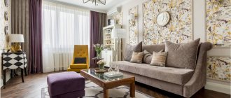
Wallpaper combinations in neutral tones
When starting a renovation, some owners place their main emphasis on wall decoration. They buy wallpaper that is expensive, flashy and, moreover, incompatible with furniture or decor. Meanwhile, designers warn: wallpaper is just a background on which you can “place” beautiful furniture and decorative elements.
Therefore, it makes sense to buy rolls of a couple of shades. Moreover, pastel colors can be both dark and light. It is advisable to combine dark with light related shades, or make smooth transitions from one color to another.
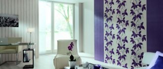
A way to stand out
There are different combination ideas for wallpapering walls. With the help of different paintings it is easy to place accents. To do this, bright or patterned specimens are often glued against the background of plain options. Such a picture will easily become a real art object.
Attention can be directed to a specific object or part of the room. Combination is also an opportunity to express your “I”. Only people who are insecure about themselves refuse to show individuality in their home.
The bedroom is a great place to express yourself. No strangers are invited here; here you can fully be yourself.
A little about accents
There should be one accent wall. Making two surfaces in one room at once in the “Cuba” or “London” style risks creating the impression of bad taste and bad manners.
Neutral light wallpaper is good for small rooms, or living rooms with several doors and window openings. A rectangular bedroom or children's room will look great in a dark design, especially if the room is located on the sunny side of the house.
- Designers recommend purchasing accent black, gray and white wallpaper with silver splashes in the “Cuba” style and matching it with dark gray, rich rolls of matting.
- Another option, “Night London” in rather rich gray shades and light gray wallpaper as a background.
- Neutral wallpapers look great in combination with urban or natural motifs and landscapes, where there are bright accents.
- Drawings in red, orange tones, or golden, warm ocher inclusions.
- Accent abstraction is also welcome, which will look great in combination with a pastel background.
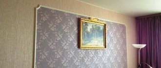
As a rule, an accent wall should not be overloaded with decor. The maximum that can be hung on it is a large flat plasma TV. Paintings, photo frames and other decor on the wall, where there is a full-fledged picture of a night city or Venetian motifs, are not appropriate.
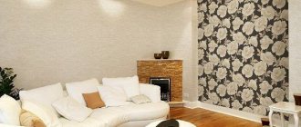
The accent wall should be chosen based on the principle of clarity. This means that it should be placed in a prominent place, one that catches the eye when entering the room.
Decoration nuances
Source: //dekormyhome.ru
Combined wallpapers are very popular, this is due to the versatility of the method and the possibility of using this finishing technique for rooms of various types. Combined wallpaper can be selected to suit any room style, choosing different color palettes and patterns. Instead of standard wallpaper, you can use photo panels, bamboo and liquid wallpaper. For decoration, you can use various combination options, combine different textures, shades and patterns, creating a unique, stylish interior.
There are several options for combining wallpaper:
- decoration of adjacent ceilings and walls using coatings of contrasting colors (the wall is decorated behind the headboard);
- decorating walls using wallpaper of various colors;
- use of wallpaper inserts;
- decorating opposite walls using two types of wallpaper.
Source: //i.ytimg.com
When choosing a design and type of decoration, you must immediately decide what the furnishings should be like and in what style they should be made. For example, for a northern room with a small area, dark-colored coverings with a complex, intricate pattern are completely unsuitable. But for southern bedrooms this option is suitable, but it is necessary to highlight an accent wall.
You need to start planning your bedroom design with its area and configuration:
- for very small rooms it is necessary to select light-colored coverings that will visually expand the walls;
- for large rooms with a significant glass area, you can use coatings of any shade, but it is better to highlight the bed area; also for such a room you can use dark coatings;
- narrow rooms can be visually “stretched” if you use light coverings for long walls and dark ones for short ones;
- if there is a niche, you can use coatings of a lighter or darker shade to decorate it; panels with floral patterns or photo wallpapers are also good for a niche;
- When using photo wallpaper, it is recommended to use this material on the walls adjacent to the window, and not opposite.
To highlight individual walls or areas, you can use a general monochromatic covering and inserts with spring patterns or bright ornaments. For example, for a recreation area, panels with views of nature or city landscapes are well suited; if the room is not very large, then the drawing should have a perspective. These can be forest or garden paths, flowering fields at dawn or sunset, river or lake surface. In this case, you need to pay attention to the finishing of the furniture - the color of the wallpaper should not merge with it, that is, it is advisable to select contrasting shades. The only exception is a monochrome interior, but even in this case an accent is needed, for example, gilding, patination, a subtle, barely noticeable ornament.
Source: //stylingroom.ru
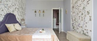
When decorating the sleeping area, the design is used for the wall to which the headboard is adjacent. This makes it possible to create the necessary focus and make the environment more comfortable. The color of the wallpaper may be different, but it is better to choose coatings from one collection. For example, the overall tone could be pearl gray, and the insert could be an ash rose or lavender shade. You can use an interesting patchwork technique, for which the space behind the bed is decorated in patchwork style - in the form of a combination of wallpaper fragments with different colors and patterns. This imitation of a patchwork quilt will give the atmosphere more comfort, but the technique itself is not suitable for all styles. For example, patchwork finishing is not used for high-tech or classic interiors.
Using two types of wallpaper for the bedroom allows you to give the decor more attractiveness and comfort. Various methods and techniques are used for finishing; their choice depends entirely on the area of the room, its shape, and the characteristics of the furnishings.
In which rooms is it better to combine different wallpaper tones?
Designers are advised not to limit the implementation of their ideas regarding layouts in design to stereotypical opinions. Combining different tones of wallpaper, patterns, and creating accent walls is acceptable even in the kitchen space. Moreover, the accents can be echoed by a ceramic apron, an ornament on curtains or blinds.
These finishing options look good in the hallway. By the way, you can hang a large floor-length mirror on the accent wall, but the places where the closet, shoe rack or hangers will be located should be decorated with neutral background wallpaper.
Designers unanimously declare that the most correct solution is to decorate a bedroom or living room with wallpaper of different colors.
You can decorate a child’s room the same way. For example, choose a neutral background, and the accent will be wallpaper with photo printing in the form of your favorite cartoon characters or comics.
But a small space of a loggia or balcony can be done without accents, but with a combination of different shades of the walls.
Features of the design of a small room
- In a small apartment, for example in Khrushchev, it is preferable to choose light shades when combining.
- The vertical or horizontal direction of the pattern or lines will help adjust the space.
- Simple drawings and patterns can also visually enlarge a room. You can see what drawings can visually expand the space here.
- Mirror surfaces can significantly help expand boundaries.
- Pairs of tall mirrors framed will completely change the appearance of the interior.
In the photo, one of the walls is decorated with wallpaper with horizontal stripes, which visually increases the width of the children's room.
In the photo, one of the walls is decorated with wallpaper with an ornament; this technique will visually make a long room of a small area more proportional.