The modern interior is distinguished by originality and the implementation of the most daring ideas. You can achieve this result using a combination of wallpapers. Thanks to this solution, the interior becomes lively and dynamic.
It is worth noting that this innovation in the field of design was recently considered unacceptable. But in recent years, combining wallpaper of different styles and colors can be found more and more often.
Rules and recommendations
When deciding to renovate a room by combining wallpaper, you should take into account the area, location, purpose and proportions of the room.
- When choosing the main tone, you need to start from the area. In a small room, it is inappropriate to use a dark color palette; a light pastel palette looks more harmonious, which will visually increase the area of the room.
- In a spacious room, a combination of dark colors and voluminous patterns is acceptable.
- Location plays an important role. In a room with windows facing north, it is better to use a warm palette, this will compensate for the lack of sunlight.
- On the south side, opposite, cool shades look more harmonious; they will give a breath of fresh air.
- In an apartment with high ceilings, you should not combine wallpaper with vertical patterns.
- You can adjust the height of the ceilings using horizontal stripes and three-dimensional images. The same rule works in the opposite direction; for small rooms, light, plain wallpaper and a small, discreet pattern are suitable.
Zoning principles
Creating different functional areas in a room is not only a beautiful, but also a practical solution. There are different ways to accomplish this task.
The easiest and most affordable way is to use a combined wallpaper design. The functional area is highlighted using a contrasting color and wallpaper with a contrasting pattern.
Don't be afraid to experiment, you will get the most daring and original solutions.
The choice of zoning method depends on the purpose of the zone that needs to be allocated, as well as on the presence of partitions in the room.
For example, when we combine wallpaper in a hall or children's room in order to divide it into even parts, it is recommended to paste half the room in a bright color, and the second in more restrained shades.
To complete the task, install a decorative partition.
Combination methods
Combination with vertical stripes
With the help of striped wallpaper you can visually increase the height of the ceilings. The frequency and width of the bands depends on personal preference. When purchasing material, your choice should be on rolls of the same size and, if possible, from the same collection. In this case, the finished version will look like a solid composition. The color palette can consist of two close to each other or contrasting colors.
In the photo, one of the kitchen walls is decorated with striped wallpaper.
Combining horizontally
Horizontal patterns and stripes can “pull apart” the walls and make the room wider. This finishing option is suitable for rooms with high ceilings; in a compact room, a feeling of a low ceiling may appear.
Another way to combine is to divide the wall into two parts horizontally, with the top half usually in a lighter color than the bottom. Often the lower part is made of wall panels.
Accent wall
Most often, the accent wall is the one that the eye falls on when entering the room. A bright shade or three-dimensional image will “pull up” the wall; with this technique you can bring a long narrow room a little closer to the shape of a square. Depending on the stylistic direction, the main color may be similar in tone to the accent wall or radically different.
In the photo, the accent wall in the bedroom is decorated with pink photo wallpaper with flowers.
Plain and plain
Different shades of the same color will help to zone the space and create a play of shadows. For example, part of the bedroom is finished in a light gray shade, and the sleeping area is finished in a deep, rich color.
Pattern or ornament and plain
One of the most common finishing methods is the combination method. Floral patterns or ornaments can resonate with the style of the interior. The pattern is applied with a stencil, sticker or wallpaper. Today you can often find collections in stores that present monochromatic options and those with a pattern applied to the same base.
Pattern and Pattern
Completely different patterns can exist harmoniously in one room, but they should be united by a common note. This could be common motifs, elements or color.
Combining photo wallpaper with wallpaper
Photo wallpaper can significantly increase the space of a room. Perspective photo wallpaper, such as a road or a tall waterfall, will elongate the room and make it wider.
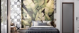
The photo shows a promising photo wallpaper (a receding pier), which helps to visually increase the height of a small bedroom.
Considering that photo wallpapers themselves have a voluminous and colorful image, it is worth combining them with a calmer tone so as not to overload the room.
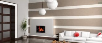
Focus point
In order to highlight any area, for example a fireplace or TV, use background wallpaper. Part of the wall may have a solid color that differs from the main shade or have an unusual pattern.
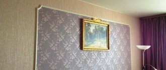
Decorative decorations
An unusual picture is formed by elements framed in frames and moldings. Against the background of a calm shade of wallpaper, there may be inserts with ornate patterns. This combination is suitable for an interior in a classic style.
In the photo in the living room in the classic style, the wallpaper is decorated using moldings.
Patchwork technique
Patchwork technique is suitable for decorating a nursery or bedroom. The point is to combine an overall picture from patches of different wallpapers. When gluing, it is necessary to maintain an even seam.
Allocation of niches
An interesting solution would be to highlight the niches in the wall with a different color. The recesses can be made a couple of shades darker. When decorating a niche with textured wallpaper or panels, lighting looks good; the relief will cast interior shadows.
Combining wallpaper with different textures
The combination of different textures looks harmonious in almost any room in the apartment. In small rooms, wallpaper with a shiny surface will increase the space due to its reflective properties. In addition, they look interesting in contrast with the matte canvas.
Room zoning
You can divide a room into zones in several ways, one of them is by dividing it with color and texture. The kitchen, combined with the living room, will be separated by wallpaper of the same texture, but in different shades of the same spectrum. A good option would be structural wallpaper for painting.
The photo shows two types of wallpaper with a floral and checkered print.
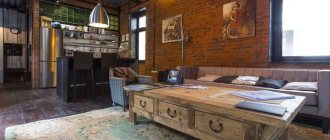
Combination with brick wallpaper
Brickwork is most often associated with the loft style. In a small apartment, it is possible to replace natural material with imitation wallpaper. Red brick wallpaper goes well with matte gray or white material. White brick looks harmonious with light walls.
Types of wallpaper for the kitchen-living room - colors and materials
Wallpaper that can withstand temperature changes and high humidity and does not absorb odors and grease is suitable for the kitchen. For example, inexpensive paper collections will not last even 5 years. In addition to the practical role, when choosing a beautiful combination of wallpaper for the kitchen-living room, it is important to take into account the design of the room.
Non-woven wallpaper is a modern and practical replacement for the paper version. They look more original than standard collections. Dense fabric has a fibrous structure and looks more textured.
Modern style kitchen
Vinyl wallpaper perfectly hides wall imperfections and is highly durable. They are easy to wash and repaint.
Paintable wallpaper is a great option for a large living room. Thanks to the ability to choose several shades, it is easy to create original color combinations.
See also Gray wallpaper and a variety of shade combinations
How to combine wallpaper by color?
Monochromatic combination
A calm color combination, despite its saturation, can be called monochromatic. These are shades of the same color, differing in saturation. In the interior, a richer shade can be used to mark the desired areas or visually divide the space.
The photo shows a monochromatic combination of colors on combined wallpaper.
Complementary Combination
This is a combination of contrasting, opposite colors. For example, red and green, purple and yellow, orange and blue. A combination of this kind is suitable for finishing any room. A combination of calm shades can be used in the living room and bedroom, and bright ones are suitable for a nursery.
Similar
At first glance, similar colors are completely different, but their use in the interior looks harmonious, each shade smoothly flows from one to another. As a rule, this is a combination of two or three adjacent shades from the color wheel.
Combination of individual colors (table)
| Beige | Chocolate, white, red, blue, emerald, black. |
| White | Universal color. Combines with any shades. The most successful combination is with black, blue and red. |
| Black | Like white, it is a universal color that goes well with many shades. Successful options: white, red, lilac, pink, orange. |
| Brown | Ivory, beige, green, pink. |
| Grey | The whole palette of pink, from pastel to fuchsia. Red, blue, plum. |
| Black and white | The combination of black and white is already considered complete. Both shades are universal; the combination will complement almost any color. |
| Green | Yellow, golden, orange, chocolate, black, gray. |
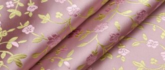
| Pink | Grey, chocolate, turquoise, young green color, olive, soft blue. |
| Blue | Grey, orange, green, red, white, blue. |
| Blue | White, pink, gray, yellow, brown, red. |
| Lilac | White, green, pink, chocolate, gray, black. |
| Red | White, blue, green, black, yellow. |
| Yellow | Brown, grey, black, blue, turquoise. |
| Violet | White, yellow, orange, lilac, black. |
The photo shows a combination of three types of wallpaper in the interior of a children's room.
How to choose photo wallpaper
One of the ways to visually expand the space is to print a picture on the entire wall. A wide selection of photo wallpapers with a 3D effect allows for a non-standard solution when organizing space. The combination of photo wallpaper in the living room interior with other decoration requires a good imagination to imagine the end result, as in the photo.
Many companies offer printing of any image using an industrial printer in the form of photo wallpaper. When choosing a photographic image, it is important to consider how it will be combined:
- Furnished;
- with floors and ceilings;
- with other wallpaper or wall decoration;
- with lighting;
- with accessories and small items;
- with curtains and other textiles.
The drawing creates an emotional background in the living room. If the goal of the setting is complete relaxation, then it is better to choose a peaceful sunset landscape, a waterfall or leaf fall in the mountains.
Pictures of nature where you spent your childhood will add a nostalgic touch.
The landscape of the ocean coast, where the family periodically goes on vacation, will bring pleasant memories.
The choice of subject may be dictated by a dream - a desire to visit Paris, Rome or the old streets of Prague. Photo wallpaper will help you “remove” one wall in the living room, opening up a panorama of the coveted space. The feeling of reality will be emphasized by a translucent curtain of one shade.
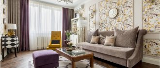
Living room interior with beautiful wallpaper
Living room with bright wallpaper
Combining wallpaper in the living room
See alsoHow to choose wallpaper for the hallway and corridor photo ideas for an apartment
Photos of the interior of rooms in an apartment
Living room
There are a lot of wall decoration ideas for the living room. The material and pattern are selected depending on the style. In a spacious living room with a corner sofa, an accent wall looks harmonious. A beautiful pattern and rich colors will indicate a place of rest.
Bedroom
In the bedroom, as a rule, preference is given to calm shades. A combination of a calm shade of the main wallpaper and a photo wallpaper with a floral print at the head of the bed will look harmonious.
Kitchen
In the kitchen, it is more practical to combine wallpaper above the dining area and tiles in the cooking area. Colors may overlap with each other.
The photo shows a horizontal combination of two types of wallpaper - plain and with a floral print, the joint is decorated using a white molding.
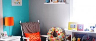
Children's
You can safely combine bright and rich shades in a children's room. For toddlers, you can use a patchwork technique with gender-appropriate colors and designs. One of the walls decorated with photo wallpaper or wallpaper with patterns will also look good.
Hallway and corridor
In a spacious or open hallway, you can combine simple, smooth and textured wallpaper with imitation of different materials.
The photo shows a practical combination of decorative panels with wallpaper.
Expert advice
- If the work is done with your own hands, then you should definitely make a drawing or sketch of the future structure, according to which all actions will be carried out. When using complex shapes or patterns, it is better to transfer such a design directly to the surface.
- Professional designers do not recommend using matte and glossy coatings together if they separate the wall. Such combinations are best used when creating small parts or appliques.
- It is worth mentioning that the price of some types of wallpaper is quite high. Therefore, it is very important to make all calculations correctly so that there is no overspending.
A huge number of different types of wallpaper on modern building materials markets allows designers to use all their imagination and imagination
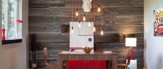
Combination with other finishing materials
Wallpaper and painting
The combination of painting and wallpaper looks good in the bedroom. A smooth painted surface will be complemented by canvases with an ornament, checkered or ornate pattern.
Combination with decorative stone
Combining wallpaper with stone looks harmonious in the living room or hallway. The corners and part of the wall are trimmed with stone. The material can be either natural or artificial.
Combination with brick
By combining wallpaper and brickwork you can get a brutal loft style and delicate Provence. Depending on the color and decorative content, you will get a completely opposite apartment design.
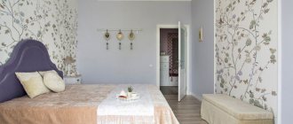
The photo shows a combination of wallpaper with a brick wall in a bedroom interior.
Wallpapers and panels
Combining wallpaper and panels will be a good option for decorating a hallway, living room or nursery. As a rule, the lower part of the wall is finished with panels using the horizontal combination method. The variety of choices allows you to make renovations in both classic and modern styles.
Plaster
Combination for any part of the house. Plaster sets the main tone in the room, wallpaper is an accent element. The combination can be with plain wallpaper, wallpaper with a discreet pattern and photo wallpaper.
Tile
Combination for kitchen and bathroom. The working area and the area of contact with water are finished with tiles, the rest is provided with wallpaper. The combination can have a contrasting combination or have common colors and elements.
The photo shows a combination of wallpaper with mosaic tiles.
Nuances of choosing for the hall
For rooms, there are four factors that influence the choice of material color:
- You need to look at the orientation relative to the cardinal direction.
- Evaluate the interior style.
- Determine if the furniture is multi-colored.
- You need to stick to your taste.
Black makes the room stylish
Sometimes living rooms are multifunctional. In the usual sense, the living room is needed for leisure. The kitchen is used for eating, and the bedroom is used for sleeping. If all of the above actions are performed in the living room, then versatility will be an important factor.
- It must be taken into account that people eat in the living room, which means that the chance of contamination increases. Children will be playing there, so they need to create a fun environment.
- Sleep will also take place there. Therefore, you can’t go too far with brightness either. You won't be able to sleep well with bright colors.
- Premises must be allocated separately. But there shouldn't be any obvious contrast. This is especially appropriate in situations where material needs to be changed in several rooms at once. After moving from a pale room to a bright one, your eyes may begin to ripple. This cannot be allowed.
Discreet and at the same time bright and stylish print
How to design a transition when combining
No transition
The simplest and most common method is the absence of a transition. Wallpaper sheets are glued end to end. It must be remembered that for the best result you need to prepare and level the surface. This method works well for an accent wall.
Moldings
A beautiful and elegant way to decorate. Visually it looks like a painting or panel. The main tone is chosen to be a calm shade, the second part can have either a simple geometric or an unusual shape and is trimmed along the edge with moldings.
Wallpaper border
The border is placed along the upper edge or along the central part. It will add zest to the interior. Looks harmonious in the living room, bedroom and children's room.
Nuances of human psychology
Red The correct choice influences whether a person wants to be in the room or not. Red colors are considered ideal for the living room . It will add a festive atmosphere and energy. It is difficult to stay in such a room for a long time. For rare stays in the room, a red shade is suitable. It is in no way suitable for relaxation; rather, on the contrary, color gives strength for further work.
Yellow It is advisable not to use only red ones, but to dilute them with neutral shades . Yellow is more calm . The presence of yellow will give the room an atmosphere of family comfort. This can also include a golden hue. It also gives a certain boost of energy, but the color is not as aggressive. Pale gold and corn can be included in this category.
Family atmosphere
Blue To create a calm environment, blue should be used. They act as a pressure and nerve stabilizer. Excessive use of blue in decoration will make guests feel overwhelmed. If the window faces north, then you can use a bright blue tint. It is classified as warm.
Green Greens give an association with nature. Some may associate it with spring, with leaves, with the forest. Like blue, green has a calming effect on people. A living room with greenery can be used for meditation. Depending on the location of the sides, the temperature of the green tint is selected. Although the beige shade is considered a classic, you can overdo it, and then the room will become boring. It does not give any surge of strength and does not affect mood in any way.
Combination of several green textures
Beige You can use beige as a neutral background . A fashion trend is the use of gray. All its shades are also included here. If the color of the furniture is too saturated, or the furniture takes a lot of attention, then they can be shaded with gray wallpaper. Materials with cold look organically for high-tech style rooms and industrial premises.
Features of the design of a small room
- In a small apartment, for example in Khrushchev, it is preferable to choose light shades when combining.
- The vertical or horizontal direction of the pattern or lines will help adjust the space.
- Simple drawings and patterns can also visually enlarge a room. You can see what drawings can visually expand the space here.
- Mirror surfaces can significantly help expand boundaries.
- Pairs of tall mirrors framed will completely change the appearance of the interior.
In the photo, one of the walls is decorated with wallpaper with horizontal stripes, which visually increases the width of the children's room.
In the photo, one of the walls is decorated with wallpaper with an ornament; this technique will visually make a long room of a small area more proportional.
What can influence the choice of color?
It is not customary to design all rooms in the house in the same style.
They need to be separated from each other. This is also done with finishing materials. You immediately need to figure out how the room will be used? For the living room, the normal state is a state of fun, trouble. Guests usually gather there. The apartment owner is faced with the task of creating a bright environment so that guests do not get bored.
Color options
The opposite situation is with the bedroom. In the bedroom, most of the time is spent sleeping, so there should be a calm environment. You can’t use shades in the bedroom that give a boost of energy and suppress laziness. You won't be able to relax in this situation. The issue of dimensions cannot be ignored. Finishing material plays an important role in the visual perception of space. There are techniques that increase space. There are ways to compensate for too spacious rooms. It’s just important not to confuse the shades.
Provence style color is ideal for the bedroom
Lighting Features
The choice of color is also influenced by lighting features. When the window faces north, this leads to poor quality lighting. Poor quality natural lighting needs to be compensated. It is not enough to install lamps. You also need to choose the color of the material wisely.
Tip To avoid discomfort in a dark room with the lights off, you need to use light shades. It is advisable not to go out of style.
This color will add more light to your room.
You cannot thoughtlessly use them just because you liked their shade or pattern . Some styles are strict in this regard, for example, baroque or classic. There are fewer problems with conventional modernity, but it also has its own requirements. They affect brightness. You need to be able to combine correctly. You cannot use different shades in one composition. It is important to maintain harmony everywhere.
The color of the wallpaper should be in harmony with the furniture.
The issue of practicality cannot be avoided. Dirt on white shades is very noticeable. For a bedroom or living room this is not so important. This factor is more important for the kitchen. Ceilings and walls get dirty there much faster. The proximity of the stove, the heat from the oven, cooking, lack of free space - all this makes the walls very vulnerable.
Advice You need to choose practical materials.
This also applies to the children's room. Children may accidentally smear or write on them.
Practicality comes first in the kitchen
The location of the material is also a key factor. For one, it is better for it to be located on the wall. Others feel more at home on the ceiling. You should try on the shade in advance, even before gluing. This will help you understand the right choice.
Layout errors
Some mistakes when combining can spoil the overall picture.
- You should not place large furniture along a wall with large patterns; it is better to choose plain background wallpaper.
- In a small room, the wrong decision would be to decorate it in dark colors. Light shades and bright decorative elements will look more harmonious. You should also not use three or more colors.
- In a narrow room, wallpaper with patterns is not applied to a large wall, as this will make the room even narrower.
- In an apartment with low ceilings, horizontal stripes and patterns will shorten the space even more.
How to place accents
If you are a novice designer, choose the easiest way to combine wallpaper - an accent wall.
Experts recommend placing emphasis on only one wall in the room. In exceptional cases, it is allowed to focus on two parallel or adjacent walls.
- Flowers on the wall - tips for using flowers in interior design. Beautiful combinations and interesting design options (85 photos + video)
- Purple walls - beautiful ideas for using purple and recommendations for choosing combinations (95 photos + video)
- Walls in the nursery: the best interior design ideas and choice of colors for the design (120 photos and videos)
The wall on which the accent is placed differs from the rest of the interior in color saturation, wallpaper texture, catchy patterns, or design style.
But it is worth remembering that it is necessary to comply with the style of the room’s design. Therefore, patterns and shades should resonate with the existing objects in the room.
If the size of the room does not allow you to zone the space, or highlight an entire wall, you should turn to the technique of a focal point.
This method involves highlighting a certain area of the room using color and pattern. This accent is used to highlight the wall near the bed, fireplace, and paintings.
Combining liquid wallpaper
Liquid wallpaper deserves special attention. They allow you to create unique paintings, even diagonally, while being easy to apply. According to tactile sensations, liquid wallpaper has a soft and warm surface. The material is applied according to the principle of textured plaster. For an ideal result, it is also necessary to prepare the surface.
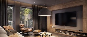
In the photo, the TV area is highlighted with liquid wallpaper.
What photo wallpapers are the most popular?
Realistic pictures of Italian streets, vast expanses of space, green and lush landscapes began to appear in our homes. Among the most popular themes that are used in images on currently popular wallpapers, it is worth noting the following:
- nature and landscapes;
- plants and flowers;
- animals;
- panoramas;
- sea, space;
- night city, European streets;
- celebrities, film clips;
- children's fairy tales and cartoons;
- individual stories;
- abstraction.
Beautiful design of combined wallpaper (photo)
When choosing the option of renovating a house by combining different wallpapers, you need to keep in mind the size of the rooms, their configuration and purpose. With the correct combination of coatings, it is possible to obtain the following results:
- visual increase in room area;
- hiding minor damage to walls;
- saturating the room with additional light;
- allocation of certain areas;
- creating an emphasis on stylistic features.
To give a unique style, it is possible to use only a few colors that are similar to each other. This range of shades can be applied using a specialized circle with a color chart.
Properly selected wallpaper will help highlight the special style of any room.
Advice! To get a multi-layer effect, the canvases are applied to each other, choosing one of them as the main one. Others in this case will be additional elements.
Zoning a room with their help
Zoning the room helps highlight the functional areas of the room. There are several criteria by which photo wallpapers are used for zoning :
- If this is an entertainment or active recreation area, it should be highlighted with images of animals, landscapes or flowers.
- Photos of food, fruits or drinks are suitable for the dining area.
- The children's area can be marked with images of cartoon stories or characters.
- Decorate the office with reproductions of famous paintings or geographical maps.
- An innovative solution when zoning a room is to decorate the ceiling with a photo print.
Combination of wallpaper with ornament
When choosing two types of wallpaper, one of which is represented by a large ornamental pattern, you need to be very careful.
This is due to the fact that large motifs look good only in large rooms, otherwise they risk eating up an already small space. As a rule, the companions to such wallpapers are single-color wallpapers that match one of the primary colors.
Choice for the bedroom
For the bedroom, you need to focus on the fact that the day will begin with this room. And a person’s mood depends on what color of wallpaper is used. It should be noted right away that aggressive colors are prohibited. There will be no quality sleep, and annoying ones will lead to frustration and quarrels. Too minor will also not lead to anything good, since the room should not turn a person into a lazy creature.
You should immediately consider a selection of popular shades:
Blue relaxes and calms
- Blues are often chosen because they are calming, despite their coldness. You can only use light blue, not blue. Blue is allowed only for compact rooms - it can visually expand them.
- The mood of green is perfect for the bedroom. Color gives relaxing emotions, relieves stress, and allows you to relax.
- It’s not for nothing that universal ones have such a title - they can be used everywhere. You can combine anything with white. The room will be light and open, but if there are other shades along with white. Having only white will make the room look impersonal. This is a good option for small bedrooms. It goes with most popular colors. These can be used in bedrooms with poor lighting.
- The use of yellow compensates for this deficiency. Like white, brown can be classified as a universal shade. It will never go away in reality. It has the most positive impact. In such a room you can relax.
Brown is a universal shade
Are there any conflicting colors for the bedroom?
There are several colors that can be used in the bedroom under certain circumstances. But we must immediately make a reservation – the colors are contradictory. For example, this is red wallpaper. It is the color of aggression, leadership and dominance. Leaders and easy-going people like him. The color is most often used in the living room, but it can be used in the bedroom as well. But then the red wallpaper will need to be diluted with a light finish.
Blue is cool. It definitely needs to be diluted. Otherwise, blue wallpaper will cause melancholy and depression. For small bedrooms this is prohibited.
Blue only for large rooms
Black can overwhelm its richness, so splashes of beige or white are a must. A completely black interior for a bedroom is unacceptable.
Cardinal directions for the bedroom
As for the living room, the cardinal directions play a big role in the bedroom . Especially if the apartment owner is interested in Feng Shui. If the windows face south, then there will be no problem with light. After lunch there will be too much light, so you need to absorb it:
- blue;
- purple;
- terracotta.
All of the above rules are relevant only for spacious bedrooms. There is no need to use dark ones for compact bedrooms. When the window faces north, there will be a lack of light. Then even opening the curtains will not greatly improve the situation. You will need to use wallpaper in a beige, gold or yellow shade.
Bohemian style
Color combination of wallpaper and furniture
It is customary to plan the overall range in advance, so that in practice you do not end up with a frankly unsuccessful combination of finishing materials and furniture.
- For light furniture, you need to choose materials to match. Such wallpaper can be golden, white and beige wallpaper. In rooms with large walls you can play with contrast. That is, you can use black furniture and white wallpaper and vice versa. Warm and cold shades cannot be mixed under any circumstances.
- As for dark furniture, it refers to warm furniture. Accordingly, cool shades cannot be used in wallpaper. Suitable colors are white, sand, ocher, brown. Furniture should act as a secondary material, while wallpaper will be the main element.
There are also some bold solutions to add some light color to a dull interior. You can try combining different types of wallpaper. The point is that you need to use the same pattern structure. Colors can be any. You can make a vertical or horizontal position, as well as inserts and niches.
Horizontal stripes are good for zoning a room
Horizontal stripes are used to zone the room. At the bottom of the room, dark wallpaper with a dynamic pattern is used. At the top of the room there will be calm tones. Vertical stripes can be made monochromatic. The width of the stripes can be selected to be the same as the dimensions of the bed. The material can either reach the ceiling or go beyond it. Inserts are required to highlight space. The area above the bed is often highlighted.
Advice If there is a niche in the room, then it is worth making it the same as the other walls.
Minimalist style
The combination of two plain types of wallpaper looks very original. They are usually used in minimalist styles, such as Scandinavian or loft.
We recommend reading:
Original painting of walls in an apartment - cheap and beautiful: photo examples of painting walls- Turquoise walls - design ideas, stylish combinations and design features (130 photos)
- Photo frames on the wall - placement ideas and options for decorating walls using photo frames (115 photos and videos)
Color combinations are formed here on the principle of contrast for modern and contemporary styles. Or according to the principle of nuance for the Scandinavian style or Provence style.
But in both the first and second cases, the most important thing in ideas for combining wallpaper is to choose two colors so that they form a single harmonious color space.