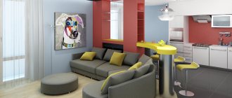
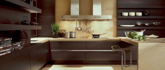
A dark kitchen can be a particularly original interior design solution. We recommend this option to those who want to create an exclusive atmosphere in their apartment. A dark-light kitchen with combined kitchen facades is now the most popular. White-dark (white-black and white-brown) kitchens lead among this group. In the photo, dark kitchens look less massive than in reality, so we can only recommend this solution for spacious rooms with high ceilings and large windows.
Kitchens in dark colors have become especially popular due to styles such as art deco, loft and minimalism. A dark-colored kitchen can be black, brown, dark gray, purple, blue, green and have other shades of facades. There are also kitchens with dark countertops, where imitation black and brown marble are the leaders.
A kitchen with a dark bottom looks less massive and is suitable for rooms of all sizes, even the smallest ones, if the interior decoration is done professionally, taking into account the small space. A kitchen with a dark top is a riskier option and requires detailed supervision by an interior designer.
Pros and cons of a dark kitchen
If you haven’t yet decided which side you’re on – dark or light, we suggest looking at the pros and cons of using muted shades in the interior.
Pros:
- Stylish and non-trivial. How often do you see black kitchens in the interiors of your friends and acquaintances? We bet that furniture and decoration in light shades are much more common. And if dark tones were wisely used in the design, then you will immediately receive 1000 points for courage and good taste, and you will definitely be known as an unconventional person with an interesting view of the world.
- Versatile. This palette of shades will fit into any style - be it classic or any modern trends (Scandi, loft, hi-tech, minimalism, etc.).
- Helps with zoning. For example, a black set will visually separate the kitchen work area.
- Calms. Muted dark shades give peace and comfort, reduce nervous excitability due to the intimacy of the interior, which they create.
- Bright accents stand out. Complex, deep, interesting tones are better revealed and look more impressive against a dark background.
Minuses:
- The kitchen may seem gloomy and uncomfortable.
- This color scheme is not suitable for poorly lit rooms or kitchens with small windows.
- It is impractical to design a work area; dark surfaces are difficult to clean. Water stains, limescale and dust are more noticeable.
- This interior color scheme requires a special approach to the choice of finishing materials and accessories; every detail must be thought through.
If you know certain techniques and tricks, you can prevent the occurrence of the above-mentioned disadvantages.
Watch also an interesting video from the designer with design tips:
Black as main color
Something remains a classic, no matter what changes in fashion occur.
This fully applies to kitchens decorated in black. It is ideal for a modern style design if you play with contrasts. Glossy facades seem even richer if you highlight them with a white apron. This type of renovation looks better in spacious rooms - there the anthracite color will become deeper.
For a more classic design, choose matte - it looks elegant. It is important to choose the right small details - against such a background they can become stylish accents.
An interesting technique: The lampshade of the chandelier should also be made black - unusual, but effective.
Black is a deep independent color, so not every combination in this case will be winning. We recommend paying special attention to the quality of materials. For example, such a stone countertop will set off a glossy black set than a plain plastic one.
Monochrome solutions are also a good choice. If the room is spacious enough, you can highlight the beauty of the furniture. Use graphic prints in white and noble silver metallic - other colors are prohibited in such interiors.
An unexpected but very successful addition is matte dark pink tones. They harmonize well with pink, enlivening the look of the kitchen. True, it is important not to overdo it - one or two inserts, no more. And no rich caramel!
Design secrets
The kitchen interior will not seem gloomy and repulsive if you choose the right companion colors, finishing materials and accessories. Below we will talk about specific techniques that will help make the design harmonious.
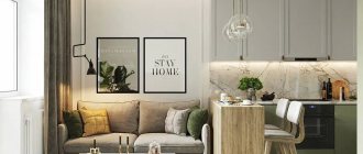
Add light shades
Dilute the interior with white, light gray, beige or other pastel colors. Depending on the size of the room and the design concept, you can play with the ratio of dark and light shades in the interior. If you want more brutality, introduce light colors pointwise, only as accents.
If you need to let more light and air into the interior, then increase the amount of light to the desired proportions.
2. Use textured and textured surfaces
Materials that create voluminous, relief surfaces will smooth out the severity of the color scheme. Dark kitchens look especially beautiful in combination with natural materials while preserving their natural texture and texture - with wood, marble, granite, and other types of stone.
Combinations with concrete, decorative plaster and brickwork also look very nice.
Matte surfaces are a safer option than glossy ones
In addition to the practicality of matte surfaces, it is also worth mentioning their noble effect compared to gloss. On matte surfaces, dirt will be less noticeable, and such facades will look more stylish and expensive.
Gloss is more difficult to work with and less practical to maintain. However, if you want to add glamor and chic to the interior, then in small quantities you can use it in the design of those surfaces that you rarely touch: for example, in the design of upper facades, display cabinets, and decor.
Dosed use of gloss significantly reduces the risk of bad taste.
Gloss in art deco kitchen design
Don't overdo it with decor
If finishing materials and color combinations are harmoniously selected (in other words, if the three previous points are met), then the kitchen does not need extensive decoration. A couple of volumetric parts will be enough.
Add bright accents
Rich, rich colors will look more impressive and stylish against a dark background - orange, yellow, emerald, blue, cyan, etc. In small quantities they can be used in decoration, in the design of small objects, such as kitchen chairs, dining table bases, curtains , apron, etc.
Care Tips
A black kitchen requires more care.
If you do not cook often, and a dark set is more of a spectacular element of your interior, then maintaining its neat appearance is not so difficult.
If you are ready for even the most impractical – black glossy facades or countertops, then consider a few care recommendations.
- Avoid rough brushes and abrasive detergents. Your arsenal should only contain soft microfiber cloths, rubber rags and soft sponges.
- Solidified and ingrained fat can be washed off using degreasing gels and simple dishwashing detergents - Fairy, Persil, etc.
- Do not use detergents containing alcohol, acetone or chlorine. These substances may dull the gloss.
- For simple stains, you can use an alcohol-free glass cleaner.
- The mandatory final stage of cleaning is wiping the surfaces dry with a clean and dry cloth. You can use disposable paper towels. This will remove streaks and prevent plaque formation.
Variety of dark tones
You can create a kitchen interior in dark colors using different color combinations. You can choose one shade as a background or play with achromatic combinations from medium gray to black.
It is undesirable to make the entire interior monochromatic. Use colors of varying degrees of saturation to create zoning. For example, the kitchen area can be decorated in dark brown, and the dining area in beige or white. And vice versa.
Black
Brown
Dark blue
Dark green
When are dark colors contraindicated?
A small kitchen area is not a contraindication for dark shades, contrary to popular belief. But a small window can really play its fatal role. Please note that dark kitchens look most impressive in rooms with large windows. But this does not mean that such shades should be abandoned altogether. Use them as complementary and accent pieces.
If there is not enough sunlight in the kitchen, dilute the interior with light shades. The less light, the more light there should be in the overall proportion.
Which countertop to choose
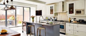
The work area in the kitchen is often decorated in contrasting colors. A countertop made of light material will create a cozy atmosphere; it will look attractive and neat in a dark kitchen. For implementation, light marble, snow-white acrylic, and milky wood are used.
Light tabletop
A dark countertop will also look harmonious. To prevent the work area from merging into one spot, the wall behind the set is decorated in contrasting light colors. Dark wood species are used, the color of the countertop matches the facades of the set. If blue, emerald or other tones are used, a black tabletop will look stylish and highlight the shade of the set.
Emerald kitchen, black countertop
Choosing a style
As we noted above, among the advantages of this color scheme is its versatility. Dark shades are appropriate in classic and modern interiors. The only difference is in the proportions: somewhere dark will dominate, and somewhere it will act more as a complementary or accent color.
Classic
High-tech Minimalism
For the English style, loft and art deco, the dark color scheme of the interior is often style-forming.
Loft
Kitchen in English Art Deco style
Decoration Materials
Only the decoration, furniture or facades of the furniture do not have to be dark. A black faucet, refrigerator or black apron, for example, can also add a touch of luxury and elegance to the interior.
Floor, walls, ceiling
You can experiment with the design of the ceiling, apron and walls, but some bold decisions will require certain knowledge in the field of design and a project thought out to the smallest detail.
Dark colors can be an effective tool in creating optical effects. For example, a black accent wall visually creates a feeling of endless space, therefore expanding the room, and a black ceiling appears higher.
But black or dark brown flooring is the most impractical solution. There is a lot of dust on it. Black and white tiles would be a great alternative.
Apron
When choosing the color of an apron, it is necessary to take into account not only its compatibility with furniture and other interior items, but also the operating conditions.
If you cook a lot often, then you shouldn’t choose a glossy apron.
If the kitchen set is dark in color, the apron can be made a tone darker or lighter, depending on the design concept. Or you can focus on it by decorating it in red, orange, yellow.
Backsplashes made of dark gray tiles and porcelain stoneware looking like stone or concrete look beautiful.
The boar tile can be laid out in a beautiful pattern and contrasting white grout can be used.
Other interesting options are skinali, a brick-like apron, or painted with slate paint. The last two options will fit perfectly into the interior of a loft-style kitchen.
Tabletop
The tabletop can match the set or contrast with it. To make it easier to care for, choose not black, but dark gray matte countertops made of natural or acrylic stone, laminated chipboard to look like concrete.
A black glossy countertop is the most impractical option.
A light countertop can dilute a dark interior or play in contrast with black facades.
Marble looks impressive with its beautiful, natural pattern. It is better to make an apron from the same material. With this design of the work area, practically no additional decor is required, since the unique pattern of the stone is already a decoration in itself.
Options made of wood or with its high-quality imitation will look beautiful.
Dark color palette
The range of colors is not limited to black. Muted options are found in all popular colors. The choice of palette for a dark kitchen depends on the owner’s preferences and design features.
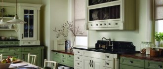
Brown
Noble shade of oak, delicious chocolate, coffee... Do you still think that a room in dark brown tones is boring? With the right color selection, you can create a unique and very cute design.
Pay attention to the traditional design - with a wooden set and discreet shades. It looks elegant and noble. As decoration, choose a light apron with a tiled picture.
A small kitchen in dark brown tones will be beautiful if you are responsible in choosing not only furniture, but also household appliances. Everything in the interior should be harmonious - don’t forget about it.
We recommend using the lighting capabilities: it can make the room visually larger, even if dark colors generally predominate.
For spacious kitchens with an island, a monochromatic design is not the best move. Make light accents - for example, an apron or, as in this photo, countertops that imitate ivory marble.
A light beige color will also help to dilute the brown palette - a traditional combination that has not gone out of fashion for many decades. Here you will have to maintain the generality of texture - otherwise the contrast from a light color nuance will become too catchy. This is acceptable in a high-tech style, but for those who prefer classic furniture, it’s better not to risk it.
A wooden studio kitchen is an excellent choice for a private home. We recommend choosing shades to achieve the effect of antiquity - a simple, but well-known and reliable technique.
Dark grey
Dark gray kitchens look good in high-tech and loft styles. To prevent the interior from looking boring, you can create harmonious combinations with bright decorative items. Gray goes well with almost all colors.
This neutral tone, combined with yellow, blue and brown paints, allows you to make the kitchen warmer or cooler, depending on the preferences of the owners.
Dark green
Kitchen sets use both soft shades of moss or malachite, and more juicy shades of dark emerald and viridian. They fit well with most interior styles.
In classic styles, such a set can be combined with wood or stone surfaces and shades of precious metals. In modern interiors, dark green shades are combined with lime color and light achromatic tones.
If the kitchen is spacious enough, you can decorate the walls in dark green tones. The set can be made light, black, dark gray or a natural shade of wood.
Dark blue kitchen
It is quite difficult to imagine a completely blue kitchen; most often, warmer notes are added to it - beige, cream, coffee tones. The blue glossy set looks great in a beige kitchen.
Orange and yellow walls will make the interior more cheerful. For those who like a more austere, cold interior, you can combine a blue set with gray walls, a granite splashback, and silver curtains. Such combinations are the priority of modern styles, reflecting the manufacturability of the kitchen equipment used.
Black
A black kitchen is one of the most common options for a kitchen in a dark color, well suited for simple interiors with graphic lines. It is used as a dominant feature (black set or wall decoration) in spacious rooms, but in a cramped kitchen it is better to assign black the role of an accent color.
Black contrasts with most shades, so its use requires careful consideration of the color scheme. A black set requires a skillfully selected background; The walls for such furniture are usually made light.
The black floor is characterized by increased soiling - dirt and dust are especially noticeable on it. Those who are thinking about choosing such a covering for the kitchen should take this into account.
It is better to opt for brown or dark gray surfaces: dirt is not so noticeable on them.
Violet
Dark shades of purple create a chamber atmosphere. In the interior of a purple kitchen, especially a small one, it is better to use warm or neutral tones. Cool shades of purple in a small room with inexpensive renovation will look pretentious and obliging.
In order not to burden the interior, you can make only part of the facades purple (for example, the upper ones, and match the lower ones with dark wood). The walls and apron with such a set should be light.
Red
This is where a truly limitless field for imagination opens up. There are many variations of kitchen interiors in dark red and burgundy tones. The main thing is to find exactly the one you like.
The classic solution is a set in the color “wine burgundy”. Despite its elegance, it looks very modern. You can complement it with an apron with a print. Choose a combination of rich purple and white - you can't go wrong.
A black and red kitchen is another solution that seems to have come straight from the pages of a color matching textbook. It doesn't matter what style you want - high-tech or something more traditional. With the right choice of furniture, it will look harmonious.
Pay special attention to accessories: the set looks simple, so additional accents will be required. Dishes, paintings, flowers - small touches will make your renovation perfect.
Do you prefer custom design? Consider a rounded set in cherry tones. White countertops highlight the shade best. The unusual shape itself attracts the eye, so there is no need for decoration.
The main thing is to maintain order - any sloppiness will ruin the impression.
The dark red color scheme is another unexpected move. If you are used to thinking that pastel colors are more suitable for this style, we will surprise you. The rich shade of the facades harmonizes perfectly with its traditional techniques - very bold and, at the same time, cozy.
Dark orange
Orange itself is rarely used in dark colors. But as a stylistic addition, it’s fine. At the same time, the shades are distinguished by a wealth of nuances - why not use this in interior design?
Juicy orange facades and an apron in sunset tones are a striking example of a modern kitchen. The black edging in this situation serves solely as a frame - a non-standard use of a usually independent color.
For such decor, it is necessary to take into account all the details - it looks very catchy, so the slightest carelessness is unforgivable.
A more restrained option is terracotta tones. The classic dark orange color is suitable for any room layout - it is quite elegant, and yet looks non-trivial. You can combine it with the usual black, or you can experiment - for example, choose a dark blue or green shade.
As you can see, decorating kitchens in dark colors does not at all limit your choice to standard black and brown colors. Although even they can be extremely original and stylish. There are unusual dark colors in almost every segment of the palette - don't be afraid to experiment with them to create a truly unique interior.
Blue kitchen
Dark shades, such as the color of the night sky or Prussian blue, are well suited for decorating sets. Matte facades of this color will be appropriate even in styles in which the active use of dark colors is usually not practiced - for example, in country or Provence.
Glossy blue facades combined with light wall decoration are suitable for a minimalist interior of a small kitchen. You can complement the interior with a bright apron in cool colors.
Dark furniture and appliances
Since kitchen furniture is quite large in size, the easiest way is to make a dark shade the main dominant feature of the interior by choosing a kitchen set in black or another dark color.
Smooth facades without relief are easier to care for. However, should you always be guided only by practicality? Look how beautiful black sets look with paneled fronts or with carvings!
If you choose effective furniture care products and wipe the kitchen regularly after each cooking, then you will never have problems keeping it clean and well-groomed.
The choice of technology directly depends on the direction of the design. For example, in classic and English interiors, an oven or microwave with bronze elements and brass or copper-look handles will look beautiful. Patina on dark facades can be in harmony with this design of equipment.
In retro, boho, and loft style interiors, bright vintage refrigerators and ovens in red, yellow, and blue would be appropriate.
For most modern trends, especially for high-tech and minimalist styles, white, black or metallic appliances with a chrome-plated facade are suitable.
The problem of choosing a refrigerator design can be solved even simpler: it can always be built in, hidden behind the facades, if there is no need to make an accent, as, for example, in loft, retro or boho styles.
Fronts: glossy or matte
For a kitchen in a classic style, it is customary to choose matte facades. However, they also suit many modern styles.
Matte dark surfaces look noble and expensive; dirt is less noticeable on them. But for a cramped kitchen, this option is only permissible if the walls, floor and ceiling are light. If the room is small, be sure to read the article How to choose a kitchen set for a small kitchen.
Glossy facades suit modern minimalist styles. Because they reflect a lot of light, they are a good choice for tight or poorly lit spaces. It is easier to wash such facades, but dirt is more noticeable on them than on matte ones.
A dark, glossy finish is not the best option for countertops and backsplashes in terms of practicality: stains and dirt are very noticeable on such surfaces.
Lighting
The darker the color scheme of the interior, the more thoughtful the artificial lighting should be. The shadow from an incorrectly installed lamp or from a lack of lamps will make the kitchen gloomy and visually narrow the space. To prevent this from happening, even at the stage of a major overhaul, consider a kitchen lighting scheme.
It is important to provide general lighting and lighting in each area - working, dining, relaxation area (if the kitchen is combined with the living room).
General diffused lighting can be represented by one chandelier or several spotlights.
You can hang a pendant lamp above the dining table or install a sconce if the table is against the wall.
Black and gold kitchen
The color of luxury and sophistication is simply created for the design of a black kitchen. Gold is used in decorative elements on facades and fittings. An integral part of a black set will be a brass sink and faucet, and the color may also be present on the apron.
Curtains on windows with iridescence, figurines on shelves, picture frames and vases will help complement this combination. Do not forget about sufficient illumination for this design; a black set with a gold frame requires a classic crystal chandelier on the ceiling, beautiful sconces on the walls and discreet but bright illumination of the work area.
Curtains and decor
Textile design occupies a special place in design. You need to choose a style and fabric for curtains based on the style of the interior and the tasks that they must solve.
In a classic kitchen, curtains, in addition to their main function of protecting from bright light, play an important decorative role. The high cost and status of a classic interior will be emphasized by curtains or a lambrequin made of dense fabrics with a rich texture - velor, velvet, gabardine, jacquard, etc. They can be combined with light organza or tulle curtains. If the window is located next to the kitchen work area, then long curtains will have to be abandoned in favor of short curtains with tiebacks, Austrian or Roman styles.
See also 110 of the most stylish ideas for curtains for the kitchen
In a modern interior, curtains can be abandoned, especially if the window is small, the room does not have enough daylight, or if the style requires it. For example, the Scandinavian direction, hi-tech or minimalism allow for the complete absence of window curtains or almost invisible roller blinds, simple transparent or translucent light curtains without excessive decor.
Curtains can perform different functions:
- The role of a bright accent. For example, curtains of a beautiful deep shade - wine, ocher, emerald or blue - will stand out effectively against a dark gray background.
- Protection from bright light and comfort. If there is no goal to focus attention on the curtains, but curtains are still necessary (not only to protect yourself from the bright sun, but also from prying eyes in the evening, if, for example, you live on the first floor), then you can choose curtains in the main, dark colors of the interior.
- Dilute the muted color scheme. Light curtains can be the very detail that will add air and light to the interior so that it does not seem too gloomy and gloomy.
Not only curtains, but also other textile elements will help diversify and soften the interior - tablecloths and table runners, napkins for cutlery, pillows on kitchen chairs. Rough textiles made from large-weave fabric with a complex texture look especially beautiful in a dark interior.
Moderate and correct decor will emphasize the effectiveness and status of the interior. Textured and textured surfaces in the design of finishing materials and furniture, bright accents in the form of small details such as jars for spices, pillows on chairs, tablecloths, and an interesting layout of tiles on the apron will serve as decoration in themselves.
The decor can be unusual chandeliers, pendant lamps with bronze, forged, glass or crystal elements.
Wicker furniture and accessories will add coziness and warmth to the interior - napkins for cutlery made of jute or seaweed, baskets, etc.
Furniture selection
In a classic interior, the ideal option would be natural wood furniture in the appropriate style. Or a more budget-friendly analogue that meets all the requirements for shape and texture. Remember about household appliances; now there is a wide range of classic ovens, hobs, refrigerators and even kettles.
Textile color range
- In the color of the base shade. If the general background of the interior is light, in white colors. Then the furniture is selected in milky, pink, golden shades. In maximum harmony with the finishing of the floor and walls.
- Darker than the base color. This solution will add more dynamics to the interior. But be careful. The main thing here is to choose the right color contrasts. For example, furniture in shades of dark chocolate will look ideal against a background of beige and sand shades.
- The base palette is gold. Furniture in milky and cream tones is suitable for a golden finish. It will highlight the elegance and grace of gold.
All smooth lines in the furniture have a clear shape that is immediately visible. To achieve this, classic chairs and a sofa are framed in solid wood, and textile trim runs in the center.
Small dark kitchen
There is a stereotype that dark colors are strictly contraindicated for small spaces. But it is not always the case. If there are no problems with natural light in the kitchen, and dark is used in doses and diluted with light shades, then the interior will definitely not suffer in any way, and will even benefit. In addition, dark colors can create visual effects and visually expand the space.
For example, an accent black wall creates the illusion of endless space, and a black apron looks like a portal, deceiving perception and dissolving the boundaries of the room.
Who can choose a black kitchen?
The main advantage of a dark palette in design is its dynamics, which introduces a “note” of pomp and luxury into the interior. Many people believe that black cuisine is chosen either by bachelors or by very complex and reserved people, but this is not so. This design is perfect for creative individuals; the dynamic color does not distract, but acts as a stimulus for new ideas and projects.
Who is a black kitchen suitable for:
- Self-sufficient and confident people. Such individuals often want to emphasize their individuality and status, and it is a black kitchen that can add a “note” of chic and luxury to the design.
- Creative people prone to non-standard solutions. For whom a white kitchen is an outdated trend and they are ready to break stereotypes.
- Owners of large apartments. Such rooms are simply created for a black kitchen, which is able to “push the boundaries” of the familiar and already boring pastel shade.
- Residents of studio apartments. A black kitchen will be a great addition to a living room in pastel colors, without looking provocative or intrusive.
When choosing a dark-colored headset, the main thing is to observe the measure. In large kitchens, blank black facades will look quite appropriate, but if the room is not very large, then it is better to focus on a few black details. For example, dilute the dark shade with glass doors on the furniture, a bright apron or a stylish white dining area, then the room will not seem gloomy.