What color typeface are you looking for wallpaper for:
1 Beige 2 White 3 Orange 4 Red 5 Brown or wenge 6 Green, light green 7 Black and white 8 Yellow 9 Blue, light blue 10 Violet, lilac 11 Black
When planning the interior design of a kitchen, many are guided by their preferences, room size and financial capabilities. The first thing that is planned is the shape, size and color of the furniture, and then everything else is designed for the set. Therefore, it is more convenient to choose wallpaper that matches the color of the furniture. So, let's look at what wallpaper to choose for the kitchen depending on the color of the set?
For beige headset
Beige and vanilla remain the most popular kitchen color. There are many reasons for this:
- 1 Beige color is an ideal solution for a small kitchen, as its light palette works perfectly to visually expand the space.
- 2 Beige is a neutral color and is perfect for recreating any style - from sophisticated classics to chic modern, from romantic shabby chic to textbook loft.
- 3 For those who think beige is boring, we advise you to pay attention to such shades as caramel, cappuccino, creme brulee. These delicious colors will make your kitchen not only cozy, but also especially homey.
- 4 Beige is a universal color and is not capricious in choosing a pair. On the contrary, by choosing one or another color of wallpaper for a beige set, you can charge your kitchen with a festive atmosphere, give it sophistication or create a harmony of comfort.
Wallpaper color for beige kitchen:
Beige and sand shades will create a very delicate and sophisticated interior.
Whites are a perfect match. The kitchen turns out bright and cheerful. But avoid boiling white, otherwise the interior will turn out faded and “dirty”. Beige and brown are an original combination, if only beige will dominate. It is better to choose white wallpaper with a dark pattern.
Purple or lilac - bold and bold. The interior turns out dynamic and rich. It is better to choose plain wallpaper without a pattern.
Muted red, burgundy, terracotta are a harmonious pair, provided that the decor is minimal.
Gray - the kitchen will be cozy and delicate. It is only important that both gray and beige are as light as possible.
Green - the result is an interior that is close in spirit to eco-style or country style. In such a kitchen, an abundance of indoor plants and floral patterns is appropriate.
Important: if you have a beige kitchen, avoid fluorescent, cold light. It will make the interior look dirty. The same applies to appliances - a beige refrigerator and stove against a background of beige furniture is too much. It is better to choose a metallic color technique.
Finish options
The effectiveness of implementing a contrasting black and white pair in the kitchen space is determined not only by the proportions, but also by the material used for decoration. And also the place of its application.
Floor, walls, ceiling
Decorating the walls with black is a bold decision that you can only afford if you have a significant supply of usable space.
It is much more reasonable to take a snow-white coating as a basis and complement it with contrasting inserts. Wallpaper is most often used in the kitchen. Ordinary ones won't do - you need washable ones, because when cooking, fat and soot will invariably settle on the surface.
You will find fashion trends in kitchen wall design in our separate material >>> go.
A compromise option is a combination of black and white. Paired or in unequal proportions - not so important.
As for the ceiling, there are also no surprises here - it is best to design a classic white stretch ceiling. If you want a beautiful play of light, go glossy - you will get really interesting light scenarios with artificial lighting and decorative lighting.
Of course, there are also black ceilings. As a rule, they act as a contrast to a room decorated in white.
The floor is made of either linoleum on a polyurethane foam base or tiles. Don’t buy laminate: it is, of course, easy to install, but even waterproof ones suffer from frequent temperature changes. The voiced options are much more practical to use. A completely black floor should only be done if the facades of your kitchen unit are decorated in white. Otherwise, the contours will merge and the room will lose its correct geometry.
But an always relevant solution in terms of color distribution is a black and white floor made of ceramic tiles laid in a checkerboard pattern. It looks especially impressive in combination with exactly the same apron.
Apron
It is recommended to make the apron black only if you have a strong predominance of white in the room. Then it will be a spectacular dark spot and eliminate the feeling of hospital sterility. Along with this solution comes the problem of maintenance: stains and drips on it are always clearly visible.
In all other cases, it is better to make an apron:
- monotonously white - does not require special attention, beautifully emphasizes the black countertop;
- a combination of contrasts - both black and white in different proportions;
- any other color - this will be a so-called companion, as close as possible in temperature, for example, gray.
The trend now is the patchwork style - a combination of different patterns on one plane in equal segmented shares. Look how organically this mosaic fits into a monochrome interior.
Other popular design solutions include snow-white porcelain tiles imitating stone, with characteristic streaks of gray or black. It’s good if the tile is 60x120 in size - then it will look monolithic and impressive.
Designer tips
Irina
Irina Polyakova is the founder of an interior studio, architect and interior designer. The main area of work is kitchen design
If you have a loft, then try decorating the apron with artificial stone based on concrete. You can take a basic white brick, treat it with varnish to prevent it from collecting dust - and you will get a wonderful imitation of brickwork. If you prefer black, a simple method works - painting. Or, as an option, buy already painted bricks that are completely ready for laying.
Tabletop
The choice of texture depends on the style of the room. For classics, imitation granite or marble is best suited. Since contrasting design is used, the color of the countertop should contrast with the facades. However, black has an obvious disadvantage - all the stains are visible, so maintenance will be difficult.
If you have a minimalist interior in the Scandi spirit, wood finishes will look quite harmonious. There are excellent options with a fawn texture: it is as close to white as possible and greatly refreshes the room.
For white headset
White color is neutral and goes well with any other color. If you have a white set, it’s better to start from a given style. Modern furniture will look better against walls with a graphic design, stripes, unusual graffiti, photo collage or wallpaper.
You can choose bright wallpaper that imitates tiles or brickwork. For an accent wall in a modern kitchen, you can choose photo wallpaper with a 3D panorama.
Classic white furniture goes well with pastel-colored wallpaper.
The more luxurious the furniture, the more pale and unnoticeable the pattern on light-colored wallpaper should be.
For cozy white furniture in a country style, cheerful colors are suitable: floral, plant motifs or images of a rural landscape are possible.
For a Provence style kitchen with white furniture, wallpaper with images of lilies, lavender, and irises is perfect. In this case, it is advisable to choose the rest of the decor in the same shades as the flowers on the wallpaper: cream, lilac, purple, sky blue.
White furniture is a common choice for Scandinavian kitchens. To emphasize the style, you can choose blue, beige, light blue or light gray wallpaper.
Combinations with floor color
A little about floor color for black furniture. He's important. Dark and especially black furniture requires a light floor - not necessarily white, but in any case not dark or even medium, but lighter. The color of the floor is also important - black furniture looks best on the floor made of bleached oak, ash, maple, light birch, bleached wenge, as well as light natural oak. But reddish types of wood, as in the photo above, do not go well with black furniture.
And it makes absolutely no sense to put black furniture on a black floor (photo above left).
For orange furniture
Orange furniture will dominate the interior - regardless of what shade of orange is chosen. This color is the emperor. And therefore the wallpaper plays the role of exclusively background.
Against the background of gray wallpaper, an orange set always looks great. The orange-gray pair is the most harmonious for the kitchen. Moreover, you can choose the steel color of household appliances.
Green wallpaper will add festiveness and lightness to the room. The main thing is that the wallpaper is plain.
White wallpaper with an orange pattern is a bright pair. This combination can be diluted with wooden inserts: for example, by choosing a wood-colored tabletop.
The main thing in such a bright combination is to create a harmonious interior and not to overdo it with a rich orange shade.
What colors to combine black and white wallpaper with?
Once you have decided on the type of wallpaper and decorated the walls with it, it’s time to start selecting a complementary color palette. Different shades dictate the interior’s temperature and overall mood, since the black and white combination itself, with all its expressiveness, can remain a neutral background.
— The range of yellow and red is perceived as cheerful, sunny, and stimulates the appetite. Saturated options are unlikely to be suitable for the living room, and especially the bedroom, however, this spectrum has a large range of different tones, as well as subtones, from which you can choose the most suitable and attractive one.
— Southern and eastern rooms will be decorated with cool blues and turquoise, adding a refreshing coolness and balancing the color balance.
— A sharp and catchy tandem will soften natural wood. Wall panels, floor coverings, pieces of furniture - there are many ways to use them.
- Overly active exposure is also reduced by using beige, gray, pastel shades on the floor, ceiling, furniture and decorative elements. Warm tones are used in northern rooms, and cold ones, respectively, in southern ones.
Color perception
Wallpaper is the most popular type of finishing material for walls and ceilings in residential premises.
The modern market has a wide range of shades and textures, but monochrome colors remain the most popular among consumers. The use of black and white shades has its own specifics. They have a certain impact on the interior of the room and its perception by people.
Interesting fact! The unit of color measurement is nanometer. Human vision is capable of detecting shades in the range between 350-800 nanometers. Everything outside this spectrum is classified as ultraviolet and infrared radiation, which is invisible to the eye.
Proportions
The mood of a room whose walls are decorated with black and white wallpaper directly depends on the proportions of the colors. Therefore, it is important to assign their roles in advance. There are three options.
- Black on white background. An ideal option for miniature and dark rooms, since the abundance of white not only visually enlarges the room, but also makes it lighter. For the best effect, combine plain canvases with patterned wallpaper, for example, pure white on the top and black prints on the bottom.
Advice. When choosing such wallpaper, keep in mind that a large print brings the walls closer and makes the space more cramped, while a small print, on the contrary, moves the walls away from each other.
- White on black background. Suitable only for large and bright living rooms. This is a rather unusual option for wall decoration with a touch of glamor, so you need to be very careful with it: it is important that the white print is spectacular and not too small, otherwise it will get lost on the black background.
- Black and white in equal proportions. This option is good for medium and large living rooms. Use this wallpaper for functional zoning of space: one part has more black, the other has more white. To prevent the area where black predominates from being too gloomy, take care of bright lighting.
Types of material
Wallpapering is the most common way to decorate walls. It seems that choosing them is very simple.
Therefore, many do not attach much importance to this process and give preference to a certain material, based only on external characteristics or price category.
However, the modern assortment is very diverse, and each type has its own positive or negative properties.
The most economical, but short-lived option is paper wallpaper. If owners are prone to frequently changing the appearance of their home, they can be a completely acceptable material.
Finishing in this case is not difficult and does not require the use of sophisticated tools or virtuoso skills. You can easily choose the desired ornament, but you will not be able to hide the unevenness of the walls with their help.
We also note washable variations, which are somewhat more expensive. They are quite easy to care for, so you can use them longer.
The market offers simplex and duplex modifications, one- and two-layer, respectively. However, such wallpapers are inferior to more expensive types in terms of wear resistance and resistance to moisture.
For decoration, you can also use voluminous, kitchen or flat vinyl wallpaper. The first type is based on foamed vinyl, so it has a well-defined relief that looks quite attractive.
Kitchen wallpaper has high washability and moisture resistance, which makes it a good material for decorating both the kitchen and the bathroom. The last variety imitates a fabric covering.
Non-woven wallpaper has gained popularity due to its excellent performance characteristics along with its low cost. They are suitable for any room, as they look great and hide uneven walls. In addition, they can be used as a base for coloring.
Textile wallpaper is a fairly expensive option. Perfect for the living room, bedroom and corridor. They look very picturesque, presentable, and also hide the imperfections of the walls.
Another great choice is photo wallpaper. They visually expand the boundaries of space, especially if they have a perspective design. Their range is practically unlimited, because in special workshops they can print any image upon your request.
For red furniture
Bright kitchen furniture with glossy fronts will look best in a spacious kitchen or in an apartment with a studio layout. Such furniture immediately becomes the dominant feature around which the rest of the interior is built.
A juicy red shade for the set (scarlet, carmine, red, crimson) is highly not recommended for a small kitchen. The abundance of red in a tight space leads to rapid fatigue, irritates and can even cause aggression. The optimal solution: a set of calm, muted shades of red - terracotta, burgundy, garnet, coral, cherry.
Since the red set will play the main role, it is better to choose a neutral background color for the wallpaper. White, cream, light wood, ivory, and gray wallpapers are perfect.
Red and black kitchens create a dramatic effect. Black wallpaper for a red headset is a bold decision. The kitchen turns out to be dynamic and hyperbolic. It is better to stick to modern styles.
The combination of red and black will balance white well. For example, white wallpaper with a black graphic pattern is an ideal choice for a red kitchen in a high-tech or minimalist style.
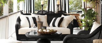
Choosing a sofa to suit the style of the room
If you adhere to a specific design style, then the sofa should fit organically into it. Designers have developed ready-made combinations for different directions to make choosing the color of the sofa easier:
- Classic
Solid neutral shades of brown, gray, white, beige.
Gray Angelic sofa in a classic style interior
- Art Deco
Red, black, blue sofas.
For interiors in the Art Deco style, dark-colored sofas are often chosen
- Retro
Rich warm shades: brown, yellow-brown, orange-red, beige-orange.
When decorating a room in a retro style, try not to make it too dark. For example, yellow-orange or patterned wallpaper will go well with a brown sofa, but it is important to consider the amount of light in the room.
Light brown sofa in a retro interior
- High tech
Acid and bright colors, often plain upholstery.
An example of a successful combination of blue and neutral shades
- Minimalism
Plain upholstery. Gray, white, black are suitable.
A characteristic combination for minimalism: gray, white, black and beige
- Provence
Delicate and light shades of blue, lilac, pink, beige. Sofas with neutral patterns fit in.
White sofa in Provence style in the living room
- Country
Natural tones: yellow, green, beige, brown. Sofas with a combination of different colors and bright colors are suitable.
For country style, it is important to choose natural and deep upholstery tones.
- Scandinavian style
Soft and soothing shades, plain upholstery. Grey, white, beige.
Simple sofa shapes with white, gray and beige upholstery suit Scandinavian style
Advice! The most universal colors of sofas are neutral and light or medium-saturated. These colors fit into any interior, and this is the simplest solution. It is only important that the color of the sofa does not completely coincide with the shade of the walls: for example, the color of the sofa with beige wallpaper should be several tones richer or lighter.
If the set is brown or wenge
The wenge-colored set looks luxurious and in itself is a real decoration of the kitchen, without much need for additional decor. Wenge-colored furniture is usually characterized by simple, laconic forms that emphasize the texture of the material.
Dark furniture will look most advantageous against a light background, and therefore it is better to choose wallpaper in pastel colors: cream, sand, milky, beige.
If the wenge color is from a warm palette (with a chocolate or burgundy tint), the wallpaper can be vanilla, muted orange, terracotta, pistachio.
The cool shade of wenge (with hints of purple or green) harmonizes with lilac or green wallpaper.
Plain wallpaper looks best. Keep the patterns to a minimum so as not to overload the interior. As a last resort, you can choose wallpaper with a faded pattern or gold embossing.
Beige
Both rich and pastel colors can be combined with this calm color.
If you want to dilute a boring beige, add some bright colors, or make an accent on the walls, then it is better to opt for a violet or purple shade. Such a bold decision will only look good if there is enough natural light entering the room.
To create a relaxing atmosphere in the room, shades from the boudoir palette, which also include beige, are suitable. The combination of beige wallpaper and beige furniture is permissible only if the color of the walls is at least one tone lighter - this way the interior will look very strict and noble. Gray wallpaper may seem boring at first glance, but pairing it with beige furniture will make the room visually more spacious and brighter.
Laconic beige color of furniture and walls
For green furniture
Green or light green is a win-win option for kitchen furniture, as the color is soothing and inviting. The “plus” of green is that it can be combined with almost any other color. The main condition: the couple must be in harmony in tone.
So, if you have furniture in warm shades of green: grassy, olive, light green, then you should choose orange, yellow, burgundy or rich beige wallpaper. A good addition to such combinations would be brown accessories or materials that imitate natural wood.
Light green furniture will become the dominant feature in the interior. It requires a neutral background, so it is better to choose plain white, milky, beige, or cream wallpaper. And the color balance will be supported by light green accessories: a border on a tablecloth, a pattern on light curtains, a lamp or dishes.
You can pair moss or olive-colored wallpaper with light green facades. But be sure to balance out the pair with pops of white. Light green furniture will look organic against a background of light, natural shades: brown, pink, blue, sand. Light green categorically does not accept proximity to lilac and violet.
Cold shades of green (with an admixture of blue, gray or cyan): mint, turquoise, pine, emerald harmonize with cold colors - blue, cobalt, steel, boiling white.
The second aspect that you should pay attention to is the selection of furniture
Furniture with soft and lush upholstery, leather furniture, furniture with many inclusions of other materials (for example, wooden handles, mirror surfaces, and so on). There are a great many options to choose from, but the result is the same: the color of the furniture should be combined with the color of the wallpaper. This simple and unpretentious formula will allow you to achieve that very desired effect of harmony within the walls of your own home. It will also allow you to slightly simplify the already difficult task of choosing furniture for the interior.
In fact, there are not many plots for the development of events:
- You can independently select each element of furniture, combining armchairs, sofas, wardrobes and chests of drawers solely at your discretion.
- You can also turn to ready-made design solutions that offer you complete sets of furniture made in the same style and design. This will save a lot of time and help you not to rack your brains with choosing colors and patterns for each individual element.
- The third, and perhaps the most controversial option, is to resort to a personal furniture design style. The ambiguity of this approach lies in the fact that the price-quality ratio is not always balanced in a given situation. Moreover, by leaving the fate of your future furniture to the will of the designer, you are thereby playing a kind of “Russian roulette”, the result of which may be an unsuccessful decision, far from your personal vision.
If you want to create a design solution yourself, you will need a lot of time, patience, effort and money to create your own project (which may also be a failure).
But still, it’s not for nothing that people say: those who don’t take risks don’t drink champagne! Therefore, sometimes it is better to take everything into your own hands and do it the way you want. Fortune favors the brave!
The third aspect, without which the previous two steps cannot be completed, is the combination of furniture and wallpaper to achieve your goal. Remember how at the very beginning we asked you to ask yourself questions about the end goal of your entire home design? So now, based on these answers, try to understand what you would like to see in each individual part of the apartment and why.
Bathroom, kitchen, hallway, bedroom, living room, children's room - there are so many independent, separate rooms in your apartment, each of which can simultaneously combine with each other and have its own style and atmosphere! This is exactly what you should start from when choosing furniture and wallpaper both for the entire apartment as a whole and for each “corner” of it in particular. This is the only way you can fully unleash the potential of your own home, turning it into the most important place in the whole world!
Now that you know enough to understand the importance of choosing the right wallpaper and furniture, we would like to show you with examples what options for their combinations in the interior may be interesting and useful to you.
Black and white set
The duet of black and white is considered a classic - strict, but impeccably elegant.
The combination of black and white facades always looks impressive, elegant and fits perfectly into the concepts of avant-garde, art deco, minimalism, and retro.
Combinations of black and white set and wallpaper color.
White wallpaper or white with black graphic design. This tandem creates a monochrome atmosphere. I felt like I was in a newsreel from the beginning of the last century. The ideal combination to create a retro style - you can add posters with graphic designs and retro accessories.
A good option for a small kitchen is to cover the accent wall with black wallpaper with a white pattern, and the rest with white wallpaper with the same black patterns.
If the facades of the furniture are glossy, then for the walls it is good to choose warm shades of white: cream, beige, milky.
Gray or “wet asphalt” colored wallpaper is appropriate in a modern interior. They go well with the metallic shine of kitchen appliances. But the interior requires bright lighting.
Blue wallpaper will dilute the interior with colors, and blue wallpaper will add softness and tenderness to the black and white kitchen. Yellow wallpaper looks good in combination with a black and white set, if yellow is more like the color of dull gold.
Kitchen with red wallpaper
If you are a fan of retro, avant-garde or hi-tech style, then red wallpaper for a black and white kitchen is the best option.
The set and the rest of the furniture, made in black and white, go perfectly with this color and all its shades. It is not necessary to choose too bright a color; you can also choose muted ones. To prevent such a coating from taking all the attention, you can cover only one wall with it, and decorate the rest in white tones. The design of such a room in the form of a panel looks very interesting. Pay attention to the photo:
Even the most inexperienced home craftsman can cope with its production. Such a panel is made according to the following scheme: sheets of red wallpaper are glued near the dining table. Borders can be disguised using decorative slats. The rest of the space is covered with white or beige wallpaper. To add creativity to the panel, you can decorate it with decorative stickers.
These could be flowers, butterflies or still life images. You should not cover the entire space with red wallpaper for a black and white kitchen. An excess of this color can cause depression and have a depressing effect on the psyche of all family members.
In the following video you can get acquainted with interesting design solutions for choosing wallpaper for a black and white kitchen:
Recommended Posts
3d wallpaper for the living room + photo
How to properly glue wallpaper on drywall with and without putty…
How to hang wide wallpaper
Options for wallpapering in the living room, kitchen, bedroom
How to choose two types of wallpaper for the living room
How to glue wallpaper with your own hands
For yellow furniture
Yellow color for a kitchen set is very insidious from the point of view of psychological impact.
The brighter the shade of yellow, the more sunshine and joy there will be in your kitchen. But an excess of yellow surfaces causes rapid fatigue and irritation.
Neutral shades are considered optimal - golden, sand, mustard, gray-yellow. Juicy, acidic shades of yellow are appropriate in a modern kitchen. For classics, it is better to choose muted tones. Tip: If you like several shades of yellow, always choose the lighter one.
Yellow furniture goes well with white, milky, green (any shades), blue, pink wallpaper. Golden yellow plus red is a great pair for oriental style.
Yellow and blue are a royal combination, provided that the yellow has a hint of gold. Yellow and brown are a combination taken from nature. Add green accessories to such an interior and you will get an interior close to eco-style.
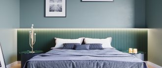
For blue and light blue furniture
Depending on the combination of shades of blue and wallpaper color, you can significantly influence the visual perception of the interior. It all depends on what kind of atmosphere you want to create in your kitchen.
If you add white, light green or sky blue wallpaper to rich blue furniture, the interior will turn out cool.
Peach-colored wallpaper will help “raise the temperature.” Do you want to add cheerfulness to your blue kitchen? You can combine blue with yellow, grass green or orange. Blue furniture and red and white striped wallpaper are a bold decision that will highlight the retro style. But such decoration looks good in a spacious kitchen.
If the furniture is cornflower blue, match it with wallpaper in a sunny yellow or straw shade. This color pair is reminiscent of summer, a field of flowers, a sunny sky and is perfect for embodying a country style.
The combination of blue furniture and gray walls is an option for a spacious kitchen in a modern style. But such an interior necessarily requires bright lighting. And don’t forget about the color tonality - the same cold shades of gray go well with cold blue.
Combinations with walls
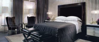
I get asked so many questions about what to combine black furniture with in the interior - it came into our everyday life relatively recently, and we have not yet learned to work with it as easily as, for example, with walnut. So, today for you – photos of interiors and practical tips on how to introduce black furniture into the interior.
Let's start with the main question - what walls does black furniture go with?
The most common option in the last century - black furniture against white walls, as in the photo on the right - is already desperately tired and is almost never used in modern interiors.
Now you can place black furniture on a white background only under one condition.
The original, unusual shape of black furniture is this condition. Sterile interiors with simple forms of black furniture and white walls are already a completely passed stage . Black furniture doesn’t have to be as pretentious as in the photo above; it can be of quite laconic forms:
But even modern, laconic forms of black furniture should have some kind of zest - a smooth curve, holes, a fun possibility of transformation, etc. And simple black furniture against a white wall is considered boring .
Patterned wallpaper
A much more popular idea now is to place black furniture against walls covered with patterned wallpaper, as in the photo on the right.
It is against such a background that black furniture of simple shapes (that is, all modern furniture) looks more interesting, and the interior retains its dynamics, which is completely killed by simple black furniture against the background of white walls.
But since not everyone wants to cover the entire room with patterned wallpaper, alternative options immediately arose - one part of the walls is covered with wallpaper with patterns, while the other remains white, and black furniture is placed next to it, as in the photo below.
This method is suitable for both vertical and horizontal combinations of wallpaper, as you can see in the photo above and in the photo below. Wallpaper does not have to be black and white - it can also be color.
Choosing wall color
Finally, we moved on to the question of what wall colors can be used with black furniture. In the following photos, the walls will be plain, but the rules for plain walls also apply to walls with a pattern.
The first color that comes to mind is, of course, red. The red, black and white interior is invariably in demand, and black furniture is, of course, the main assistant in its creation. Designers have been experimenting for a long time with shades of red for walls and black furniture, and the main conclusions were something like this.
Scarlet color goes well with matte black furniture, as in the photo above. This also includes raspberry, ruby and other deep shades.
Pure red is suitable for glossy black furniture, without bluish tints, as in the photo on the left, and a light red color is closer to coral, as in the photo on the right.
(By the way, check out the bold goth-style design find in the photo on the right - but this is just an ordinary vinyl sticker.)
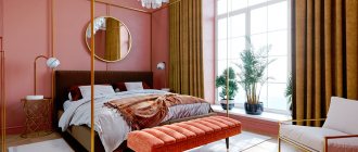
Purple and pink tones
Another popular solution is to combine black furniture with lilac, purple and pink tones. In this case, lighting is very important - in the photo on the left, all the walls are painted with the same dark lilac color, but the wall against which the dressing table is located seems coral pink - this is because yellow light bulbs are installed in the sconces.
Lilac, lavender, amethyst, light lilac look good with black furniture.
Blue shades
Cool blue shades are generally an ideal background for black furniture, especially glossy ones. The blue color makes black furniture seem to “shine,” and this again gives the interior dynamics, which is important if the furniture is large, as in the photo on the left.
But it is better to add accents to such an interior in light, pure colors - brown is too muted for this combination - use grass green, lime color, vanilla yellow, light pink, light lavender. These colors will make the interior with black furniture visually lighter and fresher. If you use muted colors, as in the photo on the right, then the furniture should be matte.
Grey colour
Light gray is also a good background for black furniture. It is better to use light and cool shades of gray - they make the interior with black furniture reasonably contrasting and do not look dirty. Combine them with ocher, bamboo, straw and other natural colors, as in the photo above. Or use cool colors for accents - blue, sea wave, turquoise. But blue and purple accents for gray walls and black furniture are not very suitable - they look gloomy.
Gray-beige shades, as in the photo above, also go well with black furniture, and you can add not only cold or natural colors to them. The entire boudoir palette will suit them perfectly.
Warm colors
Now let's look at warm colors that go with black furniture.
Generally speaking, the coral red you saw in the goth bedroom photo above is just about the only color that goes well with black furniture.
Other warm colors, especially orange, make black furniture very intrusive . Therefore, if you want warm colors for the interior with black furniture, a dilemma arises - either the interior will become darker due to the muted background, or, if the background is light, then the black furniture will simply oppress. Notice how heavy the black chest of drawers appears in the context of the pastel walls and furniture.
Therefore, use the rule that designers know well:
– when choosing a warm color for the walls, make it as light as possible, and make black furniture as elegant as possible.
Compare two pictures:
The rich golden yellow color of the walls in the photo on the left and the massive black sideboard make the interior very active and heavy, and the elegant black chairs in the photo on the right look good against the cream background.
Muted shades
Experimenting with muted colors for walls with black furniture is a dangerous business. I touched on this topic in an article about wenge.
Dark furniture against a dark wall looks very oppressive, and you can’t do without white accents.
Compare the photos on the left and right. The photo on the left has relatively light walls and floors, and black furniture generally looks fine. On the second, the photo walls are dark, and neither bright accessories, nor carpets, nor glass blocks can help - both interiors seem dark and gloomy.
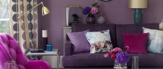
For purple and lilac furniture
Purple is perhaps the most controversial color in the palette, as it combines the coldness of blue and the fieryness of red. It is usually believed that purple is not the best choice for decorating a kitchen.
But this color has so many shades that there will probably be one that you like. Choose: lilac, violet, lavender, plum, blackberry, amethyst.
Rich purple is a chameleon color. Depending on the background, it can change its tone.
Thus, purple facades against the background of red walls will appear purple, and against the background of blue wallpaper they will take on an indigo hue.
In any case, these combinations require a splash of white (to balance the contrast) and bright kitchen lighting.
Various shades of purple are combined with different colors:
- For a lilac kitchen, green, blue, light yellow, and cream wallpapers are well suited.
- Pinkish-purple facades look most advantageous against the background of emerald green or white walls.
- The combination of a purple set with white or light gray walls is a win-win option. The interior turns out rich, but not dark. You can also add black as decoration.
- The soft lilac color of the kitchen set looks especially attractive against the background of light wallpaper, especially if the facades are glossy. It is better to choose wallpaper in conservative colors: white, beige, milky, cream.
- Want to add romance? Choose wallpaper with a light background and discreet patterns of lilac and pink flowers.
For a modern style, you can choose wallpaper with white and lilac stripes. But it is better to use such bright wallpaper for an accent wall, leaving the general background of the walls light.
Comments
Iren: 05/21/2012 at 9:39 am Good afternoon! Please tell me we are in a bedroom of 25 sq. we bought black glossy furniture and a black bed, above the bed there is a huge painting 1.5mx2m of 2 gray elephants, the floor is light brown parquet. I would like light yellow wallpaper on the walls... How will it all fit together, maybe change the light of the walls and what textiles (curtains), interior items to choose. T.K. initially we wanted African style, safari….
Helen: 04/19/2012 at 8:21 pm Black furniture harmonizes well with wicker items.
Katya: 04/18/2012 at 10:40 pm Good afternoon! I want to describe everything to you once again, otherwise I’ll soon have trouble sleeping because of my thoughts! I’m doing renovations in my room 14m. If you make a light-colored bed https://borovichi-mebel.com/tahta/opn2558.html - like this, the shelves of the built-in wardrobe are black, the doors are mirrored. The stretch ceiling is white gloss. What color should I use for the floor, wallpaper and curtains?
ticca:
04/23/2012 at 2:52 am Make the floor light, preferably like in the presentation photo of the bed. For walls and curtains, take colors from the water palette https://ticca.ru/tsvetovye-palitryi/tsveta-vodyi/: for walls, choose a light color - turquoise, blue, light green, lavender. And for curtains - another color from the same palette, more saturated (for example, the walls are light lavender, then the curtains are rich pink).
Katya: 04/25/2012 at 1:26 pm Tissa, and if the floor is made black, the color of the filling of the closet, and the bed is light, the walls are milky and the curtains, as you said, are crimson, the ceiling is white, then how will it be?
ticca: 04/05/2012 at 12:36 am That will be good too. True, the subfloor, of course, will be very active. But if you get tired of it, you can always buy a light carpet.
Katya: 04/17/2012 at 5:40 pm and is everything I have in mind harmonious? How do you think?
Katya: 04/17/2012 at 4:06 pm Hello, can you tell me how best to do it? I'm renovating my 14m2 room. I'm making a built-in wardrobe, mirrored sliding doors, shelves and drawers in a wenge-colored closet. I want to order a dark bed, the back is made of leather, the color is gray-brown, similar to wenge. The ceiling will be a stretch white gloss. What color should I choose wallpaper and curtains?
ticca: 04/17/2012 at 8:00 pm I would recommend a very light gray color for the walls and berry shades (raspberry, strawberry, etc.) for the curtains - it will be very modern. You can make the walls cream to make it warmer.
Kate:
04/18/2012 at 11:20 am Thank you, but can you tell me what color to make the floor, otherwise I’m confused! and the bed is better dark or light)))
Katya: 04/18/2012 at 12:48 pm https://borovichi-mebel.com/tahta/opn2558.html – this is the bed I chose, but I can’t decide whether it’s light or dark, please tell me
ticca: 04/22/2012 at 10:14 pm If the walls are light gray, then the bed will be milky white, as in the photo. If the walls are cream, then you can have a dark bed.
Galina:
09/01/2012 at 10:20 pm Ticca, hello! Thank you very much for your recommendations! Again, I need your advice - in my son’s room (14.5 sq m) the walls are covered with wallpaper with retro cars on a beige background and there is a wardrobe and a bed in black and brown, repeating the outlines of the car on the wallpaper (not yet gloomy!) Is it possible to combine dark furniture with white or pine color under stain? The floors are light brown, the doors are ivory. Thank you!
ticca: 09/01/2012 at 10:31 pm If the furniture is large, then it is better to make it white - just so that it does not look gloomy. If the furniture is small (like a bedside table), then you can use pine wood under the stain.
Eva: 04/01/2012 at 6:20 pm Hello! I read your articles with enthusiasm and, it seems to me, only you can help me))
The gist is this: Room 14 meters, bedroom. One wall is pure white, the other is white with some kind of silver pattern, abstraction. On the white side there is black glossy furniture, namely: a pencil case and two horizontal cabinets, on one of them there is a TV, the other hangs from above. A black bed, in fact only the back and black legs are visible from it, the rest is the mattress))
And two small bedside tables, also black. All. There is nothing else for now. Please advise what color to choose curtains, blanket (bedspread), rug and sconces? And most importantly, I will need to make a custom-made wardrobe, so now I’m tormented - what plan? Thank you very much in advance.
ticca:
05/01/2012 at 2:53 pm Cool colors will suit your room - light blue, turquoise is not very rich and bright, but a little powdery, pastel lilac will go well, all light green shades, cold pink. Some of these colors should be used for curtains and bedspreads. (In your case, it will be better if the bedspread and curtains are, if not from the same fabric, then at least similar in color) And for the carpet.
For example, the curtains are pastel lilac with silver trim, the bedspread is pastel lilac without silver trim, the rug is mint color (a light cool silver-green). A couple of decorative pillows on the bed. One is light blue, the other is mint. The pillows may have silver embroidery. Sconces are best with a silver base and a white lampshade.
Make the cabinet glossy white, and make one (or two) of the doors mirrored.
Anonymous:
22/11/2011 at 2:35 pm Good afternoon! Having trouble choosing bedspreads and decor! Bedroom in gray tones:
- The wall opposite the window is dark gray with small light gray flowers on long stalks; in the sun it casts a light olive color;
- the side wall is plain light gray with a barely perceptible shade of light green;
- the second side wall is light gray with the same flowers as on the dark wall;
Basic curtains:
- gray with dark gray ornamental cubes twisted in a spiral;
- the second below them: monochromatic satin colors of wet asphalt;
- curtains: white tulle, plain.
Furniture: light yellow maple. The floor (laminate) is dark shades of brown, the doors are dark brown. Maybe a white blanket?! And the silver decor? Thank you in advance!
ticca:
22/11/2011 at 6:50 pm Silver decor definitely. As for the bedspread, I’ll say this: you can have a white one, but then let it have silver embroidery or other silver trim. Or you can, for example, olive or light green to add more color to the room. Also with silver trim.
Nadezhda: 11/16/2011 at 1:21 pm Please tell me which curtains to choose? In my bedroom the walls are blue, the tiles on the ceiling are also blue. The furniture is black and silver. I'm thinking of choosing drapery curtains in a warm shade of blue, white tulle, and silver mesh. Is my decision correct?
ticca: 11/18/2011 at 5:50 am A silver lambrequin will be just right, and blue curtains are also good, but the shade of blue must be chosen very carefully. Look here https://ticca.ru/ottenki-interera/ for tips on creating a tint interior, I hope they will help you, in general, few people decide on tint interiors, your interior will definitely be unusual!
Tatiana:
08/10/2011 at 11:57 pm Hello! Please help me decide on a color scheme for a teenage girl. This is her first separate room and I would like it not to disappoint her! She wanted a panel on one wall (where the bed will be). On a white background there are gray outlines of houses and large inscriptions in English in black letters. The panel is nice, but now we are puzzled: what color should we make the other two walls? (Besides them, there are two more windows in the room). We will be very grateful for your advice!
ticca: 09/10/2011 at 12:10 am Look at the main shade of gray used in the panel. If it is warm, choose light (necessarily light) warm shades for the walls - light yellow, light creamy pink, actual cream, maybe light orange (look at the pale orange shade in the pastel color palette). In this case, use more saturated warm colors for accessories, curtains and bedspreads. If the main gray color is cold, choose soft blue, turquoise, light green colors for the walls.
Then the accessories can be rich, cool colors, or bright yellow or bright orange. A soft, soft lilac for the walls will also go well with the cool gray color. Then the accessories can be pink, silver, purple. (Well, this is an amateur design).
Maria:
08/10/2011 at 12:32 am Hello! Please help me select a harmonious upholstery color for a black sofa! We moved to an apartment decorated in warm colors. The wallpaper is light beige with a repeating pattern of ocher rectangles with dark brown patterns. The carpet is ocher, the doors are laminated beech (most likely). In all this warmth they brought a massive one (in this article it looks like a sample sofa with matte upholstery photo 26), upholstered in black velor with zebra back cushions and inserts on the armrests made of mahogany...
There is also black furniture in the room. Glossy TV stand, TV itself, computer desk (metal + glass). Unfortunately, the only piece of furniture that you can do something with (change the upholstery only on the backs or completely) is the sofa. I tried orange on the pillows, both a bright and a soft shade - there was no harmony at all, please advise!
ticca:
08/10/2011 at 1:54 am If you are determined to change the upholstery on your sofa, then in principle you are quite free to choose the color for the new upholstery. All warm shades of green will suit you. For example, olive, and soft light red shades (coral primarily, but you can also consider terracotta). And warm gray or walnut shades. It can be done more elegantly. For example, choose a pistachio or kiwi color for a sofa. These green shades will best connect the warm surroundings of the room and black furniture and will look good against the wallpaper.
You will also need one or two accessories in the same color as the sofa. Which should be placed next to black furniture. For example, you can attach at least a small vase or box to the TV stand. And on the computer. table - a glass for pens or a wall organizer. (By the way, you can make it from the same fabric that will be used to upholster the sofa. – https://ticca.ru/organayzer-svoimi-rukami/).
This is how I advise you to choose a color for your sofa. Remove all of your textiles from your closets that have colors on the list. And apply each of them to the sofa so that they are in contact with the walls and black upholstery. (If you do not completely change the upholstery.). And try to imagine how this color will look on the entire sofa. This way you will choose the right color. Then you will simply look for fabric in stores with this item.
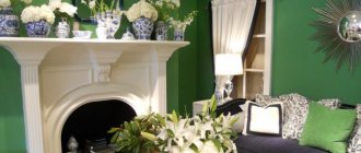
For black headset
Black furniture always looks luxurious. But the abundance of black surfaces can cause a depressing mood, especially if the facades of the set are made in matte shades.
Black color requires bright lighting and the most neutral background - white is best.
It is no coincidence that black and white has long become a design classic. White wallpaper and gray flooring go perfectly with the black color of the set. Add a few rich shades in the decor, and you will get a wonderful kitchen in a modern style.
Black can be combined with ash gray, smoke color or steel - steel-colored household appliances will fit well into such an interior.
Black furniture and red wallpaper are the solution for a spacious kitchen. Designers only advise avoiding flashy shades of red. Coral, burgundy, and cardinal colors are best suited. With such a palette, it is necessary to add white decor.
Glossy or matte?
Now let's talk about the black furniture itself. Surely you have wondered whether to take glossy or matte, large or small. Below are a few photos for you to illustrate both questions.
In my opinion, glossy black upholstered furniture, like the leather sofa in the photo, looks better and more elegant than matte. Of course, it requires more careful care, but it pays off with a beautiful appearance.
But matte black upholstered furniture, like the textile sofa in the photo, looks worn from the first days, and after a couple of years of use it looks like a faded rag.
Solutions for dark rooms
Even if there is not enough natural light in the kitchen, most often this affects those whose windows face the north side, then this is not a reason to abandon the design in black and white.
You just need to make White the main one, and Black needs to beat him. For example, a white kitchen with black appliances is a classic technique. Moreover, built-in black appliances require much less effort to maintain than black glossy facades. A white kitchen with a black apron will also look great. Basic white will soften, and black will be a wonderful accent for any kitchen.
By adding artificial light, you don’t have to limit yourself. Additional lamps on the set, diode strip along the apron, or brighter lamps of cold or warm white color - and the kitchen will not look dark.
With these simple techniques you can create the design of your dreams in any room.