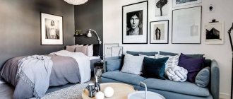
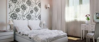
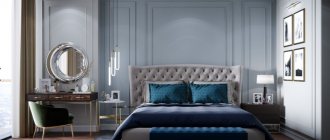
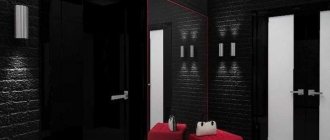
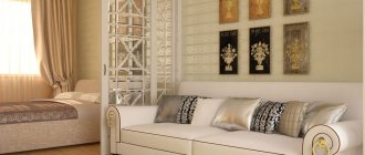
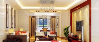
Regardless of the size of the apartment and the number of rooms, its furnishings must fully comply with the chosen design. At the same time, the location of furniture is of great importance in everyday practicality.
Rational organization of space implies thoughtful functionality and decor of corners in the apartment.
Wall shelves
The corner is a great place to store books and display your collections. Open shelves are inexpensive, but they look airy and stylish. Ideal for small spaces, as they rationally use the area of the room and add depth to it.
Ideas for decorating a corner of a room
If the apartment is large, then the corner can be filled with decorations that will delight the owner and surprise his guests. Filling options:
- recreate a small greenhouse and fill it with ornamental plants;
- put a large aquarium with fish;
- make a place for pets, beautifully decorating it with special furniture;
- put up a football table.
Photos
With this creative approach, the corner will look original and stylish, because most people are accustomed to seeing photo frames located in the center of the wall or standing on shelves.
The composition can be supplemented with clocks, mirrors and inscriptions.
Inna Zol
Designer and decorator Inna Zoltmann.
Designer and decorator Inna Zoltmann.
“It seems to me that an empty corner in the interior is a misunderstanding, given the cost per square meter of real estate (especially in Moscow); with proper planning and the designer’s desire to use every millimeter of the area entrusted to him, such a question should not arise at all.
There are well-known professional techniques that prevent the appearance of empty corners: for example, classic axial layout and functional zoning of space.
Interior fragment.
Design: Inna Zoltmann. Photo: Sergey Ananyev. Style: Natalya Onufreychuk.
Interior fragment.
Design: Inna Zoltmann. Photo: Sergey Ananyev. Style: Natalya Onufreychuk.
To create a beautiful classic layout with a pronounced axis of symmetry, the proportion of the golden ratio is very helpful, when each room is conventionally divided into several parts (usually an odd number), and the sizes of these parts are related harmoniously.
With proper zoning of space, each room is assigned a specific function; the main object dedicated to this function is placed in the center of the space, and objects with additional functions can be placed on both sides. This way, there are no empty corners left - they are all occupied by necessary objects and delight a person with their usefulness and beauty.
Interior fragment.
Design: Inna Zoltmann. Photo: Sergey Ananyev. Style: Natalya Onufreychuk.
Interior fragment.
Design: Inna Zoltmann. Photo: Sergey Ananyev. Style: Natalya Onufreychuk.
It is very important to think about the ratio of objects in volume and height; basically, there are two options.
- We place a large (main) low object in the central part of the room, and tall ones at the edges or corners.
- There is a tall, large object in the center (for example, a buffet), and low ones at the edges.
This is always a detailed study of each of the walls in millimeters and constant reflections on the benefits and beauty.
In my project for the beauty salon “Confetti” on Patriki, the main hall serves as a living room; I placed the administrator’s desk in the center of the main hall - this is the main piece of the room, and in the corners there was a waiting chair and a manicure table (and these are additional functions). Opposite the administrator’s desk there is a decorative console for information materials (catalogues, business cards and booklets).”
Interior fragment.
Design: Inna Zoltmann. Photo: Sergey Ananyev. Style: Natalya Onufreychuk.
Interior fragment.
Design: Inna Zoltmann. Photo: Sergey Ananyev. Style: Natalya Onufreychuk.
Work corner
see also
Photo of corner computer desks
Any unused corner in the room will become a convenient mini-office if you fit a suitable table into it, equip shelves and organize the right lighting.
Sitting with your back to the space of the room, it is easier to concentrate on work and not be distracted.
Natalya Preobrazhenskaya: “A bare corner is not in favor of comfort”
Natalya Preobrazhenskaya, designer, head of the “Cozy Apartment” studio.
Natalya Preobrazhenskaya, designer, head of the “Cozy Apartment” studio.
“The very realization that not all corners are filled psychologically expands the space - it means that the owners have space, and they can afford not to take up every centimeter. But a bare corner, on the contrary, does not speak in favor of comfort. Empty corners cut up space and create a feeling of tension; Even in minimalist interiors, I recommend avoiding empty corners. At the same time, arranging furniture “along the wall”, pushing a sofa or table tightly into a corner is also not an option at all: such an interior takes on a taste of officialdom, as if no particular effort was put into creating it.
Interior fragment. Design: “Cozy apartment”.
Interior fragment. Design: “Cozy apartment”.
Top simplest and most effective solutions for filling an empty corner
- Plant in a large pot.
- Large art ceramics.
- Interior sculpture.
In one of the projects, we softened an empty corner by adding a wide ribbed MDF panel to look like wood - the living room turned out to be visually larger and looks very respectable.
Another solution is to make narrow, illuminated shelves for small pieces of art and a home library. However, it is better to fit them into niches so that the corner itself remains open. This solution is only suitable if the layout allows such recesses to be laid in advance.”
Fireplace
A corner fireplace is conveniently placed near a heat source with a good view of the flames from all sides. A fireplace in an apartment can be either electric or artificial - for example, made by yourself.
Dressing table
It is needed in the room of a teenage girl or woman to regularly monitor her beauty and put herself in order. It should have drawers and shelves for convenient and practical placement of decorative cosmetics, creams and jewelry.
You need to think about an additional light source in advance. It can be mounted in the frame on the mirror or stand next to it.
Mirror
This is another simple way to expand the space optically - place a mirror in the corner of the room. The unused corner will disappear, instead giving a feeling of airiness and masking the unevenness of the walls. The mirror canvas can be supplemented with garlands or a floor lamp.
Choosing a style direction
To make a room beautiful, it is very important to choose the right style solution. The design of the room must correspond to the inner worldview. Therefore, before starting to repair or re-equip a room, it is necessary to clearly think through the style solution that will subsequently be implemented. It is very important that everything, from the finishing of the main planes to the smallest decorative elements, is subordinated to the same style.
Interior design styles have evolved over the past several centuries.
Modern
Modern is a very original interior solution. A home room designed in it should contain original textile solutions with patterns depicting non-standard large flowers, insects and curving lines. It is advisable to apply stained glass elements pointwise. And definitely wooden carved structures of unusual shape.
Art Nouveau style is a design in which natural materials, natural colors and soft, rounded lines predominate in the furnishings and decor.
Modern
The modern style is more dynamic, which is why it is not suitable for everyone. It is often chosen by teenagers and active young or middle-aged couples.
When decorating it, you should prefer an achromatic color scheme with small splashes of bright and rich color, but always in a small area.
Modern design style is a natural, eye-pleasing atmosphere.
All surfaces should be as geometric as possible, without any smooth complex designs. Here everything is subject to the coldness and prudence of the modern technological world. This is a kind of home comfort that is not suitable for everyone. And this should be taken into account!
Classical
The classic interior is more traditional. But for its most authentic execution, a significant amount of money for implementation and a large number of elements are required:
- Expensive furniture of classical forms, with obligatory elements of inlay and carving.
- Upholstered furniture upholstered in expensive fabrics such as brocade and jacquard.
- Classic carpets on the floor and decoration with vases and figurines.
Classic style in the interior is like wine - it becomes more valuable over the years.
And others
When you want softness and tenderness, especially in the bedroom, a cozy white room can be decorated in a shabby chic style. It is worth mentioning right away that such an interior is more suitable for a young girl, since small ornamental motifs in the form of flowers or butterflies should be placed on the light-colored walls, upholstery and curtains. The abundance of ruffles, flounces, and textile trim makes the room truly girlish.
Shabby Chic style in the interior, otherwise known as “shabby chic”, is a fairly young design direction of the late 80s.
For the living room you can choose Provence or rustic style. They fit very well into standard city apartments, without requiring too expensive changes and, at the same time, do not clutter up the space with large furniture elements.
It is chosen by sophisticated people and people who want to add a romantic atmosphere of rural life to everyday life.
The colonial style also behaves well, but here you will need to maintain every little detail in order to maintain a balance between elegance and laconicism.
Colonial interior style is European comfort and oriental flavor in one bottle.
But using authentic national styles, for example, such as Japanese or oriental, is not recommended. They can get boring quite quickly and cause irritation in the owners later.
Piece of art
Some decorative detail - a sculpture or wall painting - will help smooth out the corner. Unlike a plant, a plaster bust does not need to be looked after: you just need to brush off the dust. As an alternative, you can use a tall floor vase, an original screen or any other art object.
Valeria Moskaleva: “No need to litter the space, leave room for air”
Designer Valeria Moskaleva.
Designer Valeria Moskaleva.
“Harmony in space is what a designer should strive for. When planning the interior, I try to think through every detail and every corner. The emptiness in the interior and corners, in my opinion, is even a plus, but such decisions must be justified and supported by the overall aesthetics and style of the interior.
Speaking of “emptiness,” I would like to recall the interior of the Katsura Imperial Villa in Kyoto or the interiors of Carlo Scarpa. In them, emptiness is already art and decoration of life. No need to clog up the space, leave room for air.
But if it so happens that such a corner has appeared and it’s difficult for you to live with it, you can use decorative techniques with mirrors. Be careful what is reflected in them! This technique can give additional depth and deceive the eye, hiding the imperfections of the angle, or work in the opposite direction if you have a lot of unnecessary things and clutter in your home. The effect of sloppiness will increase several times.
Interior fragment.
Author of the project: Valeria Moskaleva. Style: Yulia Chebotar. Photo: Mikhail Loskutov.
Interior fragment.
Author of the project: Valeria Moskaleva. Style: Yulia Chebotar. Photo: Mikhail Loskutov.
Perhaps a free corner is just a reason to buy art, an art object, or a place for a musical instrument. So, in one of my projects a piano appeared, which the owner had long dreamed of.”
Interior fragment.
Author of the project: Valeria Moskaleva. Style: Yulia Chebotar. Photo: Mikhail Loskutov.
Interior fragment.
Author of the project: Valeria Moskaleva. Style: Yulia Chebotar. Photo: Mikhail Loskutov.
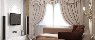
Correct placement of the TV
The most important item in the living room interior is a TV or home theater. He is able to gather all family members around him. Its convenient placement is in an angle. It can be viewed from anywhere in the room. There are several ways to install the TV:
- Suspended on a special bracket. When choosing this element in the store, pay attention to the product that turns away from the wall. This is convenient, especially when you need to connect a memory card or antenna.
- Install a corner cabinet.
- Place a corner chest of drawers.
- Build the TV into a special niche made of plasterboard.
- Install the TV in the corner section of the wall.
Corner wardrobe in bright colors
