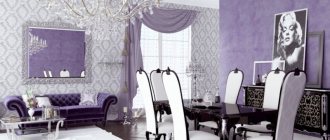
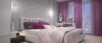
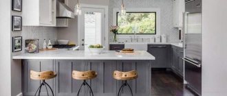
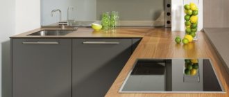
Shades of purple on a psychological level are associated with willpower, mystery, intuition and creativity. Color has the ability to relax and calm.
You don't often see purple in a kitchen interior. Not everyone likes it, and it’s not easy to apply to every style. But if used correctly and combined with other colors, you can get a rather stylish and beautiful interior.
Our successful examples of kitchen design in purple tones will help you make your choice.
Purple kitchen design Source kuhenmart.ru
Features of lilac color in kitchen design
Lilac can be used in the design of almost any room, the only question is in what quantity and in combination with what colors. He has his own mission in kitchen design. Here are some facts about the use of this color in the interior:
- One of the most “inedible” colors in design. If you tend to overeat, this is an additional way to control your appetite.
- It has many shades: from pale to rich, from cold to warm. The choice of tone will be influenced by the style of the interior, the location of the windows and the degree of natural light in the kitchen space.
- A large amount of this color in a kitchen design will “heavien” the interior, so it is best to use it as accents or dilute it with neutral ones - gray, white, sand, etc.
- The smaller the kitchen, the lighter the shade should be.
- This is the ideal color for a Provence style kitchen design.
- Dusty shades look very beautiful in combination with rough, textured surfaces, for example, with stone, concrete, wood with a pronounced texture and wicker furniture.
Set
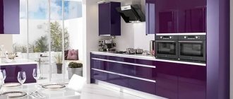
The purple set in the kitchen interior looks stylish and modern. When choosing furniture, you should take into account the location of the kitchen: for the north side it is better to buy a set in a light lilac tone, for the south you can choose a color of any saturation.
The choice of furniture colors also depends on the square meters of space. The smaller the room, the lighter the furniture. For spacious kitchens, you can purchase a set of purple colors of any saturation.
Possible combinations of shades: white and lilac, black and purple, beige and lavender, pink and purple.
Psychologists recommend choosing headsets in purple tones for those who want to lose weight: this color will not allow you to eat an extra sandwich or piece of cake.
Variety of shades
A positive perception of lilac in the interior is formed primarily due to the successful choice of shade.
This may also be interesting to read:
- Turquoise color in the kitchen interior - 120 design options in photos
- 117 Best Examples of Dark Kitchen Designs
Pale or bright?
Lilac can be used as a background, accent or as a complementary color. In the first case, it is recommended to select pale, pastel shades, and in the second, use brighter colors.
As the main, dominant background
Accent
It can also act as an additional color in the company of white, gray, black, pistachio, yellow and other colors. In this case, it is important to guess not only with the shade, but also with the proportions.
The color scheme of this kitchen is based on three colors - white, lilac, blue. Bronze/gold/orange is used as accents in the design of fittings, lamps, and kitchen accessories.
Warm or cold?
Lilac is a mixture of blue and red. To achieve complex, interesting shades, add white or light gray, which gives a beautiful dusty effect. Unlike purple, it has more blue undertones, but you can play with proportions, getting a variety of shades from warm to cold.
If the kitchen windows face north, then you can compensate for the lack of sun with the help of a warm shade.
If the windows face south and the bright sun comes into the room most of the day, then cool tones will look more harmonious, adding coolness and freshness.
Corner
Kitchen units installed in one (or two adjacent) corners are relevant today. In this case, it is easy to zone the kitchen area, for example, into a food preparation area and a place for eating it. Such models will also become popular in studio apartments, where a separate room for the kitchen is not allocated.
When choosing a purple corner kitchen, you need to be careful so that it doesn’t get visually “lost.” The dark shade of the main background can be diluted as follows:
- choose a model with glass or mirrors;
- concentrate bright lighting over it;
- choose a countertop in light colors, perhaps from natural stone;
- decorate shelves and other work surfaces with white, shiny design elements and embroidered towels.
The dark shade can be diluted with many elements
What does it go with?
Lilac is a very difficult color to work with. It has a strong emotional impact. If you overdo it, the kitchen will resemble the interior of an elderly Barbie. But in the hands of a person who has excellent taste, it is a powerful tool for creating a non-standard, creative, inspiring space.
With white
The most win-win and successful combination is with white. Shades of white can always be added to the palette with lilac and other bright tones to unload and refresh the interior.
White adds air to the room, allows you to play with the proportions of colors in the interior, helping to find balance.
With gray
The combination with gray will add high cost, severity and elegance to the interior, since gray slightly mutes lilac and its infantile character, thus revealing its best qualities.
In the high-tech style, gray is reflected in the design of metal and chrome surfaces, which adds a technological atmosphere to the interior.
Purple curtains
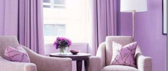
When choosing curtains for the kitchen, you should take into account the size of the room and the degree of its lighting. If the room is small, you can either hang curtains in a light purple shade or install blinds. A Roman blind will also work.
For a spacious kitchen with large panoramic windows, you can choose long curtains made of natural flowing material. They can either be completely purple or have a beautiful pattern of this color on a lavender background. A decorative cord with thick tassels or a ribbon made of thick satin will help add elegance to such curtains.
What style should you use for a lilac kitchen?
In certain styles, lilac will reveal its best qualities. Let's take a closer look at how this color can be used in traditional and modern interiors.
Provence
The most ideal scenario is to use it in French country style. Here he will most harmoniously reveal his serene mood. It is better to use dusty, dirty, muted tones. In combination with rough and aged wood in the design of ceiling beams or furniture, stone in the design of the floor and cold light plaster on the walls, lilac will never give a cloying and irritating effect.
Modern classic
Light lilac can be used in the design of kitchen furniture, in the textile design of a kitchen in the neoclassical style. Brighter tones closer to purple will add luxury and richness to the setting. It is better to dilute such an interior with calm milky, beige, white shades so that lilac of varying degrees of brightness fits harmoniously into the overall atmosphere without sharp transitions and contrasts.
Shabby chic
In the shabby chic style, warmer, lilac tones will prevail, which, unlike Provence, will create a slightly infantile, marshmallow mood. In addition to it, the interior may contain a lot of pink, milky, white, and soft blue.
Country
Against the background of the natural palette of a country interior, lilac will harmoniously serve as accents, and in a muted, very pale form, it will also act as a background.
Cornflower blue, violet, and not too bright tones will add coziness and bring you even closer to nature, evoking associations with fragrant wildflowers.
Scandinavian
In the Scandinavian style, it is better to use lilac spotwise, as small accents, for example, in the form of floor paths, napkins for cutlery, and pillows on chairs.
Modern kitchen
Shades of lilac fit harmoniously into modern interiors - loft, minimalism, hi-tech.
In minimalism, it is better to use cold, muted tones, with a mixture of white and gray.
Bright lilac with a slight vintage mood can be used in the decor of a loft kitchen, for example, in such oversized, small details as upholstery, an apron or a poster on the wall. You can use a gray-lilac, dirty shade in greater quantities, which will emphasize the brutality of the loft.
In the high-tech style, lilac is diluted with white chrome, gray, and metallic shades. Gloss, glass and metal work best alongside neutral and muted shades.
Finish options
Tile is considered the ideal covering for flooring. An alternative option could be a durable laminate board, which will harmoniously combine with the kitchen set and wall decoration. In terms of color, beige, light brown or creamy tones are best. A dark purple floor will complement the lilac wall cladding and white ceiling plane. When using such a palette, a competent selection of furniture elements and textiles is important.
For kitchen walls, washable wallpaper, mosaics, tiles or ceramics would be appropriate. Liquid wallpaper with small inclusions or ordinary canvases with elegant floral patterns or sinuous lines have a very unusual look. When decorating a work area, it is most practical to use tiles or skins with drawings of flowers, still lifes, and other things.
The photo shows a kitchen apron decorated with purple orchids.
Paint, plaster, as well as plasterboard structures or tension fabrics are suitable for finishing the ceiling. Basically, the ceiling plane is kept in a light shade to make the room visually seem much more spacious. It is also possible to use a two-tier system in white and lilac shades. A rather bold design move would be a completely purple ceiling finish.
The photo shows a kitchen interior with a two-level stretch ceiling in white and lilac colors.
Lighting Features
Lilac can change its undertone under certain lighting. Due to the lack of artificial lighting, a lilac kitchen may seem gloomy and uncomfortable. Therefore, it is important not only to take care of the moderate brightness of the main light, but also to evenly distribute sources of artificial lighting throughout the room - to illuminate the work area, to provide separate lighting for the dining area.
White
This is a universal duet, as it will look great in any style. It is quite neutral and is not capable of causing any too strong emotions. It can be used in any room, regardless of its layout and area. This combination will be especially relevant if you have a small lilac kitchen.
Photo from source: avatars.mds.yandex.net
Tabletop “Cedar” 1205/BR Diamond light gray
Photo from source: static.tildacdn.com
Tabletop “Cedar” 2946/R Galia
Photo gallery
Green
Creating such a duet in the interior requires special care. After all, despite the fact that the combination is one that can be found in nature, it requires a competent choice of shades. For example, too saturated or dark green in large quantities can overload the interior and make it too gloomy.
In classic kitchens, the lilac-green duet can be found relatively often, but it is necessarily complemented by neutral light colors - white, beige.
Moderate delicate shades are characteristic of Provence. More intense ones are for modernity.
Photo from source: mebel-sirius.ru
