Lilac living rooms are not found too often. And all because this color is far from the most common for interior decoration. Many people are simply afraid to decorate their rooms with this range, considering it mystical. In fact, the lilac interior of the living room is cozy, beautiful, and luxurious.
For example, there is a purple color similar to it, it is darker. It is for this reason that it is considered a more depressing color.
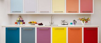
Lilac is lighter, which is why many more people like it. In addition, purple has many shades, there are about fifty of them! Due to this, the interior can be made very unusual and extraordinary using these tones. We invite you to view a photo of the lilac living room at the end of our article!
This color has a cold tint, thereby giving the room freshness and even slight coolness.
This option is excellent for creative people, powerful and at the same time noble people who gravitate towards mystical phenomena.
In nature, lilac and violet are expressed in the most delicate, sophisticated varieties. For example, violet, crocus, grape, butterfly, order, blackberry, currant, plum, lavender and others.
Read here: Brown living room - stylish interior design in the living room (85 photos)
In general, the lilac design of the living room is incredibly successful, just like for any other room. For example, in the bedroom you can calmly relax with it and tune in to a quick sleep.
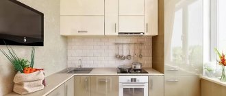
In the living room, a friendly environment conducive to communication is created, while in the kitchen it encourages culinary creativity. And if you use lilac in the nursery, the kids will develop their creative potential faster. But in this case, it is still worth using light colors, combining them with a different range.
Purple living rooms
An amethyst half-tone living room will look mysterious and elegant if it is complemented with a spectacular lighting design with neon bulbs and LED lamps on the ceiling.
And it is best to decorate it with crystal accessories and tall, narrow vases.
A lavender-colored living room will look fashionable and stylish, especially if you add gold or olive-colored items. An elegant addition to such an interior would be a crystal-shaped aroma lamp with lavender essential oil.
A living room in grape shades will look positive and solemn if you add glass flowerpots and a crystal chandelier to it.
Lilac is perfect for a studio apartment; such an apartment will be decorated with photo wallpaper with a white lily, glass screens and curtains made of transparent fabric.
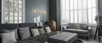
A living room in purple colors goes well with a noble shade of gray.
Green objects will enliven a purple living room, especially if you make a white glossy stretch ceiling.
The living room will look gentle if you dilute it with pink or crimson color, and complement the interior with a chandelier with a chrome base and crystal-shaped lampshades.
Combination with brown
In this combination, it is worth remembering that brown is able to calm and suppress the emotional background.
- Narrow hallway - design ideas. How to arrange a hallway (80 photos)
Living room 30 sq. m. - 75 photos of fashionable design ideas
Living room 16 sq. m. - 75 photos of the design of a cozy living room
But the second one, that is, lilac, will only enhance this feeling, so you won’t want to do anything here at all. It follows that this combination is most suitable for bedrooms.
Read here: Living room with a wardrobe - review of the best models (80 photos)
After all, in addition to relaxation, the atmosphere is also created a mystical one.
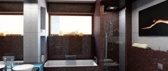
An excellent option for this combination in a home cinema room, in which the mysterious atmosphere will only be emphasized due to lilac, but thanks to brown you will be able to calm down and relax.
To get inspired by ideas and decorate your living room in lilac tones, we suggest looking at a selection of the best interior design photos!
Furniture
When giving preference to a purple living room, it is very important to choose the right lighting, curtains and furniture for it. Moreover, the furniture in a room of this color scheme plays an important role.
So, you need to take into account the texture combination, and the more gloss is used, the more elegant the design as a whole will look.
Upholstered furniture upholstered in silky jacquard purple looks elegant and noble, like the purple living room design photo that can be seen in the catalog.
Furniture upholstered in velor or amethyst-colored velvet looks noble.
In what styles is it used?
Purple is considered a truly universal color, which, depending on the shade, can be found in classic and modern styles:
- Lavender is considered characteristic of French Provence;
- Iris is the calling card of Russian Art Nouveau;
- All bright shades are important components of modern styles: pop art, hi-tech, minimalism;
- Deeper purple is good for ethnic styles: Arabic, Indian, Moroccan.
- Purple with a silver tint, complemented by mirror surfaces and the shine of crystal, is suitable for the majestic Baroque and Art Deco.
Decor
Decor, elements of which are natural gems or artificial stones will add luxury to the living room.
This will make the living room more luxurious with charoite vases or jadeite glasses, figurines decorated with amethyst, and rock crystal chandeliers.
Fresh flowers in beautiful vases or indoor flowers in original flowerpots, especially orchids, will make a living room in purple tones warmer.
Features of application
To understand the specifics of using purple wallpaper in the interior, you should find out all the features of such shades. Purple includes both cool (blue) and warm (red) shades. This admixture of opposite colors determined the contradictory nature of purple wallpaper.
That is why designers advise not to use an excessive amount of purple tones in the interior - it is advisable to decorate only one of the walls with them or create small inserts on already pasted light wallpaper.
Purple is ideal for combining backgrounds. With its help, you can emphasize certain areas of the room, as well as divide the wall into two or more parts.
When choosing purple wallpaper for walls, think in advance which shade will best reveal your design idea.
Since a room with purple wallpaper is perceived as dull and gloomy, such shades are not recommended for decorating cramped and poorly lit rooms.
But in rooms with a disproportionate shape, wallpaper of this type allows you to correct the design flaws: by decorating one wall in a purple tone and the rest in a lighter tone, you can visually move this surface away.
This palette can be presented in a large number of shades:
- lilac (light purple with a hint of pink);
- lavender (pale purple);
- lilac (bright and light purple);
- purple (with elements of a burgundy palette);
- eggplant (dark purple);
- standard bright purple shade and others.
These shades can be combined with each other to create harmonious tints in the interior or combined with wallpaper of a different color.
The combination of purple wallpaper with other shades is possible in different versions: plain (with less saturated and light shades), contrasting (with bright tones), neutral (with black, white, gray and brown colors).
Purple color is suitable for decorating walls in modern, high-tech, minimalist styles, as well as in classical, pop art and Victorian styles.
Thematic drawings on the coverings will help to emphasize the stylistic direction. For example, purple wallpaper with strict patterns can be used for rooms in a classic style, while abstract motifs can be used for a modern design.
Photo of a purple living room
Types and design of wallpaper
Today, the market offers a huge selection of wallpaper based on manufacturing technology, texture, size, and color palette. It is necessary to take into account all factors influencing the final result. As well as a combination of wallpaper with furniture, decor and textiles.
Wallpaper is one of the most popular finishing materials. Its advantages are obvious: convenience, a large selection of colors and textures, convenience and ease of use.
Depending on the material from which the wallpaper is made, the following types are distinguished:
| Paper | The cheapest material. It can be of different densities. Advantages: affordable price, large assortment. Disadvantages include fragility, quickly fades, and are susceptible to moisture. |
| Non-woven | It is based on non-woven material with the addition of non-woven fabric. It has high density and strength. Moisture-resistant and environmentally friendly material. Easy to use, hides minor wall defects. |
| Vinyl | There are wallpapers on paper and non-woven bases. Advantages: durable, moisture-resistant, long service life, easy to clean. Disadvantages: poor breathability, releases harmful substances. |
| Liquid | A type of decorative plaster. Based on cellulose, decorative fibers, dyes. Eco-friendly and durable material, levels the walls, has no seams. |
| For painting | Popular on the Russian market. The advantage is that the wallpaper does not need to be re-pasted; it is enough to simply repaint it. Durable, inexpensive, vary in color and texture. Suitable for both home and office. |
| Textile | Fabrics are used to add uniqueness, luxury and sophistication to the interior. Advantages: no seams, sound insulation, thermal insulation, natural material. |
There are many wallpaper models:
| Monochrome | Suitable for small spaces. They combine well with white baseboards and moldings, do not distract attention, and serve as a good backdrop for paintings and accessories. |
| Geometric motifs | The pattern consists of lines, geometric objects that visually transform the room. Suitable for modern interiors. Goes well with a background of a different color. |
| Strip | Suitable for all interior styles. A horizontal stripe visually expands the space, and a vertical stripe raises the ceiling level. The thin stripe is invisible, but at the same time original. A wide stripe adds style to the room. |
| Drawing of plants | Suitable for interiors made in classic and Provencal style. The wallpaper depicts natural elements: flowers, buds, grass, stems, roses, butterflies. Wallpaper with small patterns is a good option for small rooms, while wallpaper with large ones is for spacious interiors. |
| Classic design | Popular in classic interiors. It consists of intersecting curls, monograms, forming a single pattern. An additional metallic coating can be applied to it to add shine. |
| 3D background | High-quality, expensive and durable material. All purple colors are used, suitable for large rooms. Made from environmentally friendly materials, moisture-resistant, flame-retardant. |
Accessories
Purple has long been firmly established in a wide variety of accessories for men's and women's clothing. Ties, belts, gloves and scarves in numerous shades, from ink to soft lavender lilac, as well as purple shoes and handbags are all recommended to be worn, especially if you don’t have the courage to immediately put on a large piece of clothing of this color. Let the choice of purple in the details of the set be a touchstone, the first stroke across the palette of your wardrobe.
It should be noted that purple is recommended to be reflected in eye makeup. This is the only color that sets such conditions for fashionistas. The remaining shades obediently accept the fact that copying them by matching the color of the shadows to the color of a dress or coat is considered bad manners.
Color theory Your color type Selection of hair color Combination of colors to get color in the interior in the interior of another interior in the interior - in the interior of unusual interiors in the gray-violet interior in the interior of the living room Considering the interior of the living room in the gray-violet interior the main thing
combines article and renovation to create a modern purple image looks thanks sofa source
Greyblue, turquoise
One of the most spectacular and even luxurious color combinations! Shades of gray for the most part are classified as cold, just like shades of blue (turquoise). It is not surprising that such ensembles look harmonious. Gray and blue can be combined regardless of the saturation of both colors. In any case, the end result will bear the stamp of nobility and restraint. But turquoise and gray are a different story. Turquoise can only be a solo color; even in small quantities it brings a festive mood. Gray is an excellent support for turquoise and it is best if it assists in the form of accessories, shoes and handbags. Another spectacular combination is turquoise and gray metallic.
Turquoise combined with gray of different textures - metallic and matte.
Grayblue
Gray and blue are included in the palette of so-called business or work colors. This combination is often used to create uniforms for employees, work clothes, and also in business dress codes. In addition, some shades of blue, like gray, bear the stamp of mediocrity. And it’s not for nothing that apt comparisons of “gray mouse” and “blue stocking” are circulating among people. Therefore, when combining clothes of gray and blue colors, under no circumstances allow the shades of “blue stocking” and “gray mouse” to appear in the same outfit! Let it be not a formal blue, but a rich royal one, and not a dark gray, but a pearl one, then the ensemble will definitely not smack of dullness! Another way to get away from the working mood of gray and blue is to use different textures. Translucent or bouclé fabrics, metallic materials or embroidered with sequins - there are many options for different textures that will bring freshness and give a different mood to a business gray-blue ensemble.
Dark metallic blue and pearl gray are not a working combination at all.