Home » Rooms » Kitchen and dining room
DesignKitchen and dining roomWall decorationInterior colors
Alyona
7601 Views
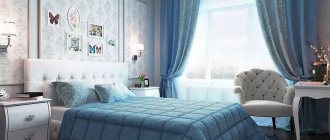
A blue kitchen in the interior is a common solution. This is a calm, cold color that helps to visually expand the space. If you choose the right accessories, complement it with bright accents and don’t go wrong with color combinations, the result can be amazing. Such a kitchen will remind you of the sky or the sea - whichever you like best. But, of course, in order to make you happy with the result and enjoy using the kitchen, you need to be patient and carefully select all its elements one after another. After all, disharmony is the main enemy of any interior. Everything will be discussed in more detail later in the article.
Peculiarities of perception and use of color
When creating a harmonious interior, it is important to take into account the psychology of color. What emotions does this shade evoke? Psychologists say that it has a beneficial effect on the nervous system, calms, helps to concentrate, which is why it is ideal for easily excitable and emotional people. And this is not surprising, because this color was created by nature itself.
However, there is also a downside: in large quantities it can depress, cause associations with a hospital ward, and drive depression and apathy. To avoid a negative effect and find a middle ground, it is important to dilute it with other shades that will balance its severity.
Straight corner set with blue facades in combination with wood-effect facades Corner kitchen set with sky-colored facades
Let's tell you a few facts that will help you better understand how suitable this shade is for decorating your kitchen.
- Blue reduces appetite. On a psychological level, color is associated with peace and serenity and encourages slow and mindful eating.
- Blue is ideal for designing well-lit kitchens with south-facing windows. The bright daytime sun can be tiring, but turquoise or cornflower blue curtains, for example, will just refresh the interior and bring visual coolness.
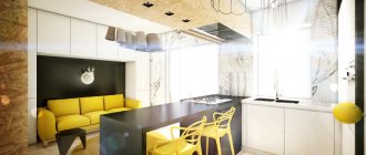
Kitchen island and bar counter "2 in 1". Bar stools with soft upholstery are like a bright accent.
- Blue is a cool shade. In large quantities it can be depressing and depressing. Therefore, it is important to add warmth to it with the help of other warm tones - cream, milk, butter, etc., as well as with the help of certain materials and textures - surfaces like natural wood or stone, textured plaster finishes, textiles made from natural fabrics with coarse weaving (for example, cotton, linen, matting, burlap), wicker furniture.
Island set with accent island module
A dark wood-look countertop while preserving the natural texture will soften strict, cold facades
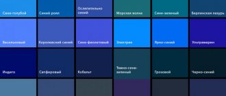
- Blue has many similar shades - turquoise, mint, azure, blue-gray, cornflower blue, aqua, hyacinth, aquamarine, etc.
All of them also belong to cool shades, but they produce a different impression. For example, turquoise and aqua are more active and rich compared to the calmer gray-green or mint.
Kitchen with a peninsula and turquoise walls Mint corner set
L-shaped mint-colored set in a small kitchen
Floor surfaces and ceiling
The following can be used as flooring:
- laminate;
- tiles;
- linoleum.
Laminate does not react well to water, but is easy to care for. The tiles have an attractive appearance and can be quickly washed. However, this coating is slippery and may crack. Linoleum is the most budget-friendly finishing option, but it does not last long.
A classic ceiling design option is sky blue. The room becomes more spacious and airy. Combines with white, turquoise and beige. The ceiling of a light blue kitchen should be contrasting or snow-white. Dark colors are recommended for use in spacious rooms.
A color scheme
Depending on the brightness, this tone can act as a background, a bright accent, or a complementary shade in a contrasting color scheme. All three examples are shown in the photo below.
Pale blue serves as a neutral, calm background against which bright accents will stand out.
Bright colors do not overload the interior, as they are diluted with achromatic white
As a bright accent against the background of an overall neutral color scheme
The combination with gray and blue creates a monochrome interior. To prevent it from seeming boring, play with the degree of brightness and saturation of shades.
There are several general secrets, knowledge of which will help you easily select successful combinations.
- Pale blue can also be combined with pastel, light shades of other colors.
- Bright blue will go better with equally bright tones. In order not to overdo it in brightness, the interior can be diluted with a neutral white, beige, creamy, creamy or milky shade.
- Blue is the color of the sky and water surface, which means it gets along well with other colors that naturally occur in nature - yellow, blue, brown, beige, sand, green, white, etc.
- If you are not sure which companion shade to choose, choose white. Pale and medium blue paired with white form a calm background, and you can experiment with colored accents and add warm shades using oversized furnishings - kitchen chairs, textiles, decor, etc.
With white
The most win-win combination is with achromatic white. It will help balance the excess of blue in the interior and dilute the bright turquoise or azure shade. White will always save you when you are in doubt about choosing the right compatible tone.
Combination of shades in styles
Blue color occurs in many famous styles:
- Shabby chic - characterized by elegance and decorative elements. Light blue in this style can complement white in various tulles, ruffles, other textiles and in the manufacture of aprons.
- Mediterranean interior. Heavenly color is often used to form an apron. For this purpose, tiles with patterns characteristic of the style are selected.
- Country, Provence. Matte light colors and whitish surfaces are used.
- Modern option. The design of a blue kitchen can be very bright and contains a combination of a soft, azure shade with fragments of green. This style often uses metallic finishes to create a futuristic shine on surfaces.
When decorating a bluish kitchen, you always take advantage of light shades in any style. You can see this in the photo of the blue kitchen.
What style is suitable for a blue kitchen?
This tone is universal and suitable for any design direction. However, in some styles it looks most harmonious.
Modern classic
Blue is an ally of elegance, and therefore neoclassicism. You can dilute it with gray, white, milky, black.
Mediterranean
The name of the style itself already conveys its basic color scheme - shades of blue, blue, sea wave, turquoise, azure. The background is white, light gray, and the accents are yellow, orange and red.
Provence and country
This color will fit especially organically into a rustic-style interior. The natural shade of the sky will harmonize perfectly with the worn and aged surfaces of the Provençal kitchen, with textiles made from coarse fabrics, with solid wood furniture and natural materials with a pronounced texture and texture.
Minimalism
Blue can dilute an ascetic minimalist interior, since this color best suits the mood of the style. It will not be difficult to fit it organically into the overall color scheme, since it goes well with the colors characteristic of minimalism - white, gray, black.
Wall decoration
When choosing a color shade to cover the walls, you need to consider:
- dimensions of the room and window openings;
- features of the chosen style;
- color proportions of the design composition.
Wallpaper
Light colors are suitable for any decor style. Blue walls in the kitchen will become a wonderful backdrop for original furniture and decor. However, it must be remembered that blue wallpaper in the kitchen quickly becomes dirty under the influence of fumes. In view of this, it is recommended to give preference to those that are more wear-resistant.
Wallpaper with a pattern of vertical stripes is ideal for a kitchen with a low ceiling. Sky-colored wallpaper with a gray pattern will complement the design composition, made in a modern style. You can stick white wallpaper with a pattern.
Ceramic tiles for backsplash
An excellent design option is ceramic tiles in the majolica style, combining different shades of blue. This decoration method is applicable in many styles. You can add authenticity to a beige and blue kitchen in the Provence style using ceramic stone tiles. For high-tech and loft styles, it is better to choose plain light gray tiles.
Selection of headset and equipment
How to use blue in the design of facades, which countertop will look best with a blue set, when is matte better, and when is gloss? It is important to think through all these questions together, using our recommendations below.
Facade design
Blue can be used in the design of kitchen facades, combined with other colors, for example, with white, gray, black, yellow or beige, dusty pink or cappuccino color.
Modular kitchen "Fance" Leroy Merlin with mint-colored lower facades
Leroy Merlin kitchen set with paneled facades from the “Tomari” series. Ideal for Provence style design
Richly colored facades can stand out against a neutral background, such as beige, cream, pale yellow or white walls.
When is gloss best?
The more complex and interesting the shade, the heavier the balance will be in favor of matte facades. The matte surface conveys deep tones better and cleaner.
When choosing between matte and glossy, you should also keep in mind ease of maintenance, interior style, and room size. It is easier to remove dirt from a glossy surface, and finger stains will be equally visible on both matte and glossy doors.
The style of the kitchen is much more important. For Provence, neoclassical, scandi and country styles, they often purchase sets with paneled facades, which are not glossy. Gloss is inappropriate in these styles, since their main motto is naturalness.
Light glossy facades will be a good solution in the design of a modern small kitchen. Thanks to the reflective surface combined with an airy, heavenly shade, they will visually expand the space.
Tabletop
The most beautiful option for a kitchen countertop in blue tones - under light or dark wood, preserving the natural texture and natural shade.
Technique
Against the background of blue facades, built-in white, gray, black and metallic appliances will look beautiful.
In retro-style interiors, bright red and orange vintage refrigerators and freestanding stoves with an oven look interesting.
You can go the opposite way and decorate the appliances, rather than the facades, in this color. The retro refrigerator and stoves in a delicate shade of the sky look very original in the interior.
Design features of the kitchen set
When creating a design composition, you need to consider:
- texture of facade surfaces;
- body material;
- headset shape;
- color design.
Glossy or matte surface
A glossy façade looks much more impressive than a matte one. However, it does leave handprints and traces of dust. Furniture needs regular cleaning; stains are more difficult to remove.
Glossy kitchen
Matte fronts look elegant. They are relatively easy to care for. Fingerprints are not visible. There is a wide range of cladding options on the market. Despite the advantages, an incorrectly selected design can visually make the kitchen smaller. To avoid damaging the surface, treatment should be carried out with a non-abrasive cleaning agent.
Selection of housing materials
To create the cabinet part of kitchen furniture, three types of materials are used:
- Chipboard.
- Natural wood.
- MDF.
The most budget option is chipboard. However, the material is not of high quality and presentable appearance. The service life of chipboard furniture does not exceed 7 years. A set made of MDF is considered a higher quality option, affordable. Another advantage of MDF furniture is its resistance to steam and deformation. Cabinets made of natural wood look luxurious. Their service life is twenty years.
Headset shape
Depending on the type of layout, kitchen furniture can be:
- linear;
- corner;
- double row;
- U-shaped;
- island
The countertops and wall cabinets of the linear set are located along one wall. The corner layout is practical and functional. A two-row placement option is suitable exclusively for a wide kitchen. A U-shaped blue kitchen set is installed along three walls. An island one involves installing several countertops in the center of the room.
What to do with blue color in the kitchen interior?
This color can be used on a large scale only if its brightness is low. Pale blue can be used to decorate walls, floors and ceilings. Bright is suitable for placing accents and as a complementary contrasting color. In the last two cases, the percentage of its content in the interior should not be more than 30. Let's look at specific examples of how the interior will look in each of the listed cases.
Walls and floor
If blue is used to create a background, then for wall decoration you can choose pale blue washable wallpaper or paint. Rich shades can be used to decorate one wall. which will be the main bright spot in the interior.
Pale blue ceramic tiles with a pattern will look beautiful on the floor.
Apron
An apron can act as a background or a bright accent. If you need to somehow dissolve the apron against the general background of the kitchen, then choose tiles or skins of a pale blue, gray-blue hue.
For an accent and bright apron, rich shades of turquoise, azure, and sea green are suitable. Please note that a bright apron should not compete with equally rich facades. One thing has to stand out.
You can support an apron in a sky or turquoise color with other, oversized furnishings, for example, kitchen chairs, curtains, or a tablecloth of the same shade.
If the walls in the kitchen are painted a beautiful cornflower blue shade, then in the apron area you can maintain this tone by ordering transparent frosted glass to protect the work area. This way the design looks cohesive. The idea is especially suitable for decorating a wall free of upper cabinets.
Curtains and textiles
With the help of textile decoration, you can refresh the kitchen, add lightness and airiness to it. In a kitchen with south-facing windows, blue curtains would be an excellent option.
Textile
Plays a much bigger role than some people think. Without making major changes in decoration and arrangement, you can use textiles alone to shift the emphasis in the right direction.
Contrasting curtains with prints and patterns immediately attract attention, especially in a small area. If the window area should not be highlighted, a material that matches the walls will do.
Multi-layered draped curtains in the kitchen can create a nuisance, so short French curtains, roller blinds and Roman blinds are the best options. When looking for the optimal decorative solution, do not forget about the functional component.
The presence of textiles in the kitchen is not limited to this. Bright tablecloths, towels, napkins, potholders, aprons not only create the mood, but also, if necessary, significantly change the design of the room.
Decor options
If the overall design of the kitchen is made in blue tones, then bright elements of orange, yellow, red, green, and blue can be used as decor. This could be a tablecloth, flowerpot, painting, vase, chair cushions or napkins for cutlery.
Decorative elements of a blue hue will also help to dilute the monochrome interior, introducing color variety into it.
An interior that is too bright, for example, with a predominance of yellow, can be balanced by blue, bringing calm and rigor.
House plants can be the finishing touch to the design. Green leaves will harmonize with the overall color scheme and enliven the atmosphere.
Tips from designers
If your kitchen is made up of blues and grays, it can be transformed with invigorating bright shades. For example, red, yellow, pink are perfect for changing the kitchen.
Blue color can be slightly diluted with warm colors, such as beige or cream, or another option with brown and soft yellow colors. It is best to use a dining set made of wood and matte tones.
For a small kitchen it is better to use a light blue shade; it will increase the space. In addition, you can often change furniture or curtains, because any decision or change always suits these shades.
If it is difficult to decide which color scheme to choose, then you should pay attention to color schemes that have already been tested and are ready for implementation. It’s not at all difficult to draw up a diagram yourself; you just have to turn to nature.
All companion colors look perfect, because they are related shades. But in a neutral palette it is better to use light colors. Combinations of bright colors are perfect for contrasting colors.
Note!
- Turquoise kitchen: TOP-150 photos of fashionable turquoise kitchen design ideas + reviews of stylish interiors
- Light green kitchen - TOP 130 photo reviews of light green kitchen design and decor. Features of the style of furniture and decor in the interior
Lilac kitchen - features of lilac shades in the interior. Stylish kitchen design ideas with photo examples
Features of blue kitchen lighting
With improperly organized lighting, a kitchen in blue tones in the evening risks turning into gloomy and uncomfortable. Cool shades need good artificial lighting more than others. To do this, it is important to provide not only central lighting, but also illumination of the work area and local lighting of the dining area.
For artificial lighting, choose warm light.
Advantages and disadvantages
The list of advantages of this design method includes:
- visual expansion of space;
- the soft blue interior makes the room brighter;
- Light colors are ideal if the room size is small.
Cons of the interior:
- dark shades compress the space;
- color does not promote appetite.
There are a huge number of design options for a blue kitchen. The coloring is used in many styles. By following the design recommendations, you can create a beautiful interior yourself.