Psychological effect of green shades
Green has a rich palette, and its shades can be combined with almost any other. It is the color of nature itself, and most people associate it with a long and happy life. No wonder, according to Eastern beliefs, it brings health, prosperity and wealth. Shades of this color improve your mood and save you from excessive anxiety. A person freed from anxiety feels better and, therefore, more successful.
Positively affects mood
According to psychologists, this color gives confidence and puts you in a calm, working state. A person contemplating shades of green is in good shape throughout the day.
We should not forget, however, that if there is too much green in the interior, it relaxes people too much. Therefore, shades of light green are not recommended for use in large quantities when decorating work spaces, where people need vivacity and high tone, and not excessive relaxation.
The main thing is not to overdo it with color
Features of light green, impact on humans
Green color is associated with spring – warm and light. This color is often used in the interiors of a children's room, because green has a beneficial effect not only on the nervous system, relaxing a person, but also improves vision and has a positive effect on brain function.
In the photo: the kitchen interior is made in light green color, it lifts the mood and adds bright colors.
Studies have shown that color affects every person in exactly the same way. Light green color in the interior helps to cope with negative thoughts and emotions, calms and refreshes.
Basic techniques for using bright colors in the interior:
- Background painting of a wall or partition with a bright color, against which a composition of furniture and decorative items in neutral shades is built.
- Neutral walls (light or dark), against which furniture in bright, light green colors is placed.
- Plants. This premium characterizes many indoor plants; they create a fresh atmosphere in the interior of the room.
Light green combinations
The light green color is very intense. To prevent your eyes from getting tired, this shade must be “diluted” with other colors.
It has been established that the lack of variability in the color design of a room has a depressing effect on human thinking, which by its nature strives for diversity. Therefore, no matter how beautiful the selected light green tone is, it should be correctly combined with other colors.
Combination with other colors
For rooms intended for children, a competent selection of several friendly shades, combined with one or two contrasting ones, is very important. This is important for the child’s mental development, his mood, and also for developing his sense of taste.
Creating harmony with the help of consonance of colors
The table shows possible color combinations and gives recommendations for room decor.
| compatible shade | Effect | recommendation for use |
| pink | a truly natural combination associated with young plants in spring, creating an effect of freshness and a positive attitude | bedroom; girl's room |
| shades of white (beige, off-white, cream) | white tones soften and calm the intensity of green, making the room seem wider | children's; kitchen |
| gray tones | favorably set off light green, give the room severity, reduce brightness and intensity | study; a kitchen that opens into a living room in studio apartments; bedroom |
| orange | the combination of warm (orange) and cold (light green) creates an atmosphere of positivity and at the same time calm | living room; kitchen; children's room for boys |
| yellow | morning combination, bright and warm, ideal for rooms with windows facing north; creates a positive attitude | nursery for girls; study; kitchen |
| lilac/violet | an exotic combination of tones that allows you to ideally divide the room into darker and lighter zones; noble dark shades of lilac are refreshed with light green | kitchen; bedroom; bathroom or shower room |
| fuchsia | an unusual combination in which fuchsia tones should be either muted or added in minimal quantities; creates a feeling of cheerfulness and optimism | Vacation home; bedroom; kitchen |
| turquoise/blue | a fresh combination of shades that gives a feeling of joy and calm, ideal for rooms with a nautical theme | nursery for a boy or girl; bedroom in a country cottage; bathroom; kitchen |
| brown | a combination borrowed from nature, calming, ideal for relaxation and successful mental work | study; bedroom; boy's room |
| blue | a strict combination in which the frivolity of light green is extinguished by a noble dark shade; perfectly allows you to divide the room into zones | living room; kitchen; bedroom |
| red | an unusual combination in which light green should predominate, and red should only create the desired accent (for example, edging walls or furniture) | kitchen; a kitchen in a studio apartment combined with a living room, in which the red tones are enhanced; premises in a country house. |
The combinations presented in the table give only a general idea of how shades of light green work with other colors. When choosing decor, it is necessary to take into account such nuances as the intensity of the shade.
We take into account all the nuances
Lighter colors “expand” small rooms, creating the illusion of space and freedom. Dark shades, on the contrary, create a feeling of cramping. When finishing the “top” of a room, for example, the ceiling, it is necessary to give preference to lighter colors, and vice versa.
In order not to visually reduce the height of the ceiling, you should adhere to the principle “the higher, the lighter.”
You can decorate only one wall
Shades for contrast
Decorating a room in which only two colors are used looks rather boring and monotonous. It is very difficult for a master to maintain everything in only two tones. Therefore, in order to improve the style of a room, it is necessary to correctly place color accents in it, choosing contrasting shades for this.
We correctly place color accents
The table shows shades that combine well with light green. It also lists those colors that can serve as an ideal contrast for some combinations with light green.
| friendly tones | contrasting tones |
| yellow | golden, red, fuchsia, burgundy |
| blue | silver |
| orange | mustard, brown, black |
| golden | turquoise, graphite |
| fuchsia | white, beige |
| pink | white, black, brown |
| brown | aquamarine |
| beige, cream | red, fuchsia, purple, brown |
| emerald/blue/turquoise | purple, yellow |
| red | white, beige |
Successful contrasts in the living room
Proper combination of light green with friendly and contrasting tones will create a unique decor for the room, emphasizing all the advantages of the room.
Color combination in the interior: green and white
This combination creates a modern, simple two-tone interior, with a fresh, clean atmosphere. You can break the sterility and add liveliness to the room with brown, yellow, pink or blue shades. This combination in interior design has a slightly elevated character; it speaks of the nobility of the family living in it.
Style solutions
There are a number of room decorating styles. For some of them, light green color combinations are very suitable.
The table shows interior design styles. It also lists those color combinations that can be used when decorating rooms in a particular style.
Colonial style in the interior
Despite all the apparent stylistic versatility of the light green color, there are a number of areas in which it is completely unacceptable and can even ruin the entire impression of the design.
| style | color combination | materials | additions |
| eco-style | combination of natural colors - brown, dark gray, terracotta, chocolate | cork wallpaper, wood, natural stone, bamboo, marble pattern tiles, rattan fabric | large-leaved indoor plants, landscapes with images of natural landscapes, bamboo mats |
| japanese minimalism | white, pink, fuchsia, dark gray | laminate, porcelain tiles, paintable wallpaper, bamboo | paintings depicting hieroglyphs, edged weapons on the wall, bamboo stems, ikebana from dead wood, floor vases |
| romanticism, retro, country | yellow, orange, red, blue, sea green, pink | wallpaper with stripes or small flowers, laminate, porcelain tiles, wood | wooden furniture, pillows with embroidery, handmade imitation, curtains with ties, patchwork bedspreads, soft fabric toys, removable furniture covers |
| eclecticism, avant-garde, futurism | white, lemon, blue, fuchsia, golden; the more saturated the color, the less of it there is in the composition | suspended ceilings, possibly with a shiny surface, laminate, porcelain stoneware, wallpaper of different but related shades | pieces of furniture of original shape, built-in lighting |
These styles include:
- baroque;
- Empire;
- Renaissance.
Bright design of your interior
When decorating a room in classic styles, light green color is appropriate only as a light accent, for example, on curtains or tapestry. In a more intense version, it can spoil the impression of a strict interior by introducing frivolous notes into it.
Lime apron in the kitchen
Color combination
Rich green in interior elements Source www.komfortium.com
Green is often used to create accents on a beige background. This is a very cozy and beautiful combination, it is easy to work with and create decor in almost any style.
Brown and green looks very elegant and suits any style.
Gray together with green creates a calm, relaxing atmosphere; it is used for the bedroom or living room.
Dark green sofa in the interior Source sovetunion.ru
Orange and green make the room bright and cheerful. Orange is used only as an accent.
Bright combination: green with orange Source lu.linkedin.com
Yellow looks very beautiful and bright, especially if you choose a light green shade for it. Suitable for bathroom or kitchen.
Pink looks very elegant and delicate if you choose the lightest shades.
Combination of pink and green colors Source redterem.spb.ru
Red and green are used very carefully, usually as an accent. This could be a drawing on the wall, a piece of furniture.
Wine-colored sofa on a green background Source yandex.ru
The blue-green combination looks a little boring, so white, gray, and cream are added to it. Turquoise and green look especially beautiful.
Green goes harmoniously with blue-violet. This interior looks original, contrasting, stylish.
Combination of green with deep blue Source colorama.se
Rooms decorated in light green color
This color is suitable for almost any room. It can revive any room and give it a new, completely unrecognizable look.
Living room
Since the living room is a place where the whole family gathers in the evening and where guests are received on holidays, it should be spacious and at the same time cozy.
Light green shades are perfect for living room design. They go with almost all colors. Nowadays it is very fashionable to decorate living rooms in light green tones.
Cozy living room in light colors
They perfectly refresh the room:
Lime white
Since light green is a cold color, a matte, warm, milky shade of white would be more suitable for the living room interior. Shiny and cool white surfaces will give the room a somewhat formal look. Since the contrast between white and light green is very strong, it should be “diluted” with softer tones, for example, light brown furniture or sofa cushions. To soften such a harsh combination, it is possible to decorate one of the walls with flowers, if the other walls are plain. Curtains with a medium flower pattern are also allowed, which will enliven the interior.
Combination of white and light green
Light brown
Lightweight cabinet furniture in brown shades will look great in this combination of shades. You should avoid excess decor in the form of patterns or flowers in favor of striped wallpaper. In this version of the living room, an electric fireplace looks very good near one of the walls, around which an artificial niche will be created, trimmed with natural stone. You should choose monochromatic accessories and household items. A large indoor plant will look advantageous.
Chic tandem of light green and brown
Light green pastel classic
This option is perfect for living rooms that are on the shady side and have insufficient lighting. Light green color in combination with milky and beige tones will create a feeling of lightness. A crystal chandelier with candlesticks, which will give the room an antique atmosphere, would be useful in this interior. Wallpaper for such an interior is possible in both light green and pastel colors. If the choice is made in favor of the former, it makes sense to choose light curtains to balance the basic tones. It is better to choose light furniture for this interior, with sofa cushions to match, but in richer shades.
Light combination of shades
Lime-pastel in a rustic style
For this version of the living room, you need to choose appropriate furniture, for example, unpolished wood, imitating rough handicraft work. In this case, you can use fabrics with small flowers to decorate curtains and sofa cushions.
Lime black
This living room decor option is very strict and eliminates the use of unnecessary decorations and accessories. Black color, as a rule, is used sparingly so as not to make the room gloomy. Basically, for such options they choose black furniture in a minimalist style. Curtains, upholstery of sofas and armchairs, sofa cushions - everything has a monochromatic shade.
Choosing black in a minimalist style
Lime blue
This is a very bold combination of shades for living room decor.
Having chosen it, you need to clearly decide which of these cool colors will dominate and which will remain muted. Equal in intensity, blue and light green colors are too tiring. A combination of muted blue furniture and a small amount of bright light green would be ideal. Dark brown furniture will serve as a good contrast in this case. Such a strict combination of tones excludes frivolous patterns in the interior. In this case, textiles with a geometric pattern will look good. Nice contrast in the living room
For the sunny side, it is wiser to choose more saturated and dark shades, while the north side, on the contrary, requires greater lightness and transparency of the selected color combinations.
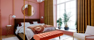
Bedroom
When decorating a bedroom, you must remember that the room is intended for relaxation, therefore, the use of too bright, “acid” shades is unacceptable. It is necessary to choose shades that, looking at them, will make a person relax and tune in to a healthy sleep.
The use of bright colors is unacceptable
Various options and approaches are possible for decorating a light green bedroom:
- Light green white . This combination allows you to create a very delicate and light decor. The ideal solution in this case would be to choose white furniture, bedspreads and pillows in pastel colors and light green wallpaper with golden accents. Light green wallpaper with beige and mustard stripes will look very advantageous.
- Lime pink . A very subtle combination of shades can create a wonderful design for a young girl's bedroom. In this case, color patterns on wallpaper or textiles are allowed. In a bedroom of this design, it is recommended to choose dark pink curtains, and some accessories – cream color.
- Light green brown . This is a more formal version of the bedroom. A combination of brown furniture, light green wallpaper, possibly with floral patterns, and brown curtains is appropriate here. This solution is suitable for those rooms whose windows face south.
- Light green blue . For the bedroom, blue should be chosen in a more “marine” version. The aqua color will greatly refresh the bedroom, and yellow accents will help create an optimistic atmosphere. In this case, the shade of sea wave should be more intense than light green.
- Lime gray . Anthracite tones are perfect for decorating a large room with high ceilings. Light green in this case is only an accent, occasionally “appearing” in a geometric pattern on a bedspread and pillows. It makes sense to choose light green tulle and combine it with gray jacquard curtains. In such a design, one of the walls may be light green, if the color of the other walls is gray.
A green bedroom, from a psychological point of view, is a good option
Combinations of red and any shades of green are not recommended for decorating bedroom interiors, as such a combination has an irritating effect on the nervous system.
Children's
Decorating children's rooms requires a creative approach. It is necessary to carefully select color combinations for the design of children's rooms, since color affects the psychological state of the child.
We carefully select color combinations for the nursery
Various options and approaches are possible for decorating children's rooms:
- Light green brown . This option is preferable because it allows you to combine almost any furniture and flooring with a base shade. For one of the walls, you can choose a plot design depicting, for example, a jungle or a world map. Milky white is perfect as an accent, like the color of the ceiling, tulle, chairs and bedspreads.
- Lime pink . When choosing this combination, you should avoid banality. Pink and light green should be “diluted” with beige shades, while avoiding flashy, acidic tones and floral patterns on wallpaper or textiles. Stripes on a bedspread or curtains would be appropriate, but the walls should be made plain. You need to choose muted shades of pink. It will go perfectly with the light green color of a bogged rose. You cannot use flashy colors to decorate children's rooms.
- Light green and turquoise . This combination looks great in a children's room. If you combine light green with yellow, orange or mustard tones, you can create a unique interior in a marine style.
Do not use only flashy tones
All color combinations in children's rooms should be calm and somewhat muted. You should avoid choosing shiny surfaces, giving preference to matte ones.
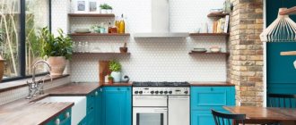
Kitchen
Light green is becoming an incredibly fashionable shade when decorating a kitchen interior. Light green color can give the kitchen both a strict and frivolous look. It enlivens the interior and visually expands the space.
Kitchen in light green color
Light green has many combinations with other colors that are appropriate when decorating a kitchen interior:
- Light green beige . This decor option is very calm and discreet. It allows you to choose several bright color shades that will undoubtedly become the “highlight” of the design, for example, tiles with a bright ethnic pattern, an unusual chandelier, an interesting pattern on the ceiling or curtains. The combination of light green, milky and beige colors is suitable for decorating a kitchen in a vintage, rural or even ultra-modern style.
- Light green brown . Noble brown tones can somewhat mute the light green shade. In this combination, simple white furniture, for example, made of eco-leather, will look great.
- Lime-turquoise . This kitchen design option looks very advantageous. You can decorate the kitchen in a colonial style. For this style, you need to choose cork wallpaper, curtains made of bamboo or other natural materials. Wicker rattan furniture looks great in such an interior.
Think through every detail
VIDEO: Filling the interior with a variety of colors
Light green in the interior
Combination of colors and shades
Bright combination of red, orange and green in the interior
Red is considered a complementary shade to green. This means that in this combination the greatest expressiveness of red and green is manifested. They seem to glow that they don’t do anything without each other. This is its attractiveness, and it also causes irritation when contemplated for a long time. You can “calm down” the combination by clouding pure colors, making them complex, you can also add black or dark brown, white colors.
The combination of green and orange, although bright, is inferior to red. It is more comfortable and less intrusive.