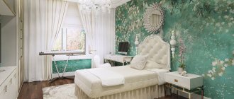
Photo: inthi.ru Rich, complex shades have long been in fashion instead of pure and laconic colors. Among them is elegant turquoise, which gracefully balances on the line between cold severity and homeliness. In interiors, delicate bleached shades and dark turquoise with admixtures of black or gray are equally good. This is a great way to freshen up your kitchen without making it too loud. And we will tell you which styles to fit turquoise into and what to combine it with!
Features of color perception
Have you noticed how the color turquoise improves your mood? Its psychology is the most favorable, because this shade is associated with nature, with seascapes. However, even the most beautiful and pleasant shade can be annoying if the companion colors are chosen incorrectly. This is exactly the case that requires, as they say, measuring 100 times, or rather, thinking a thousand times about what, how and in what quantity to use it.
Notice how beautifully the wood breaks up the design. A concrete ceiling serves the same purpose. Textured and textured materials like wood, stone, concrete, decorative plaster or brickwork are the best friends of turquoise in the interior.
This controversial and unconventional color requires careful handling. Depending on the warmth, intensity of the shade, as well as on the proportions of its content in the overall color scheme of the interior, it can evoke exactly the opposite emotions. In too much quantity, cold turquoise can tire and cause depression, but when used in moderation, it will enliven the interior and add bright notes to it.
This is not the most “appetizing” shade, so it is ideal for those who tend to overeat and want to control their diet.
Interesting examples
Ideas for original design can be gleaned from photos showing finished interiors.
Provencal inspiration
Southerners are passionate fans of fresh turquoise tones. Residents of sunny cities find coolness in them. The predominance of pastel blue is typical for the interiors of the French province. The most popular among shades is heavenly. For the Provence style, a skillfully aged, translucent palette combining several similar shades is ideal.
Facades and countertops with a “worn” effect look sophisticated, in which the turquoise color successfully sets off the wooden bottom of the set. Blue combined with light wood, linen, stone and baked clay emphasizes the old French style in the interior. In such a kitchen you want to have breakfast with croissants and freshly squeezed juice to the tunes of yesteryear.
In this style, turquoise predominates on wooden surfaces. Walls are painted in shades of azure and used in textiles and ceramics.
Scandinavian style
This trend came to our culture from countries with cold climates. Norwegians and Swedes acutely feel the lack of solar warmth and comfort surrounded by icy nature. You can correct the situation with the help of wood and ceramics in light shades.
The Scandinavian interior is characterized by a predominance of cloudy and grayish shades, like the sky before rain. White marble, glossy ceramic fragments and stainless steel look very successful with them.
A bright blue wall on the sunny side of the kitchen looks great. With bright wall decor, the individual style of the owners will appear. Spot accents are, in principle, a feature of the Scandinavian style, while a lot of turquoise is not allowed due to the risk of overloading the interior.
Modern style
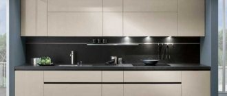
A monochrome turquoise kitchen is difficult to fit into a classic interior. And for avant-garde design, furniture in this color is most suitable. If you want to make turquoise the dominant color in the kitchen interior, you should complement it with black, gray steel or white gloss.
Flowers require depth and uniformity. Smooth surfaces made of durable glass, artificial stone, chromed steel, and polished wood are used. Facades made of these materials occupy most of the space in the room.
The rest of the surfaces are well done in light and delicate shades. If the windows in the kitchen face the sunny side, the turquoise color of the facade in cool colors can refresh the interior and give it the missing coolness. Being in such a room will be a pleasant pastime.
Art Deco
This solution will suit lovers of original and atypical solutions. Turquoise, in contrast with golden shades, looks rich and catchy, as suggested by the shocking Art Deco style. Crystal and gloss in the interior of such a kitchen are a given.
Modern
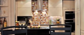
The glossy gloss of the facades, rounded corners and smooth lines of furniture in turquoise colors in this case look unusually bright, like the waters of a tropical ocean. Having caught this “wave”, designers begin to surf in this direction. Often, the apron is decorated with photo printing depicting exotic fish, underwater corals, fancy shells, and spreading palm trees.
Acrylic countertops are traditionally used, and appliances are selected with a metallic finish. If we consider the shades of turquoise in the interior of the kitchen, not a single room in style will find a similar one. The rich palette of shades of this noble color implies an individual approach and a tendency to experiment. By changing the decoration of the walls in the room and filling it with new colored accessories, you can radically change the style and mood in your kitchen.
The next video is about an originally designed turquoise kitchen set.
Variety of shades
Turquoise is a mixture of green and blue in certain proportions. And depending on these proportions, you can get many of its shades: from light to dark, from bright to pale, cold (with a predominance of blue) and warm (with a predominance of green). Hue, subtone, brightness and saturation will greatly influence the mood of the interior, its perception, as well as the design concept and style choice.
What does turquoise go with?
When choosing successful color combinations, it is worth taking into account the different characteristics of the color - its undertone, degree of brightness and saturation.
With white
White will always help out when you need to dilute an overly colorful, bright interior. Paired with turquoise it will create a spectacular contrast.
The combination with white refreshes the interior, but at the same time makes it cold. Warmth and coziness could be added, for example, by a light wood countertop or yellow and green accessories in the kitchen work area.
If the shade contains more cold blue, this combination may seem boring and repulsive, so it is recommended to dilute it with textured surfaces under natural materials. You can also soften the turquoise and white combination by adding warm shades.
With gray
Turquoise can be diluted with gray. Unlike white, the combination with gray will not be as sharp and contrasting. Softer color transitions will make the interior strict and calm. If you get tired of the monochrome and dusty color scheme over time, then it won’t be difficult to add carrot-colored details to it - this is the accent that will stand out most effectively in the turquoise-gray color scheme.
With black
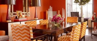
The combination of bright turquoise with black (especially glossy) will add extravagance and glamor to the kitchen interior. If you are not a fan of art deco style interiors, then you are unlikely to like such an active duo.
To make the interior harmonious and calm, use black as an accent in the design of small elements, and you can choose light gray or beige as the main background.
Another option is to use black in combination with pale turquoise. Then the colors will not conflict with each other, and the color scheme will be less aggressive.
Beige and brown shades
If you want to decorate the kitchen interior in calmer colors, then it is better to balance turquoise with a calmer brown or sand color scheme. Beige, ocher and earthy shades will perfectly highlight its brightness.
This may also be interesting: 110 best cappuccino-colored kitchen design ideas
Like a bright accent
The safest option is to layer bright accents on a neutral background. For example, you can decorate your kitchen in a gray and white color scheme with the addition of wood and wicker elements. And add bright turquoise chairs or armchairs, curtains, decorative dishes or a lamp as accents.
If the main palette of the interior is neutral, in basic colors, then in addition you can use another bright color, for example, red, orange or yellow, as an accent.
If turquoise is already present in sufficient quantities in the design of larger items, then a couple more small details will be enough, which will slightly affect the color proportions already established in the interior.
Combination with other bright colors
If you are not afraid of bright interiors, then you can add one or two more equally rich colors to turquoise. Red, raspberry, orange, yellow, purple, light green are good colors. To ensure that the color scheme is not too variegated and harmonious, use them pointwise, in small quantities, and apply them to an already created neutral background.
Advantages and disadvantages
Turquoise is quite difficult to use in the interior; it has its own advantages and disadvantages that should be taken into account when decorating a kitchen.
Advantages
1. Sophistication. Color is strongly associated with sophistication, even some bohemianism. This is a halftone of refined luxury that can add noble notes to any environment.
2. Brightness. Brightness and saturation make it possible to use halftone as an accent tone and use it in bright palettes.
3. Stylistic flexibility. Color skillfully adapts to any style and helps create the most harmonious environment. In a classic interior it will look solid and elegant, in a high-tech setting it will seem modern and technological, surrounded by Provence it will enhance the romantic atmosphere, and in a wooden country house in country style it will create a relaxed mood.
4. High compatibility. Turquoise looks great both in combination with light tones and in combination with dark ones; creates spectacular duets, trios, and even quartets and quintets with bright colors; can become the basis for a monochrome setting or emphasize the delicacy of a pastel palette - in a word, color offers truly ample opportunities for creating a harmonious, stylish palette.
5. Freshness. Turquoise has a refreshing, invigorating effect.
6. Rarity. A kitchen in turquoise is a design that doesn’t come up very often; you definitely can’t blame this tone for its ubiquity.
7. Richness of the palette. Turquoise is blue-green, the color of a thrush's egg, sea green, mint green, greenish blue, and many other options.
Flaws
1. Cool effect. The freshness of the tone, which seems like a plus for some, can be a strong argument against for others.
2. Ability to be annoying. Turquoise is active, it tends to become boring, and if the proportions are incorrectly chosen, it can also tire.
3. Excessive expressiveness. For lovers of neutral, maximally calm interiors, the brightness of color (even in its most pastel forms) is unlikely to suit them.
4. Difficulty in choosing a shade. There are really a lot of halftones, and choosing the right one is often not easy, because they all greatly depend on the lighting. A turquoise kitchen in the interior, which seemed ideal in the photo, may look decidedly unfavorable given your level of lighting in the apartment - and vice versa.
Another disadvantage follows from the complexity and versatility: choosing accessories, household appliances, and decorative elements in the chosen undertone is very difficult.
Choosing a style for a turquoise kitchen
Turquoise can be used in any style, but it is important to choose the right shade. There are areas in which this color is not only appropriate, but also obligatory as a style-forming color that conveys the mood and main idea. This is, for example, the Mediterranean style.
Modern directions
Modern trends allow you to experiment with any shades and color combinations, and feel free to mix them with any other rich tones of the color wheel. And if you want calm colors, then turquoise can be used in combination with gray, blue, white or beige, creating interiors in the style of minimalism, hi-tech or techno.
Minimalism
Classic and neoclassical
Turquoise, diluted with beige, brown, and gray shades can become part of the color scheme of a kitchen in the style of English classics.
This color can also be safely used as a complementary or accent color in the design of a kitchen in the style of a modern classic. It will look luxurious in the design of upholstered furniture - in the upholstery of sofas (if the kitchen is combined with the living room), in the upholstery of armchairs or kitchen chairs, in the design of curtains made of dense and expensive fabric such as velvet or gabardine.
Country and Provence
For country-style kitchens, the color turquoise can be a bright accent. You can decorate the floor, curtains, and kitchen units in this shade. If the house is made of logs and the walls are not lined, then a wooden surface of a natural shade will harmonize perfectly with the turquoise elements.
In Provence style kitchen design, it is better to use dustier, faded tones. For example, a turquoise-colored sideboard with scuffs and an aged effect will fit very nicely into the interior. This color in Provencal kitchen can be used both in furniture design and in decor, for example, in the design of dishes, curtains, covers for kitchen chairs. To make the interior softer and more comfortable, create textured surfaces using natural materials (wood, stone, brickwork, etc.).
See the room tour of a beautiful kitchen in Provence style in white and turquoise tones below:
Scandinavian
Cool shades of turquoise are ideal accents for light Scandinavian cuisine. To make the interior not too strict and gloomy, add details in yellow, red or green.
Mediterranean
This is exactly the style in which it is not only possible to use turquoise, but also necessary to create the atmosphere of a seaside resort. Cool shades can be used as accents in the design of a kitchen apron, in the decoration of walls or floors, in the design of a kitchen set. The combination with natural and textured materials (stone, wood, rattan, brickwork and decorative plaster) compensates for the strict and cold color scheme.
Interior ideas: what elements are beneficial to highlight with turquoise?
The result of decorating a kitchen in turquoise depends on the lighting and shades of the companions. If the room is located on the north side, you should choose warm turquoise shades, they are based on a yellow undertone.
Interior design of a turquoise kitchen Source legkovmeste.ru
If the kitchen is located on the sunny side, you can use both warm and cold turquoise shades for interior design.
Kitchen in turquoise tones Source mykitchendesign.ru
Decoration Materials
Pay attention to how cheap the interior is made of artificial materials in turquoise color - plastic, PVC. And this marine shade is revealed in a completely different way through noble natural materials - wood, ceramics, glass, stone, etc.
Wood painted turquoise in the interior will look more stylish and beautiful than plastic in the same shade, and cheap aquamarine wallpaper will look less advantageous than decorative plaster with a chaotic pattern, painted in the same color.
There are many more such comparisons that can be made, and you can clearly see this for yourself using the example of the interior photos below. Next, we’ll talk about whether it’s worth using turquoise in finishing materials, and how to do it correctly.
Floor, walls, ceiling
If you are not sure that this color will not get boring in a year or two, and its large content in the interior does not scare you, then you can buy wallpaper or paint in this shade.
It is not recommended to decorate all the walls in bright turquoise; it is better to choose only one plane for emphasis. Another option is to reduce the degree of color saturation; a paler shade can now be safely used in the design of all walls.
A non-standard solution is a bright turquoise floor, which can be obtained by laying tiles of this color or painting parquet boards. Colored linoleum or PVC tiles have their place, but if the material is of poor quality and cheap, it can greatly spoil the overall appearance.
Is it possible to make a turquoise ceiling? Easily, using stretch fabric, paint or a hanging structure. But the question is: is it worth it?
In a small kitchen or a kitchen with low ceilings, you should definitely abandon this idea and use more familiar, traditional solutions. In a spacious room with a high ceiling, this idea has a place, provided that the finishing materials are noble and natural (and, as a rule, expensive).
For example, a wooden ceiling painted turquoise will look beautiful in a Mediterranean-style kitchen.
You should not use plastic and cheap glossy PVC fabric to decorate the ceiling in this color.
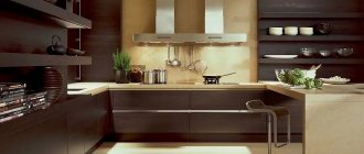
Apron
You can focus on the apron by choosing ceramic tiles of the desired shade, mosaic or skins to decorate it.
The tiles laid out in a pattern with contrasting white or black grout look beautiful.
To bring together the color scheme of the interior, the shade of the apron can be supported by other interior elements, for example, by purchasing chairs or curtains in the same color.
Tabletop
The most successful and win-win tabletop design options:
- white or light with a tint and pattern similar to natural stone;
- gray for concrete or granite;
- under the tree.
Wood in its natural shade neutralizes the coldness and activity of turquoise, so a beech, oak or walnut countertop is the best solution if you want to add coziness, softness and warmth to the kitchen.
You can find successful combinations of cyan facades and black glossy countertops. For a kitchen in the Art Deco style, such an active and bright duo would be appropriate, but the glossy black countertop is very difficult to maintain. If practicality is of great importance to you, then when choosing a dark countertop, it is better to choose a matte dark gray rather than black.
Selecting wallpaper and flooring
What wallpaper should I buy for turquoise-colored kitchen furniture? One of the best solutions is light tones of cream and gray. Lightened wallpaper for painting looks rich.
The turquoise kitchen interior shown in the photo will be embellished by the following types of flooring materials: laminate and parquet. Oak looks great in different color variations, as well as walnut and ash.
Natural shades make the interior homely and, in addition, present an attractive texture. If you choose ceramic tiles for the floor, you should give preference to soft beige shades.
Read here! Small kitchen - practical ways of furnishing that will help save space, tips for improving the design and the best examples of interiors in the photo!
«>
Or experiment with the color of chocolate. To achieve the effect, you can use patchwork tiles as a material for finishing the floor surface.
Kitchen set and furniture in turquoise color
Bright sea-green facades will immediately become the visual center of the kitchen. Therefore, for finishing walls, aprons, and other surfaces, it is worth choosing more restrained tones or diluting the kitchen with white, milky, light gray, etc.
An interesting solution is turquoise technology. There are offers on the market such retro-style refrigerators and stoves that will fit perfectly into a boho or country style interior.
A dining group in this color design will stand out against the overall neutral background of the interior, which will allow for zoning. Turquoise can be used in the design of kitchen chairs and armchairs, in their upholstery or in the design of individual elements and accessories - napkins for cutlery, tablecloth design, chair cushions, covers, etc.
Lighting secrets
A certain lighting angle and its brightness can greatly affect the color and its perception. This is especially true for glossy surfaces and very bright shades - aquamarine, cyan, sea wave.
Light can change hue. For example, under a warm light stream, a green tint will appear, and a cold light stream will enhance the blue tint. If such scenarios are undesirable, then it is better to choose lamps with neutral or soft light.
Regardless of the color scheme, remember the basic rules for organizing lighting in the kitchen, which are stated below.
Artificial lighting should be uniform and sufficient. To do this, it is necessary to provide several light sources and correctly distribute the lamps across all main areas of the kitchen. At a minimum, it is necessary to provide lighting for the work area, dining area and basic, general lighting. The latter can be represented by one chandelier or several spotlights.
Styles for turquoise in the interior
Turquoise looks quite harmonious in almost any style direction. However, the leaders using turquoise are country, unusual vintage and modern trends.
Wicker furniture items can complement the country style. Minimalism is characterized by rather bold combinations of colors and shades.
In strict high-tech, turquoise will be an excellent pair for chrome and metallic.
Curtains and decor
A less risky decision is to use turquoise in decor and accessories. If you make a mistake, it will be easier to correct the situation than if you were wrong with the shade of the facades or walls.
Sea green curtains or pillows on kitchen chairs, vases, ceramic dishes, floor runners, etc. can serve as a bright accent.
Small details can act both as individual accents and as a complement, for example, to a bright turquoise apron or bright armchairs.
It is better to think about the use of turquoise in decor and textile design at the renovation planning stage. If such accents do not match the chosen shade of the walls or furniture, then even a small detail can ruin the result, and cyan curtains can have a global impact on the perception of the interior.
Modern, minimalism and hi-tech
In designing the Art Nouveau style, bright colors and at the same time quiet palettes are used. The turquoise color in the kitchen interior is compatible with shiny chrome fittings.
Steel appliances will complement the overall design. As for the countertop, it should be white, gray, or have a log shade.
The spirit of minimalism includes furniture in a comprehensive palette of turquoise. You can highlight the naturalness in this interior using wood finishes and special accessories.
Read here! Kitchen floor tiles: the best design ideas and instructions for choosing the right tile (90 photos)
As for the high-tech style, frosty tones, matte finish, modern appliances and kitchen accessories come first.
Small turquoise kitchen
Review of a small Tiffany-colored kitchen in the video: