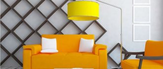
The effect of orange on humans
All colors of the spectrum can influence a person’s psycho-emotional state, and orange is no exception. Since ancient times, people have noticed that the color orange increases appetite, improves digestion and stimulates brain activity. And in some countries it is the color of love.
In the interior of premises, orange shades can:
- Give a feeling of vigor or relieve fatigue;
- Cheer up, overcome depression;
- Diversify gray everyday life with bright colors;
- Reminds you of sunny days and warms you up on long winter evenings.
In everything you need to know when to stop and try not to overload the room with these colors, because... Too much orange can cause aggression and irritation.
Orange color is chosen by purposeful, active and cheerful people endowed with leadership qualities. Children also adore him, because... it gives room for imagination to their inquisitive minds.
Comments
EMILYA says: 05/06/2013 at 2:05 am Hello! Please tell me about the choice of curtains. The thing is that in my living room the light wallpaper gives off a slightly light-light peach tint, the carpet is orange-brick, the sofa is gray with pillows a brighter tone and with dirty milky pillows, the table and chairs are made of solid wood, and the upholstery of the chairs is light orange floral .
I’m thinking of either adding orange or gray curtains to the tulle on the sides. And there is also an idea to combine organza from pieces of these two colors, the room is 6 by 5 somewhere, 6 of them are occupied by the side where the curtains will be. Suggest your options, maybe that’s not what I had in mind at all)))))))))))))
Jul says: 04/03/2013 at 10:28 pm I really liked the combination and we implemented it in the children's room. Now it’s a matter of accessories)))) Please advise what colors can be used for curtains (north side + balcony), room for a 7-year-old boy, furniture with a reddish tint, dark floor, orange sofa. Thank you in advance.
Yulia says: 01/03/2013 at 1:00 am it’s a very noble combination. the photo is just a peek
Svetlana says: 03/03/2013 at 12:20 pm Good afternoon! Great site! Based on your articles and recommendations, we have already done renovations in the kitchen and in the hallway. It has come to the living room :) Please advise me on the choice of shades. In a small living room (3*6) I want to decorate the interior with a combination of gray and orange colors. I want to paint one wall (small opposite the window) orange, I don’t know what shade to choose that would go with the main color of the walls, gray (I don’t know the shade yet, but I want the room to seem more spacious).
Since I want to divide the living room into two zones (a relaxation area for parents and an area for 2 children), near the orange wall there will be a wall bars for children (black), a small table with chairs (what color is better to choose?). Please help with a choice of colors for furniture and textiles in the recreation area (door, TV stand, sofa, carpet, curtains or tulle, pillows) and what color accessories should I choose? Thank you!
Svetlana says:
16/03/2013 at 7:11 am Hello, ticca! Once again I carefully read the article and found answers to my own questions :) This is how I see my living room: Two long walls will be light gray in a neutral shade, one wall (which is opposite the window and which I want to highlight for the children's area) will be orange, if I understood correctly, any shade will do here, and you can start from it when choosing accessories.
The wood-effect floor is a light honey shade, the curtains or just tulle are light yellow (but not brighter than the walls), the furniture is white (TV stand, shelving, table and chairs for children) Chandelier and lamps in the color of chromed metal. All that remains is to choose a sofa and a carpet. I understand that a white sofa will do, but I’m afraid that small children will ruin it :) And here we need your advice. Which sofa (cushions for it) and which carpet should I choose to make the interior complete?
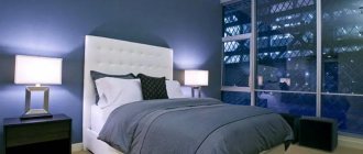
LARISA says: 10/02/2013 at 7:43 pm HELLO! PLEASE HELP WITH SOLUTION TO THIS QUESTION. I HAVE GRAY CURTAINS WITH A SHOW IN MY BEDROOM. WHAT COLOR IS BETTER TO CHOOSE THE WALLPAPER. FURNITURE IN THE BEDROOM “WOOD LOOK.” IS IT BETTER ONE COLOR OR WITH A PATTERN? THE BEDROOM IS SMALL. THANK YOU, I AM WAITING FOR HELP.
Elena says: 01/13/2013 at 10:56 am Thank you very much! Very useful article. You're really helping. And if the floor of my aunt’s northern six-meter kitchen has light gray porcelain tiles and pale gray tiles were purchased for the apron, then what color do you think is best for wallpaper and curtains? Would she like an orange and white kitchen - or is it better to look at another - has it been chosen, but not yet purchased?
ticca says: 16/01/2013 at 6:59 am You can have an orange and white kitchen, everything will be ok with it. Then it is better to make the walls white too - in a six-meter kitchen this is an excellent solution, don’t be afraid of getting dirty, if you take smooth wallpaper for painting and paint it with special paint for kitchens (Tikkurila has one), then it can be washed with a brush, and dirt will not stick to it. And curtains are better not curtains, but light curtains of light gray or light yellow or light pistachio color.
Olga says: 07/24/2012 at 12:59 am This is it!! hooray! I've been thinking about this combination for weeks, and now I know the names of “those” colors: tangerine and glowing orange! At the same time, I learned that I need to be very careful with the cold cream shade that I planned for the walls... I’ll think about it. Thank you very much for the article, and for the site as a whole - it is simply a storehouse of useful and fresh information!
Anonymous says:
05/06/2012 at 10:50 pm Good afternoon! Thank you very much, all the articles are very useful and interesting! You write about complex things so easily and simply that everything becomes clear! Please tell me, I have this idea, I bought white wallpaper with a metallic gray pattern for the hallway, all rolls with a twisting vertical stripe and one roll with large painted flowers (the same gray metallic). I want to glue wavy wallpaper, and in the center there is a square of flowers, and around the perimeter there is an orange molding, i.e. the effect of a painting hanging on the wall in an orange frame.
The question is tormented by what size to make these same paintings? What to start from? Is there a relationship between the size of the wall and the “picture”? The corridor is winding, so I planned one such “painting” for each wall. Is it better to lay laminate flooring under “red” wood or under “gray” wood? And is there any point in doing this at all? How to combine this kind of wallpaper correctly? Thank you!
ticca says: 12/06/2012 at 3:28 am Very good idea, I deeply approve. Look here https://ticca.ru/ostatki-oboev/ and here https://ticca.ru/kartinyi-iz-tkani/ some ideas for making such paintings.
Yes, proportions are important. But there are no ready-made recipes. You need to walk along the corridor and understand the main things for each wall: a) the height of the painting stickers (I think the center of the painting should be somewhere at the level of your eyes, and not in the center of the wall) and b) the width of the painting (I think somewhere 60-70 cm, no more). And the molding is better to be wider in order to more clearly separate the paintings from the background - about 4 cm.
Redhead is better on the floor