/Design/Kitchen color/
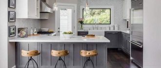
Beige is one of the most win-win and universal colors, which can be the starting point in decorating a kitchen interior in any style. Beige kitchens, walls, wallpaper, floors, aprons, countertops, curtains, tables and chairs in neutral tones are valued by designers for their practicality, ability to “calm” bright accents, “soften” dark tones, add a feeling of warmth to the environment and combine with all colors of the spectrum . For those who are at the planning stage of a kitchen design or want to refresh an already formed beige interior, we have prepared 3 tips for working with space, a list of the 9 best “companion colors” and 100 inspiring photos of kitchens in beige tones.
Laws of color
Shades of beige are considered the most popular when it comes to decorating the interior of a modern kitchen. This can be clearly seen by looking at numerous photographs of beige kitchens posted on the websites of furniture stores and showrooms.
There are several design rules for interior design:
- Using beige color to decorate the floor, walls, ceiling, will require that the kitchen set be decorated in a contrasting pink, light green, red or black tone. The opposite option is also possible - the facades of the kitchen furniture are in beige, then the walls are in a contrasting tone.
- The golden hue effectively dilutes the atmosphere. For this purpose, it is recommended to use various decorative elements, bar counters and shelves.
- Lighting fixtures – sconces, chandeliers – should be equipped with yellow shades. Spot lighting can only be used above the work area.
- A kitchen with lower light green or green cabinets in combination with beige facades of the upper ones looks stylish and elegant.
- Experienced designers recommend using beige when decorating the table surface.
Important! The snow-white gloss of any surface in a light brown kitchen looks pretentious and loud.
Design features
We have written a lot about how great beige kitchens are in combination with other shades. Another important question is how best to implement it in space. This is not so simple in the case of a room divided into functional zones.
Walls and apron
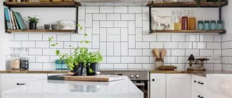
Monotonous beige wallpaper will be the ideal backdrop for organizing color compositions in your design. Their advantage is that they provide a variety of options for adding interesting details with a more pronounced color intensity.
If this layout seems too boring to you, try choosing texture options. For example, with patterns extruded on the surface.
You can do it differently and take yellow or pink walls as a basis. In this case, you should choose a beige set, and the wooden tabletop and apron will form a single composition, carefully maintained in the current eco-style.
An effective way to refresh the color perception of a room is to use mosaics. As a rule, it combines several shades at once, and this gives you complete carte blanche in terms of enhancing the decorative effect.
Tabletop
The exceptional friendliness of beige in relation to natural textures suggests the use of a wooden tabletop. Or stylized as a stone. The choice of color depends on how the facades of your set are painted: a beige tabletop will be in place where the set is an accent dark spot in the room.
The eternal question of “gloss or matte” can only be resolved in terms of the paradigm of your taste. Everyone has their drawbacks: gloss gets dirty faster, and stains on a matte surface are much more difficult to remove.
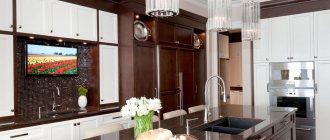
Beige kitchens with black or dark countertops are a good way to break up the monotonous design of the room.
Floor and ceiling
Laminate? Linoleum? Everything is suitable, but wood-look ceramic granite will perform much better. It is available in different formats:
- 15x60;
- 20x60;
- 30x60, etc.
Fits both straight and diagonally. In the second option, the material consumption is slightly greater, but the space visually expands.
When choosing a color and texture, be guided by the facades of the furniture set: the classic design of a room involves darkening the tone from top to bottom.
However, sometimes the opposite happens. The final result will not suffer at all if the rule of a single texture is followed and there are no flashy shades in the color composition.
Expert opinion
Dmitriy
Sales consultant in a ceramic tile store
One of the most common questions when choosing tiles for the kitchen is: will it withstand a collision with falling dishes? Absolutely all porcelain stoneware currently sold has strength class 3 or 4, which allows it to easily emerge victorious from such “mini-battles.” There will be no trace left on the surface after the fall.
But it’s better to leave the ceiling white. This is a classic that, even in high-tech format, often remains untouched and justifies itself perfectly.
However, you can always experiment. Tension fabrics are available in completely different colors, including those with the addition of decorative elements.
Curtains and textiles
If you are arranging a room according to the principles of minimalism and hi-tech, then you should avoid textiles altogether. As well as from draped curtains. These elements best realize their decorative potential in a classic or Provence format.
Curtains in general can become that lifesaver that will help correct the shaky color balance and restore lost harmony. This way you can introduce a third companion color into the color space.
Should I make them dark and bright? Definitely, if the overall design seems inexpressive and boring to you.
No, if there are already enough dark spots in the space. In this case, it is better to maintain harmony by choosing curtains to match the color of the background wallpaper. A tone lighter or darker is not that important.
Kitchen with access to the balcony? You will find the secrets of decorating a window with a balcony door here.
The same goes for textile elements. Properly selected, they create good volume and make the interior lively and soulful.
Cons of color
Many people do not like pastel colors because:
- they are boring and cannot create a festive mood;
- delicate, light colors require constant care;
- the cost of design in beige is significantly higher than using other colors.
We can only fully agree with the third argument - the interior of a kitchen in beige really requires significant financial costs. But you can argue about the first two “disadvantages” - it all depends on the tastes and preferences of the apartment owners.
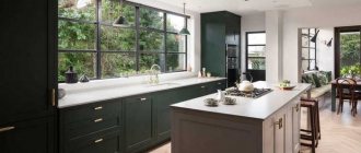
About the pros and cons of green cuisine
If you are not a designer, but you need a green kitchen, creating a design will not be as easy as in the case of neutral, basic colors, such as white, gray, beige. After all, despite the fact that green is combined with all colors, in order for the duet to turn out to be truly harmonious, you need to delve into the nuances of color and choose the right shades, undertones, saturation, depth, etc.
Photo from source: remont-volot.ru
Table top Cedar 3829/Nw Bunratti Oak
What troubles can you encounter if you use green in the interior ineptly?
1) if the lighting system is not organized correctly, the shade of green may be perceived in a distorted form. Thus, the perception of the interior will be spoiled;
2) the presence of too many bright green shades in the interior will cause overwork, irritation, and apathy;
3) despite the versatility of green, choosing a companion color for it is quite difficult.
Photo from source: inmyroom.ru
Tabletop Cedar 3831/M Douglas light
What benefits does green have? If you approach the issue of its use in the kitchen interior competently, then you will be able to fully appreciate all its advantages:
1) the possibility of use in an overwhelming number of stylistic directions. In certain proportions, it is appropriate both in classics and in ultra-modern solutions;
Photo from source: remont-volot.ru
Table top Cedar 8341/1 Travertin beige
Photo from source: remontbp.com
Tabletop Cedar 111/1 White
2) versatility - green has a lot of complex and incredibly beautiful shades. Vivid examples of this are emerald, mint, pistachio, olive, etc. They allow you to create truly stylish, unusual interiors;
Photo from source: almode.ru
Tabletop Cedar 1110/S White
Photo from source: design-homes.ru
Table top Cedar 5140/Mn White moon
3) with the right choice and lighting of the shade of green, it will fill you with vitality, calm you down, and restore energy. Remember that light and warm shades of green help increase appetite;
4) naturalness - this color is more common in nature than others, evokes associations with fertility, freshness, and is always pleasing to the eye;
5) relevance - one of the currently trending colors;
6) can act as a neutral background or a bright accent;
7) there is no dependence on the size of the room area. A kitchen in green tones will look great in both small and large kitchens. In this case, the main condition for successful design will be a successful choice of tone;
 goes well with indoor plants.
Photo from source: pinterest.ru
Tabletop Cedar 1110/S White
Combining related shades
Correct design largely depends on the harmonious combination of the color palette. Beige “gets along” best with its relatives:
- white (but in no case glossy!). This combination is especially successful in small rooms - it creates the impression of an airy and cool environment. The only disadvantage of such a “union” is that it requires careful and daily care;
- ashen (gray). An excellent solution for the kitchen. This color is recommended to be used for various details, and the furniture itself should be decorated in beige;
- black. Creates an unusually effective contrast. A darker shade is recommended for finishing various small elements. It is also possible to use a black tabletop.
- Brown. The interior acquires sophistication, charm and restraint.
Important! When decorating a beige-brown kitchen interior, special attention should be paid to lighting. A lack of light will turn the kitchen into a gloomy room that is unpleasant to be in.
Furniture selection
The final choice depends entirely on the style in which the interior is decorated. It is clear that if you are building a room according to the ascetic canons of pragmatic high-tech, then there is no question of deliberately wooden tables and chairs. You will also have to forget about carved facades and lattice inserts on the doors.
Designer tips
Irina
Irina Polyakova is the founder of an interior studio, architect and interior designer. The main area of work is kitchen design
Do not overuse the abundance of elements and clutter the room with unnecessary furniture. Proceed from the fact that the priority in any kitchen is freedom of movement. If there is an abundance of square meters, then you can add discreet upholstered furniture: a sofa or an armchair. Black color will be in place.
In all other cases, a set of furniture and a standard dining set will be enough to complete the design of the room.
Kitchen set
If beige is the background color, then the set can - and even should - be made darker. At the same time, you don’t have to go beyond the boundaries of color: play with variations. Or always use a working scheme with a light top and dark bottom: brown or completely black lower cabinets will harmoniously complement the upper beige facades.
Are you building an interior according to modern standards? Then use hidden fittings: without handles the set will look more impressive. Pay attention to the corner option if you have a room of more than 6 square meters.
Other, less obvious companion options:
- grey;
- mint;
- white;
- red, etc.
Designer tips
Irina
Irina Polyakova is the founder of an interior studio, architect and interior designer. The main area of work is kitchen design
When it is not possible to dilute the monochrome, you can use a little trick and use a set with black handles. It would seem like a mere trifle, but it looks so bright and impressive in any format: no matter what kind of beige kitchen you have - matte or glossy.
Lunch group
If you have a classic look, then a discreet wooden table and matching chairs will fit well into the interior. Wood can be replaced with tempered glass.
Choose massive carved furniture if you are leaning towards Provence or country. It’s good to add a small chair and put a cover that matches the genre over it: the atmosphere you need will be enhanced significantly.
The standard modern style is characterized by the use of tempered glass: transparent or intimato. The lack of space can be compensated for by a suitable shape: a round table will significantly optimize the space.
Stone stylization is also in use. Dark or light brown marble will look especially impressive in a beige kitchen. It is important that the stone motifs of the dining table and countertop overlap or at least do not conflict with each other - the room will look more harmonious from the point of view of internal harmony.
Examples of dining groups with a finely calculated balance. It is important that they meet modern design standards and can be easily implemented even in the format of small Khrushchev-era rooms.
Curtains
The predominance of beige color in the kitchen interior brings calm and coolness to the room, so the curtains should be in pastel colors.
Effectively decorate windows with curtains:
- peach;
- lavender;
- wheat color.
It is quite appropriate to use bright “spots” of the interior through curtains with an emerald, red or blue tint.
Cafe-au-lait curtains should be complemented with light milky tulle curtains.
Walnut and chocolate-colored textiles will add additional charm to the entire setting.
Important! Windows should not be decorated with colorful curtains.
Provence and country
If you dream of creating the most warm, homely and cozy atmosphere in your kitchen, then country and Provence styles are the ideal choice for you.
Kitchen sets in this case should be made of natural wood or its high-quality imitations. Of all the shades of green, the preferred color for decorating facades in this case will be pale green.
In general, in these styles it is better to rely on pastel, muted colors and avoid bright and saturated ones.
Photo from source: mykaleidoscope.ru
Tabletop Cedar 111/1 White
In addition, in the interior you can use accessories in green that match the style - decorative dishes beautifully arranged on open shelves, a fabric lampshade, a tablecloth on the dining table, weightless curtains with chintz frills on the windows.
In the case of country and Provence kitchens, it is better not to show household appliances, but to hide them behind the facades so that they do not violate the rustic style concept with their modern appearance, or to find retro models that will fit perfectly into the interior. By the way, the domed hood is one of the iconic elements in this case.
Green kitchen utensils (kerosene lamp, aluminum bucket with dried flowers, plaster photo frames, candlestick) will successfully complete the composition.
Photo from source: cucine.ru
Tabletop Cedar 7059/E Coral
Lighting rules
A beige-style kitchen should definitely be equipped with warm (yellow) lamps! Installing so-called daylight (white) light bulbs makes the entire interior of the room lifeless, boring and dull.
In dark kitchens it is necessary to equip additional lighting. This is especially true for the work area. But placing a chandelier above the dining table would be a very good solution.
The predominance of caramel shades in the interior requires lamps with elements of gilding, crystal and matte shades.
How to choose a countertop and apron
A win-win “appetizing” option is chocolate and coffee shades that will complement the light beige set and create a harmonious ensemble.
Tip: Beige goes with many colors. Choose a tone and feel free to experiment with lilac, red, green, and shades of blue and cyan are generally a very stylish and successful solution.
You also need to take into account the lighting, for example, you should not use cold colors (gray, blue, purple) in a dark kitchen, but in a small kitchen it is better to use shades of white and light beige.
Tip: if you complement a beige set with a countertop that is similar in color, this will make the kitchen airy and light.
Styles
The beige color used as the basis for the design is suitable for the interior:
- Scandinavian;
- classical;
- minimalist;
- Art Deco;
- country;
- Provence;
- Mediterranean;
- Art Nouveau style
Let's take a closer look at what rules in the interior a beige kitchen should obey.
Scandinavian style
The “harsh” Nordic setting requires clear forms, a harmonious arrangement of furniture, and a combination of simple furnishings with neutral colors.
The gray-beige kitchen is complemented by cladding made from environmentally friendly materials and the use of decorative elements made of stone, clay, wood and glass.
Classic
The ideal interior design option for a spacious room is beige. Spectacular stained glass windows, massive frames, framing paintings, furniture with carved elements, chandeliers and balustrades on a nude background make the kitchen design in a classic style luxurious, stylish and elegant.
Decorative elements in burgundy or wenge look good in this design.
Small pink kitchen: interior design
Pink color visually expands the space. It is able to visually expand the walls and raise the ceiling, so it looks great in small kitchens. The choice of suitable shades in this case is much greater than with flashy red. Light pastel pink brightens up the entire interior.
An important nuance is warm and cold tones. Cold tones are suitable if the small kitchen is located on the sunny side, and in summer it is too hot and stuffy. They bring a feeling of freshness and lightness. Warm ones make the room brighter and more comfortable, facing north. For a small kitchen, a lot of light is the basis of comfort.
The ideal choice for a small kitchen is white and pink. It is impossible to miscalculate with such a combination, and it always looks fresh. These can be soft pastels in a country style or rich shades to create bright accents. A light base, glossy surfaces, compact and functional furniture, and a minimum of frills will give their results. Even a small kitchen will be comfortable and beautiful.
Country styles
American countryside is done in a warm beige color palette, creating a cozy and bright simplicity. Furniture made from environmentally friendly raw materials and decorative pottery emphasizes rural unpretentiousness.
Pastel shades of a light beige kitchen in the Provence style, shabby furniture facades, and natural fabrics add a special charm to the French countryside.
Originally French sophistication in interior design is given by open shelves and chintz curtains.
Decor and accessories
Since green is a rich and very beautiful color, a large number of details will cause chaos and destroy the atmosphere of calm. Therefore, they should be introduced gradually. Designers advise choosing several colors and combining them with each other.
Functional items are often used as accessories in a green and white kitchen: plain or painted ceramic dishes, lamps, kitchen utensils. Green branches in transparent vases on the windowsill. Matte plant pots on a wooden open shelf.
Even a bright green refrigerator or microwave will serve as decor. The main thing is that the shade and appearance of the equipment fits into the style idea of the interior.
Extravagant styles
The distinctive features of the styles are the mandatory presence of built-in equipment. The difference is that high-tech is distinguished by straight design lines, while modern prefers smooth and curved outlines.
Beige kitchens of both styles are combined with dark colors of kitchen equipment and chrome fittings.
Arrangement rules
Creating a comfortable, but at the same time original design is possible subject to the following canons:
- the dining area should be placed so that reflections from light aprons do not enter the eyes during daily meals;
- decorating the apron with light ceramic tiles helps to visually increase the space;
- spectacular patterns and abstract designs on the wallpaper visually “raise” the ceiling;
- all equipment should be in contrast with the general background of the kitchen;
- the completeness of the interior depends on carefully thought out little things that at first glance seem unimportant;
- the required number of lamps should be equipped.
Apron
The beige tones of the kitchen set look elegant against the backdrop of black, red or purple “protection” of the work area.
The materials for the apron can be:
- ceramic tile;
- mosaic;
- skinned with photo printing depicting various pastries and sweets.
Arrangement of a compact kitchen in pink tones
A small room needs additional and good natural lighting, so when arranging the interior, designers advise choosing the lightest colors possible. It is best to simply paint the walls of a small kitchen white or eggshell color; the floor can be made light gray or sand color (wood, laminate, ceramic tiles can be used as materials).
A kitchen set in white or light beige should be made of lightweight materials. In such an interior, an abundance of glossy and mirror surfaces is welcome - they will help fill the room with light and air, making it more voluminous and spacious.
If there is a need to visually expand the space and “raise” the low ceiling a little, only one wall should be painted pink, the other three walls should be just white. In this case, it is the shades of white that should serve as the main background when creating the interior. It is better to avoid using too bright saturated pink tones, such as fuchsia.
Wallpaper
The choice of wall covering depends on several factors:
- from the tone of the kitchen set;
- on the lighting of the room;
- from the texture of the material.
The general rule is the following - beige wallpaper in the kitchen should be either slightly lighter or slightly darker than the facades of the furniture.
Important! You should not opt for trellises of “flashy” colors. Bright colors will “absorb” the delicate beige color and the kitchen will lose all its nobility and charm.
Kitchen windows facing north indicate that the room is poorly lit and the best choice would be the color of baked milk or ivory for the trellises.
It is advisable to cover a bright room with windows facing south with wallpaper in a gray or olive shade.
The texture of the material for “northern” kitchens should be fleecy and with convex patterns.
Smooth to the touch wallpaper looks ideal in “southern” rooms.
Beige-brown kitchen design and room features
When choosing a beige-brown palette for your kitchen, keep in mind that beige has different shades. The interior of a room facing south is best done in cool colors with lilac and gray notes, which are also present in beige tones. For northern cuisines, warm shades are chosen - cream, caramel, sand.
It is also better to choose a kitchen set based on the area and location of the room. If the kitchen area is small, then it is optimal to paint the bottom of the furniture in brown tones, and the top in beige, as in the next photo.
When choosing wallpaper for a small kitchen, no matter what colors are used in the set, you should give preference to a light finish: it will make the room more spacious. Brown can be left in the furniture of the dining area or only in details, such as curtains, chair cushions, sofa upholstery, tabletop, lampshades, an ornamental strip on the apron or furniture facades.