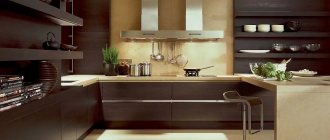
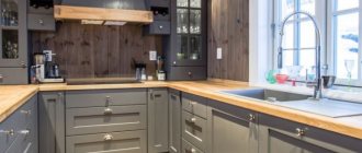
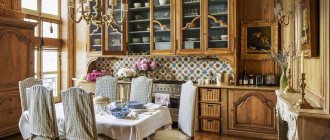
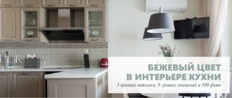
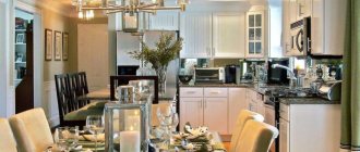
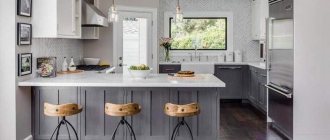
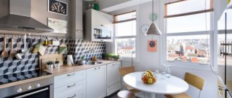
White and brown kitchen is considered traditional and can create a cozy, homely atmosphere. You can use a warm combination of colors for modern and traditional interiors. To get an interesting, unique design, experts use an original approach to the balance of shades and decorative design of the kitchen space.
About the character and properties of brown color
those around us have a huge impact on our well-being, mood, desires and even appetite. With color it is possible to form an idea of the beauty of objects, focus attention on certain details and hide what you would like to fade into the background.
Like all natural colors, brown has a beneficial effect on human physiology in general. Evoking associations with the soil of the earth, tree bark, such products as fresh bread, cinnamon, chocolate, vanilla, creme brulee, caramel, nuts, it will undoubtedly take its rightful place in the kitchen interior.
When creating an interior, remember that comfortable living and a healthy psychological climate for the family directly depend on the color design of the apartment.
The kitchen, as a place intended primarily for eating, is the subject of detailed study and clear planning of color schemes. After all, if someone’s goal is to lose weight, then they should not use shades that increase the desire to eat. Conversely, there are people who suffer from poor appetite and, on the contrary, need to stimulate it, creating favorable conditions for this through visual influence.
Brown color has a relaxing effect on the human nervous system, creating a cozy, calm atmosphere, and at the same time does not cause drowsiness; on the contrary, it increases mental and physical performance.
White top, chocolate bottom
The white and brown set in the budget version looks quite simple: white top, wooden or glossy chocolate bottom. In this combination, the question often arises of what the design of other surfaces in the room should be.
- Wallpaper is usually chosen in white , but part of the room is covered either with material with a pattern, or part of the finishing is done with wooden panels - in the color of the furniture. If the kitchen facades are glossy from MDF or laminated chipboard, then the wallpaper in a white palette will dilute the glossy stretch ceiling.
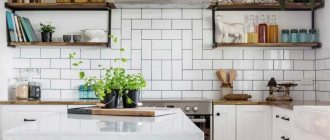
- The apron can merge with the upper or lower facades. That is, the white top is complemented by a snow-white working wall. This could be an apron with imitation brickwork. Today, a fairly common fashionable solution is glossy white brick made of ceramic tiles. Then the countertop should be the same color as the lower cabinets or floor.
The photo shows a white and brown kitchen with a brick apron.
- Bright projects look unusual, but interesting: the design of a white and brown kitchen can use a third shade for accents, which become the apron, decor and various details. Almost all colors are in harmony with this palette. Skinali in orange, yellow, lemon, and bright blue tones will look non-aggressive and cheerful. It could be just a photo print with a plot or a monochromatic solution.
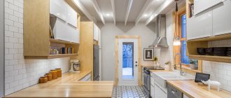
- Eco-friendly design allows the use of wooden surfaces where ceramic or glass materials are usually installed. This interior involves the use of exclusively natural wood materials, and not MDF. That is, here both the apron, the tabletop, and the dining furniture will be made of solid wood. Its natural color will become the main brown in combination with white. Accordingly, the lower façade of the furniture is similarly made from natural wood. In combination with this design, choose paper wallpaper or simple paint. In a spacious room, finishing with wooden panels, but not MDF, would be appropriate.
Green and brown kitchen
A green-brown kitchen is the best way to relieve fatigue and tension after a working day. A green-brown kitchen is an excellent choice for fans of the Provence style. These colors have a calming effect on the psyche, as they evoke pleasant images of a dense and shady summer forest.
Brown trunks and green tree crowns - what could be more harmonious than color combinations created by nature itself? It is not surprising that on the basis of this color combination you can build an ideal interior in the Provence style.
This popular French interior style is loved by many of our fellow citizens for its special style and charm. Southern motifs and evergreen fields inspired the founders of this style. In this context, olive color looks especially impressive with brown shades; it evokes images of hot summer and an olive grove.
White kitchen - practical or not?
According to quite a large number of people, designing a kitchen in white tones is a wrong choice, because such a room will need frequent and fairly thorough cleaning. Not everyone has time for this.
We will not deny that stains and stains are clearly visible against a white background, because this is true, and the surface will need to be wiped quite often.
But much at this point depends on the materials used. It is quite possible to choose them so that cleaning does not cause any problems or discomfort. For example, if you cover the walls with washable wallpaper or cover everything with decorative tiles.
The material from which the floor is made should be chosen especially carefully. It should have a high level of strength and not be afraid of moisture.
Of course, stylish white kitchens will require maintenance, but they will also guarantee you a great mood and inspiration that will make cleaning a joy!
Kitchen in beige and brown tones
This color tandem is widely popular in the interior. On the one hand, the practicality and nobility of brown, on the other, the light and comfort of a beige companion. These warm, congenial colors softly shade and complement each other perfectly.
A beige-brown kitchen is practical to use; in a room with this color design there will always be a good appetite, because the colors of caramel, chocolate and vanilla evoke corresponding associations. A brown-beige kitchen set will serve as an excellent basis for creating a chic interior in any style.
If you correctly place color accents and select suitable shapes for beige, a wide field opens up for experiments in such popular directions as Provence, shabby chic and country style. It all depends on what your specific color preferences are. Based on them, you can choose shades in a warmer or cooler range of beige.
Warm colors include beige-pink, beige-green, beige-orange, peach color and some other combinations. From year to year, experienced designers and colorists are inspired by the breadth of brown and beige tones.
In the cosmetics industry, the clothing industry and of course in interior design and other areas of fashion, different names for shades of beige and brown are used. The tendency to reveal brown and beige tones in the form of a coffee and chocolate theme has long gained mass popularity.
The names of various fashionable drinks, the main ingredient of which is coffee, instantly appeared in kitchen set catalogs: mocha, café au lait, latte, cocoa, ice cream, cappuccino and many others. This advertising gimmick works great. It is intended to encourage the interior designer, furniture maker and buyer to direct their attention to the appetizing names.
In what style should I make it?
The combination of white and brown is one of the most popular. In the modern manner of execution it takes on a new interpretation. In traditional interiors, brown is presented in wood and leather, looking solid and expensive. Modern minimalist interiors make the white and brown kitchen set visually easier to perceive; innovative durable materials are used for implementation.
Classic
The classic style is characterized by the use of natural materials: wood, marble, stone. Wall decoration and facades with a matte finish, pastel shades for walls. Stucco molding, patterned milling on furniture, and moldings are used.
Suitable for classics:
- Facades made of natural wood: mahogany, walnut, wenge. Dark, deep shades are combined with a white countertop made of natural stone.
- White kitchen with a stylish brown splashback and gold vintage fixtures. Carved fronts complemented by chrome handles.
- The walls are in light pastel colors or two-tone. You can use combined wallpaper with patterns and mosaic tiles.
- The floor is calm, brown, close to beige or with a pattern.
Country
Original and simple rustic style. Simple wooden furniture is used, facades with glass and bars are complemented with forged handles. Decorative items include a copper chandelier, dishes made of clay and wood, and baskets.
Suitable for a country style interior:
- Heavy kitchen set made of brown or light wood with an aesthetic light countertop.
- The floor is made of combined tiles or stone in beige and brown shades to match the color of the set.
- Open wooden shelves with dishes and jars made from natural materials.
- Vintage chandeliers and plumbing fixtures in copper color, artificially aged.
Minimalism
Characteristic are straight facades and furniture with smooth shapes. For surfaces, plain materials are used, both glossy and matte. Nothing unnecessary should remain on horizontal surfaces, the appliances are built-in, the decor is minimal or absent.
How to match the style:
- The colors of the floor, walls and furniture should have something in common. They can be white to match the kitchen facades, or the wall decoration is brown and the floor is light. Do not use variegated colors in decoration, only plain ones.
- Combine straight facades with imitation wood with white trim and countertops.
- Use several levels of lighting so that the snow-white color does not look too cold. Preference for warm light lamps.
- Choose leather furniture to match the color of brown facades. Use a glass or white table surface.
Briefly about taupe kitchen
Brown and gray colors create a harmonious, strict combination. A gray-brown kitchen is the choice of a practical person who prefers impeccable style and comfort. The duet of gray and brown sounds elegant and expensive if you choose the right tonal relationships. These colors are designed to balance each other.
The predominance of cool light gray over the warm brown shade of milk chocolate will give the interior space and at the same time a cozy, stress-relieving atmosphere.
It would be appropriate to add bright, contrasting accents in the form of, for example, posters or paintings. Of the textures in such an interior, gray stone and golden brown wood will work well together. For variety, you can add metal and glass elements.
Design and textures
The design may include furniture with matte, glossy facades, glass inserts, stained glass windows, as well as fittings in the form of gold-plated, bronze or copper handles.
Gloss surfaces in dark brown tones look very catchy and impressive. Plain facades are sometimes diluted with bright accents, such as drawings.
The photo shows a kitchen interior with a suite with light brown wood-look facades, decorated with patina.
The use of patina can add originality, charm and charm to the kitchen, adding an unusual and chic antique look to the surface.
The photo shows a gray-brown glossy set in a kitchen interior with brick walls.
Features of brown kitchen
The design of a brown kitchen should be thought through to the smallest detail. All interior elements, such as curtains and furniture upholstery, kitchen facades, the color of wallpaper and floor finishes, lighting and lighting fixtures, should seem to form some kind of unified ensemble in color and style. Kitchens in brown colors can be combined with elements in shades of chestnut, cognac, brick, yew, coffee, cinnamon, cocoa bean, brass or barley.
It’s easy to get lost in this variety and make the wrong choice, especially since for an excellent result of all finishing work, you should take into account the lighting factor, the size of the room, and the personal style preferences of the owner of the room. After all, if in a small six-meter kitchen we use the maximum of chestnut shades, the room will visually become smaller, and in addition to poor lighting, we will end up with a tiny kennel.
Based on these premises, the interior of a brown kitchen should be diluted with companion flowers. A good companion to brown is the color of caramel, as it is a transitional color to yellow.
Complement these two colors with a shade of azure or red pepper, and you will get a lively, multifaceted, but at the same time calm interior.
A kitchen in brown tones is perfectly complemented by orange shades. Brown in a duet with orange gives a wide range of design ideas. The orange-brown combination is reminiscent of a riot of autumn colors, bright, warm, special. The third color will be superfluous here, but it’s worth diversifying the interior picture with the presence of different shades. They go well with the brown-orange colors of peach and apricot, which can be diluted with milky shades.
Plain solutions for furniture and walls
As a rule, when choosing monochromatic solutions, you should understand that brown cannot be the background, so white is left for the walls.
But there are options here too:
- A plain white palette for decorating a kitchen can still seem quite boring, even when combined with brown furniture. Therefore, a harmonious solution would be to choose an accent wall, the wallpaper on which may contain a chocolate pattern in the style chosen for the entire interior. For example, a large openwork pattern is chosen for a classic design, polka dots and small flowers are chosen for a vintage design, an abstract pattern with cosmic notes is suitable for a high-tech and minimalist style.
- The majority of surfaces, including furniture, can be made in white. Then it is advisable to choose textured wallpaper and still choose a place for an accent wall. This is usually the dining area. The interior will then be decorated with a brown floor, perhaps partly with the same ceiling. An apron in the same colors also becomes a mandatory element. You can complement this combination with a dark dining set and matching tabletop. This solution is applicable in modern interiors, when kitchen furniture in the same color scheme with the walls will simply blend in, and attention goes only to the details.
The photo shows a white interior palette with a wooden apron and countertop.
Brown kitchen interior elements
If for some reason you were unable to purchase a brown kitchen set and in general completely different colors predominate in your kitchen, but you are a fan of this noble color, then you should not deny yourself a little.
There is nothing stopping you from adding brown elements to your interior, because the brown color itself is natural and discreet, and with the right combination it will only add contrast and charm to the room.
This could be, for example, brown wallpaper in the kitchen or a kitchen with a brown countertop. It should be remembered that wallpaper that is too dark visually makes the room smaller.
Choose lighter shades such as brown-beige. Chocolate-colored walls will contrast effectively with the light facades of the set.
Brown curtains for the kitchen will also help satisfy the taste preferences of a lover of chocolate shades. It will not be difficult to fit brown curtains into the interior, because they do not attract much attention, but will serve as a backdrop for brighter accent spots.
Advantages and disadvantages
Advantages of white and brown kitchen:
- White is an achromatic color; it goes well with all shades and does not interfere with adding bright details and decorative elements to the interior. Suitable for organizing small kitchens, visually increasing the space.
Small kitchen
- The most common are warm shades of brown; it creates a cozy, homely atmosphere. There are different tones, from light, sandy, to dark brown wenge.
Wenge is one of the darkest shades
- The combination does not strain visually, it helps you relax and collect your thoughts.
- Green plants look great in this kitchen.
Plants in the interior
Flaws:
- Dark brown color needs to be dosed, especially in small kitchens. It can visually reduce space. In large rooms this effect is not noticeable.
Dark is suitable for large kitchens
- White color on work surfaces can be easily soiled. It is necessary to carefully select materials for organizing the work area.
- It is required to maintain a balance of colors. The predominance of snow-white will feel like turning the kitchen into a hospital ward.
Color balance maintained
Photo of a brown kitchen
https://www.youtube.com/watch?v=Bsl5GP2ug5U
About the advantages of white kitchen design with photo examples
1) appliances and kitchen utensils look great with white, since both light and dark shades look harmonious with it;
Photo from source: jkuhnya.ru
Tabletop Cedar 7051/Q Umbria dark
2) the lighter the shade of white, the wider the space decorated with it will appear. Thus, the lightest shades of white will be the most useful and appropriate in mini spaces. They will make the kitchen elegant and spectacular.
Photo from source: elledecoration.ru Tabletop Cedar 0410/S Carrara marble
About choosing a headset shape
This choice is really very important because it directly affects how ergonomic the kitchen will be. During the planning process, furniture of various sizes and configurations is used.
Direct
Optimal for kitchens whose owners cannot complain about not having enough space. Everything, even equipment, fits easily here along one wall.
Photo from source: mebelzlataperm.ru Tabletop Cedar 1021/Q Black
Corner
Such sets are a particularly good choice for small kitchens or those in the interior of which a lot of additional furniture is used - sideboards, sofas, TV areas, etc.
Photo from source: pinterest.ru Tabletop Cedar 3521/S Reed
U-shaped + peninsula
The kitchen in white tones in the photo with a U-shaped set looks incredibly stylish! This is an ideal configuration of a furniture set for decorating kitchens and living rooms, because it provides an excellent opportunity to make a bar counter out of a tabletop in one corner, and simply leave a work surface in the other.
Photo from source: designwiki.ru
Tabletop Cedar 7052/FL* Wotan Oak
Trends for 2022
1. Expanded buffet area
Most often, the buffet area is built directly into the suite. But previously, buffets with glass doors were always located separately, next to the dining table. At this point, it's amazing how varied the buffets have become!
Photo from source: datacenterdays.com
2. Sliding doors between the living room and kitchen
Photo from source: market-dveri.ru
One of the most fashionable solutions today, which is used to separate the kitchen area from the living/dining area. Fits perfectly into any style. Can be transparent/multi-colored.
3. Mosaic panel on an accent apron
It can really be made from small glass particles, or it can be imitated using a high-quality print made on porcelain stoneware.
Photo from source: pinterest.ru
4. Sink in the same color as the countertop
This solution always looks more beautiful and neat compared to contrasting options. But there are exceptions: in a loft the contrast will look more appropriate.
Photo from source: lgrstroy.ru
Tabletop Cedar 4021/S Lucca
5. Chairs/armchairs of different colors in the dining area
It looks very unusual and non-standard. Here you can make the most interesting combinations: emerald + burgundy + blue + dark blue + pale yellow + pink, etc.
Photo from source: dizainexpert.ru Tabletop Cedar 811/1 Metallic
6. Kitchen top and apron made of natural granite
Looks great in white kitchens, the interior of which is made in a classic/neoclassical style. The stone itself can be gray-white-brown, gray-white-black, red-black-gray, beige-white-black and other colors.
Photo from source: euromoyka.ru Tabletop Cedar 9968/S Pebbles
7. Suspended ceilings with stained glass
An excellent alternative to standard solutions, if your budget allows.
Photo from source: design-homes.ru Tabletop Cedar 1110/S White
General color characteristics
To successfully plan the design of a brown kitchen, you should know the following features of this color:
Effect on humans: brown shades calm and evoke a feeling of security, warmth and comfort. This is due to the fact that from time immemorial they surrounded us everywhere: in the form of tree trunks, earth, clay, stones, fruits, plants, in the colors of animals, for example, cows and horses. A brown kitchen will seem not only cozy, but also solid, respectable, and noble. Brown also helps to focus and balance emotions, so this is a great option for those who have a habit of working at the dinner table.
Who is most suitable for: conservatives, intellectuals, business people and calm people.
Optical properties: dark, slightly saturated and warm color. Visually distances and weighs down furniture, curtains or walls, without increasing or decreasing their volume.
Which kitchens look best in: Spacious kitchens with large windows that face north, west or east.
The most suitable styles: classic, loft, country, rustic, African, English.
We correctly place accents
The main fear of those who have chosen a white kitchen design is that the room will seem uncomfortable and sterile, like a hospital ward. It will be quite difficult to stay in it for a long time. Mixtures of other shades and colors will be a real salvation. Which ones and where? We are considering options:
1) If you are interested in white kitchens in a modern style, consider such an interesting option as colored appliances. For example, a red refrigerator will become a bright accent.
Photo from source: shkafkupeprosto.ru Tabletop Cedar 3230/S Light Sonoma Oak
2) Apron - looks great if the set is 100% white;
Photo from source: accuisines.com Tabletop Cedar 111/1 White
An apron made of bright ceramics also looks great.
Photo from source: stroitelux.ru Tabletop Cedar 2074/FL Oak chestnut
Glass apron - suitable for kitchens in a modern style. A white glossy kitchen will make a particularly successful duo for them.
Photo from source: kaspi.kz Tabletop Cedar 5110/1 Andromeda white
The apron and floor are made of porcelain tiles that imitate marble - if you use the same tiles to finish the floors in the bathroom, toilet, corridor, loggia, hallway, the design will be uniform. It looks as harmonious as possible.
Photo from source: duvils.ru
Loft-style “hog” tiles - regardless of color - light/pastel/bright - such bricks always look great on a backsplash. Especially if the kitchen is in a loft or scandi style.
Photo from source: xplit.ru Tabletop Cedar 111/1 White
An accent apron in a bright color will add liveliness to the interior and create the right mood and theme. For example, if you would like to maintain a spring mood, make the apron yellow, and if you want to feel eternal summer, use blue shades, like the sky or sea.
Photo from source: kuhnov.ru
Tabletop Cedar 4091/Q Damask steel
3) Curtains/curtains in window openings will add individuality to the interior;
Photo from source: ivd.ru
Tabletop Cedar 4040/S Antares
4) A tablecloth, colorful chairs, lamps can also successfully dilute an all-white interior.
Photo from source: mykaleidoscope.ru
Tabletop Cedar 5016/Pt Black Detroit
5) The furniture in the dining area is black;
Photo from source: ninamayainteriors.com
6) Black floor;
Photo from source: psistema.ru
A floor surface with geometric motifs - this can be ceramic parquet, herringbone parquet, porcelain tiles with decor/metal inserts, as well as porcelain tiles imitating marble with inserts made from various rocks. In any case, it will be better if a professional develops the design.
Ceramic tile finishes look great because they are the easiest to clean off dirt. “Chess” is one of the most successful patterns.
Photo from source: design-homes.ru
Countertop Cedar 713/1 Black granite
Wood boards of various shades and white laminate will also look very nice.
Photo from source: birzhaplus.ru Tabletop Cedar 9022/S Whitened Oak
7) Colored accessories;
Photo from source: happymodern.ru Tabletop Cedar 4032/S Porphyry
Don't want to make a large bright spot? Then use small color accents. For example, dishes, small household appliances, etc.
Photo from source: yastroyu.ru
Confused by an empty wall? Decorate it with a pop art painting. This is a bright style, so the picture will not require any additions.
Photo from source: mykaleidoscope.ru
 Lavender bunches, clay pots, bunches of onions, copper dishes are an excellent option for a kitchen in Provence, shabby chic or country style.
Photo from source: salon.ru Tabletop Cedar 709/1 Taurus andromeda
9) Vase with a flower bouquet;
10) Ripe fruits on a dish standing on the table;
11) Chandeliers, fittings and other accessories in a golden hue - perfectly accentuate the beauty of the set;
Photo from source: otvetus.com Tabletop Cedar 2347/soft Blanco Marble
13) Lamps made of chromed metal, bronze;
Photo from source: dg-home.ru
14) Solid wood elements - will give the interior a natural feel;
Photo na-dache.pro
Table top Cedar 690/P Indian wood
15) Plants in colored pots;
Photo from source: ogogo.ru
16) Ivory, cream, pearl elements will make the room more elegant;
Photo from source: mebelvs.ru
Tabletop Cedar 3043/S Semolina gray
17) Art Deco furniture - will add maximum sophistication and chic to your kitchen. The presence of such objects in the space immediately makes the interior status higher. It can be used for both neoclassical and laconic design. In any case, it will look very good!
Photo from source: italianskaia-mebel.ru Tabletop Cedar 1021/Q Black
18) Decorating the walls with moldings - will look great in the dining area if you have a kitchen-dining room. This will give the space a European style and make it more aristocratic.
Photo from source: odstroy.ru Tabletop Cedar 6651/Qr Greek Travertine
19) False columns made in a classical style are typical for baroque, classical interiors. They can be in white or any other light shade, as well as with or without gold patination.
Photo from source: almode.ru
