Orange color is a symbol of positivity, joy and good mood. It gives energy and vigor, puts you in the right mood. The shades are widely used in various styles, but the main thing is to maintain a balance and choose a use for it so that the combination of orange in the interior looks harmonious and original.
Color Features
Orange is a warm, rich color that represents a transition from yellow to red, therefore combining their characteristics. Evokes positive associations: fruits, south, autumn leaves, spices. And also fire, sun, optimism, joy, vitality. It is also associated with spiritual growth - it is not for nothing that the robes of Buddhist monks are of this particular color.
It stimulates appetite, stimulates brain function and generally has a stimulating effect on the psyche, so you need to select color combinations with orange in the interior so that it is always balanced with neutral, calm shades. You should use it with caution in the bedroom and in the children's room: in large quantities it tires and even causes anxiety.
It is also important to note that it is not suitable for all styles. Thus, red is rarely used in classic, rococo, empire and high-tech. But it feels great in modern and minimalist, country and eco interiors. Often used as an accent in the Scandinavian direction.
Instagram @brooklinteriors
Instagram @enjoy_home
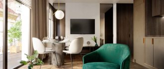
Instagram @pierre.yovanovitch
Instagram @emi.home
Instagram @emi.home
Additional details
With the right combination, orange will look advantageous in the interior. However, it is important not only to choose the right shades, but also to observe the nuances in detail. For example, take into account color features when working with lighting. Orange does not absorb sunlight, so it will look good even in small rooms with small windows. If, as part of a project, it is necessary to create an emphasis on a separate zone, in addition to the orange tint, it is worth adding an additional artificial light source to it.
Orange looks great in textiles of different densities. This color is also suitable for curtains. Such a solution will add warmth and comfort to the space.
In addition to textiles, figurines, paintings and other decorative interior items can also serve as separate orange accents. The main thing is to maintain a balance and not overuse bright additions.
Shades
The activity and perception of orange depends on which direction the undertone shifts: towards yellow or towards red. The closer to red, the richer and more aggressive the color is. Proximity to yellow gives a feeling of comfort and sunshine, creating the illusion of an increase in temperature in the room. But citrus does not have to be bright and concentrated - there are almost pastel variations that do not have an active effect on the psyche. There are many shades that deserve attention.
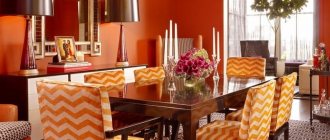
- Citrus fruits - orange, tangerine, grapefruit. These are the most luscious tones, only the names of which exude vivacity. In the overall palette, they should take the place of a color accent that will balance neutral colors.
- Peach, apricot - in contrast to the previous bright fruits, these tones, diluted with white and beige, tend to pastel colors. They can be used in any room, not only in decoration, but also in furniture or decoration. They refresh the atmosphere, but do not put pressure on the psyche, so they are often used in the bedroom and nursery.
- Amber is a darker and deeper tone associated with the warmth of autumn. It may be lighter with a yellow tint or turn brown. Pairs well with wooden elements and natural fabrics. It can also be used for decoration, but it is better to choose a diluted version. Or use it not on all surfaces, but to highlight an accent wall.
- Terracotta is the darkest of the popular shades, as close as possible to red. Makes the space elegant and cozy, goes well with any natural textures, be it stone or wood. Can be used in any room. Whether to use terracotta as a base or as an accent depends on the richness of the tone.
Instagram @justinablakeney
Instagram @solovyeva_natalia_designer
Instagram @linedesign_studio
Instagram @zhilin_brothers
Instagram @lavkadesign
Instagram @olegkurgaev_design
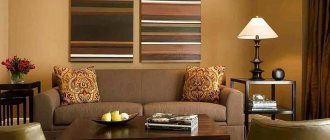
Kitchen
Juicy color promotes digestion and improves appetite. A laminated kitchen worktop in rust, copper, persimmon or saffron tones is sure to freshen up the look of a simple kitchen.
Country style is characterized by a combination of orange and natural wood. The salmon shade of orange and dark wood are characteristic of a stylish and respectable dining room.
Fresh orange adds an elegant, modern style to the kitchen. Bright and glossy surfaces will decorate even a very compact room without natural light.
A luxurious dining room will result if orange interacts with yellow and red colors. Yellow portrays a fun, playful and optimistic atmosphere, while red adds drama and intensity. Orange color encourages social interaction and tolerance of other people, and the kitchen is where the whole family gathers.
What to combine orange with
Let's consider which colors go best with orange in the interior.
Grey
Gray is friends with any variations of red: from dark ocher to juicy tangerine. Achromat in this case will act as the basis of the palette, and orange can be used either as a bright accent or as an additional color.
Instagram @masterskaya_atmosfera
Instagram @pavelalekseevdesign
Instagram @interiors_dd
- Colors in the interior
Gray in the interior: the best color combinations and 50 examples with photos
Blue
An effective and win-win combination. The blue of the sea in nature itself coexists with warm sand or sun-warmed earth, so this combination always works. If you want to use these two colors as the main ones, then it is better to choose deeper and muted variations: indigo, gray-blue, ocher, amber, terracotta, etc.
Instagram @enjoy_home
Instagram @pavelalekseevdesign
Instagram @a_gorskaya
Instagram @zhilin_brothers
Instagram @olegkurgaev_design
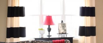
Black and white
Without further ado, both achromats can be successfully combined with anything. Red will add a touch of warmth and energy to a restrained monochrome palette and will immediately enliven the interior. Or black and white can balance a palette created using active paint.
Instagram @linedesign_studio
Instagram @ermolenko.design
Instagram @a_gorskaya
Instagram @pavelalekseevdesign
Pastel shades
Citrus can be combined with any pastel colors, but in this case it is better that the shade is also muted, diluted with white or beige. By reducing the brightness, you will get a harmonious and equal in intensity combination of colors in the interior with orange.
Instagram @olegkurgaev_design
Instagram @interiors_dd
Instagram @planirovka_home
Curtains
Curtains should complement the orange wallpaper in the interior. When choosing them, you can follow the spectrum technique presented earlier. Opting for black, white or gray curtains or a curtain fabric that combines these colors is another great choice. But consider the texture of the fabric! Glossy orange walls require the use of matte fabrics for curtains. This means that it would be ideal to avoid silk and satin fabrics. Cotton, linen, embossed, lace and sheer fabrics are some of the options to prefer. Choose white curtains with subtle orange accents in the design. These can be either floral or geometric motifs. They will harmoniously complement the orange wall. This option is especially good for children.
Purple upholstered furniture in the interior
A purple sofa is not bad in monochrome against the background of lilac, lavender, lilac or bluish-pink walls. This palette of purple tones can be diluted with beige, silver or delicate green.
As a rich accent, a purple sofa is most suitable for a neutral gray interior. However, even in a beige interior, purple upholstered furniture looks royal.
Purple sofa in the interior
In a combined plan, a purple sofa and armchairs should be combined with khaki, golden yellow and soft green.
General tips for choosing a sofa
Before choosing the color of the sofa in the interior, it is worth considering the basic rules:
- Ideally, the design of the room should be thought out before the renovation begins, so that the desired color combinations are clear in advance. If you have the opportunity, it is better to contact a professional designer during the planning stage.
- Choose the shade of the upholstery consciously and thoughtfully, because the colors we find ourselves among affect our state. If you want to buy a sofa with bright upholstery, you should think about whether this is a momentary desire? Will you get tired of the color after a year or a few?
- Focus not on trends and fashionable solutions, but on your preferences. If, for example, gray sofas are popular in all catalogs at some point, this does not mean that this will suit you too.
- Decide what you expect from a sofa. Will you unfold it every day and use it as a bed? Is the capacity of the boxes and their presence in general important? There are many sofa folding mechanisms on the market, from which you can choose a model that suits your request.
- Pay attention to the upholstery material: will stains be easy to remove? The question is especially relevant if you are looking for kitchen furniture or if there are small children in the family.
How to choose the right textures?
If you decide to decorate your home or one of its rooms in blue and orange tones, then you need to know that without using the appropriate textures, your design will not be complete. The thing is that different types of textures, this mainly concerns textiles, can have different effects on shades.
So, for example, if you choose blue curtains made of silk or velvet, they may look out of place in your design. All this is because the glossy texture does not absorb light, but the pile, on the contrary, gives it away. But if you are planning to opt for softer, muted shades, then you are better off choosing textures with pile and matte.
Don’t be afraid of bright and contrasting combinations; as a result, the interior with their use will charm and delight, all this can be seen in the photos, which were selected in order to convince that the combination of blue and orange in interior design is actually acceptable and great in the end. Only experiments make it possible to decide whether you like such harmony or not.
Yellow upholstered furniture in the interior
Yellow upholstered furniture is great in the fourth color plan (a colored sofa in a neutral interior), if the walls have one of the shades of gray. Yellow furniture against the background of gray walls burns and glows - like the sun in the middle of lead clouds or like an electric lantern on a dark street. Effective, impressive and cheerful.
If the "Combined" color plan is selected, green, blue and purple surfaces will be suitable backgrounds for the yellow sofa chairs.