The color scheme used by designers includes several shades, the use of which can transform and decorate any interior. A striking example of this is the color pink. Many people, influenced by various stereotypes, treat it with caution. However, modern design solutions allow you to look at it differently and begin to decorate various rooms.
Bright pink color in the interior
Pink windows in the interior
Fashionable shades of pink in the interior 2022
According to designers, pink color in the interior is one of the most fashionable in 2022. It’s no wonder that Design Week in Milan was marked by this color. A large number of fresh shades have appeared in the pink range, which not only create an atmosphere of peace, but also refresh the space.
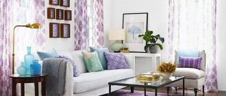
Pink and green in the living room
Pink sofa in the interior
Pink and lilac in the bathroom
Dusty pink
A dusty pink tint is gradually replacing green and blue colors from interiors. It can add a touch of romance, femininity and tenderness to any room. It is used both for finishing large parts and for adding small touches. The shade can be used in any room; the most advantageous option is its combination with gray.
Pink color in the bathroom
Beautiful combination of pink with other colors in the living room
Pink and blue in the living room
Pearl pink or ash pink
This shade is an alternative to beige. It can be used to decorate various interiors due to its versatility. The color gives the room a feeling of lightness and can be used in any room.
Pink panels in the interior
Pink chest of drawers in the interior
Pink color in the living room
Powdery pink tone
A delicate powdery shade takes pride of place in interior design. With its help, you can decorate a room in any style: from classic to ultra-modern. This tone is warm and lively and looks very advantageous in well-lit rooms. It is also often used to decorate large areas (for example, ceilings, walls, floors).
Pink marble in the interior
Pale pink interior
Pink leather furniture in the interior
Pink champagne
This is a light, light and unobtrusive shade of pink. Its use does not cause fear of overloading the intended design with color. It can be used in any style, but it looks most successful in classically decorated rooms.
Pink furniture in the interior
Pink elements in the office
Pink and brown in the kitchen
Dirty pink
The shade combines pink and gray colors. It is calm and is most often used in design as an additional tone to the main one. Pairs perfectly with white or deep gray.
Color Features
The main quality of this delicate color is its ability to calm; even in a state of strong excitement, it will help you relax and reduce stress.
The color range is multifaceted, from delicate white pastels to dark lilac and purple-pink. It is not found so often in renovations and decorations, but it looks impressive. The best combination can be considered with white color, it makes the pink tone softer and brightens the room. The photo shows the dining area. The walls are decorated with photo wallpaper depicting a blooming garden.
Combination of pink with other colors in the interior
A fashionable trend in style is the combination of various colors with shades of pink. There are many successful combinations; with their help you can decorate any room and satisfy the most sophisticated taste. It is important to know what color goes with pink in the interior.
Pink ottomans
Pink and gray in the living room
Pink carpet in the interior
Peach
The combination of peach and pink colors is one of the fashionable trends in modern colorism. This is a warm color, and its shades against the background of peach will appear as a shadow, creating volume.
They go well together when the intensity of the pink does not exceed the peach. It is desirable that the design of the room is clear, contrasting and does not allow blur. Colors should shade and emphasize each other.
Pink dining room accessories
Pink textiles in the interior
Cream
The combination of pink and cream shades gives a delicate pastel combination. The interior evokes a feeling of cleanliness and freshness. This combination is best suited for decorating a nursery or bedroom.
Grey
Gray color goes well with almost any shade. The gray-pink room design looks stylish and sophisticated. In order to give character to the interior, it is necessary to change the color ratio. The room will be gentle and sensual if you increase the presence of pink. By focusing on something else (gray), you can give the room asceticism and seriousness.
Any of the color combinations will look advantageous, as gray becomes less formal and restrained, and pink becomes brighter and more expressive.
Green
Pink and green colors allow you to create an atmosphere of freshness of spring or the harmony of summer in a room, they are conducive to creating a cheerful and cheerful mood, and carry a positive charge of energy. The green color in this combination reduces the frivolity of pink, making the interior bright, stylish and extraordinary. Green-pink interior is a successful find of modern designers.
Beautiful combination of pink and lilac in the interior
Pink and yellow in the living room
Pink kitchen
Yellow
The combination of pink and yellow is an unusual, attractive, sometimes controversial, but always cheerful solution. Both colors evoke positive emotions, and the combination of even the lightest and palest shades gives a positive picture. Can be used to decorate the interior of a nursery, bedroom, bathroom, living room or kitchen.
Interior with different shades of pink
Pink brick tile
Pink children's room in Provence style
Red
Pink and red are an ambiguous combination. Both colors are self-sufficient; their abundance can lead to rapid fatigue. A common combination is red with hot pink in an exotic oriental style. This option should be used with caution, since most people are accustomed to more moderate combinations of color shades.
Wallpaper with pink flowers in the interior
Pink and cream in the bedroom
Pink sofa upholstery
Blue
Blue and pink colors are considered classic, but their combination is not a very common option in the design of rooms. There is no dominant shade, so the optimal effect is achieved by a combination with equal saturation (that is, one color supports the other).
Pink tiles in the interior
Pink curtains in the interior
Pink pillows in the interior
White and black
White and pink colors enhance the brightness of the shades and give them airiness. It is better to use not pure white, but its shades - ivory, ivory, baked milk.
You should approach the combination of black and pink wisely, since the interior can turn out vulgar and vulgar.
Which ones should you be careful with?
Pink with blue
These are recognized “antipodes”, so you need to be extremely careful with their combination. An exception is the design of a children's room for children of different sexes. Only there it is really justified and looks successful.
Photo: Instagram love_scandi_kids
Photo: Instagram love_scandi_kids
Photo: Instagram love_scandi_kids
Pink with black
A bold mix, but not everyone can make interiors in such colors look vulgar. You can and should add wood and white tones.
Photo: Instagram scandi_with_love
Pink with orange
This combination is common in the oriental style and, perhaps, is justified only in this case. Today, oriental accents are very relevant, but it is important not to overdo it - add them in doses in textiles and patterns. For example, the option in the photo is rather an anti-standard.
Photo: Instagram formulakomforta40
Styles known for pink tones in the interior
Rooms decorated in one color are boring and uninteresting. It is considered more correct to combine different shades in the following options:
- one dominant color and several of its tonalities are selected;
- Contrasting colors are used to create the interior.
Each style has its own requirements for color schemes. The use of pink and its shades is possible when decorating the interior in every style.
Pink wallpaper in the interior
Light pink interior
Pink decor in the interior
Art Nouveau style
Cold and noble colors are typical here, against which bright accent spots can be placed. The following options can be used:
- painting the wall in cool shades of pink, using matching colors to decorate the remaining elements;
- furnishings with pink furniture (you can maintain the shade in lampshades, curtains and other accessories);
- ultra pink accent spot on a calm background;
- the use of pink in textiles and accessories (pillows, tablecloths, curtains, decorative ornaments);
- unobtrusive prints on wallpaper.
If you want to decorate the room in exclusively pink tones, then you should use pastel shades, combining them with darker ones.
Pink in Provence and shabby chic style
Provence and shabby chic are two very similar styles. They are characterized by romance, space, light and the presence of shabby elements. Pink color applies:
- painting the walls or covering them with plain wallpaper (possibly with a small pattern of flowers);
- repeating the color of the walls in individual decorative elements;
- upholstery of soft furniture parts;
- textile elements - capes, bedspreads, tablecloths, curtains;
- repeating floral motifs in interior details.
You can decorate any room in this style. The design conveys calm and tranquility.
Pink interior in Art Nouveau style
Pink painted walls in the interior
Scandinavian style and pink color
For many, Scandinavian style is all about clean lines and bright spaces. However, often in this interior you can find walls decorated in bright colors. The most widespread shade is “rose quartz”. It is soft and delicate, widely used in the design of children's rooms and bedrooms. Also, muted tones of pink are selected for rooms. Their combination with gold makes the room warm and cozy, and with olive it makes the room refined and conservative. Elements of white, gray and orange colors go well with pink.
Pink children's
Pink and red in the bedroom
Pink armchair in the interior
Techno style
Interiors decorated in techno style are dominated by cool colors and dark shades. Bright pink elements can be used to separate functional areas in the house. Variegated fabrics with intense patterns and abstract shapes are also widely used.
Classic and neoclassical
The classics are characterized by light and gilded surfaces; they are harmoniously combined with salmon and soft peach shades. The interior in the neoclassical style is characterized by muted tones, so pale pink shades are often used.
Pink and black in the bedroom
Pink and wenge color in the interior
Pop art style
Traditionally, bright colors are used to decorate the interior in the pop art style. Often designers give preference to all sorts of shades of pink. At the same time, it is recommended to use no more than three different colors and make the floor, walls, and ceiling without an abundance of flower combinations. At the same time, you need to focus on furniture, bedspreads and decorative elements.
Pink color in the kitchen
Pink and white in the bathroom
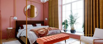
Pink color in the bedroom
Finishing
Walls
Wall decoration in several colors remains relevant, thereby also adjusting the space.
- For a classic interior, a combination of pink and beige is suitable.
- For a modern, Scandinavian and minimalist interior, combinations of pink with gray and white, as well as photo wallpapers, for example with images of roses, are suitable.
- In Provence design, pink brick walls will decorate the interior of a living room or hallway; pale pink walls or pink-lilac wallpaper will also look harmonious.
The photo shows a compact bedroom in a modern style. The design uses a combination of white, pink and yellow.
Floor
Carpet will decorate and eliminate unnecessary noise from a children's room, living room or bedroom. Floor slabs with imitation marble deserve special attention; they look very impressive even in small rooms. Suitable for corridor, living room and kitchen.
Ceiling
A suspended ceiling made of plasterboard allows you to recreate a multi-tiered structure of an unusual shape, and thanks to the tension fabric, you get a perfectly flat surface, which can also visually enlarge the space due to the glossy material. An interesting idea would be to decorate with wallpaper with photo printing, for example, a pink sky with snow-white clouds.
The photo shows a bright children's room, the ceiling of which is finished in a dark pink shade. The interior is complemented by other details of similar shades.
Doors
Doors of a non-standard color will become an elegant detail of the interior. They can overlap with other objects, such as light pink window frames.
A few rules for using pink
The use of pink gives designers almost endless possibilities in developing various interiors. Having so many shades, the color can be used in any style. To achieve the desired effect, you need to remember some rules:
- Using color, you can visually adjust the size and volume of the room and the objects in it. For example, if you paint one wall light pink, the room will seem more spacious;
- The right color combination. Brown, gray, yellow, turquoise and green colors go well with pink. Bright shades are best used to highlight individual interior details, combining them with white, beige and pale lilac.
In addition, there are important aspects of using color in the interior.
Pink bedroom
Pink bathroom
Rules for combining warm and cold tones
All colors have their own thermal shade. Pink (depending on the shade) can be either warm or cool. It is important to be able to combine these tones in interior design. The following techniques are used:
- balancing a warm shade with a cold one;
- strengthening one of the colors against the background of another;
- Reducing saturation by applying neutral colors to large areas and using them as a background for bright elements.
The best use of a variety of tones is one version of pink with many elements of varying saturation (from light to dark shades).
The influence of natural and natural lighting
When decorating any interior, you should pay attention to lighting. The fact is that daylight and artificial light have different effects on shades of pink. It can distort the intended design and make it look unsightly. The pink interior looks great in good natural light.
Pink paintings and other interior decor
Pink mosaic in the bathroom interior
Pink chair in the interior
Moderation and color unity
Moderation in the choice of colors lies in the limited number of shades used in the design of the room. At the same time, it is recommended to use no more than 3 colors and 5 shades that are combined with each other.
Role in design
Psychologists say that pink is a symbol of friendliness, maturity, and femininity, while another point of view says that this tone is inherent in frivolity and frivolity.
In the sleeping and guest areas, shades of light pink speak of tenderness and femininity, while rich shades are inherent in passion, selflessness, and kindness.
From a medical point of view, such an interior has a beneficial effect on a person, it lifts the mood and gives new strength.
Using pink in different rooms
Pink color is included in the interior design of all rooms, regardless of their functional purpose. We offer some tips for decorating various rooms.
Pink for children's
One of the most popular colors for decorating a nursery (especially for girls) is pink. Delicate shades relieve stress, calm the nervous system and lift your spirits. If there is not enough daylight in the room, then you should choose warm shades. Otherwise, it is recommended to use cool tones (raspberry, lavender, fuchsia and magenta). The richer the pink color, the more pronounced its ability to visually enlarge surfaces and objects.
In small children's rooms it is better to use only light shades. If the room is decorated “for growth”, then it is better to take some neutral color as the basis of the interior, and leave pink in the accents (curtains, linen, carpet, chair).
Pink for the bedroom
When decorating a bedroom in pink tones, you should avoid using only one color; it is better to add contrast between the furniture and decoration. White, brown and golden furnishings are suitable for this. It is better to choose bright and muted pastel colors for the room. Using color you can also highlight the functional area.
Pink in the living room
In the interior of the living room, stylists recommend using various shades of pink:
- mauve;
- pink caramel;
- old pink;
- shade of pink powder;
- salmon;
- dusty rose;
- pink-peach;
- light pink;
- smoky pink;
- pink-orange;
- pink mother of pearl.
Pink color can be used as a background or as a complement to another tone. Pairs well with wood tones, white and black. It also looks harmonious with raspberry, purple, green, coffee and gray colors.
Pink kitchen
Pink color is compatible with gray, green, yellow and black colors when decorating a kitchen. The kitchen interior in white and pink looks very stylish. Some rules to remember:
- You should not use more than two colors;
- if the room is small, then it can be decorated in one color, using different shades;
- if the furniture is bright, then the walls are made in neutral colors (and vice versa).
Before decorating your kitchen, you need to keep these tips in mind.
Pink for the bathroom
Decorating the bathroom interior in pink is an unusual idea. It can be suitable not only for young girls, but also for men (if the color combination is well chosen). For the bathroom, pink is attractive because it can visually enlarge the room. The most commonly used combinations with other colors are:
- white or cream (for a delicate combination);
- gray (will take on a noble and elegant look);
- hot pink, black and burgundy (looks brutal).
Unsuccessful solutions are combinations of pink with blue and orange.
Bathroom ideas
A good option for a bathroom is pink walls, white fixtures and dark wood furniture. Cabinets and cabinets stand out noticeably against the background of light walls, making the interior look bright and contrasting.
Photo:
If you can’t do without white finishing in the bathroom, you can complement it with black. This combination is contrasting in itself, but in a company with rich pink it will show itself in all its brightness. You will have the opportunity to place accents by highlighting functional areas with colorful decoration.
Photo:
In a bathroom with pink furniture, you can add rich orange elements. But, as with any colorful design, do not forget to leave light areas so that the interior does not turn into a continuous bright spot. So it’s better to add orange details here in the form of small decor: rugs or shower curtains. The combination of shades will still be noticeable, but you will avoid oversaturation.
Photo:
Original room decor elements in pink
An original design is impossible without the use of individual decorative items that complement the interior. They are selected according to the color corresponding to the design idea.
Pink textile
One of the main elements of textile decor is curtains. The main thing when choosing a product is to choose the right color combination. For example, light pink curtains combine well with trim made in light colors. Often, pink curtains are used in combination with white, peach and green.
Pink upholstery for furniture
When choosing upholstery for furniture, you should proceed from a pre-planned color scheme:
- Single color. Furniture and walls are in the same color scheme; the upholstery should differ only in shade.
- Neutral. Light walls, upholstery in pastel shades of pink;
- Neutral walls + bright accent. The upholstery can be in bright colors (for example, fuchsia).
- Combined. Involves bright walls and matching bright upholstery.
It is furniture upholstery that adds a unique note to interior design.
Vases, paintings and other decorative items in pink
Decorative elements are invisible at first glance, but give the interior a complete look. These include various vases, flowers, dishes, paintings and much more. Decorated attributes, made in various shades of pink, will serve as a good addition to the interior if they are combined in color.
Trendy pink doors
Bright pink doors are an element of the interior that can transform and revitalize it. The most popular shade among designers is coral. It goes well with beige, peach, milk, cream, chocolate, light blue and even black colors.
Pink carpet in the interior
The pink carpet is the last element that completes the interior composition. Typically, the coating has a light and attractive design, patterns and pictures, since manufacturers mainly focus on the female audience. When choosing a rug shade, you should consider how it will match with the rest of your room.
Thus, pink is the favorite color of designers and stylists this season. The use of many shades allows you to create unique and original interiors of any room.
Furniture
Sofa
The sofa is the main piece of furniture in the living room; it can fit succinctly into the overall interior or become an object of attention due to its color and shape.
- A light palette, such as a gray-pink combination, will complement a modern, light room design.
- Rich shades, such as fuchsia, will look good in a minimalist design as a bright accent.
The photo shows a living room in neoclassical style. The upholstery of the upholstered furniture is made of dusty pink velvet.
Bed
A light pink wooden or wrought iron bed will add a touch of romance and tenderness to the interior. A good option for a bedroom in classic, shabby chic and Provence style. A bright tone will look impressive on velvet or leather upholstery with the addition of decorative elements.
Closet
An antique wooden cabinet can turn into a real work of art if it is restored and painted in a beautiful and unusual color. In addition, sliding doors for a wardrobe can have almost any shade or mirrors with patterns.
Armchairs and chairs
Armchairs and stools, just like other pieces of furniture, can stand out in the overall picture or support the overall style. The duo looks interesting with a sofa and armchairs of excellent color.
The photo shows a modern children's room for a girl. The wall decoration is made using photo wallpaper with a three-dimensional image of peonies.
Textile
Curtains
The textile part creates an atmosphere of comfort in the home. Tulle in a soft pink shade will look harmonious both on its own and in combination with thick curtains, for example dirty pink or in a gray-pink combination. For a balcony or office, you can use blinds, and in the kitchen and nursery, Roman blinds or pink-peach curtains will look good.
The photo shows a bedroom in pink. One of the walls is decorated with photo wallpaper depicting large lilies.
Carpet
A plain, long-pile carpet will decorate a design in a modern, Scandinavian and minimalist style, and will also fit well into the interior of a children's room. For the classic direction, Provence style, shabby chic, a carpet with short pile and an unusual pattern is more suitable.
Pillows
Cute soft details will decorate the sofa and armchairs in the living room and children's room, as well as the bed in the bedroom. Different shades, shapes and prints in the same theme will combine well and make the interior brighter.
Blankets and bedspreads
A blanket or blanket will complement the overall picture. Shades may overlap with other interior items and decor.
Color psychology of pink and features of its perception
“If a solution is chosen for the bedroom interior in a pastel pink color, as if faded, close to peach, then men will also be happy to be in this room, enjoying the comfort of the atmosphere”
The first and main association that is inextricably linked with the pink shade is femininity. He is subconsciously perceived as girlish, doll-like, toy-like, cute, so it is not at all surprising that men are frankly disgusted by him. Naturally, they will resist the appearance of pink not only in the men's bedroom, but also in the matrimonial one. But in the kitchen or living room, men may perceive it more calmly, especially if there is little pink and its brightness is muted or diluted with other colors.
dark pink furniture dilutes the light tone of the room
Muted pink is less annoying because it is more gentle and affectionate. It seems to envelop you in spiritual warmth, soothe you and “stroke” you. If a solution is chosen for the bedroom interior in a pastel pink color, as if faded, close to peach, then men will also be happy to be in this room, enjoying the comfort of the atmosphere.
Quite bright, but not provocatively flashy pink creates a feeling of carefreeness. This is the color of childhood. Women are not able to resist this influence. In such a pink room, they feel like just girls, with their inherent frivolity, carelessness, and openness to the world. From the point of view of experts, this is just great. The pink interior will become a real oasis of psychological comfort for women who are under constant emotional stress. In the “cocoon” of pink walls, they will be able to fully relax and forget about the hardships of everyday life and the burden of everyday worries.
a wonderful combination of gilded decor with a rich pink interior
You need to get a charge of vivacity, be filled with energy and a thirst for life - make the interior in a rich color, close to raspberry, fuchsia, purple. This will really stimulate, but keep in mind that these tones will increase blood pressure, increase breathing and make the heart beat faster, so they should not appear in the bedrooms and offices of people with heart problems and hypertension. But for those who are prone to depression and suffer from hypotension, such colors in the decor will only benefit.
Pink shades are generally pleasing to the eye. They are light and light, capable of extinguishing aggression and preventing manifestations of ill will. Knowing about this quality, American psychologists recommended making the interior of prison cells exclusively in pink, insisting that this is the easiest way to relieve prisoners from attacks of aggression and dissatisfaction.
soft pale pink tone of the walls with bright furniture elements
Cookies and cakes will sell better if they are packaged in pink. Marketers are well aware of this and use this effect to its fullest extent. The secret is that pink makes you want to taste something sweet. These tones are associated with candies, berries, creams, and confiture. This gastronomic streak has made pink paints popular in kitchen interiors. A discreet pink dining room helps improve appetite. On the one hand, this is simply great, but on the other, if there is a sweet tooth in the house who cannot lose weight, it is better to refuse such a background.
Photo gallery
The gallery presents colorful photos of finished interiors in pink tones. For each style, there are several options that will inspire you to create new and no less interesting combinations.
Adviсe
- Pink should be chosen individually according to taste. It must be remembered that the purpose of the room affects the use of the color palette. So the children's room uses light shades and the younger the child, the lighter the shade.
- One color should not be everywhere; it should be diluted with shades, playing on the contrast of colors. But using a large number of shades will also ruin the look. You need to use 2-3 types maximum.
- A rich color will increase the space, but in a narrow room it is still preferable to use lighter shades.
When creating an interior using pink, you can plunge into childhood inspired by its shades.
At a time when the whole world was beautiful and seen through rose-colored glasses. Premises made in a similar style will add romance and help you distance yourself from pressing problems, taking your consciousness into the world of dreams and daydreams. This is an excellent choice for light, creative people.
Decor and accessories
The final stage in creating a room design. Despite the delicate nature of pink, decorative elements and accessories can have a strict form and are suitable for decorating a stylish city apartment. Decor can combine different materials and only become more interesting from this.
Photo of pink bedroom
Contrary to its banal flirtatiousness, the decor and design of the pink bedroom is presented under the guise of not at all boring products:
- Overlay panels - installed immediately above the floor, giving the walls a basement style;
- Molding - overlay strips that serve as finishing contours;
- White blinds are an ergonomic and sophisticated alternative to curtains;
- Bizarre shapes from 3D printers are a good replacement for standard paintings and vases.
So it turns out that the pink bedroom itself is modern, which makes it even more relevant among young representatives of the fair sex.
At the same time, a boudoir and a chest of drawers, chandeliers and floor lamps are suitable for a pink bedroom. These objects are already characteristic of classicism. Therefore, the pink bedroom, to a certain extent, makes it possible to choose between the “past” and the “future.”
Sources
- https://fabrika-potolkoff.ru/otdelka-pomeshchenij/interer-spalni-s-rozovymi-oboyami.html
- https://setafi.com/spalnya/spalnya-v-rozovyh-tonah/
- https://fotospalni.ru/rozovaya-spalnya
- https://dizainkyhni.com/drugie-komnaty/spalnya/dizajn-spalni-v-rozovom-cvete-60-foto-primerov-poleznye-sovety-dizajnerov.html
- https://design-homes.ru/komnaty/spalnya/dizajn-interera-spalni-v-rozovykh-tonakh
- https://prostilno.ru/cvet/rozovaya-spalnya.html
- https://CozyBlog.ru/interery/spalnya/v-rozovom-tsvete.html
- https://tvojdizajn.ru/dizajn-spalni-v-rozovom-czvete-osobennosti-czveta-sovety-po-obustrojstvu-foto-podborka-intererov/
- https://spalni.guru/rozovaya-spalnya/
- https://dizajnhome.ru/rozovaya-spalnya/