Modern home furnishing professionals are constantly surprising us with interesting ideas. Without their unique discoveries in the field of design, progress would slow down, and people's curiosity would lose ground for this widespread feeling. Among the innovations that are constantly being replicated in magazines, you can often see burgundy wood in all its attractiveness.
The fashion for this material is associated with the ancient times of the Middle Ages, where respect for this magnificent texture of the original shade solution originates, which became the impetus for the emergence of several style solutions at the same time.
Red color - color psychology
Color psychology is a field of science that deals with the influence of colors on the human mind, and therefore our mood, feelings and how we are perceived.
Any shade can have an emotional impact on a person and evoke certain associations. Interestingly, in addition to emotional reactions, colors can also produce physical effects. For example, the main character of today's article, red, causes human reactions to stimuli to speed up by up to 12%.
What other properties does red have? Red in all its shades is generally associated with wealth, status, power and luxury. On an emotional level, this color can excite, energize, and also increase restlessness, anxiety and incite aggression.
Red color in the interior is also associated with action, activity, aggression, struggle and competition, as well as with love, desire and passion.
It increases adrenaline levels. Gives an energy boost, instantly attracts attention, causes excitement and provokes impulsive reactions. Moreover, each shade of red has its own effect on a person’s mood and well-being. It symbolizes life and vitality.
Very often the color red is also combined with power and prestige. In Chinese and Japanese cultures, it is believed to bring wealth, happiness and prosperity. The color red and its shades form a very rich group. Inside it you can find the whole range of colors.
And depending on the lighting, from pale to rich, from cold to warm. Such as carmine, raspberry, purple and scarlet. The meaning and way in which red interacts changes depending on its intensity.
Bright red color represents passion, sexual energy and love. Dark is power, leadership, luxury and prestige, but at the same time anger.
Falling shades to brown are associated with stability, confidence and success. Especially pale red, i.e. delicate pink, soothing, enveloping, creates the impression of warmth and delicacy, associated with romance and love.
Fuchsia, in turn, creates a feeling of joy and youth. Red, due to its stimulating properties, will not work well in every room. The combination with red color is perfect for hallways, kitchens, dining rooms, offices, study rooms and especially for those places where social life takes place.
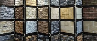
Mahogany wood effect
Alder, elm, ash, beech, cedar, birch, cherry and pear lend themselves well to imitation. For work you need to have the following tools and materials:
- copper sulfate;
- yellow blood salt;
- skin;
- wood glue.
The process of obtaining mahogany color includes the following steps:
- The surface is carefully polished.
- Wash with 10% sodium chloride solution.
- The compositions are applied in strict sequence: the second layer only after the first has completely dried.
- The proportion of the composition of copper sulfate is as follows: 1:10-50. Yellow blood salt 2:100. To better fix the paint, add wood glue, no more than 3% of the total volume of the solution.
- Application can be carried out in any convenient way.
- If the result is not satisfactory, you can apply another layer.
- After complete drying, the item can be used.
Interior decoration of rooms in red color
- Kitchen. Red awakens the appetite and is often used as an accent apron for the owners, or as a tabletop. Usually combined with gray, light colors.
- Bathroom. You can paint a wall in the bathroom with red, or use it if the room is too large.
- Living room. It can be decorated with red curtains or furniture covers, and can also be combined with gold, wood and velvet.
- Bedroom. This room should not be made too bright as it is a place to relax.
- Children's room. This color is completely unsuitable for small children, but quite suitable for teenagers. You just need to use it carefully, making only accents.
- Hallway. To prevent the room from seeming boring, it needs to be filled with good lighting.
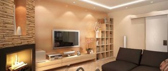
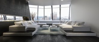
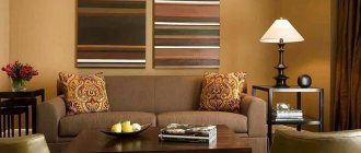
Living room
Red sofas and armchairs will look great in any style room. This color symbolizes power, authority, luxury. It is not recommended to choose such furniture for dreamy people who lead a quiet, measured lifestyle.
The red upholstered furniture itself is already a bright spot in the living room interior. That is why, when choosing such products, it is necessary to decorate the walls, ceiling, and floor in light or dark colors.
The saturation of the shade of the upholstery of chairs and sofas depends on their material. When choosing furnishing elements, it is important to remember that the smooth texture of the upholstery adds shine to the product and makes it brighter. The relief structure of the furniture upholstery mutes the red color.
The choice of furniture should be determined by the shades that you chose when decorating the walls and ceiling of the living room. If you want to choose red furniture, then you should place it near light walls. If the room is already decorated in red colors, then you should choose light furniture models.
A combination of red and black colors is considered good; this combination will give the room elegance and indicate the good taste of the owner of the apartment.
Let's consider some features of placing red furniture in the living room:
- A red sofa will look good in a room decorated in gray tones. Conversely, a gray sofa can reduce the impact of red.
- If the curtains and wallpaper are decorated in red colors, then the furniture should be purchased in light colors and based on the general color scheme of the living room.
- Red interior items such as a pouf, pillows, vase and many others will look good.
- You should think carefully before using red curtains, as they can seriously shade the room.
- It should be understood that the color red attracts all attention. Therefore, it is worth combining red and light pastel colors to make the room look harmonious and beautiful.
When choosing furniture for a red living room, you need to carefully study the furniture market and choose something that really suits the overall style of your living room and looks perfect.
Kitchen
The kitchen set with glossy red facades looks stylish. The combination of red and white colors gives the room a festive atmosphere. In addition, furniture with a black tile apron looks impressive and strict.
The color red in the kitchen awakens the appetite. In such a room you involuntarily want to cook something delicious. Properly selected interior items and suitable design of walls, floors and ceilings will become the dream of every housewife.
Cabinet
The following types of furniture are suitable for the office:
- desks;
- cabinets;
- racks;
- the Bureau;
- armchairs;
- chairs.
A classic-style office implies the presence of furnishings made from solid wood. Tables and cabinets made of mahogany look especially elegant, expensive and strict. Elegant chairs, sofas and armchairs with red upholstery also highlight the elegant, luxurious design of the office.
Such a room is an ideal place to work; nothing will distract you from your work. Red furniture is suitable for other styles, for example, minimalism or hi-tech.
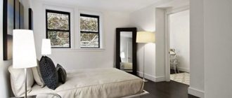
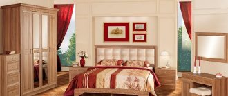
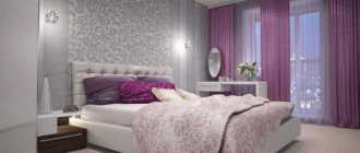
Bedroom
Psychologists do not recommend using this color as the dominant color for the recreation area. But you shouldn’t completely ignore it - how an additional color can increase sensuality, add intimacy and intimacy.
The moderation of red will allow you to create a bedroom in various styles - from adapted Japanese to fashionable urban or glamorous. An accent wall as a decorative technique, relevant for the bedroom, may well be colored if it is located behind the head of the bed.
In addition to the fashionable component of bedroom design, tactile sensations are important. The rest room should not have excessive artificial gloss. Diverse textures and matte finishing materials will make the bedroom truly cozy:
- velor headboard, small furniture (ottoman, armchair);
- silk bed linen;
- fur, “fluffy” details.
In any room, the determining criterion is not only the amount of red, but the colors that complement it.
Children's room
As we have already said, when decorating a nursery, red is used carefully and in doses. It is unacceptable to cover vertical and horizontal surfaces with such a palette. In most cases, it is present in furniture elements and decorations. White, milky, brown, blue colors will be good companions.
Bathroom
It is better to make a bathroom in a scarlet or pale shade; it goes well with white sanitary ware, but the emphasis can also be placed on a red installation. You can paint the wall near the bathtub or shower in red, leaving the rest of the walls white or gray.
To avoid too much bright color, the floor should be dark brown, black or white.
Hallway
In the hallway and corridor it is better to combine red with white or light gray; sufficient lighting is also important.
On a white background, a chest of drawers or a wardrobe can be red; the red interior can be diluted with a checkerboard black and white tile floor.
Mahogany oil
The main task of using such a product is to protect the surface from biological contamination, high humidity and destruction. High-quality oiling hides defects and minor imperfections. In addition, expensive wood receives the following positive properties:
- improving performance characteristics;
- improvement of external attractiveness;
- increase in service life.
Natural oil penetrates deeply into the fibers of mahogany, increasing its properties. The compositions are classified according to the main technical parameters:
- density;
- viscosity;
- amount of dry residue;
- type of volatile substances.
The most popular for self-processing are:
- Tung
. Suitable for processing everything from floors to dishes. Popular manufacturer Borma Tung Oil. - Degtyarnoye
. Used for application to external surfaces in contact with water. The compositions Tume Torvaoli or Hele Torvaoli are of good quality. - Linen
. The cheapest option for various jobs. A popular type is OxiDom or Neomid. - Vaseline
. Helps emphasize the naturalness of wood. You can choose, for example, Biolar.
Red in combination with other colors in the interior
In many ways, the success of decorating a room depends on the correct combination of red shades with other colors in the palette. By playing with color, you can either create a real masterpiece, place accents, or spoil the aesthetics of the room.
White
White is rightfully considered classic and will be the perfect match for any color. It softens the impact of colors, making the environment more comfortable and bright.
At the same time, you need to take into account that a tandem with pure white will bring some officiality, so you can use softer tones of cream, milk or beige.
Grey
A slightly less contrasting, but no less effective combination of colors. It exudes sophistication and bohemianism; in addition, gray and its shades have been at the peak of popularity for many seasons now. Scarlet tones in this situation should be used carefully, pointwise.
Orange
Orange is one of the shades of red, so this combination in the interior looks very warm and cozy. The design of the living room in these colors looks especially good when it is filled with bright sunlight.
You need to be extremely careful when filling a child’s palette with a palette, since a violent combination can cause unwanted aggression and an excess of depressing emotions in the child.
It is advisable to decorate the walls and ceiling with white paint, and use red and orange in fragments - this could be one accent wall, visually moving the wall away, or parts of furniture and decor.
Gold
Red and gold suits the baroque style of the living room or bedroom, where dark red is combined with gold trim and furnishings.
Beige
The beige shade restrains the activity of red, so this interior looks soft and calm. This union does not require a third color. Here it is only important to choose which color will become the leading one. If it is beige, then the atmosphere of the room will be cozy and inviting. Incorporating a pattern or brickwork into the interior will add liveliness.
For rich reds, sand, straw and earthy shades are suitable. And for neutral beige, all shades of red are suitable, even scarlet, wine or deep crimson. When combining pale shades of beige and red, it is convenient to create a retro style in a room, because such a tandem appeared a long time ago. And this union takes root well in modern interiors.
By the way, you should not use only one shade of beige in this duet: such an interior will turn out monotonous and boring. It is better to create smooth color transitions from different shades of beige. If beige is chosen as a background shade, use one large red accent or several small accents so that the red color does not get lost.
For example, it could be red curtains in the interior in addition to pillows on the sofa. Photo wallpaper with large bright red flowers on a beige background will successfully decorate the living room interior. If you glue red wallpaper in the interior, then only one wall should be occupied by it, otherwise the interior will turn out gloomy and even aggressive.
Brown
The combination of brown and red shades looks truly noble, but their tandem will look quite dark in the interior. This combination is suitable for spacious, bright living rooms or offices, but it is still better to dilute it with lighter colors in the form of one of the walls, accessories, and decoration items.
In the bedroom, bedding can take on this role; in the kitchen, snow-white porcelain can be used. There are other options, when, for example, vertical and horizontal surfaces are filled with milk paint, against which brown furniture and small red accents look beautiful.
Black
The combination of red and black in its pure form is rarely found in interiors. This is due to the fact that such a tandem creates a depressing environment, however, brave, decisive individuals may well experiment by filling, for example, a bedroom with a black and red palette.
In other cases, it is better to add other shades from the brown and white range, which will significantly de-escalate the situation.
Green
Most ready-made palettes with these two colors are natural, embodying nature. For a calm, soft combination:
- Noble marsh, rich light green, fashionable shade of young greenery.
- Pure scarlet, burgundy with hints of brown.
- For a cold palette: contrasting colors will be dark, extremely close to black (purple, blueberry), creamy white with a bluish base.
- For a warm palette: dark brown and a lot of diluted light yellow, vanilla. Peach and orange are a spectacular addition.
Together, “red + green” set a certain mood and require implementation in decor and decoration: floral and plant patterns, berries, bouquets of flowers, autumn palette. Different color saturations, the addition of wood, and stencil elements will allow you to embody a country style for the bedroom and dining room.
Important. Lighting greatly affects the red-green tandem, sometimes not in the best way - preliminary colors and fabric samples will help.
Too pure, not muted colors - for a youth environment, as this is a rather rich combination. They also avoid overly obvious implementations - for example, photo wallpapers with poppies, tulips. Macro photography can quickly become boring, and in small rooms it can look depressing, despite the life-affirming palette.
Blue (turquoise)
This combination is extremely rare in interiors. These colors are essentially antagonistic. Blue is ice, and red is fire. In addition, both of these colors have different temperature effects. But with the right combination, you can get a very cozy atmosphere.
It is important here which color will be leading and which color will be complementary, which will determine the overall temperature of the room. If you want to make it warm, take pale red as a background, and just complement the picture with blue. To create a cool interior, blue should dominate, and red should be used as an accent.
The red and blue interior will look good in a children's room if pale blue is used as the basis. A marine theme will come in handy here.
For the bedroom it is better to choose a light blue background, and red only to emphasize respectability and sophistication.
Remember: various shades of red are suitable for blue, and it is better to choose rich red tones for blue.
If you want to make an unusual interior, then combine red and turquoise. Such a union will ensure a good mood and create a feeling of comfort and prosperity.
Blue
Cool blue color will be a good partner to scarlet, hot tone, balancing its activity. This union gives a lot of scope for improvisation - depending on personal wishes, the owner of the apartment can fill it with warmer or cooler motives.
In this case, it all depends on the amount of a particular palette - if there is more red, then the room will be filled with warmth, and vice versa. To calm the contrast somewhat, white is added, and blue can be replaced with turquoise or purple, resulting in a completely original colorful setting.
Combination of colors and textures
For red color in the interior, texture is very important. You can create an aristocratic atmosphere with the help of voluminous and rough textures - textile wallpaper, complex plaster, velvet and silk with a printed pattern. In a minimalist design, mirrored glossy surfaces, mosaics or matte plain flat paint will look good.
Manufacturers
Most often, headsets made in Italy, the USA or France end up in our country. Rich traditions in furniture making help create real masterpieces. Indonesian furniture made from solid mahogany is no less in demand. They are mostly handcrafted from quality wood. But it is quite difficult to find them here.
Interior styles and red color
Despite all the complexity and ambiguity of the shade, red easily fits into completely different interiors. And the secret is extremely simple: natural colors are always universal in use and easily combined with each other. Therefore, the fashion for red never went away, smoothly moving from Victorian palaces to extravagant pop art, as if straight from the pages of comic books.
Classical
You can create it in red, you need to select deep and dark shades, finish with plaster or wallpaper with patterns. The red interior in the classic version is combined with gold, black trim, emerald, olive, blue, light blue.
Renaissance
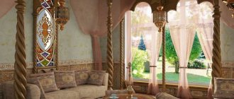
Historical motifs are increasingly gaining momentum, transforming into modern design. The most common are the Renaissance and ancient Greek movements. If the second is distinguished by calmness and the predominance of light, cold notes, then the first is an eternal holiday and luxury. You can't do without a fiery mood here.
The most popular color for interior decor is red and gold. This is the calling card of the style. It is also sold mainly in large pieces, such as carpets, curtains, sofa upholstery, pillowcases, etc.
The greatest application of the direction is found in design projects of the bedroom, living room and hall. In other parts of the apartment it may be less pronounced.
Minimalism
Red in the minimalist style is used very often, mainly in dark and light colors (without intermediate options). Purple, scarlet, fiery shades are suitable. Perhaps painting one wall in a rich color in any room will highlight the area and visually enlarge the space.
Provence and country
These two directions are very similar. Only Provence is distinguished by greater tenderness, softness and calmness. One of the details that unites them is the red color scheme. The whole spectrum has taken root here, only it is implemented in different details.
Since these are environmental currents, we will see an abundance of wood in every project. Mahogany looks great in living room design. Also, various little things will help support the appropriate colors.
In both styles, great attention is paid to textiles. It is found in abundance in the kitchen and living room and plays an important role. The predominant tones of both styles are calm, so the one under consideration realizes itself in details; in textiles it also appears partially, combining with the main ones.
Loft in red
Can be created by using red brick or a painted brick wall in red or white. A combination of white, gray, black and red in different proportions would be appropriate here. For example, a large sofa or bed can be made red and the walls gray, or vice versa. It is better to make the floor wooden, the walls matte coral.
The photo shows a kitchen-living room in a loft style, which combines comfort, practicality and negligence at the same time.
How to identify mahogany?
People like to fake expensive wood, so it is recommended to ask for documents that can be used to establish the authenticity of the material. In order not to fall for the trick of unscrupulous sellers, you need to know what mahogany looks like. You can use the following recommendations:
- Akazhu wood has a red heartwood and greenish sapwood. The treated surface of this wood is revealed by small strokes grouped in stripes that are arranged in parallel.
- High-quality material is able to reflect streams of light and exhibit shine.
- The Akazhu tree has dark stripes that can be seen on one side, turning into light ones when viewed from the other side.
- The wood on carvings darkens slightly over time.
- In dark red meranti, the sapwood is lighter in tone than the heartwood, which acquires a dark red tone over time.
What furniture goes with red?
Also in this case we choose simple, refreshing colors, i.e. white, beige, light beige, grey, sand, cappuccino - on the other hand, you can also try black and anthracite. In the kitchen, red tiles over the sink and burners will pair well with dark cabinets, and in the living room, a dark sofa will look great against a red wall.
The redness of the walls will acquire nobility if combined with elegantly shaped furniture that is antique. If we care about modernity, let's combine red walls with simple and geometric furniture.
How to properly care?
Small scratches are easy to disguise. Take a cotton swab or small brush. Moisten it with a weak iodine solution and wipe the scratches. Wait for the surface to dry.
Mahogany has a special shine that also needs to be maintained. To do this, you can wipe the surface with burdock oil. A small amount is applied to a soft cloth, wiped, and then the furniture is wiped well (linen can be used). This can only be done on varnished surfaces. Burdock oil can be mixed with vinegar and wipe off dust with this mixture.
If the red wood is polished, then you can take care of it in this way. Wrap the used tea mixture in a napkin (preferably a leaf). Wrap, squeeze out the liquid and wipe the furniture. Then dry with flannel.
Furniture in red
Red, although complex, really suits any interior design. In a classic style, a red sofa and armchairs will make an attractive accent in a muted color scheme - to avoid dominating the arrangement, choose furniture with simple, functional shapes.
Those in shades of bright red and coral will be lighter, more energetic, adding an attitude of youth. On the contrary, maroon paired with luxurious velvet slipcovers will help create a glamorous atmosphere.
Bright red cabinets, chairs or stools make a great addition to a modern kitchen or bathroom, especially when paired with white and black for a super modern, modernist vibe.
In industrial interiors, a small piece of furniture, such as a table or cabinet in a shade of red (bloody or, conversely, red, faded), skillfully breaks the cool color palette.
On the other hand, in boho interiors, red combined with warm yellow, invigorating greenery or turquoise will bring exotic inspiration and will be associated with the Arabian style.
Sometimes one piece of furniture is enough to add character to an ordinary interior - it could be an elegant chest of drawers, a convenient drawer or a slim, lightweight wardrobe.
Red furniture will look great against anthracite walls, gray extensions, warm wood and green plants - this combination is a ready-made recipe for an elegant and surprising yet cozy living room.
A little red furniture on a dark background is a great combination for a modern masculine loft, the owner of which is not afraid of complex connections.
In turn, a composition of red, white and dark blue colors will create the well-known marine arrangement. If our room was decorated in shades of beige and gray, one or two red pieces of furniture would fall into place.
Red sofas and armchairs will look great, decorated with soft pillows in colors of olive, beige, golden yellow, turquoise, light blue and navy blue.
Mahogany species
The following types are currently popular:
- Mahogany
. It grows in the Central American jungle. The height of the tree is up to 60 m. The diameter of the trunk is about 2 m. Under the bark there is wood of various shades and densities. - Amaranth
. Found throughout South America. The tree is up to 25 m high and reaches 80 cm in diameter. On the cut, thanks to the interweaving of fibers, you can see the original pattern. Studying mahogany, what kind of species it is, we note that amaranth is distinguished by its ability to restore color after removing the top layer. - Keruing
. The breed grows in Southeast Asia. Reaches a height of 60 m. Crimson or red inclusions are visible on the cut. Due to the presence of rubber resins, wood is resistant to moisture. - Tick
. This mahogany tree is found throughout the African continent. The wood has a uniform golden color. The distinctive properties of this breed include the ability to withstand strong mechanical loads. - Merbau
. Habitat: northern latitudes of Australia and southern Asia. On the cut, the red wood has golden veins. The material is resistant to moisture and insect attacks.
In addition, there is wood of secondary value, which is also popular:
- white and Siberian derain;
- berry and pointed yew;
- Daurian zhoster;
- sequoia;
- the peel was fragrant.
Photo of red furniture design
Recommendations for creating a bright interior
It is important not to forget that the effect of brightness in design is achieved through texture, for example, an absolutely smooth table surface or sofa in the living room, as in the photo of red pieces of furniture, can add maximum shine and, accordingly, richness of shade in the interior space, decorating the wall surface with relief material in on the contrary, the corridor will mute the palette of tones.
Separately, it is impossible not to say about the modern kitchen space, in which it is preferable to create an atmosphere conducive to cooking. Thus, a bright lingonberry shade in kitchen designs will please the eye. Along with it, the background of this room makes the palette of the interior as a whole harmonize in a fun, completely relaxed game.
Let's talk about how to diversify the interior space of one of the premises of your home:
- the living room will be maximally updated by such a piece of furniture as a red sofa located in the central part of the room;
- a great addition would be carpeting on the floor surface in a similar shade to the sofa;
- an original table in a corridor or hall will go perfectly with curtains of a similar palette;
- To decorate a rest room, it is recommended to match the red cabinets by painting the wall and floor surfaces in soothing shades.
Wall decoration
Experienced designers often combine red furniture and interior items with white-red or pale red shades of walls. Such designs, when combined, are considered the most successful.
Combination living room interior designs feature one accent wall with a bright red accent. This is done only if all the furniture is selected in light shades.
Wallpaper with gold and snow-white patterns is perfect for this design. This decoration adds a luxurious atmosphere and expensive look to the room.
Floor finishing
A red accent on the floor is done only in combination with some other color.
There are several basic combinations:
- White and red - these two colors combine with each other in the best possible way.
- Black and red – this pair of colors is also considered basic. It is important to remember that in this case you need to complement the red accent floor with black furnishings. Most often, apartment owners add golden and snow-white patterns to the bright accent red floor - these colors are also basic. It is these combinations that give the room unprecedented luxury and sophistication.
- Pastel colors and red – beige colors also go well with red. But there are several disadvantages: a beige floor against a red interior will seem dirty. Tiles are often used in floor finishing. Red tiles with a beige or pastel pattern fit perfectly into a red interior, so this is perhaps the most suitable combination option.
Ceiling finishing
The red ceiling is combined with stucco, borders made of gold or white plaster. A two-level plasterboard ceiling, niches and color transitions are suitable for a modern interior. A stretch ceiling in a wine or bright shade with spot lighting is suitable for a bedroom or living room.
The photo shows a glossy two-level stretch ceiling with a plasterboard structure and a mirror that makes a small room spacious.
The red ceiling decoration looks quite original and beautiful. At the moment, there are several design options for finishing the ceiling in red.
Let's look at the features of some of them:
- Red stretch ceiling. This type of ceiling is the most popular in our time, due to the fact that a suspended ceiling can emphasize the overall style of the room. The surface of such a ceiling is flat, and the choice of colors and images is unlimited. There are two types of suspended ceilings: made of fabric materials and PVC materials.
- Red painted ceiling. A good option, since you have the opportunity to choose exactly the shade of red that you want to see in the room. You can also choose glossy or matte paint, which will give your room even more charm.
- The ceiling is covered with red wallpaper. A fairly common option, it is easy to implement. Wallpaper can be selected with any image that will fit perfectly into the design of your living room.
- Red plaster. Quite an old finishing method that has been tested over the years. The ceiling will look beautiful because of the irregularities and reliefs that will play in the light.
- Red ceiling tiles. An unpopular option, since the tile itself can reduce the space in the living room, but if used correctly, the room will become truly cozy and beautiful.
- Suspended red ceiling. This ceiling is made of plasterboard and PVC materials. There is also a cassette type of this ceiling. A wide selection will allow you to choose something to your liking. Suspended ceilings are made in different ways and using different materials, so today this option looks very attractive.
Magnificence in harmony with the unusual characteristics of wood
Chronicles indicate that the interiors of rich European houses were once full of exclusive shades of previously wood species. This type of wood is found both in Jamaica and in some Latin American countries.
It is for this reason that the living room, in the design of which there is a place for modern furniture in a red shade, indicates the wealth of its owners. After all, the supply of arrays is very limited, and the products are expensive, no matter whether it is a table or an original-shaped stand.
And yet, it is important to emphasize that the design for each interior space benefits exclusively from the presence of red furniture in it:
- upholstered pieces of furniture in red are characterized by better aesthetics in comparison with other varieties of solid wood;
- your kitchen space will look unusual and elegant;
- the living room furnishings will flicker with an unusual hue in sunlight, resembling a flame;
- structures made of red wood will last for many years, as it has high performance properties;
- this type of wood allows you to get an excellent durable table comparable to a metal structure;
- When installed in a hall, corridor or bedroom, such furniture is not afraid of moisture and temperature changes.
Photo of red color in the interior
Sources
- https://colorance.ru/krasnyy-tsvet-kak-umelo-vvesti-v-interer/
- https://ooo-interier.ru/krasnyj-interer/
- https://mblx.ru/palitra/816-mebel-krasnaya.html
- https://roomester.ru/dekor/cveta-interera/krasnyj-cvet-v-interere-85-foto-primerov.html
- https://Trizio.ru/s-kakimi-cvetami-sochetaetsya-krasnyy-foto-idei-978
- https://design-homes.ru/idei-dlya-doma/krasnyj-tsvet-v-interere
- https://kraska.guru/dizajn/cvet/krasnyj-cvet-v-interere.html
- https://www.ivd.ru/dizajn-i-dekor/cveta-v-interiere/krasnyj-cvet-v-dizajne-kvartiry-40-primerov-i-sovety-po-socetaniu-27041
- https://RoomPlan.ru/dekorirovanie/krasnyj-cvet-v-interere/
- https://myprofnastil.ru/blog/2021/12/12/kak-ispolzovat-krasnyj-cvet-v-interere/
- https://basicdecor.ru/blog/post/krasnyy-v-interere/
- https://lafoy.ru/krasniy-cvet-v-interere-90-foto-456
- https://www.dizainvfoto.ru/interer/krasnyj-cvet-v-interere.html
- https://mebel-designing.ru/2020/02/17/%D0%BA%D1%80%D0%B0%D1%81%D0%BD%D1%8B%D0%B9-%D0%B2- %D0%B8%D0%BD%D1%82%D0%B5%D1%80%D1%8C%D0%B5%D1%80%D0%B5-%D0%B4%D0%B8%D0%B7% D0%B0%D0%B9%D0%BD-%D1%81%D0%BE%D1%87%D0%B5%D1%82%D0%B0%D0%BD%D0%B8%D0%B5/
- https://mystroyinfo.ru/krasnaya-mebel/
- https://novinkimebeli.ru/krasnaya-mebel/
- https://gostinaja.ru/krasnaya-gostinaya/