A win-win option is white skirting boards with the same door and window frames. They can “make friends” with each other even colors that seem inappropriate at first glance, enliven the atmosphere, give it a solemn and elegant look.
- White plinth can be used in any room - in the living room and kitchen, in the bathroom or in the hallway.
- The plinth can be wide or narrow, in one line or in two.
- A white plinth emphasizes the geometry of the room, highlights the planes of the walls and changes the perception of volume - the room seems lighter and airier.
Let's consider several options for combining baseboards, floors and doors when decorating an apartment, and their role in shaping the interior.
The door and floor are dark, the baseboard is light
If you want to combine dark flooring colors with dark door panels, designers recommend choosing light colors for baseboards and trim. This will visually lighten the room and make it more “transparent”.
The combination of the floor and doors of the same color will look harmonious, and a contrasting baseboard will help avoid monotony. Please note that the width of the linear elements - both the plinth, platbands, and cornices - plays an important role in the visual perception of such a solution. In this case, it should be at least eight centimeters. This color scheme looks very elegant and suits any room in the apartment.
What walls does a gray floor go with?
Gray color also belongs to the group of chromatic colors. It serves as a good background for almost any chromatic colors and their shades. Just remember that gray also has undertones and shades, and it can also be warm, cool or neutral. When choosing a wall color in combination with a gray floor, you need to take this into account.
If you already have the color of the walls or furniture as a given, the shade of gray should be matched to these elements. If you are just planning the interior for now, and have already decided on the gamma, you can add gray specifically/consciously. If you don’t yet know what kind of walls and furniture you will have, the best solution is neutral gray.
Gray looks very noble with soft pink, pastel shades of yellow. When paired with blue, it can feel a bit “cool”, but you can add accessories or furniture in warm colors to neutralize this effect. You need to carefully combine a gray floor with green walls. It is difficult to make friends between these two colors in the interior, although it is possible. But you need to choose shades carefully, otherwise it will be uncomfortable. There may even be a certain dissonance.
The door and baseboard are light, the floor is dark
The light color of the floors, baseboards and doors requires constant care and maintenance of cleanliness. Therefore, the floor is often made dark, but doors and baseboards can be light. This option looks very solemn and is suitable for different interior design styles.
But there is one nuance here: both the doors and the baseboards will have to be washed quite often so that they do not lose their attractiveness. White color is especially impractical in this regard, therefore, when thinking about the color combination of the baseboard, floor and doors, it is hardly worth including white there. It is better to choose light, but less easily soiled tones: beige, cream, ivory, light wood.
- A very good option is to combine a dark floor with light baseboards in large rooms that are not crowded with furniture. A small room, “stuffed” with various things, is not suitable for such a design.
- Another option for combining floors and doors according to the dark-light principle involves painting the walls in light colors. This looks especially good if the room is not too high. This color combination will visually “raise” the ceiling a little.
Principles for choosing shades
Shades for combination are not selected randomly. To combine them, you can use several rules, which we wanted to introduce you to.
Principle 1 – similarity of shades
Several shades are used, but within the same range only the degree of their saturation remains different. And so that the picture does not turn out to be too boring and monotonous, minor additions of a fundamentally different color are used, which can “maintain neutrality” or be an accent. That is, one color predominates, and it will be the main one.
Let's see how it looks with specific examples:
Principle 2 – matching shades (complementarity)
Complementarity is the compatibility of colors in the spectral circle opposite each other. To determine such shades, the Swiss artist and art critic Johannes Itten came up with a conventional color wheel that designers use.
If you fit a triangle, square or rectangle into it as shown in the photo, you will get a harmonious combination of shades that can be used in the interior.
Basic types of color layouts
| № | Photo for clarity | The principle of color combination |
| 1. | Contrasting triad | If the triangle is regular, the combination is called a contrasting triad - you can see its variations in the picture. |
| 2. | Complementary split | An acute triangle forms a complementary split when two colors are close to each other and there is only one shade between them, and the third is their complete opposite. |
| 3. | Square pattern | A square combines four colors equally spaced from each other. That is, they will all be complementary. |
| 4. | Double complementary | In a rectangular scheme, there are two close and two opposite pairs of colors, which is why this scheme is called double complementary. |
There are also more complex multi-color schemes that combine 5-6 shades, but you need to be careful, it’s easy to make a mistake. These schemes are used mainly by professional designers.
Gallery of interiors made according to the rules of color arrangement
3
Rule 3 – opposite colors (contrast)
The contrast scheme is bright and win-win, very comfortable for vision. It contains both analogue and complementary colors, which must be very carefully placed. Everything is simple here - for each color, the contrasting color is the one opposite on the color wheel. There are also subtleties here - for example, when a warm shade is contrasted with a cold one.
Important! Some colors should be used with caution, as they can negatively affect our emotional background.
Psychologists have long attached labels to each color, but a plus can be extracted from every color disadvantage:
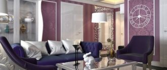
- black and purple visually reduce the space, but are ideal as an accent and add a graphic touch to the interior;
- brown in large quantities (a woody texture loved by many) drives melancholy, and without bright accents this color leads to depression;
- red promotes high blood pressure and nervous tension, but in small quantities it will make the room cheerful;
- gray is the color of sadness, but perfectly balances the most aggressive shades;
- blue – causes drowsiness, and therefore is great for the bedroom;
- blue is uncomfortable and cold, but in combination with warm shades it brings harmony to the interior;
- white can equally well both cause discomfort and lift your spirits - it all depends on its shade and quantity.
Important! These colors always require contrast, thanks to which they will sparkle with new colors and look more optimistic.
Let's see how contrasts are played out in the interior:
A special harmony is created by related and contrasting shades. Related ones include those that contain the same proportion of the main color. They are within one quarter of the circle - the 3 closest colors. Contrasting, as already mentioned, refers to opposites. The most contrasting are 3 pairs of colors: green-red, purple-yellow, blue-orange. And related-contrasting shades contain the same share of the common color that unites them. They are separated by a whole quarter of a circle - three shades.
Important! When arranging colors, you can use not only colors from adjacent quarters, but also from opposite ones (two pairs).
This is precisely what results in the double complementary combination discussed in the previous chapter. If only two colors are used, then they are complemented with the same ones, only either more darkened or more blurred.
Beautiful combinations of related and contrasting colors:
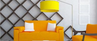
Light baseboard, dark floor, bright door
The colors of the floor, baseboards and doors can be chosen in such a way as to create a spectacular and original combination that serves as an independent interior decoration. For example, with a standard dark floor covering and light wall decoration, using a white baseboard and a bright color for the door leaf will create an interesting artistic image.
A rich color will allow you to concentrate attention on the entrance area, so this solution is usually chosen for decorating the interiors of kitchens, hallways, and halls. Such a contrasting combination of baseboards, floors and doors will look good in pop art style, as well as modern minimalist styles.
Role in the interior
Initially, the plinth was used exclusively for protective purposes. It covered the unprotected gap between the floor and the wall, from which the wind blew and the cold blew in. This element also allows you to hide the builders’ flaws: unevenness or crooked cracks. For wall decoration, moisture-resistant materials that can easily withstand contact with household chemicals (paper wallpaper, plaster) are not always used. When wet cleaning floors without a baseboard, it is easy to catch an unprotected piece with a mop and ruin part of the coating. Inside the hollow models there is a special groove into which the wiring is placed. Skirting boards are an excellent camouflage for unsightly communication lines.
In modern versions, even a heating system can be placed inside the draft (the architectural designation of a relief “belt”), which will warm the room along the perimeter in parallel with the radiators. For decorative purposes, some models are equipped with backlight bulbs or sockets. An organically selected pair of floor plinth and ceiling fillet will unobtrusively emphasize the height of the walls.
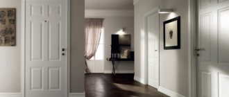
The baseboard and floor are light, the door is dark
If the doors have a dark color with light floors, then the baseboard should be chosen in light shades. But there are no strict restrictions for platbands; they may well be as dark as the door.
This combination will be most harmoniously perceived in large rooms - living rooms, halls. A small room will be “crowded” by a large dark spot of the door, so for such rooms it is better to choose other color combinations of the floor and doors. This design is best suited for the neoclassical style if it is implemented in a country house.
Door surface options
There are two main types:
- Matte. Noble matte interior door leaves fit perfectly with the overall design concept and create a truly amazing interior, filling the atmosphere with special comfort and notes of conservatism.
- Glossy. They look much fresher and more unusual, and due to the shine and brightness of the gloss, they give the room a presentable appearance and visually increase its area.
The photo shows a children's room and a white interior door with a matte surface.
Depending on the glossy or matte surface, the overall spatial perception can be significantly influenced or completely changed.
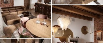
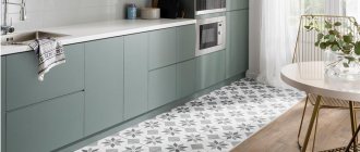
Combination of materials
Harmony of textures allows you to create an aesthetic interior and comfort in the room
When designing, it is important to show a sense of proportion so that the number of different structures is minimal. Don’t get carried away with a pile of plastic, glass, textiles, metal and wood in one room
Experiments are welcome, but with a competent arrangement of a small number of materials. The well-known combination of glass and wooden elements makes up the optimal composition precisely for this reason. The rule of three discussed above also applies here. When no more than three types of finishing materials are used in interior design. If you need to create a bright accent, you can use the following design rules for interior design:
- The use of contrasting door panels in a small room is unacceptable for the simple reason that they visually reduce the space. At the same time, monochromatic products create a harmonious union with the floor, visually increasing the volume of the room;
- For narrow corridors or oblong rooms, it is recommended to use bright accent products. This allows you to bring them closer to distant walls. The room takes on a harmonious appearance. Especially if the gamma matches the color palette of the floor covering;
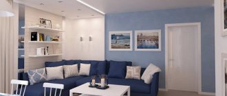
- Large areas of living rooms seem designed for daring experiments. However, even here the above-mentioned design laws will be relevant. When the doors are made in one color, and the temperature range of the products is organically combined with the floor covering. Cool duets include cool maple with refreshing mint, French rose or lavender. But you can create a more contrasting floor.
General recommendations
How to choose the color of the baseboard? This question is faced by many people who have started repairs with their own hands. If you choose this element of the interior incorrectly, it will not fit into the overall picture and will spoil the overall impression of the appearance of the room. Therefore, this issue must be approached responsibly. You will need to use your sense of taste. It's also worth considering expert recommendations.
It is worth saying that there is no single rule for choosing the color of an interior element such as a baseboard. Therefore, the choice is made in accordance with the features of the existing design. You can match the baseboard to the color of the floor or doors or, conversely, make it contrasting. Sometimes this interior element is combined with the color of walls, window frames, ceiling beams, etc. There are many options.
To avoid mistakes, you should choose a plinth after completing all construction work. In this case, it will be known exactly what shades are inherent in the floor, walls, doors, etc. The baseboard will complete the overall image. It will bring a complete look to the interior.
When studying recommendations on how to choose the color of a floor plinth, it is worth saying that there are a huge number of different variations on sale. It is important to select not only the shade, but also its texture. So, for a wooden floor it is also worth purchasing a wooden plinth. You can also purchase other varieties. However, they should at least imitate natural wood.
During the renovation, other materials (tiles, linoleum, self-leveling polymer, etc.) can be selected for finishing the floor. In this case, the shade is selected by trial and error. When purchasing skirting boards in a store, do not throw away your receipt. You may need to change the baseboard several times before finding the right shade.
Would completely different colors be appropriate?
Sometimes, looking at photographs of various interiors, you can come across rather unusual color combinations. Moreover, sometimes it is even impossible to imagine that completely different colors can be successfully combined. Doors and floors help to recreate the completeness of the designer's plan, and therefore their sometimes exotic colors will come in handy.
Options for such original solutions are presented below in numerous photos: