Delicate pastel, which reigns in interiors for more than one season, may seem banal and inexpressive to some. Fascinated by the Scandinavian style, which is dominated by simplicity, order and modesty, we are accustomed to bright colors that create an impeccable backdrop in homes and apartments. Therefore, we approach rich and elegant colors with great restraint, fearing failure in the form of a darkened and gloomy interior.
Darker and richer shades should be introduced with a certain sensitivity, but if the room is properly decorated, we obtain a unique effect that belongs to luxurious interiors, decorated with splendor but also with taste.
Burgundy - in the sense we talk about today - is a sophisticated color associated with elite and dignity. How to implement it indoors? What colors to combine with? Here's our guide.
Burgundy color: associations, features, psychological aspects
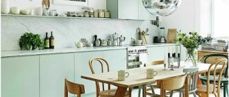
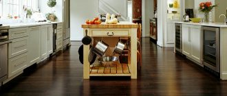
Mixed berries, grapes, pomegranate, cherries, wine - burgundy color evokes associations with all this. It is tasty, juicy and ideal for creating a beautiful and cozy kitchen interior.
Photo from source: pinterest.ru
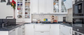
A burgundy kitchen interior in the shade of burgundy is the simplest embodiment of this color, which will take on the role of not only the basis of the composition, but also the main interior accent.
Photo from source: mykaleidoscope.ru
Tabletop “Cedar” 1017/1A white crushed ice
Comfort and audacity are two, at first glance, incompatible qualities, but they are surprisingly united by burgundy color. Due to the fact that it contains red notes, it is quite active, just slightly aggressive. And brown notes neutralize this effect and make the color cozy. Burgundy always becomes the center of attraction, giving the room additional elegance, beauty and luxury. It's no wonder that Bordeaux cuisine always remains in trend!
Photo from source: behance.net
The visual depth of burgundy shades means that they should be used with caution in small kitchens. Otherwise, there is a high risk of making the room feel overloaded. Therefore, it is better to focus on creating bright burgundy accents. Against a background of light colors, such details will look especially emotional and dynamic. And creating a neutral background will help make the space visually wider.
Photo from source: idei.club
Tabletop “Cedar” 811/1 Metallic
The strong energy of burgundy color contributes to the fact that it is chosen by powerful individuals who radiate self-confidence. At the same time, it has a calming, calming effect. A burgundy kitchen is a space that surrounds you with comfort and coziness. It's fun to spend time here.
About the advantages and disadvantages of burgundy
The interior of a burgundy kitchen has its pros and cons.
The pluses are that this color looks very expressive, original, expensive, elegant, and festive. And at the same time, it has a calming, calming effect.
If we consider burgundy from a practical point of view, then here you can find a plus - dirt is not as clearly visible on burgundy as on light colors. This is a non-staining and practical color. A very good choice for decorating a kitchen space!
Photo from source: hunker.com
Tabletop “Cedar” 8237/PT Marble fresco
Let's look at the shortcomings. Since burgundy is more of a dark shade, visually a room decorated in this color seems smaller than it actually is. That is, it is better not to use it in small kitchens. But the details will be quite appropriate. At the same time, it is important not to combine them with other similar dark shades, so as not to make the space too gloomy. After all, in this case, you are unlikely to be comfortable in it.
Photo from source: almode.ru
Rules for creating a burgundy kitchen
To make a kitchen design in burgundy color truly harmonious and tasty, you must follow the following rules:
1) a kitchen set with glossy facades will help make the ceilings visually higher;
Photo from source: skidkom.ru
Tabletop “Cedar” 811/1 Metallic
2) use burgundy color to a minimum if the kitchen is small in area. Actively dilute the space with light warm shades - milky, cream, caramel;
Photo from source: akuhnja.com
Tabletop “Cedar” 1110/S White
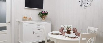
3) the best color duets of burgundy are obtained with white, creamy light blue, gray;
Photo from source: metkon-perm.ru
4) textiles made of silk, velvet, leather, elements made of plastic, glass - the most suitable decor options;
Photo from source: pinterest.ru
5) both burgundy matte and glossy kitchens are appropriate here. The former contribute to the creation of a strict interior, and the latter - a more luxurious one;
Photo from source: casavogue.globo.com
Tabletop “Cedar” 921/1 Kungur Marble
6) curtains are one of the most important decorative elements in a space that should not be forgotten. They can take on the role of a burgundy accent in the interior;
Photo from source: severdv.ru
Tabletop “Cedar” 5142/Mn White Moon
7) in the same room, along with burgundy, you should not use pink, yellow and bright green shades, as such combinations will cause irritation.
Color combination
I wonder what color burgundy goes best with!
Designers believe that a combination of black and red is perfect for brave owners. It is very important to harmoniously distribute them around the entire perimeter of the room, then you will get a unique result.
Also a win-win option is gray - burgundy. A simple interior, suitable for a living room or work room.
Burgundy - brown. For those who are modest and do not like pretentious interiors. Suitable for any room, use antiques as an addition (furniture, figurines, paintings, etc.)
To calm the burgundy color, you can add a little pink. Well suited for the bedroom, where you just need to relax and unwind.
About the variety of shades of burgundy
Burgundy color is very versatile. All its shades can be divided into four conditional groups:
1) classic burgundy - a shade that combines red and brown;
Photo from source: doremi27.ru
2) garnet - a shade that is particularly rich and bright. Looks great with contrasting shades, especially in combination with white;
Photo from source: catherineasquithgallery.com
3) ripe cherry - the most saturated and dark tone of the entire palette;
Photo from source: dailysabah.com
4) deep carmine - this shade contains bluish notes, due to which it is colder.
Photo from source: pinterest.ru
What manicure is in fashion now?
Brown, blue, deep green, wine shades will be more relevant than ever this season. By the way, iridescent pearl shades of varnishes will become one of the most fashionable in manicure 2021-2022. Fashionable red, black and white manicures seem to never go out of style, certainly this season.
Interesting materials:
How to remove pen paste from wallpaper? How to scrub tiles on the floor? How to remove tile adhesive from tiles? How to remove a pen from a case? How to remove a handle from the leather of a bag? How to remove a pen from non-woven wallpaper? How to remove a ballpoint pen from leather? How to remove tape marks from wood? How to remove super glue from furniture? How to remove dried super glue?
Color combination in the kitchen interior: burgundy +
Burgundy-colored kitchens, photos of which are presented in this article in a wide variety, sometimes amaze with the variety of color combinations that can look very good in them. Let's list the main ones.
White
A white and burgundy kitchen is an excellent option for those who want to visually make the space wider and give it lightness and airiness. The white color in this case favorably emphasizes the richness, depth and versatility of burgundy.
You can use colors in the interior in different ways. It could be a completely burgundy kitchen against white walls, as in the photo.
Photo from source: akuhnja.com
Tabletop “Cedar” 7025/Q Giallo Marble
Or the kitchen - white top, burgundy bottom. Or vice versa.
Photo from source: live-design.ru
Tabletop “Cedar”946/1 Castillo dark
In this case, sets with a countertop that imitates white marble will look especially harmonious.
This combination can be found not only in classic interiors, but also in high-tech kitchens.
Photo from source: womanadvice.ru
Tabletop “Cedar” 2238/S Breccia light
Details will help diversify the interior and create a different mood - from modest or solemn to funny.
Black
Burgundy + black is a duet with which you need to be especially careful, because a black and burgundy kitchen, if overdone, can look too gloomy. In addition, such a range will visually reduce the area of space, which will not be at all beneficial for those who have a kitchen that is already small.
To prevent such a development of events, use white and burgundy as the dominant shades in percentage terms, and leave black to a minimum.
A good example is a burgundy kitchen with a black countertop. It looks very luxurious and very elegant.
Photo from source: dionell.rf
Tabletop “Cedar” 1207/BR Diamond dark graphite
Grey
The combination of burgundy and gray is a special level of sophistication. After all, a burgundy and gray kitchen always looks very aristocratic. And if you decide to use both of these colors as your main colors, choose the lightest shade of gray, almost bordering on white. An abundance of other light details in the interior will also not be superfluous.
Photo from source: shefkuhni.by
Tabletop “Cedar” 1017/1A white crushed ice
A dark burgundy kitchen, in which there are dark gray colors, should be decorated according to the same principle as black and burgundy. That is, dilute the space as much as possible with light shades.
Photo from source: almode.ru
Tabletop “Cedar” 2338/S Lunar metal
Beige
A burgundy and beige kitchen always looks especially warm and gentle. You can safely make both colors the main ones and not be afraid to overdo it.
Photo from source: 123cabinetry.com
Tabletop “Cedar” 2032/M Rigoletto light
Burgundy and milk cuisine is the most successful solution. It is better to choose warm shades of beige, since when using cold ones there is a risk that they will “kill” all the charm of burgundy.
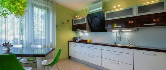
The inclusion of such green shades as muted olive, green tea, light green into these interiors will look very original and at the same time quite calm.
Photo from source: ital-moscow.ru
Tabletop “Cedar” 2236/S Semolina beige
Orange/coral
Such bright colors in a duet with burgundy look very original. But it is very important to use them wisely so that it does not look tasteless. An excellent solution is to dilute the interior with beige and present orange in minimal accents. Their role can be played by a painting, a dish set, a vase, kitchen textiles, etc.
Photo from source: media.360.ru
Tabletop “Cedar” 4032/S Porphyry
Color proportionality
Depending on the functionality of the room, designers recommend the dosage of this color. After all, a comfortable pastime depends not only on personal preferences. Sometimes even your favorite shade of burgundy can cause discomfort and negative psychological pressure if there is excess.
The total area of the room is of great importance - Bordeaux does not like small rooms. It is able to reduce space visually. Therefore, light colors are chosen as companions, reducing the overall drama of the color.
Will delight you with ideal, verified duets, with no room for error, with the following tones:
- subtle shades of beige;
- pearl and smoky gray;
- pure white;
- creamy, milky, champagne, any alternative modifications of white.
Black and white interiors come to life thanks to bright berry and fruit shades. A distinct finish will add contrast to this trio of mostly achromatic colors. Even the calm, muted tones of a burgundy wall will not allow the hallway or kitchen area to look boring if there are black and white tiles on the floor. But a predominant amount of dark color, without a sufficient share of light, will make the room gloomy.
Not every room can withstand the abundance of deep shades of French wine in the interior. Sometimes it makes more sense to choose one thing for expressive color: furniture instead of walls, or only small decorative objects, as is the case with a nursery. A table of the predominant use of color in specific rooms from the point of view of psychological comfort, regardless of cubic capacity, will help.
| Accent surface area | Large elements | Small accents | Predominant color | |
| Hall | + | + | + | — |
| Living room | + | + | + | + |
| Bedroom | + | + | + | — |
| Kitchen | + | + | + | — |
| Children's | — | — | + | — |
| Cabinet | + | + | + | + |
| Bathroom | + | + | + | + |
Burgundy kitchen in the interior: photos of successful combinations
To make the façade of a burgundy kitchen look harmonious in the kitchen interior, you can supplement it with the following elements:
1. Kitchen apron
Photo from source: dev.buyx.ru
Tabletop “Cedar” 111/1 White
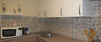
The work area, decorated in deep wine shades, is suitable for large kitchens. If the area is not too large, it is better to use a mosaic in which burgundy tiles are mixed with white ones.
Finishing the apron using natural materials such as wood and stone will add special luxury to the design.
Photo from source: pinterest.ru
Tabletop “Cedar” 2075/FL Oak Kera
The exposed brickwork protected by a transparent skin will also look original.
Photo from source: jkuhnya.ru
Tabletop “Cedar” 1205/BR Diamond light gray
The latter can be used independently, being colored, with a print, etc. This option will fit into the kitchen space in any case, regardless of the area of the room.
Photo from source: odincovo.legkomarket.ru
Tabletop “Cedar” 9022/S Whitened Oak
2. Curtains
The use of draperies is appropriate here. Curtains with hooks made of thick fabric will add special luxury to the kitchen. It is important that the shade matches 100% with that used on furniture facades or other decorative elements.
Photo from source: eldomo.ru
If the kitchen is small, it is better to use light tulle curtains in burgundy shades.
Photo from source: severdv.ru
Tabletop “Cedar” 7024/E Imperial Marble
3. Lunch group
The design of a kitchen with a burgundy set suggests that the rest of the furniture, including the dining group, will be made in other, more neutral colors. The ideal option is white or cream tables and chairs. They will make the space easier to perceive and fill it with air.
Photo from source: shkafkuhni.ru
Tabletop “Cedar” 3025/Q Black marble
If the chairs are upholstered, wine-colored fabric, as well as black, brown and beige options, would look appropriate.
Photo from source: instagram.com
Tabletop “Cedar” 727/1 White granite
Also, the burgundy color of the kitchen set can be duplicated in the pillows laid out on the sofa, if there is one in the living room area.
Photo from source: almode.ru
4. Lamps
A chandelier with a bright lampshade, made in the same tone as the facades of the kitchen unit, will look appropriate in any style, will help to dilute the severity of the interior, if it suddenly turns out to be monochrome, and will also favorably emphasize the dimensions of the room.
Photo from source: interiorno.ru
Tabletop “Cedar” G018/1 Galaxy Black
If the kitchen has low ceilings, then small neutral ones should be preferred to bright lamps.
Photo from source: chilliday.ru
Tabletop “Cedar” 5016/Pt Black Detroit
Correct lighting
The overall impression of the interior largely depends on the level of lighting in the kitchen. The cherry kitchen is made in dark shades, so the reflective ability of the surfaces does not exceed 15-20%. In this case, it is necessary to equip the room with a sufficient number of lamps.
There are a number of rules that will help achieve maximum effect.
- According to current standards, the amount of light in a living space must be at least 150 lux/m2. Knowing the kitchen area, it is easy to calculate the recommended minimum and add another 10-15%. The fact is that the abundance of light has a positive effect on mood, performance, and appetite, so you should not neglect it.
- The location of the window opening should be taken into account. If it is oriented north, then it is advisable to increase the brightness and number of lamps. And for rooms with windows facing south, they will need a little less.
- It is better to place light sources at different levels. A central chandelier is usually installed on the ceiling, and functional areas are equipped with local lamps.
- To highlight individual details, it is good to use decorative lighting.
- It is recommended to choose the design of the lampshades according to the interior style. This will help avoid disunity in design.
- Special devices (dimmers) designed to adjust brightness will allow you to adjust the illumination depending on the time of day as you wish.
Ceiling slots must be fixed in such a way as to follow the contours of the kitchen unit.
Burgundy classic
A burgundy kitchen, designed in a classic style, will look best against light walls. At the same time, it is better to make the facades of the set in rich wine tones. Gold-tone fittings will look great.
Photo from source: dizainexpert.ru
Tabletop “Cedar” 8050/soft Sandy Marble
If the area allows, then it is better to place the dining group in the center.
Photo from source: kitchencom.ru
Upholstery of upholstered furniture can be made in burgundy and brown shades.
It looks good when the palette is duplicated in textile details.
In this case, it is very important to create the right lighting system. These can be chandeliers and sconces with crystal in gilded and beige lampshades.
Photo from source: pinterest.es Photo from source: mebel-mr.ru
Tabletop “Cedar” 1012/Cr Ceramics white
Choosing a floor covering
In theory, a white floor would look amazing in a situation like this. In fact, this color scheme is impractical, since any contamination will immediately be evident.
Designers recommend choosing flooring in beige, green or gray. A tile that matches the color of natural stone is ideal. Parquet or laminate is also appropriate.
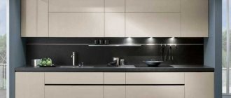
High-tech Bordeaux
Burgundy kitchen in the interior, the color combination in this case allows you to play up the contrast of light colors and the mutedness of burgundy. To create the most appropriate bright contrast in this style, garnet shades are most often used and embodied in glossy surfaces. And if you make the base of the furniture and the floor in the same color, you will get an interesting “floating” effect.
Shades of juicy cherry will add futuristic notes to your kitchen design. Silver surfaces, including household appliances, look appropriate.
Such dark shades of gray, such as graphite and ash, will look beautiful in detail, in a duet with objects made of glass and chrome.
Photo from source: ital-moscow.ru
Best couple
Burgundy in the interior is used to occupying a dominant position, allowing other shades to only bask in the rays of their glory. In order not to make a mistake and choose the best company for this impressive color, you can use the following combinations tested by designers with other tones.
Burgundy and black
A gothic and gloomy combination of burgundy and black at first glance is suitable not only for the interior of a medieval castle, it may well exist in a modern apartment with certain conditions:
- all main areas of the room should be highlighted with artificial light;
- The presence of light-colored furniture and decorative elements is required;
- the ceiling should remain light;
- glossy surfaces are welcome.
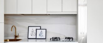
Burgundy and white
This combination does not require additional recommendations; it is equally suitable for all rooms. White will allow burgundy to reveal itself in all its splendor without drawing attention to itself. In response, burgundy will gratefully emphasize the main advantages of white: purity and freshness.