Photo: salon-pride.ru Although minimalist trends confidently occupy the first positions in interior design, the classics do not give up. Classic kitchens are always about coziness, warmth, home, stability and comfort. Despite all their monumentality, they remain graceful and elegant, for true connoisseurs. Do you recognize yourself and your dream? We'll tell you how to bring this idea to life!
Features of the classic style
For all its traditionalism and rigor, classics in the interior are much more diverse than it might seem at first glance. There are dozens of interpretations of the canons and origins of this style in the world, related to regional characteristics, era, and fashion trends.
Initially, classical interiors are a heritage of Greek and Roman ancient traditions. Luxurious decoration, stucco molding, marble columns, massiveness and simplicity - this is what inspired European classicism of the 18th century.
But not just antiquity, because numerous historical styles of the 17th-19th centuries are also called classics. This is the luxury of Baroque, and lush Rococo, and the laconic English style, and the elaborate Empire style. There are also narrower national and local trends: for example, Russian Baroque.
All these different and sometimes contradictory styles are united by small nuances and details. Classic interiors are large and open spaces, clear symmetry, consistent geometry and composition, and the presence of distinct centers. The interior is always built around the main element - a sofa, bed, fireplace or dining table.
The simplicity of lines and laconic forms are fully compensated by luxurious materials and lush decor. For decoration, natural stone, valuable types of wood, gilding and stucco molding, bronze, copper, luxurious fabrics, precious metals, and inlay are used.
European classics
The interior of a classic kitchen in the European style is very rich in colors. We can use the Italians as an example. This design cannot be called exclusively aristocratic and, moreover, boring.
There is a lot of expression in Italian classics, which correlates with the characters of the inhabitants of this country. They love to decorate their kitchens in shades of pistachio, olive, and turquoise. The priority is a noble gray and beige palette, as well as very bright colors: red, fuchsia, blue.
Italians decorate their kitchen windows with light curtains, or Roman blinds, or blinds. The overall impression is clear lines, competent design, rigor in the execution of almost all interior details.
Color solutions
A kitchen in a classic style always has deep, natural colors. Light pastel colors come to the fore, which are combined with dark brown and woody shades. And deep complex colors are good for accents: burgundy, emerald, azure, grape.
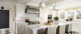
White kitchen in classic style
If you don’t know where to start and what to grab onto, white in a classic interior is a win-win option. When decorating a kitchen, you will have to take into account that it is also the most easily soiled, so choose only easily washable textures. But it visually increases the kitchen area and makes the room lighter and brighter.
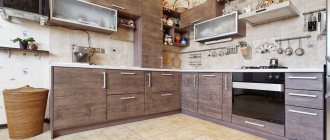
Brown kitchen in classic style
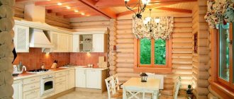
The ideal classic combination is white and brown, including all shades of sand, chocolate and coffee. These are wooden parquet, panels, solid wooden furniture, ceiling borders. To make the coating more practical and durable, you can use artificial imitations. Now they are almost impossible to distinguish from the original, but they are less capricious.
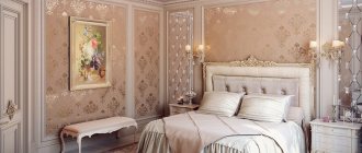
Beige kitchen in a classic style
If white is too boring and bland for you, pay attention to all the richness of the palette of beige, cream and milk. Such shades are warmer and cozier, so they are extremely appropriate when decorating an elegant kitchen. Beige harmonizes with stone countertops, artistic parquet, and plaster stucco.
Green kitchen in classic style
Green is the color of peace, tranquility, relaxation, and at the same time, luxury and wealth. Choose dark emerald or malachite tones, velvet textures, stone. They harmonize perfectly with wooden kitchen units, glass inserts and gold-plated fittings.
Red kitchen in classic style
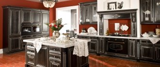
Red color in the kitchen is one of the most win-win options, because it stimulates the appetite. It’s not for nothing that the halls of many popular establishments and fast foods are painted in all shades of red or orange. For a classic interior, choose darker, richer and muted tones - and such a kitchen will be truly elegant.
Wallpaper
There can be nothing pretentious in decorating walls with wallpaper: a plain material or a faded pattern. The cooking room has high humidity, so fiberglass or vinyl is more often used.
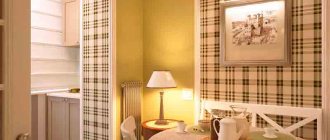
A variety of colors are allowed: floral patterns, medallions, stripes, checks, damask, monograms, Venetian plaster. Photo wallpapers and frescoes depicting ancient streets of European cities or great paintings fit in appropriately.
When choosing wallpaper, focus on the lighting in the kitchen:
| 1 | In a bright, sunny room, wallpaper in cooling shades (pale blue, snow-white, blue, beige) is preferable. |
| 2 | For low ceilings, choose wallpaper with vertical stripes |
| 3 | In a dark room with windows facing north, wallpaper is used in warm colors. |
Furniture for kitchen
The choice of kitchen furnishings depends entirely on your preferences and lifestyle. The minimal classic set consists of the furniture set itself and a dining table.
Refuse chrome, glass, transformers and glossy acrylic facades. Classic collections never completely go out of fashion, so they can be found in the catalogs of most manufacturers.
Massive round, oval or square tables on large carved legs and with the same carved decor look good. They are complemented by dining chairs upholstered in leather, velvet or jacquard. More modern interpretations make it possible to replace the dining area with a high and wide bar counter adjacent to the suite.
Decor
Decor is the very thing that distinguishes classic interiors from any modern reworkings. Luxurious carved kitchen facades, bronze or gilded handles and hinges, semi-columns, bas-reliefs, pilasters - all this is at your complete disposal.
Mirrors and paintings in massive expensive frames, panels, mosaics, and artistic paintings look interesting. To decorate, use massive candlesticks, luxurious vases, beautiful watches - all these are also functional accessories.
Kitchen design 2 by 3 meters: beautiful ideas (80 photos)
Curtains and textiles
Textiles occupy a very important part in the design of classic interiors, and especially kitchens. It is better not to overuse it with lush, heavy and massive curtains. They accumulate dust, absorb odors, and are not very safe near the stove.
But in the kitchen, luxurious tablecloths, decorative napkins, and beautiful sets of potholders and coasters will be more appropriate than ever. Choose towels and other accessories from simple textured fabrics and decorate them with embroidery, fringe or tassels.
If there is a sofa in the bedroom, pay attention to classic jacquard or tapestry upholstery. The main thing is to choose fabrics that are easy to care for and clean, and you can add elegance with the help of decorative sofa pillows.
Hood
Any installed equipment must correspond to the classics. Now there are many models that allow you to make a room not only functional, but also special. For example, choosing a large dome, it will resemble a hearth in the house and add coziness, and if you decorate it with decorative details, it will increase the solemnity.
The hood trimmed with wooden baguettes looks interesting. Baguettes are made from solid oak or beech, because these hard woods do not deform from high humidity and sudden temperature changes. The hood can also be built into a cabinet; it will not be inferior in performance; in addition, it will be possible to install carbon filters to better eliminate odors.
Materials and design
The basis for finishing any classic interior is natural materials or a completely reliable imitation of their texture. Now this goes well with eco-trends that call for the abandonment of synthetic coatings. In such a kitchen it will be equally pleasant and comfortable to prepare lunch, enjoy morning coffee or discuss news with friends over a glass of wine.
Floor finishing
Natural artistic parquet is a bright and stylish attribute of classic interiors. But in the kitchen it may not be entirely appropriate and practical, because there is always humidity, grease, stains and temperature.
If you still prefer functionality, replace the wood with laminate flooring. Each manufacturer has different collections for different breeds, patterns and ornaments.
A stone covering is more appropriate than ever in the kitchen, and it doesn’t matter whether it’s real or artificial. It is easy to clean, does not absorb odors, and stains do not penetrate into the structure of the material. This floor goes harmoniously with a window sill or countertop made of the same stone.
You shouldn’t give up on tiles either: large porcelain tiles, contrasting chessboards, small mosaics. Complete your choice with an apron over the work area, made in the same style as the floor.
Ceiling design
The ideal ceiling for a classic kitchen is a simple plain whitewash or a light stretch fabric with a matte or satin texture. Be sure to use stucco decor: thresholds, cornices, borders, chandelier sockets.
Wall decoration
Fabric or paper wallpaper looks harmonious in classic interiors, but this solution is not entirely functional for the kitchen if you plan to cook often. In this case, pay attention to washable non-woven collections with classic ornate or floral patterns.
Combine plain wallpaper with wood paneling, stone trim or tiles. The main thing is brevity when choosing colors and textures, because they are fully compensated by the decor.
Choosing a color
The classic color of the kitchen is pastel. Preference should be given to no more than 3 tones.
It is advisable to select them from a related spectrum of warm or cold shades of gray, beige, natural peach, brown, vanilla and milk.
When decorating classic interiors, designers recommend the following color combinations:
- Black and white.
- Ivory.
- Soft vanilla.
- Caramel.
- Tender apricot.
- Olive.
- Tones of natural wood textures.
Light shades will complement elements made in gold or silver decor, but there should be few of them. Literally a couple or three. A combination of contrasting tones is also acceptable. For example, red with vanilla, yellow with black, blue with white.
Lighting and backlighting
Lighting in a classic kitchen traditionally consists of several sources. In the center of the composition is a luxurious chandelier, which is placed either clearly in the center of the room or above a large dining table. Choose multi-stage and multi-tiered designs with crystal pendants or chandeliers in the form of massive candlesticks.
For local lighting, sconces and floor lamps designed in the style of a chandelier are suitable: candlesticks, pendants, decorative textile lampshades. Modern neon or LED lighting is almost never used, but you can illuminate your work area with neat built-in spotlights.
Apartment design in Scandinavian style (80 photos)
Layout options
The classic style opposes various experiments, so here you can only find the usual options for arranging furniture.
- Linear is the most versatile type of layout, which is suitable for both large and small rooms. The stove and hood are located in the center of the room and set the axis for symmetry. If there is a lot of free space, then the direct set can be supplemented with a multifunctional island.
- Corner - suitable for medium-sized rooms, when there is a lot of space, but the island still won’t fit. It is this type of layout that many designers call optimal because of the very convenient location of the work area. If necessary, the corner layout is complemented with a bar counter, which can separate the work area from the dining area.
- Parallel - this arrangement of furniture is only possible if the dining area is moved to another room. With a parallel layout, the set is placed on two opposite walls, thus creating a lot of space for storing utensils. You rarely see a bar counter or island with this arrangement. If they are present, they most often replace the function of the dining room.
The layout should be selected based on the available space. For example, for a long and narrow kitchen, parallel arrangement of furniture is clearly not suitable, but angular or straight - yes.
Kitchen apron in classic style
An apron is a very useful acquisition for any kitchen, and especially for a classic one with its valuable finishing materials. A mosaic made of small tiles, glass or mirrors looks good. Moreover, these can be ready-made compositions that just need to be carefully transferred to the wall, or original artistic solutions.
If you prefer simplicity and monumentality, cover the wall above the work area with stone. Natural marble or granite are heavy and expensive, but artificial imitations will cope with this task.
White marble countertops
Carrare marble and Calacatta marble are exquisite materials that stand out in classic kitchens. Marble countertops are always the focal point of a classic kitchen.
Many homeowners can't resist the beauty of a white marble countertop, even though they know full well that there will be maintenance issues.
Note!
Apron for the kitchen: TOP-130 photos of design and modern designKitchen in minimalist style: new designs for minimalist kitchens. Choice of colors, furniture and additional decor + 120 photos
- Kitchen in the Art Deco style - TOP-190 photos of kitchen interiors in the Art Deco style + DIY stylish furnishing ideas
Design of a kitchen-living room in a classic style
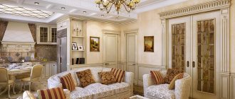
The kitchen-living room opens up more space for self-expression while embodying the classic style. Here you can experiment with composition and zoning, because the classics still gravitate towards pronounced centers. Leave a few of them: a relaxation area and a work area, a dining table and a bar counter, a fireplace or a massive sofa with a coffee table.
Corner kitchen in classic style
Classic furniture is quite massive and monumental, so it will not fit into every kitchen. But there is a way out: corner sets allow you to use every centimeter of space, including previously useless corner areas. And at the same time, it is convenient to integrate household appliances, a sink and even a refrigerator into such a kitchen.
Apartment design in Provence style (60 photos)
Wide palette of shades
Classics do not limit the choice of tones when decorating interiors. You can use any color from a wide range of palettes. But there is a rule here: do not “paint” the kitchen in all the colors of the rainbow, using only a couple of shades, without overdoing it with color.
Small kitchen in classic style
The classic style is difficult to fit into a small and cramped kitchen, but you can safely use its modern adaptations and interpretations. For example, neoclassicism is based on the basic principles of classicism, but at the same time it is much lighter and more concise. Use only light colors, discard all unnecessary details, choose functional decor.
Kitchen in a classic style - photos of real interiors
The multifaceted and varied classic style opens up many more options for kitchen design than might seem at first glance. That's why we've put together a whole gallery so you can get some inspiration!
