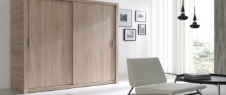
The overall perception of the interior of a living space depends on the correct design of the hallway. It does not always receive as much design attention as other rooms, but it is the impression of the first room that a person enters that creates the basis for the perception of the entire home and owners.
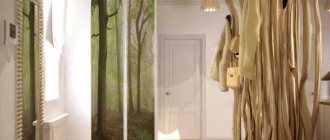
Hallway interior design Source Design-homes.ru
Criteria for choosing a color for the hallway
- Small hallway
Most hallways are small, this has long been no secret. And a recipe for creating a harmonious interior in such premises has long been identified. Choose cool grey, blue or silver shades.
This design will refresh the interior and visually add more. However, make a choice in favor of any pastel, smoky and muted shades. Milky, powdery, coffee, ivory. Choose any one. If the room has low ceilings, choose a monochromatic light finish that matches the main color concept.
- Long narrow hallway
For this type, light shades are used. White with warm or cool undertones is often chosen. We strongly recommend that you avoid any patterns or geometric lines. Imagine filling the space with furniture after renovation. And then all your family members will leave outerwear, umbrellas, hats, and bags in the hallway. They are all different colors and textures. If you add wallpaper designs to this ensemble, chaos will result. Opt for plain coverings. This solution will look stylish and noble.
- Wide hallway
In such a room there is an opportunity to show imagination and experiment with colors and shapes. Use dark shades in combination with light ones; contrasts are always in fashion. A calm palette in milky and coffee shades or coal black is up to you.
- Large hallway
In a large hallway, the main thing is to follow the basic rules of design. Choose a style and realize your wildest ideas. Red, orange, apricot, yellow, green - any color is at your service. If you have a window in the hallway that faces south, it is better to cool the interior with fresh and cool tones. The color of sea wave, blue, emerald, purple will perfectly complement the warm and bright interior.
Feng Shui hallway
A very fashionable trend is choosing the color of the hallway according to Feng Shui. If you follow all the canons, the colors will correspond to the cardinal directions. The beginning is set by the front door - the counting of colors begins from there.
You can choose the desired color and shade using the Bagua compass. The color palette depends on the sector in which the corridor is located.
Bagua Compass
When decorating a room, you should take into account universal recommendations. For example, in small hallways it is recommended to use light colors. But you need to act carefully so that there is no conflict between the colors that Feng Shui recommends and those that decorate the room.
Article on the topic: Decorating a small hallway in a Khrushchev apartment: techniques for visually enlarging the room
Feng Shui allows you to decorate not only walls, but also furniture and interior elements. According to Feng Shui philosophy, Shimo ash is a type of wood that can fill a person with energy. Therefore, it is better to select things for the hallway from such material. The rich colors of ash will help with this. Even such small compliance with the directions of the Bagua compass counts.
It is important to take care of lighting. It should be bright. It is better to place the selected type of lighting above the entrance. This will help bring good luck into your home.
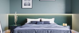
Hallways in light tones
Light colors look light and airy and fill the room with bright positive energy. It’s no secret that this design visually expands the walls and raises the ceiling. Most people find it very comfortable to be in such a room.
The light palette can be combined with any shades from the color spectrum. Any decor and unusual elements will look bright, light and stylish. The general perception of the interior is associated with calm, cleanliness and freshness. Especially if you use soft pastel colors. Soft blue, lilac, light green, milky. Such colors always look well-groomed, warm and create a magical, cozy atmosphere.
How to visually lower or raise the ceiling
Interior design dilemmas accumulate when, in addition to narrow planes, ceiling height poses a significant challenge. If the hallway is low, it is recommended to choose vertical stripes or cover the ceiling surfaces with a lighter color - for example, white, blue or soft gray.
The chosen shade should be slightly thinner than on the walls, this will create the illusion of increasing the distance between the ceiling and the floor. The resulting impression of “lifting” will be enhanced if the tonality passes to the walls in the form of a strip about a dozen centimeters thick.
In high interiors, you can also use drawing tricks that will align the proportions of the four corners and lower the ceiling.
- The first method involves the use of horizontal stripes, the task of which is to optically expand the room.
- The second is to cover the ceiling with a darker shade than on the walls. Thanks to this, the room becomes not only lower, but also more comfortable.
Chocolate tones in the hallway
Chocolate shades look delicious and create a warm atmosphere. This tone is often used in natural wood textures, which gives the interior nobility and speaks of the high status of its owners. This color is traditional and has long been considered a classic, which always looks respectable, expensive and stylish.
How to visually change the proportions of a corridor
An effective way to change the proportions of a hallway is vertical stripes. They give the interior elegance and lightness, and also “lengthen” it. This will look good where the ceiling is lowered or the arrangement has a touch of sophistication.
For this reason, vertical lines often emphasize a glamorous, vintage or retro style. In turn, horizontal stripes optically expand the surfaces and increase the depth. When used on a shorter wall, they are the perfect tool for masking imperfections in a narrow room or long hallway.
Small and wide stripes are an extremely decorative element, so it is best to choose them on one, maximum two walls, and reduce the contrast with pastel, harmonizing or monochrome colors. This will prevent the decor from becoming overwhelming while highlighting surfaces and turning them into eye-catching features.
Conclusion
Colors affect more than just mood. In addition to their decorative and psychological function, they also effectively cope with complex surfaces, such as a narrow hallway, a small area, a high or low ceiling.
Choosing the right tone and its application in a certain plane will be a panacea for internal ailments. Light colors will optically enlarge a small corridor, dark colors will add depth, and stripes will expand the wall, lower or raise the ceiling. Using the designers' recommendations, you can enjoy the cozy interiors of small corridors.
Gray tones in the hallway
Gray shades have a rich palette. They go well with other colors. Gray is basic, which means it will highlight other tones against its background, emphasizing their depth and other advantages. This tone creates a calm atmosphere of relaxation and harmony with oneself. In addition, this is the most practical shade of all. Ideal for the hallway, even for small spaces.
Use light shades of gray. For example, metal color, graphite, pearl. These colors will make the interior lively and dynamic, moderately strict, simple and concise. Don't be afraid of this color scheme; your interior will not be dull and faceless, as is commonly believed.
Color combination
A good idea for decorating a narrow corridor is a combination of shades with the same temperature, with varying degrees of saturation, as well as a composition of shades adjacent to each other on the color wheel.
This gradation will be especially beneficial in a small hallway. On the opposite side, you can use the darkest option: coffee brown or granite tones. In turn, the ceiling, floor and furniture should be light, this balances the contrast.
More: How to comfortably arrange a small hallway
In color combinations - in addition to choosing the right shades - proportion is also important. If we choose three shades, it is recommended to distribute them at 70% (neutral), 20% (complementary) and 10% (contrast).
In the case of two, the dominant main tone (70%) is complemented by an accent color (30%). Thanks to this, chaos can be avoided, and the decor will be in perfect harmony.
Blue and white: lightness and freshness
Supporters of the classics who do not want to experiment can choose a combination of white and blue . This simple and obvious idea, as if whispered by nature itself, provides enormous space for creativity. Marine style, Mediterranean, classic, Provence suggest themselves in this range. White adds airiness to the interior, which is often missing in rooms without windows. At the same time, such a partner will create the prerequisites for linking the interior of the corridor with the furnishings of the rooms it connects: white interior doors will become a kind of universal portal between the styles of different rooms.
Blue and green: a natural duo
Another pair of colors that looks natural, like a tandem dictated by nature itself, is blue and green . The overall impression will be determined by the shade of green. Designers traditionally recommend paying attention to light colors, reminiscent of fresh foliage, or olive shades, hiding the severity of blue. The landscape of the combination will involuntarily set you in a romantic mood, especially in a composition with light accessories and wicker furniture.
However, for supporters of more luxurious interiors, there are ideas in these tones: dark blue in symbiosis with pine or emerald greenery and a subtle gilding motif
- a combination worthy of palace apartments. Gold can be successfully replaced with light bronze, but in this case there should be a little more forged or cast elements of this shade, up to 5% of the wall area.
Blue with gray: the severity of silver or the dynamics of metallic
The complex and at first glance gloomy combination of achromatic gray and blue does not seem to be the most successful for a hallway. Even if silver plays the role of gray, it is difficult to call such a duet life-affirming. In this case, the blue color in the hallway interior should be diluted by at least a third. At the same time, this combination is perfect for a spacious hallway in a classic or retro style: slight melancholy and relaxation are guaranteed in such walls.
The impression will be enhanced by mother-of-pearl and numerous mirrors , visually multiplying the space. Those who are drawn to the latest in technological progress can choose another technique: metallic on a blue background. Open chrome shelves and mounts for sports equipment will fit perfectly into the interior of the hallway of a modern young couple who promote the motto “Life is movement.”