The fashion for decorating a hallway in light colors is difficult to explain. Perhaps this is a kind of protest against stereotypes that classify corridors and halls as technical rooms. Perhaps the hostess’s attempt to once again emphasize her talents for maintaining order
, which the black and white hallway requires even in small details.
Perhaps you just want to realize the incredibly stylish interior you saw in a photo in a glossy magazine. In any case, before taking on such a complex combination, you should familiarize yourself with the rules for creating a black and white environment
. The designers of the WESTWING shopping club are ready to share their secrets and subtleties.
Modeling space with black and white planes
Dark objects appear more compact, and light objects visually expand - this simple truth
familiar to everyone.
This technique can also be used in the interior, especially in a room with such a lack of space as a hallway. A small room should not be decorated with dominance of black; light walls will bring not only freshness, but also spaciousness
.
An exception to the rule “black narrows” is bright gloss
. This texture, often used in the design of ceilings, not only expands the space, but also makes it multifaceted, multi-level. It is a kind of mirror, reflecting both the rays of lamps fixed on the surface and the entire furnishings that make up the interior.
This confronts the master with a choice of texture and color : a hallway in black and white can be completed with either a snow-white or a black glossy ceiling, which is not hampered even by the low level of the rough ceiling. The same technique of expanding space can be used in floor finishing and in the design of wardrobes.
Ceilings
Today, suspended ceilings have become almost a standard in apartment renovation. Quick installation and low cost allowed this interior element to become widespread in our country.
A black ceiling in the hallway is a unique alternative for those who do not want to paint the walls in dark shades. In this case, the wallpaper should be as light as possible, even reaching white.
A black ceiling allows you to shift the accents and, with light wallpaper, make the doors black. Such a top feels great, both on its own, when there is nothing else like it in the interior of the hallway, or when played with color combinations.
A dark ceiling can have light projections, which, with the help of design tricks, are perfectly played with similar black elements on the floor. A switched-off TV in such a hallway, if its size and length allows, will become part of the decoration of the entire room.
Black and white or white and black: decorating the walls
The black and white interior of the hallway will still force you to decide on this issue: when organizing an environment that simultaneously resembles a chessboard and piano keys, one of the colors should become dominant
. Usually it becomes white. The reason for this is the rather modest area of domestic corridors and the influence of light colors on the emotional state. This is not to say that the design of a black and white hallway cannot be built on black or dark gray walls, but it will cause much more trouble. Not only will the lighting of such a room have to be doubled, since it will seem gloomy at the slightest lack of it, but also any negligence in cleaning on a truly black color will be visible even more significantly than on a snow-white one.
A combination of 3 light walls and one black will save the situation. It is the latter that can be minimally decorated, and the necessary furniture elements
.
The latter need to be discussed separately, but the general trend is the same
: since clothes used every day are rarely monochromatic, and different colors will involuntarily destroy the harmony of a black and white duet, a black and white hallway clearly requires closed cabinets and drawers for shoes. The best option is sliding wardrobes. To save space, mirrors can also be included in their facades without allocating a separate place to them.
rational to choose which of the walls will be dark and which will be white
: the area immediately adjacent to the front door suffers from pollution much more than others.
Naturally, it is she who, as a rule, is made dark gray. When choosing a material, you should focus on samples that are not afraid of wet cleaning:
- natural or artificial stone;
- tiles and ceramics;
- mosaic panels and laminate.
Fortunately, modern manufacturers sufficiently supply distributors with any of these materials in black and white.
For the rest of the room, you can use black and white wallpaper and decorative plaster. The option of using a coating for painting is also worth considering: in case of contamination, it allows you to quickly and inexpensively refresh the coating
.
How to combine wallpaper in the kitchen?
When choosing wallpaper to combine, pay attention to color, texture, pattern, density and thickness of the coating. Use adjacent tones for monochrome interiors, and the principle of contrasts for accents
Combine single-color collections with patterned ones in the same range or the same type of patterns in different colors.
Wallpaper companions
If you want to combine several types of wallpaper in your interior, but have doubts about combinations and harmony, choose companion collections. They can be found in the range of most manufacturers and are already balanced in terms of technical, operational and aesthetic characteristics. The companion wallpaper will definitely not look too colorful and tacky, but not too boring either.
How to combine wallpaper with a pattern?
The most difficult thing is to combine several collections of wallpaper with expressive designs. Despite the eclectic fashion, I want to get a comfortable and cozy kitchen. Balance can be achieved if you correctly balance one with the other.
If your pattern is too large, maintain the proportions and overall color scheme. If the pattern is small and of the same type, you can experiment with colors and placement. Be sure to control the brightness and saturation of the shades so that they are harmonious and do not visually make the room smaller.
Plain wallpaper goes well with almost any pattern. Romantic floral and plant motifs - with stripes or polka dots. The cage looks interesting with geometric patterns, but watch the lines and accents - geometry most affects the perception of the room.
Plain and accent wallpaper combinations
Several collections with a difference of up to 3-4 shades create a bizarre chiaroscuro effect. Use this for zoning, geometry correction or visual expansion of space. This is a good choice for modern and minimalist interiors, for pastel Provence.
The reverse technique is a bright accent wall that immediately attracts attention. In this case, it’s better not to overuse patterns and textures, but stick to one thing
Neutral and faded combinations will fit into minimalism and Scandinavian style, while bright and rich ones will complement loft, hi-tech, and modern.
Combination with photo wallpaper
Rich paintings and photographs can be appropriate in the kitchen like nowhere else. Even the brightest colors here don’t look too flashy or aggressive, so don’t deny yourself colorful accents. Choose wallpaper with a 3D effect or perspective to visually enlarge the room, or textured coverings to imitate any other materials.
Vertical and horizontal combination
Vertical combination is a simpler and more obvious technique: you simply stick on different strips in different sequences. To do this, it is better to choose rolls from one manufacturer and from adjacent collections so that they match in width and thickness. Otherwise, the coating will be too uneven and sloppy.
Horizontal combining is much less common and much more difficult to do yourself. For example, the lower part of the wall is covered with wallpaper with small stripes, and the upper part is covered with wallpaper in a single color or with a floral pattern. The joint is closed with an elegant decorative tape - and here is an elegant solution for rustic and classic styles.
How to combine textures in the kitchen?
When choosing textured wallpaper for the kitchen, do not forget that they will inevitably have to be washed and cleaned of stains. Therefore, it is better to place the most complex and expressive reliefs away from the working area.
A plain, even coating with expressive accent inserts looks interesting. Experiment with a combination of matte, satin, glossy or shiny canvases. Combine regular wallpaper with plaster, brick, stone, wood or cork.
Finishing niches and wall panels
When combining different collections of wallpaper, it is not necessary to cover all the walls with them. You can choose an accent collection for decorative compositions. For example, panels in massive baguette frames look no worse than posters or paintings, and at the same time emphasize the necessary areas - for example, a sofa or a dining table.
If you like expensive textile wallpaper with a pronounced texture, gilded threads and decorations, use them as decorative inserts in a classic kitchen. The main thing is to place the composition away from the work surface, stove and sink.
Any niches and plasterboard structures will sparkle with new colors if you approach their finishing with imagination. In combination with textiles and other kitchen decor, you will add individuality and expressiveness to the interior.
Floor decoration
A black and white hallway is a problematic issue when it comes to flooring. Either color can be considered easily soiled, and covering it with a carpet of the same shade will only aggravate the problem. Stops at halftones
: gray tiles imitating natural stone, laminate or parquet made of dark wood, economical linoleum with a graphic pattern will look harmonious, and with a few movements with a damp cloth they will acquire their original appearance.
You shouldn’t give up door mats either, the main thing is not to disturb the harmony
. On a floor made up of black and white “shards”, plain textiles will look impressive, and a rug stylized as a zebra or “Dolmatian” will fit perfectly into a monochrome background. A chess floor can be called a classic.
Types of decoration
There are several types of color decoration of premises, namely:
- gluing dark wallpaper in the hallway;
- tiled space cladding;
- application of paints and varnishes;
- the use of plastic panels imitating natural materials;
- connecting several methods simultaneously.
The most common stylistic solutions:
- Painting a specific area to deliberately emphasize a desired detail of the space (painting, carpet, chandelier).
- Painting the ceiling space in a dark color with the further installation of many diode lamps to create a “starry sky”.
- The dark floor in the hallway using natural materials creates elegance and rigor.
- In small rooms it is better to install modular compact systems with mirrors.
- The combination of a large mirror in a dark frame located opposite the entrance will visually increase the area.
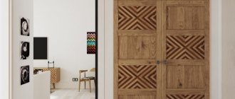
- Interior doors in dark shades can be an excellent addition to the interior to create a more panoramic view of the entrance space.
Successful photos of dark hallways avoid clutter and an abundance of furnishings to avoid cluttering the room.
Black and white embodiment of various styles
It seems that the hallway in black and white does not allow the designer’s imagination to fully run wild. This impression is deceptive: in a classic duet we can implement almost any interior style :
- the minimalism of such a set of colors is enough;
- classicism is easily built by adding silver and shades of gray, embodied in fancy lines and fantasy forms;
- high-tech is based on the conciseness of forms and the validity of each of the implemented elements;
- art deco is woven from a web of lace and decorative perforation;
- the east appears in half-hints and half-tones, beckoning with its mystery
and slight reticence.
The opinion that the stylistic solution of the corridor must necessarily echo the interior of the other rooms has long been rejected by modern designers. Such support is only necessary if there are no interior doors. If they are present, each of the areas of the apartment can represent an independent interior style
.
Color games
Experienced designers warn against crossing the line of “excess” when decorating interiors in red tones. Your task is to “tame” the violence of the fundamental tone. This can be done by introducing other shades of the rainbow palette into the decor of the red hallway. The ideal partner for red will be white. They will cope well with the task:
- Beige.
- Ivory shade.
- Grey.
- Caramel.
- Gold.
- Silver.
The red rug in the hallway matches perfectly with the color of the front door
A competent approach to the use of this extraordinary color in all respects will allow you to create a red hallway of incredible beauty.
Moreover, the color you choose does not necessarily have to be introduced into the decor directly, that is, in a classic tone; it can be quite worthily replaced by other representatives of the red spectrum. A hallway in other shades of red will get a more refined and austere look: coral, brick, terracotta or Venice. The above light colors can also dilute and shade them.
Romance
For people who are not shy about tears and loud laughter, who cry over the story of Hachiko and laugh at the next viewing of an old comedy, retro style in black and white, art deco, and Greek will suit them.
For the first one, you will have to abandon modern materials
: retro is based on imitation of natural textures and techniques. Vintage photos as accessories, meticulous selection of fittings and small details, embodied in the use of furs, leather and heavy textiles with a touch of luxury. An old grandmother's chair reupholstered in appropriate shades with a slightly updated varnish will become the highlight of such an interior.
In art deco, little things are not an addition, but the foundation of the style.
: carved frames, turned legs, twisted structures and lace are the elements that form this at the same time slightly frightening and naive style.
Classics are built on shades and halftones, and one of them should be silver, which also belongs to the achromatic scale. The walls are decorated with textile-inspired wallpaper, an embroidered blanket is thrown over the sofa or ottomans, and the ceiling lamp is equipped with a lampshade made of thick fabric.
Interesting hallway in Greek style
: like the design of a black and white children's room for a boy, it is based on the vest effect and the “Greek wave” as the main ornament. Contrasting stripes can line the perimeter of the ceiling and floor along the walls, and a decorative cornice can divide the walls into a gray bottom and a white top.
Decor
An entrance hall of any size and color requires a minimum of decor so that the interior is not visually overloaded. Often the focal points of attraction are furniture and lamps. It’s not surprising, because the black design of the hallway enhances the perception of light elements. However, you should not limit yourself to neutral and pastel designs:
- Upholstered furniture can be red, lemon or lettuce;
- The door mat is gray or purple.
The mirror deserves special mention. It doesn't just allow you to tidy up, it reflects light and creates a focal point of attraction against a black background. The main thing is that the mirror occupies no more than 30% of one wall, and is also located on the edge of the room or above the chest of drawers. By the way, the choice of thematic location partly influences the choice of the shape of the reflective base: it is recommended to install a horizontal mirror above a high chest of drawers, and a vertical one above a low chest of drawers. The last option is also relevant for the edge of the room.
Creative
The duet of black and white is self-sufficient: chaotic strokes on the walls, mysterious silhouettes in which, as in a psychological drawing test, everyone sees something different - ideas that are easily embodied in the black and white interior of the hallway. Enhancing contrasts
achieved by introducing a third color. It should be bright enough not to get lost against the backdrop of the most challenging of contrasts. Shades of orange, red, and green are perfect. The optimal ratio to the rest of the area is 1/10. The additional color should remain just an accent. Only 3-4 elements will fulfill this role: colored frames on the walls, a stylish bright blue key holder, a carrot-colored chair cover and a set of hangers of a similar shade. For light interiors in black and white tones, this could simply be the shade of the lampshades, changing the tone of the entire room.
The benefits of an interior built on bright accents can only be appreciated when you get tired of it. You can change it in a matter of minutes by purchasing several accessories in a completely different color. The WESTWING shopping club will help you with purchasing little things: a collection of designer accessories from the site’s partners will help you organize a stylish interior
, suitable specifically for your character, and when your mood changes, WESTWING will support you again, suggesting fresh ideas.
Chocolate tones in the hallway
Chocolate shades look delicious and create a warm atmosphere. This tone is often used in natural wood textures, which gives the interior nobility and speaks of the high status of its owners. This color is traditional and has long been considered a classic, which always looks respectable, expensive and stylish.
Selecting furniture
For a small white hallway, it is advisable to select furniture in light shades. Furniture with dark tones can overload the space and create a gloomy atmosphere. Placed pieces of furniture in a narrow corridor will visually reduce the area, which is undesirable for a small room.
When arranging the hallway, it is important to choose the right patina cabinet, structures for shoes and storage of small items, shelves, benches and other paraphernalia. The presence of such pieces of furniture will make the corridor functional and your stay in it comfortable.
Furniture can be modular or built-in, made of solid wood, chipboard, MDF or other materials.
An important rule is not to purchase furniture that is too massive. It will steal the square footage and make the space cluttered
White furniture looks elegant and luxurious. However, scratches, abrasions and other traces of mechanical influences are very noticeable on it.
