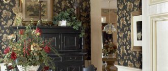
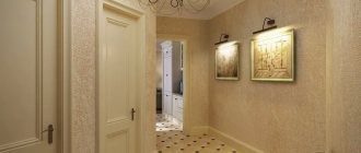
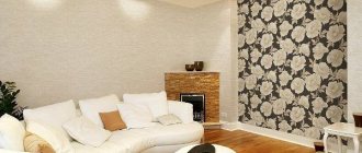
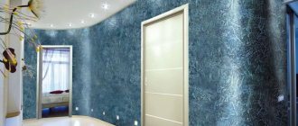
“People are greeted by their clothes,” a Russian proverb tells us. The clothing of the apartment, of course, is the wallpaper. Indeed, they immediately catch our eye when we enter a new room. Moreover, when the question of renovation arises, the first thought is: “what wallpaper should I choose?” Personal preference comes first in this matter, but there are several nuances that need to be taken into account when purchasing. We will talk about them.
Combined wallpaper in the interior
Location of windows and availability of natural light
Usually every home has natural light. The amount of sunlight entering the apartment depends on the location of the glazed openings. The Eastern teachings of Feng Shui recommend gluing wallpaper according to the principle of harmony. This means that the main color should be chosen towards daylight.
Wallpaper Panel Design
How to decorate the walls in a room other than wallpaper
Finishing the walls during the renovation process is the most important stage, because it is the surface of the walls that a person most often comes into contact with, both visually and tactilely.
Different materials are used for wall decoration:
- Plastic;
- Siding;
- Drywall;
- Decorative plaster;
- Painting;
- Tile;
- Lining.
But the most profitable, budget-friendly and affordable material for wall decoration is wallpaper. They can be painted, re-glued, and decorated at any time, with minimal cost to changing the style and design of the room.
Kitchen
Proper organization of kitchen space saves 60–65% of the distance the housewife travels while preparing food, plus 25–27% of time. Let's use ergonomics. The main trio: stove, refrigerator, sink. They cannot be installed far from each other.
I mention this because some people recommend hiding the refrigerator in the pantry. However, installing a stove and a refrigerator next to each other, or a stove and a sink, is also not rational. You will have to put a lot of effort into maintenance.
A small kitchen complements the interior design
Fashionable and rational L-shaped placement of working planes.
Advice: Choose furniture with retractable cabinets. Hinged doors take up a lot of space. Organize lighting for cabinets and work tables - time savings are guaranteed. Fight clutter and the room will look larger.
The L-shaped placement of the kitchen unit saves space and at the same time there is enough space for work
Zoning can be emphasized by island placement of furniture. Install an electric or induction hob on such a cabinet. Stylish, comfortable and functional.
An interesting effect is achieved by using hanging cabinets and tables of different depths 300, 450 or 600 mm . This “breaks up” the space, making it easier to maintain order on the shelves (small items do not get lost in deep cabinets).
Zoning can be emphasized by island placement of furniture
Beautiful wallpaper for the room
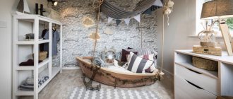
Beautiful wallpaper will always complement the interior and can act as an independent decorative element. But what wallpapers are considered beautiful? First of all, it is the right wallpaper for a particular room. In addition, you need to take into account the age of the owner of the room. Fashionable and youth wallpaper, in the rooms of teenagers and young people, this is photo wallpaper. Wallpaper with cartoon characters and wallpaper in bright colors look good in a children's room. For a young man, photo wallpapers with images of cars and a marine theme are suitable.
Also pay attention to tips on choosing stylish and unique wallpaper for the bedroom: https:///remont-i-otdelka/steny/oboi/oboi-dlya-spalni
For a girl, floral prints on paper wallpaper, photo wallpapers with cities, countries are suitable, the main thing is to combine them correctly:
- Furniture color and wallpaper color;
- Interior style and wallpaper texture;
- Maintain the color scheme in decorative elements.
You should not emphasize the bright color of the wallpaper with rich decorative elements; it is better to use bright decorative elements for rooms with light wallpaper in pastel colors.
Fun geometry on the walls
Recently, wallpapers depicting geometric shapes have become popular. This is due to the fact that figures can visually enlarge the space, which is very important for small rooms.
Straight or broken lines, squares and triangles on walls are popular.
- An upward pattern can visually lift the ceiling.
- Such wallpaper can be used to decorate a room in a modern or classic style.
- Designers recommend using gradient wallpapers, as they are in trend this year.
- A barely noticeable transition from a lighter shade to a darker one visually increases the space and looks elegant and unusual.
Gradient wallpaper is best suited for decorating a room in eco-style and minimalism. Combining multiple shades is a fashion trend for 2022.
Hall design in a one-room apartment
In a one-room apartment, a single room performs all possible functions. In this regard, it will be useful to divide it into zones. This can be done using different types: combining wallpaper in stripes or making inserts, setting boundaries with furniture, using partitions and niches. A young family of two, ready to experiment, can turn their apartment into a studio - remove the wall between the room and the kitchen, thereby gaining more space.
Photo 4 - Interior of the hall in a one-room apartment
Photo 5 - Interior of the hall in a one-room apartment
Photo 6 - Interior of the hall in a one-room apartment
In a one-room apartment, everything should be comfortable and functional. Think about how to divide the area into zones. Arches into the hall look beautiful, and you don’t have to completely destroy the partition. The combination of wallpaper with furniture and textiles should add warmth and comfort.
As for wall decoration, the material can be very different. But it is better to choose a pastel, discreet color for wallpaper or textured plaster. Bright colors can be used, for example, to highlight one wall or as decoration - pillows, textiles, paintings. Considering that all possible activities and recreation will take place in one room, too saturated walls will not contribute to either good work or good sleep.
Photo 7 - Interior of the hall in a one-room apartment. Wall decoration, decor
Photo 8 - Interior of the hall in a one-room apartment. Wall decoration, decor
Photo 9 - Interior of the hall in a one-room apartment. Wall decoration, decor
In addition to the selection of finishes, versatility should also be inherent in the furnishings.
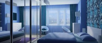
You can choose two-color wallpaper. Combining walls will help separate the seating and dining areas. Light wallpaper harmonizes perfectly with dark furniture. How to choose a bed, table, wardrobe? For a small room, it is better to buy a sofa that will fold up. Choose a table based on how many people will sit at it. Transformable furniture is perfect for small spaces. The table can also be folded and unfolded. If you need space for things, then it is better to buy a wardrobe with mirrored doors.
Easily transformable furniture will help you quickly adapt the room to new circumstances.
A good choice could be a compact sofa, a folding table, or a wardrobe. Almost the same principles apply in a small apartment - light colors of wallpaper will make a small living room wider, and universal furniture will allow you to keep the space as uncluttered as possible.
Photo 10 - Interior of the hall in a one-room apartment. Arranging furniture
Photo 11 - Interior of the hall in a one-room apartment. Arranging furniture
Photo 12 - Interior of the hall in a one-room apartment. Arranging furniture
In a long 3x6 room, you can hang pictures and put a minimum of furniture, then the space will expand a little. In a Khrushchev-era building, the hall can be enlarged by demolishing the wall between the room and the kitchen. If there is a balcony, then it can be attached to the living room.
Shape of the rooms
The design of the apartment depends on the size, height and shape of the room. Let's consider the features that are taken into account.
Studio apartment design with mustard notes will make the interior warm
Square
This is the perfect shape. A person feels comfortable in such rooms.
Simple home design in Scandinavian style
There can be many design options, but here are the basic principles:
- Design using straight lines and laconic furniture.
- Use diagonal arrangement of furniture and objects.
- The wall around the window opening remains light.
- If the window is small, install cabinets with mirrored doors near it - the room will immediately increase.
- Corner cabinets are a good option.
Lots of light and mirrors increase the space
This will be interesting to you: REVIEW: Layout of 2 (two-room) Apartments: 215+ Photos of improved Design methods of transformation
Rectangular
Narrow rooms can also be made more comfortable if part of one of the walls is decorated with textured, patterned, printed wallpaper or decorated with decorative plaster. Thus, the long plane is split up and its proportions change. Half-columns and pilasters are installed - they make the room square and comfortable.
Prints on wallpaper visually break up the space and make it more comfortable
Forget about the walls from your past life. Yes, they are roomy, but they stole an additional 40-50 cm of room width.
Tip: In long rooms, place cabinets along short walls and use window space. This also allows you to create cozy dimensions.
Make the most of your space
Use mezzanines, create storage areas for clothes and shoes in niches and storage rooms. If the corridor allows, order a narrow wardrobe with special brackets for tramples located perpendicular to the doors. Such cabinets are only 35-40 cm deep.
Use light colors in your decor to expand the space
With bay window
If the apartment has a bay window, good lighting of the apartment is guaranteed. In this corner it is good to place a table with cozy chairs or small armchairs - a place for relaxation or work is ready. The bay window can be a play area or used for a child to do homework.
Modern interior design with a workplace by the bay window
Curtains separate this corner from the main room. In this room, reinforced double-glazed windows are installed to separate the room from the outside world.
Avoid placing large furniture. It will destroy all the charm of such an architectural element.
Small furniture will highlight the elegance of the bay window
Zoning a room using wallpaper: basic techniques
Repair with zoning differs in different techniques. The most popular ones are not difficult to implement.
Popular zoning techniques:
- Pasting the walls with a coating with a horizontal stripe visually lowers the ceiling, but expands the space inside;
- A vertical stripe on one or two walls is logical in a room with a low ceiling, but large in area;
- A floral print to highlight the seating area makes the space cozier and more logical.
You can solve the problem of low ceilings with wallpaper with vertical stripes.
If you use the same floral print in a square room, it is better to take wallpaper with a chaotic and small pattern - this will make the room weightless and airy.
In a studio apartment, you can make one wall the central one and cover it with a decorative coating with a dark pattern and large flowers. The wall will be more significant and visible.
Choosing wallpaper
Smooth or textured? Smooth canvases should be given a firm no. But embossed plain or multi-colored wallpaper will come in handy. Even a subtle texture will have a positive effect on the visual perception of small spaces. But the more pronounced the relief is on the canvases, the more noticeable the play of light and shadow will appear and the more spacious the rooms will appear.
Read also: What does a witness do at a wedding?
Matte or shiny? Matte canvases should be left until moving to a larger apartment. If there is a lack of volume, you need to choose wallpaper with at least a slight shine. Moreover, there will not be much difference in the type of canvas - silk-screen printing, metallized coating.
Small or large pattern? Any! However, light wallpaper with an almost invisible pattern is suitable for covering all the walls in the apartment. As for canvases with large ornaments, you should act differently. Ornamented colored wallpaper is used only for one wall in any room, thereby visually “pushing it aside”.
- 1 of 5
On the picture:
To “pull back” one of the walls in a small room, cover it with darker wallpaper with a large pattern.
What wallpaper is best to choose for a room?
The best way to update the decor of your apartment is to hang new wallpaper. In 1-2 days, housing can change dramatically: visually become larger or smaller, more secluded or more spacious. It all depends on the choice of wallpaper. You also need to take into account the wallpaper material and the purpose of the room (living room, children's room, bathroom, etc.). So what wallpaper should you choose for your home in this or that case? Let's look further.
Classification of wallpaper.
Volumetric light-colored wallpaper
In our age of computer technology, 3D wallpapers have become popular. This became possible thanks to 3D printing. The designs on such wallpaper look natural.
In addition to originality, 3D wallpapers have a number of other advantages: they are durable, environmentally friendly, and easy to stick to walls.
Photo wallpapers are still popular, but now there is a huge selection of designs.
- Thanks to the innovative technologies used in the production of photo wallpapers, they are durable, resistant to moisture and easy to stick to walls.
- Fashionable photo wallpapers are made only from high-quality materials.
- Like 3D wallpapers, they delight with the variety of designs and realistic pictures.
- Wallpaper that imitates a stone wall or a mountain waterfall is ideal for the Gothic style.
Functional purpose of wallpaper in a one-room apartment
Wallpaper in the apartment is selected based on the functions and processes occurring in the room. For the kitchen, you need to focus not on color, but on the surface. It should be practical, easy to clean, absorb and release moisture. The sleeping area cannot be decorated in a contrasting and very bright way. Colors that promote relaxation are suitable here. It is from this point of view that it is necessary to consider the cladding of the walls of each room.
Wallpaper for zoning a room
The main criterion by which a room is divided into two or more sections is color. What shade is used in a particular place largely determines its functional purpose.
When choosing wallpaper for certain areas, you must adhere to certain rules so that the interior of the room is harmonious:
- They should have common details: similar texture, color, pattern.
- The same width as the sheet.
- Smooth transition in the drawing.
It is also necessary to take into account the type of lighting present in a particular area of the room.
Wallpaper is best for zoning a room. It is not necessary to use partitions that will take up space in a small room.
Accent wallpaper
A reception room with an accent wall is multifunctional, because it can decorate a room and make it more original. With its help you can visually expand, narrow and even zone the space. This can be the perfect backdrop for highlighting some decorative elements or features of the room.
They attract attention with the help of wallpaper of a different color, which differs from the background not only in contrast, but also in color and pattern. On a dedicated wall there is often a fireplace, a TV, and a dining table.
When choosing wallpaper for an accent wall, you need to take into account the color scheme of the entire room so that it does not go out of the interior and does not disrupt the overall harmony.
How to expand the space without moving the walls?
Positive emotions are very important for comfort. Experts often advise using light tones of different colors. However, this is not a clear rule. In small rooms you can use fragmented bright and dark colors.
Sliding wardrobes will solve the problem of storing many things
The area of the premises can be increased by dismantling the built-in cabinets with shelves. They are located in the corridor and room. Instead, they install a wardrobe or a corner cabinet, which are large in capacity and allow you to solve the issue of storing things.
Avoid a lot of small items
Let's look at the basic visual principles of expanding space:
- Vertical stripes and patterns of finishing materials “raise” the ceiling well.
- A similar effect is achieved by multi-tiered suspended ceiling structures. In this case, the central part is the highest. A vault effect is created.
- Glossy stretch ceilings with a mirror surface visually dissolve the ceiling.
- Illumination of the perimeter of the room and low chandeliers increase the height.
- Mirror surfaces of cabinets expand the area of the room.
- Horizontal, diagonal stripes and patterns on one of the walls help change the proportions.
- Avoid a large number of small items: magnets on the refrigerator, souvenirs on open shelves. Instead of several small paintings, choose one medium-sized one; replace miniature figurines with one plaster sculpture or floor vase.
- Do not use heavy and dark velvet, taffeta, or satin curtains. The best option would be light curtains and curtains, fashionable this season, that imitate natural materials: linen, silk, cotton. They do not block sunlight and connect the room with the outside world.
- All doors must have glass inserts. Exception: doors for the toilet room. An interesting effect is created by the play of contrasts: a light door leaf with dark glass beads.
- In a long room, decorate the gable walls with a darker shade and the side walls with a lighter shade. This visually changes the proportions.
Tip Large mirrored doors of sliding wardrobes must be decorated with sandblasting or a decorative pattern. Otherwise, reflective surfaces create a feeling of unreality and anxiety.
Areas in the apartment that contrast not only in color but also in materials
If you like to change the environment around you, choose paintable wallpaper for decoration. Repaint one or all walls a different color from time to time. Thus, the room acquires a new “face” at minimal cost.
The interior is designed entirely in beige tones - this is a universal and stylish choice.
VIDEO: Renovating the interior of a modern apartment
Design of a one-room apartment
Modern interior
Wallpaper color palette for a one-room apartment
Shades for an apartment are selected depending on its size and lighting. Sometimes only one color is used, with white being preferred. In fact, the design intent should not be limited. A single shade visually reduces the size, so for a small apartment you need to select two or three colors. But a varied palette is used in large-sized interiors.
Tropical Wallpaper Design
Green wallpaper design
Glass wallpaper design
Bright shades
A bright apartment should exclude sharp contrast, but can be complemented with bright details. Their presence adds mood and expressiveness. Calm tones can be beautifully complemented by decorative panels and pieces of furniture with eye-catching upholstery. In a small apartment, variegation should be avoided.
Pastel shades
You can apply several pastel shades to a couple of primary colors. The result is a smooth transition that creates softness. It is recommended to use room items and accessories in a different color. Pastel in design refers to calm stylistic solutions.
Game of contrasts
Two colors combined in the interior create an academic impression. Most likely this can be attributed to the classic style. Combining contrasting colors and combining opposite shades is appropriate only in large apartments.
Wallpaper design monochrome
Striped Wallpaper Design
Bathroom
A small hygiene room and toilet are a headache for the owners. You don’t want to carry bath accessories from your room or hide cleaning chemicals on the mezzanine or in a drawer on the balcony. A good option is to combine two rooms. This conversion is acceptable if no more than two people live in the apartment.
In a small apartment it is acceptable to combine a bathroom and a bathroom
Combined
If you remove the wall between the hygiene room and the toilet, install a shower cubicle or hydrobox, then in the room you can install an automatic machine, a pencil case for hygiene and washing supplies, bathrobes and towels.
Tiles of the same color on the walls and floor - a trendy solution
Put all small items in cabinets. Do not use the tile layout: dark bottom, light top, this is the century before last. An interesting effect is achieved by using patterned tiles on only one wall (along the bathroom or inside the shower cubicle). Leave the remaining walls smooth. The space will become stylish and visually increase.
If you install a shower cabin, there will be space left for installing equipment
Buy console toilets and save 0.5 m². They “steal” less room space. Visually separate the toilet with a low partition. It can serve as a storage place and shelf for decorative items and candles. Just don't go overboard with the details.
Scandinavian design in the bathroom and emerald white colors
Separated
Turn the bathtub across the room and you can make room for the washing machine. Use models with rounded edges. Plastic lines change space. Be sure to use a decorative panel that covers the space under the bathtub. Do you like bright colors? Choose tiles of the same color and different shades, variety is guaranteed.
Try to make the entire space functional
A large number of reflective surfaces increase the space. This room needs good lighting. Ideally, multiple light sources. Place spotlights in a checkerboard pattern - the space expands. Installing along walls pushes the boundaries.
Separate bathroom in minimalist style with futuristic accents
Instead of tulips, install a “Moidodyr” washbasin to use shelves for detergents . By replacing the bathtub with a shower cubicle, 2 - 2.5 m² is saved with a hydrobox. For convenience, replace all swing doors with sliding ones.
Lots of light and reflective surfaces increase the space
A little about security . For the floor, use special tiles with an anti-slip surface. Plumbing fixtures must be well secured. If communications are covered with plasterboard or plastic, install inspection doors to provide access to the pipes.
Make sure the tiles have a non-slip surface
Combination with textiles, furniture and upholstery
In order to highlight textiles, it is necessary to combine shades of the same color. Furniture can be shown using the method of contrasts. The following combinations will give a beautiful effect:
- yellow wallpaper with purple, blue or green furniture;
- beige walls with dark green upholstery or curtains;
- pink or sand wallpaper with blue elements of room items.
The beauty of the furniture is highlighted by dim tones and poorly defined patterns on the walls.
Metallic wallpaper design
Wallpaper design pink
Wallpaper design for a one-room apartment
The ratio of cold and warm shades
The design of wallpaper selected for a one-room apartment is subject to the principle of compatibility. Warm and cool shades of the same color are used. This method is suitable for creating a calm interior, as well as as a background for bright elements: a contrasting sofa, wall decorations.
Harmonizing combinations: raspberry with pearl and pink-lilac, and burgundy with beige shades.
Polka Dot Wallpaper Design
Wallpaper design in the bathroom
Plain wallpaper design
Rooms with photo wallpaper in the interior
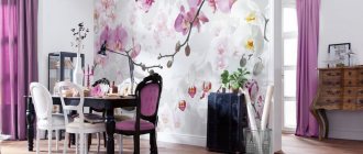
Decorating walls with photo wallpaper is the current trend in the world of renovation and interior design. Photo wallpapers are perfect for any room in terms of size and purpose, and if you choose the right design, you can highlight the room and its advantages.
The most common photo wallpaper ideas are:
- Cities of the world;
- Floral prints and nature;
- Animals;
- Children's photo wallpaper;
- 3D photo wallpaper.
Both for home and studio, photo wallpapers look amazing on the walls. Modern digital photo printing on wallpaper conveys patterns and images as accurately as possible; it can be used to visually expand a room and hide imperfections in the wall surface.
Photo wallpaper can be used to cover not only the surfaces of walls and ceilings; they can be used for designer pasting of old furniture and entrance doors to a room.
Exclusive design solutions
To increase the space, you can demolish the walls between the kitchen or hallway, making a more spacious studio, or add a balcony or loggia.
But in the second case, insulation of the newfound area will be required, and in any case the redevelopment will have to be legalized.
If you don’t want to deal with complex and tedious coordination, you can use small tricks that will help you find a little extra space:
- A small modular wall will replace the huge cabinets that were in fashion in the late 90s, and a sliding wardrobe will save space for opening hinged doors.
- A folding sofa will replace a bulky bed.
- The window sill will provide additional opportunities; on it you can place a workplace, a dressing table, or create a place to store toys or small items.
- The usual chandelier will be replaced by built-in lamps located along the perimeter of the ceiling. If you choose a multi-key switch for them, you can illuminate only certain areas of the room, leaving all others in relative shadow.
- In a large area, they use division into separate rooms, highlighting a bedroom or office. But instead of solid walls, light partitions made of curtains, folding screens, and plasterboard are installed. In this case, the area of the resulting premises must be more than 10 square meters.
Basic Techniques
It is not necessary to cover all walls with the same wallpaper. For modern interiors, such a traditional method will be quite boring and dull. Designers have long come up with a number of techniques for combining surfaces of different textures and shades that are suitable for both large and small rooms. We will get acquainted with some layout options for two or more types of wallpaper further.
Reception of “Different Walls”
This method will require two types of wallpaper: plain and bright with a pattern or textured surface. The principle of combining is to cover opposite walls with the same wallpaper. You should be careful with rooms of non-standard configuration. Cold shades make the object move away, so blue, light blue, and green wallpapers are not recommended for finishing “short” walls, as the room will seem even narrower.
Reception separation
Space division can be done in two ways:
- Horizontal;
- Vertical.
In both cases, you have to sacrifice something: either the height of the ceiling or the width of the room. The first option is suitable for small rooms with high ceilings. It helps to cope with the so-called well effect. Horizontal separation is usually carried out at a height of 0.5-0.7 m from the floor. The strip can be “adjusted” to some large piece of furniture. For example, the back of a sofa, the head of a bed or a dining table. In rooms with windows, they are guided by the height of the window sills. The vertical division visually raises the ceiling. Usually two types of wallpaper are combined, which differ in color and texture. There are a lot of combination options: symmetrical, asymmetrical, narrow stripes with wide double or even triple ones. If you need to completely erase the boundary between it and the wall, one of the strips of wallpaper “extends” to the ceiling, making the angle between the surfaces inconspicuous.
Accenting
This method will require two types of wallpaper: simple, plain and bright, with an original pattern that attracts attention. The first to paste over three walls, and the second - the remaining fourth. It will become the accent, the main highlight of the interior. In the bedroom, attention is drawn to the wall against which the bed rests with the headboard. In the living room, this is the surface behind the back of a large sofa. In the kitchen, the role of an accent wall is played by the one that became the background for the dining group.
Alternation
Alternation is carried out using both two and three types of wallpaper. Unfortunately, the second option is not suitable for small rooms, since excessive diversity will not benefit them. You can combine different wallpapers: plain with floral or geometric patterns, striped or checkered with florists, abstract with different motifs. For small rooms, it is better to opt for single-color wallpaper, which will highlight the brightness of the floral pattern or the richness of wide stripes.
Reception diagonal
Covering one wall with wallpaper diagonally is an extraordinary and bold decision. The best option for such an experiment would be vertically striped wallpaper. An unusual wall will greatly distort the space and it will be perceived completely differently.
What to consider when choosing wallpaper for small rooms
When choosing wallpaper you need to pay attention to two features:
- Quality and type of material (paper, non-woven fabric, vinyl, liquid fabric, foil, cork, with mineral spray).
- Appearance (texture, texture, color).
When choosing a material, only the functional purpose of the room is taken into account. The appearance should correspond to the design style and emphasize the advantages of the room, masking its shortcomings.
Style and design of the room
The style of the room is the very factor that determines the choice of decoration and furniture details. First, they focus on a certain direction in design, study its features, and only then select wallpaper, furniture, and decor. Decorators highlight a separate line of styles that are perfect for small spaces of standard and non-standard shapes. Here are three popular leaders:
- Minimalism. The breath of the East, bursting into the art of modern design, is a long-awaited discovery. Minimalism can be characterized by the single principle of “nothing superfluous.” The room is decorated in white with rare splashes of gray or black, they use only the necessary furniture set, and practically do not spoil the interior with furniture. This approach allows you to rid the room of unnecessary things, as a result of which it begins to look larger than it actually is.
- Scandinavian. The cold blue of the fjords, the dazzling shine of artificial snow caps in the sun, rare spots of greenery and the piercing blue of a clear sky. This is the only way to describe the natural color scheme of the Scandinavian style. The interior should glow slightly from the cold, which is melted by the warmth of the fireplace and the warmth of animal skins lying on the sofa or armchair. Scandinavian style is northern, strict and uncompromising. Here, too, unnecessary details will look inappropriate, as in minimalism
- High tech. A modern trend characterized by an abundance of mirror and chrome surfaces. The combination of neutral white and gray will open up an illusory extension in a small room with additional square meters.
Wallpaper for minimalism is devoid of texture and any pattern. They are monochromatic and may seem boring to connoisseurs of eclectic medley. In the Scandinavian style, they often resort to the “wall separation” technique. Wallpaper with a pattern or print covers only one surface, which will become an accent. The rest remain monochromatic within the acceptable color range for the Scandinavian style. For high-tech, you can use unusual foil wallpaper that will harmonize with the chrome surfaces of furniture and decor.
Drawing and texture
Texture is a special relief on the surface of the wallpaper, which often forms a certain pattern. Most designers agree that raised shadows add volume to a room and are suitable for small spaces. If you need wallpaper with a delicate texture, you should pay attention to vinyl and paper. On them, convex areas protrude above the surface by only 1-2 mm. “Liquid” wallpaper has the most pronounced texture. Drawing is another important feature. Wallpaper without an image is called plain. The rest can be conditionally grouped into several groups:
- Striped wallpaper. Scratching walls has never gone out of style. Vertical stripes are more common than horizontal stripes. The former are ideal for small rooms with low ceilings. Vertical stripes lengthen the space and visually “lift” it. Horizontal lines expand the room, but at the same time lower the ceiling. First, decide on the type of room you have (small with a low or high ceiling), then proceed to choosing striped wallpaper.
- Cell. Another “timeless classic” design. Plaid goes well with rustic style. It brings order and at the same time light notes of anger when performed in rich colors. Don't cover the entire room with checkered wallpaper. This is not a prison. An accent wall is enough. The combination of cells and floral motifs looks gentle and familiar. This is one of the favorite combinations in Provence.
- Floral motifs. There are enough options for floral wallpaper design that even a fastidious designer will find it “the same.” In small rooms it is not recommended to use wallpaper with large flowers. It is better to opt for delicate miniature field bouquets or small inflorescences.
- Wallpaper with large and small stains. They can also be called abstract. Such wallpaper perfectly masks unevenness and defects of the walls. Large dots make the space visually smaller, while small dots, on the contrary, move the walls away from each other.
Color spectrum
Color is the main criterion for wallpaper. It can visually make the room larger, but it is important to choose the right combination of shades for the walls, floors, ceilings, and later furniture. Black and all dark colors are not suitable for such rooms. Blue, light blue, turquoise, cobalt, asphalt gray in combination with the whiteness of the ceiling will add air to the room. These shades are recommended to be used if the room has a large window and a lot of natural light. For those rooms whose windows face the shady side, it is better to choose a duet or trio from a variety of warm shades: yellow, ocher, light brown, café au lait, peach, pink. Unfortunately, these tones will not affect the visual perception of the size of the room, but will make it much warmer and more comfortable. Saturated bright colors look good only in combination with calmer, faded shades. A striking example of such a combination is the “different walls” technique.
Design of walls of rooms in Khrushchev
A one-room apartment in Khrushchev can create a modern look thanks to wallpapering. The space will be fashionable if you define its style. Classics are usually liked for their luxury, and country - for their coziness. What wallpaper to choose for a one-room apartment in this case? Minimalism is the right solution.
Wallpaper design for a one-room apartment in black and white
Wallpaper for the living room
Wallpaper for a small living room with low ceilings should be selected based on a stylistic decision. Minimalism is optimal - a Swedish and Scandinavian way of decorating small spaces. In this case, white color is used in large quantities, and light shades are also added. The cold spectrum visually increases the size.
The following styles are used:
- Japanese (use natural colors, natural materials);
- high-tech (minimum furniture and filling the interior with modern devices and forms);
- stylistic mixture (combines a number of directions and creates a combination at its discretion).
A small apartment can also be decorated in warm colors.
Wallpaper design for a one-room apartment with pineapples
steklooboi v interiere
Wallpaper for the bedroom
The classic option is to cover all the walls of the bedroom with the same wallpaper. In this case, they choose models that are quite restrained in both color and design - be it paper or vinyl.
A combination of companion wallpaper is also used: for example, the first two walls are covered with canvases with floral patterns, and the remaining ones are covered with a striped version.
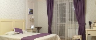
In addition, you can focus on one wall. Most often, this is done by highlighting the wall at the head of the bed using unusual and bright patterned wallpaper. At the same time, the rest remain monochromatic. The color of such accent wall coverings in the bedroom is supported by bed textiles - bedspreads and pillows.
Wallpaper design with floral print
Wallpaper design in the interior
Wallpaper design brown
Wallpaper for the corridor and hallway
The hallway is the first thing they see when they enter the house. You need to set the mood and reflect the character of the owners, so the design must be carefully thought out. In the hallway, a textured wall covering or a pattern that imitates natural materials is recommended. Color and print must be perceived correctly under electric lighting.
Dark and small room
Naturally, if the room is too small and lets in very little light, then it needs to be made lighter. An interesting move would be to choose lighter wallpaper (beige, peach, pink) for the dimmest wall or the wall located opposite the window. Do not use cold shades (blue, purple) for northern rooms.
Glossy wallpaper that reflects light, as seen in the photo, will make the room larger and brighter. The problem of dark rooms is most common in studios.
Replacing wallpaper in an apartment: where to start
Any master will tell you that it is preferable to part with old wallpaper - that is, remove it. This is where the renovation begins.
Before hanging new wallpaper, be sure to remove the old ones.
You can remove wallpaper with your own hands like this:
- Non-woven fabric and vinyl can be removed without much difficulty. Just pull the bottom of the strip and it will actually come off entirely. The remaining pieces need to be moistened with warm water, and then calmly removed with a spatula.
- Paper wallpaper can be removed by dampening. Wet the wall with warm water from a spray bottle, wait about forty minutes, and the wallpaper itself will begin to pull away from the wall, and then remove it with a sharp spatula.
- You can remove wallpaper by making cuts on the wall . The wall is also moistened, but moisture will enter the adhesive composition through cuts.
- You can steam the wallpaper with an iron through a damp cloth. It’s better to use a steam generator, it’s faster and more convenient.
Related article: How to securely attach balusters to the floor and steps
Stores today actively sell special compounds just for removing old wallpaper. These liquids are safe for human health, so they can be applied to walls even in the presence of other people in the room.
How to make curtain hooks?
At what distance should curtain hooks be hung?
It is recommended to place the hooks at a distance of 5-10 cm. The most optimal option is 7-8 cm. Placing them in increments of 5 cm allows you to achieve deep embossed folds, but when attaching them at a distance of 10 centimeters or more there is a risk of fabric sagging and unreliable fixation of the curtain fabric.
What types of curtain hooks are there?
There are several types of curtain rods on which curtains are attached using hooks:
- forged;
- ceiling;
- aluminum;
- bay window;
- string;
- old and new type rack.
How to secure the curtains?
Curtain with elastic
The budget method is to hang curtains without any curtain rod, using an elastic band. To secure your curtains beautifully, simply use a strong elastic band. The curtain is folded and hemmed, and an elastic band is threaded through the folding opening. You can secure the edge of the elastic in the window seal.
At what distance from the window should I hang a ceiling cornice?
Length of the cornice = window width + 30-50 cm. Before attaching the ceiling cornice, leave a distance between the cornice and the top of the window: at least 5 cm, necessary for the window to open freely. Distance between wall and cornice: from 10 to 15 cm.
How to calculate curtains for a ceiling cornice?
Thus, in order to calculate the height of the curtain, you need to measure the distance from the hook attachment point to the bottom edge of the future curtain, and add 3 cm to this distance. For example: You want a floor-length curtain. We measure the distance from the hook to the floor - let it be 247 cm. Add 3 cm - we get 250.
How to correctly calculate the width of curtains?
If you use fabric loops on curtains, then the width is calculated by multiplying the width of the curtain rod by 1.5 or 2. If you plan to hang curtains on grommets or calculate the width of the curtain on a ribbon, then simply buy a canvas twice as wide as the length of the curtain rod.
How many meters should I take for curtains?
The standard width of a roll of translucent tulle is 2.8 m, which should be quite enough for the standard window height, so the issue of length remains resolved. As for the width, for a given window width and the selected frame, 2*2=4 m of fabric will be required. May 5, 2015
What types of cornices are there?
What types of cornices are there?
- Profile (rail cornices made of flexible materials that can be curved or any other shape. ...
- Telescopic (can be folded and unfolded, used for different rooms).
- Spacer ones (like telescopic ones, they are sliding, but are mounted without brackets, with emphasis on the wall.
Where to hang curtain hooks?
The following methods are used to attach curtain tiebacks to the wall:
- Below the window sill line by 20-30 cm. This method contributes to a significant visual narrowing of the window and is used for heavy curtains. ...
- Above the window sill level (at a distance of 2/3 from the floor surface). ...
- At the level of the window sill.
What are the curtains held up to?
Traditional curtain rods
Cornice rod is a classic type of cornice that can be made of wood, metal, plastic and metal-plastic. The rod is attached with brackets to the wall or ceiling; it can have several rows for hanging different types of curtains at the same time: curtains, tulle, lambrequin.
How to make curtains without a cornice?
You can hang curtains on regular coat hooks or Velcro strips. Helpful advice! Before hanging light curtains without a cornice, it is recommended to check whether the “string” will be held by the dowels in the wall or other base. If they do not hold, use temporary fastening to the window frame, for example, with Velcro tape.
How to attach curtain tiebacks to the wall?
Curtain tiebacks can be attached to the wall at different distances from the window opening. This largely determines what the size of the window will visually appear to be. Hanged close to the opening, they will narrow it; installed at a distance, they will widen it.
Interior of the hall in the apartment
In an ordinary apartment, the living room often has an additional purpose - it is both a hall and a sleeping area, a dining room or an office. The interior of a living room in a one-room apartment and the design of a living room in a three-room apartment are, as a rule, different things.
Design ideas can be very different. In a spacious room, you can decorate the walls in lingonberry tones, buy green pillows, armchairs, a sofa, and the room will sparkle with bright colors. In such a room there will always be an upbeat mood. The room should be furnished to a minimum. It's better if everything has semicircular corners, then you won't hit it.
Photo 1 - Interior of the living room in the apartment
Photo 2 - Interior of the living room in the apartment
Photo 3 - Interior of the living room in the apartment
Depending on the color of the wallpaper, choose textiles:
- plain;
- in a cage;
- striped;
- with drawings.
Dark furniture is more practical and helps in creating a modern design in a panel small apartment.
In a room of 15 sq. m. with a balcony, you can increase the space by demolishing the wall. The design of the hall depends on what functions it should perform. This can be a classic room for family relaxation and gatherings with friends. Or maybe you need to allocate part of it as a work area or study space for your child? Do you like watching sports? Then buy a large plasma and hang it in front of the sofa.
The room is 16 sq. m., 17 sq. m., 18 sq. m. of heat can be added by an electric fireplace with the effect of a live fire. This technique will heat your room in winter, and in summer you can enjoy the flame without heat. The room is 20 sq. m. you can create ideal conditions for comfortable living. Consider the design of the ceiling. An excellent solution could be a prefabricated plasterboard structure with built-in lighting. You can adjust the lighting.
Wallpaper for the room (photo)
The best posts
- Socket boxes for drywall: correct selection and installation
- Repair of plasterboard ceilings: we fix the problem ourselves
- Grouting drywall joints: materials and techniques for performing the work
- How to make a partition from plasterboard - step-by-step instructions
- Machine for the production of profiles for plasterboard: production of frame elements
- Decorative plasterboard - for effective finishing of premises
- How to replace drywall - alternative finishing materials
- Door seal: the culprit of drafts, noise and odors
