Curtains are no less important element of the interior than furniture or wall color. They are the finishing touch and add coziness to the room. To make the interior look beautiful, you need to choose curtains for the living room to match the color of the wallpaper: modern ideas and combinations will help you choose the most suitable option.
Curtains are one of the most familiar interior elements.
The most important thing is not to make a mistake with the color
Experts say that curtains and wallpaper should not match tone on tone. If the walls and window merge into one shade, this creates the impression of an incomprehensible and tasteless design. The advice here is simple: you should choose curtains a couple of shades darker or lighter than the wallpaper.
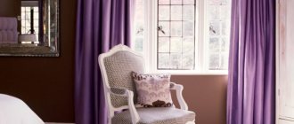
It is no secret that the same purple color has a lot of shades: from lilac and lilac, to bright and rich fuchsia, deep lavender or grape. In the photo of curtains in the color of the wallpaper you can see interesting combinations in the interior of different rooms.
What should you consider when going to the store to buy ready-made products or fabrics for curtains? The solution to the question of how to choose the color of curtains is quite simple. You should take a piece of wallpaper with you. This will make it possible to choose a lighter or darker shade of curtains, but in the same color scheme.
If the wallpaper has a pattern, and a large one at that, it is advisable to buy plain curtains, but in the color of the walls or the print itself. The color combination of curtains and wallpaper in this case can be tone on tone. For wallpaper without a pattern, you can choose curtains with an unobtrusive pattern, the shade of which will be ideally combined with the color scheme of the walls.
Often, owners glue wallpaper of related or contrasting colors to the walls of the living room or bedroom. In this case, the curtains can be matched to one of them, or you can combine both shades in the window drapery set itself. For example, the wallpaper is black and white, the curtains are pure white, the curtains are dark gray or black.
Curtains for white walls in Scandinavian style
Currently, the Scandinavian style is becoming increasingly popular, so soft white walls in the interior are becoming more and more common. When choosing curtains for white wallpaper within the style, you should take into account the minimalist design features.
Scandinavian design allows you to avoid curtains, but not everyone will like this option, especially those owners whose premises face the sunny side of the house. This style does not focus on window openings.
A good option for white wallpaper in this case are roller blinds in a pure white or beige shade. It is not prohibited to replace curtains with simple light-colored blinds. For bedrooms, classic floor-length curtains will come in handy, but they shouldn’t be conspicuous either. It is worth choosing white or gray options without patterns. The cornice should not peek out from under the curtains.
In the process of decorating a room, you should rely only on your taste and intuition; this is the only way to get a good result.
We suggest looking at our selection of photos of curtains for white wallpaper in the bedroom, living room and for a children's room with white walls.
You may also be interested in: White curtains - calm and stylish design
Save
Save
Save
Save
Light walls – dark curtains, and vice versa
Designers recognize this method of layout as classic, but recent trends are moving away a little from following these tips. Modern curtains can match the tone of the upholstery of an armchair or sofa cushions, or in the bedroom - with bed linen.
But the option when darker curtains are selected to match light wallpaper is still quite relevant. But at the same time, the room must have elements that fully match the tone of the curtains or curtains.
If the room is small
In this option, designers do not recommend framing the window in dark colors, and it is advisable to drape the walls with light wallpaper. In this case, the beautiful curtain design is plain beige or light gray curtains made of natural fabric. The wallpaper is in the same range, but a couple of shades darker.
In a small room you can hang curtains with vertical stripes or small patterns. Sprawling patterns or flowers will visually “steal” the space. The color combination in the interior of a small room should be laconic. Monochrome is preferable, or using just a couple of shades of the same range.
Basic principles of combination
When choosing curtains, wallpaper or furniture upholstery for any of the rooms (in the nursery, kitchen or living room), experts apply two basic principles for the juxtaposition of shades:
- Contrasting. Opposite colors intertwine here. At the same time, they look beautiful in pairs, like black and white, red and black, blue and white, yellow and green.
- Similar colors. Here colors of the same scale are collected, but in different tones. Some color will be more intense than its neighbors.
Interesting: Fashionable apartment interior 2019-2020
Cool or warm tones
The natural light in the rooms depends on which side of the house or apartment they are located on. If in the northern part, it is advisable to choose warm, more saturated tones of wallpaper and curtains. When the bedroom, kitchen or living room is on the south side, you can experiment with cool shades of draperies. The main thing is not to combine warm and cold colors.
How to make the right choice?
If the wallpaper is paper, light weightless curtains with transparent tulle will do. Vinyl works well with denser materials. It is worth remembering that bright colors of wallpaper and curtains are not welcome in rest rooms. It is best to choose curtains for the bedroom that match the color tone of the pattern on the wallpaper.
By combining the tones of wallpaper and curtains you can create interesting transitions or even accents. For example, burgundy curtains with a white curtain against the background of pink wall decoration look good.
Beautiful combinations of shades
To understand in more detail which color goes harmoniously with which, let’s give the following examples:
- Gray – blue, light blue, black, brown, burgundy, marsala, orange, green, yellow.
- Black – absolutely any shade suits it. Just like the white one. Black and white are the basic colors.
- Orange – blue, green, olive, light blue, brown, beige.
- Brown – beige, white, black, grey, orange, red, warm green, blue, light blue, pink, burgundy.
- Green - pink, blue, light blue, orange, gray, white, black, crimson, red.
Such combinations look very interesting indoors. But before you combine colors with each other, read the recommendations of the experts below.