The right color combination will help create a stylish and original interior in the living room. Today ReRooms will talk about 14 colors that can and should be combined with other shades to get interesting colors.
These colors can either be basic or find their place in various interior details, for example in decor or textiles. In order not to overload the room or, conversely, make it faceless, it is imperative to combine colors. And we'll tell you how to do it.
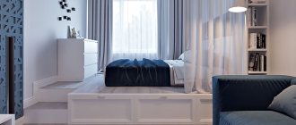
Blue
Blue is one of the most sought after colors in the design world. It is quite difficult to use, but if you find a suitable pair for it, then believe me, your interior will radically change.
To break up the gloom of blue shades, use the aforementioned beige or white. Thanks to this combination of colors, you can create a maritime mood, which is sometimes so lacking in city apartments. However, this combination can often look too cold.
Add to these colors a bright red carpet and purple accents on textiles, then the blue and white design of the room will be transformed and you will get a full-fledged vintage interior. Just don’t forget in this case to add unusual decorative items: carved candlesticks, fresh flowers, marble vases and unusual lamps.
elledecor.com
1/3
elledecor.com
2/3
elledecor.com
3/3
The elegance of powder and beige
Muted pink looks great in a small living room as it is a neutral color. To create a calm environment without sudden transitions, combine shades of the same brightness that are next to each other on the color wheel.
Milky and earthy-beige deep shades are perfect for powdery shades. Use this combination if you want to create a delicate, muted interior, but traditional beige does not suit you.
Violet
This color has a large number of shades of different temperatures and brightness, so it is very interesting to work with it in the interior of the living room. As you understand, there are a lot of options for combinations with purple.
The only caveat: don't use dark purple alone, otherwise you risk turning your living room into a Count Dracula crypt. To create an unusual interior, abandon the classic white or beige shades, give preference to contrasting tones that will bring brightness and fun to the living room. To do this, use green, orange, blue, red or brown. The listed colors can be either bright or pastel. The main thing is to find a balance and fit each shade appropriately. In the photographs you can see very unusual and striking examples.
amara.com
1/3
elledecor.com
2/3
elledecor.com
3/3
Winter Garden
Another way to create an atmosphere close to nature is to fill the living room with natural shades: brown, sand and grass green. They support the “forest” theme, calm, set the mood for relaxation and provide an opportunity to escape from the bustle of the metropolis.
When creating such an interior, it is important to maintain a balance: coffee and beige tones should serve as a background for green, and not vice versa.
Coral
This color will help create a good mood and atmosphere in any style and in any area, which is why we love it so much. Depending on the lighting in the living room, it can produce different shades: pink, orange, red and brown.
The peculiarity of coral color is to give off warmth to the surrounding environment. Therefore, if you live on the north side of the house or it is always cool in your area, this color will be a real salvation. Pair it with beige and brown, complemented by interesting decorative elements, such as a coral chandelier (and why not?). If, on the contrary, you think that the color is too hot and intense, use white and blue to cool it down. Combine blue and coral in textiles or furniture upholstery, and white in wall decoration.
Such color combinations will always give you a good mood and charge you with energy.
elledecor.com
1/2
housebeautiful.com
2/2
Types of paints for room design
Alkyd
A special type of paint and varnish materials. Characterized by versatility of use. Alkyd paints come in matte, glossy, and semi-matte.
Among the main advantages of this coating are durability, quick drying and compatibility with any material.
Alkyd paint for wood, metal, and plastered surfaces
Emulsion
There are several varieties of this type of paint:
- Silicone. Universal, suitable for any surface.
- Latex. Versatile and damage resistant.
- Polyvinyl acetate. They are low cost, but not waterproof enough.
- Acrylic. Strong, resistant, durable.
- Water-based. Protects the surface from damage.
- Water-dispersed. They fit perfectly on brick, concrete, and wooden surfaces.
Emulsion paints
Textured
The main features of these paints that give them an advantage over others are the lack of ability to absorb odors, ease of use (they rarely get dirty), and environmental friendliness.
Textured paint for walls
Green
One of the most frequently used colors not only in the interior of the living room, but also in the interiors of other rooms, especially the kitchen. And this is not just like that. Green color calms and creates a natural atmosphere that is so lacking in city apartments. As with the above-mentioned colors, we advise you to avoid banal combinations, such as green and beige, green and blue. It’s better to experiment and create a real jungle at home.
If the living room area is large, use bright shades of green combined with yellow, pink, blue and brown. Complement this bright madness with unusual decor: figurines in the form of parrots, dishes in the shape of fruits, bright paintings and pillows. This will definitely turn your room into a tropical jungle.
If the room area is small and you don’t really like flashy shades, then give preference to muted green shades that will go well with beige, brown and gray. However, you shouldn’t completely abandon bright accents; just use pastel shades instead of flashy colors.
You can also see examples in the photographs provided.
elledecor.com
1/2
elledecor.com
2/2
Features of choice
A correctly selected color scheme can visually make a room larger and more spacious, fill it with light, support the overall concept, and even eliminate some of the shortcomings of the room.
Criteria for color selection
- Features of lighting. Dim lighting can be corrected by using bright, light palettes that distribute light evenly and eliminate dark corners. If natural light enters the room in sufficient quantities or even in excess, preference should be given to cool, calm tones.
- Design and personal preferences. First of all, the color of the living room should be liked by its owners. In addition, if a certain style concept has already been chosen in a design project, it must be adhered to.
- Functionality requirements. The color of the finish can often act as a tool for zoning space instead of massive partitions or furniture groups.
- Living room area. A spacious room opens up more opportunities for realizing bright ideas. Here you can create a contrasting finish, or use smooth transitions. Small living rooms require the use of light colors and neat accents that will harmonize with other interior details.
Not all walls have to be painted the same tone, but there should be balance in everything. The finishing of the floor and ceiling is pre-thought out so that all surfaces fit well together.
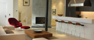
Red
This color has long been feared for its excessive brightness and aggressiveness. However, now almost every interior contains this color in various shades and on various surfaces. You need to use it very carefully, because if you overdo it, you'll end up with a visual nightmare instead of a cozy living room. In order not to get tired and irritated in such an interior, you need to mute it with white, beige or brown colors.
We advise you not to use red in the decoration of walls or ceilings; it is better to focus on furniture, textiles or decorative items. To make your living room look more interesting, experiment with red patterns combined with other colors: red and white curtains, red and blue pillows.
amara.com
1/3
elledecor.com
2/3
elledecor.com
3/3
Preparation
Before painting, it is necessary to prepare the surface. This is the most important stage, since the result depends on the quality of the preparatory work. This is especially true for the living room, where all the flaws are immediately evident.
Preparation is carried out in several stages:
- It is necessary to clean the surface of old coating, protruding pieces of cement and small irregularities.
This can be done with a wide spatula, sequentially processing each area. Attention: If there are large chips, blockages or holes on the surface, they need to be additionally plastered. - Priming the base. You will need a roller. To speed up the work, you can use a special construction sprayer.
- Lifting corners to give them visual evenness.
- Apply finishing polymer putty to the base in 2 layers. First, you need to apply the first one, wait until it dries completely, remove small bumps and irregularities with a spatula, and then proceed to apply the second layer. Read about how to putty and evenly paint walls here.
- Then you need to clean the putty surface with sandpaper (No. 150).
- Next, the surfaces are primed again, and fiberglass is glued on. The material hides any surface imperfections, protects against the appearance of microcracks, prevents the development of mold, and allows the walls to “breathe.”
- When the fiberglass has completely dried, you need to begin applying the final coating - superfinish putty (2 layers). Thanks to this material, the wall can be given a perfectly flat surface. An important condition for using superfinish putty is high-quality preparation of the base.
- The final stage is cleaning the surfaces with sandpaper No. 240. After sequentially performing all the described actions, you can begin applying paint.
Grey
The popularity of this color has increased exponentially after the release of the famous film. Gray is rich in different shades that can be emphasized thanks to light and dark, warm and cold colors. At first glance, it seems that gray is a boring color with a meager palette, but this is not so. With its help, you can create a very cozy room in which you can relax comfortably. To do this, combine gray and white colors, do not forget to add wooden textures to this combination, which will create a more cozy atmosphere.
If this combination seems rather boring to you, it doesn’t matter - introduce a contrasting third color into the interior: green, red, blue or purple.
elledecor.com
1/3
elledecor.com
2/3
elledecor.com
3/3
Color combination in the living room
Green and walnut - fashionable colors for the living room
When it's gray and rainy outside, we look for something that will improve our mood. Fortunately, this season will not be complete without interiors in cheerful greenery. And it's all thanks to the Pantone Color Institute, the world's renowned oracle of color trends, which has named green as its Color of the Year 2022. This is where there is so much green inspiration in the bedroom! Everything revolves around tropical leaves these days, but keep walnut tones in mind— warm tones incorporated into the living room will make the interior feel cozy and comfortable.
Green on the walls in the living room always harmonizes perfectly with golden-colored wood furniture. It is suitable for both modern and classic interiors. It is soothing and relaxing, making it an ideal choice for your living room to unwind after a long day at work.
Turquoise
Turquoise color is very noble and beautiful; it must be in the interior of the living room. It can be combined with white, beige and blue shades, then you get a very delicate and unobtrusive interior. However, if you create the same design as shown in the photographs, you will get a bright and expressive environment. To do this, add red, orange and yellow and you have vintage style in your pocket.
The main thing is not to overdo it with saturated shades.
elledecor.com
1/2
amara.com
2/2
Mustard
Luxury, prosperity and independence - these are the associations that arise when we mention mustard color. Depending on the lighting, it plays in different shades: from bright yellow to dark.
This color goes well with its closest neighbors - yellow and brown. The first will add brightness and energy to the interior, while brown will add luxury and style.
For a summer mood, combine mustard and blue colors with interesting decor, this will add freshness and good mood.
decoist.com
1/3
decoist.com
2/3
elledecor.com
3/3
Brown
Brown is another color that will not go out of style for a long time due to its versatility. It can fit into any interior: be it cozy Scandinavian or luxurious classic style. The classic combination - brown and white, coffee with milk - is used very often by designers in living room interiors, as it creates both a cozy and luxurious atmosphere. White color in this combination creates a background for brown shades, highlighting them favorably.
To make the brown and white palette sparkle with colors, add fresh flowers and unusual decorative elements to the interior, as shown in the photo below. Just a couple of touches - and the living room takes on a touch of nature.
amara.com
1/2
elledecor.com
2/2
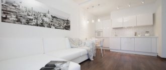
White
This color is the basis of all basics; no modern interior can do without it. However, we do not recommend using this color alone, as the living room risks turning into a hospital ward. It is unlikely that you will be comfortable in such a room. To make such an interior warmer and homelier, add blue or beige to white - you can see examples in the photographs. From a lifeless and cold room, these two shades will make something airy and peaceful. This color scheme is used in Scandinavian interiors.
amara.com
1/2
amara.com
2/2
Olive
This is a stylish and sophisticated color that goes well with both neutral shades (white, beige, brown) and bright ones (red, purple, yellow).
The combination of olive color with brown and white is very harmonious. It is reminiscent of wild landscapes, where massive tree trunks juxtapose with delicate foliage shimmering in the sun. This palette will bring peace and serenity to the interior.
home-designing.com
1/2
annaburkeinteriors.com
2/2
Burgundy
Not every owner will like this color, since burgundy is a very expressive shade by nature. However, if you correctly fit it into the interior of the living room, you will get an expressive and expensive-looking room.
This color is rarely used in wall decoration. But if the soul demands, we will not resist it. In this case, use a warm shade and keep the surface of the walls glossy - this way you will minimize the excessive saturation of this color.
As a rule, burgundy is used in furniture upholstery, textiles and decor. It becomes a bright accent in any room.
shirokoi.org
1/3
annaburkeinteriors.com
2/3
hgtv.com
3/3
Textile
Modern rooms do not have a lot of fabric: curtains on the windows, a blanket on the armchair, pillows on the sofa, a carpet on the floor. That is why their shape and color are carefully thought out. If the color accent is aimed at furniture or decoration, then it is better to choose neutral, straight-cut curtains.
Instagram @u.kvartira
Instagram @modern_potolok
If the decor is matched to the tone of the finish, then curtains in rich colors and the same decorative pillows will help to dilute it with bright spots.
Instagram @ushakovasvetlana_design
Instagram @ne_prosto_irma
Separate mention should be made of the carpet. Fluffy with long pile or smooth with a geometric pattern, it creates a warm, homely atmosphere.
Instagram @interiorlab
Instagram @studio_bright_design
Instagram @daubandart
- Living room
How to choose a carpet for the living room floor: the latest models and best options